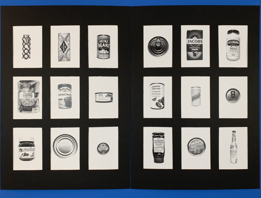
Window-mount Boards:
For these images i presented them in 3×3 a5 window mounts. This worked best for a typology as the images had equal space between them as well as having a clean border that works perfectly for a typology as they are meant to be the same size to show the individual differences. The contrast between the white of the background and the black board works well as it draws the images forward making the actual products stand out more. The equal divides between each image is interesting as it makes each image more individual giving them their own space. The tonal range and contrast in each of the products gives the image a deeper dimension as it is drawing away from the vibrance of the products which is used to draw consumers in and instead focuses on the products shape and illustration.

