Image Analysis From Each Section

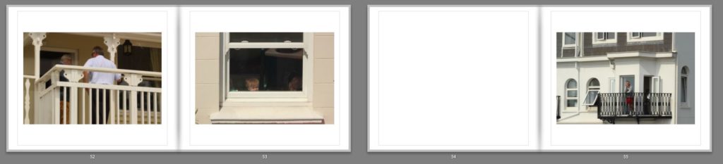
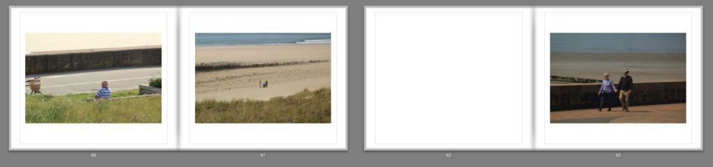
Once I had started the developement of my book I decided that I should analyse an image from each theme of the book, this is because of how each image represents the catagories that I am exploring and the processes I have gone through to produce the desired outcomes. By doing this it would allow me to have a better understanding of how I should compose my books, as if I go about changing the layout in the futureit could give me ideas of how the different areas within each book could look through this change. Here are my chosen images:

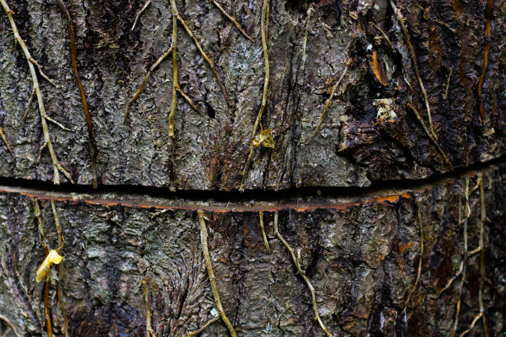
Abstraction through Texture: For this theme within my book I had wanted to particularly look at the surface texture of things such as trees, water and plants. When photographing the subjects I always took into consideration the structure of what I was looking at, examples of the consist of the image above where I would make sure the grain or any abnormalities within the subject was photographed in a way that reflected symmetry generally facing the opposite direction of the overall movement of the rest of the photo. To accompany this I have been looking at the topic of colour as well in textures and how the area that is photographed can often reflect what type of environment it was taken in and the textures you would see whilst walking through that specific area. When putting together my book I will be making sure that the images have a smooth transitioning between the colours so that it prevents the book from being jumpy and having an uncoordinated structure.

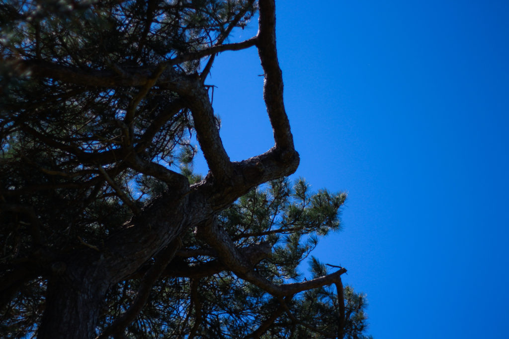
Abstraction through Colour: This was one of my favourite themes to photograph because of the use of in camera settings to create the desired results wanted from the topic. Composition is a huge element of this section due to how the simplicity of much of the imagery produced requires a unique perspective in order to portray them in a way that interests the viewer and draws them in. To do much of this I have been basing my compositions in the book around the idea of transitioning between the intensity of the certain colour present in each photo, in the case of the one above it being blue. By doing this in the book it prevents the order seeming like a splatter of colours jumping from yellow to blue immediately, instead allowing it to start merging into the next like a slideshow. Much like texture I wanted the viewer to experience a unique perspective of how the environment could be viewed, however instead of isolating the subject like the other two themes I have chosen to look at the entire landscape so that the viewer gets an overall impression of what has been created.

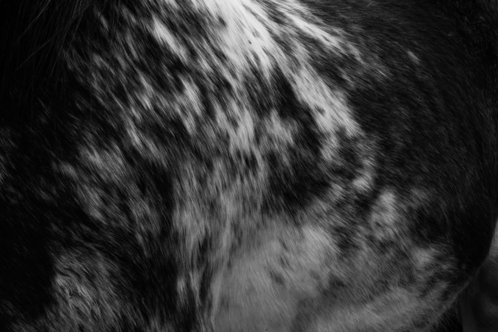
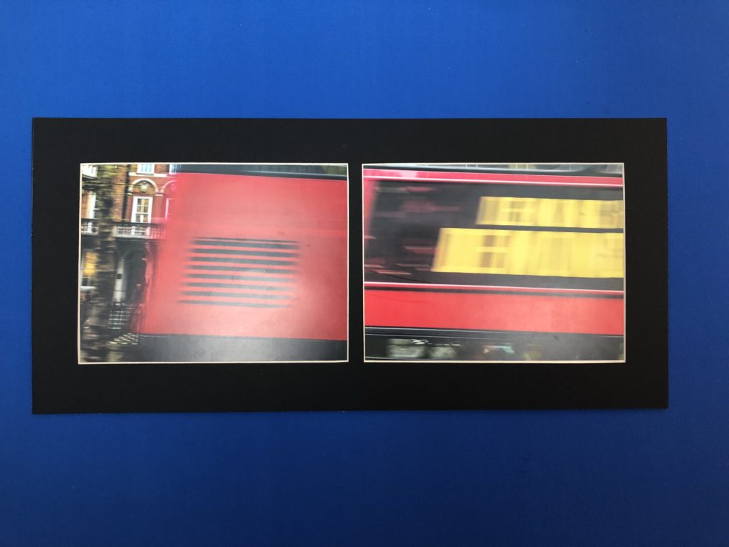
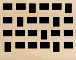
Abstraction through Pattern: Regarding the theme of pattern this was probably the most intensive theme due to the amount of experimentation that was required to create the results I wanted. Within the book I have grouped together the images that I thought used similar techniques to produce them such as aperture and monochrome like the one above. Through the use of this it allowed a greater emphasis of whites in particular, presenting the outcomes as more pure than the reality it’s in whilst highlighting the patterns inside each. Much like the theme of texture I really wanted to explore the form of the subjects photographing, and made sure to photograph the patterns in a way in which captured movement and the beauty that could be seen. The reason I chose to photograph this subject using a monochrome filter was that it was hard to capture pattern to its full effectiveness without removing all aspects of colour, reducing it to shades and preventing the viewers from becoming distracted by other contrasting aspects.

Evaluation – Final Outcomes

My final pieces are displayed in two forms. In a photo book and mounts. These two forms allow my images to have a sequence to give my photo book a narrative. The narrative for my photo book was pin pointing areas and objects, with vibrant colours, and then capturing those images through carefully thought out shoots throughout London and creating juxtapositions between the images to make the viewer compare the similarities between the two varying images. This is where my project theme comes in. My main influence and inspirations came from three notable photographers; Keld-Helmer Peterson, Saul Leiter and Siegfried Hansen.

From the start of the project ‘variation and similarity’ I was researching the work of photographer Michal Wolf. I was very intrigued by his project ‘Hong Kong Inside Outside’ as it showed the extreme diversity and variation between the locals. His images subjects where of extreme poverty among mass apartment units. he does this in a very formal and symmetrical way. From here i started looking into colour photography and researched the auto chrome, all about the begging of colour photography and how it was first produced. This made me question why so many photographer take images with beautiful colour then go in photoshop and make it black and white. All the hard work and innovation. I wanted to use this as motivation to produce colourful images for the project and show the variations of colours in the objects, buildings and nature. I started by researching the pioneer of colour photography, Stephen shore. This opened me up to a whole new range of colour photographers, such as; Keld-Helmer Peterson, Saul Leiter and Siegfried Hanson. All of these photographers have a noticeable influence in my photo book. This is what kicked my project into action. From here i carefully planned out shoots each inspired by a different reference

Photo Book:

My photo book ‘The Colour And The Shape’. Was an overall success for a final display of my images to collate them a sequence. Throughout the design process, i thought of different colour combinations that would look suitable. I came to the conclusion of using tonal colours. I would colour match the focal colour in the image and i would make that the colour of the page. Although, i did not use this method for all pages. I found other colours that compliment the colours within the images to almost extent my own image. This is what helped me achieve the final result i was initially visualising and now that it is in physical form i couldn’t be any more pleased. To Conclude i am pleased with the final outcome of my final photobook as it meets specification points for the exam and my own specification for the project and the book.

Mounts:

The first set of images on the left are of a London bus that was traveling past. as i took a picture i took a burst to try and capture the full bus so that when it came to editing i could use them to build and image of the moving bus. Overall i am pleased with how this idea turned out in my final outcomes both in this layout and within my photo book.

The middle layout is of Skateboards showing the variation of colour mixes in the images and the new mixes when compared to one another.

Finally the last layout is of my strongest images from the overall project. This is why i decided to Lay them all out in a large format to display them. They all share similar colours to each other but are in the form of other dimensions, materials, place and position. so as a result of this i believe this to be my strongest and most successful layout when it comes to consideration for the theme of the project and final execution of the layout.

I am pleased with the final result of my prints. I feel that they were the best ways to present my final outcomes in a larger format.

If I were to do this project again i would, Produce more images and shoots to work with a wider range of images. I would capture images that are focusing on similar subjects and show in almost a typology form the similarities and variations they share. I would also research other artist references that use interesting editing skills to give new meaning to the image. Such as, joiner images.

Final Postcard Display Planning

As I decided in my previous post I am intending on displaying 24 postcard prints strung up in either 6 rows of 4 or 4 rows of 6 on a wooden board of some form. I personally believe that a light tone of wood will look best as it will make the prints stand out whereas a darker wood may be too overpowering. Below is the sort of wood tone which I think will work best.

I need to make a choice as to whether 6×4 or 4×6 in terms or the print rows will make for a more successful outcome. and therefore I have created these very simple mock ups of how the compositions will both appear.

6 rows of 4
4 rows of 6

After composing these layouts in order to see what would work best I have decided the the second option (4 rows of 6) would work best. I’ve made this decision as looking at both layouts the second looks much better due to the fact that the majority of the postcard prints will be landscape. And therefore a landscape board of wood would be most appropriate visually. I will also buy brown string and some wooden pegs of the same tone so that everything displaying the postcards matches. Here is the kind of string and small pegs I will try to buy somewhere.

Then after making all of these decisions I thought it would only be right that I make a mock-up draft on Photoshop of what the display will probably look like. So I did this in three steps: one with just the postcards, one with the string and one with both the string and the pegs (As you can see below.)

Overall with that as a mock up I am extremely happy as I believe it works really well, the composition of each postcard print is carefully considered as although it looks very random that was the point as I wanted to space out the prints depending on whether they were landscape/portrait, colour/monochrome, fronts/backs etc… Also doing this layout mock up has been useful in terms of working out what dimensions I will need to use for a wooden board, and I have come to the conclusion that I will need to use a 38 inch by 48 inch board. I intend to staple each string at both ends into the back of the board in order to tightly secure them so that the postcards can hang off them using the pegs.

FINAL PRESENTATION

Window-mount Boards:

For these images i presented them in 3×3 a5 window mounts. This worked best for a typology as the images had equal space between them as well as having a clean border that works perfectly for a typology as they are meant to be the same size to show the individual differences. The contrast between the white of the background and the black board works well as it draws the images forward making the actual products stand out more. The equal divides between each image is interesting as it makes each image more individual giving them their own space. The tonal range and contrast in each of the products gives the image a deeper dimension as it is drawing away from the vibrance of the products which is used to draw consumers in and instead focuses on the products shape and illustration.