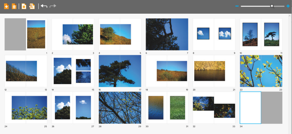
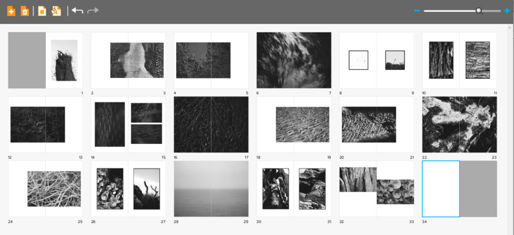
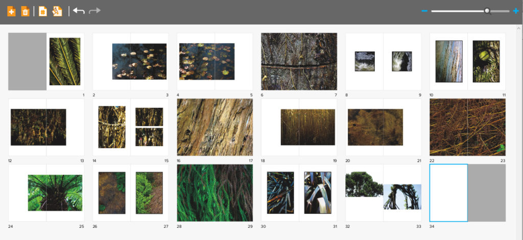
When editing my book I decided that I would use the software called Blurb to create my three books for final exam. I chose this because of how it presented me with a bigger variety of different templates that I could more easily access to that on Lightroom, allowing me to experiment more with my layouts. Whilst designing my books I decided that I would make myself refer back to my photographic books which I had drawn inspiration from by the photographer Robert Frank. By looks at his three books together it gave me ideas for the development of my own, this included the use of negative space being used effectively in order to enhance each image the way I wanted. Overall when looking over the three books ‘Tal Uf Tal Ab’, ‘You Would’ and ‘Park Sleep’ I found that I had gone down a slightly different path as in Frank’s books he had a closely similar theme throughout the three books compared to that of mine which have a similar but different theme in each book. Using his books as references and my main influence I was able to select and layout about forty images for each book. Here are my current compositions:


When designing my books I decided that I really wanted each book to have the same layout as the next, this was because I wanted the viewer to know that each book was linked together, regardless of the photos inside, and that a similar composition was a great way of doing this. Within the books I have made sure to include a variety of different page layouts consisting of one image a spread to three images a spread, this way it didn’t make the outcomes dull and bland, instead adding interesting changes in the design of the book to make the reader want to turn the next page. I originally had experimented with the blank spaces and had found by using certain images it allowed for me to use photos as a transition between different coloured pieces or subjects within, preventing this outcomes as seeming too much and rushed. I didn’t choose to have any text in my books due to wanting them to be as minimalist as possible which would allow the viewers to only focus on the images rather that what was around them.
Some of the issues that I am having through the process of creating the compositions are the particularly the compositions of the last spread, this is due to how I want it to be more simplistic, but rather retain the overall qualities and composition of the rest of the book. My final issue is the composition consistency throughout the books, this is due to a stronger start of portraying images, however this becomes harder to maintain as I progress through its creation, leaving me too have some pages blank in which I need to come back to and redesign.
