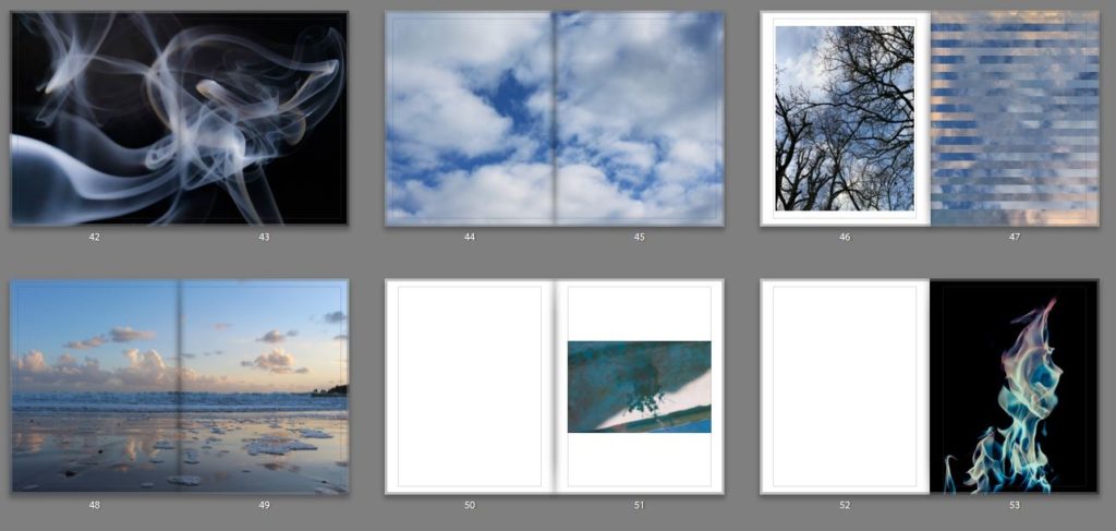
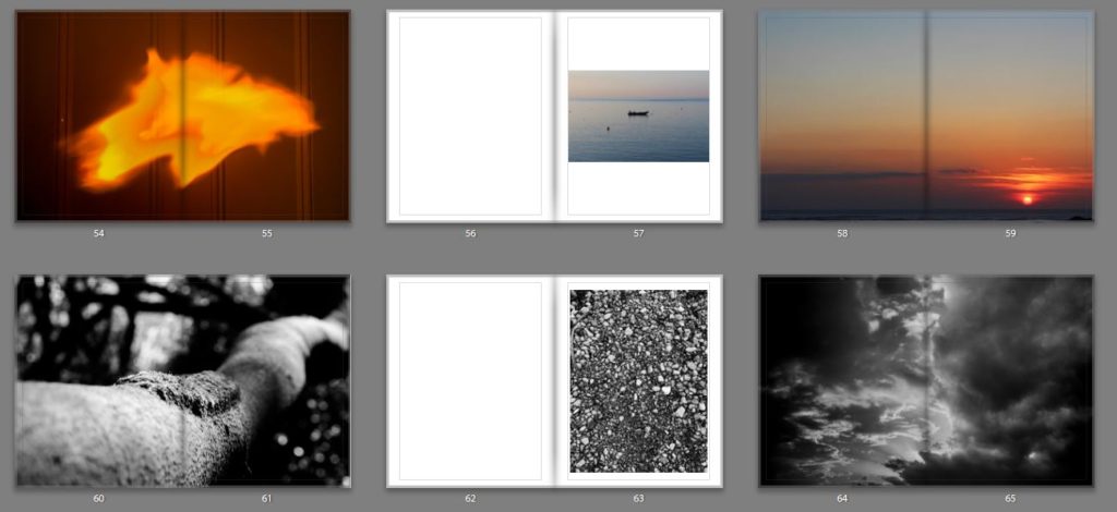
The images that I am planning to use in my photo book:
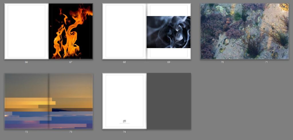
Possible layouts:
The images that I am planning to use in my photo book:


Possible layouts:


When editing my book I decided that I would use the software called Blurb to create my three books for final exam. I chose this because of how it presented me with a bigger variety of different templates that I could more easily access to that on Lightroom, allowing me to experiment more with my layouts. Whilst designing my books I decided that I would make myself refer back to my photographic books which I had drawn inspiration from by the photographer Robert Frank. By looks at his three books together it gave me ideas for the development of my own, this included the use of negative space being used effectively in order to enhance each image the way I wanted. Overall when looking over the three books ‘Tal Uf Tal Ab’, ‘You Would’ and ‘Park Sleep’ I found that I had gone down a slightly different path as in Frank’s books he had a closely similar theme throughout the three books compared to that of mine which have a similar but different theme in each book. Using his books as references and my main influence I was able to select and layout about forty images for each book. Here are my current compositions:
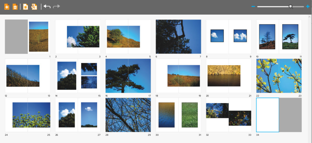
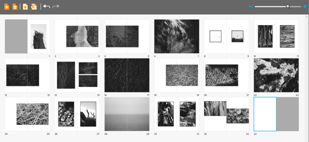
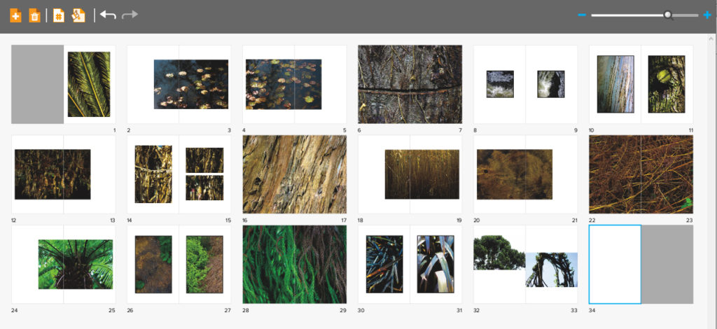
When designing my books I decided that I really wanted each book to have the same layout as the next, this was because I wanted the viewer to know that each book was linked together, regardless of the photos inside, and that a similar composition was a great way of doing this. Within the books I have made sure to include a variety of different page layouts consisting of one image a spread to three images a spread, this way it didn’t make the outcomes dull and bland, instead adding interesting changes in the design of the book to make the reader want to turn the next page. I originally had experimented with the blank spaces and had found by using certain images it allowed for me to use photos as a transition between different coloured pieces or subjects within, preventing this outcomes as seeming too much and rushed. I didn’t choose to have any text in my books due to wanting them to be as minimalist as possible which would allow the viewers to only focus on the images rather that what was around them.
Some of the issues that I am having through the process of creating the compositions are the particularly the compositions of the last spread, this is due to how I want it to be more simplistic, but rather retain the overall qualities and composition of the rest of the book. My final issue is the composition consistency throughout the books, this is due to a stronger start of portraying images, however this becomes harder to maintain as I progress through its creation, leaving me too have some pages blank in which I need to come back to and redesign.
Peter Devito has become known for his work surrounding the issue of skin conditions recently on social media where his images have gone viral. Currently studying at the the Fashion Institute of Technology in New York City he has developed this project which has gained attention from bloggers and magazines. H became interested in photography in 2013 on a pre college program but still works in mix media including illustration. He uses his work to convey his perspective on the world, evoking deep thought in his pieces. He suffered from acne growing up and saw how self image involving skin conditions had affected many peoples mental health around him. By taking intimate, close up and unedited images of himself and other young people in similar positions, along with empowering and sometimes sarcastic humorous slogans he aims to turn the stigma around perfect skin on its head. He posts the art work on social media hoping to target the area where people can often feel most pressures to areas ‘flawless’.


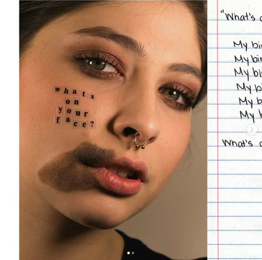

“After posting my unretouched acne images on social media, I received numerous messages from people with albinism, vitiligo, freckles and birthmarks asking me to make work that they could relate to,” he says. “I wanted to expand what I’ve been working on and give people with other skin conditions a platform to tell their stories as well. I hope this project will empower people and help normalise skin conditions.”
Peter Devito
When taking the project further he aimed to show that there was more to the subjects than their skin condition and they would not stand to be defined by them. Accompanying each portrait petter displayed a hand written note from each person about their experience living with a skin condition. One reads “My birthmark does not make me ugly,”
“Doing this project, I’ve learnt that things can only define you if you let them,” Peter continues. “I hope that doing this project will make people realise that we need more models with diverse skin. The more models people see with different complexions, the more normal skin conditions will become.”
Peter Devito
Link to Peter Devito’s website and portfolio


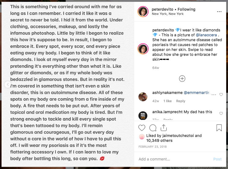
Photo Analysis: The above image is a macro of someones skin, with plastic lettering in the centre. This photo was probably taken in a studio with bright controlled lighting to illuminate the skin evenly and help the camera focus and capture the small details. The lighting has been controlled to look as natural as possible to fit with the aesthetic and aim of the image. A macro lens was most likely used to capture the fine details in the skin almost making it larger than life. The photo is predominantly a pink shade varying in light and dark tones, this makes it a very simple image to look at. The texture shapes and patterns in the photo are created through the skin ‘imperfections’ which are spread over the whole frame in a random and natural arrangement. The main focus of the text has been arranged in the centre of the image, it is the first thing we see and it is important that we read and understand the statement whilst viewing the whole image. The photograph has been cropped so that their is nothing else in the frame distracting us, for example and other body parts of background elements. This image was posted to Peter DeVito’s Instagram along with the majority of his work context of this image is, he explains that the photo if a autoimmune disease called psoriasis. Psoriasis is a common skin condition which speeds up the life cycle of skin cells, it is a chronic disease which can come can go over time showing red dry patches. Following the image is an account by the girl in the photograph, it explains her struggle being insecure about her skin from a young a age and how she has grown to embrace her her imperfections. The lettering in the image “I wear it like diamonds” suggests that instead of looking at the Psoriasis and seeing something ugly it that should be hidden and covered up she instead pretends it something stereotypically beautiful like glitter or diamonds. This could also link to the idea that diamonds last forever similarly to the disease there is no way of getting rid of them completely. Diamonds are one of the strongest known materials, this could link to the mentality of the model in this photograph who has been through a lot to get to acceptance. This photo as a whole is meant to portray something that would have previously been seen as a fault as a more beautiful and normal thing that shouldn’t be hidden. By sharing this photo Peter aims to create awareness about skin conditions in hope that people with the will feel less inlined to perfect them and hide them from the world.
I feel that it was necessary to create a book as a final outcome because I think as the topic that I chose is quite abstract in its nature, it needs to have some depth and quality to the images when looking at them as a whole to understand the project. But also by creating a book I feel that it helps the viewer to engage more with the images, as they are able to take their time looking at each image and take on its meaning, rather to when they are displayed on a wall, I feel that the images become very felt and don’t have much depth in comparison to a photobook.
I really wanted the book to convey a sense of simplicity but at the same time the images to be really powerful and to make the viewer stop and really take in what they are looking at. And make them stop in their everyday life to see the beauty that is around them if they take the change to stop and look.
My main inspiration for the style and genre of my book was Rinko Kawauchi’s book Illuminance which has been the inspiration of the whole of the project. Her book is very simplistic in its nature and each images flows really well into the next one which really helps to make the project link together, due to the atheistic of each image and the colour texture and composition of the image.
Which is something that I wanted to be able to work into my book. Which is why I didn’t separate the book by element as that would get very boring. The narrative within my book is individuality, beauty and simplicity of each element and how different each one is but yet how each one is connected and dependent on the other to survive.
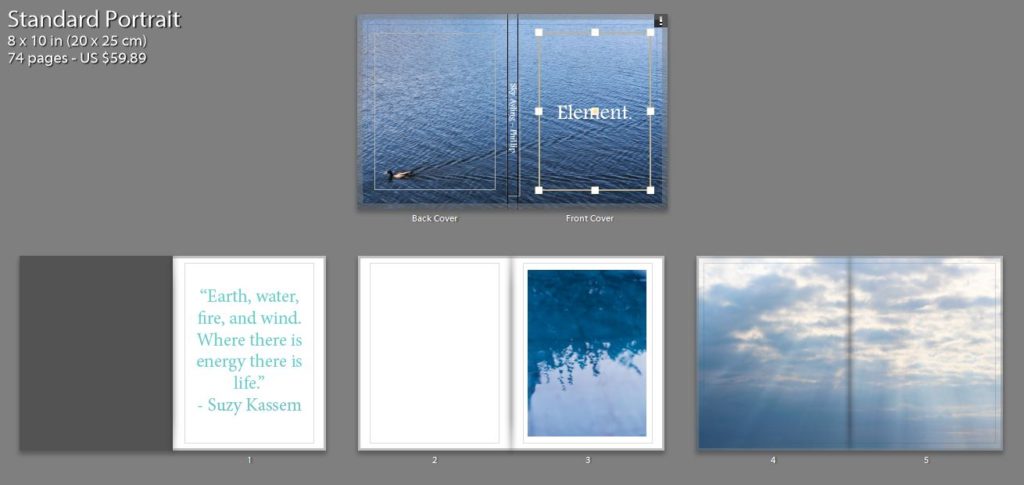
For the the front cover I wanted a image that would draw the view into the book, but wasn’t too busy so it would ruin the aesthetic of the rest of the book. I really like the cover that I chose, I think as the cool tones of the blue is calming and links my idea of the taking the image to stop and look at the tiny details, as the viewer has to stop and turn over the back to see the duck swimming across the page to see where the ripples in the water are coming from. I chose to have a big white title in the middle of the page as I think that this juxtaposes the blue and makes a bright and bold front cover which is calming at the same times as being able to draw in the viewer.
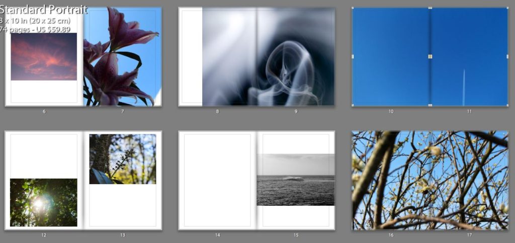
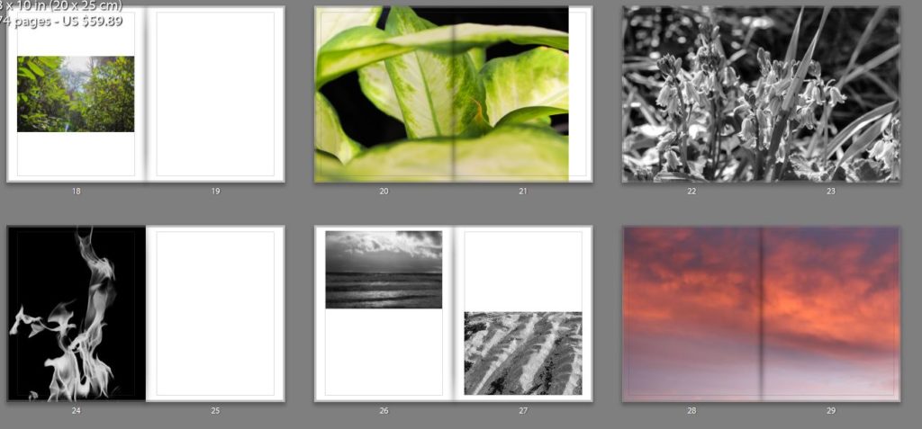
Most of my images are very colourful and the book as a whole is very contrasting in its colours, I wanted the viewer to be drawn in by the use of pastel colours. But I also wanted some images to juxtapose each other which why some but not many of the images are in black and white I also felt that is changed the sequence and flow of the book to help the viewer look at the images in a different light. I also felt that but some of the images in black and white helped to bring out the detail of them.
In the book there are different sections for each element but I wanted to make sure that each image had a connection to the image before and after it as this was a notable feature in Rinko’s work that I really liked also because I felt that it would help the viewer to understand the project more, and also create a sense of rhythm and structure for the book. However I didn’t want all of the image to be grouped together but element as I thought that this would become very boring and repetitive for the viewer.
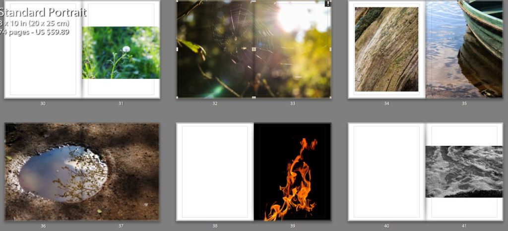
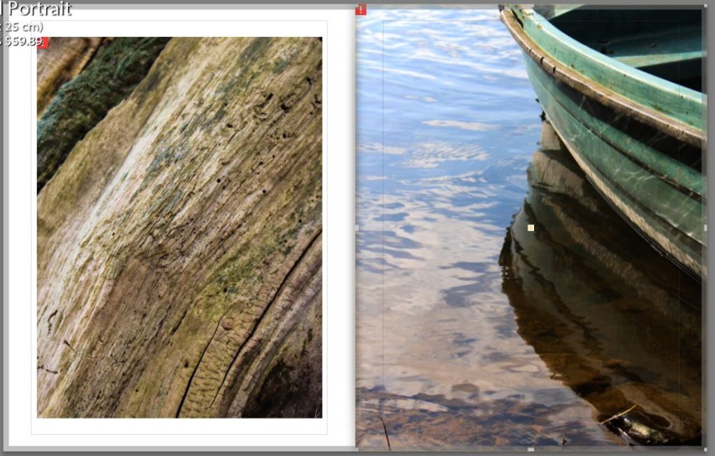
Below is an example of connections that I made between the images. One is an image is an unusual perspective of the bark of a tree, I but this image in the book as I feel that it is a visual representative of the idea that I wanted to get across of the beauty in everyday things. The other image is a close up of the side of a boast with the light reflection off the water onto the side of the boat. I decided put these two images together due to the texture and colours in the images and the lines in the boat and the lines in the bark.
Overall I think that this project has gone very as I have created a book that makes the viewer reflect on the way that they view the world and will hopefully make them some and look at the beauty that is around them which they are missing in their everyday lives. But I have also created a book that takes an in-depth look not only into the physical elements but the spiritual parts of the elements and the feelings that they convey.
