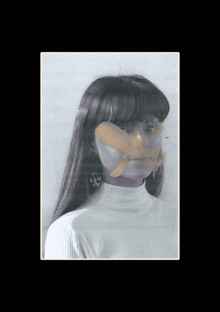
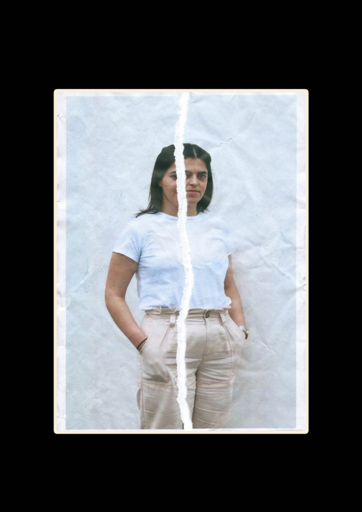
Along with the final outcome of the magazine I want to print a range off different edits which I can mount and display giving an overview of the project outcomes. For these two hand edited and re scanned images I want to simply frame them with a black window mount. I will use an A3 piece of black card and cut an A4 sized hole in the centre with a bevel cutter. I have chosen to do this so the editing and fine details stand out on their own, I also this the black boarder will help the slightly faded images look less washed out.
I want to do some more hand editing with these close up images, for the magazine I used photoshop to create a layered collage effect. I want to re create this in an A3 size using foam board as a backing. I am printing the background rectangular photos as A3 and the 4 square photos as slightly smaller than A5 allowing for a gap around the images for the background to show through. I will cut all the images so there is no white and back them on foam board o make them stand off the page, I will then Stick the 4 images onto the background image. Bellow i have made a mock up of what this might look like. The foam board will show slightly around each image helping to frame it. I will do this for both sets of images and once they are done I will review if they should be left as singles pieces or put together on another sheet of foam board.

Finally for these portrait images which I have printed as A4, I want to back then as a duo on white foam board. I think they are powerful images with complimentary colouring and look good next to one another. They are minimal but with the detailing on the faces I don’t want to distract by framing them with too many other images. The white foam board will match the white lines on the faces and some elements of the clothing whilst still showing up the grey faded background.


