PROJECT EVALUATION AND FINAL PRINT PRESENTATION

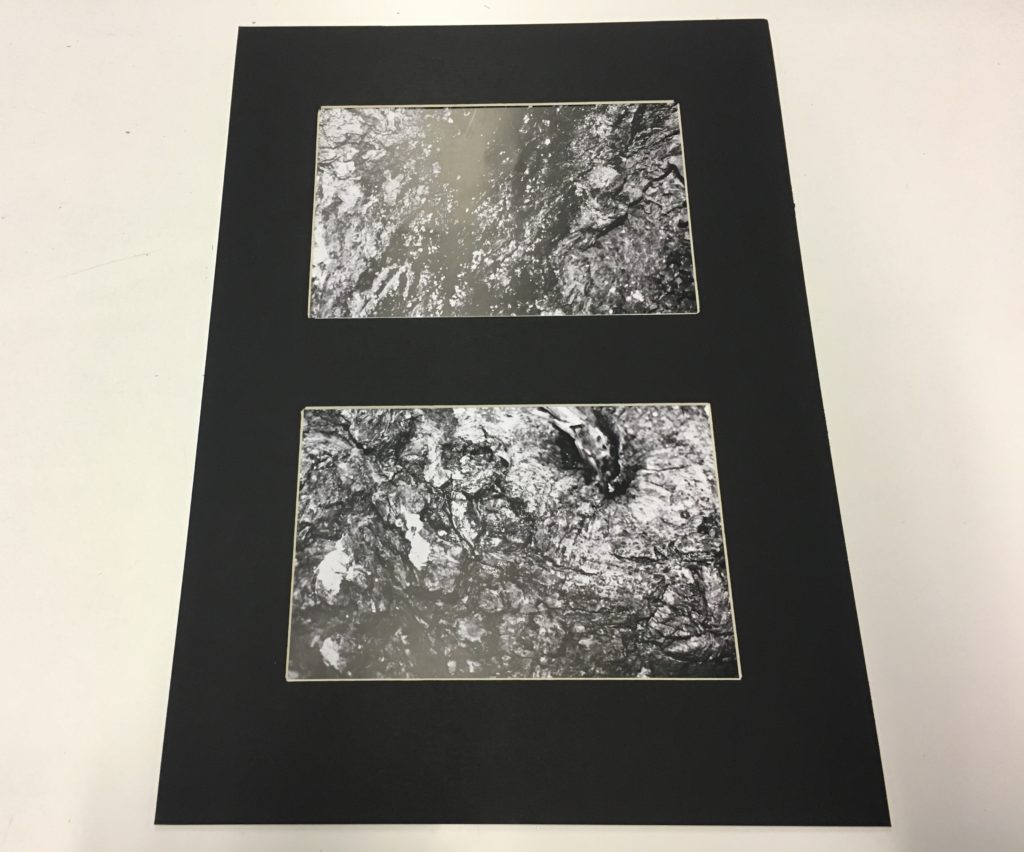
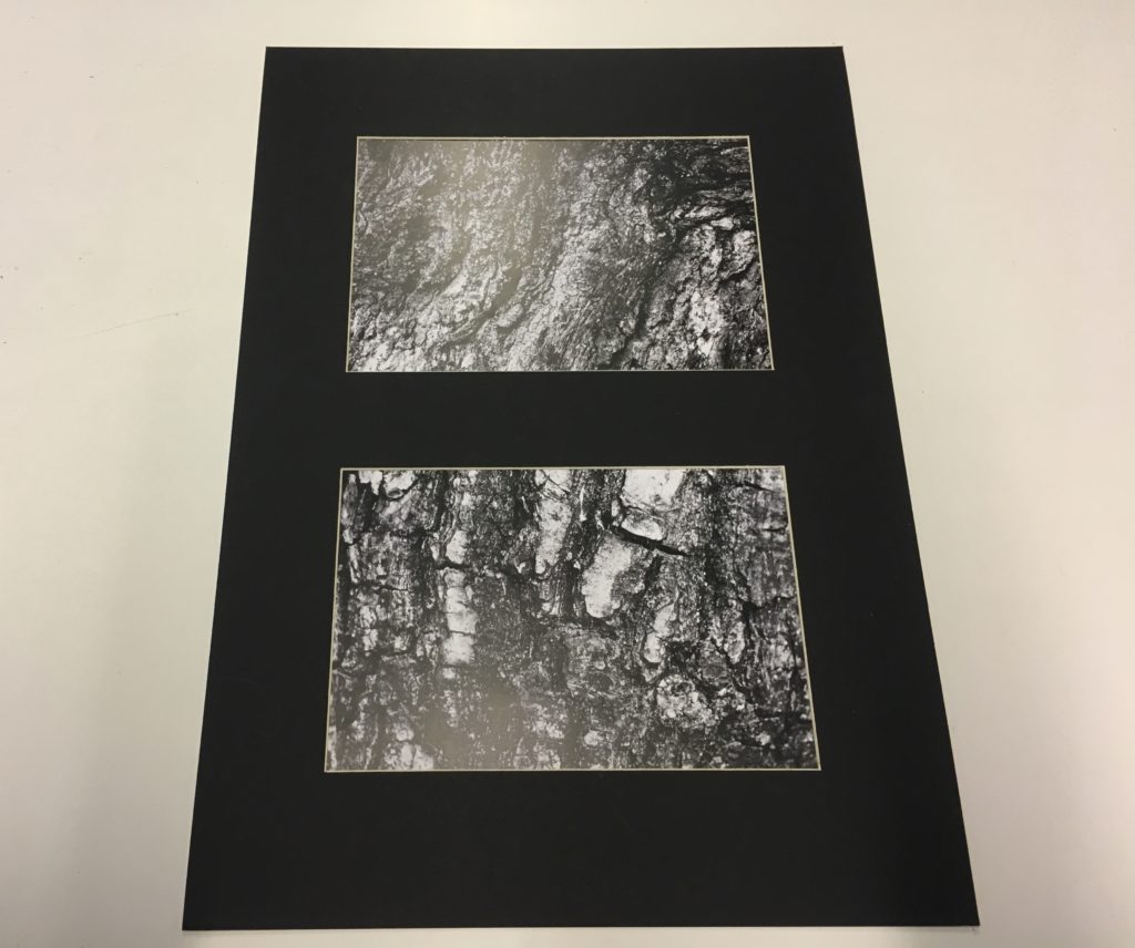
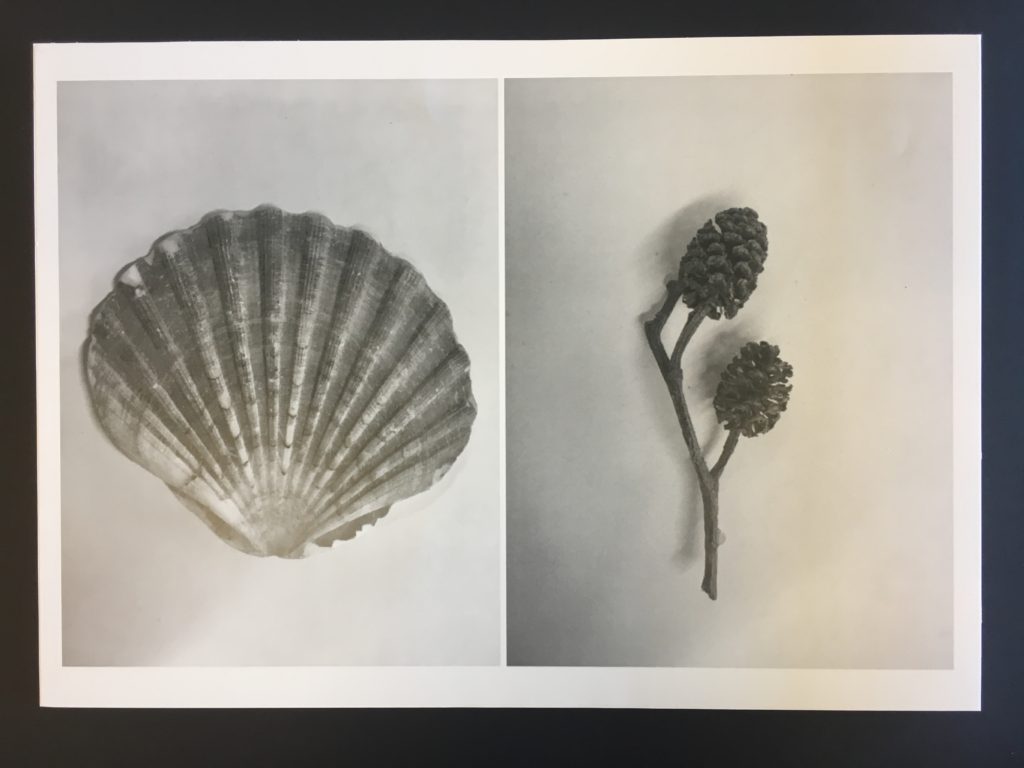
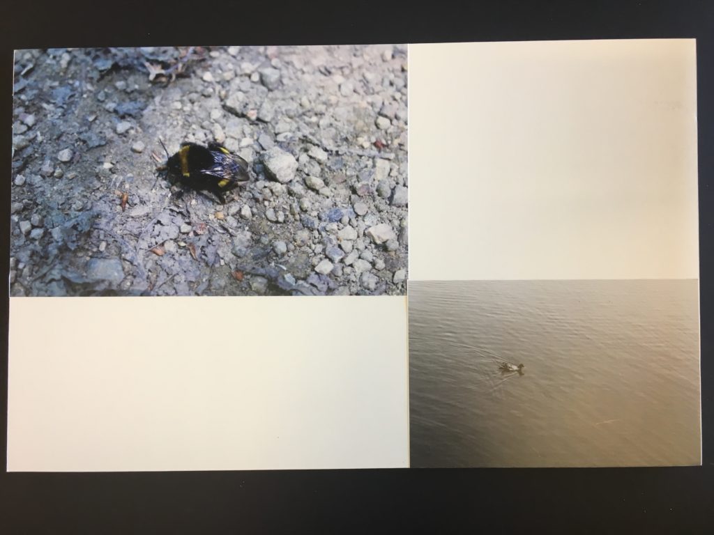
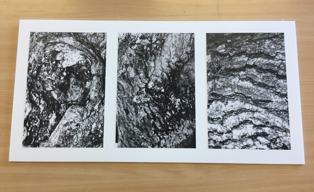
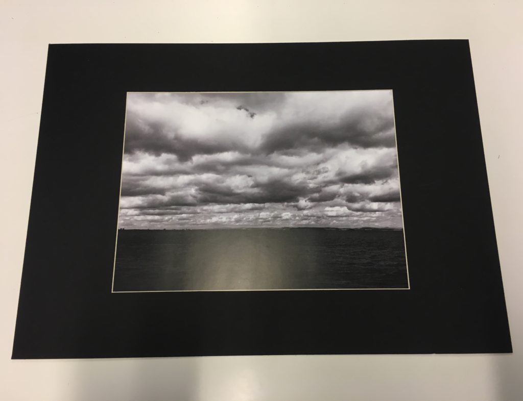
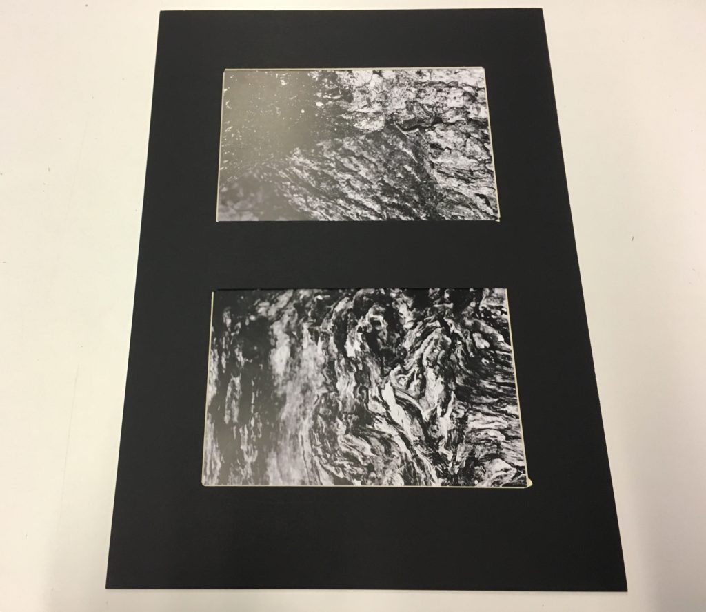
Overall, I feel my project has been an interesting and alternative insight into the diversity of the natural world and how zooming in on nature up-close can reveal it’s intricate sublime beauty. ‘Nature’ is a broad spectrum but I wanted to capture as big a variety of photos I could. My four categories of ‘trees’ , ‘natural forms’ , ‘cloudscapes’ and ‘water’ helped me establish a plan of what I would photograph on my shoots. Below, are my final prints framed up. The materials I used to help me frame my final pieces include: stanley knife, bevel cutter, black card and memory foam. For my images of high contrast and clarity, I felt the black card background mounted the photographs well, and the solid black put emphasis on the areas of light in my pictures. For my primary source images that were brighter and less heavy, I felt the white memory foam was a good backdrop as the white contrasts with the shadows and tonal differences in my pictures. The memory foam also gives my photographs a three – dimensional feel in comparison with the thinner, flat card.
Front Cover

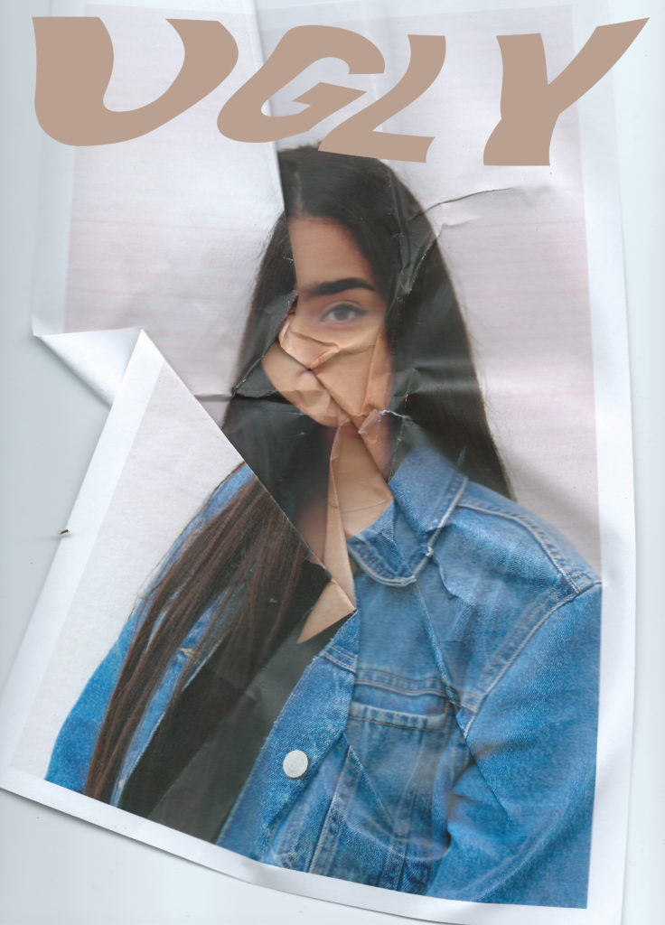
For the front cover I wanted to test out a variety of image and text combinations to see which would suit the style and message best. With my title being “UGLY” I wanted to make the corresponding image relevant and obvious with the idea and theme. The title is a comment on what beauty and therefore ugly actually is, I hope that it will challenge the viewers perspectives and make them question these commonly used words and ideologies. I wanted to keep the clastic magazine layout with the bold masthead across the top of the portrait page, and oppose the stereotypes seen in beauty magazines in other ways.

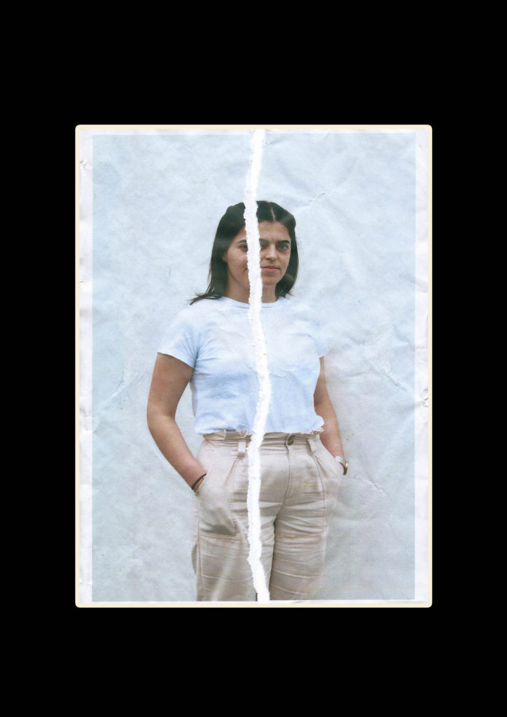
This font is bold and clear, I sampled it in a skin tone shade taken from there background image because this corresponds with running theme throughout the magazine of neutrals, browns and pinks. I tested having the font in the foreground (over the image) or in the mid ground (appearing to be behind the model). I achieved this by changing the layer opacity and erasing the parts of the word covering the models hair. This image is already distorted and unconventional with the folds and corners of the paper showing, acting ads a new frame inside the border on the magazine page.

I also tried warping the text, I like the way this turned out and fitted with the idea of distortion and imperfection. I want to develop this concept further with different fronts, warp effects and background images to see which work best together. The front cover should be striking and give the viewer and idea of what to expect inside, it ultimately sells the magazine. However saying this I also want it to be elegant and subtle.

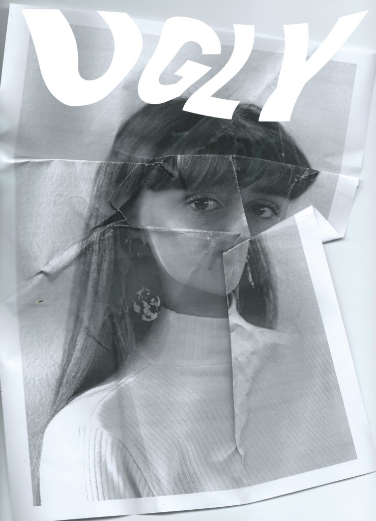
I continued to work with the same warped text over a different image, this one is more lightly distorted and has the printed page boarder cropped out making a more minimal and classic look to the cover. I made the text white and layered it offset with a coloured version of the text to look like a shadow, I made this shadow n the nude colour along with a black version which looked more bold but didn’t fit in with the interior of the magazine.

I continued to experiment with different texts, now over a black and white image. I tried black with a white shadow, and multiple layers of different nude shades stacked on top of one another as well as simple white

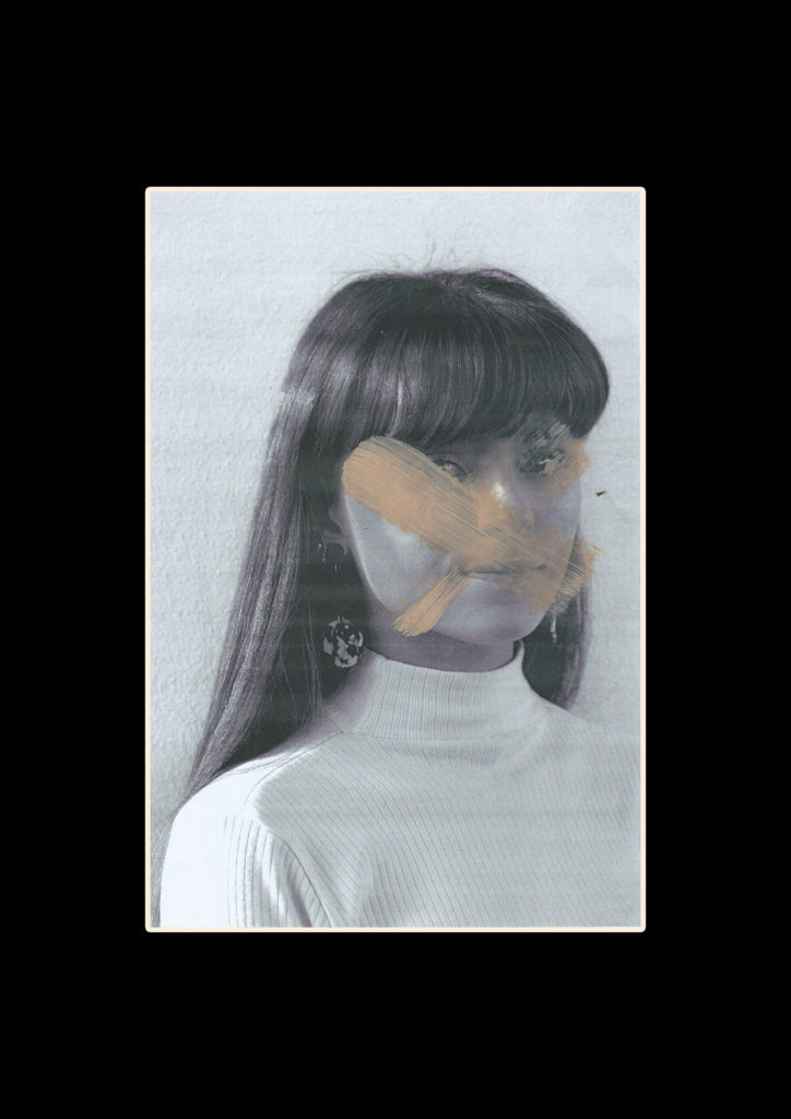
I used a font similar to what vogue and other big fashion and beauty magazines use, this is usually linked to a classy up market and professional style. I then warped the text similarly to the last text edit to give it a distorted look similar to the style and editing of the images inside. I also want to continues the style of the text on the cover throughout the magazine pages. I tried this style on top of this image because I like the faded colours and the way the text matched, the smudged foundation over he image created a blank canvas. I thought the black text was too heavy and the white blended in too much with the background. To solve this i added a subtle drop shadow behind the white text so it could be read better

Next I tried a text outline to give a more subtle look rather than the bold text. I experimented with this style in various ways adding nude colour layers and small drop shadows to help it stand out from the pale image.

ESA // Photobook Specification

How you want your book to look and feel:

Paper and ink: I will be using standard 80# paper and coloured ink for my photobook, I think that the coloured ink is important for the images because it helps provide a clear distinction between high and low tide, it also helps the vibrancy for the water.

Format, size and orientation: The photobook will be a square, 7in x 7in.

Binding: I am going to use a soft cover for my photobook because I want to create a feeling of movement throughout.

Title: I have chosen the literal title, ‘Tidal Movements’

Design and layout: I am planning to use a variety of image sizes throughout my photo book. The majority of the photobook pages will have single images, however, I am wanting to have some breaks to make it visually more interesting, therefore some pages will have grids of four images, or I will have some pages with two images to a page. I am also planning to have a double-page spread of a panorama. I am not planning to have any foldouts or inserts.

Editing and sequencing: I have chosen images that I feel flow throughout the photo book, the images I have chosen I feel create movement and therefore suggest a flow throughout the photo book.

Images and text: The text that I am using within my book is to show where the photographs have been taken, and whether the image is showing the low or high tide.


Final Prints and Exam Mock Up

Along with the final outcome of the magazine I want to print a range off different edits which I can mount and display giving an overview of the project outcomes. For these two hand edited and re scanned images I want to simply frame them with a black window mount. I will use an A3 piece of black card and cut an A4 sized hole in the centre with a bevel cutter. I have chosen to do this so the editing and fine details stand out on their own, I also this the black boarder will help the slightly faded images look less washed out.

I want to do some more hand editing with these close up images, for the magazine I used photoshop to create a layered collage effect. I want to re create this in an A3 size using foam board as a backing. I am printing the background rectangular photos as A3 and the 4 square photos as slightly smaller than A5 allowing for a gap around the images for the background to show through. I will cut all the images so there is no white and back them on foam board o make them stand off the page, I will then Stick the 4 images onto the background image. Bellow i have made a mock up of what this might look like. The foam board will show slightly around each image helping to frame it. I will do this for both sets of images and once they are done I will review if they should be left as singles pieces or put together on another sheet of foam board.

Finally for these portrait images which I have printed as A4, I want to back then as a duo on white foam board. I think they are powerful images with complimentary colouring and look good next to one another. They are minimal but with the detailing on the faces I don’t want to distract by framing them with too many other images. The white foam board will match the white lines on the faces and some elements of the clothing whilst still showing up the grey faded background.