For my Final Selection I choose the edits that i thought worked best and that I thought would be most successful to take to print.
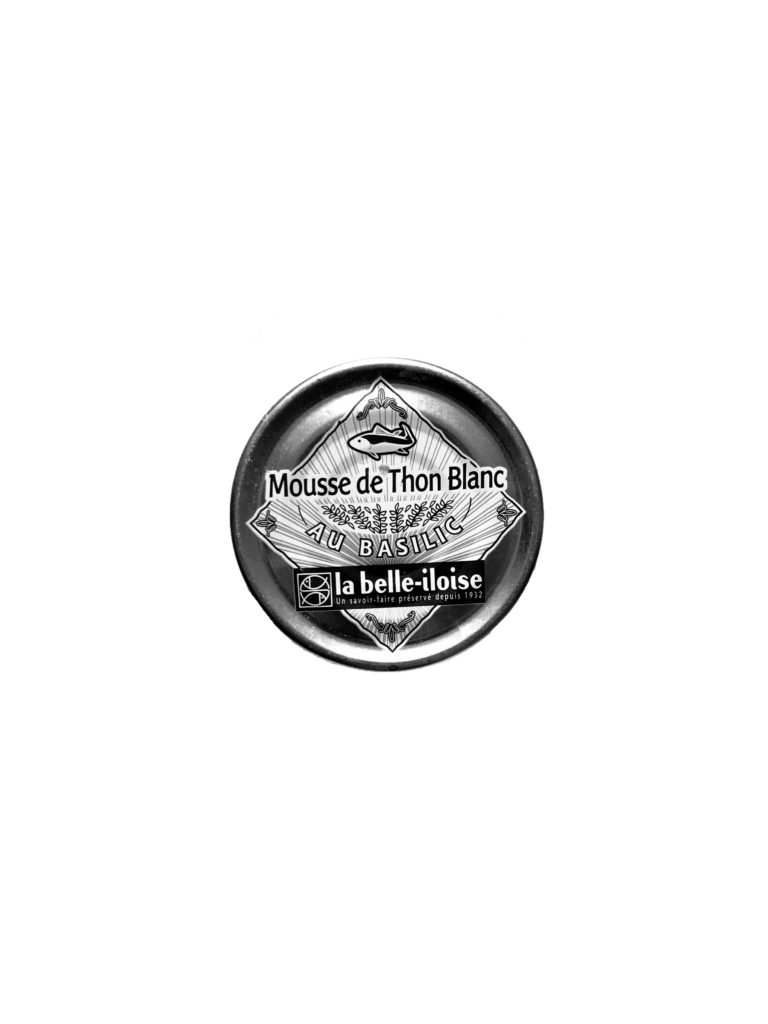
1.
I chose this typology as a collection as the image works well as it highlights more then just a singular image and drawing the viewer of the image to several products and make them look at the branding and packaging of the products more then they may usually as mostly they are consumed without thought. The image fits perfectly with the theme of consumerism displaying a wide variety of everyday products.

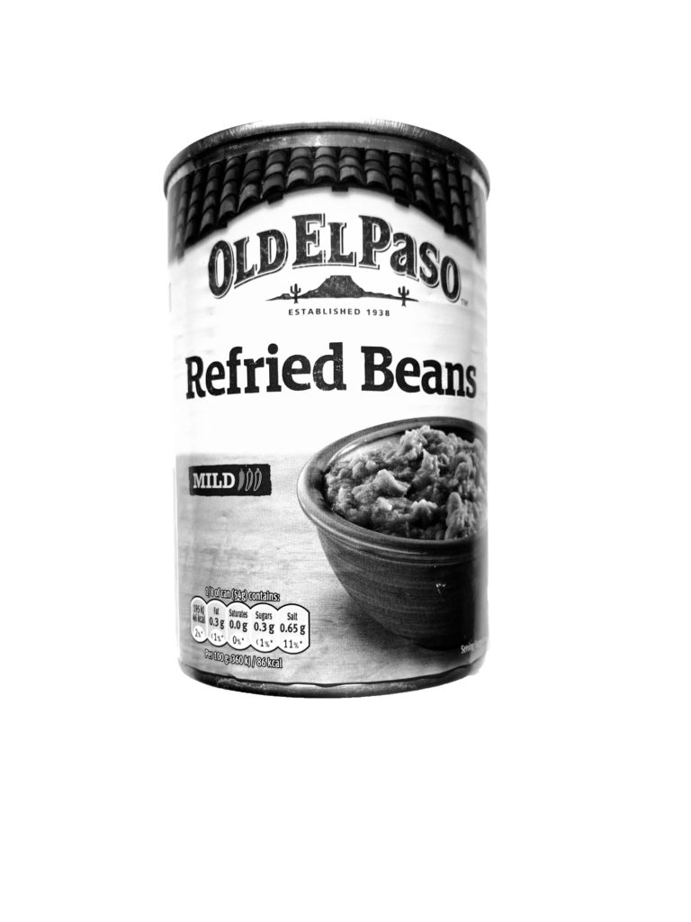
2.
I Chose this typology of images as well as it was interesting as the images gave a completely different feel once edited in black and white. The tonal range and contrast in each of the products gives the image a deeper dimension as it is drawing away from the vibrance of the products which is used to draw consumers in and instead focuses on the products shape and illustration.
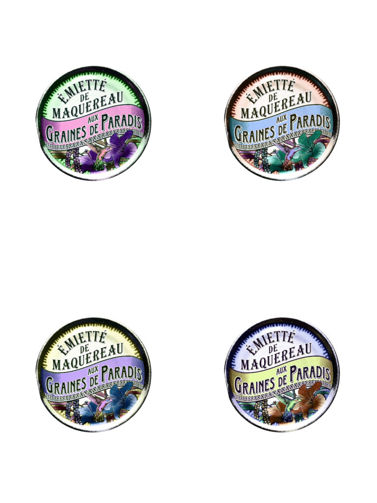
3.
I chose this Image as it worked well in response too Andy Warhol’s work. The image shows an interesting view of this product which wouldn’t be seen normally. The illustrations of the product as well as the vibrant altered colours forms a aesthetically pleasing image with the unusual colours highlighting the parts of the product which would not usually stand out.


