Edits:
I took these images in the studio against a white and a black background.
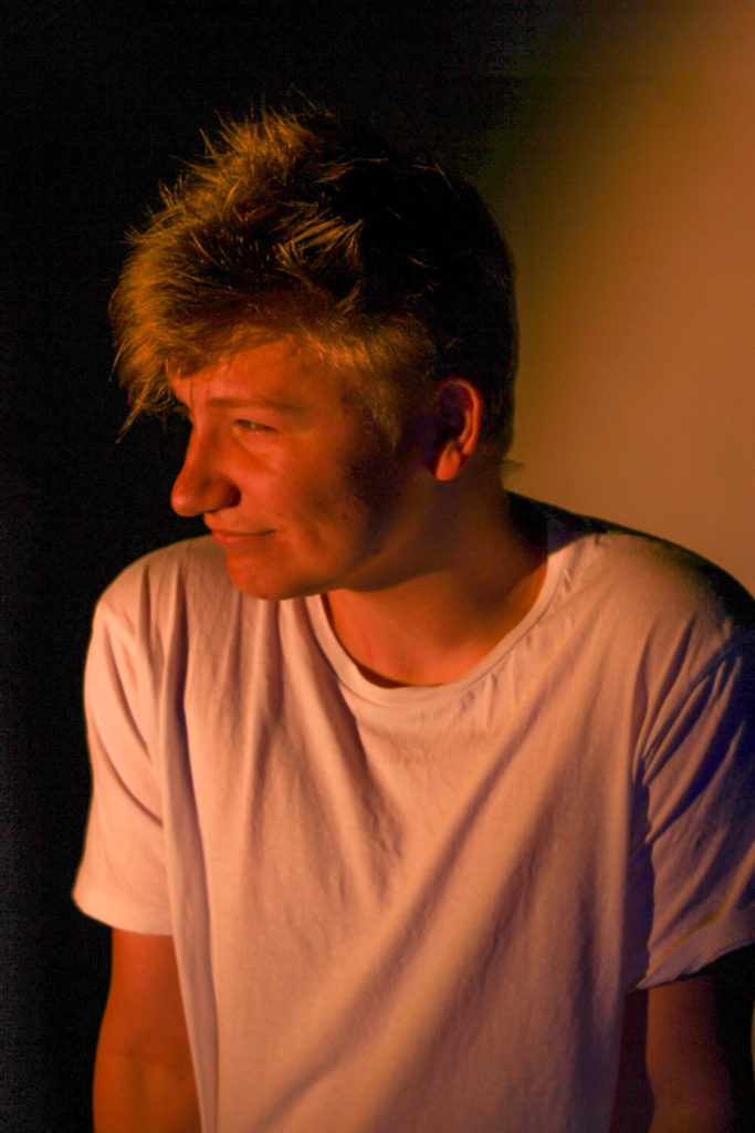
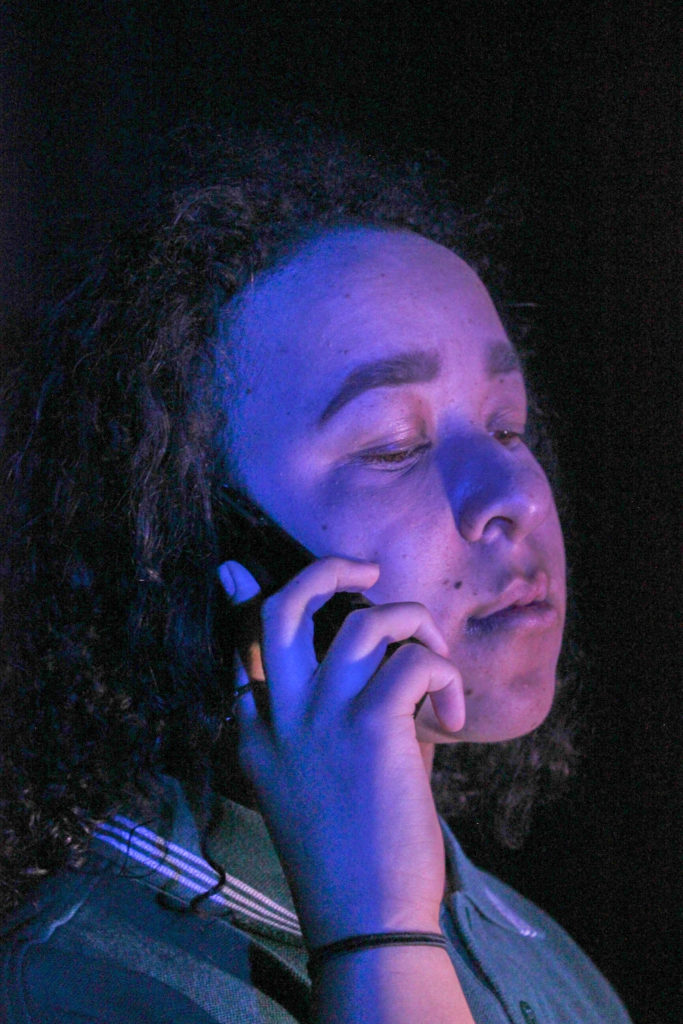
For these images I used a slower shutter speed to create a sense of movement


Edits:


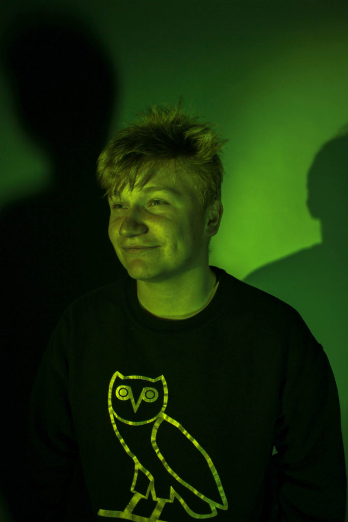
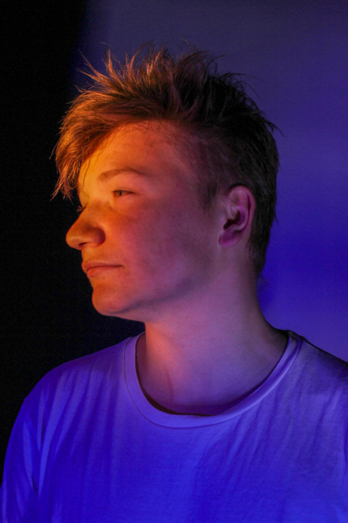




I took these images in the studio against a white and a black background.


For these images I used a slower shutter speed to create a sense of movement
For my Final Selection I choose the edits that i thought worked best and that I thought would be most successful to take to print.
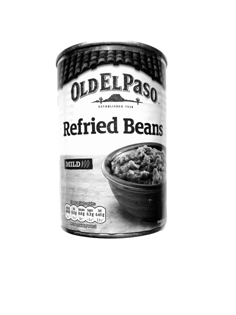
1.
I chose this typology as a collection as the image works well as it highlights more then just a singular image and drawing the viewer of the image to several products and make them look at the branding and packaging of the products more then they may usually as mostly they are consumed without thought. The image fits perfectly with the theme of consumerism displaying a wide variety of everyday products.

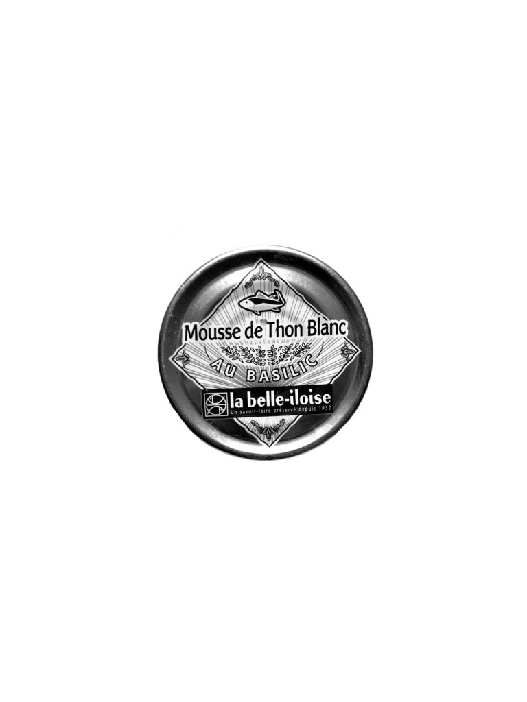
2.
I Chose this typology of images as well as it was interesting as the images gave a completely different feel once edited in black and white. The tonal range and contrast in each of the products gives the image a deeper dimension as it is drawing away from the vibrance of the products which is used to draw consumers in and instead focuses on the products shape and illustration.






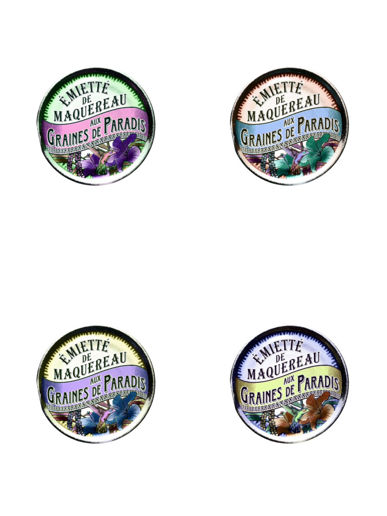
3.
I chose this Image as it worked well in response too Andy Warhol’s work. The image shows an interesting view of this product which wouldn’t be seen normally. The illustrations of the product as well as the vibrant altered colours forms a aesthetically pleasing image with the unusual colours highlighting the parts of the product which would not usually stand out.

My response:
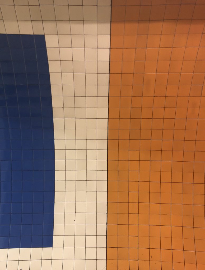
My response was captured during my shoot inspired By Hansen, i enjoyed his minimalism and i thought abstract photography would compliment other images with similar colour. I plan on using this idea when creating my final piece. I feel that this image is successful in capturing Hansen’s aesthetic. His image is very symmetrical and bold with washed out colour. This is what i tried to capture with my subject in my response, I located some tiling in one of the London underground tube stations and i immediately had to capture the tones of the tiling. I took it face on so it would be symmetrical and balanced just like Hansens.
For my edits I decided against doing anything drastic with my images and instead I stuck to cropping the images and adjusting the angle of the images to ensure that the horizons lined up with the low and high tides.
For example without editing my images look like this:


There is a clear difference between the images, the lighthouse is darker on the high tide image due to the difference in natural lighting. I have also taken the image wihtout zooming in therefore the proportions are different and the bunker and cliff edge in the forground of the high tide image is more noticble and is the subject of the image which is leading the viewers eye away from the lighthouse. Although it is not an obvious difference there is a gap between the horizon in the low tide image and the horizon in the high tide image.
In order to have these images line up and ensure that the obvious and visible difference is the change in tides, I have edited the images so that you can see that the horizons line up and the images and more in proportion with one another. I have cropped the bunker and cliff edge in the foreground out to also ensure that the main subject of the images is the lighthouse and the tidal changes.


I repeated this process on my other images.


