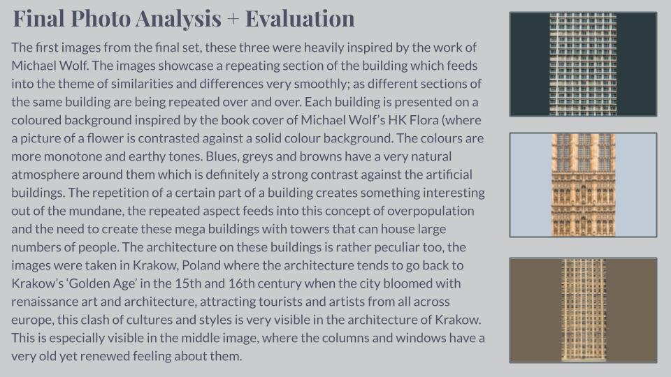
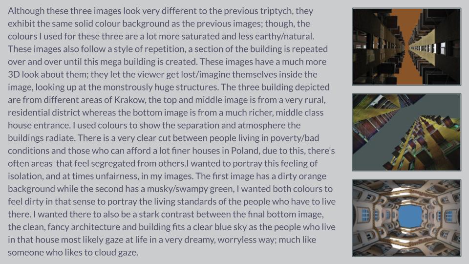
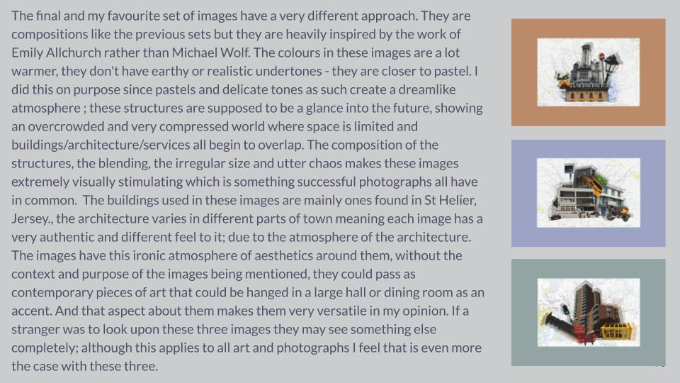
For this shoot, I wanted to create a mini nature shoot, exploring light and darkness on various nature scenes.

Edits


For this shoot, I wanted to create a mini nature shoot, exploring light and darkness on various nature scenes.


Born in 1972 in Chiayi, Chen Po-I received his master degree in Ocean Engineering at National Cheng Kung University (NCKU) in Taiwan. As a photographer, Chen’s works concern the humanities and social aspects of Taiwan, using his lens to connect himself with the greater context of Taiwanese society. With this, his photographs have the power to express the collective memories of Taiwan.


I chose Chen Po I to study as he fits into my project perfectly. My project is focused on the idea of using frames to create social commentary, which is what Chen Po I does. It is unclear wither Po I edits his images to include another image, or the view through the frame is the original view. I am going to use his work to further develop my project and use as inspiration for my next photo shoot.


Photoshoot Four
For this photoshoot I am planning to visit the Milltary Battery and take photos of the sea from up high. I want to take more images of high and low tide.


Photoshoot – Low Tide


Photoshoot – High Tide


Once I had got both sets of film developed I placed all the images out and put each images into groups as I wanted to single out the strong images within each set. I displayed them out onto a big board where I could clearly see them making it easier to find the stronger images. The images that I thought weren’t good enough I would remove from the board. Once I had removed all the bad images I began playing around with them and trying out different layouts. I had multiple different layouts however, some of the layouts didn’t reflect my images in a strong enough way as some of the images didn’t fit with each other the way I wanted them too. In addition, my last experiment really reflected my images in a way that created a relationship between each image and displayed them in a way that allowed for them to really compliment each other. The yellow stickie notes where to indicate the images I was going to use as a double page spread and the green stickies where used to show the images I wanted to display as a set.

My response

I feel successful in capturing Keld-Helmer Peterson’s aesthetic. Although both images are different, they share some characteristics. For instance, The subject matter is fairly similar, but the thing that sets them apart is the angle it was shot and the colours within the image.
I think was a strong response as it shows clear signs of inspiration yet it meets the specification of my own project. This image also contrast really well with my response to Hansen
How you want your book to look and feel:
I want the book to be simplistic in its nature but yet convey a powerful message about the elements. I am processing the book through Blurb so it will be to a high quality and look very professional
Format, size and orientation:
Rhythm and sequencing:
There will be separate sections for each element in the book but images from different elements will be placed in these sections to make sure that the book flows and connects together. The aspect of the image that I have used to connect the images are the colour , shape, composition, depth of focus and shape. I want to make sure that with each image the image before and after it flow together as without this I think that the book will lack in it rhythm.
Structure and architecture:
Throughout the book there is a range of full bleed, single portraits, 3/4 pages, single landscape images of a double page spread to keep the book visually stimulating. ttrt
Narrative:
The book will look at the individuality, beauty and simplicity of each element and how different each one is but yet how each one is connected and dependent on the other to survive.
Title:
The book will not be given a title, as like Rorschach’s ink blot tests, in which there is no text, it is down to interpretation. I want the viewer to create their own relationship between the ink blots and the portraits partnered with them rather than be hinted at with the use of a title. The title of the book is Element, as the book is looking at the element, but I wanted the viewer to make their own connection
Images and text:
There is one quote at the begging of the book to give the viewer and insight of how I felt when creating the book, but mostly I have left it up to the viewer to create their own connection to the images and their own interpretation. ‘ Earth, water, fire and wind. Where there is energy there is life’ – Suzy Kassem
Colour and B&W (or a mix):
Most of the images are in colour only a view selected images are in black and white.
Paper and ink:
I have selected matte paper for the book as it will help to blend the flow of the images.