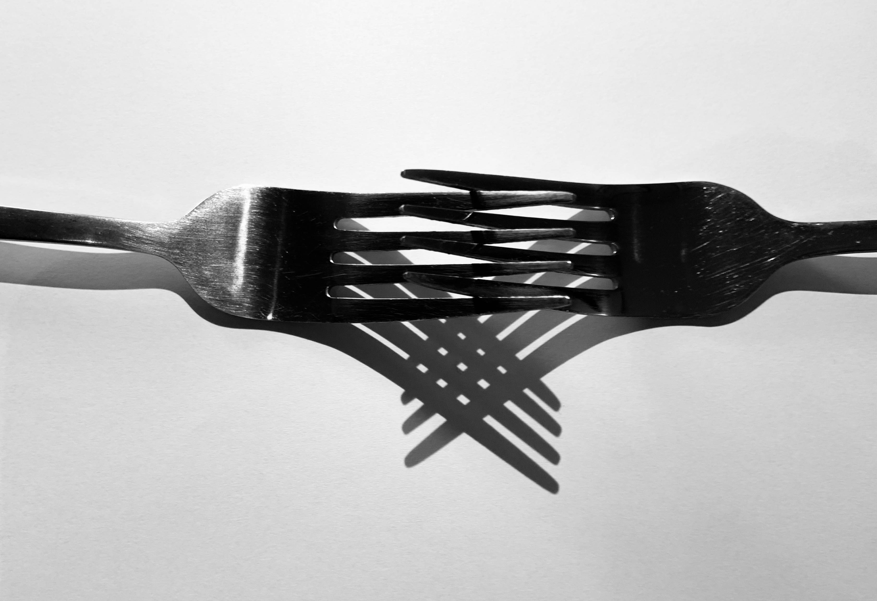
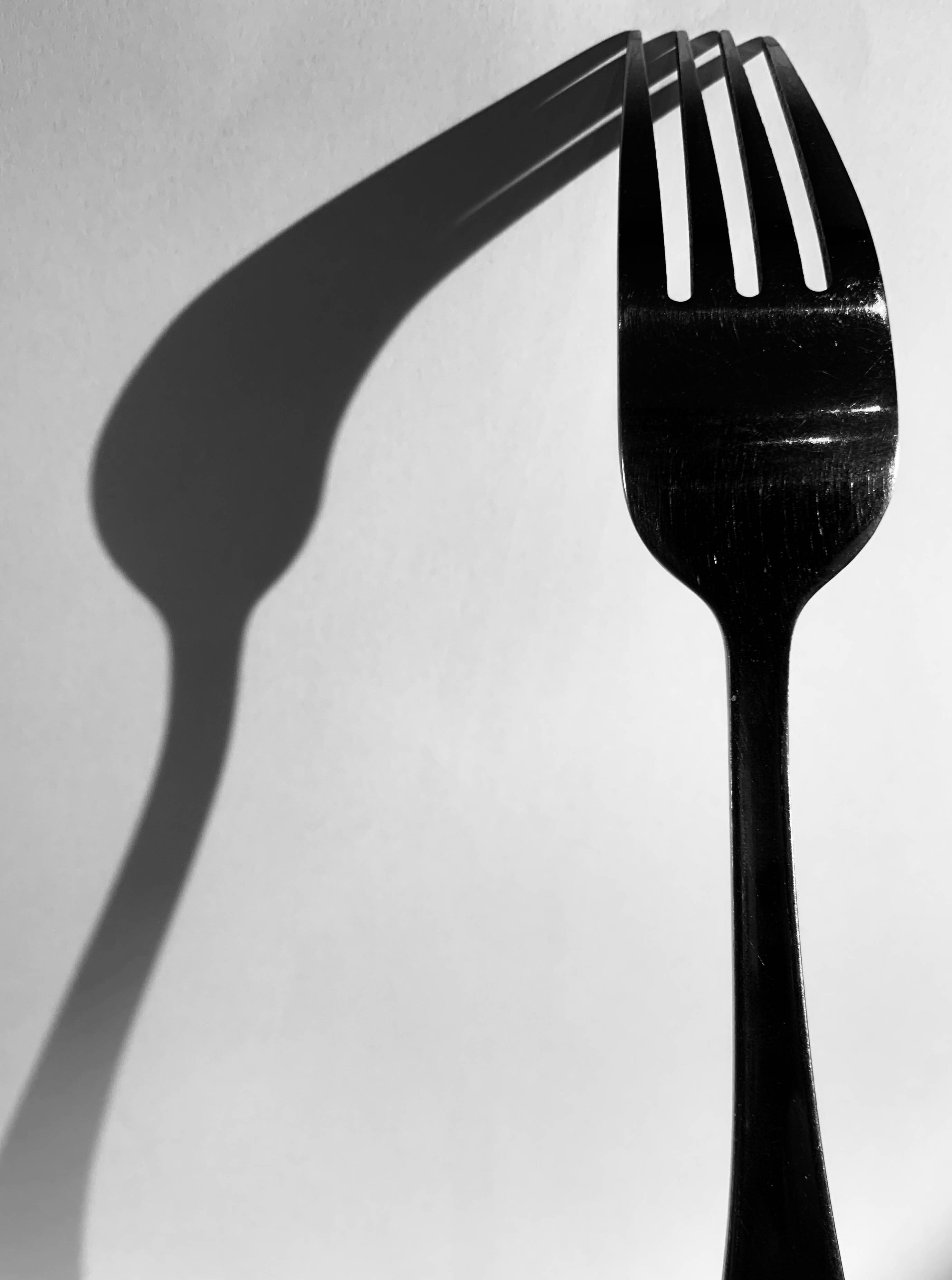
Shoot 7 – Cutlery shoot

For this shoot, I wanted to capture forks and spoons and experiment with different angles of lighting, different positioning of the cutlery and different backgrounds to see the effect of light on cutlery – which is such a simple everyday object. The variation of shadows is produced as shown below:

Contact sheet

Edits

This shoot was inspired by Michael Luitad from his cutlery work, where I have already made a blog post on him and his work.

Book Specifications

My topic in 3 words: Styles of abstraction

Topic described in a sentence: I will be exploring how three different categories of abstraction, colour, texture and pattern compliment and contrast each other when put together.

My Topic described in a paragraph: I will be looking at the topic of abstraction regarding three of the more dominant areas of it. I will firstly look at colour and the use of heavily saturated photography to isolate the subject from its surrounding environment. Texture is another theme I wish to explore through the almost unseen world present when looked at closer inspection and how natures pattern often are aesthetic and in huge variety. Lastly I will be looking at pattern and the idea of isolating once again a subject from its surrounding environment so that it becomes up to the viewers to interpret what it could be in regards to surface and look.

Design:

  • Look and feel: I would like a matte cover which would produce a photographic but card like feel which would really compliment the material being used for my overall design and theme.
  • Paper and ink: For the sleeve I would probably use printing ink to produce the title and author name, but within the book I would use glossy paper due to it producing a more detailed outcome.
  • Format, size and orientation: The format would be three portrait books due to me wanting them to be able to fit into sleeves, I would probably make the size of them relatively small just below the size of A4 paper.
  • Binding and cover: The cover would be the title of that topic of abstraction within the book such as saturated.
  • Title: Each book will have a different title regarding the contents which can be found inside.
  • Structure and architecture: The page layouts will mainly be one or two images to a spread with the occasional three images if I want to create the impression of a triptych.
  • Design and layout: Once again the pages will mainly have one to two images per spread with the occasional three or four
  • Editing and sequencing: I will be ordering the images into each book regarding which title they best fit into, saturation, texture or pattern. Each book will have the photos ordered into a way in which each compliment each other or have a greater overall theme.
  • Images and text: I would like to keep the book very minimalist and so possibly would just have the location or word saturation with its number such as #1 or #2

Photo book research

A photo book is a book in which photographs make a significant contribution to the overall content. A photo book is related to and also often used as a coffee table book.

Reymond Meeks – Halfstory Halflife

Halfstory Halflife is a book by Raymond Meeks an American photographer who is best known for his focus on memory and place, and captures daily life with his family and also the local youth. Meeks was documenting the local youth who adventure to the Catkill Mountain region in New York during summer breaks. Halfstory Halflife is a distillation of the photographs made in the shadows of these waterfalls, marked each summer by the exposure of young adults sat at a cliff both in space and in their lives.

The technical aspects to the very minimalistic layout consists of images embedded traditionally in the centre of each page with an opposing image on the next page both being A4 portrait orientation with a slight boarder round each image. For the most part, the images take up the whole A4 page however, there are some images which are A5 which are set to the right hand side of the page. I believe by having a variation of layouts throughout keeps the book interesting as it grandly becomes easier on the eye as your not consistently looking at the same layout all the way throughout the book.

As the book has a strong monochrome pallet throughout it creates strong contrasts and shadows within each images however due to the use of natural lighting, soft glares are seen on multiple images. These two factors create a strong juxtaposition due to the fact that it shows the darkness of the area and maybe their youth however the soft glare could contribute to the happiness in their lives and this location could be a spot for which allows them to proceed in being happy.

As the images are in black and white it allows for a more unrealistic interpretation of the images. I think this helps the viewer interpret these images in a different way and to connect with the pictures differently as we don’t view the world in black and white so it can be seen in an usual way. All the pages in the book are consistent, using the same style of white paper which juxtaposes with the images which alter each page with contrasting environments and a lack of colours. There are a total of 144 pages including the unused pages and a total of 78 images which is supported by a soft cover with a fold out jacket. To me, this photo book is essentially a narrative that projects the lack of youths happiness when exploring the environment, landscape today is bound up with a sense of the loss of natural space.