Daily Archives: May 8, 2019
Filters
final evaluation of project, conceptual and visual
Final evaluation: Overall I believe this project has been my favourite throughout the past two years. It is unique, unlike anything I or anyone else has ever done previously, this innovation of colour, format and presentation creates a hyper realistic emphasis on the power of life. This godly narrative is so successful it subverts expectations of what I usually develop within my work. It is also the first project which has a successful narrative which really evolves throughout yet is linked and further connoted through the exponential editing. The power, delicacy and vibrancy seen throughout is something unexpected and I belive this is why it is so powerful.
How well have ideas developed? : I believe my project has developed incredibly well. I started off initially within the development of fine art, and the questioning of chaos within the media, this Further formed to create a clear distinction between what is important within life, and in what way does everything apply different to our own individual different lives. This having clear connotations between similarity and variation. Soon experimenting with beauty and presenting my own outlook in life I developed upon the idea of haiku and finding beauty within the reality of life, Focusing on beauty however, for myself, this was not enough of a narrative concept and did not allow me to form the type of narrative that I desired for my book. More so combining chaos and beauty The concept of the evolution of life became a clear indexical theme that further allowed more conceptual ideas and flames of inspiration to transpire. To do so I started developing more shoots of houses, objects and people in order to create a more diverse narrative. I achieved around 12 shoots in total, as I wanted this large index for me to be able to show a clear presentation of a long lifespan. I soon discovered much of life revolves around questions, asking how something was created, and or celebrating and worshipping around religion. God I believe is part of any peoples lives, so adding this impression of the story of creation and life and death, just adds in this other layer, which everyone has an understanding of yet is uniquely individual to us all, sensing the similarity and difference. I believe this concept was successful and I then started development for the better finish and narrowed down to achieve a much more successful concept throughout.
Are ideas explored and selective appropriate to intentions? : I believe all of these ideas explored were definitely appropriate intentions to my project and in the end I was able to use my images of beauty and chaos as they both accessed this level of life experience and religious identity throughout my project as a whole. It enabled me to also form a stronger personal connection to my project, adding in photos of family members and my own personal narrative when it forms to the view of religion and Catholicism.
Are they sustained and focused? Are they reviewed and refined?`: My shoot started off with basis of a chronological narrative following the story of creation, to do so I started off with what god was said to create first, images of land, nature and sea, so the basic elements of life, this then further explored to images of animals and people and then the outcomes of this soon evolved to objects, houses, and the forming of religion caused by this creation and belief in god. I wanted to create another narrative level however, this was to be using images of nature and the elements to also connote a human life, using water and underwater photograph to show a simulation of birth and sanctity, soon leading into darker tones throughout the book to show a demonstration of sin and decaying of the body.
How many responses/ shoots?Command of camera skills/ photographic techniques and processesUnderstanding of composition/ considering quality of light: I have done around 11-12 shoots, Around 8 of theme are perhaps visible within the book itself. Many of the shoots I put into one contact sheet if they had the same objective, such as the underwater and above water photoshoots. I needed to take a-lot of shoots to show this diversification and understanding of life, to experience things and elements which show a direct link and relevancy to everyones life around them. When photographing I was always looking for a different interesting dynamic of composition. This differed between macro images, Images of of landscapes, close up portraiture, slow exposure and fast shutter speed. This experimentation shows different feelings within each images and purposely done in order to create a dynamic representation. The quality of images was important, I wanted a clarity to be able to know what element everything holds, as this clarity is relevant to why it was created and the usefulness within everyone’s everyday lives. My editing process was unique, I looked at the composition of a piece and it’s main elements of interest and developed it in such a way to show a disposition of colours and light and contrast to create a whole image. This was my favourite part of the process, as it made all the images unique, dynamic, more abstract yet creates this angelic movement, and emphasised the understanding of the piece itself.
What are the overall quality of the images?: The quality of the images throughout the final presentations were very good. Despite being excessively large as an A1 presentation, the final outcome fo the piece. The images within my book are all in good detail, every details clips and the clarity is very good.
How do they respond to research?How do they relate to artists references?: Much of my research started off within looking at chaos, life, and then Catholicism and Christianity. I further looked into the practicality of black and white photograph and its accessibility and accuracy to get good photos. Looking into religion was a very important part, there is so much love yet chaos seen within the old testament, even the story of creation ends with falling and failure to live in a place which is anything but perfect. Because of this the essence of dying and the fous on sentiments which fits this narrative was a very important part of my research, because it was exactly what I wanted to take photos of. Looking at artist was personally My most effective part of my project as a whole, it not only enabled my original editing inspiration, but also exposed me to a type of photography I had never tried to do previously, and also conceptual meaning of how beauty can be found within chaotic and scary parts of life, such as death itself.:
How do the interpret exam theme? : The theme was evidently. variation and similarity. I believe this is shown within my project in a few levels. Firstly the similarity could be explored through the mimicking of editing processes throughout my work, and how this development of life is also just another way to show how may different images can combine into making this repeat exploration of silver and black narrative. Too simulation can be seen conceptually through the relevance of religion. Religion is an aspect fo life which has an affect on everyones, wether they are atheistic, Muslim, catholic and Christian. However the difference and variation is the beliefs and what religion means to them as an individual. When I was asking people about what they think to be beautiful, everyone had a different response, and I believe this to be the same with religion. It Independently varies as an individual yet repeated within the same religious construct. Another similarity the basis of birth and death, no one is able to escape this, it is something which is widely feared yet inevitable. However, I think the way in which you decided to live your life according to this is where it differs. If you choose to be stranded in fear of this you will never have a proper life, whether variation is found within what people choose to be with this information, life their life and seek freedom and independence of love, or not. The accessibility of my narrative is capable of everyone to find an element of relation and fascination, yet they will all receive a different message and final outcome from it. This is the variation and similarity
Hiroshi Sugimoto
Hiroshi Sugimoto born 23 February 1948 is a Japanese photographer and architect. He leads the Tokyo-based architectural firm New Material Research Laboratory. Sugimoto has spoken of his work as an expression of ‘time exposed’, or photographs serving as a time capsule for a series of events in time. His work also focuses on transience of life, and the conflict between life and death. He is also deeply influenced by the writings and works of Marcel Duchamp, as well as the Dadaist and Surrealist movements as a whole. He has also expressed a great deal of interest in late 20th century modern architecture.
Sugimotos work “seascapes” interests me the most of his projects. In 1980 he began working on an ongoing series of photographs of the sea and its horizon, Seascapes, in locations all over the world, using an old-fashioned large-format camera to make exposures of varying duration (up to three hours). The locations range from the English Channel and the Cliffs of Moher to the Arctic Ocean, from Positano, Italy, to the Tasman Sea and from the Norwegian Sea at Vesterålen to the Black Sea at Ozuluce in Turkey. The black-and-white pictures are all exactly the same size, bifurcated exactly in half by the horizon line. The systematic nature of Sugimoto’s project recalls the work Sunrise and Sunset at Praiano by Sol LeWitt, in which he photographed sunrises and sunsets over the Tyrrhenian Sea off Praiano, Italy, on the Amalfi Coast.
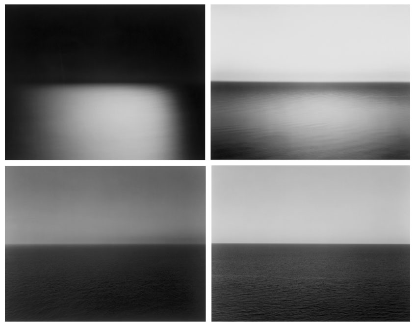
All of Sugimoto’s images are very similar as they are all half sea and half horizon. And they are almost like typologies which is similar to the work of Eadweard Muybridge’s typologies. However where these artists are similar they are also different. Both Muybridge and Qingjun both work in colour primarily whereas Sugimoto works in B/W.
Analysis
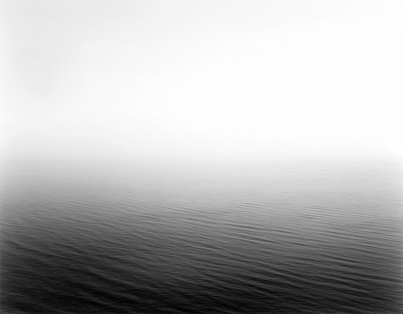
This image like the others in the “seascapes” projects are a natural black and white image. Also the images are very minimalist which makes it quite aesthetically pleasing. Within this image in particular there is no land or man-made features and unlike the other images this photos splitting line between the sea and the horizon is obscured by the fog and mist. The mist creates a sense of unease and when many people look out to sea we look at the horizon. By having the mist there it forces the eye away from the horizon and toward the sea which is where Sugimoto possibly wants us too look.
Deconstructing The Narrative of ‘Tal uf Tal AB’, ‘You Would’ and ‘Park Sleep’.
Book in hand: How does it feel?
The book’s cover and sleeve are created from card giving it a textures surface which feels dry to the touch, however the book itself is a more matte card surface giving it a smoother feel whilst adding a slight tint to the cover. This card texture is carried on throughout the layout of the book. The textured surface of the sleeve and book covers are repeated on each book.
Paper and ink: Use of different paper/textures/colour or B&W or both.
All of the paper inside the book are glossy matte textured being about the same thickness of ordinary photography paper. Within the book there are a few blank pages so that it adds breathing space when working your way through which adds to the overall effect of the photographers decisions. The only text is the ink which is in a small font in each corner of the pages to highlight what the title of each image is. The book overall is very consistent as there is a strong theme regarding composition and focus of the photographer throughout.
Format, size and orientation. Portraiture/landscape/square/A5, A4, A3/ number of pages.
The book itself it is a A3 size, slightly smaller than an A4 sheet of paper with an effective use of negative space throughout due to there being borders to each image boxing them in a result. This compliments his photography as the photos become easier to focus on especially as there are more dominant portraits within. Its hard to say how many pages there are due to there being no page numbers, but I would guess there are about 50 pages per book.
Binding, soft/hard cover. Image wrap/dust jacket. Saddle stitch/swiss binding/Japanese stab-binding/leperello.
The books use a paper card cover without any dust cover on due to there being no need through the use of sleeves. This as a result makes the book more visually pleasing as when opening it it directly links the cover page into the photography.
Title: Literal or poetic/relevant or intriguing?
Overall the titles seem to be more poetic rather than literal due to how the content inside each hardly reflects what the title suggests, instead being more around a different theme of family or location life in specific locations.
Narrative: What is the story/subject matter: How is it told?
There seems to be no narrative in the books but rather small sub sections where a few page spreads will be portraits with the next ones maybe be landscape shots or images about home life. This theme continues throughout the three individual books.
Design and layout: Image size on pages/single page, double-spread/images/grid, fold-outs/inserts:
Each photo inside the book tends to be the same size regarding whether it is landscape or portrait, with portraits tending to take up the entire page and the landscapes taking up about half of a page.
Editing and sequencing: Selection of images/juxtaposition of photographs/ editing process:
The images inside each book seem to have little editing done to them as each seems like they have come straight from the camera with in-camera editing techniques like low or high exposures. As a result of this the results seem to be more literal, portraying the photographers vision literally.
Images and text: Are they Linked? Introduction/essay/statement by artists or others. Use of captions (If any).
The books lack text as there are no page numbers or information about where the photographs are taken. However in each bottom corner of every page there are the titles of the photos present on each spread, this is complimented by the very occasional use of speech dialogue which can be seen on some pages which seem to depict a conversation between two random people.
Evaluation of my Final Piece
Throughout my work on the topic ‘Variance and Similarity’ I took lots of inspiration from a variety of sources and my experiments and plans developed over time to give a final piece that is the result of trial and error. On first thoughts when approaching ‘Variance and Similarity’ I decided that my approach would be based on the comparison of similar subjects and characteristics.
My initial ideas were to show the difference between people through the individual hand creases bespoke to each person, to create a typology of different styles of buildings and to photograph the personal belongings of individuals to give an insight into personalities. After experimenting with photographing hands close up whilst taking inspiration from Tim Booth and John Coplans I decided that this approach was too limited and did not allow me to expand what I was photographing, and I found the same when photographing the personal belongings of individuals whilst taking inspiration from Huang Qingjun’s ‘Family Stuff’.
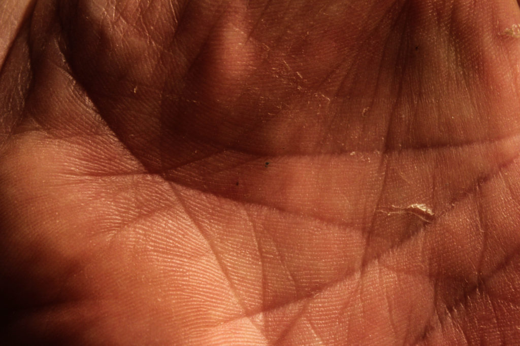
An outcome from my exploration of hands 
An outcome from my exploration of personal belongings 
A GIF produced from photographs of building patterns
Therefore I started exploring the patterns within buildings and the similarities between them – this took inspiration from Lewis Bush’s work on Metropole and Michael Wolf’s work. My initial response to these photographers layed the foundations for my final pieces as these photographs would be the base layers for the double exposure photographs that I would create later with photographs of textured steel. After researching the Becher’s I began to experiment with ways in which I could effectively display and compare photographs – I created both GIF’s and typology grids, and the grids became a key part of my project as I came to believe that they are a simple and effective way to compare photographs.

An outcome from experimenting with layering building faces over each other 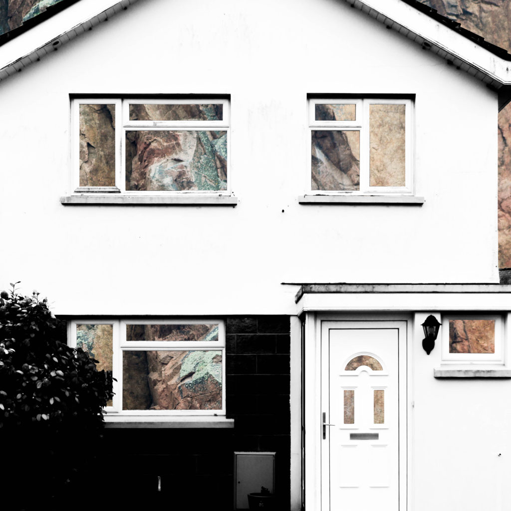
An outcome from layering building faces over rock face and removing natural frames

An outcome from layering building faces over steel and removing natural frames
An outcome from experimenting with layering photographs of building faces over steel surfaces
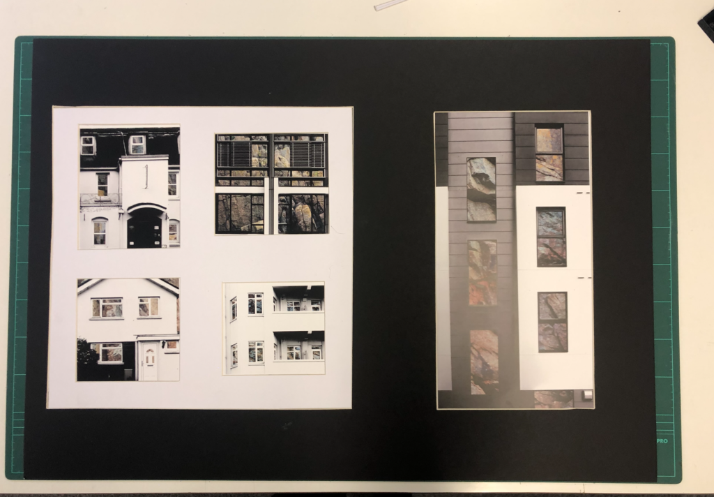
After beginning to pave a way for the route that my project would be taking, I researched John Baldessari and took inspiration from him in the sense of creating unusual abstract photographs, and his idea of putting coloured dots over faces led me to experiment with cutting out shapes in the building faces that I was photographing in order to reveal something else. At the same time I was experimenting with double exposure with inspiration from Lewis Bush’s ‘Metropole’. I decided to take a deeper search into the context of houses and buildings and so began to explore granite, due to it being an abundant resource in Jersey for building houses. This resulted in me experimenting with layering photographs of houses over photographs of granite and cutting out shapes of the natural frames to show the granite that is the base of the house. I found that this method was not as effective when working with photographs of steel so proceeded to create double exposure edits with the photographs of the steel and found that this created an abstract approach to show how buildings and materials change over time, whilst also incorporating steel due to the fact that more buildings are being built using it now more than ever. This double layering led to my final piece in which I incorporate typology grids inspired by the Bechers’ after I improved on the photographs of steel that I had photographed.
To conclude, I believe that I successfully fulfilled the exam brief and theme of ‘Variance and Similarity’ as my final outcome successfully shows the differences between different building faces whilst drawing comparisons between them, such as the common features including doors and windows. This comparison is aided by the use of a typology grid to show that the photographs are linked but individual. Therefore the photographs and presentation successfully show the variance and similarities between different building faces whilst drawing inspiration from a variety of photographs, but primarily from Lewis Bush, the Bechers’ and other New Typologists.
The final photographs produced have all been edited and captured in a way that ensures that they are technically accurate and aesthetically appealing. They were all captured with a natural lighting in order to ensure that all the natural shadows and contrasts were present in the photographs, as well as ensuring that a sufficient tonal range was present to create more contrast within the photographs. For the photographs in the typology grid there is a warm colour cast due to the rust of the steel – this contrasts with the composition on the left side which has a cold colour cast because of the cold nature of the steel layered over it. There is not a huge presence of colour in the final piece as the original photographs are in black and white but the steel layered over it is providing colours through the rust and textures within it. The final compositions are fairly two-dimensional as planned because I want to show the buildings as faces rather than as a whole structure. There is a strong sense of pattern and shapes throughout the composition due to the natural structure of houses – the windows and frames provide this sense of shaping which allows for the photographs to be contrasted. The context and idea behind this piece is that it gives an insight into changing trends. This is shown in the photographs as some of the building faces present are older and more of a traditional design, whereas others are newer estate houses. This typology grid allows the photographs included to be compared for what they are and they give an insight into how the design of buildings change, but also how the key components and shapes stay constant. The steel used also represents the changes occurring over time because previously houses in Jersey have been manufactured with granite being the base material, such as in cod houses. However, more recently with the occurrence of the high investment in the financial investment and a modern wave of house designs, steel is being used more often in houses and buildings, therefore the steel represents a variance in design and the rust represents the natural change in trends. For the composition including the granite edits the idea and context is very similar and is built from the same base (being the variance and similarities in buildings), however the granite represents an insight into what the structures of buildings are traditionally built with, compared to the steel that is more commonly being used. Together these two presentations show the variance and similarity of how buildings are built in both form and function and enable contrast to be drawn between buildings.
Eadweard Muybridge
Eadweard Muybridge, born April 9, 1830 and died May 8, 1904, was an English photographer important for his pioneering work in photographic studies of motion and in motion-picture projection.
Muybridge’s experiments in photographing motion began in 1872, when the railroad magnate Leland Stanford hired him to prove that during a particular moment in a trotting horse’s gait, all four legs are off the ground simultaneously. His first efforts were unsuccessful because his camera lacked a fast shutter. The project was then interrupted while Muybridge was being tried for the murder of his wife’s lover. Although he was acquitted, he found it expedient to travel for a number of years in Mexico and Central America, making publicity photographs for the Union Pacific Railroad, a company owned by Stanford.
In 1877 he returned to California and resumed his experiments in motion photography, using a battery of from 12 to 24 cameras and a special shutter he developed that gave an exposure of 2/1000 of a second. This arrangement gave satisfactory results and proved Stanford’s contention.
The results of Muybridge’s work were widely published, most often in the form of line drawings taken from his photographs. They were criticized, however, by those who thought that horse’s legs could never assume such unlikely positions. To counter such criticism, Muybridge gave lectures on animal locomotion throughout the United States and Europe. These lectures were illustrated with a zoopraxiscope, a lantern he developed that projected images in rapid succession onto a screen from photographs printed on a rotating glass disc, producing the illusion of moving pictures. The zoopraxiscope display, an important predecessor of the modern cinema, was a sensation at the World’s Columbian Exposition of 1893 in Chicago.
Analysis
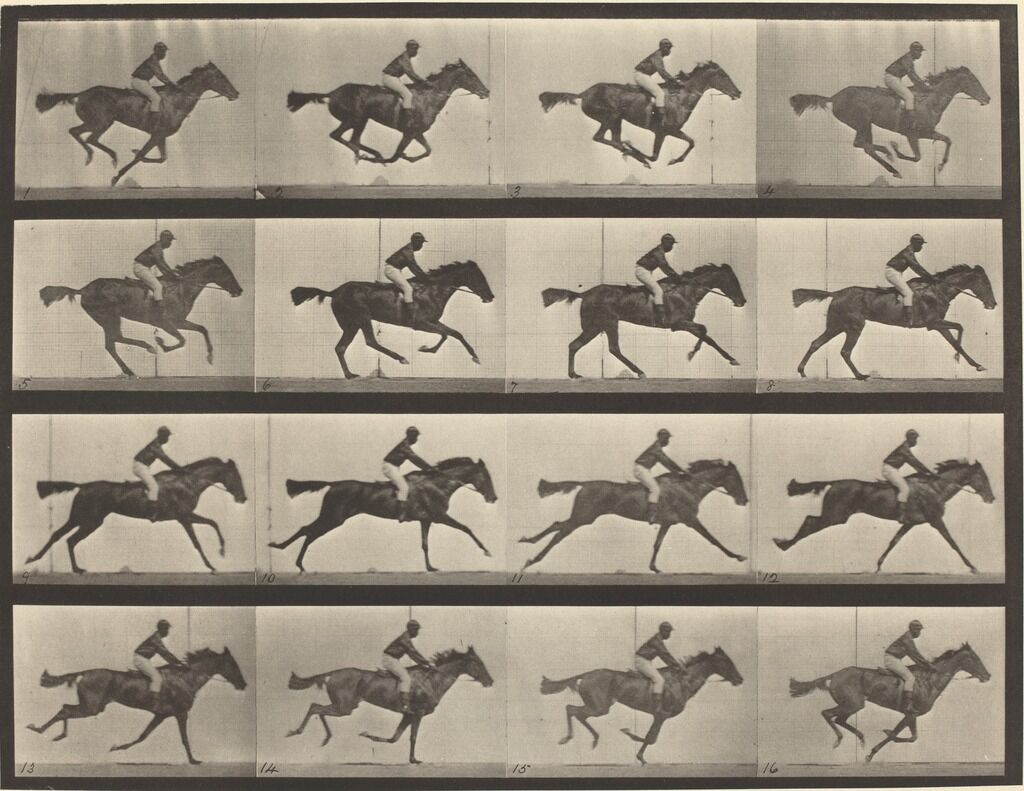
Muybridge’s most famous image is the image which started the cinematic world. This image is shows a horse running in a typology like grid, which when played in quick succession creates a sense of movement. Taken with a self made camera Muybridge created this image for railroad magnate Leland Stanford who wanted to prove that a horses legs don’t touch the ground in one point of its gallop. After this was proved many people dint believe it and discredited the project, which Muybridge lashed back at by creating a zoopraxiscope which was like a projector which played each image after each other creating a sense of movement. The image was taken with an exposure of 2/1000 of a second, and a special shutter he created to allow the right amount of light in to take the photo.
I feel I can use this in my work by creating typologies of stalls to tell a story about the subject of the photos. I feel it can also be liked to Qingjuns work as all of the images are similar, and can be put into a typology as well..
New Topographic Seminal Exhibition

In 1975 there was an exhibition of New Topographic inspired work – it was titled “New Topographics: Photographs of a Man-Altered Landscape” and was considered a point of turning in photography by many historians. The exhibitions consisted of the Bechers, Robert Adams, Lewis Baltz, Joe Deal, Frank Gohlke, Nicholas Nixon, John Schott, Stephen Shore, and Henry Wessel. The photographs revolved around typical typology themes such as abandoned buildings. What was appealing about this exhibition was how unusual they were compared to the traditional approach of photographing landscapes. The new topographic photographers were less concerned with displaying nature as an ideal haven and they prioritised showing how many has changed the landscape, possibly for the worse. The exhibition also brought around a change in the teachings of photography because all of the photographers involved were associated with academia as either students or professors, which was strange at the time as photography was not widely taught in schools. Stephen Shore’s photographs in the exhibition also showed a shift from the old belief that fine art and photography should be in black and white. Ultimately, the exhibition helped the idea of photography as fine art to gain traction. The exhibition was originally held in the George Eastman House but in 2010 was re-staged at the University of Arizona in which they chose over 100 photos from the original exhibition to include. The influence left behind from the photographers involved on photographers can be clearly seen in the photographs. Each photographer in the New Topographics exhibition was represented by 10 prints, all of which was in black and white except for Stephen Shore’s work. When introducing the exhibition, Jenkins (the curator) defined the common denominator of the show as “a problem of style: stylistic anonymity”, meaning an absence of style. The idea was that all of the photographs were stripped of artistic frills. For more detailed look at what the work of the New Topographic’s consisted of, please see my post on the Bechers.

Mobile Homes by Robert Adams 
Pier 24 by Stephen Shore
The work of the New Topographic’s appeals to me because the work that I have been doing on ‘Variance and Similarity’ involves me photographing building faces in a documentary style similar to the work of Topographics, such as the Bechers. I believe that the strong and bold photographs that they have produced in an attempt to show how there is beauty in the ugly have a strong influence over the work that I have produced as I have been photographing buildings which are not conventionally attractive, as well as photographs of steel covered in rust, which is another typically ugly subject. The resulting photographs are abstract compositions that reflect the documentative and cold-cut style of the New Topographic work. I am also presenting some of my final pieces as a typology grid, which is a feature strongly associated with the Becher’s. The typology grid appeals to me because it provides a great way to compare and contrast between photographs as well as showing trends between them in a way that is simplistic but effective.

My final presentation as comparison 
A typology grid by Bernd and Hila Becher
My response to Huang Qingjun
The work of Huang Qingjun’s “Family Stuff” photographed families and their possessions outside their homes in poor regions of china to give an insight into their lives, and tell a story about their lives from their belongings. Qingjun’s work explores families lives in detail by showing all they have, which can build a story in the viewers eye. Qingjun uses colour in his photos which helps to create an interesting image by giving colour to the subjects possessions, which helps to easily identify them. This projects fit into the theme of ‘Variance and Similarities’ because It looks at how each individual with the same level of poverty looks different, and has different belongs even though all the subjects are below the poverty line.
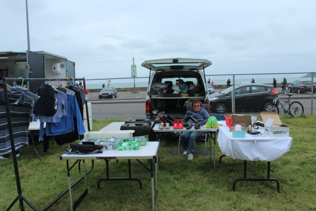
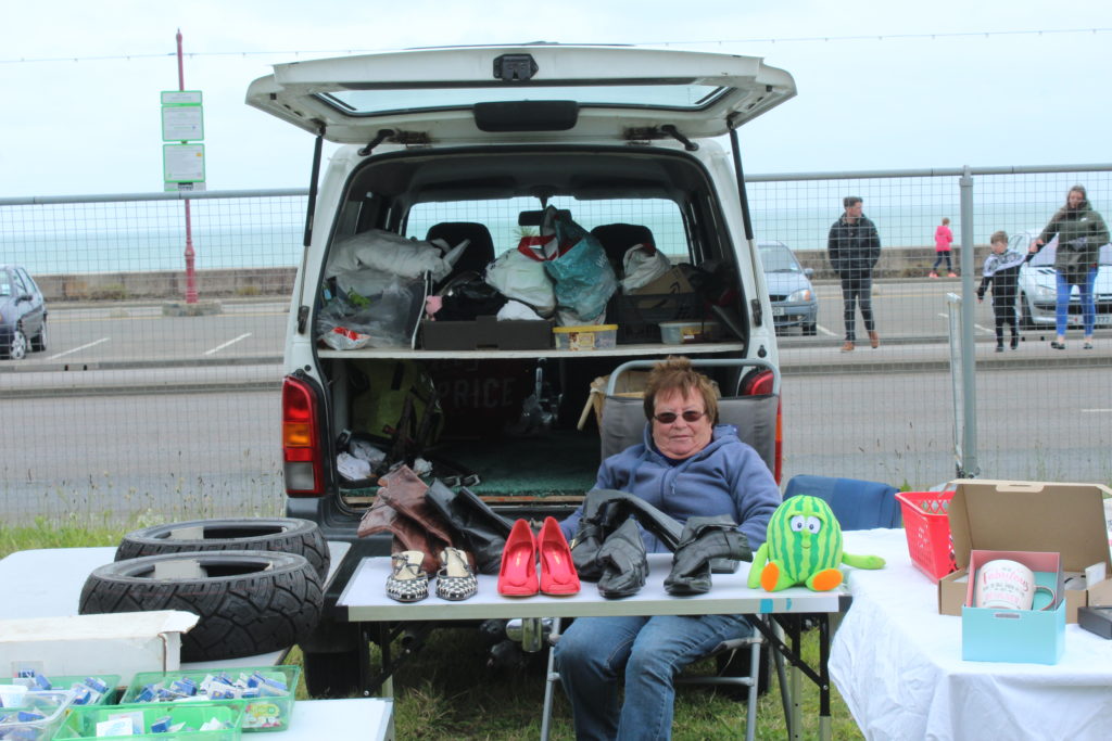
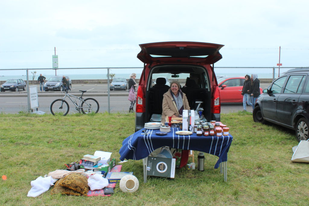
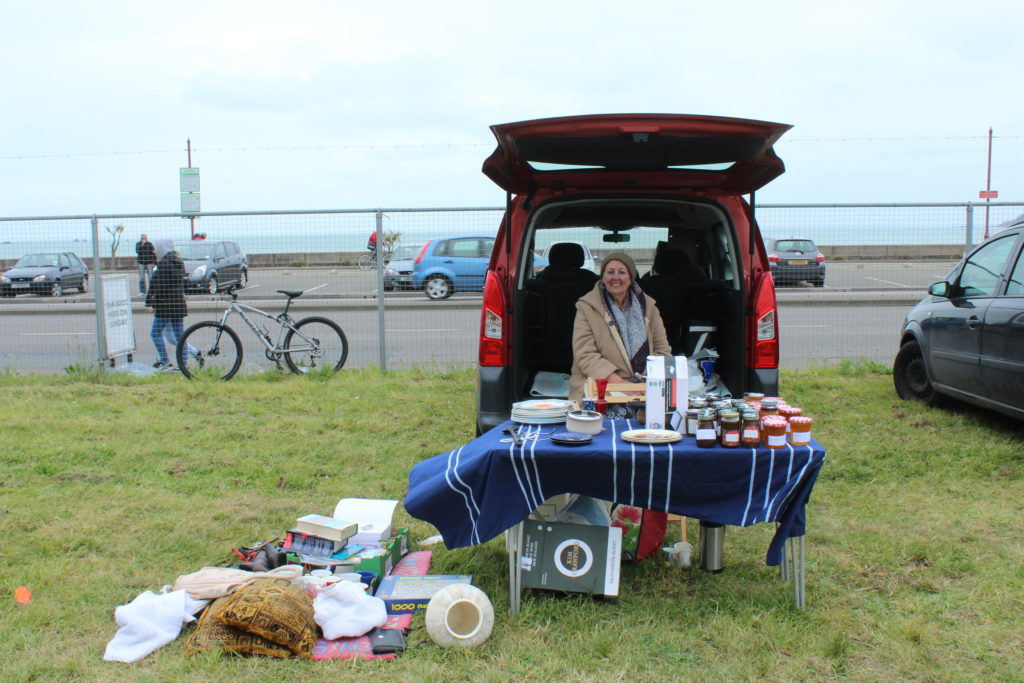
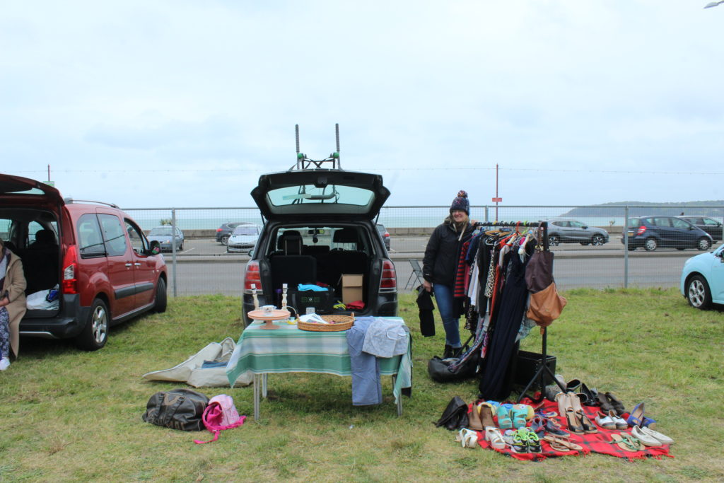
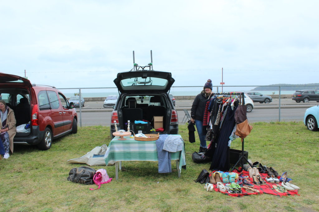
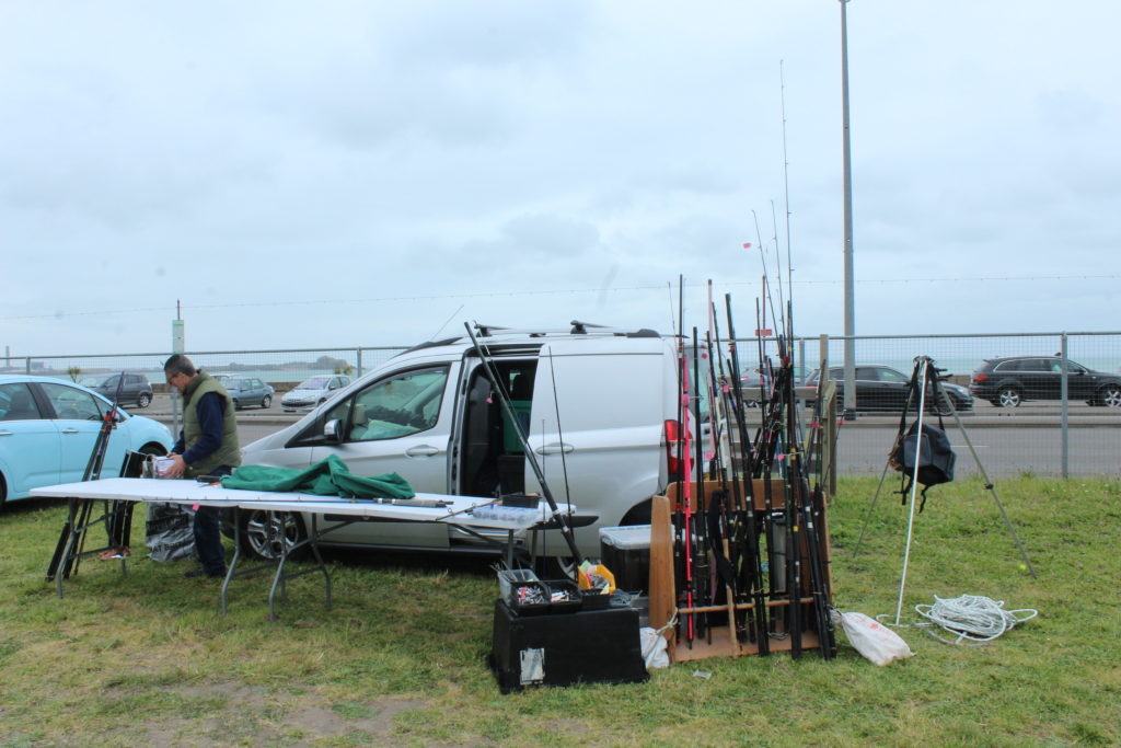
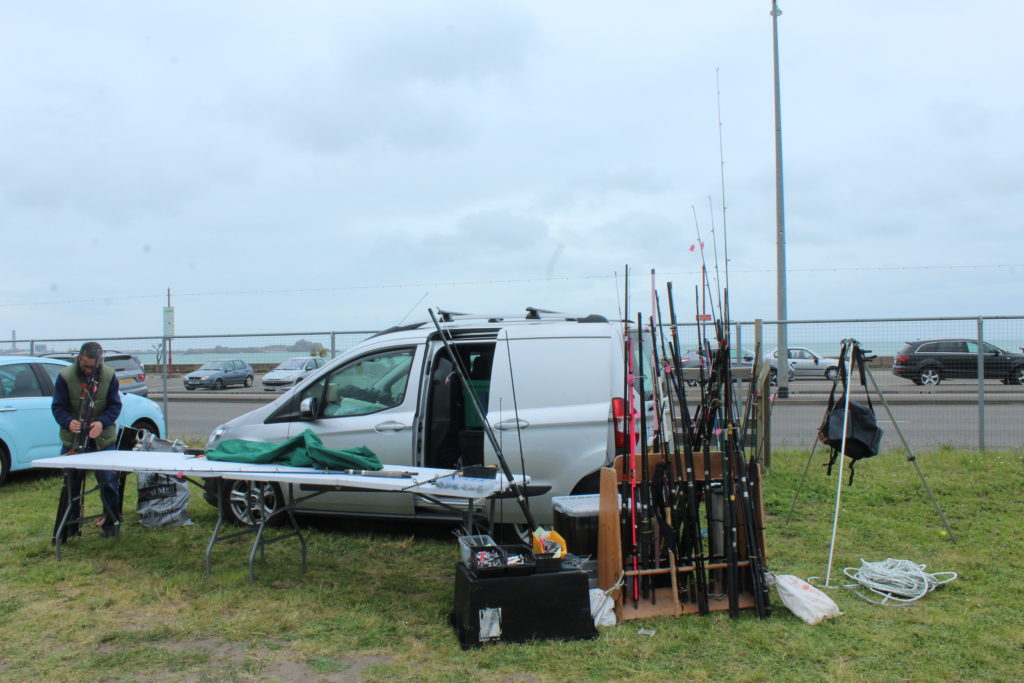
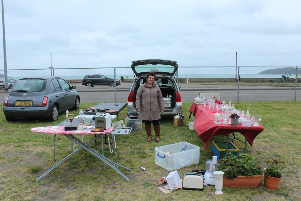
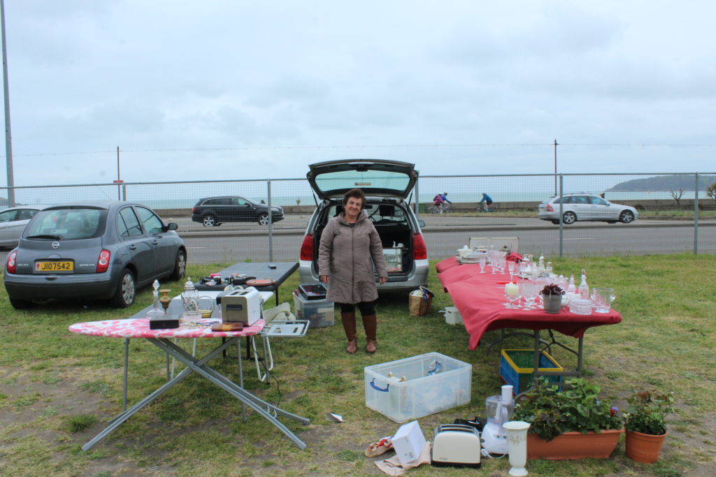
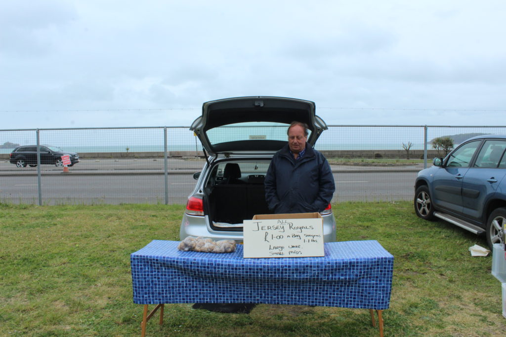
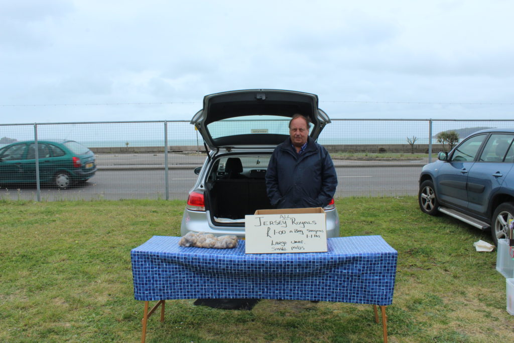
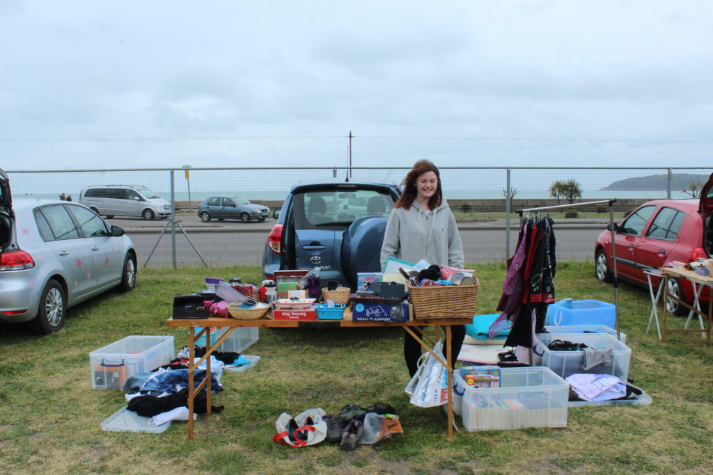
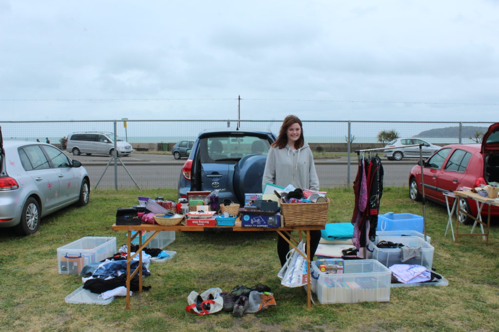
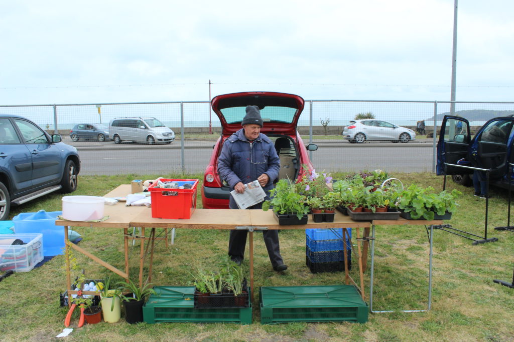
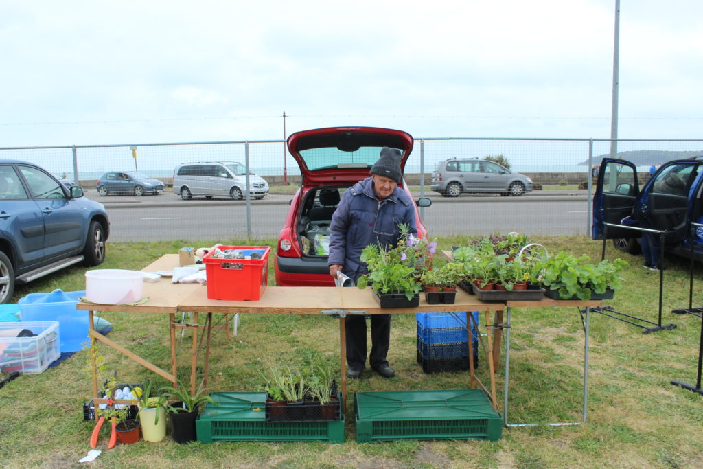
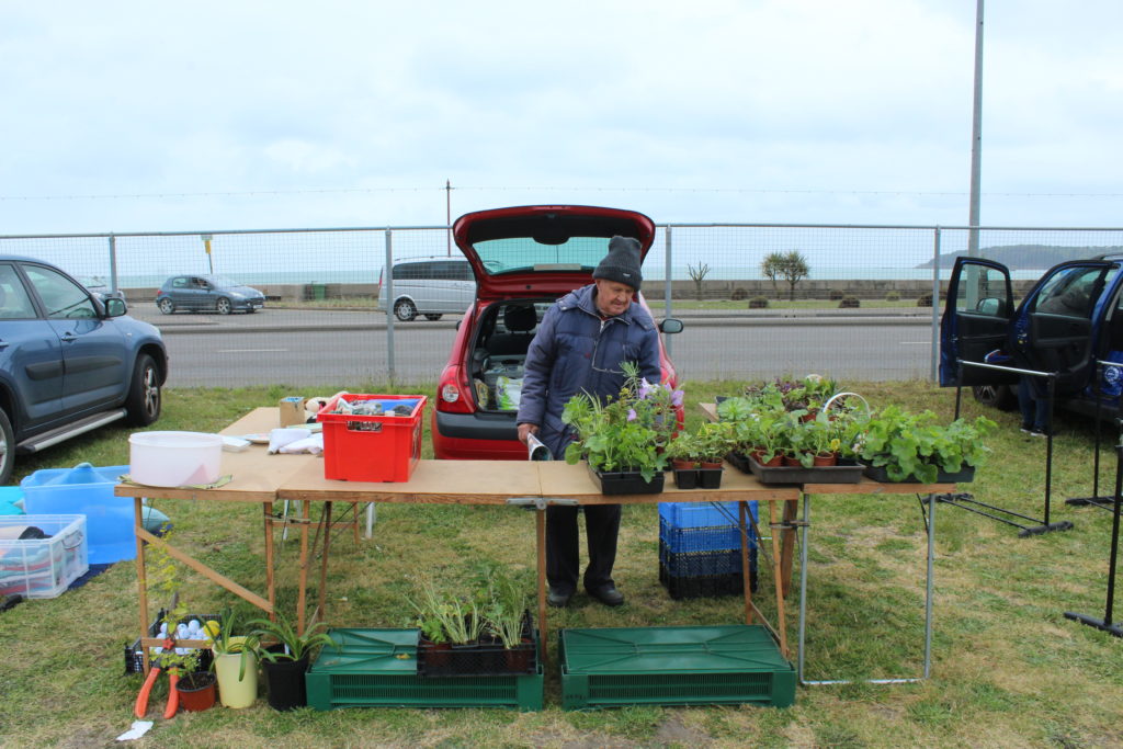
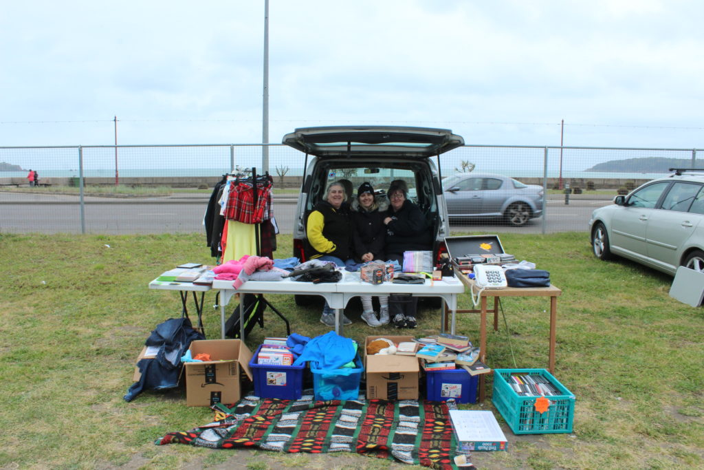
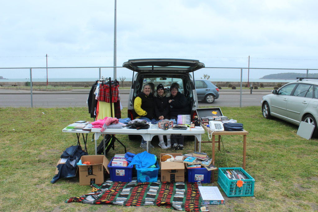
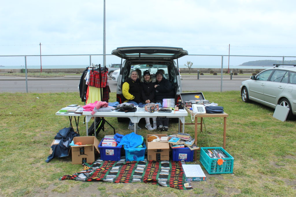
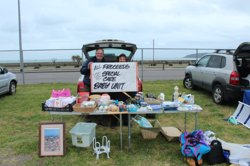
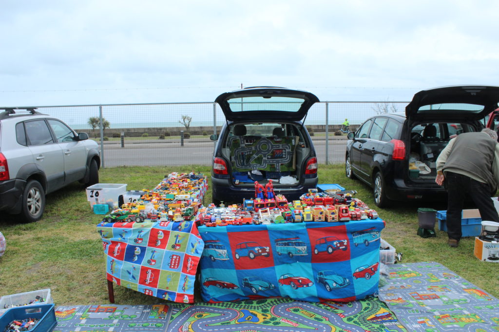
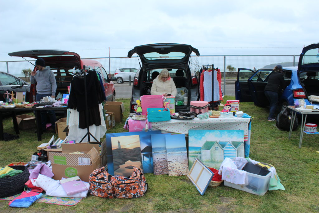
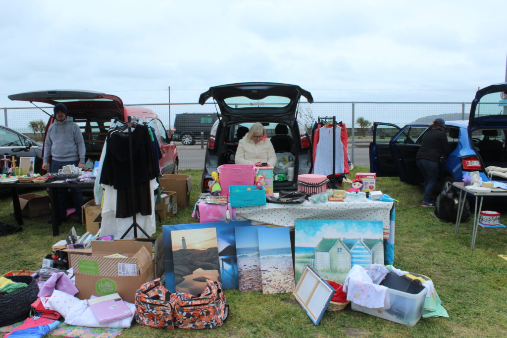
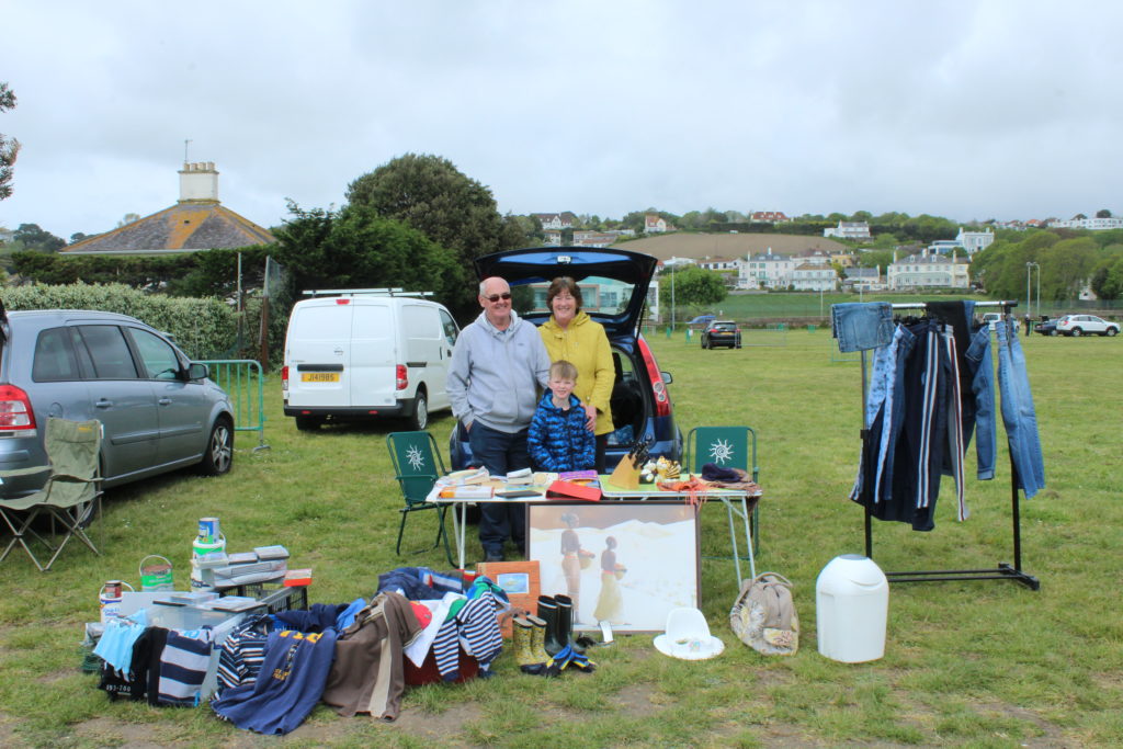
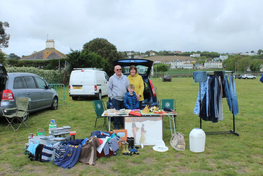
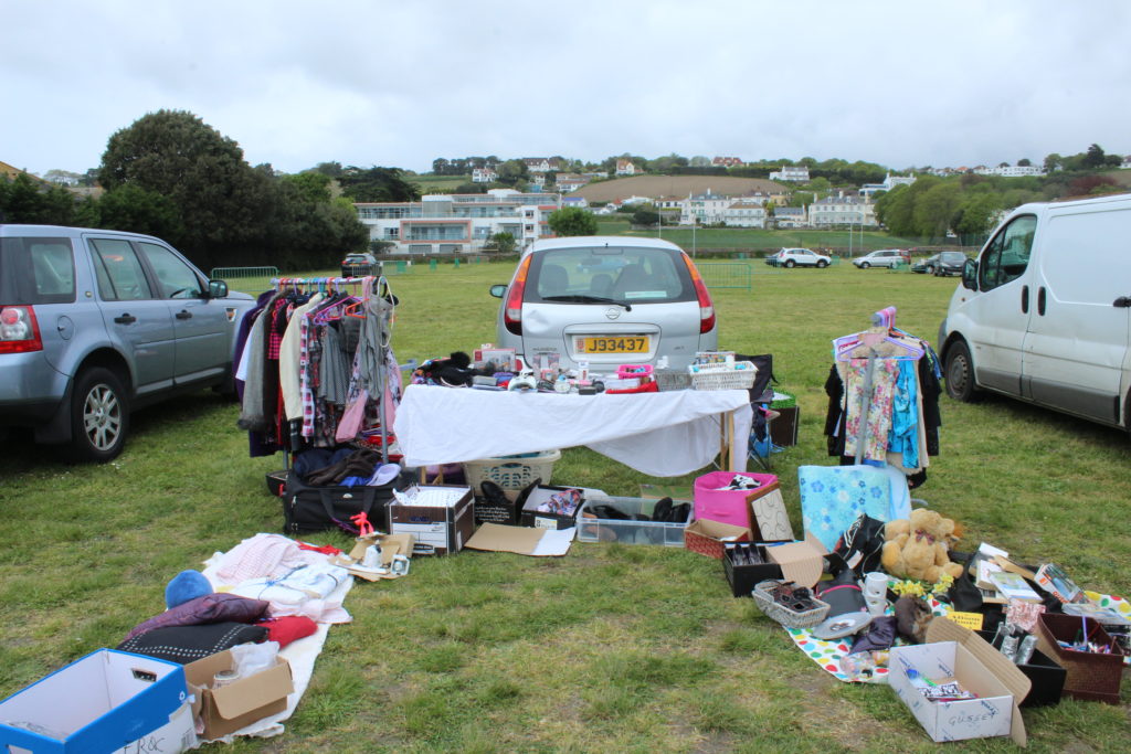
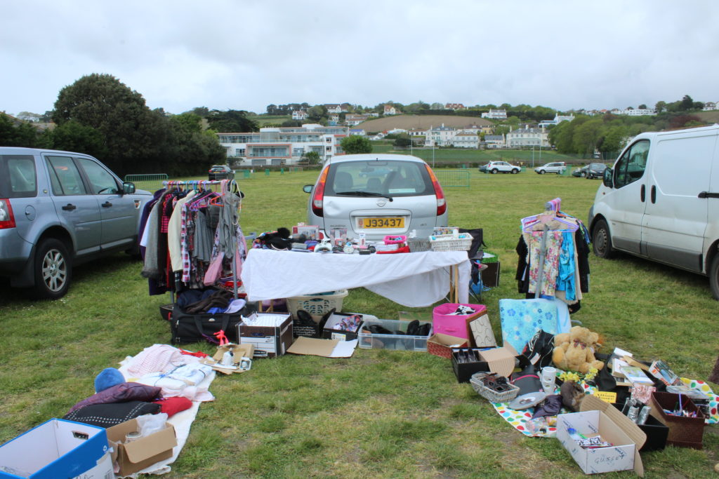
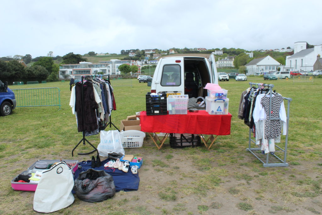
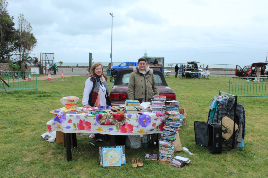
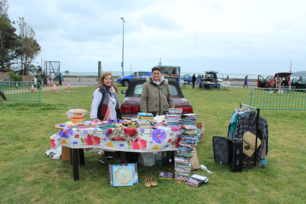
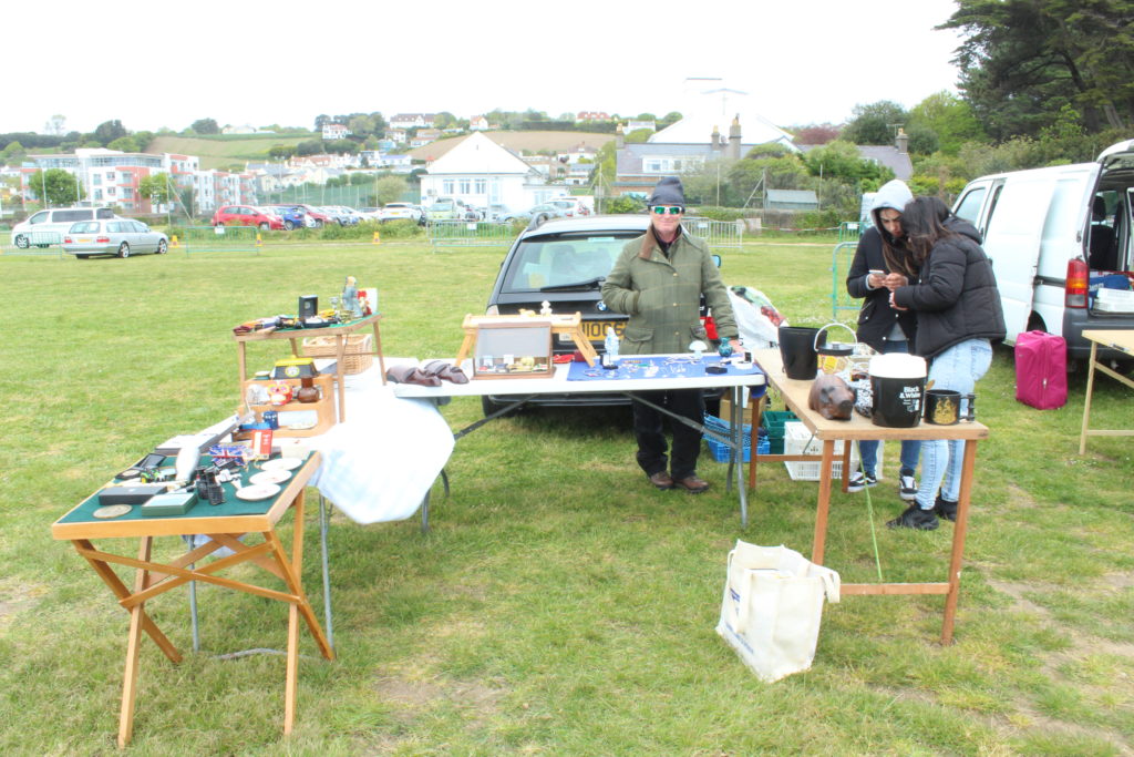
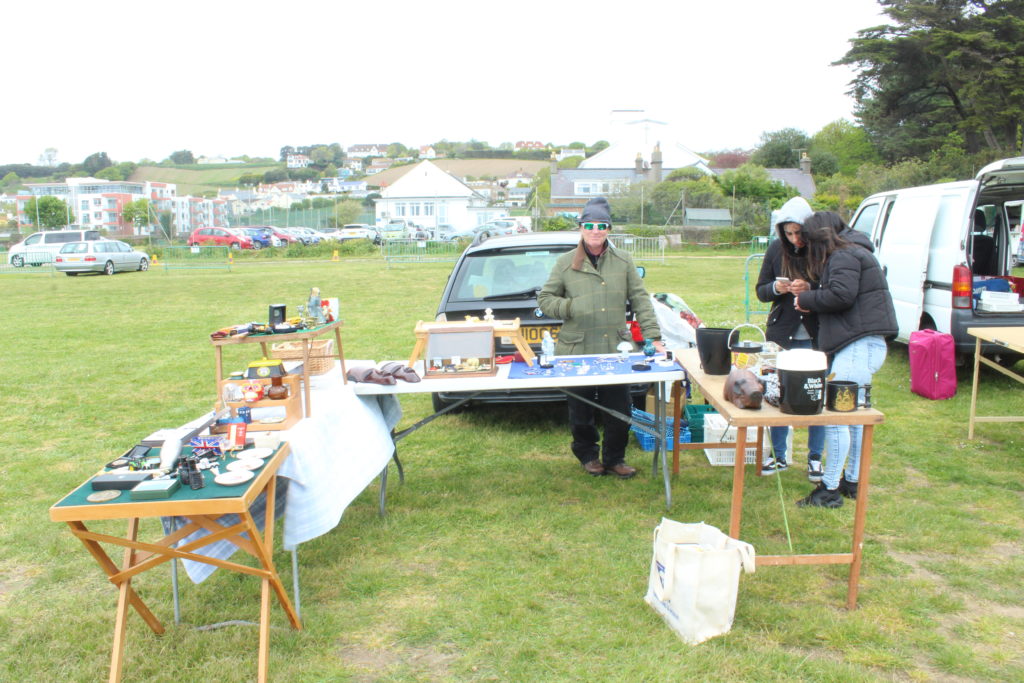
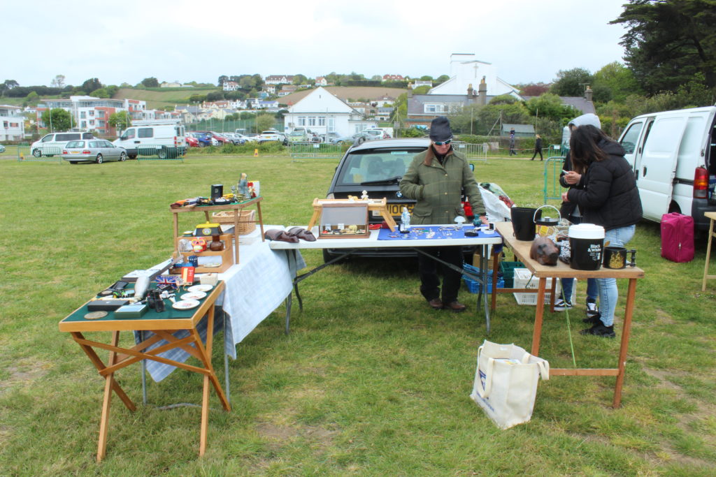
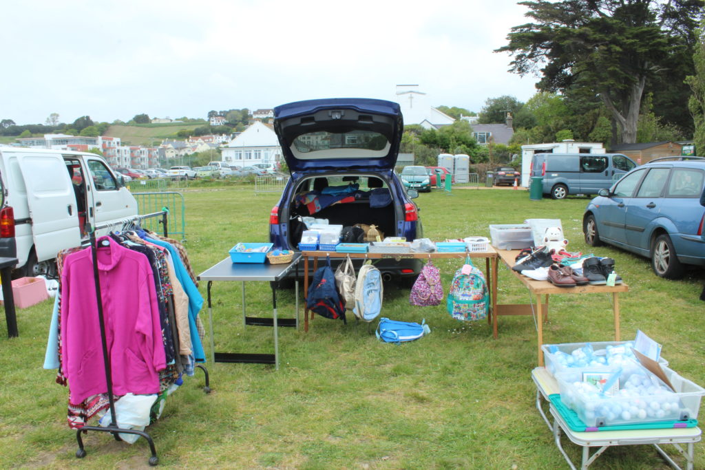
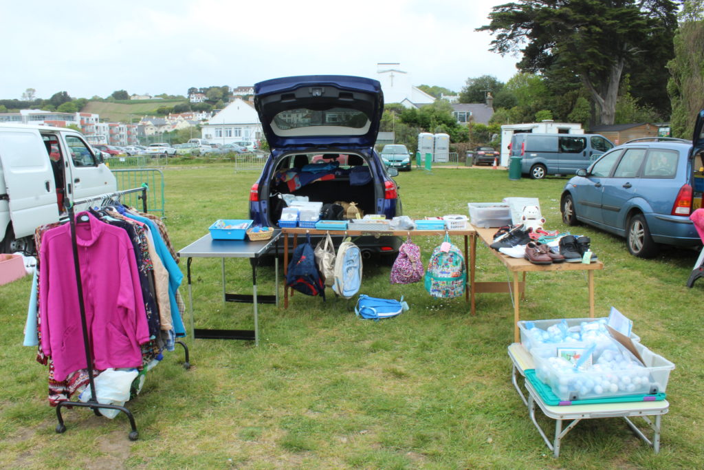
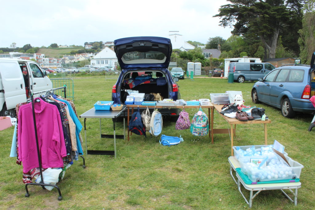
To respond to Huang Qingjun I visited Millbrook car boot and took images of the different stalls, people and the things they were selling. The intended effect was to tell a story about the people from their belongings which I believe I have achieved successfully in my images. The outcome of my images is visually similar to that of Qingjun’s as the images showed a subject and their belongings.
Contact Sheet

Edits/Typologies

As these images are all similar, and yet different I feel it suits the photos to be displayed in a typologies grid. This allows the images to be compared to each other closely, whilst also seeing the differences that are clearly between them.
Finals book, print and video
I decided to make a short video, in order to introduce my project. It is just some film footage that I have developed to be the same tonal range as my prints and book, and also added the title. I wanted to create this as something extra to allow the explanation of the key narrative. This small introduction is sped up shots of the sky edited together in order to create a simulation of the title itself. Below is a youtube link in order to show the video itself. It is a mixture of three short clips of the sky cut together, all edited to be inverted into black and white. you are able to here the sounds surrounding myself, and the pathetic engrossing darkness following of the skyline with the tittle forming. This is meant to be an introduction of the creation story, forming the godly power and making the project seem worthy to watch or look into. Overall I think this video is just an intro to my project as a whole, I too edited some of the clips to be backwards and one of which to have engraved small circle, this done in order to form an ideological representation of the presence of god. Overall I think this video is an interesting interpretation of a scenario that was beautiful, and yet too is very in keeping within images and project as a whole.
https://www.youtube.com/watch?v=END4-y0gEXU&feature=youtu.be
Overall I believe my book was developed successfully. I managed to get a complete narrative concept and also an editing construct throughout the book as a whole. Below is the final link and pdf to view the finality of my book. Ascension as a concept links well within each and every aspect being finished within this project. I believe the Power that the words had is a command, yet still has the ability to almost show a sense of connection within the power itself. The objectivity and narrative throughout has been consistent and has a clear relation to that of variation and similarity. The progression throughout this project has is been my most successful, it has allowed my ideas to grow and become more specific, yet still creating a personalised project I have ever achieved and I belive this is very fitting within the brief and forming together everything needed to be accomplished.
3.how successfully you fulfilled the EXAM brief and realised your intentions: I believe through the progression of my project, I have been able to fulfil the title of this project more and more. when I thought of variation and similarity I thought of fine art and media, and how they are represented in the everyday. However, throughout the selection process, Variation and similarity is not only expressed throughout the same consistent editing process, but also the different connects of the narrative of life which everyone experiences, but the effect of religion and how this causes and individuality to the project and has the connotations for variation. I did not want to create a project which was so directly supported to the words and so enabled no conceptual construct and undertone of meaning. So allowing this detrimental physicality of life physically and emotionally to flow throughout, showing the first aspect of birth and leading to death has such a connection of repeating differences within everyones daily lives and importance.
links and inspiration between your final images and exam theme including artists references: I belive my links throughout each of my final evaluations have been fulfilled. My inspiration was evident throughout this project, there has a clear influence from the artists I chose, especially getting towards the latter half of my project. This is the use of narrative and similar editing through the black and white tones throughout. My artists book was Their photographs capture the commonplace such as water stains on asphalt, dust clouds and rays of light, and transform these into mesmerising frames – elusive fragments that evoke an imaginary creature, a milky way, a phosphorescent silhouette…Presented together, their combined voices lead us on a journey into unexplored territory, somewhere between the everyday and paranormal, between night and day. Amongst enveloping darkness, lightness is revealed, dazzling and miraculously caught by discerning eyes. I thought these unique magical and spiritual elements could really express life death and spirituality not in a way to cause destruction and concern but fragments of our shared identity.
analysis of final prints/presentation in terms of composition, lighting, meaning, concept, symbolism etc: My final print which are seen in this blog post all have a clear connections throughout, focusing on the same theme see examples. The progression of my shoot I believe has been monumental, I belive the additionally narrative of religion has really allowed me to expand on conceptual thought of life and death and how you can focus on darker subjects matters yet still perpetuate a meaning of beauty and purpose. The sheer size of my points and due to their tonal quality I believe this is what makes theme the most successful. I believe much like my prints I will print out my book in a large size, once more to get this huge iconicity and impact and visual overload when seen. Linking my project prints with the book is the introduction video, and something which I believe really links in conceptually the title and a brief endeavour as to what this project has to offer.


Here is my final print presentation. I decided not to do the additional 18 window mount as I thought already with the 8 a1 presentations and also the short video and clear visual overload form the book, it would come together and be too much and loose the specifically of the narrative that I already have. I think this final outline of this presentation is successful. here it is below:

As spoken about previously, I wanted this presentation to have strength, and almost create a stimulation of the amount of strength god has. This power recognised within the sheer size and then imitated by the impact of the dark tonal colours is effective. Conceptually my favourite piece is the piece of the eyes, this is due to the division of both the black and the white seen throughout, also this combining division of tonal essences is mimicked through the two surrounding outsides of the trees within the foregrounding The echoes of different compositions throughout differing from more square lines to circular water motion. Much like my video the image of the waves is almost a a reversal of movement in order to create denotations to the sky. I chose this paradigm purposely to links every single one of my final presentations and to successful finish
Overall I believe my images alongside my narrative have used such a dramatic growth in order to enable a more personalised emotional connection and also to capture wanderings create a hauntingly beautiful dialogue. I took more and more shoots used to capture their everyday in an impulsive and almost obsessional way, documenting life from their doorsteps to far afield. The physiological factors present death as a common and less feared but an act of something much more spiritual, I belive my own personal connections allow a snese of bonding within this project and the reader, and how the sheer beauty within the inverted colours allow a successful finished project.

