Throughout my work on the topic ‘Variance and Similarity’ I took lots of inspiration from a variety of sources and my experiments and plans developed over time to give a final piece that is the result of trial and error. On first thoughts when approaching ‘Variance and Similarity’ I decided that my approach would be based on the comparison of similar subjects and characteristics.
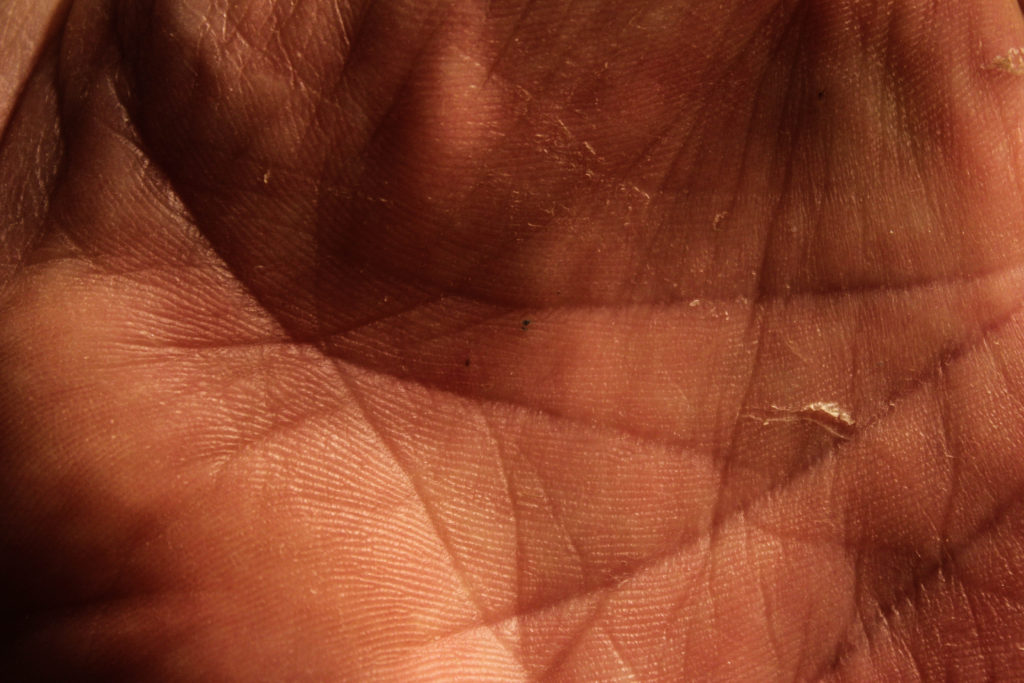
My initial ideas were to show the difference between people through the individual hand creases bespoke to each person, to create a typology of different styles of buildings and to photograph the personal belongings of individuals to give an insight into personalities. After experimenting with photographing hands close up whilst taking inspiration from Tim Booth and John Coplans I decided that this approach was too limited and did not allow me to expand what I was photographing, and I found the same when photographing the personal belongings of individuals whilst taking inspiration from Huang Qingjun’s ‘Family Stuff’.

An outcome from my exploration of hands 
An outcome from my exploration of personal belongings 
A GIF produced from photographs of building patterns
Therefore I started exploring the patterns within buildings and the similarities between them – this took inspiration from Lewis Bush’s work on Metropole and Michael Wolf’s work. My initial response to these photographers layed the foundations for my final pieces as these photographs would be the base layers for the double exposure photographs that I would create later with photographs of textured steel. After researching the Becher’s I began to experiment with ways in which I could effectively display and compare photographs – I created both GIF’s and typology grids, and the grids became a key part of my project as I came to believe that they are a simple and effective way to compare photographs.

An outcome from experimenting with layering building faces over each other 
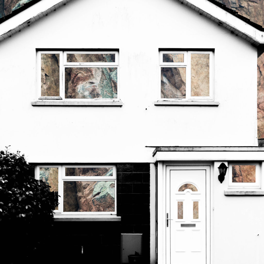
An outcome from layering building faces over rock face and removing natural frames

An outcome from layering building faces over steel and removing natural frames
An outcome from experimenting with layering photographs of building faces over steel surfaces
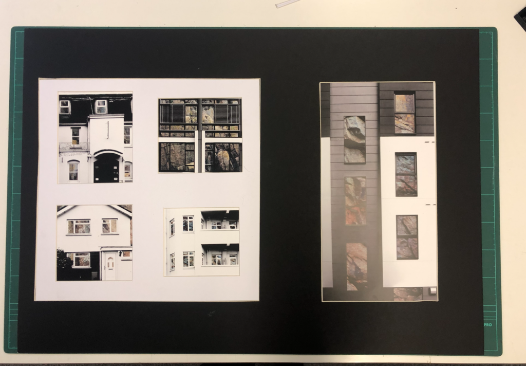
After beginning to pave a way for the route that my project would be taking, I researched John Baldessari and took inspiration from him in the sense of creating unusual abstract photographs, and his idea of putting coloured dots over faces led me to experiment with cutting out shapes in the building faces that I was photographing in order to reveal something else. At the same time I was experimenting with double exposure with inspiration from Lewis Bush’s ‘Metropole’. I decided to take a deeper search into the context of houses and buildings and so began to explore granite, due to it being an abundant resource in Jersey for building houses. This resulted in me experimenting with layering photographs of houses over photographs of granite and cutting out shapes of the natural frames to show the granite that is the base of the house. I found that this method was not as effective when working with photographs of steel so proceeded to create double exposure edits with the photographs of the steel and found that this created an abstract approach to show how buildings and materials change over time, whilst also incorporating steel due to the fact that more buildings are being built using it now more than ever. This double layering led to my final piece in which I incorporate typology grids inspired by the Bechers’ after I improved on the photographs of steel that I had photographed.
To conclude, I believe that I successfully fulfilled the exam brief and theme of ‘Variance and Similarity’ as my final outcome successfully shows the differences between different building faces whilst drawing comparisons between them, such as the common features including doors and windows. This comparison is aided by the use of a typology grid to show that the photographs are linked but individual. Therefore the photographs and presentation successfully show the variance and similarities between different building faces whilst drawing inspiration from a variety of photographs, but primarily from Lewis Bush, the Bechers’ and other New Typologists.
The final photographs produced have all been edited and captured in a way that ensures that they are technically accurate and aesthetically appealing. They were all captured with a natural lighting in order to ensure that all the natural shadows and contrasts were present in the photographs, as well as ensuring that a sufficient tonal range was present to create more contrast within the photographs. For the photographs in the typology grid there is a warm colour cast due to the rust of the steel – this contrasts with the composition on the left side which has a cold colour cast because of the cold nature of the steel layered over it. There is not a huge presence of colour in the final piece as the original photographs are in black and white but the steel layered over it is providing colours through the rust and textures within it. The final compositions are fairly two-dimensional as planned because I want to show the buildings as faces rather than as a whole structure. There is a strong sense of pattern and shapes throughout the composition due to the natural structure of houses – the windows and frames provide this sense of shaping which allows for the photographs to be contrasted. The context and idea behind this piece is that it gives an insight into changing trends. This is shown in the photographs as some of the building faces present are older and more of a traditional design, whereas others are newer estate houses. This typology grid allows the photographs included to be compared for what they are and they give an insight into how the design of buildings change, but also how the key components and shapes stay constant. The steel used also represents the changes occurring over time because previously houses in Jersey have been manufactured with granite being the base material, such as in cod houses. However, more recently with the occurrence of the high investment in the financial investment and a modern wave of house designs, steel is being used more often in houses and buildings, therefore the steel represents a variance in design and the rust represents the natural change in trends. For the composition including the granite edits the idea and context is very similar and is built from the same base (being the variance and similarities in buildings), however the granite represents an insight into what the structures of buildings are traditionally built with, compared to the steel that is more commonly being used. Together these two presentations show the variance and similarity of how buildings are built in both form and function and enable contrast to be drawn between buildings.


