Final Print Analysis

I chose these two photographs as final pieces because these flowers are some of the more interesting and successful photographs from photo shoot 1. I decided to present these two photographs as a diptych because this creates variation due to there being multiple photographs and similarity because the photographs are of the same object, I feel like this was successful and using a window mount added a more professional finish. This final piece differs from my plan, I chose to have a larger border around the photographs, because this fit better due to using a window mount.

I chose these four photographs as final pieces because of the interesting and eye-catching effect created by the sequence, to aid the effect of the sequence I have presented the four photographs in a simple straight line on black card, to allow the photographs and the sequence to be the focal point of the presentation, I feel like this was successful in creating the effect I was aiming for.

I chose these two photographs as final pieces because these flowers are some of the more detailed and successful photographs from photoshoot 1. I decided to present these two photographs as a diptych because this creates variation due to there being multiple photographs and similarity because the photographs are of the same object, I feel like this was successful and presenting on black card allowed a simple but effective sleek finish.

I chose these three photographs as final pieces because the cartoon edit creates a striking effect. I chose a triptych because the three photographs together create the effect of variation in an interesting way. To create variation throughout my final pieces I chose to use foam board and black card to present these three photographs. I think this was successful in creating variation and achieving what I was aiming for within the overall presentation of my final pieces. This final piece differs from my plan, I chose to add a larger border around each image, I feel this worked well and better than a slimmer border, for this trio of photographs.

I chose these four photographs as final pieces because because of the bold and eye-catching colours, I have chosen this layout because it gives off pop art vibes which I think is an interesting bonus and the colours contrast nicely with one and other. I chose to present these four photographs on black card because I didn’t want a window mount or foam board to detract attention away from the photographs. I feel like my choice of presentation, black card, successfully showcases what I was aiming for in my presentation of these photographs.

I chose to this photograph as a final piece because I like the simplicity of the photograph but also how interesting it is, for example the model, the flowers, all the different colours. I chose to present this photograph like this because I wanted a simple presentation to not detract away from the photograph its self.

I chose to this photograph as a final piece for the same reason as the photograph above, they both give me a similar vibe in the way that I like the simplicity of the photograph but also how interesting it is, for example the model, the sand, all the different colours and the vibrant yellow dot. I chose to present this photograph like this because I wanted a simple presentation to not detract away from the photograph its self.

I chosen to present these photographs in a triangular formation because I feel like its something different and I wanted to have a variety of different layouts throughout my final pieces. I chose these photographs because they are all very similar but the change in position and distance creates variety within the trio. I also presented it as a sequence, for example, the top is the closest, the second on the left is further away and the third photograph on the right is the furthest away.

Editing: Final Layout/Presentation

I have chosen a variation of photographs, presenting them in a variety of different colours, styles and sizes.

I plan on presenting these four photographs like this, this layout allows the photographs to be directly compared due to the close formation, this also creates a high contrast. I have chosen this layout because the purple and pink contrast with the yellow and orange directly and then both with each other diagonally, creating a balance of colour and therefore more appealing and creates an eye-catching effect. I will present these photographs as A5 prints, this allows all four prints to almost create the effect on one A4 piece, while still being layed out, rather then printed as one. I will present on black foam board, creating a contrast between the colourful photographs and black card.

I have chosen to lay these photographs out in this order, because in this order a sequence of smallest to largest is created. Secondly I plan on presenting the photographs this way because the colours, orange, cream with pink and yellow tones and yellow work again almost as a sequence, darkest to brightest, allowing the layout to be balanced. These photographs will be presented as A5 prints, I have chosen A5 due to the colours and fact that there are three prints, I feel any bigger than A5 would to overwhelming and take away from the effect of the edit and photograph. When presenting these photographs I will use, black foam board, creating a contrast between the colourful photographs and black backdrop.

I have chosen to present these prints, four in a row, to allow the sequence continued in each photograph to be visible within the layout, this creates an interesting effect, leading to what becomes the focal point of the images, the hole in the shell. To successfully allow the photographs to stand out in the layout I will present them on black foam board, this will contrast against the light white shell. These photographs will be presented as A5 prints, I have chosen to present them as A5 prints due to there being four photographs, I feel if the photographs where any bigger, the size would distract from the layout and sequence.

For this layout I have chosen a simple double photograph layout, I have chosen to present these photographs side by side, because I feel this way it demonstrates variation and similarity successfully, for example, the similarity being they are of the same object, being similar, but the photographs are not completely the same, this being the variation within aspects of the photographs. I will present these photographs as A4 prints, I have chosen A4 due to there only being two photographs and I want the details to be visible due to the fact the photographs are so simple, the details are what make them appealing. I will present the two photographs on a black window mount, I feel like this will add an interesting aspect and add to the simple photographs.

This layout will be the same as the previous one, due to the photographs being similar and I want to create the same effect using similar but different photographs.

I have chosen this layout because I wanted to do something different and interesting and I wanted to add a variation of different layouts for my final pieces.

I have chosen this simple layout because this is one of my most successful photographs, so I want to present this as an A4, with a simple black border, to not detract from the photograph its self.

I have chosen to do a basic layout because this is one of my strongest photographs, I want to present this as an A4, with a simple black border, to not detract from the photograph its self.

Shoot 6 – Boats

For this shoot, I wanted to go and visit boats down on the beach on a sunny day, when the tide was low so I was able to walk around the boats and take my images. I wanted to see how boats can have different effects of light and darkness due to their positioning on the beach, which is where the sun shines onto heavily.

Contact sheet

Edits

Shoot 4 – Darkroom

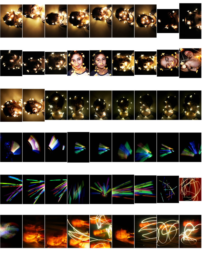
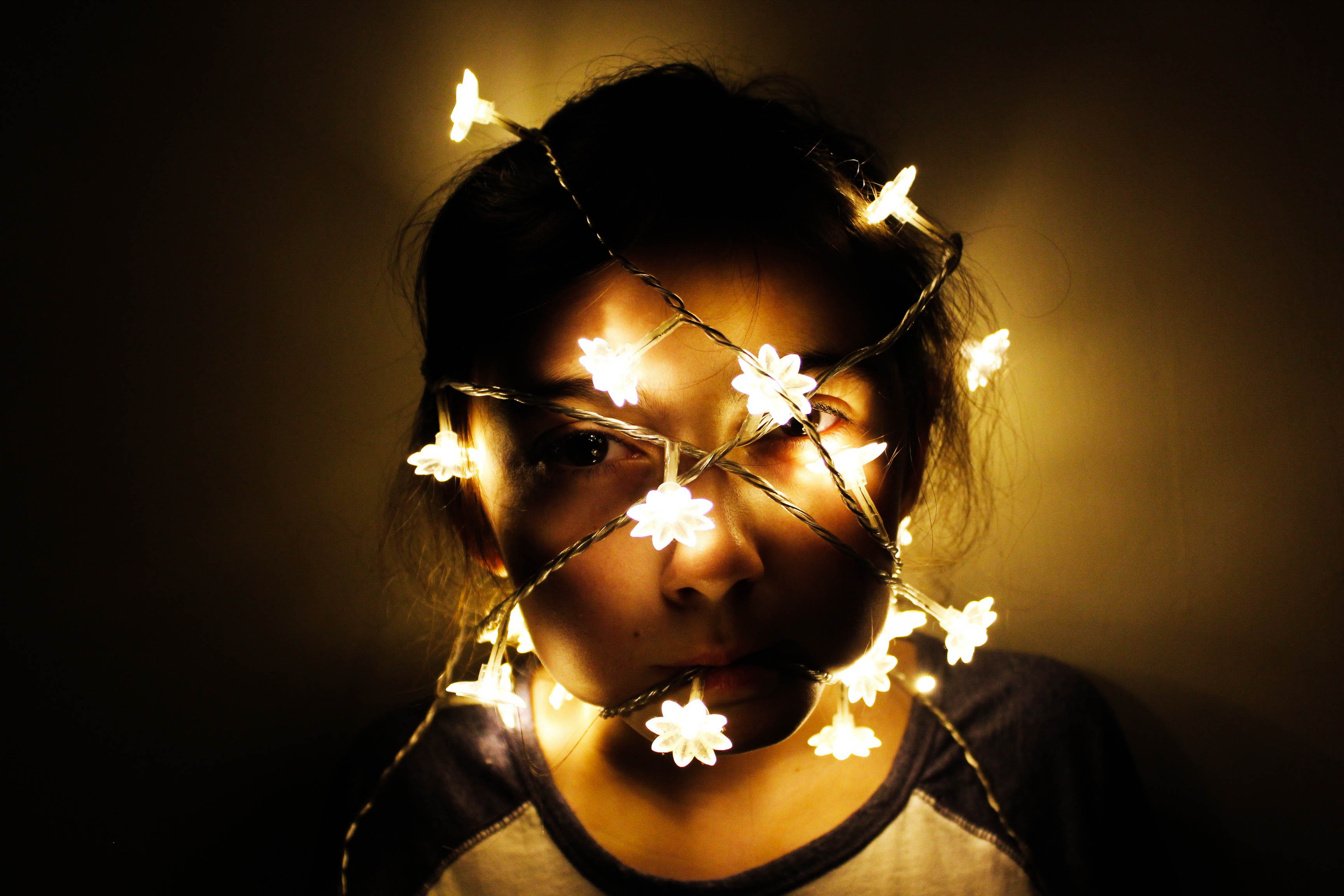
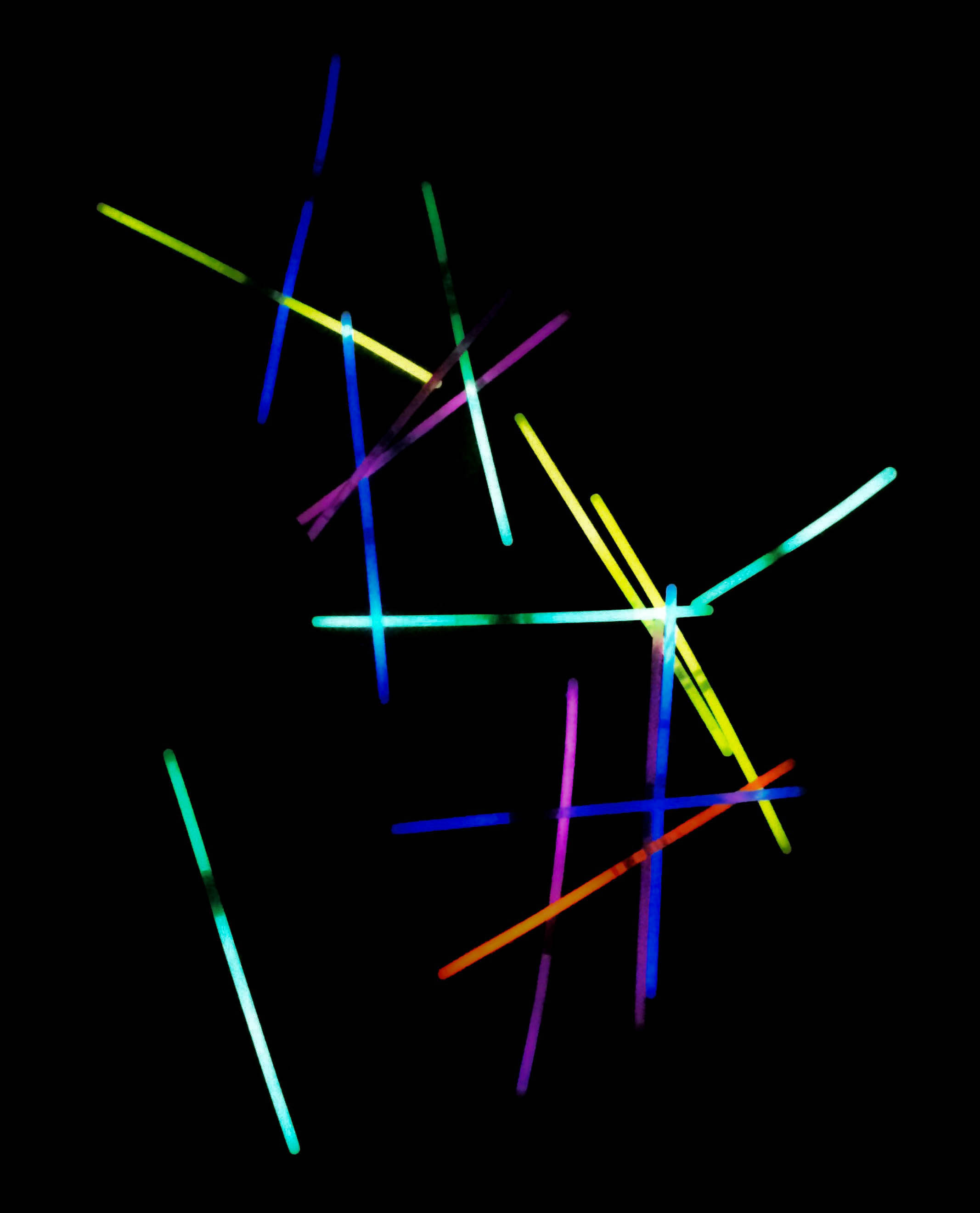
For this shoot, I wanted to create a series of images that included multi-coloured lights from a bundle of glowsticks, as well as an experimentation of using slow shutter speed and waving an iPhone torch and glow sticks around in a dark room. Additionally, in my darkroom shoot, I used fairy lights around a model to see the effect of light and darkness on the models face.

Contact sheet

Edits

Incorporating typologies

I wanted to use typologies within my book as I thought it would create a sense of similarity within each experiment however, it also consisted of variation as the images are in someway different to each other even tho they are capturing the same subject. furthermore, displaying my images as a typology in a way creates a contact sheet and further allows me to display my images in a creative way. As I had taken some of my images on film I was left with the negatives which I believe in a way is a different type of contact sheet. I also wanted to incorporate the negatives within the book. However, the images on the negatives where very small and hard to see which gave me the idea of making my own negatives but as a contact sheet. These where my outcomes.

I decided on incorporating one of the contact sheet as the front cover as it creates a very documentary style feel to it which I wanted to heavily focus on when producing and displaying my images. By having this as the front cover it doesn’t give away too much about what the book is about allowing for an element of surprise when opening it and looking at it for the first time. Furthermore, I didn’t believe that any of the images from the first contact sheet were strong enough to have single images within the book which is why I incorporated this contact sheet as I believe that focusing on the sport itself was also important and I feel will create a sense of variation throughout the book.

ESA // INITIAL RESEARCH: PHILIP TOLEDANO

Toledano was born in 1968 in London, to a French Moroccan mother and an American father. He grew up in London and Casablanca. He received a BA in English literature from Tufts University in Boston. I consider Toledano s conceptual artist. His work varies in medium, ranging from photography to installation, sculpture, painting and video.

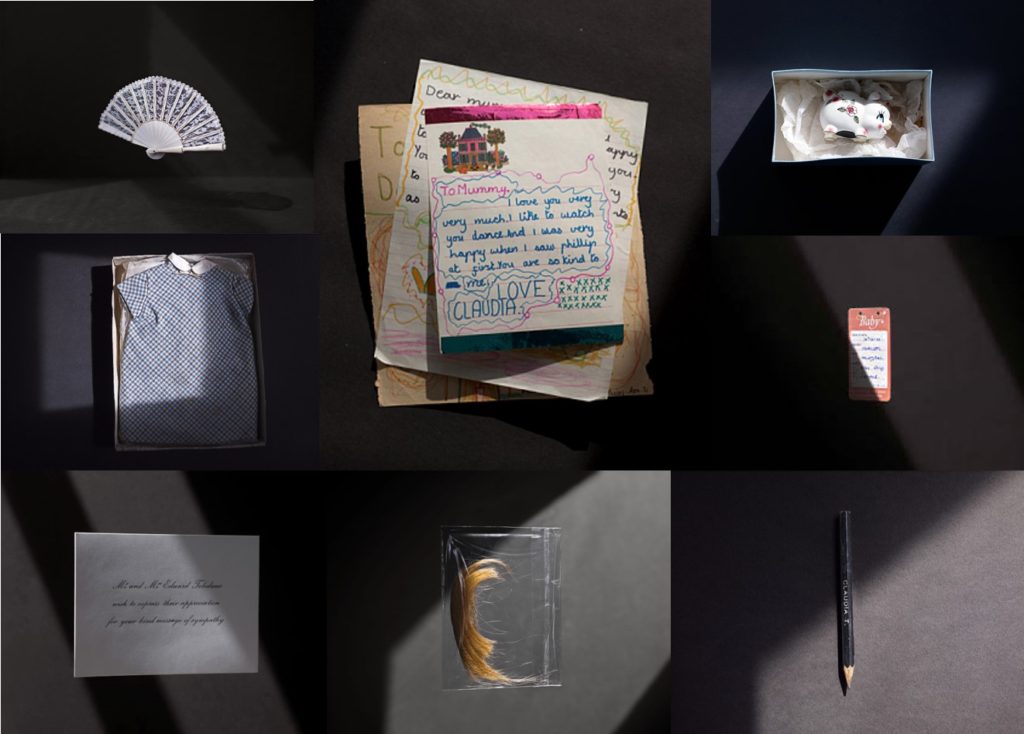
I think Toledano’s work is very interesting and I believe that these photographs are very powerful as they can tell so many stories. If you look at every photograph individually, each object obviously belongs to a person and they can all have a million meanings. When looking at the whole collection, the viewer can begin to put a story together and guess various situations.

PHILIP TOLEDANO – MOOD BOARD

Again I have created a mood board using Toledano’s images. I am using these photographs as a visual plan for the sort of things I would like to photograph. For example, clothing, documents and other objects.

ESA // INITIAL RESEARCH: MICHELLE SANK

My other artist will be Michelle Sank. I enjoy looking at her work because she also focuses on portraiture, although she does not necessarily base her work on culture, but does photograph different people in different environments and i think these photographs tell stories about who these people are and show real personalities. I plan to use the same sort of approach of taking photographs of people in their everyday environments to show the real sides of people. I think the objects around these people are what bring her photographs together and really makes them interesting as there are always little things to look at.

Michelle Sankwas born in Cape Town, South Africa. She left there in 1978 and has been living in England since 1987. Her images reflect a preoccupation with the human condition and to this end can be viewed as social documentary. Her work encompasses issues around social and cultural diversity.

MICHELLE SANK – MOOD BOARD

Above is a another mood board that I have created using Sank’s images. I plan to use these ideas to take photographs of people of different cultures in their everyday lives, using furniture and other props to enhance the idea of alternative lifestyles and personalities.

ESA // INITIAL RESEARCH: MAHTAB HUSSAIN

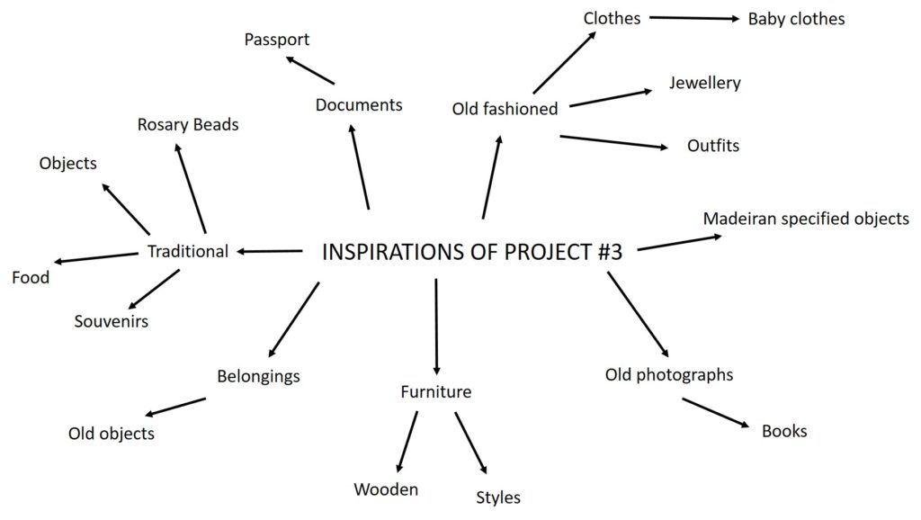
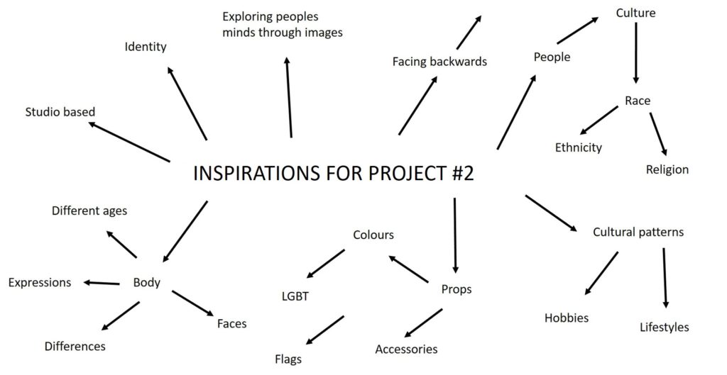
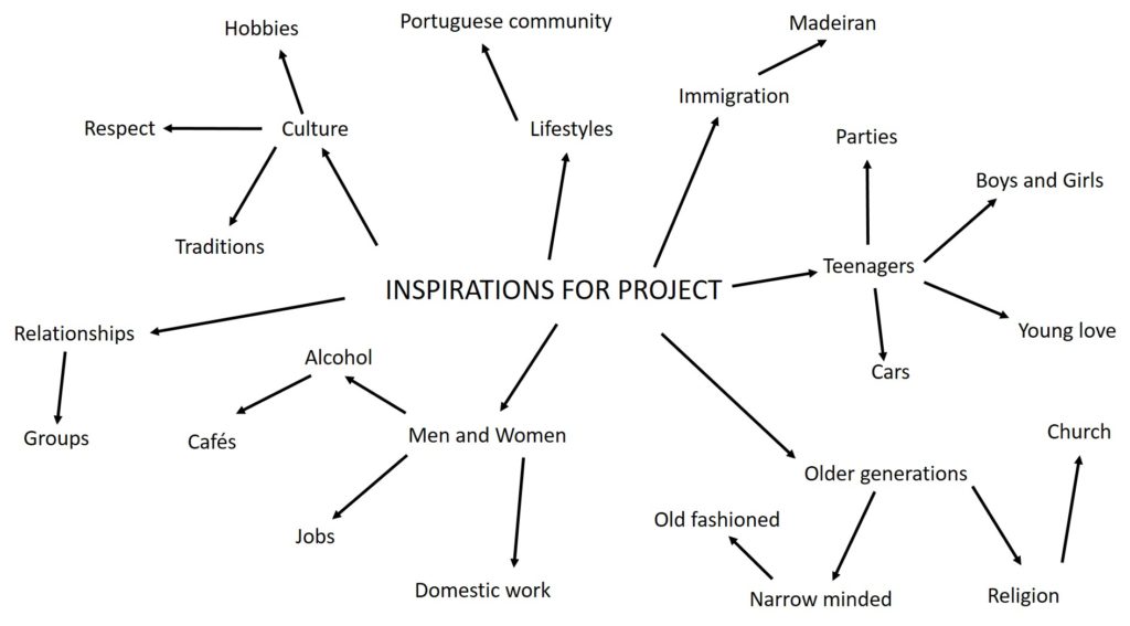
Above, is a mind map of my initial ideas. I have decided to go for a topic regarding displacement for immigrants and how different their day to day lives are. I plan to do this, mainly using portraiture. I specifically wish to explore the Portuguese community in Jersey, and enhance stereotypes. I will do this by capturing, lifestyles, cultures and traditions as a main objective. After researching photographers such as Mahtab Hussain, my interest for this project increased and it think his images are very powerful.

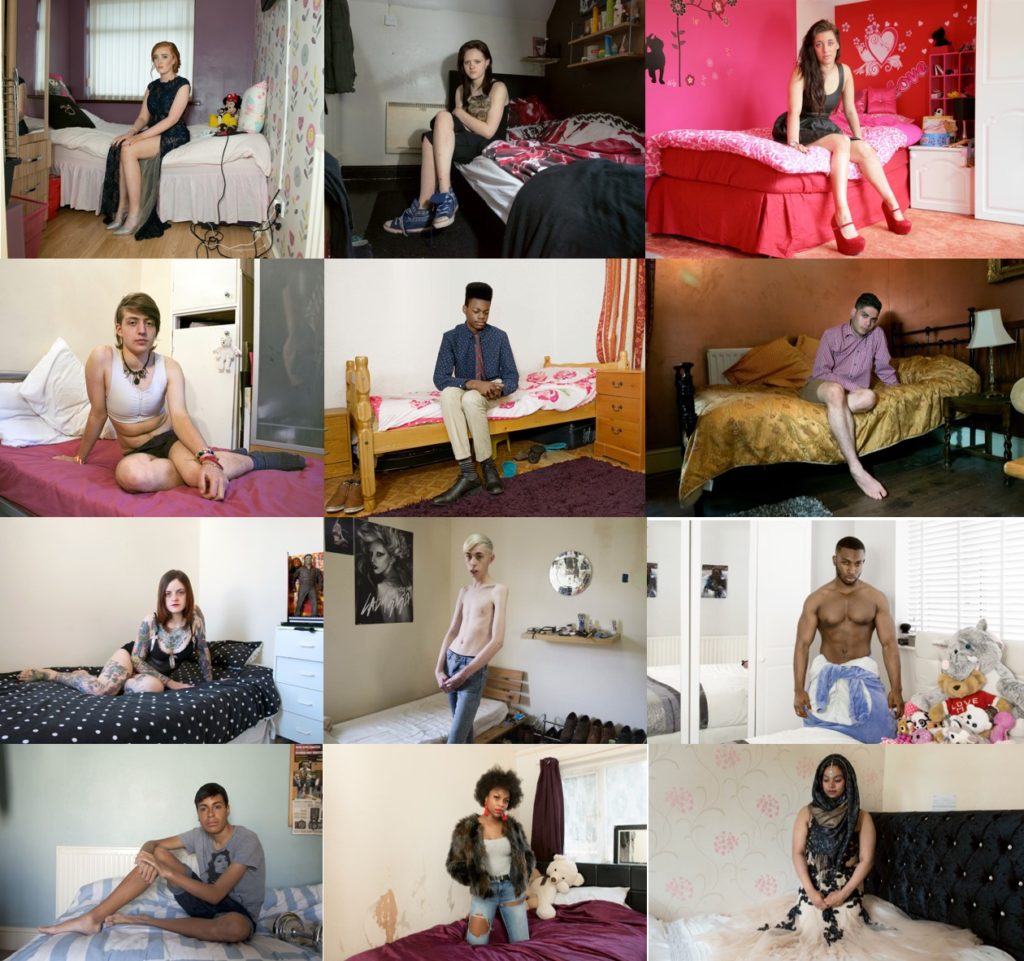
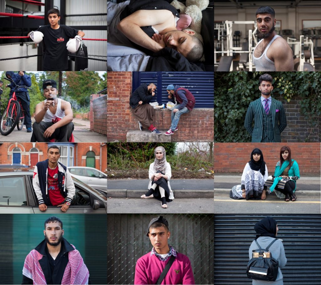
Mahtab Hussain is a British artist who captures images of his friends and family living their lives in a migrant country (in this case, London). These photographs show young Muslim men who no longer live in their native countries. Born in 1981, Hussain explores the important relationship between identity, heritage and displacement. His themes develop through long-term research articulating a visual language that challenges the prevailing concepts of multiculturalism. Hussian has publish 4 artist books. He specialised in Fine Art Photography in Goldsmith College and achieved an MA in Museum and Gallery Management, City University.

MAHTAB HUSSAIN – MOOD BOARD

Above is a mood board that I have created using Hussain’s images. I am using this photographer as a visual inspiration for my cultural photography plan. These photographs attracted my attention as most people are engaging with the camera and I think this give the images more context. My plan is to respond to this artist and explore this type of photography to a deeper level.

FINAL PHOTOGRAPHS

I have decided on 4 final photographs for my project. Each one of shoots were different in subject focus i.e. light, water, green, trees, and were inspired by a varied host of artists and photographers. My final outcomes and edited photographs from each shoot vary distinctively from one another, but are all still interconnected by nature. My project aim was to look at the variation and similarity within nature, so I categorized my shoots into nature topics that I felt would allow me to look at nature from multiple viewpoints . I focused on capturing texture, line, shadow and tone in my capture points. I looked at multiple artists and photographers for each category of nature, allowing me to have a spectrum of photographs inspired by a collection of different photographers.

Final photograph 1:

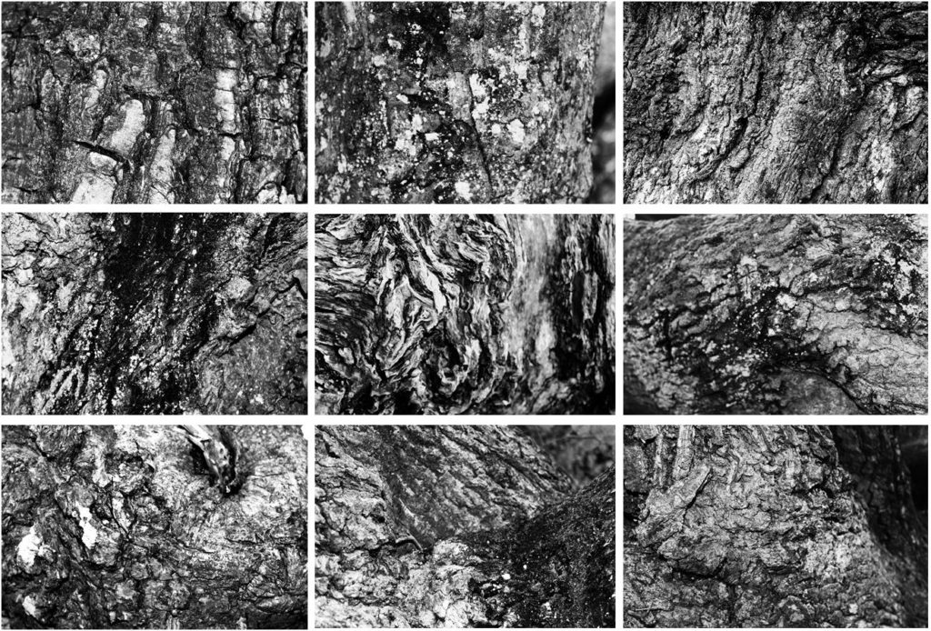
My first final photograph is from shoot 2, focused around ‘trees’. I aimed to look at trees from afar and very up close to capture the intricate detail and patterns of the tree bark. Final photograph 1 is a capture of 9 images arranged in a grid format, all of different angles and captures of numerous trees up close. I chose to arrange my photographs in this format as inspiration of Bernd and Hilla Becher who specialized in typologies and presenting multiple images of similar nature. All photographs from this shoot were edited into black and white individually as I felt the strong contrast of white and black, with shades of grey intertwined really emphasizes the tonal contrasts and shadows of my photographs effectively. My camera allowed me to present the complex detail of each curve, piece of moss, shape, bump and indent in the tree. I felt this linked back well to the idea of variation in nature as although each tree may look similar from afar, from up-close, it is evident that the detail differs greatly.

Final photograph 2:

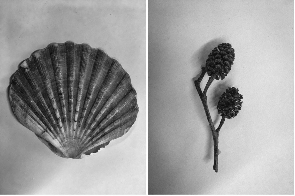
My second final photograph is from my second photographic shoot: natural forms. This photograph was taken in the style of botanical photographer Karl Blossfeldt. I photographed alternative natural forms as shown below rather than just flowers as I felt it was something different. I edited my images into monochrome and added ‘clarity’ and ‘sharpness’ to my images to emphasize the detail and tonal differences of the forms.

Final photograph 3:

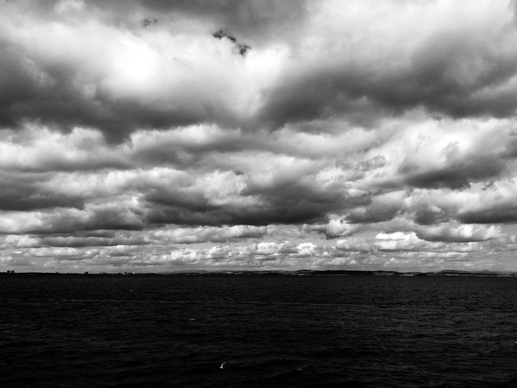
My final photograph 3 was taken in shoot 3, in response to cloudscapes. In this shoot, I took photographs in response to Alfred Stieglitz and John Day, two photographers with a very different visual style. This particular photograph was taken and edited by inspiration from Alfred Stieglitz’s Equivelents. Equivalents looks at dramatic black and white cloudscapes, an alternative viewpoint to many other photographers who photograph the sky in heavily saturated colour. In order to respond effectively, I edited this photograph in Lightroom CC, turning it into black and white then increasing the ‘contrast’, ‘clarity’ and ‘shadows’ to how I saw fit. This worked well and presented the billowing clouds as heavy and the image as very dynamic and bold. Cloudscapes can be looked at in many ways, exploring the serene and calm aspect of nature, or opposingly nature’s stormy and tempestuous character.

Final photograph 4:

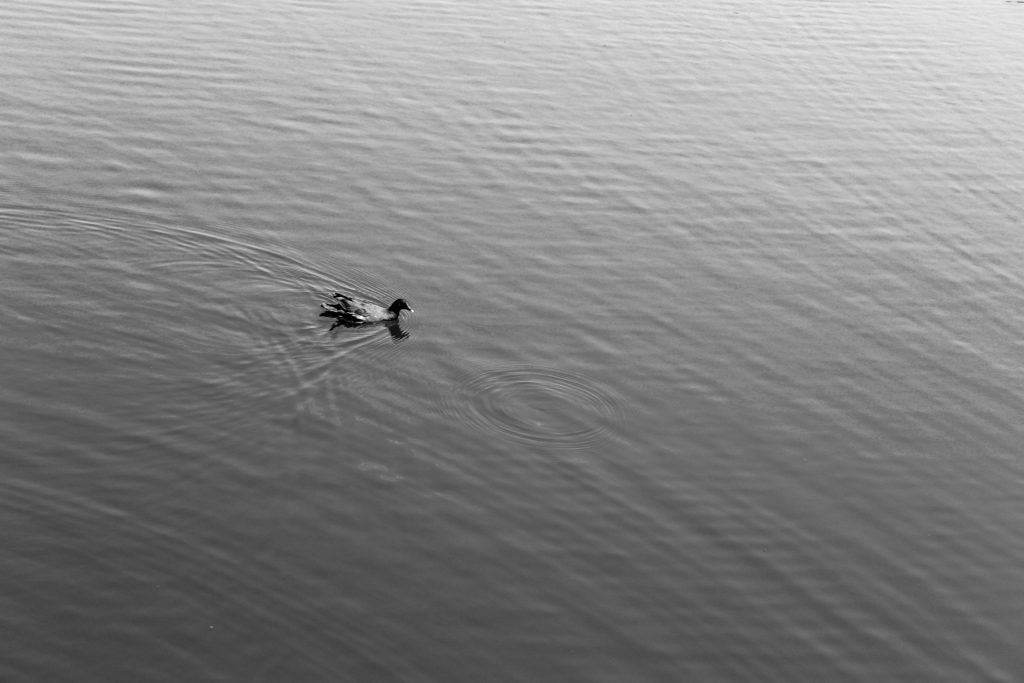
My 3rd final photograph comes from shoot 4, focused on the subject of water. I looked at Hiroshi Sugimoto’s work before this shoot, inspiring my style of response. This photograph looks at nature in an alternative way to my other photographs. This image is very simplistic and strips nature down to it’s most basic form, exploring the serenity and tranquility of how wildlife and the landscape come together to produce basic yet beautiful sights. There is little movement displayed in the water, only one single circular ripple where a raindrop has hit the water.

Final photograph 5:

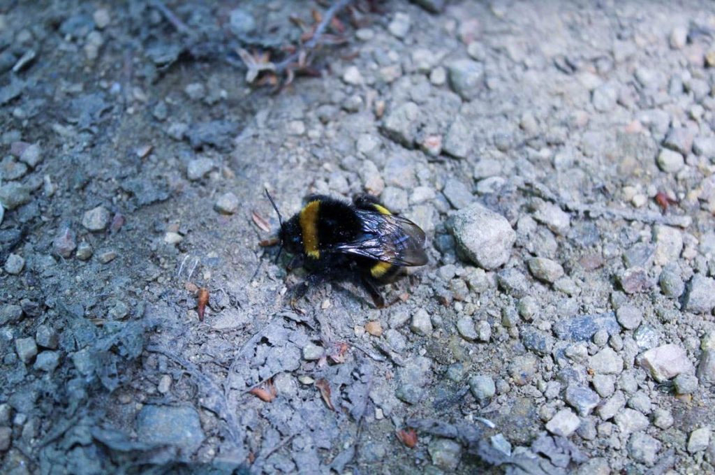
My second final photograph is from shoot 5, responding to Rinko Kawauchi. I got up-close to a bee to capture a very zoomed in look at nature’s produce. I aimed to capture the bee in detail, from it’s vibrant yellow colour, to the detail in it’s wings. The bee is the obvious main focal point of this photograph, situated centrally in the image; it contrasts well with the simplistic background of small rocks and stones.