

I thought that my close up image of the orange leaf would pair well with one of my koi fish images as both the main subjects in the images have orange tones which make them both connected. I experimented with two different koi fish images, one showing two fished overlapping each other and the other showing the movement of one fish through the ripples in the water. The first image is a calmer image, the water in the background being flat which gives it a more peaceful appearance. I like how the two fish are swimming near each other and are overlapping as they create an interesting shape in the water. This is contrasted to the second image which shows one fish coming to the top of the water, creating waves which i tried to emphasise when I edited the image. This image isn’t as calm as the first image and shows the texture of the water.
I think that the second combination is the best double page spread as the single koi fish swimming the water links better to the single leaf and has a similar rounded shape which is why I will use it in my photobook. Also the background of the images complement each other as they both reflect the light from the sun and have bright white sections, creating similar shapes on the water. I think hat this combination is the most effective and makes for the most interesting layout.


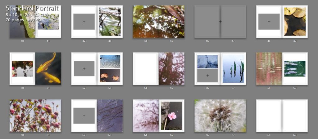
This double page I am planning to use as the first page in my photo book. I experimented by using a combination of two images on the pages, and a single image to see which was the best layout. The first double page with two images I like as the ripples in the water on the left side linking to the patterns in the second image of falling water. I like the first image as it draws on theories of abstraction through the bright red reflection of a person on the water that are warped and distorted. I also like how there are out of focus branches near the lens of the camera that add another natural aspect to the image and contrasting against the horizontal ripples of the water. This connects to the second image on the right page as there is also an section of a plant out of focus in the top right corner. The second double page is the single image of the water falling on the right side. I think that this is also effective as it focuses the reader onto that particular image so they aren’t distracted by the shapes the image that’s on the left of the other layout. I think this makes the appearance more peaceful which is why i am going to use the single image in my first page, and the image that was on the left on the page after. This is because both images are very detailed and think that they work best displayed alone.


I chose these two images to display as double pages as I think that the patterns are more detailed and noticeable when the image is filling the entire frame. I like how the first image has the bright red tones that range from right to dark, with the brightest pint being where the sun is hitting the leaves. I think this really links to my projects concept of spiritual qualities in nature emphasising the bright lights against it and the small patterns on the leaves.I also think that the second image is effective as a double page spread as there is a lot of detail in branched of the tree creating a very intricate pattern. I think this is why I will use it as a double page as I want to emphasises these aspects. I also think that this image links well to personal and spiritual aspects of nature through the yellow tones and the brightness of the image making it look peaceful and ethereal.


