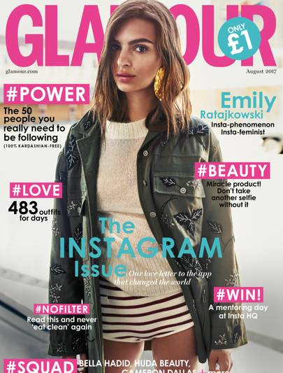
I have started thinking about and end result for this project and want to develop the idea of making a magazine which opposes the stereotypical conventions of fashion and beauty magazines. Mainstream beauty magazines sold in most shops follow similar conventions, in the sense that they are traditional in their representation of perfect women. Most covers feature one full bleed photo of a model or famous personality such as an actress or internet star. They are generally smothered in cover lines about the contents of the magazine, tips, stories, and statements such as “Miracle product! Don’t take another selfie without it” This particular issue features a famous model who has been styled and posed in a fashion shoot specifically for the cover, this suggests that the image is a constructed reality, a lot of work has gone into making her look effortlessly ‘beautiful’. The colour scheme along with the casual language (#NOFILTER) has been chosen to specifically appeal to a young female audience.

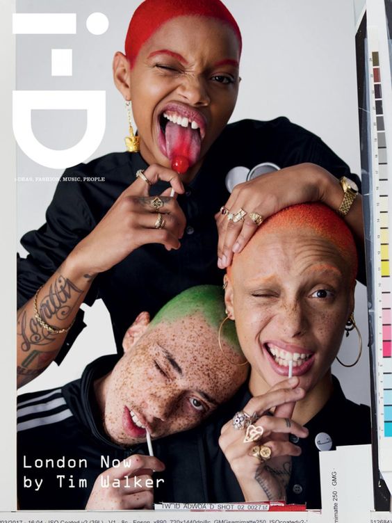
I want to base by magazine on a more modern contemporary style of publication similar to i-D or Dazed which push the boundaries of magazine and beauty conventions whilst still appealing to a youthful audience. I want to incorporate some elements from the clastic magazine style in an ironic way for example advertisements and sponsors. I want to keep a minimal colour pallet and and house style with pastels and neutral colours. I have collected images of magazine covers which have inspired me, I think their minimal styles are modern and clean which I will work well for my magazine which will predominantly include photographs with small amounts of copy. By not having any cover lines it will allow the photos to stand out more. Similarly to these examples I want to play around with different fonts which could be used for the masthead, it should be a style which looks good in any colour so it could be adapted depending on the cover image. Boarders is another feature that some of these magazine covers have, rather than having a full bleed image it is framed with a chosen colour which could be complimentary to the photo.
Because my magazine will predominantly include photos I want to experiment with different layouts to make the pages more interesting rather than traditional portrait placing. I am looking to incorporate text in a more creative way rather than having articles in columns . These examples I have found show a variety of ways I could frame images and use text within them. I like the way multiple images have been placed on the page in these examples by layering and different arrangements on a white background. Various texts have been used for example the hand written style which give a more personal feel and the more abstract warped texts used to frame the images.
Title Ideas
Looking at existing magazine titles such as Vogue, Cosmopolitan, Glamour, Bazar and Elle they have statement titles which say something about their style. For my magazine I want the title to make a clear statement about the images it will display and the idea of beauty ideals and perfection within the mass media. I have considered having the title as ‘beautiful’ or ‘perfect’ in an ironic way to contrast and question with the stereotypical beliefs. I also thought of naming it ‘Ugly’ as a comment on the labels people are given if they don’t conform or appear to be perfect.


