This equals that

By Jason Fulford & Tamara Shopsin

As research for inspiration for the design and layout of my own photobook I have looked at and analysed the book “This equals that” by Jason Fulford and Tamara Shopsin, the book consists of a series of page spreads each with two images next to each-other which relate to each-other through various things such as shapes, colours or composition. The purpose of the book is for people to find conceptual associations between the images and to discover how one image leads to another. Through a simple narrative and rhythmic sequence of photographs, the book raises multiple meanings, making the experience of reading the book interactive. Each spread presents a new relationship that changes and shifts as the book unfolds, with the last picture relating again to the first, forming a circle. This is something that I have taken in mind when considering the layout of my own book, when creating my design I kept in mind the relationship between each photo through shapes colour and composition, whether it be the photo on the other side of the page or on the next set of pages.

Rorschach Test Response

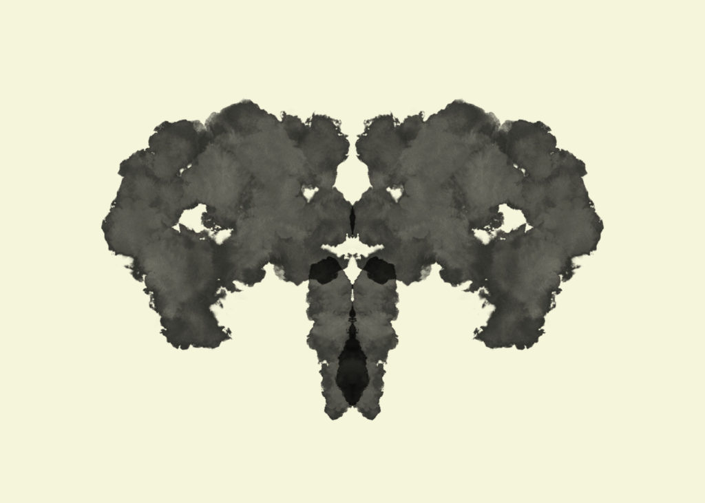
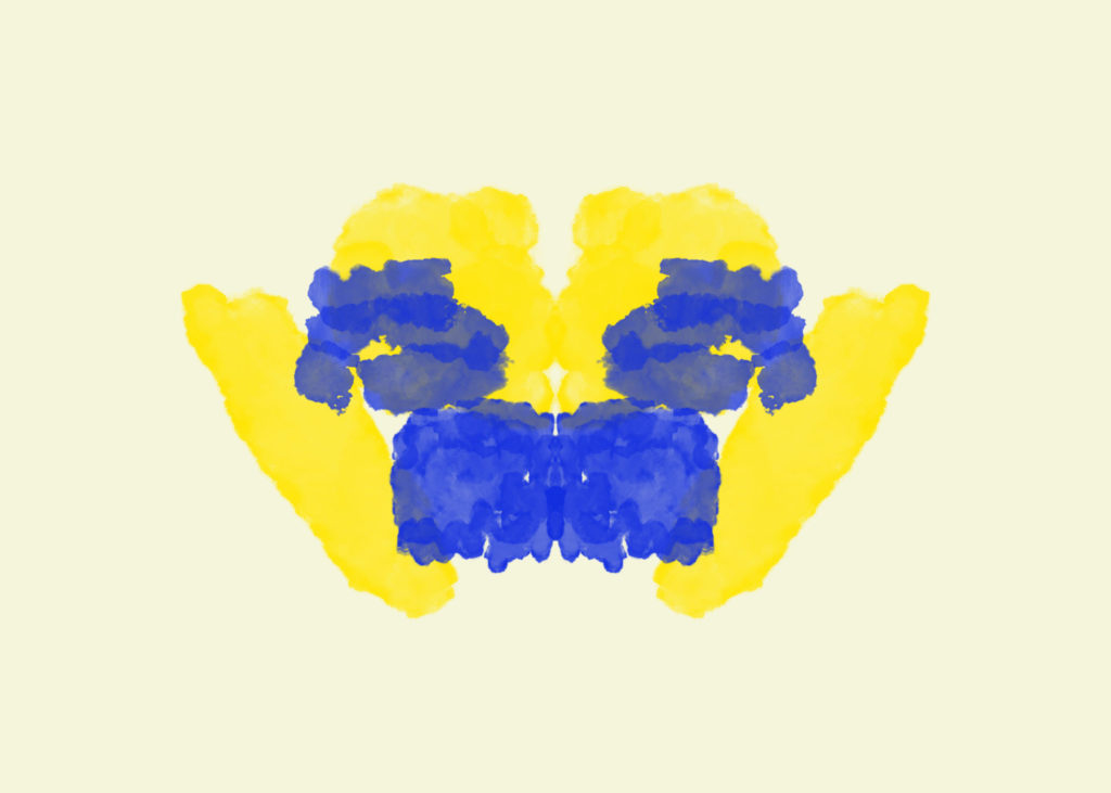
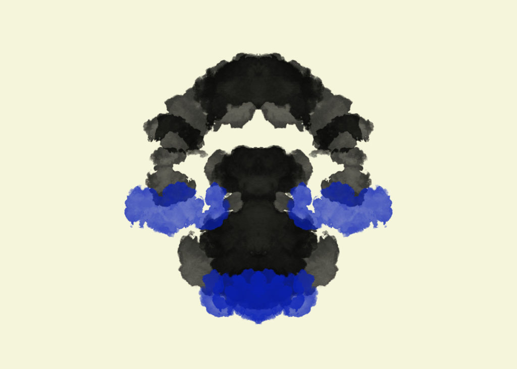
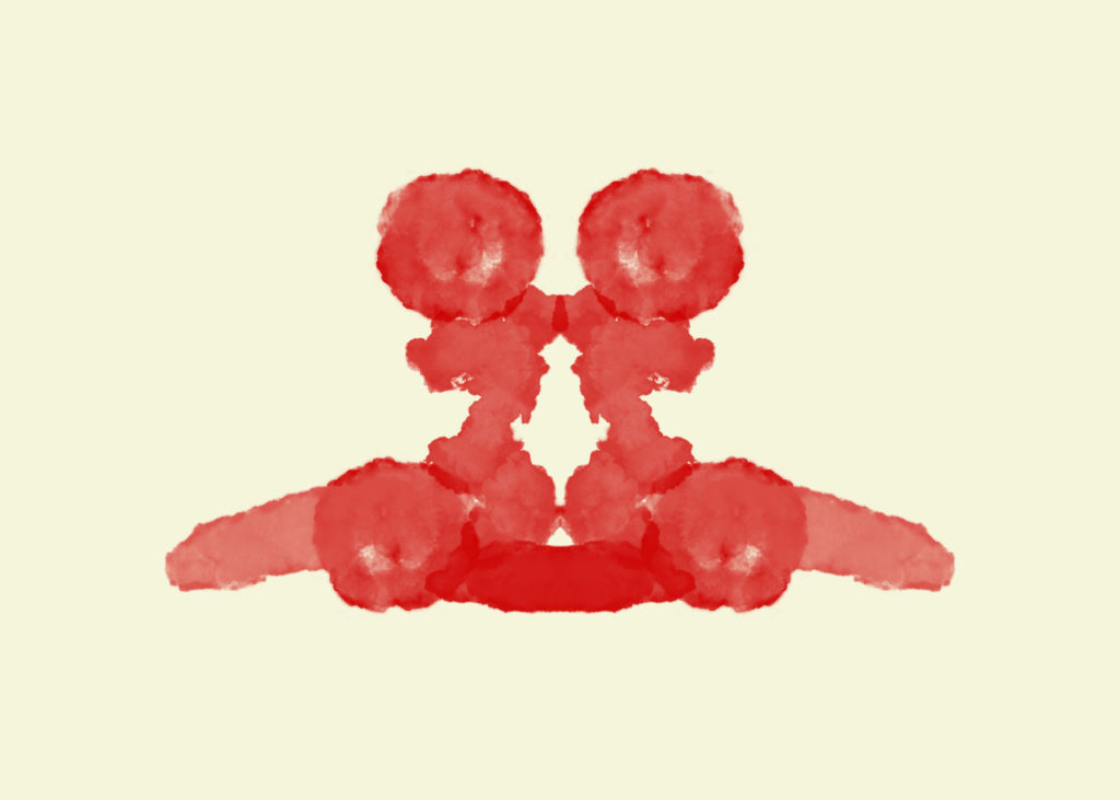
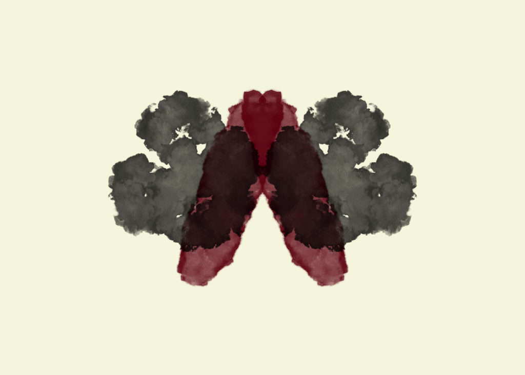
Using custom “wet ink” paintbrushes that I found online, I created Rorschach Ink Blots. I changed the colour of the background to beige (R:245, G:245, B:220) to resemble that of the original prints. I painted in symmetry mode so that the shapes were the same on both sides.

These are the brushes I used: 1 & 2

After completing the 12 ink blots, I asked a selection of people to respond to what they perceive the shapes as. I received a variety of responses as different people have interpretations, however there was also some common responses.

Popular Responses:

Inkblot 1: Skull, Uterus, Bull, Elephant, Two people looking at each other

Inkblot 2: Clown, Carrot

Inkblot 3: Two people holding two babies

Inkblot 4: Spider, Two cupid angels, Two shaggy dogs

Inkblot 5: Frog under a rainbow, Lake with arch, Angry dog

Inkblot 6: Dog, Gorilla, Tarantula, Muscular person

Inkblot 7: Two women back to back

Inkblot 8: Moth, Diseased lungs

Inkblot 9: Two rabbits

Inkblot 10: Skull, Shouting man, Beetle, Bird, Frog

Inkblot 11: Two people kissing, face, Two statues, Gloves, Two Japanese women

Inkblot 12: Butterfly, Heart

ESA // SPECIFICATION

After researching different photographers, the photographer who most caught my attention was Mahtab Hussain. This photographer looks at his cultural background and how people live nowadays. I have chosen to follow this photographer for this project because the life that Portuguese people live, really interests me. I decided to do this and plan to take photos of my day to day life, to show how youngsters live in a different country. I thought this would be the ideal project to look into because there are so many immigrants in Jersey which originate from Portuguese speaking countries, mainly Madeira.

In my images I aim to show how gender affects different lifestyles in the Portuguese community. I also believe that these ideas affects the younger generation due to the respect insisted by older family. I find this very interesting as I believe that males tend to live a free life, whereas females tend to stay home with their mothers. Portuguese men traditionally go for heavy duty jobs, mainly in construction and women work more in domestics. I aim to focus on family, relationships, home life and religion/tradition.

Living within a Portuguese family allows me to explore these details with more depth and explore the variations and similarities within different cultures. I will be doing this by shooting specific hours and days in my day to day life that I believe strongly represent other Portuguese families and immigration from Portuguese to English speaking countries. Stereotyping plays a huge role in this project, not all migrant Portuguese families live the same way however, I believe that there is a stronger relationship to this with Madeiran families rather than main land Portugal. I think this is the case as Portugal tends to be more advanced and people tend to be more accepting of the new ways of thinking, on the other hand, Madeiran families can be narrow minded and insist a lot of respect with the older ways of thinking. With this project, I want to show how important religion is to most Portuguese families, along with family traditions and the difference in lifestyles from males and females, both old and young.

When doing my research I decided that my main subject in all photographs was going to be people. I have always had an interest in portraits and exploring different types through my camera. A lot of my personal work also includes facial features, from humans and animals too. Silence says more than a speech and actions speak louder than words and I enjoy the fact that photographs are silent moments, and silent moments are usually used to appreciate situations.

My love for silence has sprung from my experiences in photography where I have been able to understand people from a deeper perspective and after living difficult situations in life I always explore peoples facial expressions, and focus on the eyes. Whilst also exploring the life of an immigrant through portraiture, I also plan to capture images of objects, possibly handmade/traditional. I rarely photograph objects but I think it could be really strong used as a pause between the images.

Magazine Ideas

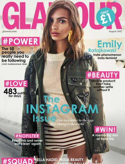
I have started thinking about and end result for this project and want to develop the idea of making a magazine which opposes the stereotypical conventions of fashion and beauty magazines. Mainstream beauty magazines sold in most shops follow similar conventions, in the sense that they are traditional in their representation of perfect women. Most covers feature one full bleed photo of a model or famous personality such as an actress or internet star. They are generally smothered in cover lines about the contents of the magazine, tips, stories, and statements such as “Miracle product! Don’t take another selfie without it” This particular issue features a famous model who has been styled and posed in a fashion shoot specifically for the cover, this suggests that the image is a constructed reality, a lot of work has gone into making her look effortlessly ‘beautiful’. The colour scheme along with the casual language (#NOFILTER) has been chosen to specifically appeal to a young female audience.

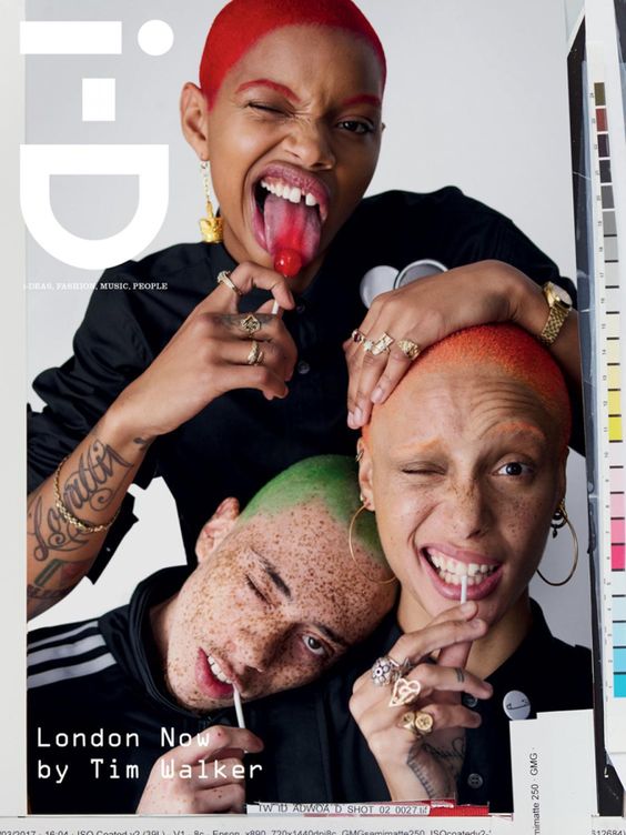
I want to base by magazine on a more modern contemporary style of publication similar to i-D or Dazed which push the boundaries of magazine and beauty conventions whilst still appealing to a youthful audience. I want to incorporate some elements from the clastic magazine style in an ironic way for example advertisements and sponsors. I want to keep a minimal colour pallet and and house style with pastels and neutral colours. I have collected images of magazine covers which have inspired me, I think their minimal styles are modern and clean which I will work well for my magazine which will predominantly include photographs with small amounts of copy. By not having any cover lines it will allow the photos to stand out more. Similarly to these examples I want to play around with different fonts which could be used for the masthead, it should be a style which looks good in any colour so it could be adapted depending on the cover image. Boarders is another feature that some of these magazine covers have, rather than having a full bleed image it is framed with a chosen colour which could be complimentary to the photo.

Because my magazine will predominantly include photos I want to experiment with different layouts to make the pages more interesting rather than traditional portrait placing. I am looking to incorporate text in a more creative way rather than having articles in columns . These examples I have found show a variety of ways I could frame images and use text within them. I like the way multiple images have been placed on the page in these examples by layering and different arrangements on a white background. Various texts have been used for example the hand written style which give a more personal feel and the more abstract warped texts used to frame the images.

Title Ideas

Looking at existing magazine titles such as Vogue, Cosmopolitan, Glamour, Bazar and Elle they have statement titles which say something about their style. For my magazine I want the title to make a clear statement about the images it will display and the idea of beauty ideals and perfection within the mass media. I have considered having the title as ‘beautiful’ or ‘perfect’ in an ironic way to contrast and question with the stereotypical beliefs. I also thought of naming it ‘Ugly’ as a comment on the labels people are given if they don’t conform or appear to be perfect.

Photobook Design Experimentaion

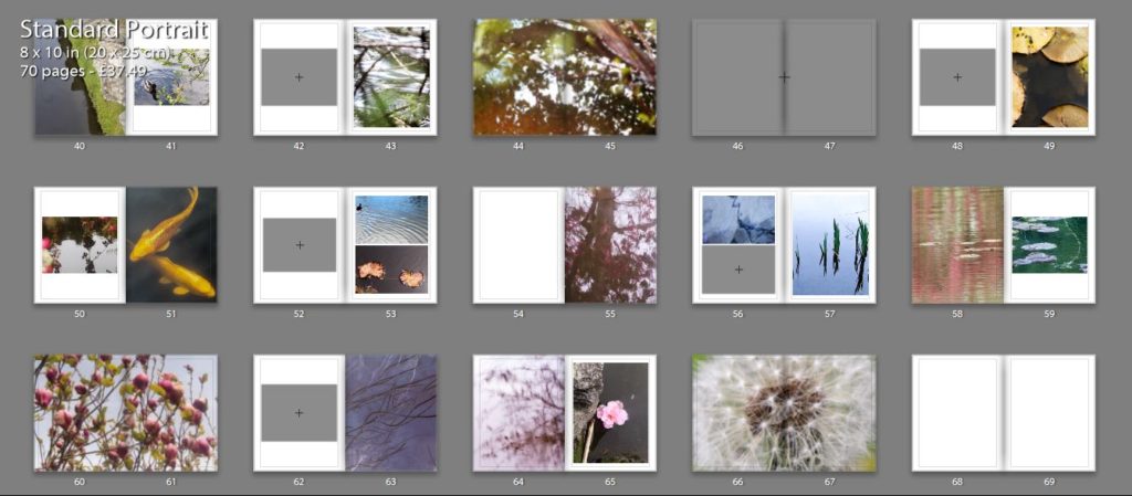
I thought that my close up image of the orange leaf would pair well with one of my koi fish images as both the main subjects in the images have orange tones which make them both connected. I experimented with two different koi fish images, one showing two fished overlapping each other and the other showing the movement of one fish through the ripples in the water. The first image is a calmer image, the water in the background being flat which gives it a more peaceful appearance. I like how the two fish are swimming near each other and are overlapping as they create an interesting shape in the water. This is contrasted to the second image which shows one fish coming to the top of the water, creating waves which i tried to emphasise when I edited the image. This image isn’t as calm as the first image and shows the texture of the water.

I think that the second combination is the best double page spread as the single koi fish swimming the water links better to the single leaf and has a similar rounded shape which is why I will use it in my photobook. Also the background of the images complement each other as they both reflect the light from the sun and have bright white sections, creating similar shapes on the water. I think hat this combination is the most effective and makes for the most interesting layout.

This double page I am planning to use as the first page in my photo book. I experimented by using a combination of two images on the pages, and a single image to see which was the best layout. The first double page with two images I like as the ripples in the water on the left side linking to the patterns in the second image of falling water. I like the first image as it draws on theories of abstraction through the bright red reflection of a person on the water that are warped and distorted. I also like how there are out of focus branches near the lens of the camera that add another natural aspect to the image and contrasting against the horizontal ripples of the water. This connects to the second image on the right page as there is also an section of a plant out of focus in the top right corner. The second double page is the single image of the water falling on the right side. I think that this is also effective as it focuses the reader onto that particular image so they aren’t distracted by the shapes the image that’s on the left of the other layout. I think this makes the appearance more peaceful which is why i am going to use the single image in my first page, and the image that was on the left on the page after. This is because both images are very detailed and think that they work best displayed alone.

I chose these two images to display as double pages as I think that the patterns are more detailed and noticeable when the image is filling the entire frame. I like how the first image has the bright red tones that range from right to dark, with the brightest pint being where the sun is hitting the leaves. I think this really links to my projects concept of spiritual qualities in nature emphasising the bright lights against it and the small patterns on the leaves.I also think that the second image is effective as a double page spread as there is a lot of detail in branched of the tree creating a very intricate pattern. I think this is why I will use it as a double page as I want to emphasises these aspects. I also think that this image links well to personal and spiritual aspects of nature through the yellow tones and the brightness of the image making it look peaceful and ethereal.