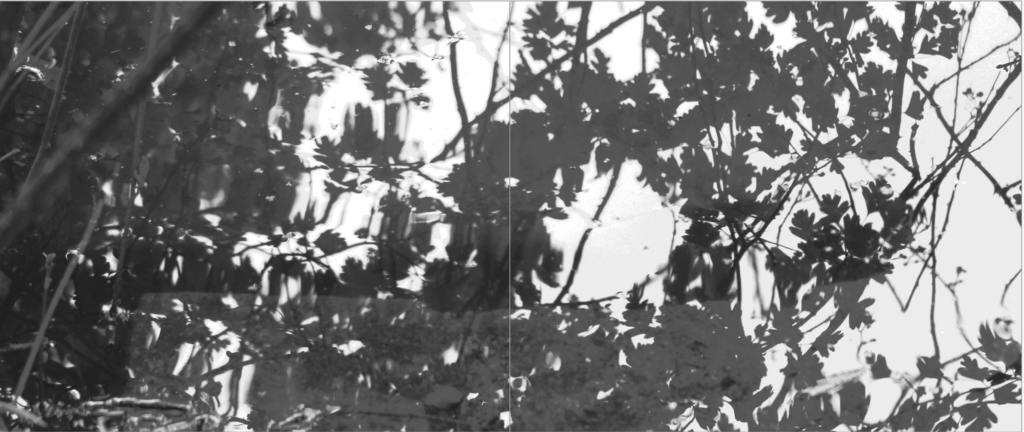
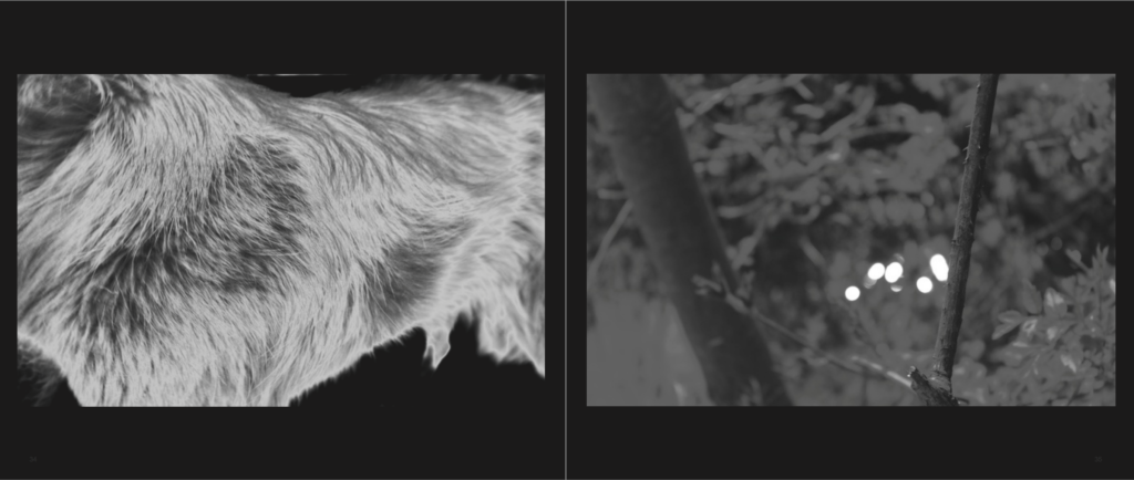
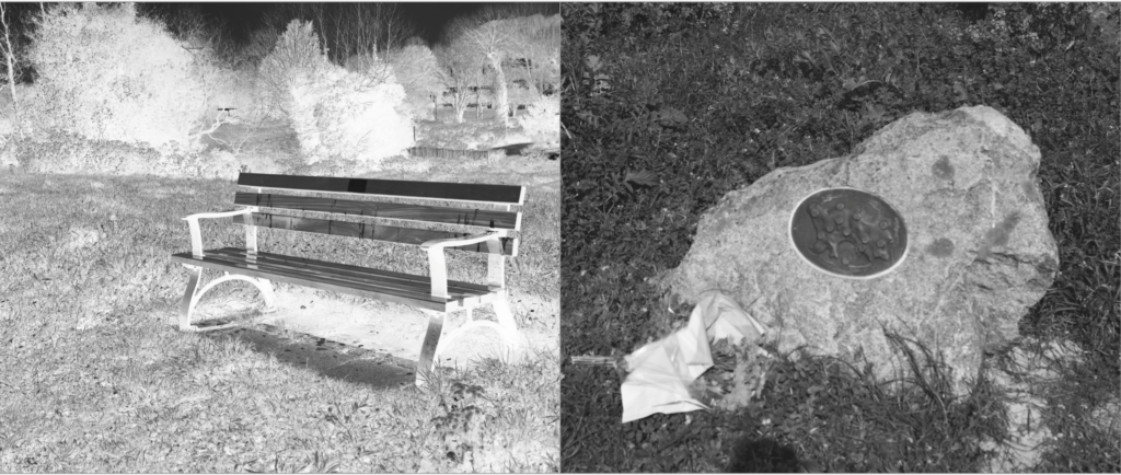
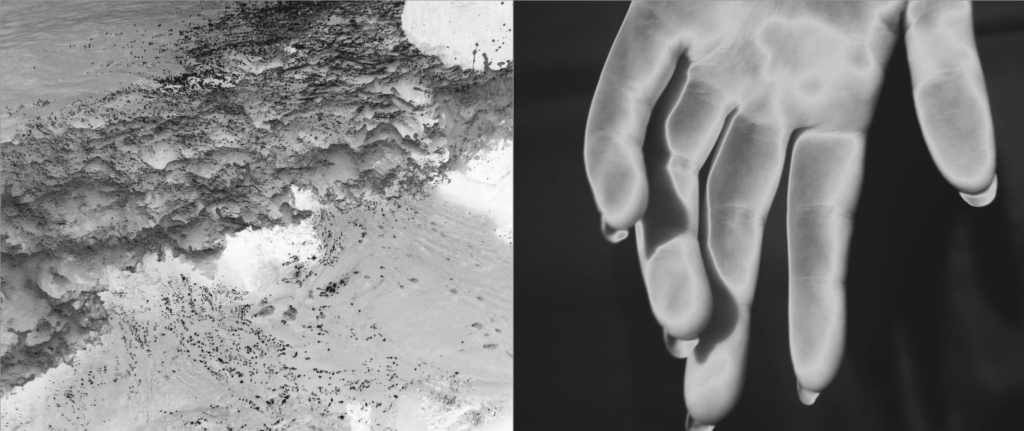
When developing my final book I wanted to have something unique, something I have never done before, and originality that meant my final presentations will be unlike any others. To do so I started off with developing the book. I Knew for my book I wanted to create a black and white tonal book. This soon transpired to having silver and black ink inverted to create glowing images. I also knew that for my narrative of life from birth to death, told through the story of creation, That I would need a long narrative. To do so I first off assigned myself 100 pages, then narrowing down only the best images to around 87 pages in total. Furthermore, to go in hand with his over exaggeration of visual overload due to the volume, I decided to have an image on every single page, so to go hand in hand with this large effect. In the end I was left with an array of different displays, differing from two full bleeds, to some with black boards to full double page spreads. The distorted array not being continually mimicked was very effective and something which Made the narrative of my book, perhaps, more enjoyable, as you are able to take your time when looking through each of the images. As spoken about previously the finality of my book was found within previous books such as Astres Noirs.
My final book layout:
The paper used will be matte, I have chosen this as I have very deep blacks, it would be definitely better for the exposure and use of my colour tones. I then Decided on the front cover that I wanted an image wrap of one of my final prints, of white branches intertwining, This to my mind both perfectly combines that of tranquility and creation of heavenly light, with the fragility of life itself. The title of my book is called: Ascension. I chose this as it is a word which not only has clear indexical connotes to that of the story of creation, Adam and eve being created and ascending into earth, but too links in with the each part at the end of my narrative, and so forming a relation of going into heaven, or being carried up. The wrap around on the cover will not be fabric, as it is a more post-modern book focusing on themes such as religious sentimentality in the 21st century, I want this slick new feel to be evident within my cover, as this is what is to be found inside my book. A pivotal of My book is the primary source of my presentation, it has the majority of my images, and too combines a clear narrative experience throughout: My final layout:


