Final A3 Print Display Plan

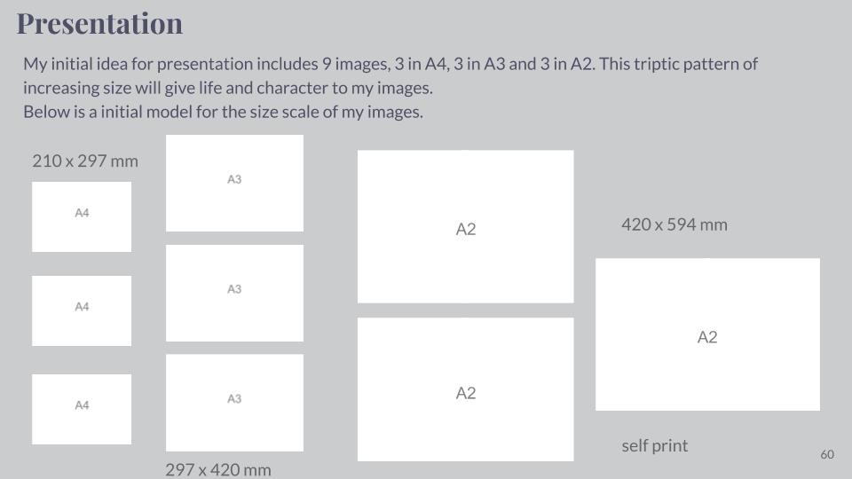
As I made evident and described in my previous post I have decided that I will compose 6 A3 prints of my Photo-montages. This post will be a plan of how I intend to display these prints. So firstly I needed to lay out some simple compositions of the images which I intend to have printed to scale. Here are the 5 options which I have come up with…

1
2
3
4
5

After laying out these compositions on Photoshop, I decided that simply based on what I believed to be most aesthetically pleasing that I would pursue option 4. However I have various options as to how I could display these prints such as many ways of: Framing, mounting and foam board. However after ruling out framing as an option due to the fact that it would over-complicate the display, from mounting or foam board I have decided that I will create a layered foam board display.

I intend to have each print on its own piece of foam board to the right dimensions, and then proceed to use double sided tape in order to attach the 6 prints to 2 full sized boards of foam. These two boards will be held together using support pieces of foam taped across the back of the two boards.

Using an easel (Photo shoot 5) – Editing

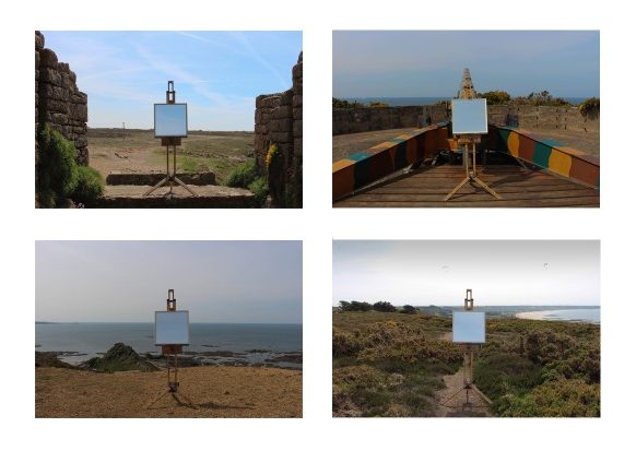
These are the images I edited from my Photo Shoot 5.

I firstly edited all the photos to make the easel and mirror be symmetrically in the middle in all the images. I also altered the lighting and contrast of the images to get them all to a consistent level.

I then experimented with laying the images out in a typology style in different formats to show how their appearance could change. I also changed the images into black and white to see how their look changed. I preferred the images in black and white as I think it adds to the old feel of the images as they do not contain any modern objects.

This image has an empty alt attribute; its file name is IMG_0711-2-1024x683.jpg

To take this image I went to my desired location of the rural cliff-paths and found a area with a backdrop that I liked. Once in this area I located the easel in a flat place where it was stable and horizontal to the horizon. Once I was happy with this, I locked the mirror in place so it couldn’t fall out or be blown over by the wind. I chose to take this set of images without a tripod as it would be easier to position and angle the camera like this. If I had to categorise this style of it would be a conceptual landscape as it is not oblivious as first the meaning of the image.