David Benjamin Sherry

David Benjamin Sherry is an American photographer and avid darkroom printer who is challenging and reinvigorating the American Western landscape tradition among other classic genres of photography. His work revolves around interests in the analog film process, environmentalism, color, mysticism, abstraction, human connectedness in the digital age, minimalism and queer politics, and he ultimately aims to reexamine the history of photography. He’s best known for his iconic monochromatic darkroom printed landscapes, a project born from his love of the outdoors and the protected natural landscapes of North America. Eventually these interests developed into new projects, raising deeper concerns for the rapidly changing environment, while continuing to sustain his queer sensibility in the hetero-male dominated canon of photography. Part-archeologist and part-futurist, Sherry uses a large format 8×10 film camera in order to reflect and contemplate our place within the contemporary American landscape.

Muley Point I, Bears Ears National Monument, Utah, Monuments, 2018

The revivification and radicalization of the colonial, heteronormative history of American landscape photography—which, ironically, is gorgeous and irresistibly romantic—is David Benjamin Sherry’s modus operandi in Monuments, eight photographs that feature scenes from the National Monuments threatened by the Trump administration. By celebrating and honoring the environmental ethic, kinship with wilderness, and formal mastery of pre-digital, film-based, darkroom photography popularized by Edward Weston, Minor White, Ansel Adams, and Robert Adams, Sherry keeps this heroic tradition alive by communing with far-flung forests and deserts to locate compositions that he transforms into sublime images. But his relationship to the forefathers stops there; his practice conceptually centers itself in education and rejection of perpetuating the corrupt political history of the American West, whose legends of freedom are fabricated from stolen lands which have been “consistently raped, abused, and destroyed,” as Sherry says.

The politics in this exhibition cannot be denied. This series features images of the Trump administration’s final list of National Monuments whose protected status will be illegally violated and “scaled down” to be sold in interest of coal, uranium mining, and oil drilling. While some photographs depict areas slated for imminent development (Muley Point I, Bears Ears National Monument, Utah, 2018), some portray areas that may not be immediately at risk (Rio Grande del Norte National Monument, New Mexico, 2018). In selecting this suite of images, Sherry preferred to openly commemorate the experience of visiting these remote, sacred, ecologically significant places, by choosing to “embody the whole monument” and embracing awareness of, “what’s safe today may not be safe tomorrow.” Oregon’s Cascade-Siskiyou, Utah’s Grand Staircase-Escalante, and Nevada’s Gold Butte—one gets lost in each image and can physically feel space, vertigo, silence, geological force, weather conditions, and time of day. This is due, in part, to large-format printing and a large-format camera – an 8×10 whose generous negatives can pack more information than high-resolution digital images. But it’s also the result of Sherry’s reverence to place: revisiting his favorite cottonwood tree five times over various seasons or returning to the Grand Staircase – Escalante National Monument over the course of ten years. Adoration and awe are media as much as photography itself for Sherry, who started his photographic exploration of National Parks in 2007 after the death of a close friend to seek the “eternal life around us,” his best photos strike a “quiet equation… that record light over landscape to define form and to find beauty.”

The monochrome printing process Sherry has developed is very much his own — he developed this after mastering “natural or straight” color printing. This process was achieved through the study of color theory and understanding the powerful effect color can have on a viewer. After spending years devoted to black and white photography, Sherry created the monochrome color in his work, as a parallel to the black and white process while even incorporating the zone system. Sherry creates a monochrome hue by using varying degrees on the Cyan-Magenta-Yellow dials on his enlarger, he pushes the color without losing image quality, to achieve the hue that he has actually “pre-visualized” at the moment the photo was taken. Sherry has amassed an archive of color test strips as a kind of reference guide for the system he’s developed for conveying an emotional response, a mood and a tone. For Sherry, monochrome color and black-and-white photography are siblings, because of their “abstraction from reality by highlighting form, light and composition.”

Although humans are absent in these photos, queer narrativity is built into both the process and product via Sherry’s own queer subjectivity. With this environmental work, Sherry aims to disrupt prevailing, institutionally-entrenched understandings of nature and sexuality. Sherry aligns his views with eco-feminism and believes that the destruction of our planet stems from the oppressive forces of the white male hegemony, and that those forces have acted violently against Mother Earth and will continue to do so unless we begin to think differently about our relationship to the Earth and to women and all “others.” Hetero-cis-white male forces, who have controlled our land for centuries, have knowingly forced the ghettoization of these minorities in urban areas, while they control and violate the natural world at will.

Additionally, Sherry considers travel for these pictures to be a tool in understanding the queer experience in mainstream society, as he navigates solo through rural spaces and communities not traditionally considered “safe” for queer people, and is faced with his “otherness” everywhere he goes. “The photo is a vehicle for talking about identity,” says Sherry. By co-opting the formal language and traditional practices of his forefathers while imbuing his finished product with his queer aesthetic and agenda, Sherry presents us with a radical new perspective of the West.

So, while these photographs grapple with grim and angering political circumstance, they paradoxically exude an adventurous, near-psychedelic joie de vivre through his use of color and form: they represent liberation, independence, resistance, and self-determination; American qualities that we supposedly hold dear, but which are constantly imperiled as the land itself. Interconnectedness between identity and the earth becomes Sherry’s poetic call for liberation from the patriarchal power structure that has controlled and abused our public lands for millenia. “With the continued destruction of our planet, we as a society are losing grasp of our deep co-dependence with the earth, and as that connection disintegrates, the key to our survival as a species has also begun to fall apart. Unless we all take action, we are only hastening our own demise.”


Rio Grande Gorge, Rio Grande del Norte National Monument, New Mexico, Monuments, 2018
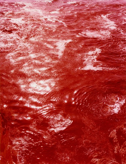
Extensions and Dimensions, Point Lobos, California (for Edward Weston), Climate Vortex Sutra, 2014
Traditional Color Darkroom Photograph, 90 × 70 inches
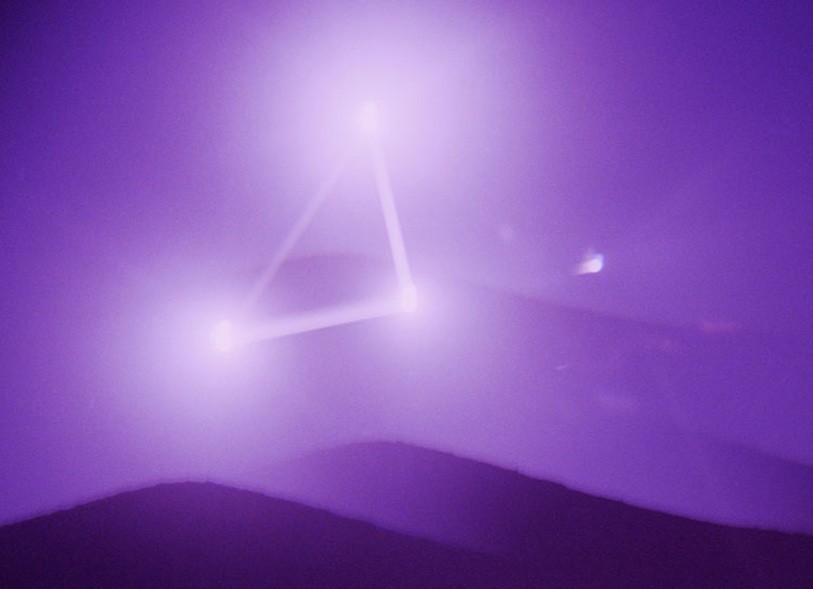
3 Suns Rose Before Me, Birth in Futureverse,
Traditional Color Photograph, 30 x 40 inches
Spectral Green Star Machine, Birth in Futureverse
Traditional Color Photograph, 30 x 40 inches
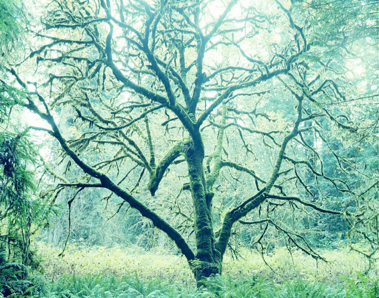
Stand With Your Lover On The Ending Earth, Birth in Futureverse,
Traditional Color Photograph, 72 x 91.5 inches

Image Analysis:
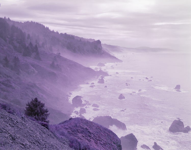
All Matterings of Mind Equal One Violet, Birth in Futureverse,
Traditional Color Photograph, 30 x 40 inches

David Benjamin Sherry captures a seascape in natural daylight, he uses a deep depth of field to capture it entirely in clarity. However, there is a subtle blur due to the sea spray, this covers the land as it disappears into the distance. The purple colour comes in the printing process, where Sherry achieves a range of tones by exposing different areas at different levels. Because of this, the image appears to reach out with a 3D effect in areas where the purple colour is stronger.

Sherry reflects the use of colour in the title of the series, ‘Birth in Futureverse’, obviously believing the World is colourful and that colour represents the differences between us.

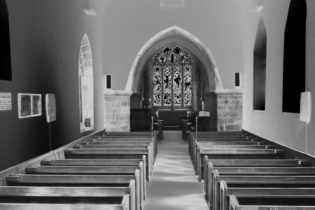
Graveyard and church shoot

contact sheet:

edits:

Analysis: This shoot had a direct narrative purpose, to show a clear evident relation to death itself. I wanted to capture an element of atmosphere throughout this shoot, accessing elements such a the surrounding area and combining this with forge-grounding and backgrounding. And many of my images were about the beginning of creation, showing nature, human life seen within a more positive manner, I thought it was necessary to get a direct presentation of the aspects of death and religion itself, but last to get images that were of a structured building and form t contradict and from a different composition than those that didn’t. Not only this but within the old church building and the dark deteriorating stone, compared to the life filled trees I was able to capture these huge contradicting colours and tones which personally I think is what makes this shoot the most successful.

Artist Reference – Eggleston

Who is he?

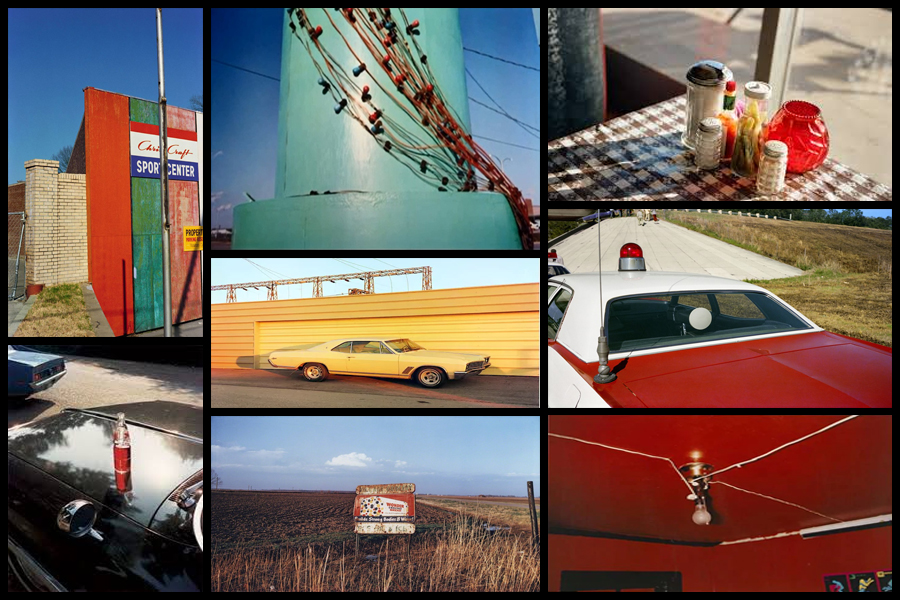
Since the early 1960s, William Eggleston used color photographs to describe the cultural transformations in Tennessee and the rural South. He registers these changes in scenes of everyday life, such as portraits of family and friends, as well as gasoline stations, cars, and shop interiors. Switching from black and white to color, his response to the vibrancy of postwar consumer culture and America’s bright promise of a better life paralleled Pop Art’s fascination with consumerism. Eggleston’s “snapshot aesthetic” speaks to new cultural phenomena as it relates to photography: from the Polaroid’s instantaneous images, the way things slip in and out of view in the camera lens, and our constantly shifting attention. Eggleston captures how ephemeral things represent human presence in the world, while playing with the idea of experience and memory and our perceptions of things to make them feel personal and intimate.

Color has a multivalent meaning for Eggleston: it expressed the new and the old, the banal and the extraordinary, the man-made and the natural. His non-conformist sensibilities left him open to explore the commercial printing process of dye transfer to see what it could contribute to picturing reality in color rather than the selling of lifestyles, concepts, and ideas. His brief encounter with Warhol exposed him to forms of popular photography and advertising, contributing to his experimental attitude toward the medium. Eggleston’s use of the anecdotal character of everyday life to describe a particular place and time by focusing either on a particular detail, such as an object, or facial expression, or by taking in a whole scene pushes the boundaries of the documentary style of photography associated with Robert Frank and Walker Evans’ photographs. His insider view allowed him to create a collective picture of life in the South, capturing how it transformed from a rural into a suburban society. Some examples of his work can be seen below:

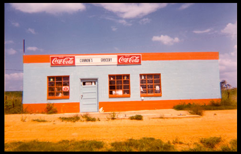
The snapshot aesthetic provided Eggleston with the appropriate format for creating anecdotal pictures about everyday life. Its association with family photographs, amateur photography, as well as Kodak’s Brownie camera (which was useable by everyone) lent his work the proper proportions and personal attitude toward the impersonal everyday. I wanted to make colour one of my main focuses when photographing the selected areas, here I found that looking and analyzing an image would prove to be most effective as it would allow an insight for me into the technical, visual and conceptual aspects of the photo that make it so aesthetic through over-saturation. The image I have chosen is called “Cannon’s Grocery, near Greensboro, Ala” and was taken 1972:

Visual: Visually the image is very aesthetic from the amount of warm colours that are present within it such as the oranges, yellows and blues. For me these colour provide us with a sense of uniqueness as all supposedly contrast each other, however instead it compliments with the colours of the building reflecting the surrounding environment like the desert and sky. Overall the piece only consists of about four to five different colours making it very simplistic regarding what can be seen, however a filter has been used to enhance the yellows and blue and create an almost artificial environment of something that may be seen on a movie set. What draws me in is how out of place the building seems as it vibrant colours are perhaps the opposite of what the desert could be seen as, giving the impression for viewers of something that could be seen for miles due to it being so out of place from its surrounding environmental landscape.

Technical: When looking over the photograph it is clear to say that a filter has been used to create an artificial feel to the overall piece due to certain colours like yellow being implicitly present through the image. A regular shutter speed and slightly lower higher exposure has been used to create a crisp and in focus shot being devoid of overpowering shadows or motion blur. The photographer has obviously made the building the focal point of the piece due to how it instantly draws the viewers attention due to its randomness regarding the surrounding environment with the yellow sand being used as a way to stop the building from dominating the composition and being too overpowering. Finally the colours have definitely been taken into consideration due to how each one contrasts another colour within the photo providing an obvious sense of old school aestheticism due to how they aren’t as crisp as they could be.

Conceptual: The image was taken at a time when the art world shunned colour photography. The solo show the Eggleston but on at the Museum of Modern Art in 1976 broke through this black and white barrier as it paved the way for wider acceptance of art and making it the preferred medium. The photograph itself represents the exciting time period in photograph when an image’s tone was more provocative than its subject.

Presenting Compositions as GIF’s

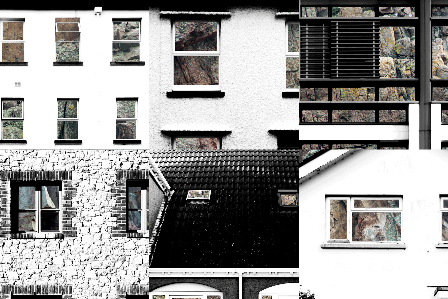
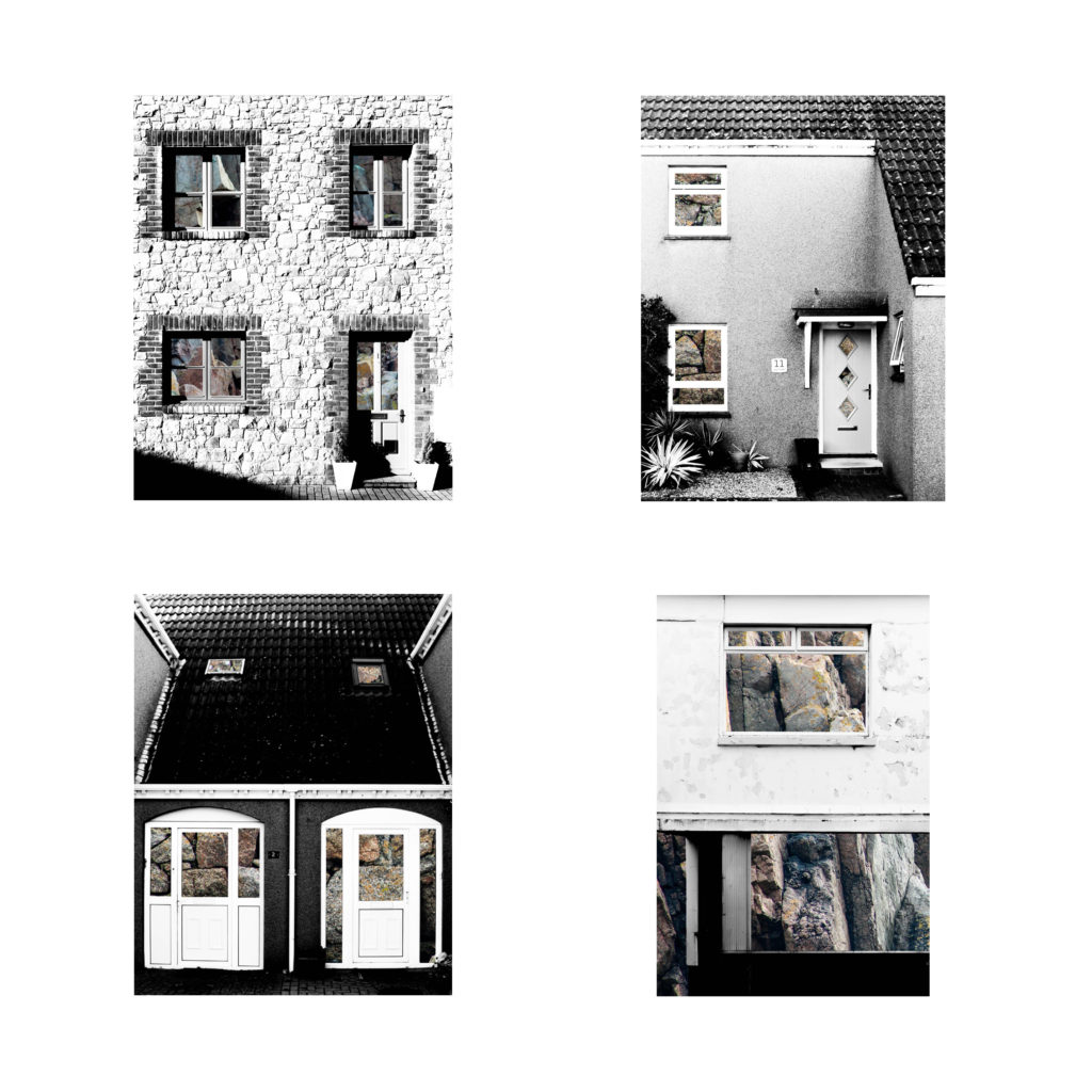
Previously I have experimented with GIF’s, but that experiment only included photographs of a limited number of building faces. In the below GIF I have included 12 fully edited photographs in which the building faces have been layered over rock faces. This use of GIF’s is extremely relevant to the topic ‘Variation and Similarities’ as it is an easily displayable way to demonstrate both variation and similarities between subjects. The 0.2 second time that each photograph is shown for, along with the cropping, creates a very abstract and unique method of presentation as the viewer is not sure what they are looking at until the GIF has been played multiple times. By using the GIF format the photographs are constantly being compared to eachother as the individualistic features of each building are being focused on and then replaced with another feature of another building, therefore it is demonstrating the variance and similarity between the buildings.

Building Faces / Rock Typologies

In this post I have experimented with presenting my compositions in which I layered photographs of building faces over photographs of granite rock faces. I believe that since I am looking at subjects that are easily comparable to eachother a typology grid is suitable – I have explored typology in the past through the works of Bernd and Hila Bechers and think it is a very effective was of drawing attention to the similarities and differences between the buildings. The use of rock faces in these compositions is great for creating similarities and differences between the photographs because not one rock face is the same as another; there is always individual angles and shapes that are unique to the rock. In typical use of typologies, all of the photographs are cropped to the same size – I had looked at doing this when putting the typologies together but found that it would take away from the composition of some of the photographs so it was best to leave them in their full shape. These typologies are made of my shortlist of best edits so I may change the photographs to all be cropped in the same way when I narrow the photographs down to about four.

Building Faces / Steel Typologies

In this post I have experimented with presenting my compositions in which I layered photographs of building faces over photographs that show the texture of steel. I believe that since I am looking at subjects that are easily comparable to eachother a typology grid is suitable – I have explored typology in the past through the works of Bernd and Hila Bechers and think it is a very effective was of drawing attention to the similarities and differences between the buildings. I have tried to use a wide variety of steel textures to create as much variety between the photographs as possible. In typical use of typologies, all of the photographs are cropped to the same size – I had looked at doing this when putting the typologies together but found that it would take away from the composition of some of the photographs so it was best to leave them in their full shape. These typologies are made of my shortlist of best edits so I may change the photographs to all be cropped in the same way when I narrow the photographs down to about four.

Kodachrome and Autochrome

What is Kodachrome?

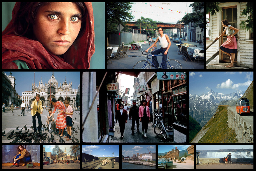
Kodachrome became the first colour film that made use of a subtractive colour method successfully mass-marketed. It was the successor of Autochrome and Dufaycolor which had been used for screenplating methods. Kodachrome has become the longest living brand of colour film due to its manifacture for 74 years in various formats to suit still and motion picture cameras including 8mm, super 8, 16mm. As a result of this Kodachrome can be appreciated due to its archival and professional market regarding dark-storage and longevity making its qualities desired by many professional photographers.

The brand name itself is for a non-substantive, color reversal film introduced by Eastman Kodak in 1935, becoming one of the first successful colour materials used for both cinematography and still photography. Over years Kodachrome was widely used for professional colour photography as the images produced were intended for publication in print media. However the film started to be sold process-paid in the US until 1954 due to legal ruling which prohibited this. Due to its growth and rising popularity of alternative photographic materials and complex processing requirments, widespread transition to digital photography resulting in Kodachrome to lose market share eventually leading to it becoming discontinued in 2009 with its processing ending in December 2010.

Some examples of Kodachrome and its photographic results can be seen below:

Over the years Kodachrome became a registered trademark of the Kodak company, with its method of colour transparency becoming more commonly known as a type of colour film the company started marketing in 1935. “Kodachrome” might sound familiar. Kodak eventually had at least three different processes that went by this new trademark, the first in 1914. In the early years of the twentieth century Eastman Kodak pursued the development of a simple color photography process that could be used by amateur photographers.

What is Autochrome?

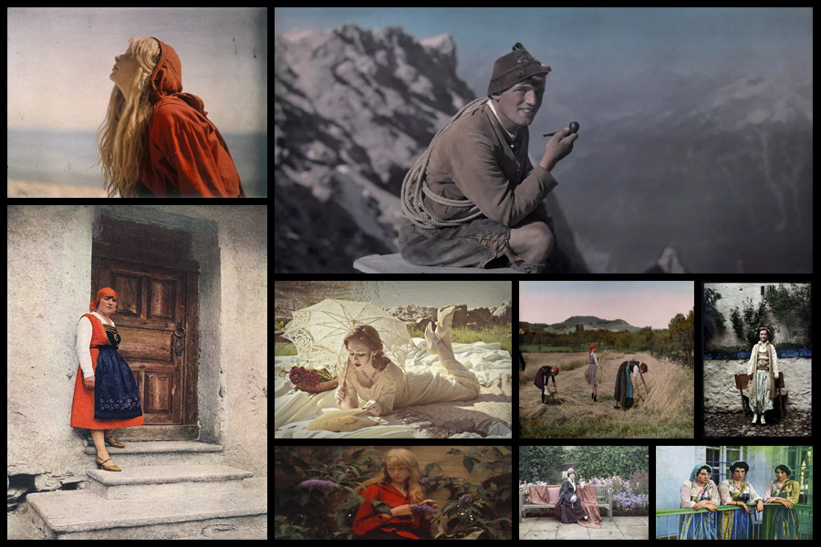
Autochrome, also known as Autochrome Lumiere was invented in France by the brothers Auguste and Louis Lumiere. Originally they presented their research into colour photography to the Academie des Sciences in 1904, with commercial manufacture of autochrome plates soon starting 1904. This led to the first autochrome process taking place on the 10th of June 1907 at the offices of the French newspaper L’Illustration. The process works by covering autochrome plates in microscopic red, green and blue coloured potato starch grains. When the photo is eventually taken the light passes through these colour filters to the photographic emulsion, with the plate becoming processed to produce a positive transparency. As a result this creates a full colour image of the original subject.

These processes were undertaken at the Limiere factory in Lyon, and included a complex process. Transparent grain was first passed through a series of sieves to isolate the grains between ten and fifteen microns in diameter. These grains are then separated into batches and dyed red, green and violet which are then once again mixed together over a glass plate coated in a sticky varnish. Charcoal powder is the spread over the plate to fill in any gaps between the grain and a roller is used to pressure the grain and flatten them out, and finally leaving the plate to be covered in a photographic emulsion.

Here are some examples of autochrome:

Overall the photos did not require much special apparatus as photographs could use their existing cameras, however they did have to remember to place their autochrome plate in the camera with the plain glass side nearest the lens so that light passed through the filter screen before reaching the sensitive emulsion. To view the image autochromes could simply be held up to the light, however for ease and comfort they were usually viewed using special stands called diascopes which incorporated mirrors. These gave the image a brighter result and allowed several people to look at the plate at the same time, they could also be presented using magic lanterns.

History Of Colour Photography

When photography was invented in 1839, it was a black-and-white medium, and it remained that way for almost one hundred years. Photography then was a fragile, cumbersome, and expensive process. In order to practice, photographers needed a lot of extra money and time, or a sponsor. In that early period, the people advancing photographic technology tended to focus not on achieving color photographs but on making improvements in the optical, chemical, and practical aspects of photography. For many, the goal was to make photography more suitable for portraiture—its most desired application. For that, photographic technology needed to be more stable, portable, and affordable, not more colorful. But people wanted color photos. (Portraits before photography were paintings—in full, glorious color.) By 1880, once the early technical hurdles had been overcome, portrait photographers began experimenting with color. They employed artists to tint photographers’ daguerreotypes and calotypes by hand.

British photographers introduced hand coloring photographs to Japan, where the practice became widespread and Japanese artists further perfected the technique. The refined, delicate hand coloring became a defining characteristic of Japanese tourist photography, the results of which were carried back to the West, influencing the art of hand coloring there. This wildly popular technique persisted in Europe and the Americas until twenty years later when Autochrome plates arrived. In Japan, hand coloring lasted yet another twenty years beyond.

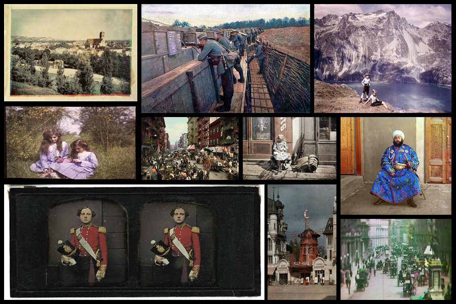
When first attempted in early 1840s people were trying to find a sort of chameleon substance which would be be able to assume the colour of any light falling upon it. The first results were typically obtained from projecting a solar spectrum directly onto the sensitive surface promising an eventual success, however a comparatively dull image would form in the camera required exposures lasting for hours or even days. The quality and range of the image colour were sometimes severely limited mainly due to primary colours, such as the chemically made ‘Hillotype’ process invented by America Levi Hill in 1850. Many others tried to experiment with other methods that prevented colours from fading over time such as Edmond Becquerel who achieved better results to some extent. Over about seven decades there was continuous experiments along these lines which would occasionally raise hopes but having no value at practical level. Here are some examples of early coloured photography:

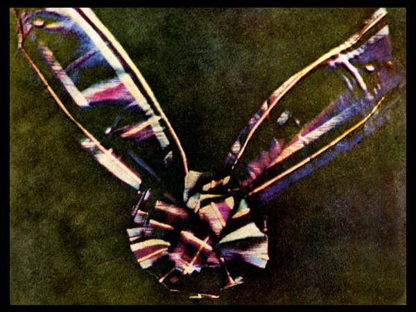
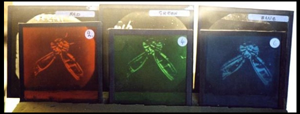
Regarding the first ever colour photograph it was taken as early as 1826 by Nicephore Niepce, however it took until 1861 to be developed by technology which could incorporate very basic colour. Overall though it was the Scottish Physicist and poet James Clerk Maxwell who produced the first true colour photograph that didn’t fade immediately or need colour adding afterwards by hand. The image can be interpreted as sinister and mysterious, this is because the colours red, green and blue have been used to take a still image of some tartan ribbon which had to be taken three times using different coloured filters each time. The technique itself was developed because of the theories about how the eye can process colour. This is the first non-fading coloured image:

The three-colour method, which is the foundation of virtually all practical color processes whether chemical or electronic, was first suggested in an 1855 paper on colour vision by Maxwell. It is based on the Young-Helmholtz theory that the normal human eye perceives colour because the retina is covered with millions of intermingled cone cells of three different types: In theory, one type is most sensitive to the end of the spectrum we call “red”, another is more sensitive to the middle or “green” region, and a third which is most strongly stimulated by “blue”. The named colours are somewhat arbitrary divisions imposed on the continuous spectrum of visible light, and the theory is not an entirely accurate description of cone sensitivity. Nevertheless, it coincides enough with the sensations experienced by the eye that when these three colors are used the three cones types are adequately and unequally stimulated.

In his studies of color vision, Maxwell showed, by using a rotating disk with which he could alter the proportions, that any visible hue or gray tone could be created by mixing only three pure colours of light red, green and blue in proportions that would stimulate the three types of cells to the same degrees under particular lighting conditions. To emphasize that each type of cell by itself did not actually see colour but was simply more or less stimulated, he drew an analogy to black-and-white photography: if three colorless photographs of the same scene were taken through red, green and blue filters, and transparencies made from them were projected through the same filters and superimposed on a screen, the result would be an image reproducing not only red, green and blue, but all of the colors in the original scene. Because Sutton’s photographic plates were in fact insensitive to red and barely sensitive to green, the results of this pioneering experiment were far from perfect.

Shoot 2

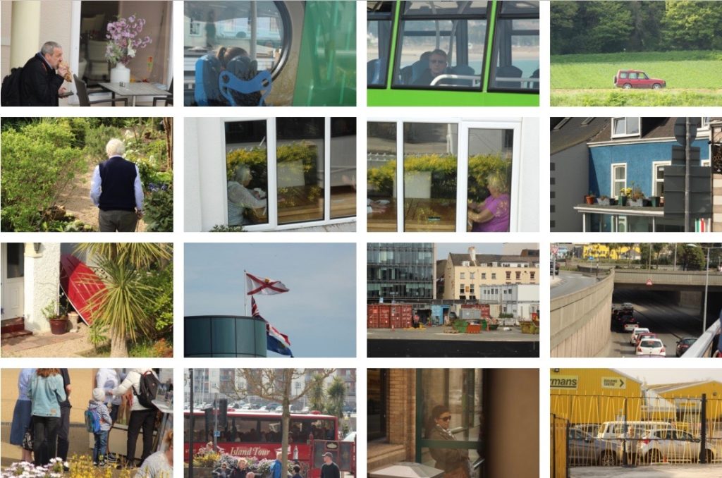
For my second shoot I decided to go out in slightly different weather conditions, on this day it was quite sunny which meant that the lighting in the photos was different and that activities going on outside created some more interesting things to photograph, because of the good weather I also was able to go on an open top bus which was particularly useful to get better angles and slightly clearer views of the things going on outside of the bus. For this shoot I went out for a few hours and took 4 bus trips to try and take photos of things happening in various areas. Below are a selection of what I think are some of my strongest images from the shoot unedited, overall I am pleased with how the shoot turned out and how I have succeeded to create some images slightly different to my first shoot, for some of my next shoots I plan to take the bus to more different areas but also to create some images earlier in the morning and later in the day and night so that and can have a final outcome with a progression of images where the lighting changes from morning to evening.

LARRY CLARK

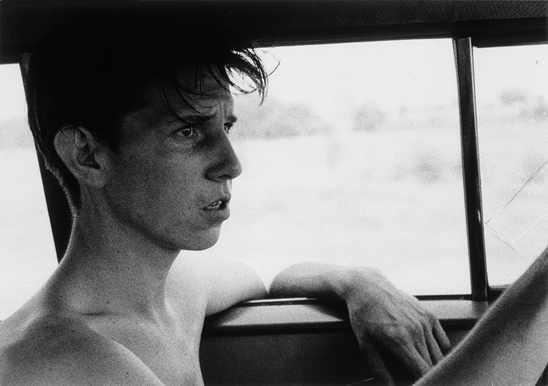
Larry Clark, born in Tulsa, worked in his family’s commercial photographic portrait business before studying photography with Walter Sheffer at the Layton School of Art in Milwaukee. Clark served in the military during the Vietnam War and has been a freelance photographer based in New York since 1966. During the 1960s, Clark documented the culture of drug use and illicit activity of his friends in Tulsa, and his photographs from those years were published as Tulsa in 1971. Considered shocking for its graphic portrayal of the intimate details of its subjects’ risky lives, the book launched Clark’s career. After Tulsa, he produced Teenage Lust in 1983, a series of photographs depicting adolescent sexuality and The Perfect Childhood. His work has been included in group and solo exhibitions since the early 1970s, and was the recipient of a National Endowment for the Arts Photographers’ Fellowship in 1973 and a Creative Arts Public Service photographers’ grant in 1980. Clark has also produced films; Kids (1994), based on his experiences with New York City teenagers and their culture of drugs, alcohol, and sex.

Larry Clark’s photographs in Tulsa are unflinching and portrays a difficult and often unsightly circumstances viewed through a participant’s eyes. Their first hand intensity, recollects the work of Danny Lyon and Bruce Davidson, but Clark’s raw voyeurism and insistent exposure of detail results in a apprehensiveness that differentiates his work from that of others in the early 1970s.