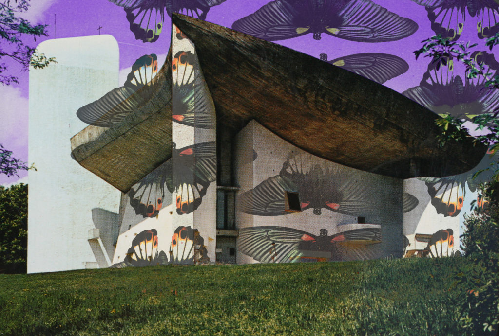
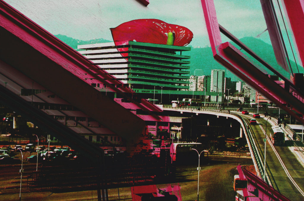
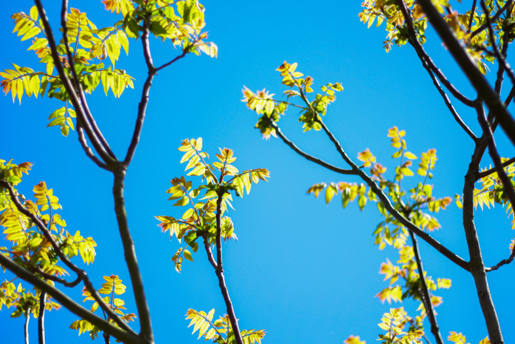
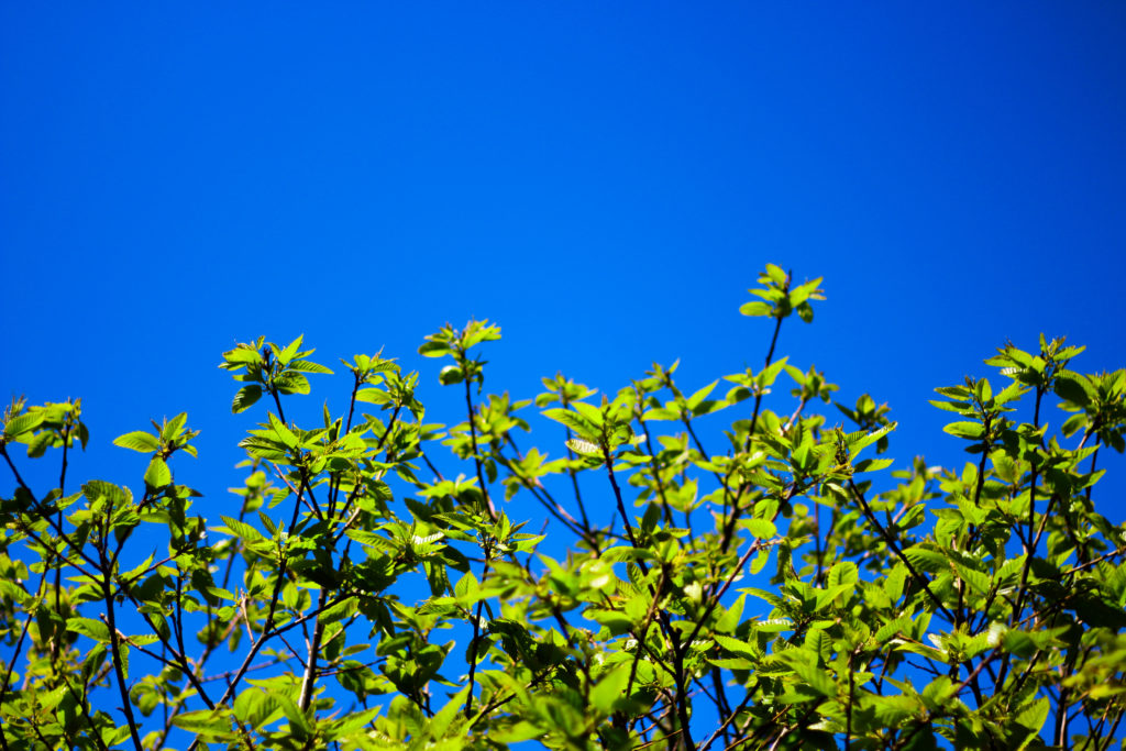
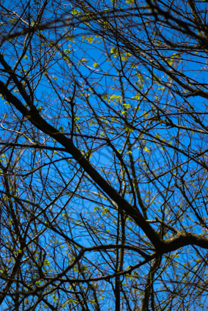
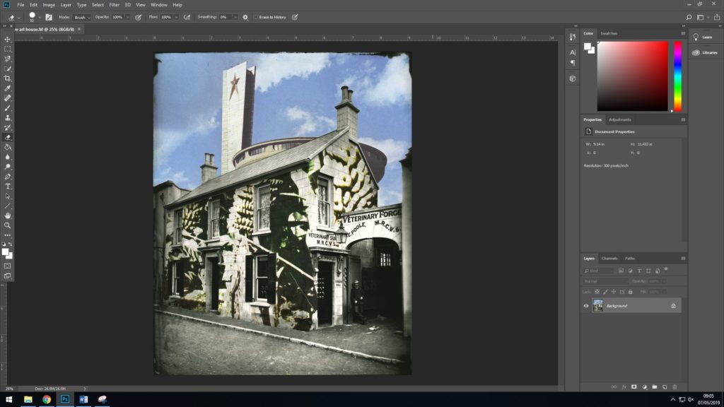
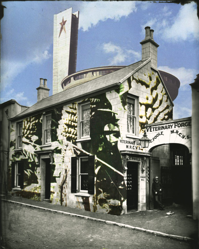
Since reflecting on my initial work, I have continued with the photo-montage process whilst gathering further visual material and taking more photographs to use. I believe that following a similar process to that in my two editing process posts has helped me to consistently produce successful outcomes which I am very satisfied with. This post is simply a display of the work I have produced since reflecting, I will go on to describe and explain my outcomes in further posts where I begin to select those which are most successful. So here just some of the outcomes which I have since made…
Monthly Archives: April 2019
Filters
Keld Helmer-Petersen: 122 colour photographs
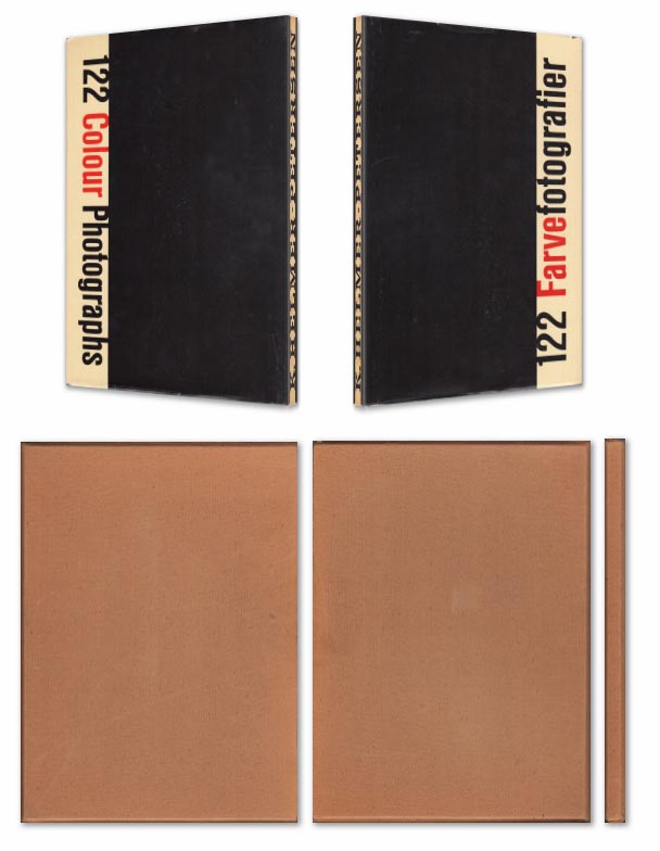
Keld Helmer-Petersen’s 1948 publication of 122 Colour Photographs stands as an extraordinary accomplishment. Inspired by the realism of the Neue Sachlichkeit movement, Helmer-Petersen concentrated on the mundane and the everyday, creating geometric abstractions out of curved doorknobs, crates of tomatoes,
Book in hand: how does it feel? Smell, sniff the paper.
Paper and ink:
The front cover has a hardcover with dust jacket in a publisher cardboard slipcase.
Format, size and orientation: portraiture/ landscape/ square/ A5, A4, A3 / number of pages.
Design and layout: image size on pages/ single page, double-spread/ images/ grid, fold- outs/ inserts.
Rhythm and sequencing: flow of images/ juxtaposition of photographs/ editing process.
Structure and architecture: how design/ repeating motifs/ or specific features develops a concept or construct a narrative.
Narrative: what is the story/ subject-matter
Title: literal or poetic / relevant or intriguing.
Images and text: are they linked/ introduction/ essay/ statement by artists/ use of captions (if any.)
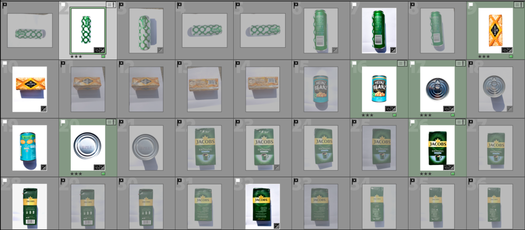
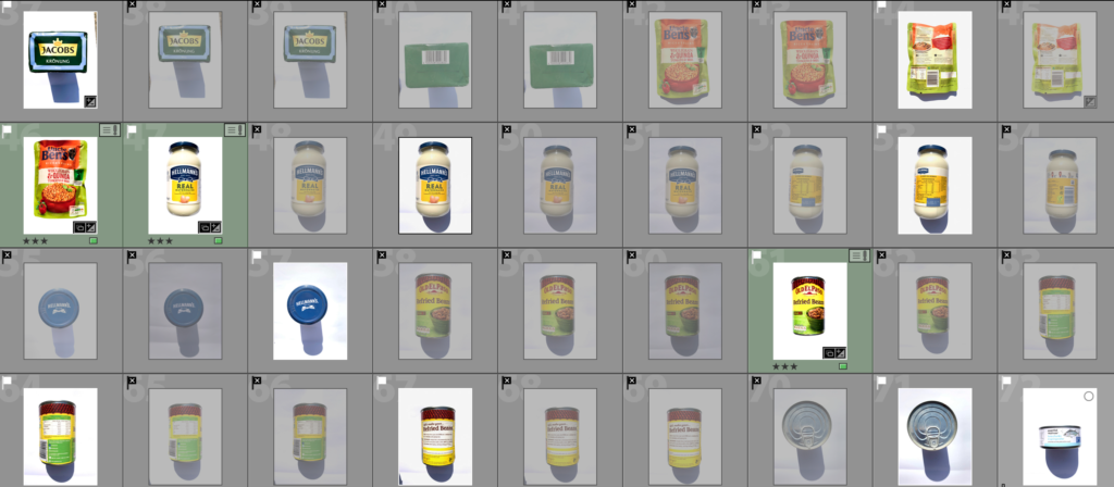
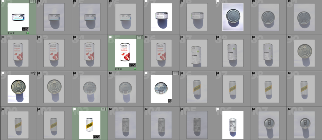
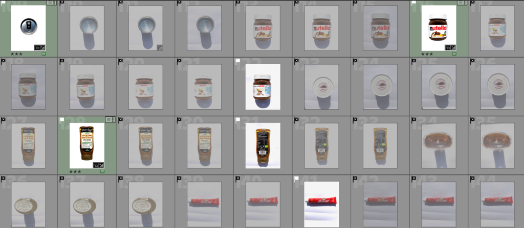
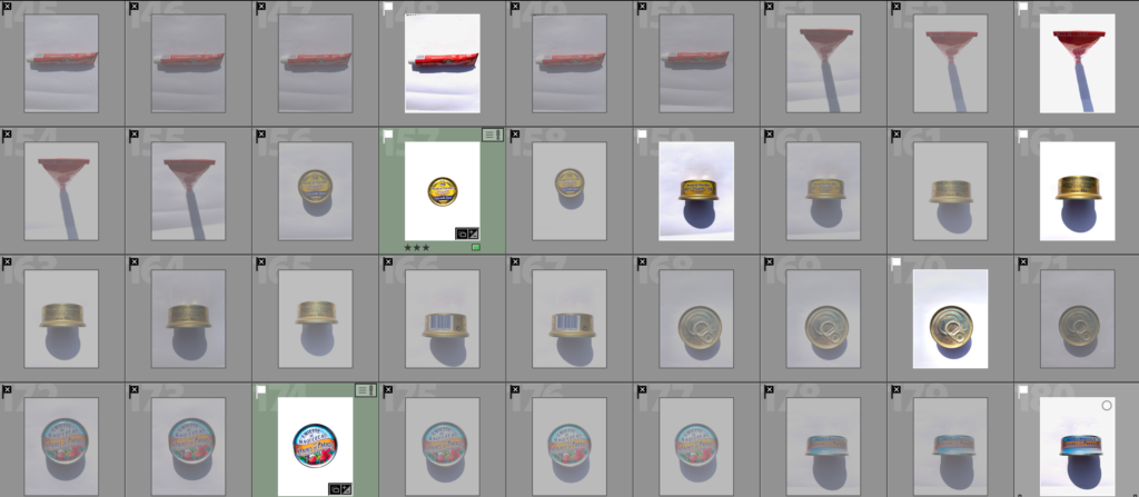
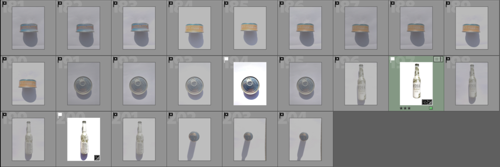
Consumerism Shoot- Contact Sheets
For this Shoot I set up a booth to photograph these object using a large white sheet to reflect the sunlight and so the background would be clean. Unfortunately this cast heavy shadows but they were easily removed when editing in photoshop to clean the background.
The Screenshots bellow show my selection process that I have done reducing the images to the most successful ones which have a white flag and the ones that didn’t work as well with a black crossed flag. The Images in green are the images that I selected as they worked best and edited them.
David Benjamin Sherry Response Plan:
Concept: To produce Sherry-esque images in photoshop using landscape and portrait images
Procedure: I have learnt that there are a variety of techniques in producing the strong sense of colour in images. In this response, I will experiment with using overlays over existing images, using colours that relate to the image as well as colours that contrast. To do this, I must:
- Step 1: Convert image to greyscale by going Image>Mode>Greyscale.
- Step 2: Go to Image>Mode>Duotone
- Step 3: In Duotone, choose “monotone” under the dropdown menu.
- Step 4: Click the colour swatch for the colour I want to use
Final Selection
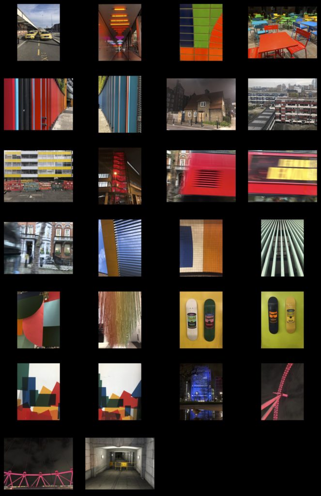
These are the images i am deciding to edit and use as final prints and in my photobook. I carefully selected these images from the 4 shoots i did. I strongly believe that these images best fit my specification and project theme of variation and similarity. They also show influential features from the photographers i studied in order to carry out my photo shoots.
When it comes to displaying my images and how they will be viewed in their final element, i would like them to be collated throughout a photobook, With juxtaposing sequences and layout variation.
Photoshoot 6- Photograms
Photoshoot Plan
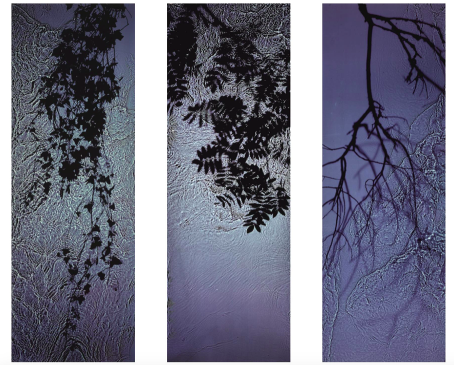
For this shoot I plan to experiment by creating images, like Anna Atkins, by using light sensitive paper and placing natural objects on top to create a print. I wanted to take inspiration from Anna Atkins as I think her images have a spiritual quality to them and I think by producing similar image, it will give my project a different type of photos, other than the landscape images, that will take my project further. I plan to see the outcomes of this experimentation and decide if i want to use them in my final outcome. If the outcomes aren’t as effective as I thought they would be, I plan to produce similar looking images from natural objects by editing, that have the same appearance of Anna Atkins images. I also think these images will reflect the work of Susan Derges as she also used light sensitive paper to create her images of the natural aspect water. I plan to take inspiration from both these photographer in my photoshoot.
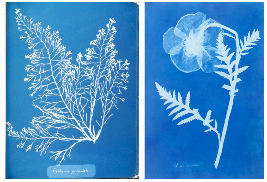
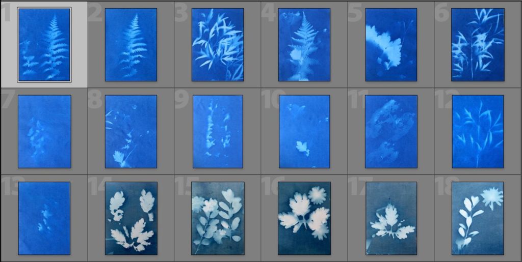
Light Sensitive Paper Experimentation
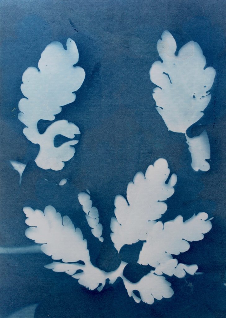
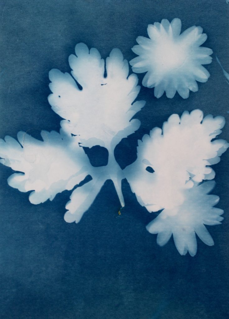
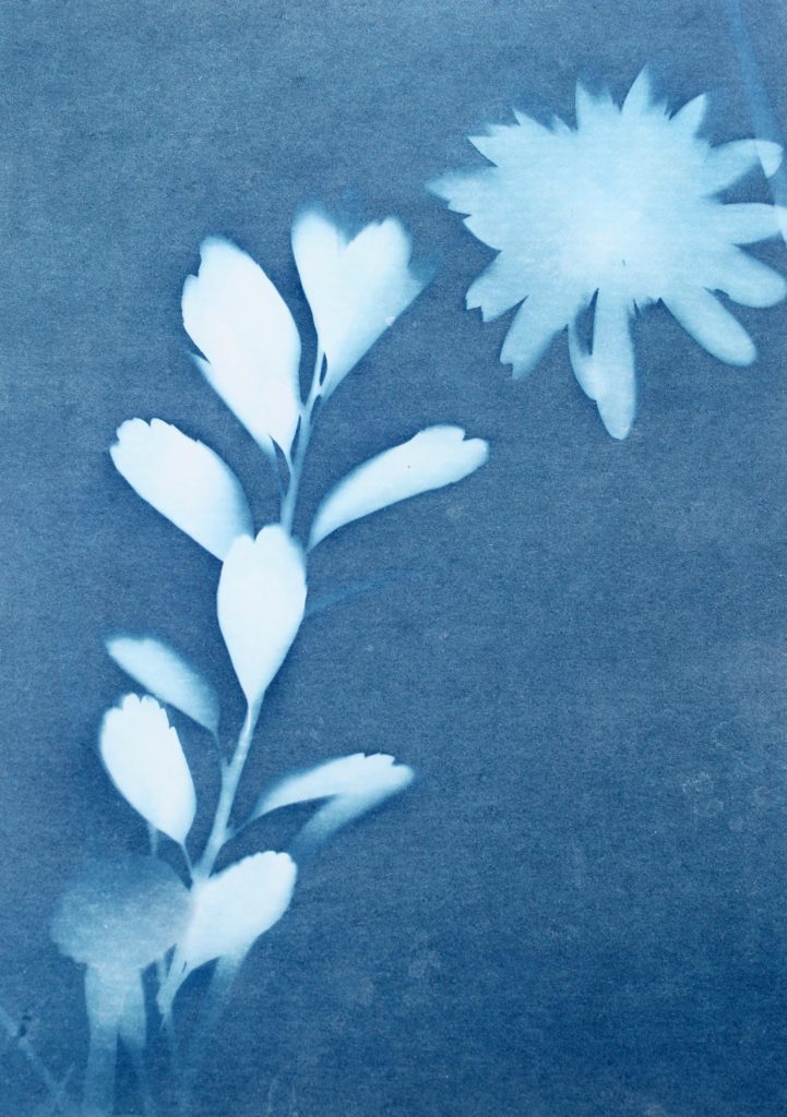
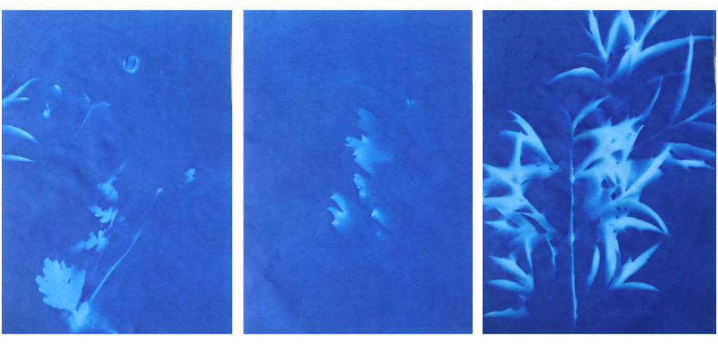
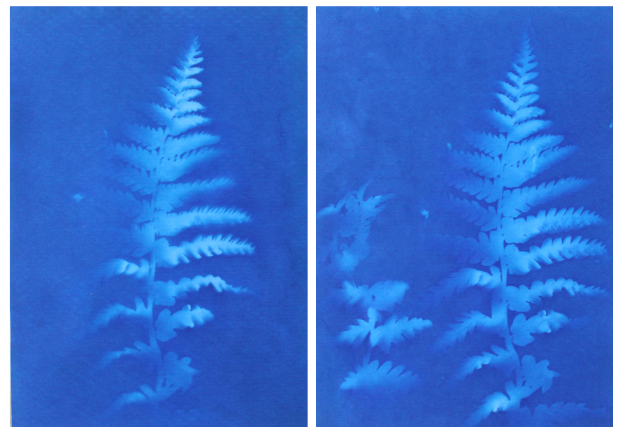
I think that these three photograms were the most effective in this shoot as they are the most clear and defined compared to others. I think this is specifically in the first image were I think that the shadows that were created by the plant on the paper were printed, making the outsides of objects on the paper darker, emphasising the brightness against the dark background. I like this as it makes the objects seem more 3D like they are coming out of the page. Other images in this shoot didn’t have this but were still effective. I also like how the specific rounded shapes of the leaves are precisely shown and noticeable against the blue background because i left it out in the sun for a long period so that the light sensitive paper had a long time to to change colour. I experimented in this shoot by leaving light sensitive paper out in the sun for different amounts of time and found that when I didn’t leave them for long, the outline of the object on the paper wasn’t as noticeable and as emphasised against the blue background. I think that both of these effects are successful as the blurred create a different look in comparison to the precise ones where I left them out in the sun for longer. I decided for some of the photograms, like the first one, to place multiple natural objects on the paper as I thought that this would create a more interesting composition when they printed. I also experimented with only one object and found that I preferred multiple.
In the second image the natural objects had moved because of the wind but because of this the plants have two different outlines, one being more faint than the other. I think that this was effective, not being as precise as the first one, as it adds different ranges of blue tones on the plants. It also creates a blurred effect making it look as though the plants are moving. I also like how in this photogram that some of the plants overlap each other, I did this to create a more interesting composition.
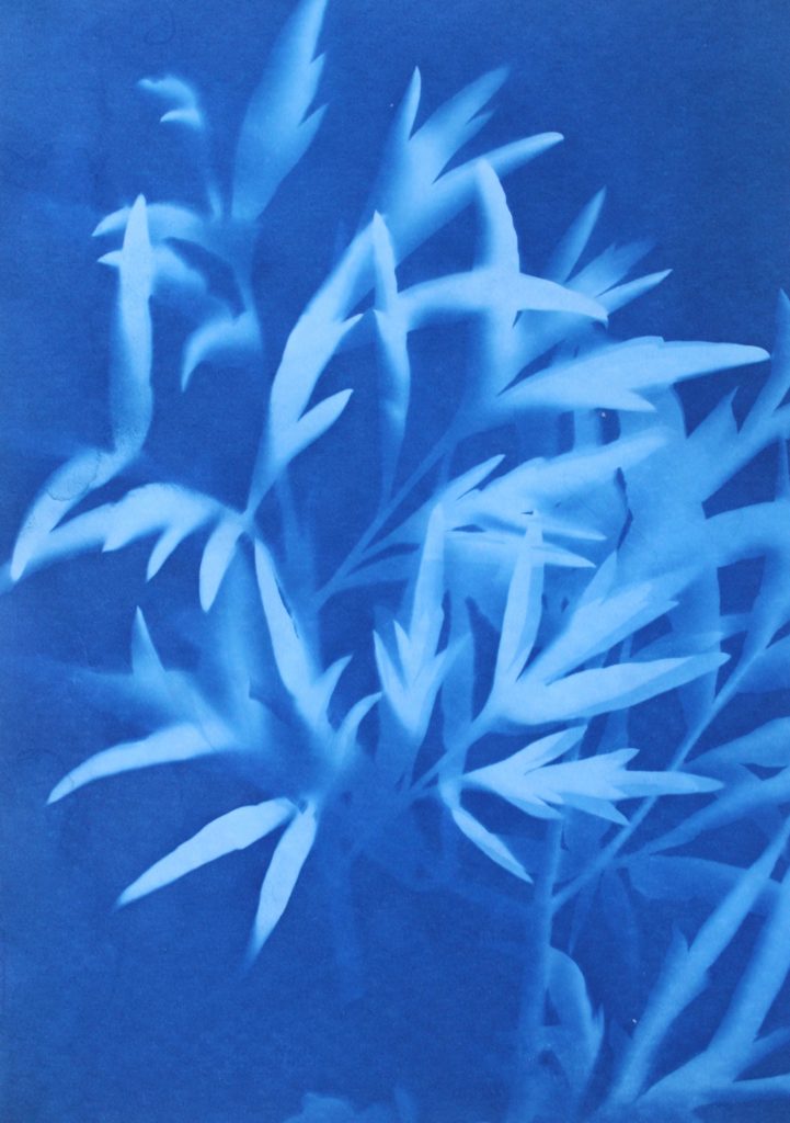
I also like this photograms as it has more shapes than any of the other ones because I used multiple of the same plant placed over each other, creating an interesting patterns against the blue background. By having the solid colours of the leaves more noticeable, it makes what the photogram is of more apparent. I like the smaller leaves that are coming from the stems as you can noticeably identify that they are leaves, linking to nature. The plants towards the top of the photograms are less clear than the ones in the middle, becoming more blurred as the edges. I think this is because the edges of the plant had started coming off the paper as it was left in the sun, but i think it’s effective as it focuses the audiences attention to the centre of the photogram. I think this is also emphasised by how it becomes darker towards the edges of the paper, highlighting the white colours in the middle. Another aspect I like is how the plant goes off the edges of the paper, as I think it contrasts nicely to the other photograms that are placed precisely in the middle or around each other. This is like Anna Atkins where she doesn’t let the plants she places on the light sensitive paper go over the edges. I thought that by doing this I would be creating my own interpretation of her work, but not directly copying the way she displays plants.
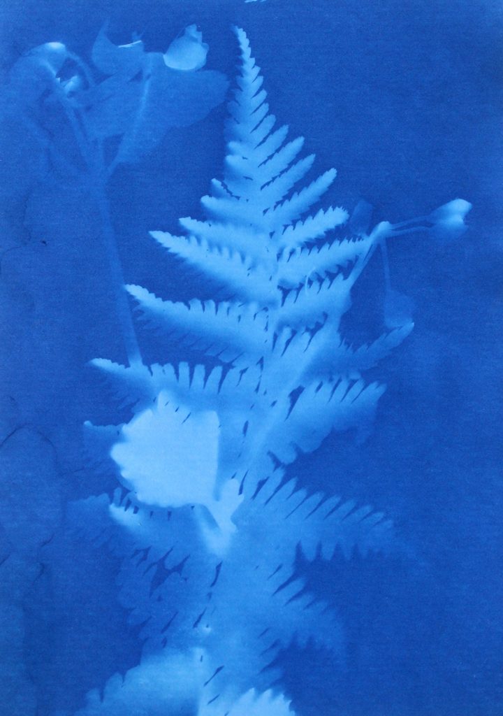
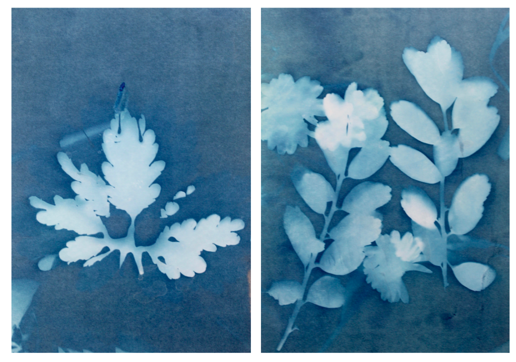
I tried to use a variety of different plants on the paper to create a range of different appearances and compositions. I tried to find plants that had interesting leaves and details so I could see the effect this created on the paper. I think this was effective as it means i could display all the photograms together and they will all be separate and contrast from one another. Also like in some photograms, like the first one displayed above, there are two plants on the paper, where one has printed clearly and the other hasn’t, creating a blurred effective in the background. I think this creates an interesting juxtaposition.
I also think that this experimentation looks at photograms in a different way to what people in the 1900s did where they were used in a scientific, analytical way. In my opinion those photograms in the 1900s still have a spiritual quality to them through the delicate lines and shapes. This is what I tried to interpret when creating my own by selecting plants with interesting shapes to highlight the intricate and delicate appearance even more.
Evaluation
Overall I think that I successfully interpreted the work of Anna Akins by experimenting with the same the technique to produce camera-less images that she did. I think that I will use some of these photograms as some of my final outcomes as I think they add another level to my work, contrasting to the landscape and close up images I have taken in nature with a camera. By including some of these in my final pints and photobook, I can emphasise nature with a different technique, still following the same theme as the other images. I will experiment by seeing how these photograms look alongside my camera images, and what they loo like separately to decide how I am going to display them.
Editing Process
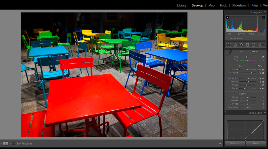
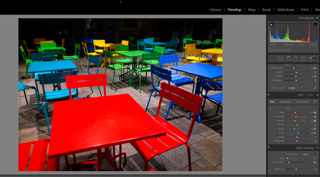
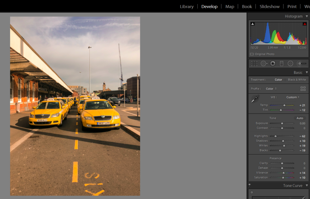
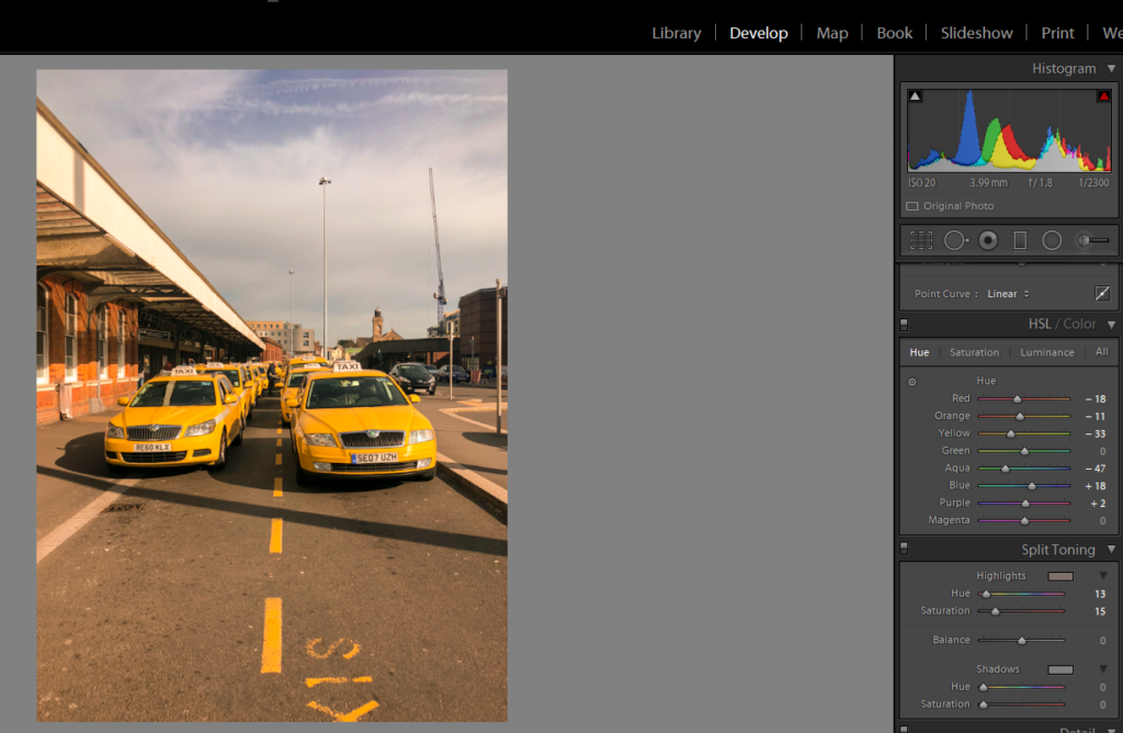
I took a relaxed approach when it came to editing and manipulating my images. This was my intention as i did not want to destroy and ruin the images that i thought were ready with minor adjustments. My process for most if not all my images was similar. I would crop the image to my desired size or no crop it at all if i think it will take away from the image. From here i would create an even balance between Dark and light tones with a slightly increased contrast. Then I would increase the vibrance and saturation of the image but not excessively. I would only increase it to give the colour a slight pop so that it stands out among other details of the image as that is my main intention for my project.
Here is the process: The Adjustment units are on the right hand side of the image. All Images Edited in Light Room
Abstract Colour Shoot #2
For this shoot I wanted to create a response to the work of Engleston due to his focus around the idea of tone and colour within urban and natural environments. What I found most interesting within his photography was how in most of them there is an overall sense of a single colour such as yellow or red, this has inspired me to create work that relates through the use of incorporating an overlay which can be vaguely seen in each picture. As a result of this I hope to achieve a new style of photography where I can this underlying saturation to produce outcomes for the photos and possible photography book in the future. Using Eagleston as my main source of inspiration I have decided to have a look at some of his works which I found to be of particular interest:
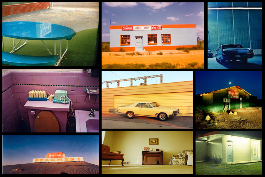
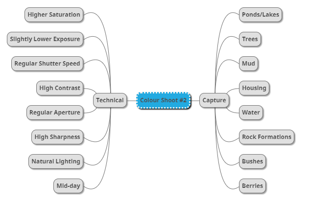
After I had looked over some of his more inspirational work I decided it was nearly time to go ahead with the shoot itself. Before doing this however I would need to create a mind-map, by doing this it would allow me to express my ideas and intentions of what I want to achieve in the shoot. Creating a mind-map not only would help direct my aims of the shoot but also reduce time wasted from deciding there and then what to do and take. Here are some of my ideas on what I want to produce during the shoot:
Once I had completed my mind-map I then decided that I would move onto the shoot itself. Using this my ideas noted above as the basis for my goals in the shoot I decided to photograph the area of Les Creux Millenium Park due to the huge range of landscape it possessed in the surrounding area, ranging from houses, fields and woods. A map of the area can be seen below:
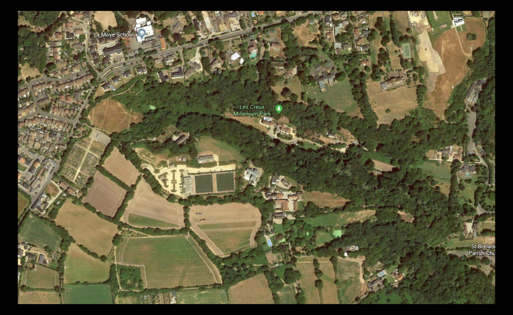
Here are the results of the shoot:
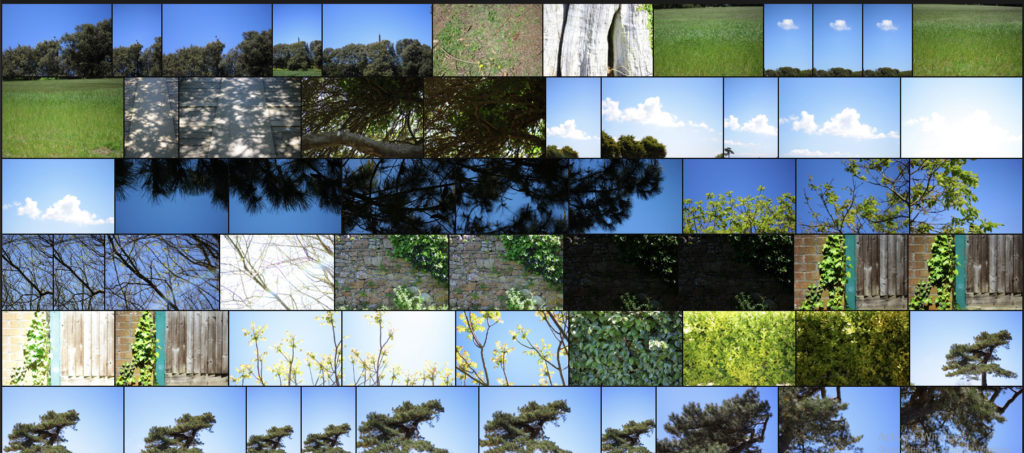
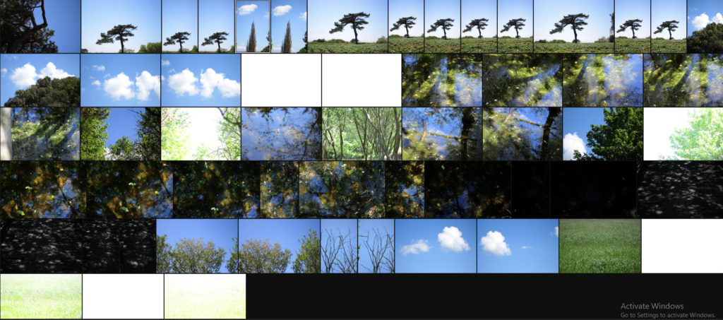
Once I had completed the shoot I then decided to go onto whittle the selection of images down to only ten. By doing this it would make it easier for me to identify which images reflected my intentions for the shoot the best and which ones had the best relevence for my topic. Here is my selection for the ten best images of the shoot:
After I had selected the ten best images I then decided that I would move onto choosing fives images that out of the ten reflected my intentions the most and had the best overall sense of aestheticism. To do this I would have to look at technicality, visual aspects and context. Here are my choices:
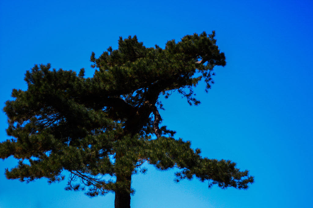
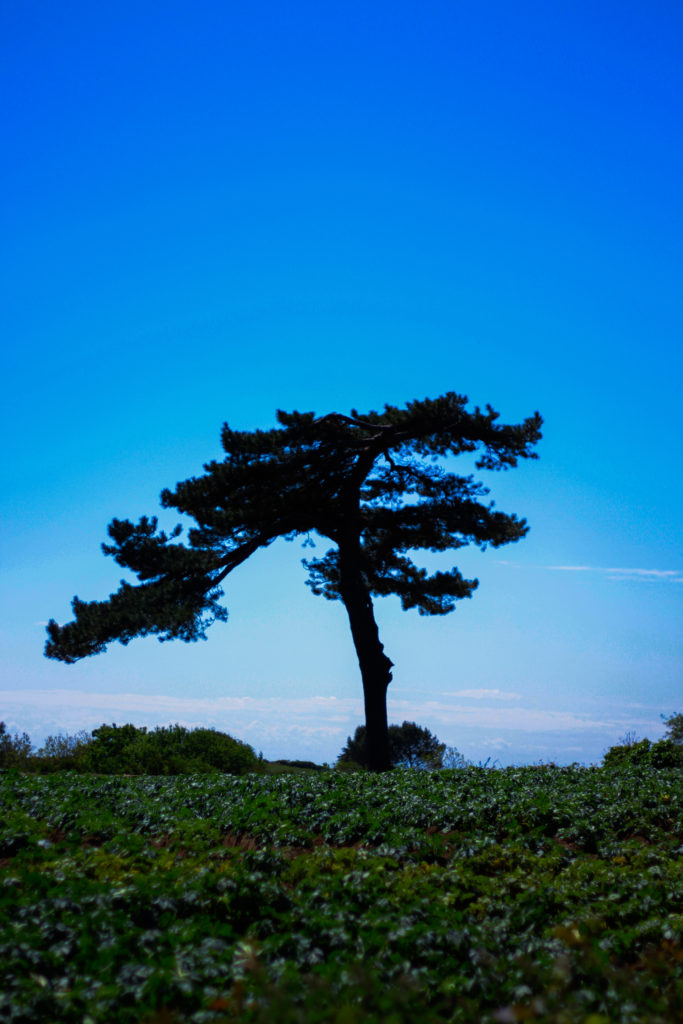
I selected this images because I really liked the defined contrast between the overly blue sky and the unusual shape of the tree. For me the green and dark browns contrasting the sky made the image the most effective due to how they are complimentary colours and so work well side by side producing an aesthetic reault. Composition wise I found that the tree being slightly on the left allowed for the end result to be more impacting because of the way it arches over the landscape filling more negative space in a more unusual way. In relation to the topic of variation of abstraction the image related well as I separated the tree from its surroundings allowed for a unique perspective to be viewed of it where it becomes isolated from its surrounding environment.
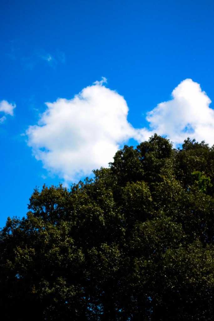
For this image the reason I selected it was because of how the blue sky and tree were complimented by the cloud which sort of transitions into the tree itself whilst merging into the blue around the corners. By the clouds taking over the negative space for me it allowed for a more effective use of the sky due to it otherwise being a bland and boring picture, however the inclusion of clouds prevents this and instead allows for an aesthetic result which could work well in a set of three. In relation to the topic the image goes well as it is evidently saturated too much which as a result produces a more abstract effect which in a way prevents viewers from seeing the tree as it once was, instead looking at it in a new light.
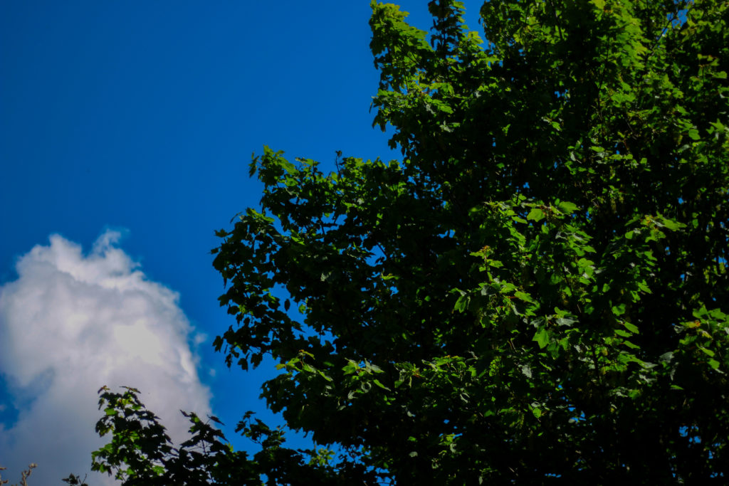
What I liked about this images was the contrasting overly saturated colours that overpower the image. For me this works really well as the image in a way is divided into two sections, one being the sky and the other nature, however I really liked the implementation of the cloud which breaks up the two dominant colour from becoming too overpowering and ruining the piece. As a result of this the cloud enhances the two colours creating an aesthetic result due to both the tree and the sky being in proportion to each others saturation. When looking at the image in regards to my topic of abstract variations I think that it goes well with the rest of the images taken due to how they all present a similar vision where there is a sense of overpowering colour which seem too surreal to be real.
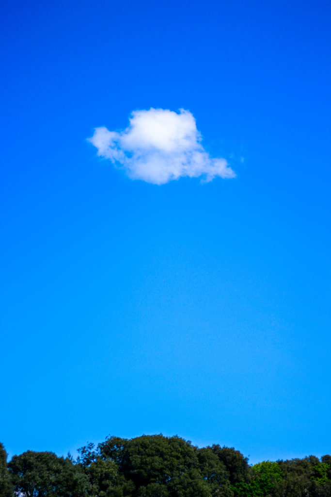
What I loved about this image was its overall simplicity. This is done through a very minimal way where there are only three small aspects to the piece being the cloud, trees and sky. For me they all compliment each other nicely due to how the green and blue contrast with the symmetry of the cloud being in the centre adding too effect from a sense of artificial aestheticism that is created. Overall once again symmetry is the key aspect to this photograph as the cloud be placed directly in the middle adds to effect as its almost as if it was placed there from its unusual position. For me this links greatly to the topic as the colours are so enhanced combined with the weird composition which as a result ends in a abstract portrait of the sky in a block minimalist way.
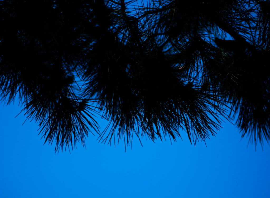
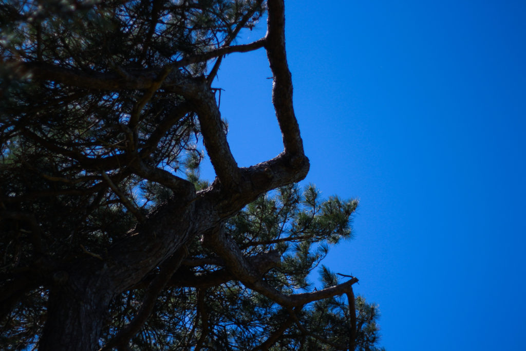
Finally I selected this image because of the huge contrast between the pines and sky which create a silhoutte of the leaves, isolated it from its environment and portraying them in a way that makes them seem as if they were something else. This contrast for me works well with an image in the previous colour shoot which I think when looking towards planning a photo-book would work well due to its similar qualities. As a result this image relates well to the topic but has been selected really in relevance to how it can be linked to the previous shoot in which silhouette of trees can be seen against a harsh blue backdrop.
After looking over all five images it allowed me to come to a conclusion to which images worked well in relation to the topic of abstract variations (this shoot being colour). By looking in depth at each image it allowed me to sum up its qualities as a reflection of my intentions not only to the shoot but the overall topic. This is my final choice for the image that best represents the entire shoot:

The reason I chose this image as the best reflection for the overall intentions of the shoot is because of how I loved the way the composition of the piece induced a sense of an artificial landscape in which it seems almost too surreal to be real. For me the vivid colour combined with the symmetrical composition of the tree really tie the photo together as each aspect of the piece compliment each other which preventing the others from overpowering and ruining the picture from becoming too eye-sore.
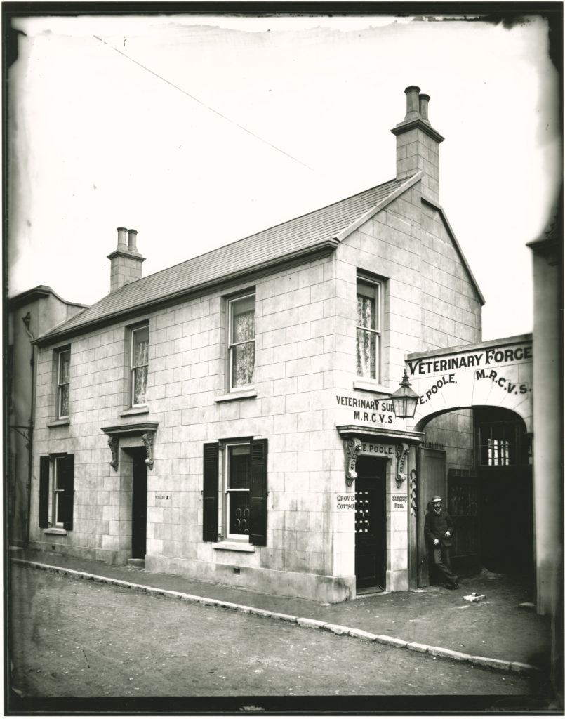
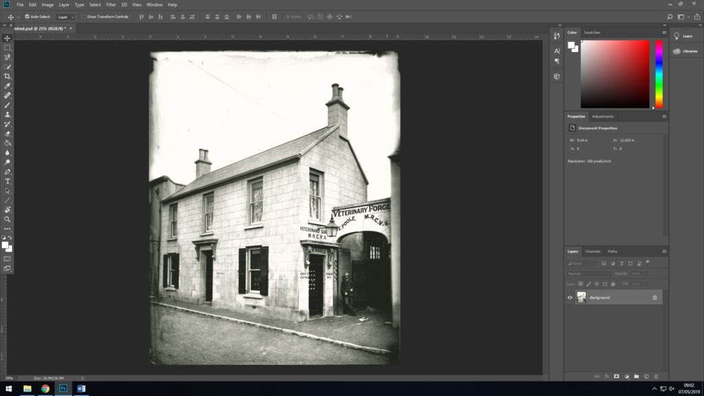
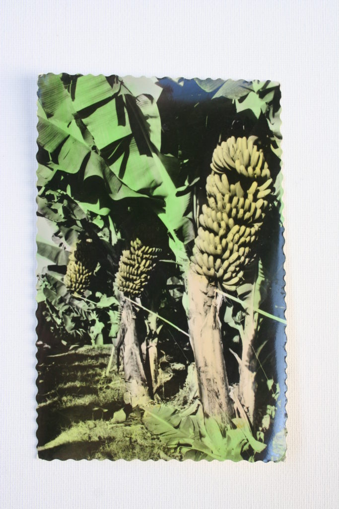
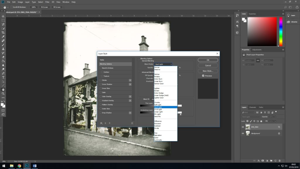
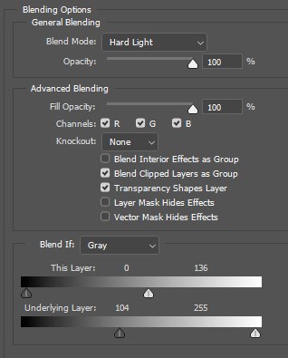
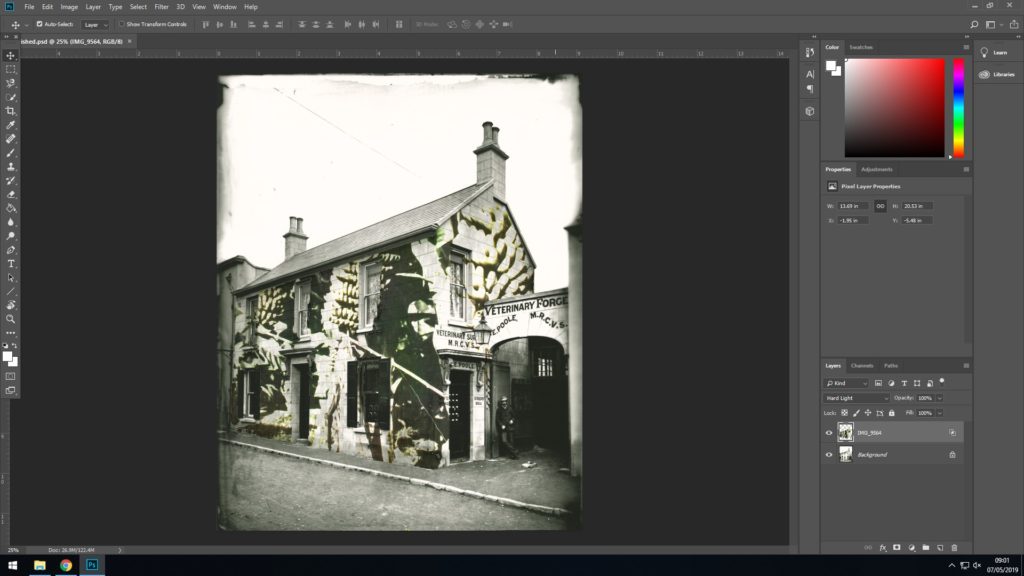
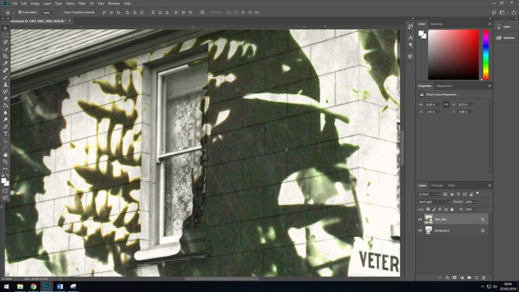
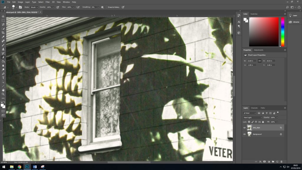
Editing Process 2
Shoot comparison
Shoot 1 – Although i only used one image from this first shoot, i believe that it is the most important images of all as it is what made me want to explore colour photography for my exam unit. It is one of my strongest images that supports the theme and style of variation and similarity. Compare to the other three shoots this one is the least successful due to the lack off images but i got one really strong one out of it.
Shoot 2 – This is my best and most successful shoot for what i was trying to capture and display at the end of the project. I got many of my final images from this shoot which really allowed me to open and explore. This will also help when it come to designing my photobook and experimenting with print layouts. Overall this will allow me to create a narrative sequence within my photobook.
Shoot 3 – Shoot 3 was an experimental, one off shoot. to explore colour in nature and landscape. although i thought this was a good idea i felt that none of the images would work with the images from the other shoots, so i’m deciding to leave them out. In addition, this one off experiment helped with my final shoot as it made me think about shooting under a different lighting influence and exploring colour and experimenting with new contrasts.
Shoot 4 – I believe that my 4th shoot was my second most successful shoot. I captured many of my strongest images for the project during this shoot. This shoot was different when it came to use of lighting as i shot in underexposed areas of coloured lights and objects. Unlike the other shoots, the images had a different feel to them with the new contrasts and tones. This, in my opinion is what made this shoot an overall success.


