Paul Graham

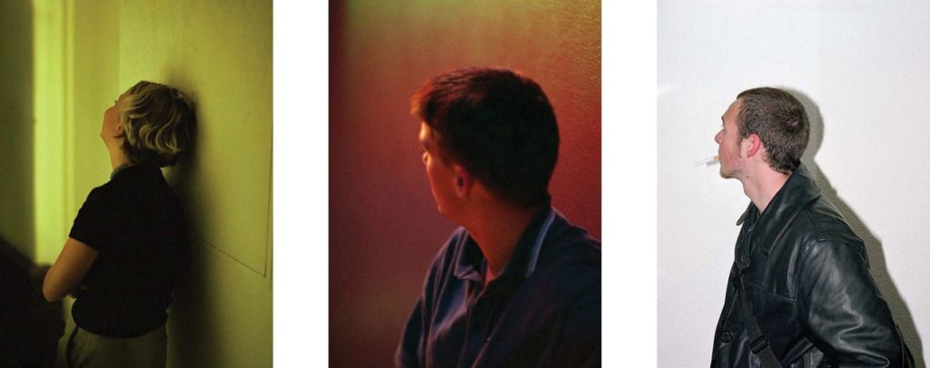
In End of an Age, British photographer Paul Graham captures the threshold moments that mark the ending of adolescence, the small slice of time between youthful indulgence and the emerging awareness of adult responsibilities. His photographs resonate between these two poles: between full-on consciousness and escape; between seeing the world with shocking clarity and the desire to hide oneself from that reality. It is a situation that each of knows and remembers all too well, a traumatic time. And it is often the threshold of a profound psychological transformation.

“It is a time when things are deeply felt, when you appear to see things very clearly, sometimes with brilliant intensity, and you believe passionately in what you can achieve, but then you also have to escape from that, to let go, to unburden yourself…The visual duality of the work reflects that duality in life – between the power of stone-cold reality and the need to escape that: get drunk, turn away, close your eyes, get stoned.” – In an interview with the author of ‘Paul Graham’ published by steidlMACK

The photographs alternate between ultra-sharp direct flash images where every detail is minutely recorded, and the opposite extreme, with loose available-light photographs, saturated with colour, blurred and sometimes poorly focused. These compelling colour images are portraits in the fullest sense – images that seek to reflect on the inner self through our material presence.
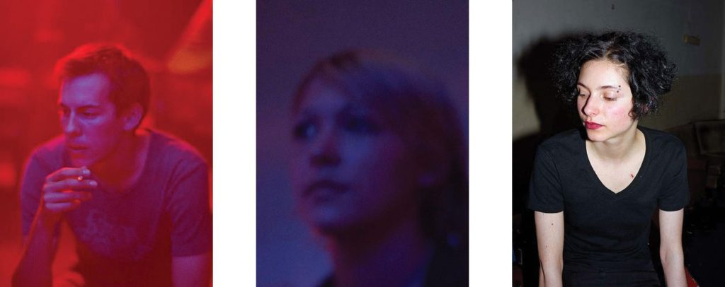
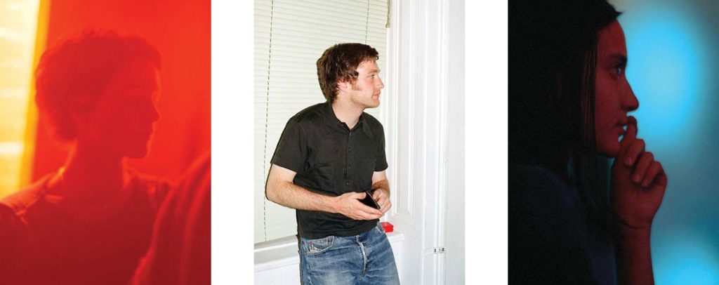
When he made the pictures for End of An Age Graham was between 39 and 42 years old, whereas the young people in his pictures were around 17 to 27. His work looks back at the pleasures and discomforts of youth now consigned to the past. Although some appear to be photographed in social situations (the lighting often suggests clubs and bars), the exact locations, individually and collectively, are deliberately withheld.

“I think it’s better that I withhold the location. Anyone can see that these are young, white, First-World westerners, but beyond that, it’s best to keep it non-specific and more universal. The minute I say that these pictures were taken in Stockholm or wherever, everyone will say “Oh, so this is how young Swedes are today,” or “It’s a portrait of young Sweden,” and that’s not the point. I want them to go far beyond any national identity. It’s not Stockholm and it’s not a documentary about young Swedes. It could be anywhere from Germany to Ireland, to the UK, to Spain, to parts of the US.” – in ‘I Blame Elvis’, an interview with Jenefer Winters.

Surprisingly, Graham did not use colour filters for the pictures: “the colour casts come from the available lighting…red or ultra-violet, yellow or green, just whatever light is there, uncorrected.” Subjects also appear to move through a gradual 360-degree turn, a dance-like spin or pirouette. This hints at the question of what is being hidden, the pressures of coming to adulthood and the feelings associated with change itself.

Image Analysis
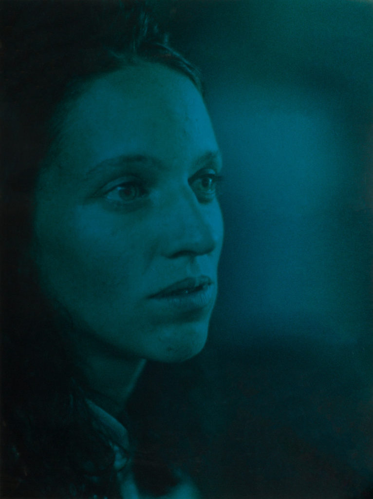
This image depicts a young woman with her face angled, as if looking off into the distance. It is unclear if the photo is staged, or candid, yet the emotion on her face still comes through. Graham composes this image to feature negative space across the right side, this suggests the nightlife environment as she is surrounded in colour. The left side of her face becomes blurred into the background, as her youth becomes associated with this atmosphere.

The colour is not overwhelming as it is not highly saturated nor highly contrasted. This allows the viewer to recognise and relate with the subject’s facial cues.

End of an age evolved from an idea Graham had in 1995 based around a common photographic ‘mistake’, the red-eye reflection so familiar from amateur snapshots. His book opens and closes with images that embrace these ‘errors’: extreme close-ups of young peoples faces with glowing red orbs floating against rough-grained skin tones. He achieves this grain in his images by using highly sensitive ISO’s.

In a way, Graham is using a documentary approach to showcase the lifestyles of the youth, yet he does this in a more minimalistic style, choosing not to present the environment, leaving the emotional strain of growing up to be shown through the facial distinctions on his subjects faces. The relationship he has with these subjects is interesting due to the age gap, signifying the strong difference between the life of the youth and the older generations.

“I was in this city on and off for two years and some of these people became good friends of mine who I know very well and remain in contact with. These people I photographed many times over, whereas others are complete strangers who happened to be standing by me, and I took a picture, and I’ve simply no idea who they are.”

Artist Reference – Brett Weston

Who is he?

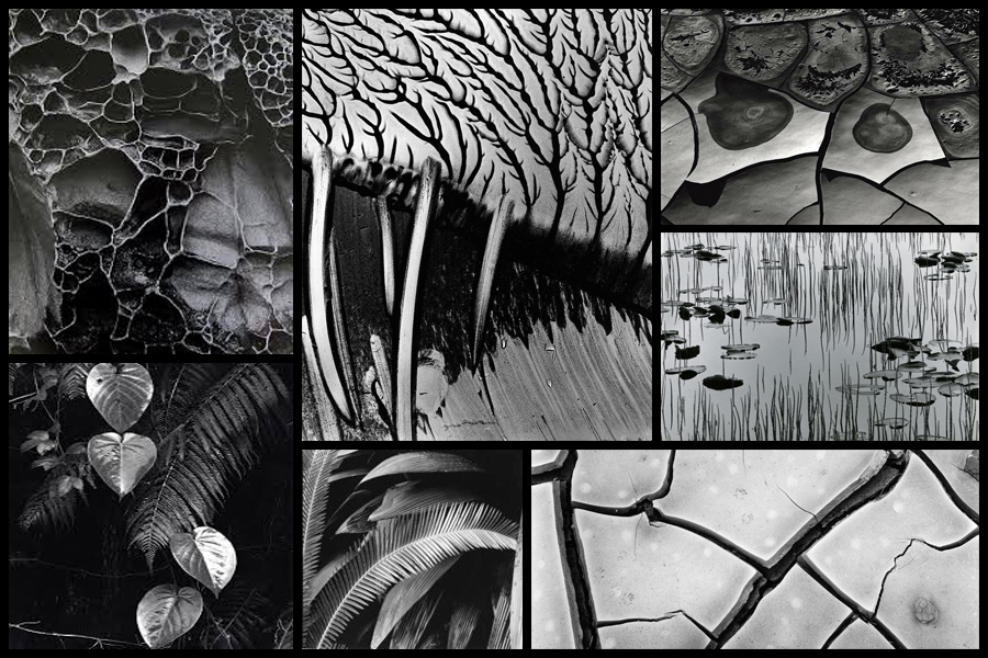
Brett Weston war born 1911, Los Angeles, the second son of photographer Edward Weston. Brett was removed from school at a young age to become his father’s apprentice in Mexico, this surrounded his by revolutionary artists of the day such as Tina Modotti, Frida Kahlo and Diego Rivera, not only did this influence his but also presented his with a striking contrast to life in Mexico but as also where he first started taking photos with a small Graflex. This introduction that Brett was shown and the work of the painters unintentionally influenced his sense of form and composition, this quality of design was evident in Brett’s early images of organic and man-made subjects. Here he started to appreciate how the camera transformed subjects close up and how the contrast of black and white altered further the recognition of the subjects. Overall it is not hard to understand his attraction to focus on abstraction dye to the characteristics he was influenced by would allow him to be uniquely identified with throughout the rest of his career.

Weston later returned to California in 1926, and Brett continued to assist him in his Glendale portrait studio whilst exhibiting and selling his own photographs at the same time. From the age of seventeen a group of his images were included in the German exhibition ‘film und Foto’, considered to be one of the most important avant-garde exhibitions held between the times of the two World Wars. Because of this his received great recognition which brought Brett international attention and inclusion in various photographic exhibitions in the following years. Although his art will always be linked with his father’s it is unfair to say that his photography is imitative of Edward’s beyond the early years as he produced an enormous body of work over the seven decades. Some examples of his work can be seen below:

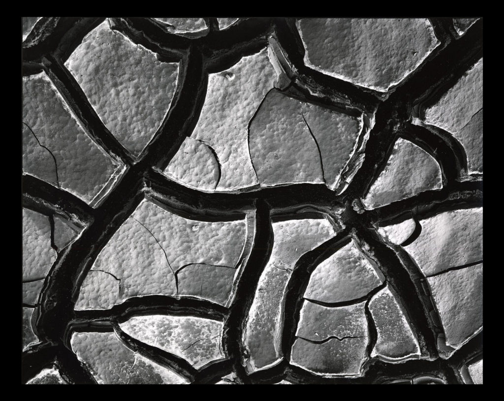
After looking over some of his images I decided that I would go onto look at one specific image that I thought would best reflect my intentions for my future shoot based around abstract patterns. The image I have chosen is called ‘Mud Cracks’ and was taken 1966 highlighting the patterns found in everyday things such as mud. Here I will go onto look at things like visual, technical and contextual aspects which would allow me to further my knowledge regarding techniques used and the style of photography created.

Visual:

Visually the piece is quite simplistic in the sense that the photo is of a piece of mud, however its when upon further inspection that there are cracks which form patterns across the mud, something the every-day eye would miss unless focused upon. For me the piece is extremely aesthetic due to how the tones used across the composition are varying grays with the only real shades coming from the cracks which allow separation in the image which prevents the outcome of pure mud becoming too overpowering. To stop the mud becoming too much Weston has made sure to include smaller cracks within the cracks of mud to add variation to the photo whilst stopping a continual generic surface from occurring across the entire image.

Technical:

When looking across the image it is clear to say that a slightly lower exposure has been used so that the darkness in between the cracks is highlighted above the rest of the image which due to sunlight is a lot lighter and therefore becomes the focal point. It looks like a higher shutter speed has been used to capture crisp detail of the mud as you can clearly see the lumps and grooves present on each slab of mud whilst there being no evidence of motion blur whatsoever. Weston has made sure to include a clear fifty fifty ration between mud and cracks which stop one or the other from becoming too overpowering and stopped the effectiveness of the other.

Contextual:

The aim of the piece is meant to create the subject and present it in an unrecognizable fashion, devoid of sentimentality. There is meant to be a sense of a lack of human presence and narrative making it unclear of what the photographer is trying to express. The composition is not amazing and the angle is wrong, however this is the aim of the photographer who could argue that the aim of modern photography is so that the image is only partially aesthetic. These concentrated images share the high-contrast and graphic qualities of Weston’s panoramas while emphasizing his affinity for “significant details” and the unprecedented attention to form, texture, shadow, and light that he explored throughout his nearly-seventy-year career.

Photobook Analysis

Historical Photobook- Photographs of British Algae: Cyanotype Impressions (1843–53)

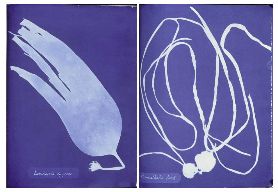
English botanical artist, collector and photographer Anna Atkins was the first person to illustrate a book with photographic images. Her nineteenth-century cyanotypes used light exposure and a simple chemical process to create impressively detailed blueprints of botanical specimens. 

Anna’s innovative use of new photographic technologies merged art and science, and exemplified the exceptional potential of photography in books. Andrea Hart, Library Special Collections Manager at the Museum, says, ‘With the introduction of photography, you get a whole new opening up of how natural history and science can be presented in print. Before the invention of photography, scientists relied on detailed descriptions and artistic illustrations or engravings to record the form and colour of botanical specimens. Anna’s self-published her detailed and meticulous botanical images using the cyanotype photographic process in her 1843 book, Photographs of British Algae: Cyanotype Impressions. With a limited number of copies, it was the first book ever to be printed and illustrated by photography.

‘Before Atkins’s book on British algae and the photographic process, botanical images would have been restricted to the traditional printing processes of engraving or woodcuts, although the art of nature printing was also in its early stages around Atkins’s time’.

Because there are limited copies of this book in the world i couldn’t physically hold this book to analyse the whole inside, but I wanted to use this book as inspiration for my photobook and especially the ways Atkins displayed her cyanotypes very simplistically on each page. This links to my 6th photoshoot where I produced my own photograms responding to my research into Anna Atkins and the history behind how they were first created.

Contemporary Photobook- Rinko Kawachi: Illuminance

I also chose Rinko Kawauchi photobook ‘Illuminance’ to take inspiration from when creating my photobook as I explored her work at the start of my project and think that the concepts of my project now were built from researching her photography and why she takes photos.

” In Illuminance, Kawauchi continues her exploration of the extraordinary in the mundane, drawn to the fundamental cycles of life and the seemingly inadvertent, fractal-like organization of the natural world into formal patterns. Gorgeously produced as a clothbound volume with Japanese binding, this impressive compilation of previously unpublished images is proof of Kawauchi’s unique sensibility and her ongoing appeal to lovers of photography.

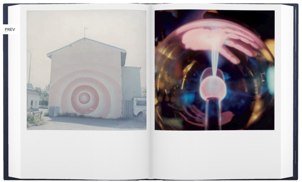
  • How does the book to look and feel, Cover The book is A4 with a hard cover which is clothbound with Japanese binding, displaying square debossed image printed onto a linen material on the front and another image in the same place/size on the back. I think that these two images are good representations of what is inside the book and interests the reader.
  • Paper and ink: use of different paper/ textures/ colour or B&W or both. The title ‘Illuminance’ is a different material to the front cover of the book where is spelt in shiny dots spelling title and her name underneath, linking to the title Illumininace. The colours of these dots link to the colours seen in the image above the writing. The colour of the front and back colour is a dark blue/purple, which complement the glowing pink colour of the plant in the image in the centre of the cover. I think that both these images link together, the image of the back displays a beam of light against a structure, the image in the front as it looks as though light is directly shining on the flower. These links together as through the emphasis of light and making it seem as though the beam of light on the back is on the flower on the front.
  • Title: Illuminance I think that this title intrigues the reader as it indicates how the images in her book emphasise light.
  • Narrative,Structure and architecture:: what is the story/ subject-matter. How is it told? The images in her book, Illuminance, span 15 years of work, both commissioned and personal projects, and have the ability to make the mundane extraordinary, leaving poetry in the viewer’s mind. A distinctive trait of her work and the book lies in the sequence and the juxtaposition of her images. This editing, she says, “differentiates between a photograph and an artwork. Seeing two images next to each other opens up the imagination and gives birth to something else. Flipping through the pages of the book, it can arouse feelings of excitement, sadness, or happiness—things that are hard [for me] to do with words.” At first glance, her photographs seem simple. But her talent lies in the way she is able to evoke the primal in all of us: a depth of raw human emotion. “It’s not enough that [the photograph] is beautiful,” says Kawauchi. “If it doesn’t move my heart, it won’t move anyone else’s heart.
  • Design and layout: image size on pages/ single page, double-spread/ images/ grid, fold- outs/ inserts. Most of her pages display a square image, starting at the top of the page and leaving white space at the bottom. This occurs on every page on the book, except for a few double page spreads where theres only one out of the two pages that has an image. Kawauchi probably did this to emphasise those particular images and to create a few breaks in the sequence of the book.
  • Images and text: are they linked? Introduction/ statement / use of captions (if any.) At the end of the book there is a body of text called Weightless Light – David Chandler at end of book which talks about some of her other photo books and and the concepts and meaning behind her images. “Her dramatic twists of subject matter and mood, , leave an overall impression of a first person narrative.” “From page to page ‘Illuminance’ builds into a sustained meditation on light’s miraculous qualities and revelatory power, at the heart of which is a reminder that light is the source of all seeing, and the fundamental property of photography.”
“In the rendering of light in Kawauchi’s work, in the continual sense of matter dissolving or evaporating into air and space, the idea behind to settle of the elemental state where the interconnection between things is also a merging, a form of immanence that suggests the possible terms of the sublime, sensory integration of our being with the natural world. “

I think that by taking inspiration from both Anna Atkins and Rinko Kawauchi when designing my photo book I will produce a body of work that will link together. I will try to interpret the way Kawauchi has connections between her images in her double page spreads. She says that “Seeing two images next to each other opens up the imagination”. This is why I will try to display combinations of images that connect e.g. through colours, patterns or texture. Taking inspiration from Anna Atkins cyanotypes will also add a different aspect to my photo book that will interest the readers and will complement my landscape image.

Archive postcards

These are a series of postcards from the Societe Jersiaise photo archive that show the seaside and popular locations from the past that must have been printed to promote jersey tourism, I intend to use some of these postcards within my book with some of my own photos of popular tourist attractions such as the seaside.

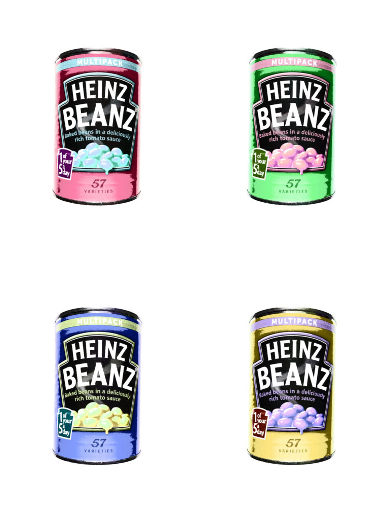
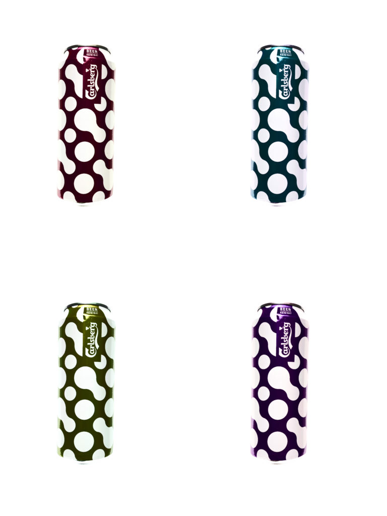
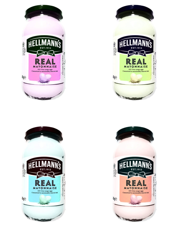
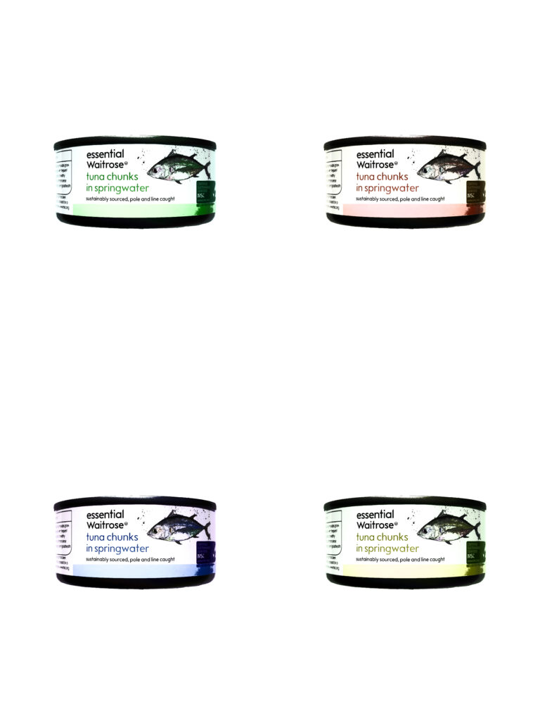
Consumerism Shoot- POP ART EDITS

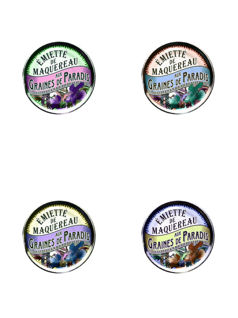
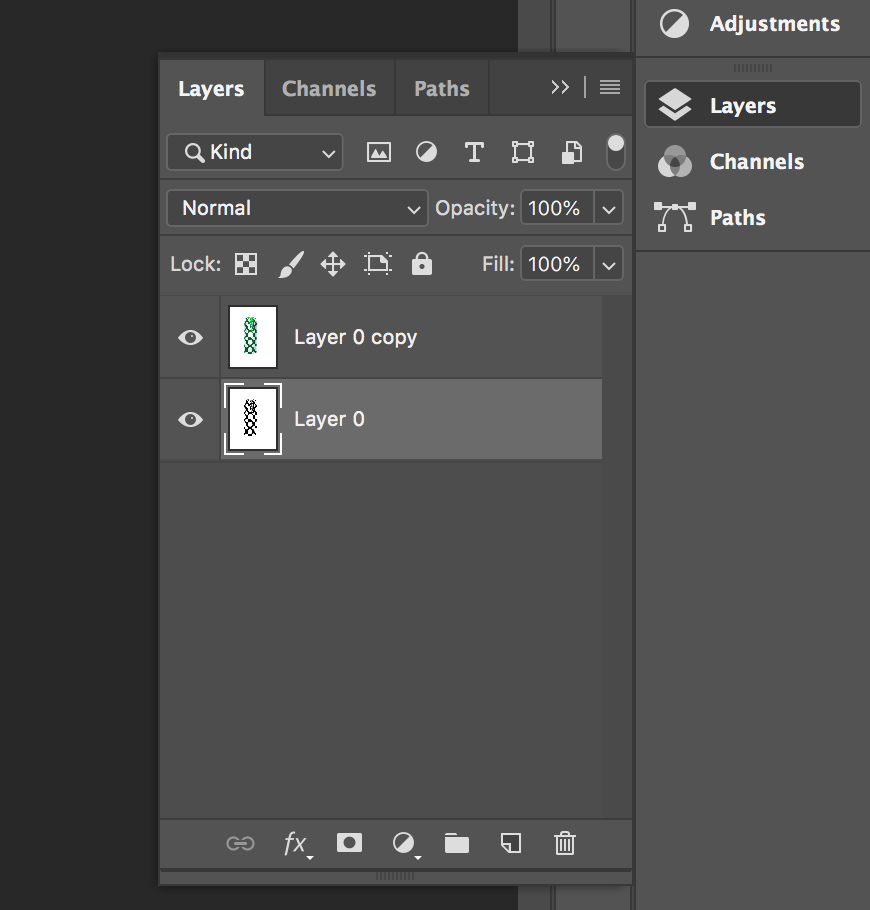
For these images i wanted to create images similar to Andy Warhol’s Screen prints like his Campbells soup cans. When creating these images I wanted to produce a printed like effect.

Steps to Create this effect:

Andreas Gursky

Andreas Gursky (born 1955) is a German photographer and professor and the Kinstakademie Dusseldorf, Germany which is the academy at which the Bechers’ taught him and influenced lots of art in the Minimalism movement. Gursky is known for large format architecture and landscape colour photographs (similar to the style in which Lewis Bush photographs in his Metropole project. Gursky studied at the Universitat Gesamthochschule Essen in visual communication, with classes led by photographers Otto Steinert and Michael Schmidt. Between 1981 and 1987 he attended the Dusseldorf Art Academy where he received training from Hilla and Bernd Becher which led to a similar methodical approach in his photography.

Image result for andreas gursky

Gursky would not digitally manipulate his images before the 1990s however has begun to rely on computers to enhance his photographs. A lot of Gursky’s photographs are taken from a high vantage point which gives an unusual but effective perspective. He tends to focus on large man-made spaces such as offices and high rise buildings. The photographs are printed to create huge panoramic colour prints which can be up to six feet high by ten feet long. Critic Calvin Tomkins described the experience of confronting one of his works in person as having “the presence, the formal power, and in several cases the majestic aura of nineteenth-century landscape paintings, without losing any of their meticulously detailed immediacy as photographs”.

Gursky’s photograph 99 Cent taken in 1999 was taken at a 99 Cents Only store in Los Angeles and shows the interior of the store as a wide composition of parallel shelves with a few white columns to separate up the photograph. The photograph represents all of the individual products as one wave of colour and blocky shapes rather than the brands and products on offer. The photograph supposedly depicts a stretch of the river Rhine outside Dusseldorf.

Andreas Gursky appeals to me because, similar to Bernd and Hila Bechers and Lewis Bush, he focuses on buildings and the patterns throughout them in order to create abstract and intriguing compositions. The photographs produced by Gursky often show the contrast and similarity between products and buildings through a typology approach without using a typology grid, for example in his photograph ‘99 Cents Gursky shows the contrasts and similarities between each of the products in the 99 Cents store. This is shown as the individual shapes of each product can be seen if you look closely but when looking at the photograph as a whole all of the products seem to be the same apart from the colour – the branding that the manufacturers pride themselves on are no longer important as all of the products blend together.

Image result for andreas gursky 99 cents
’99 Cents’

Noemie Goudal – Artist Study

Image result for noemie goudal

http://noemiegoudal.com/

Noémie Goudal is a French artist who graduated from the Royal College of Art in 2010 with an MA in Photography and lives and works in Paris. Noémie Goudal’s practice is an investigation into photographs and films as dialectical images, wherein close proximities of truth and fiction, real and imagined offer new perspectives into the photographic canvas. The artist questions the potential of the image as a whole, reconstructing its layers and possibilities of extension, through landscapes’ installations.

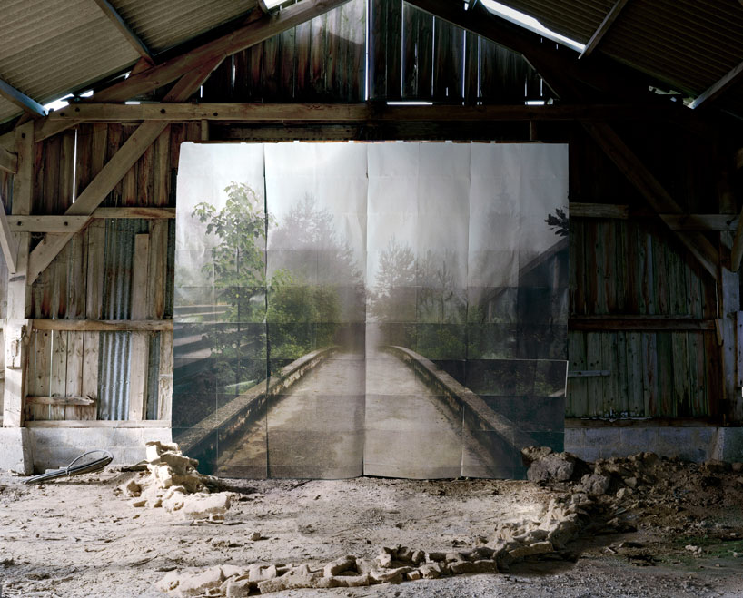
Noemie Goudal works on the land, setting up large paper backgrounds that are deliberately distinguishable. She superimposes them on the landscape, creating an image that sits on the borderline of reality without ever really forsaking it.

Image result for noemie goudal

Book development, narrative and presentation

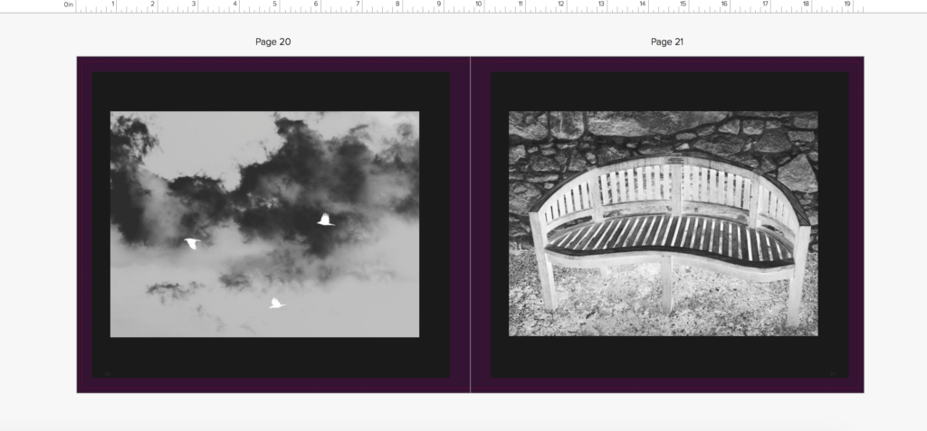
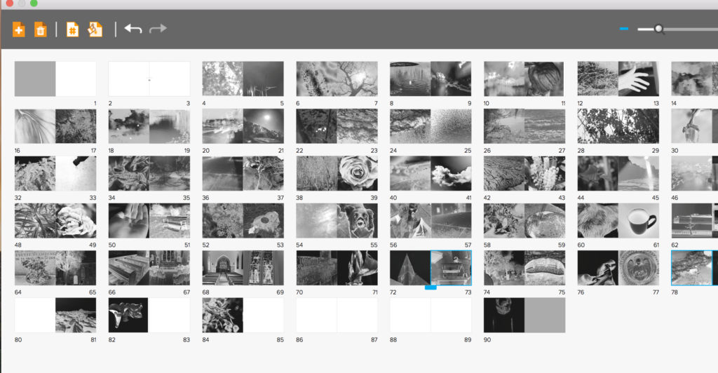
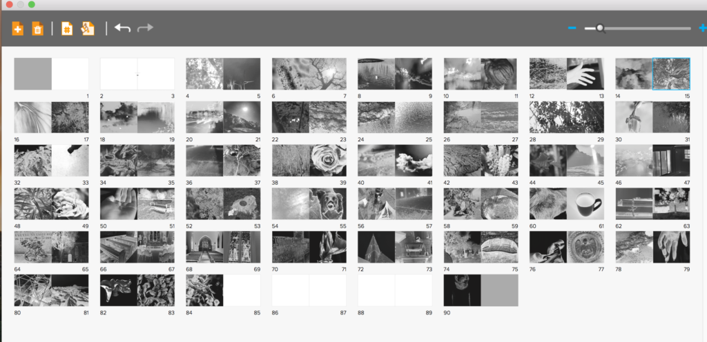
I first started off the development of my book with the inspiration of three artists who all used silver and black ink and focused on a abstract and vivid interpretation of the world. I believed all of their books had an essence of life and a narrative journey within them. I started off my shoots for the book by concentrating on the beauty and birth of life itself in a religious manner. I took around 5 shoots inspired by the beauty found within nature, and placed these images at the beginning of the book as this will be the start of my narrative journey. I wanted to place the images next to another which had a contrasting and oppositional colour inversion, so a light and a dark tonal image next to each other, I believed this attracts the same attention to each image and creates a nice flowing narrative to the book itself.

I had soon filled the first part of the book with images of life, I then wanted to show more abstract elements of religion that god was said to create, so showing direct imagery from underwater, animals, and light itself in a more creative manner. I not only wanted to show the world, But too wanted elements of myself to show the human chaos and soon destruction of the world, and the self growth and deterioration throughout the book. As the narrative is about the journey of life of people created and given by god. I decided to add objects which symbolised a life cycle and journey, such as houses, benches and mugs of tea, doing this also constitues a narrative of isolation and loneliness, and presents a sense of abandonment and getting towards the end of life itself. I soon added images from outside and in a church to not only symbolise the end of life, but an evolution of combining the end of life with the original creator itself, reflecting in both the individuals journey of life and religion itself. I also edited the images so they get darker throughout the church imagery towards the end, showing the tonal navigation of light to dark throughout symbolises a pathetic fallacy of death and foreshadowing the gradual end and decay of the book itself,.

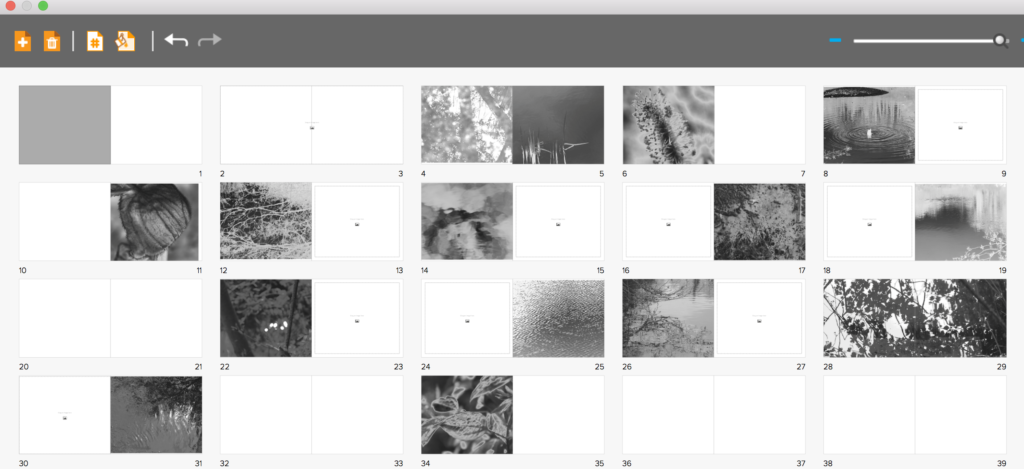
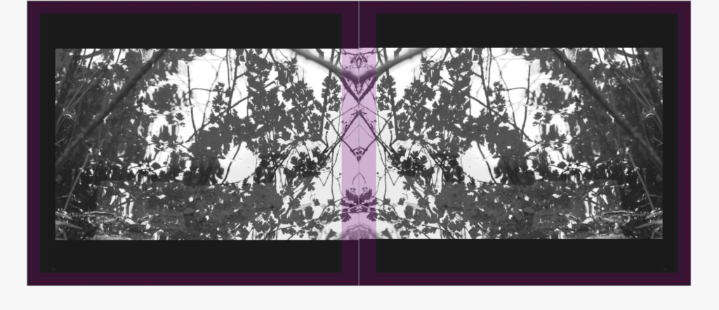
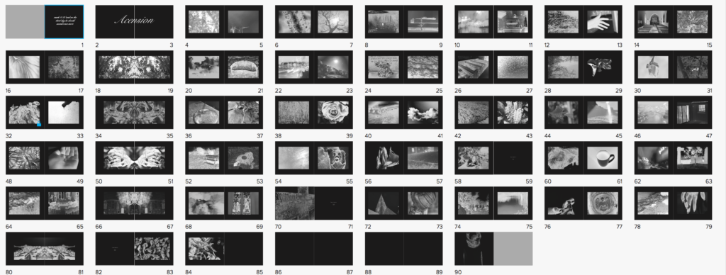
I had soon Finished applying all of the images to the book itself, having both people, nature, objects and a clear narrative both emotional, and chronological. However, after discussing with teachers, we decided to have the book this segregated wasn’t the most successful way in order to show the images, So I re arranged the narrative to show contrasting images, so rarely two nature images are together. I decided I wanted my book to be long in order to have such a strong effect, I also wanted this effect to be heightened by the image on every page always being the same proportion. I believe if you are going to do a book with such a strong concept colour-wise and story wise you need to carry on this strength and not stop the narrative at any-point. However, I thought it would be successful if like two of my artists I showed a continuous black border, which not only exaggerates the colour in the images themselves, but shows a clear narrative colour scheme throughout the book, and doesn’t make the images over-bleed continually on each page. The book itself has the layout of more of lexicon of life, and a clear chaotic feel, as life is not a simple route to the end. I the wanted to show a separating indexical icon throughout, so repeated one image across two pages every 8 pages, to segregate and keep attention throughout the length of the book itself.

Sigmund Freud

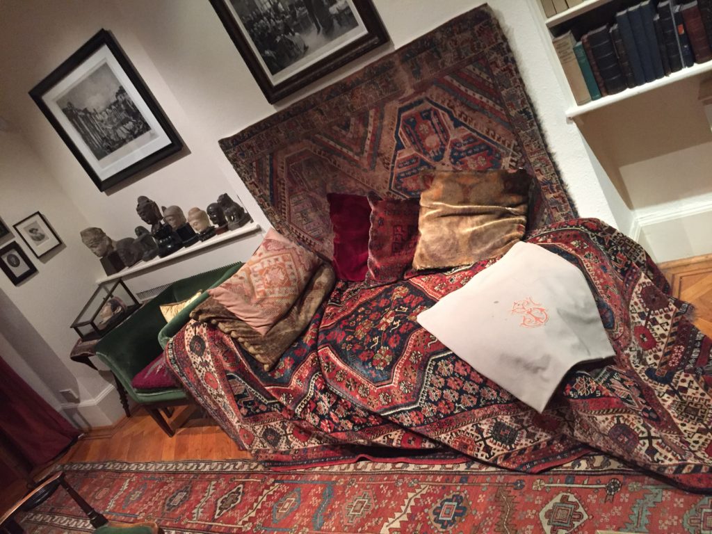
Psychoanalysis was founded by Sigmund Freud (1856-1939). Freud believed that people could be cured by making conscious their unconscious thoughts and motivations, thus gaining insight. The aim of psychoanalysis therapy is to release repressed emotions and experiences, i.e., make the unconscious conscious. It is only having a cathartic (i.e., healing) experience can the person be helped and “cured.”
Psychoanalysis Assumptions

  • Psychoanalytic psychologists see psychological problems as rooted in the unconscious mind.
  • Manifest symptoms are caused by latent (hidden) disturbances.
  • Typical causes include unresolved issues during development or repressed trauma.
  • Treatment focuses on bringing the repressed conflict to consciousness, where the client can deal with it.

How can we understand the unconscious mind?

Psychoanalysis is commonly used to treat depression and anxiety disorders. In psychoanalysis (therapy) Freud would have a patient lie on a couch to relax, and he would sit behind them taking notes while they told him about their dreams and childhood memories. Due to the nature of defence mechanisms and the inaccessibility of the deterministic forces operating in the unconscious, psychoanalysis in its classic form is a lengthy process often involving 2 to 5 sessions per week for several years.

This approach assumes that the reduction of symptoms alone is relatively inconsequential as if the underlying conflict is not resolved, more neurotic symptoms will simply be substituted. The analyst typically is a ‘blank screen,’ disclosing very little about themselves in order that the client can use the space in the relationship to work on their unconscious without interference from outside.

Psychoanalysts use various techniques to develop insight into their clients behaviour and the meanings of symptoms, including ink blots, parapraxes, free association, interpretation (including dream analysis), resistance analysis and transference analysis.

– Rorschach ink blots:

The ink blot itself doesn’t mean anything, it’s ambiguous (i.e., unclear). It is what you read into it that is important. Different people will see different things depending on what unconscious connections they make. The ink blot is known as a projective test as the patient ‘projects’ information from their unconscious mind to interpret the ink blot.

– Freudian Slip:

Unconscious thoughts and feelings can transfer to the conscious mind in the form of parapraxes, popularly known as Freudian slips or slips of the tongue. We reveal what is really on our mind by saying something we didn’t mean to. An example of this is where a person may call a friend’s new partner by the name of a previous one, whom they liked better.

Freud believed that slips of the tongue provided an insight into the unconscious mind and that there were no accidents, every behavior (including slips of the tongue) was significant (i.e., all behavior is determined).

– Free Association:

A simple technique of psychodynamic therapy, is free association, in which a patient talks of whatever comes into their mind.  This technique involves a therapist reading a list of words (e.g.. mother, childhood, etc.) and the patient immediately responds with the first word that comes to mind.  It is hoped that fragments of repressed memories will emerge in the course of free association.

Freud reported that his free associating patients occasionally experienced such an emotionally intense and vivid memory that they almost relived the experience.  This is like a “flashback” from a war or a rape experience.  Such a stressful memory, so real it feels like it is happening again, is called an abreaction.  If such a disturbing memory occurred in therapy or with a supportive friend and one felt better–relieved or cleansed–later, it would be called a catharsis.

– Dream Analysis:

According to Freud the analysis of dreams is “the royal road to the unconscious.” He argued that the conscious mind is like a censor, but it is less vigilant when we are asleep. As a result, repressed ideas come to the surface – though what we remember may well have been altered during the dream process.

As a result, we need to distinguish between the manifest content and the latent content of a dream. The former is what we actually remember. The latter is what it really means. Freud believed that very often the real meaning of a dream had a sexual significance and in his theory of sexual symbolism he speculates on the underlying meaning of common dream themes.

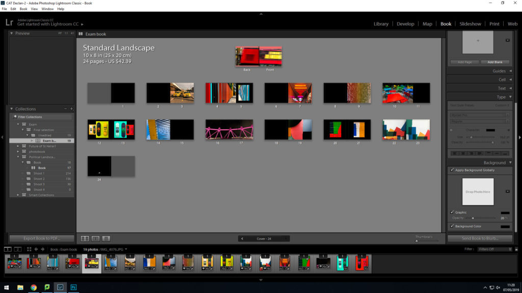
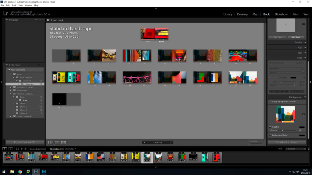
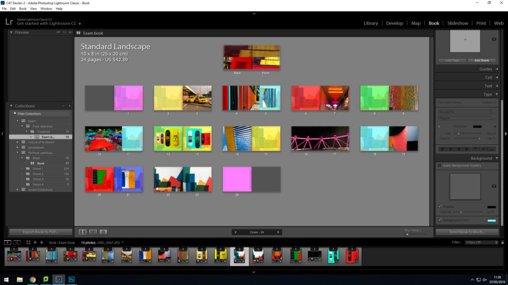
Book Design Experimentation

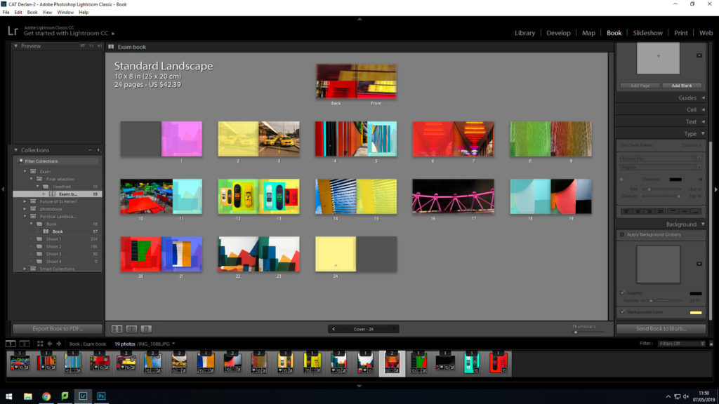
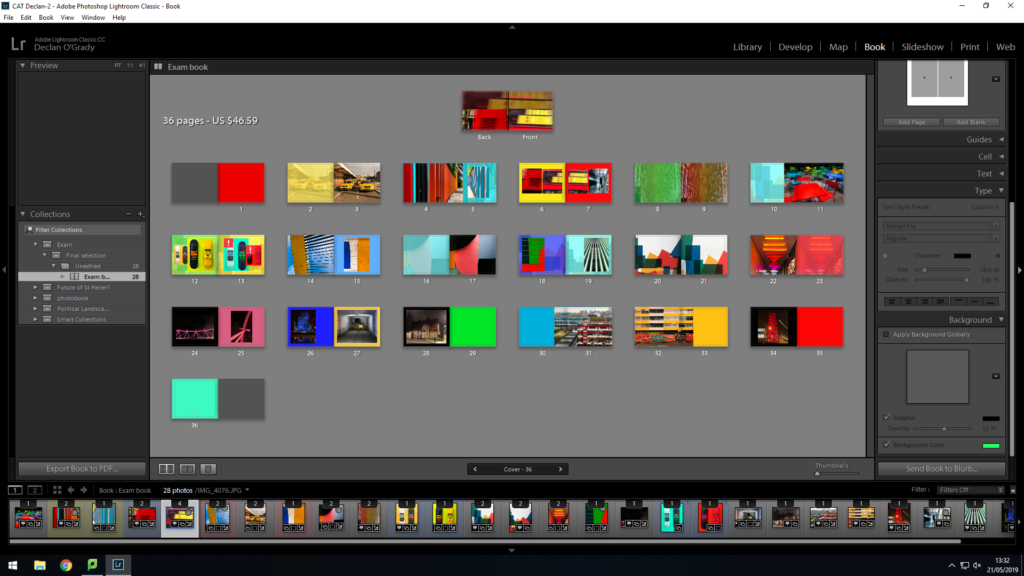
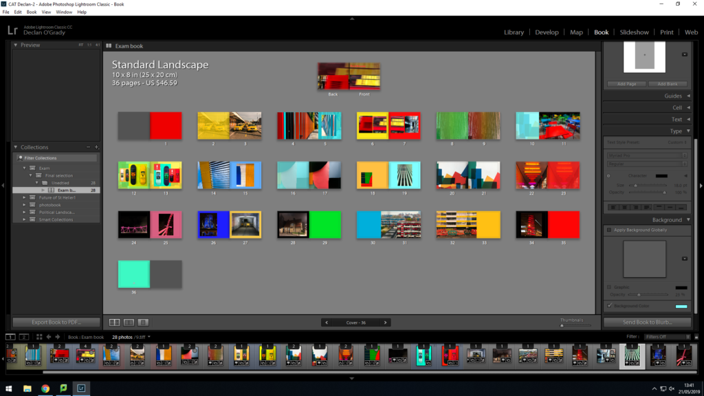
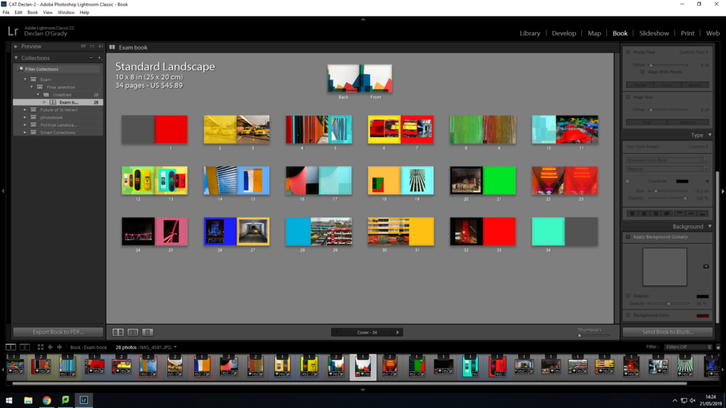
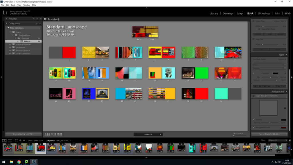
I have decided to make a photobook using lightroom to present my images as i feel that this is the best way to display and collate the images i have produced, focusing on colour photography. I am focusing on including vibrant, saturated and a contrast between dark and light.

From my artist reference on

This is my final design:

This is my final outcome for my book design. I think this will be the most suitable design as it meets my book specification.