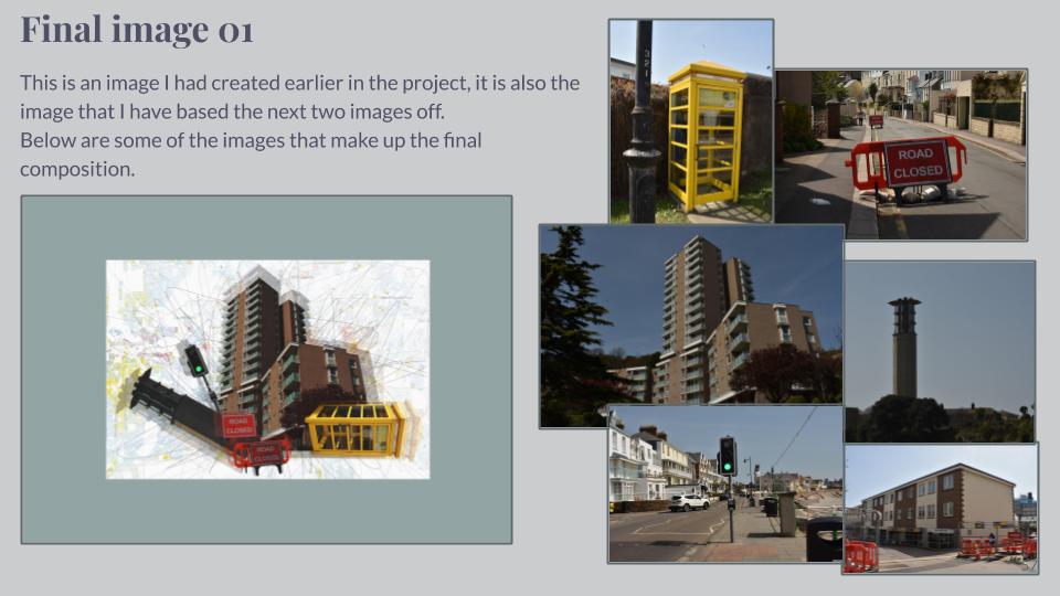


I really like my image below, taken in Shoot 7. There is a lot going on in this image, split up by the tree structures in the foreground. From subtle, pale shades of green to darker, prominent shades, my image captures the wide spectrum of colour contrasts in nature and how this presents the most sublime landscapes. Due to high camera quality and prime time of light exposure, I was able to photograph the intricate detail of the landscape; from the reflection in the water to the outline of each individual tree in the background and leaf in the foreground. This image was taken at Queen’s Valley Reservoir. The reservoir has a natural wealth of flora and fauna and is home to many species of birds and wildlife.
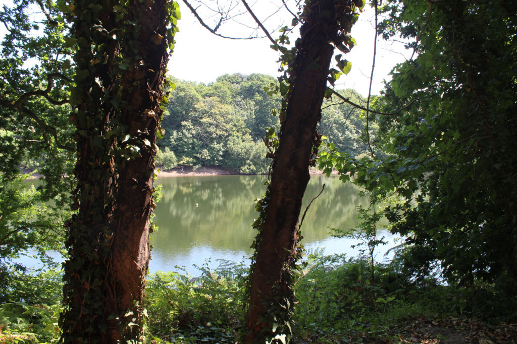
This image was taken in Shoot 3, based around cloudscapes. This particular photograph was edited in response to the photographer John Day. Day heavily edits his photographs of cloudscapes to emphasize the cloud outlines and bold colours of the sky behind. In order to respond effectively, I edited my photograph in Lightroom, increasing the clarity, contrast and vibrance to get an unusual capture of the sky above. The small-scale seagulls scattered in the photograph emphasize the immense size of the clouds.
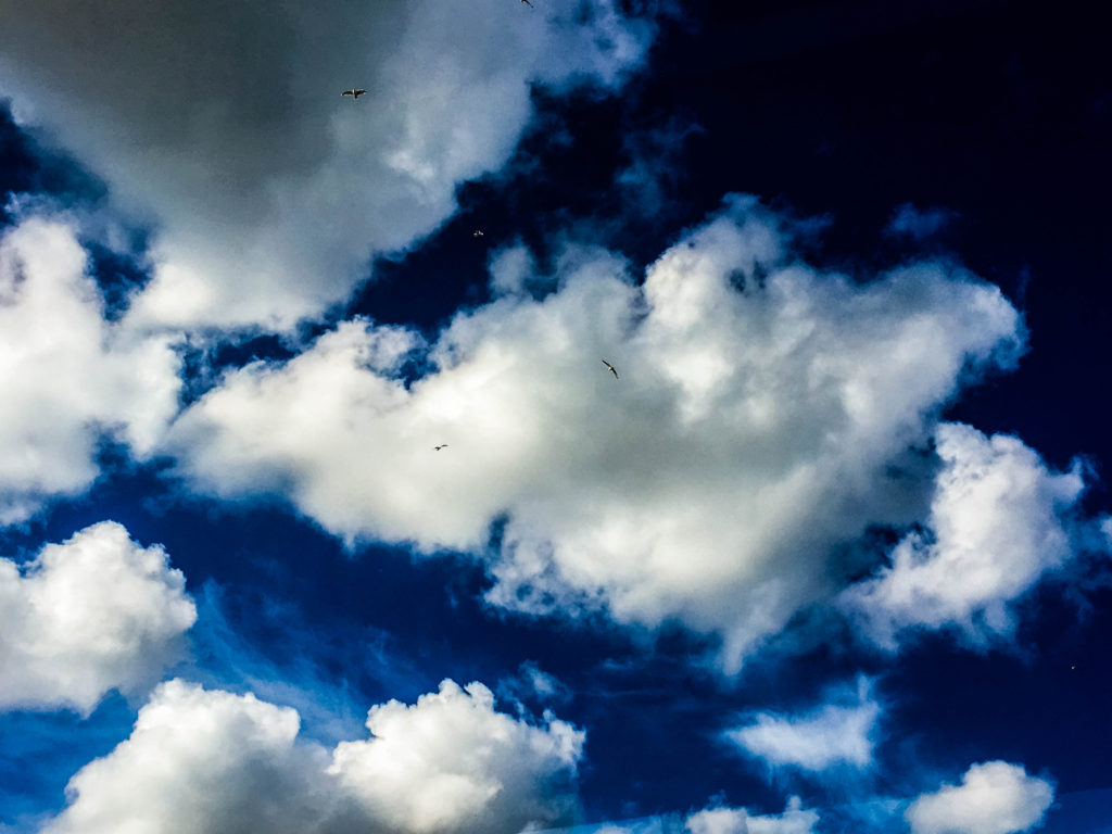
The composition of this image differs from my other large-scale format photographs. I thought a panoramic picture would be an interesting response to cloudscapes. This image was edited in response to Alfred Stieglitz, a photographer who created a famous series of cloudscapes called Equivalents. I firstly edited it into black and white but thought this wasn’t enough to portray the stormy sky visual I was hoping for. I consequently increased the clarity and shadows of the photograph, which created a more distinct horizon line and contrast within the separate clouds.


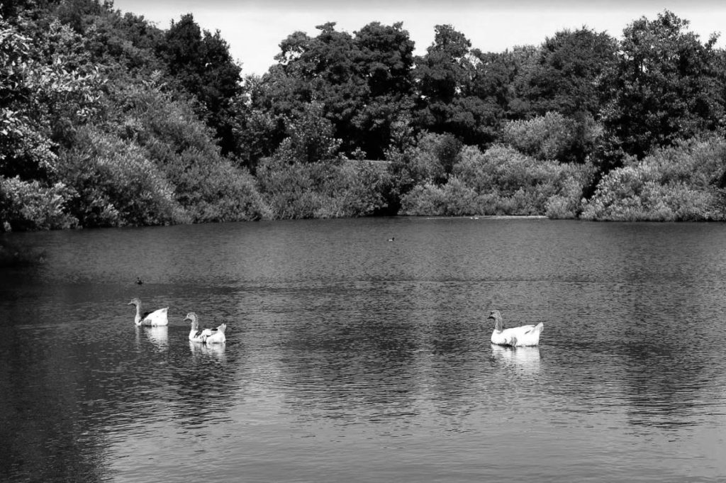
Another black and white edit taken at Queen’s Valley Reservoir, I have captured the water and 3 geese int the foreground, and vegetation in the background. The black and white edit has created clear tonal contrasts of white, black and grey, following Ansel Adam’s zone system. The water is calm, with little visual movement and almost looks like a dry surface with the geese on the surface. This image is much more tranquil and serene compared to image 3, an element of nature I wanted to capture.
In order to further develop my photographic investigation into diverse nature, I have decided to analyze 5 of my primary source images. I have chosen one image from shoot 8, one from shoot 7, one from shoot 5 and another two from shoot 6.
This image was taken in my response to the colour ‘green’, shoot 7. Although it incorporates clear evidence of vibrant shades of green, it also exhibits a range of other colours and tonal contrasts. As this project I am focusing in on the beauty of nature and zooming in on how nature can produce such unique and wonderful structures and forms, I thought this was a perfect capture. This product of nature represents how zooming in on seemingly simple and everyday things can be surprisingly interesting. Each leaf of this plant is different, from pattern and shape, to size and colour. The striking pinks, greens, yellows and reds all come together to portray a energetic and dynamic picture of nature close-up.

I like this image as it is fairly abstract and unique to my other primary source. I took this from a birds-view point at the top of a fish bowl, for a different perspective. The combination of the water and movement of the fish, has created a blurred effect. This photograph is unedited and original, despite it looking altered. The flamboyant orange colour of the fish contrasts with the paler background, and the three-dimensional bubbles above, on the surface of the water.

This photograph was taken in shoot 5, responding to the works of Rinko Kawauchi, a sublime photographer who uses light to her advantage to capture the basic beauty of the world, au naturel. I really enjoyed this shoot as I came out with a large collection of successful images resembling hers. This particular photograph was captured at St Ouen’s Bay, towards the end of the sunsetting. It is a relatively basic image, but has clear composition and a split horizon. The top of the horizon has a subtle orange glow, fading into the blue of the sky and ocean below. At the bottom of the horizon, the waves fan out into the sand in opposing directions. Due to the time of capture, this image is fairly underexposed, giving the photograph an alternative feel than nature’s usual colourful and bright visual.

Taken in response to natural patterns, this photograph is clearly evident of natural texture and shape as a result of natural processes. Taken along a coastline, my image shows the layering of rock and the interesting form it has created. The sand has been eroded through wind, waves and erosional processes like abrasion, furthermore allowing me to witness the end product of nature’s ways. The sand fades into the dark, murky water, becoming less intricate and distinguishable towards the top of the photograph. The light was prime at the time I captured this, the sunlight giving me full exposure of the detail of the sand and rock, displaying each individual line and curve in all its beauty.

In this image from shoot 8, I have focused in on the element of light and how it interacts with nature. I’ve captured the sunlight hitting the water, creating a beam of light on the sea surface. The pale yellow light glows on the dull water, radiating the waves and movement of the water.

Concept: To capture subjects casually in a social setting, inspired by Paul Graham’s “End of an Age” project.


Lighting: Two portable LED floodlights giving out artificial light to show the subject from different angles. I may choose to use only one when creating shadows on the face.
Props: I will cover the portable lights with blue colour gels, using tape to stick them down, in order to create blue light. In future shoots, I will experiment with other colour gels including red and green
Location: Social occasion at friend’s house
Camera Settings: Raised exposure for low-light situations, Small aperture to allow in more light, I will experiment with shutter speed to produce moving images and still images
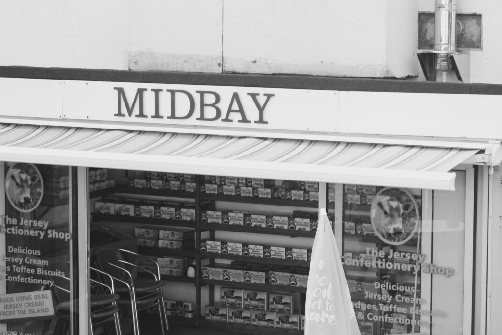
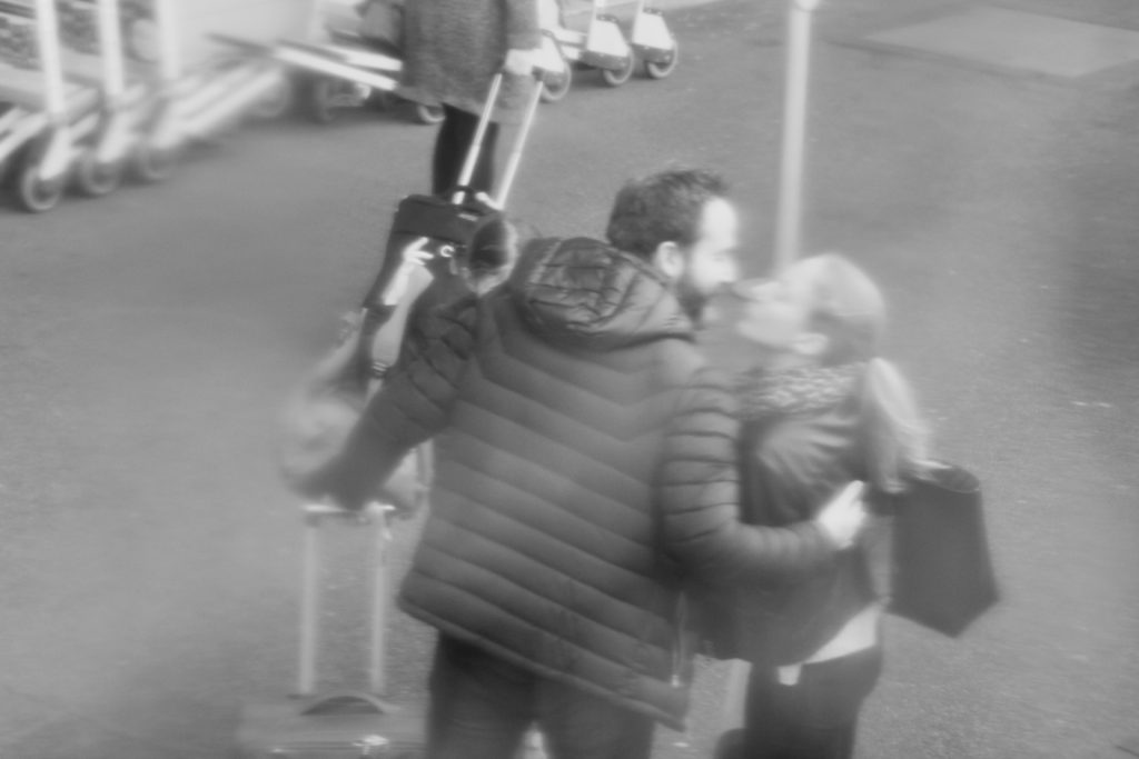
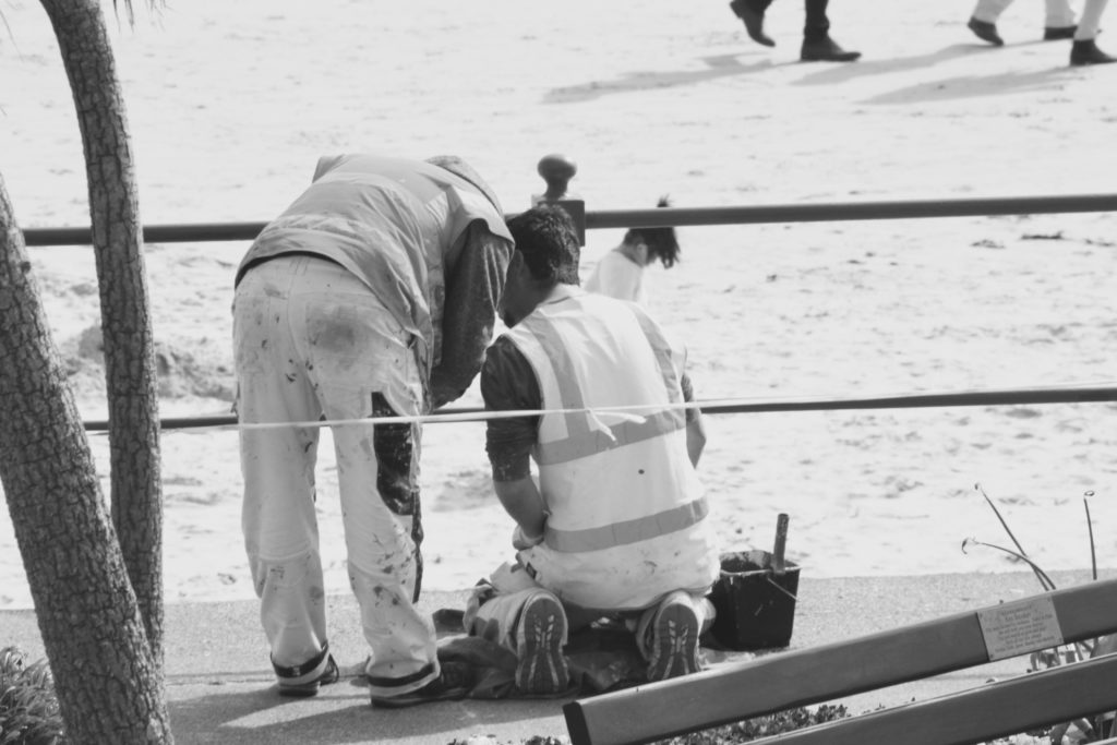
I decided to experiment with some black and white edits with some of the photos from my first shoots, I was inspired by Walker Evans series of black and white subway images and I wanted to see how editing by images in black and white would manipulate them and create a different overall atmosphere within the images. I also thought that pairing my own photos in black and white with some of the coloured postcards from the photo archive could create an interesting juxtaposition.






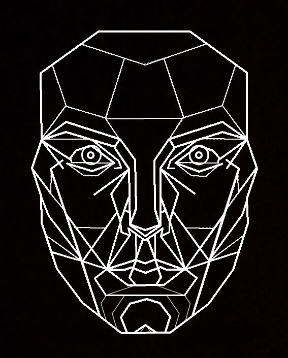
This is a structural plan developed by Dr Stephen Marquartdt of the ‘perfect face’ used by modelling agencies and plastic surgeons to re structure facial features to create a pefectly symmetrical face shapes and spacing. It is called a facial mask which aims to display classic beauty in the form of triangles and geometric shapes. People such as Angelina Jolie share similar facial proportions to this mask. I want to use this mask as an overlay on my portrait photographs, instead of adapting the face to meet the perfect proportions of the mask I want to warp the mask to meet realistic images of beauty showing that people should not have to conform to these guidelines.
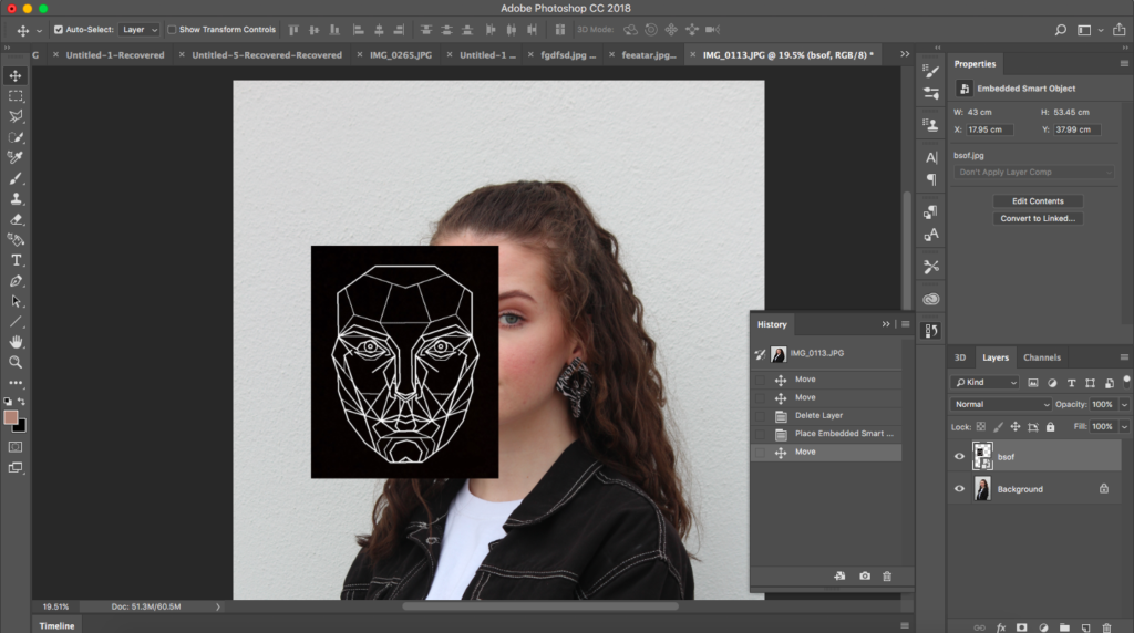
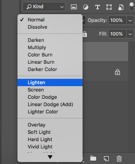
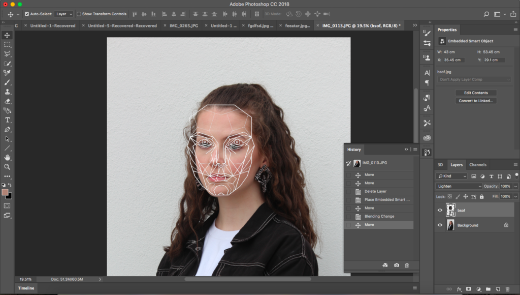
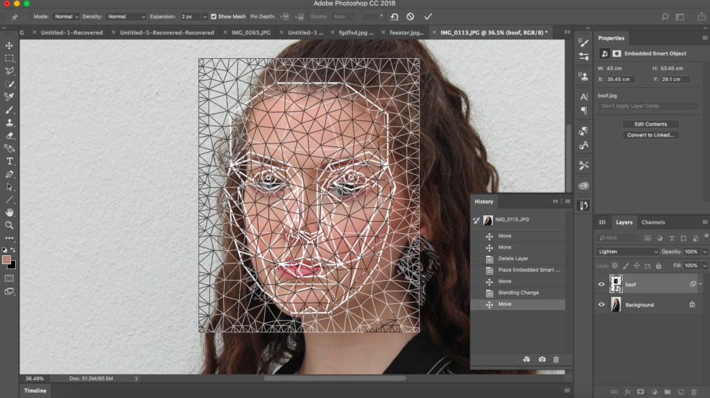
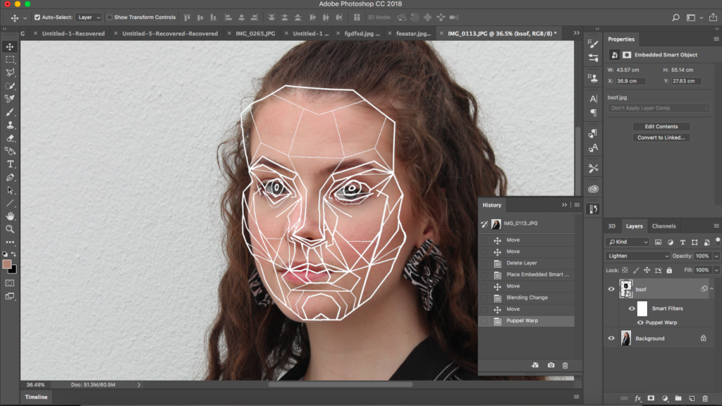
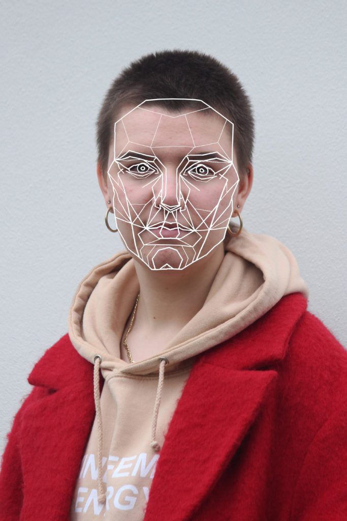
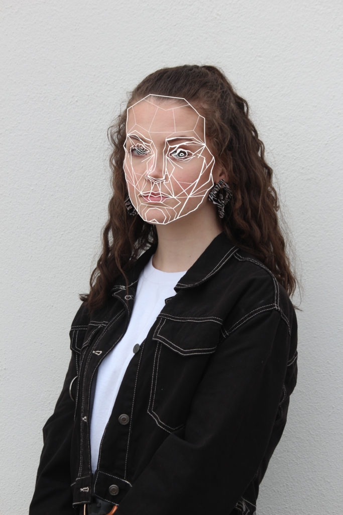
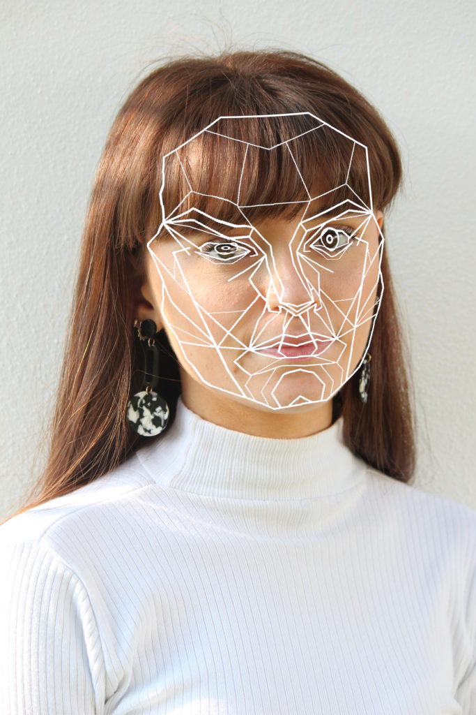
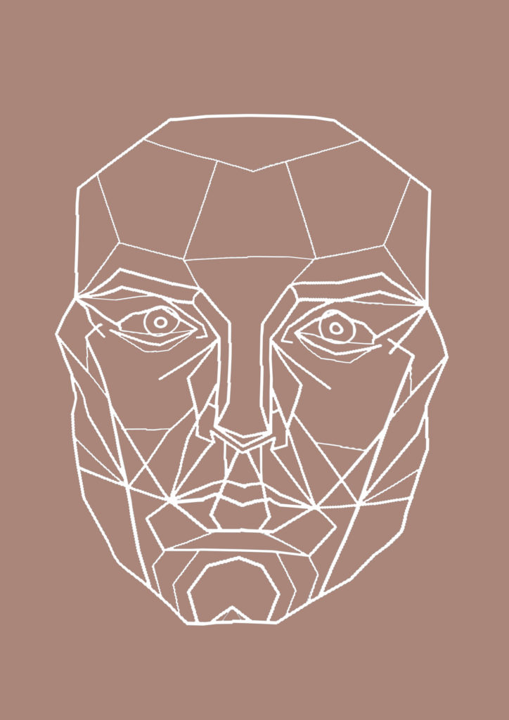
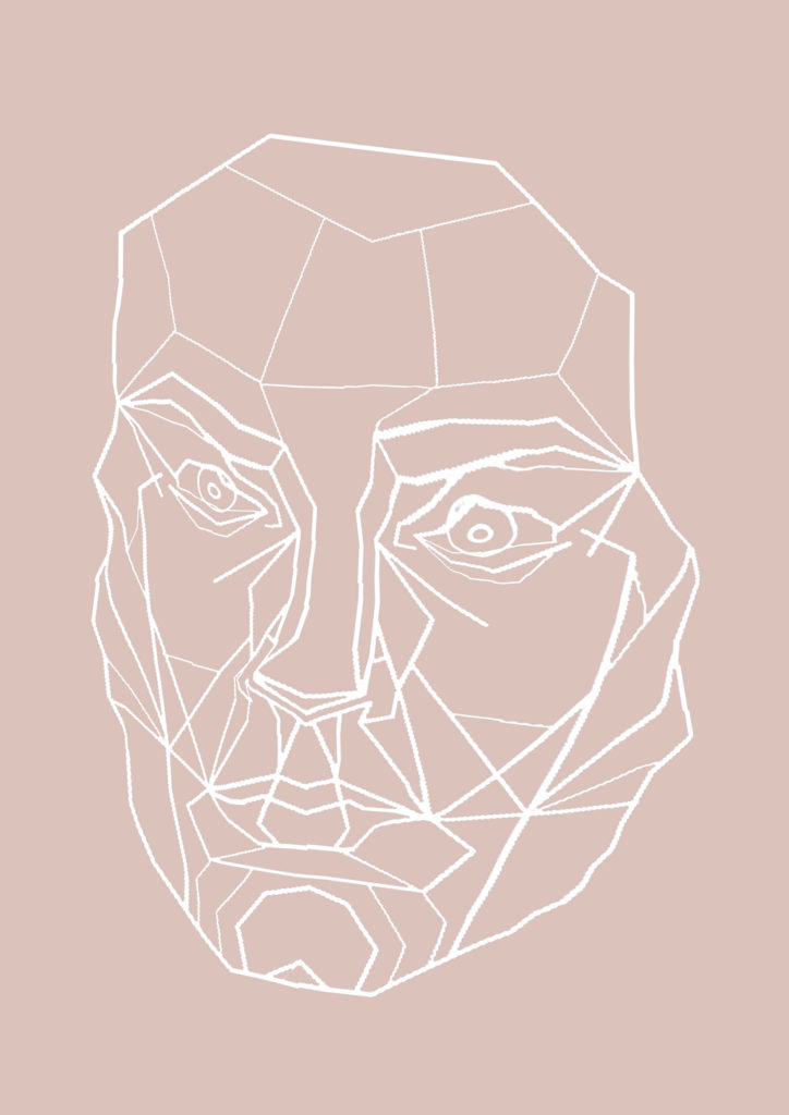

After adding and warping the mask I then copied it to a new page and changes the background to a colour found in the corresponding portrait image. I want to put the photograph alongside the mask image on a double page in the final magazine.
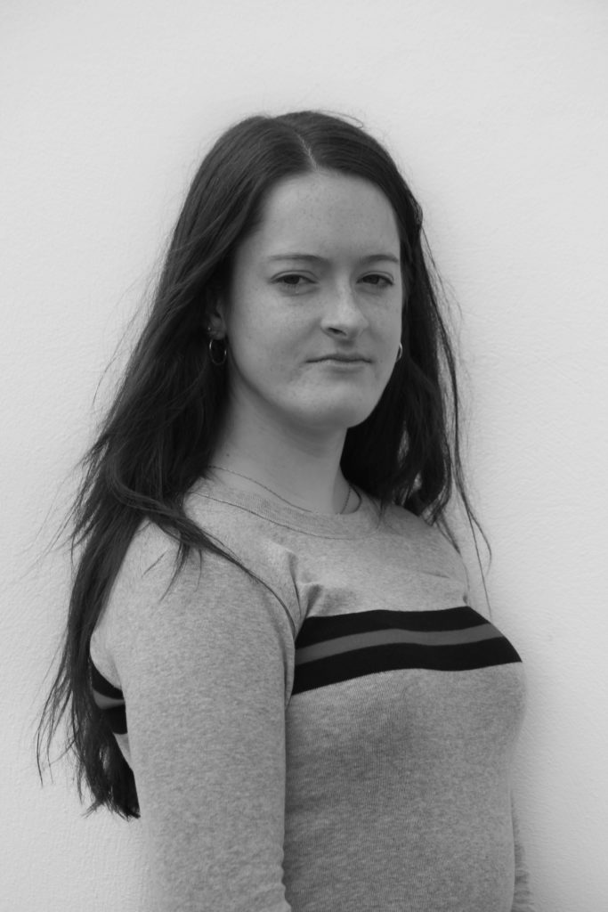
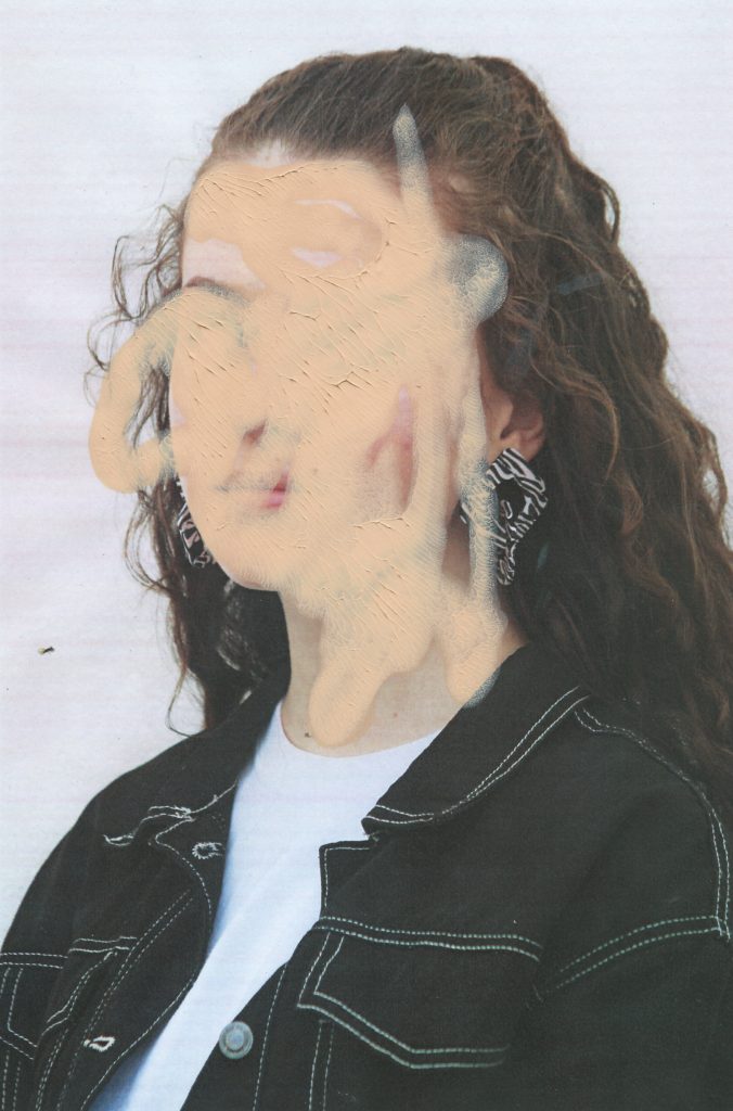
I want to edit some of the images i have taken by hand, to do this I started by changing some of them to black and white. This will help the colours in each image match and will make certain parts of the images stand out. I then printed out the photos on A4 pieces of paper, the quality wasn’t great but I like the way this looked, it deconstructed the perfect style that glossy high quality images have, this goes with the idea of challenging stereotypes on beauty.
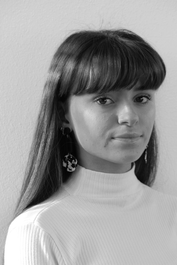
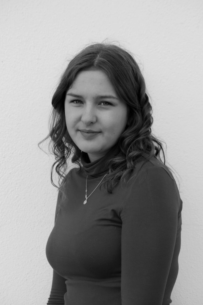
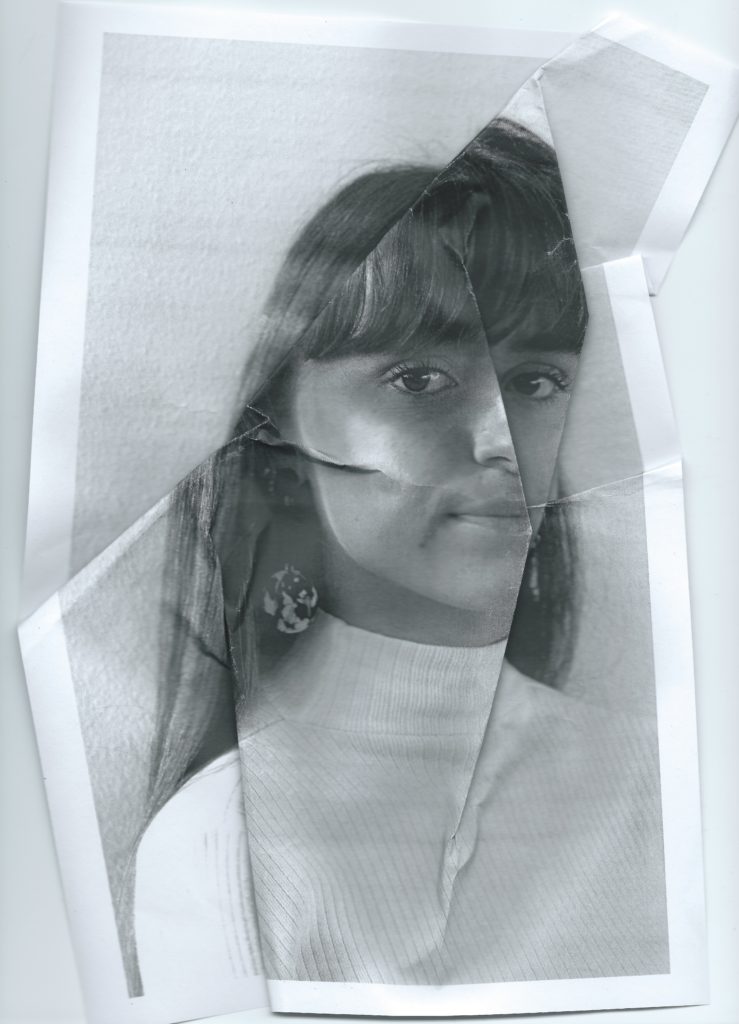
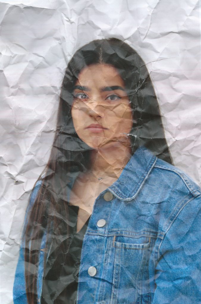
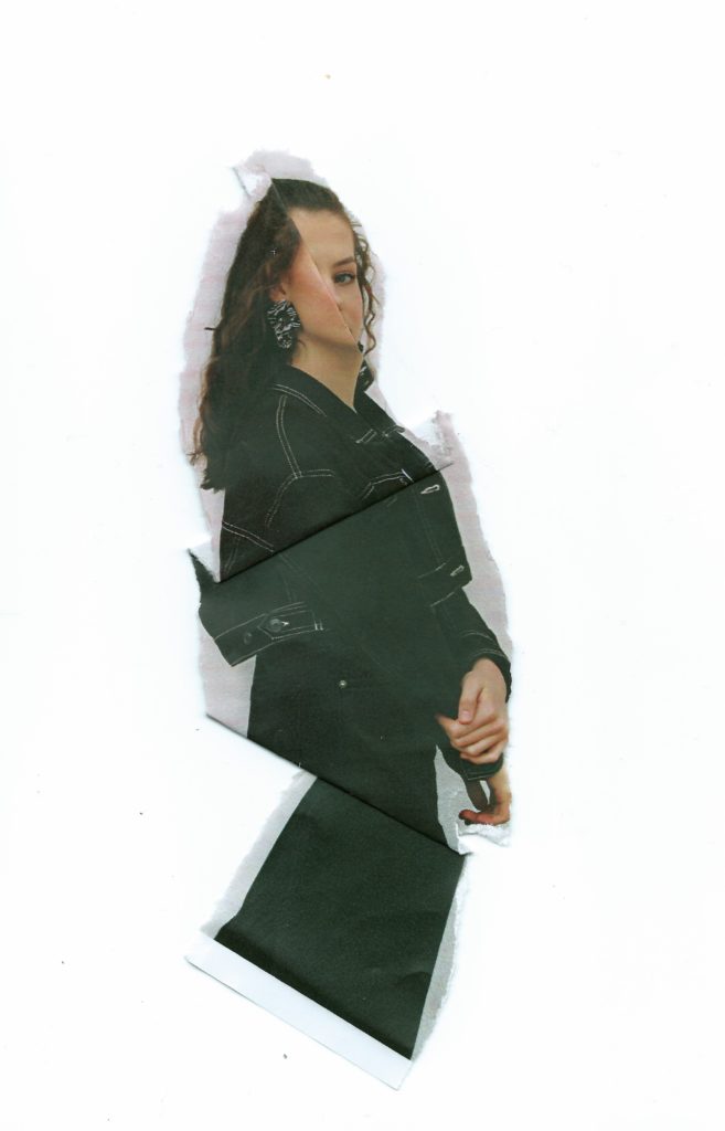
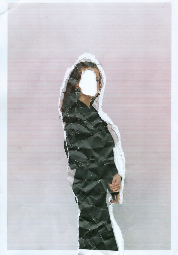
I then begun to manipulate the printed images in the style of Nigel Tomm by folding and crumpling sections to distort the facial features, I started by doing this subtly, choosing where the folds went and gradually became more destructive, crumpling it into a ball and then faltering it back out to create a textured effect. I then scanned the prints which I had manipulated back onto the computer rather than re photographing them, this shows images depth and manages shadows better. I did this with black and white and coloured images, the coloured prints were slightly discoloured and when scanned this happened more, I like the effect and colours this creates, with the pink toned background which creates a more stylised effect.

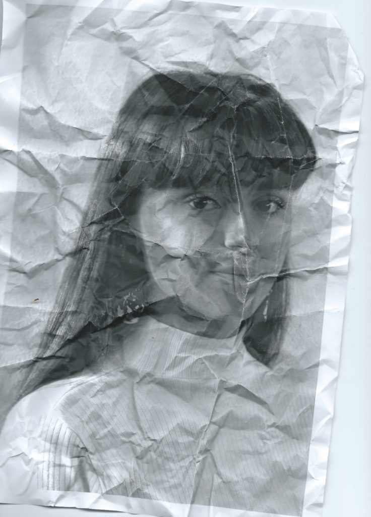
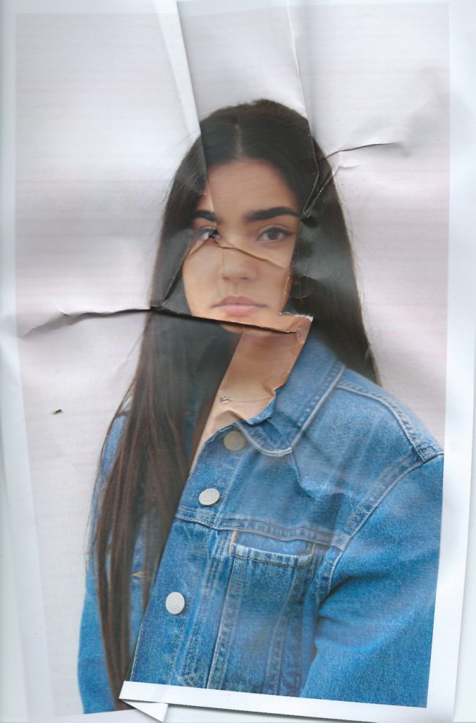
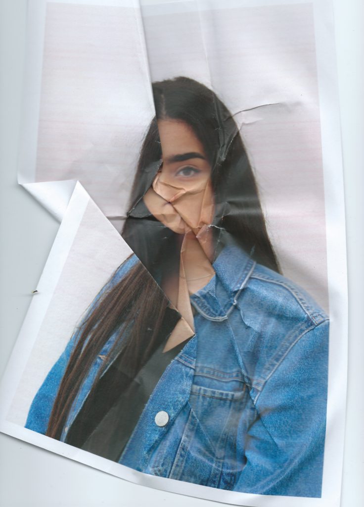
With some of the prints I decided to manipulate them using makeup, the idea being applying makeup to the image rather than the models face. This targets the idea of people using products to erases and mask their natural imperfections, many people use and wear makeup as an art form however their is no doubt that its origin is to enhance or change appearance. It is known that people use makeup to make themselves more confidant some people are even too self conscious to leave the house without it on. I think this concept is interesting to incorporate into my images because it is something that a lot of people can relate with in some way. I have used this idea to edit my prints, I wanted to make it dramatic to obviously show the message. For the first image I applied different makeup products to the relevant parts of the face to create a messy effect reminiscent of when young children try copying their mothers putting on makeup. This shows how children can be influenced by the idea of perfection and beauty from a young age from their own parents. I then continued to use foundation as a paint on top of them prints, using makeup sponges and brushes to cover parts of the face. For one of them I squeezed the foundation on to the photo and pressing it against another piece of paper, this left a textured, caky finish. I then waited for it to dry and scanned them onto the computer.

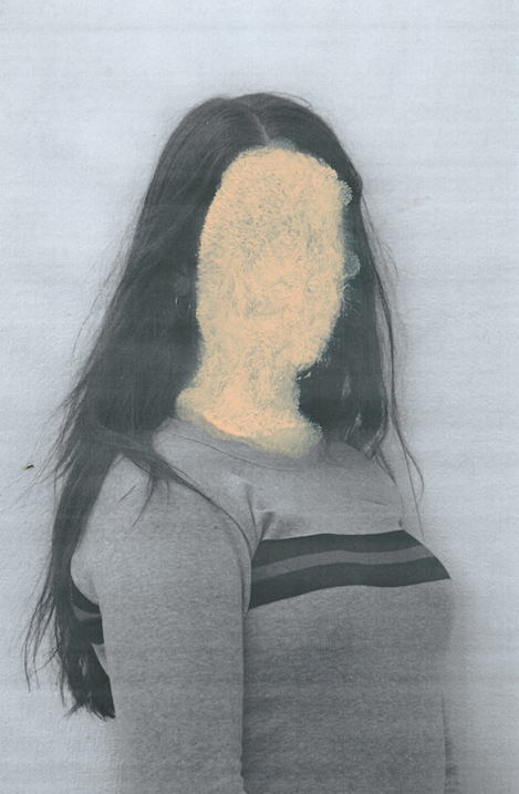
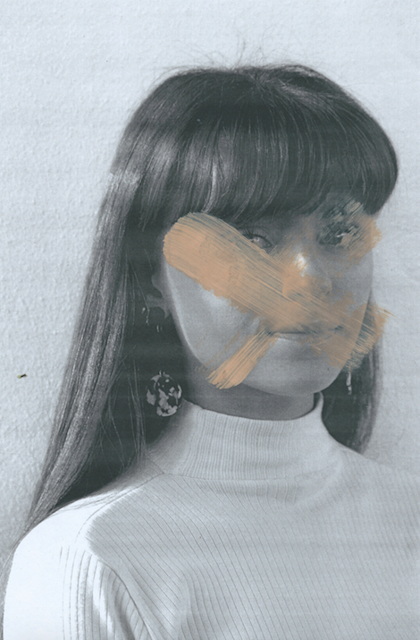
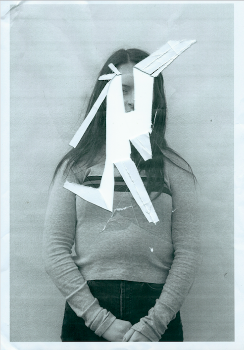
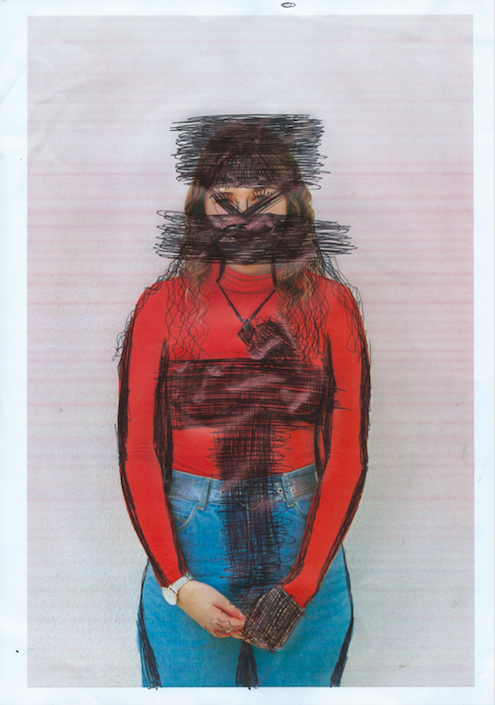
I also wanted my model to edit and destroy their own images, I printed out one photo of each model in low quality giving them discolourations and distortions. I then instructed each of the girls that I photograph to remove their insecurities or destroy the image in any way they wanted. Some of them grabbed a pen and started scribbling on parts of their faces and bodies covering and changing different aspects, other people cut, ripped and crumpled the paper. I then reconstructed the pieces and scanned them in as new photographs.



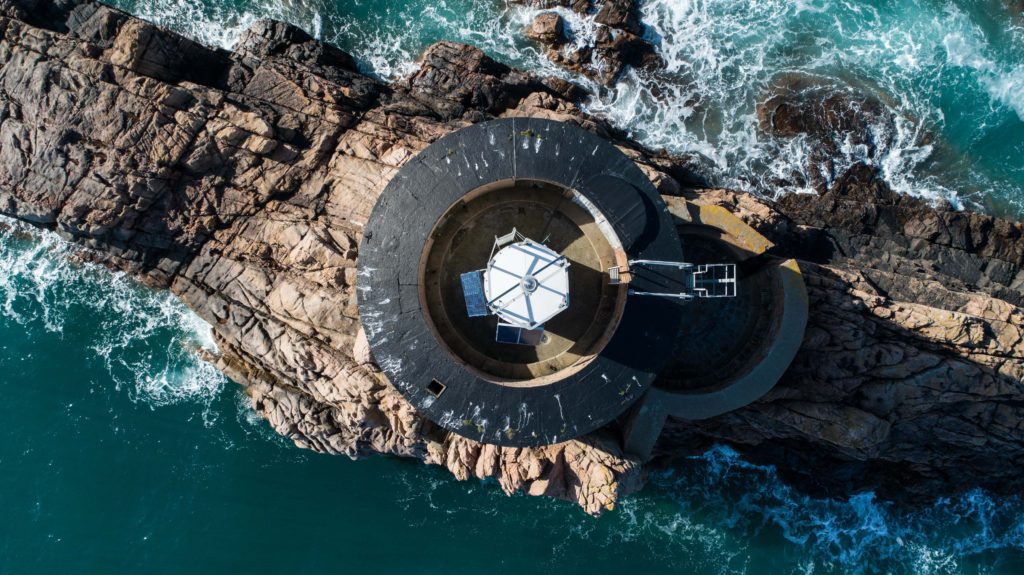
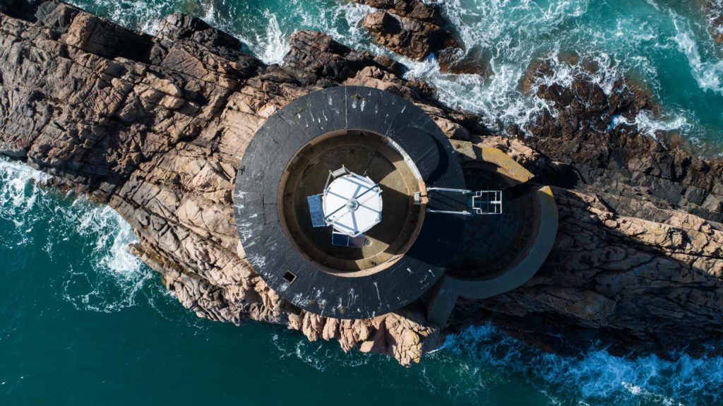
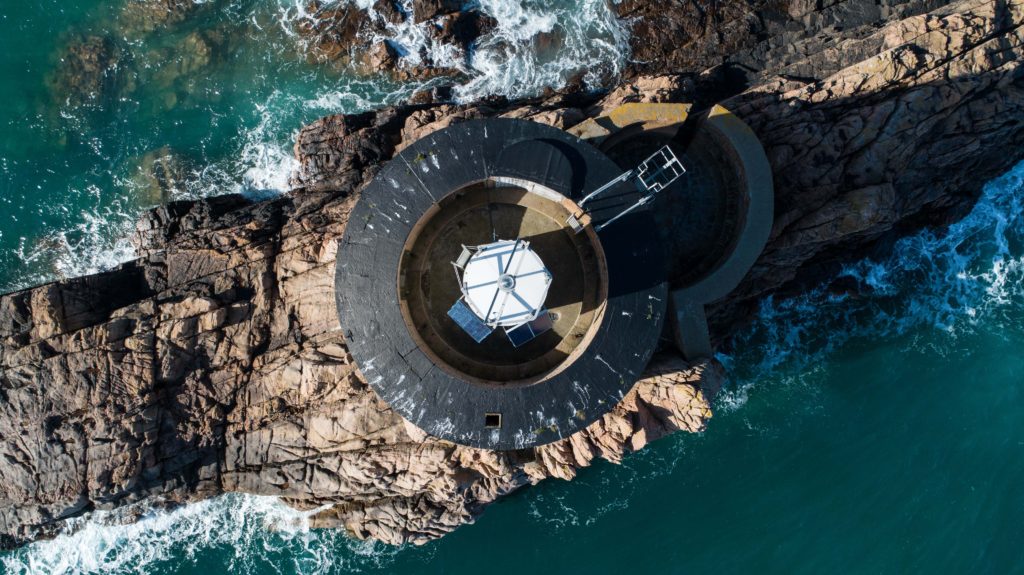
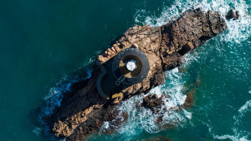
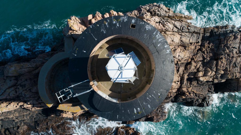
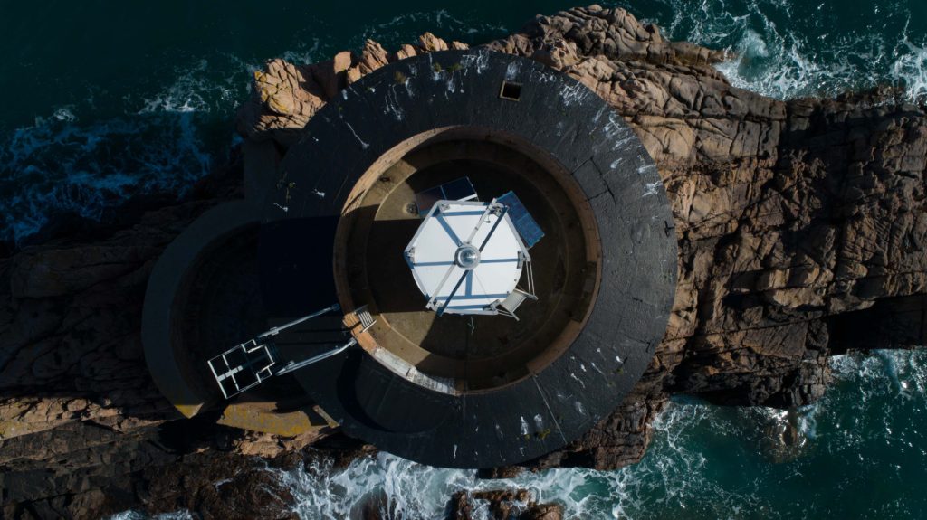
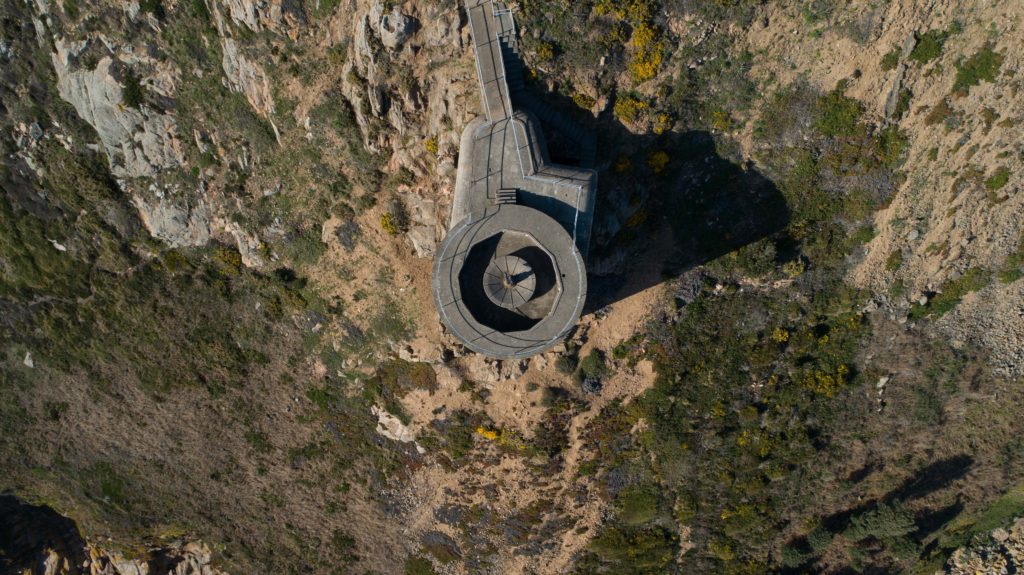
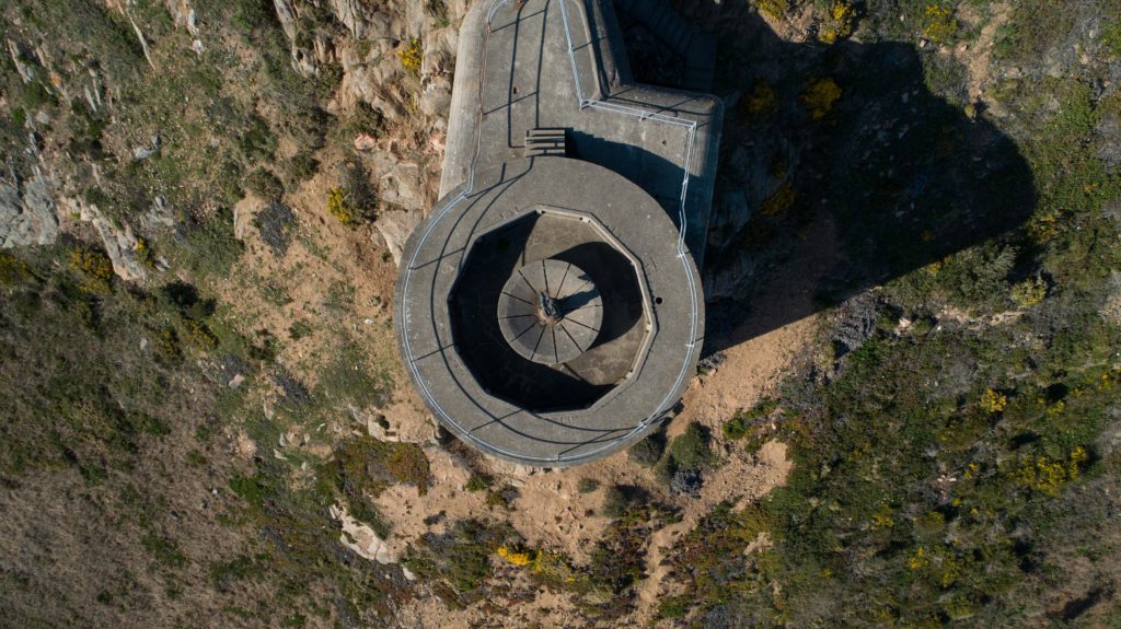
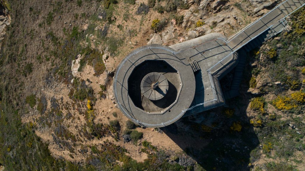
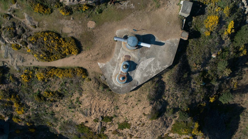
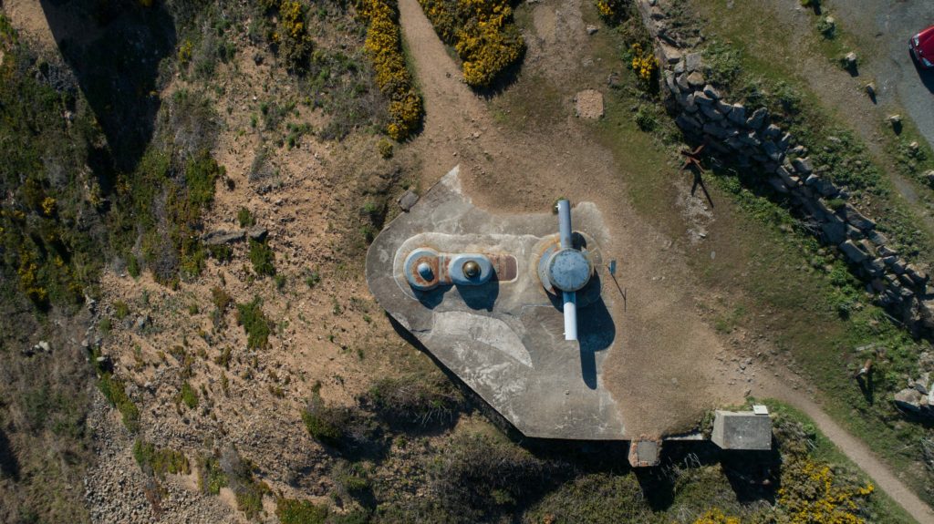
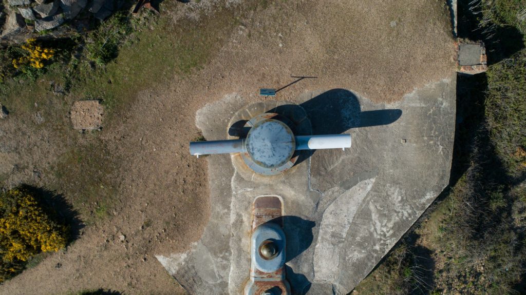
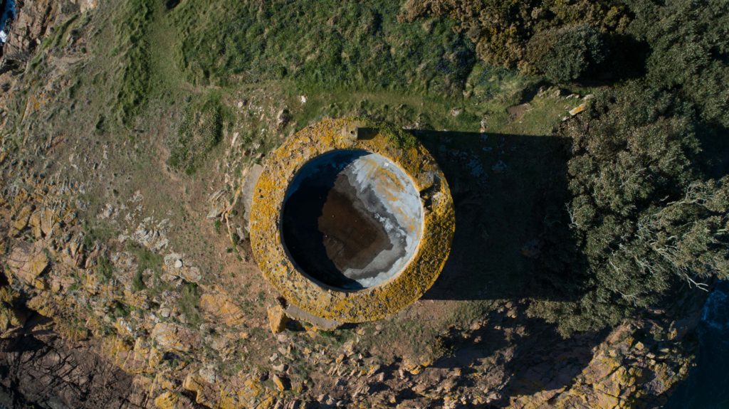
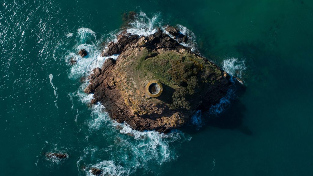
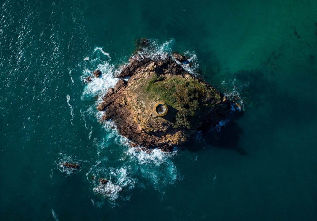
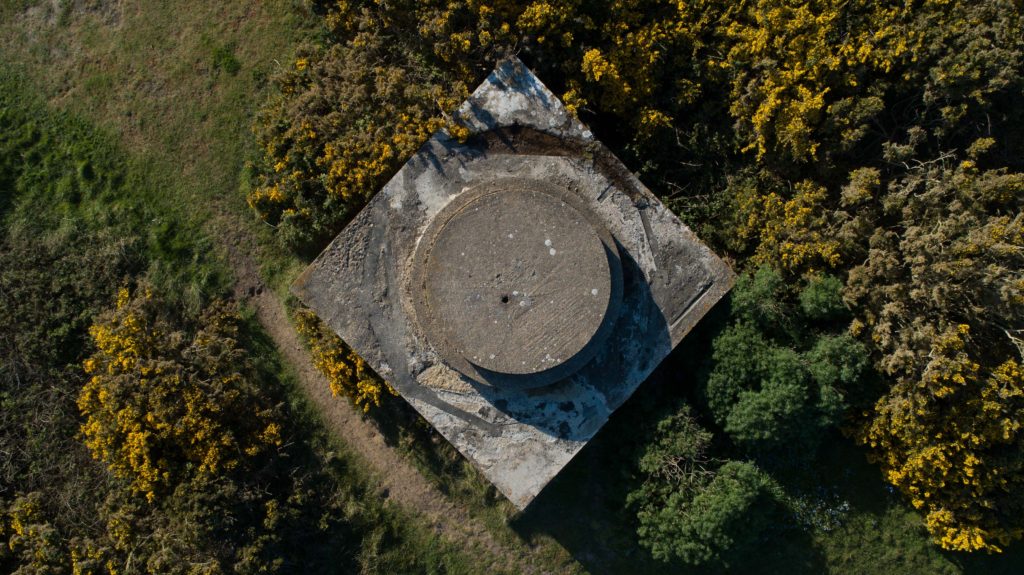
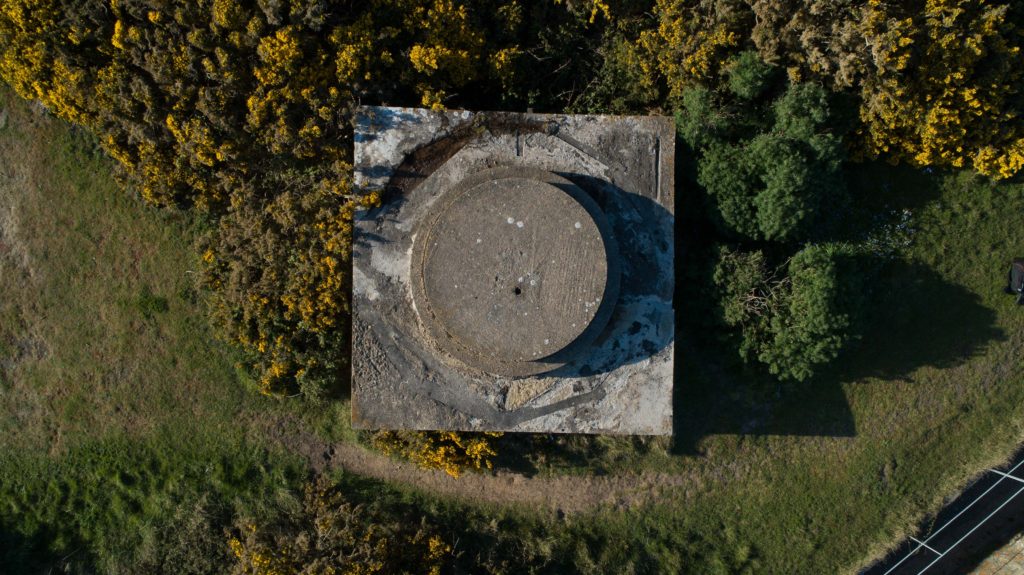
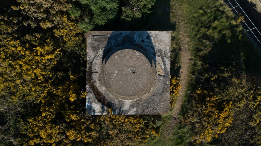
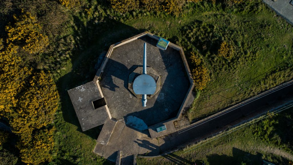
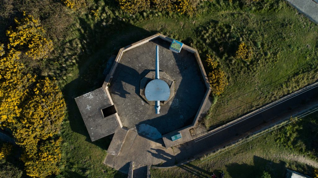
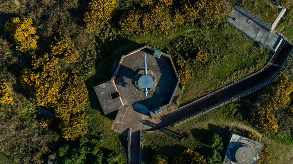
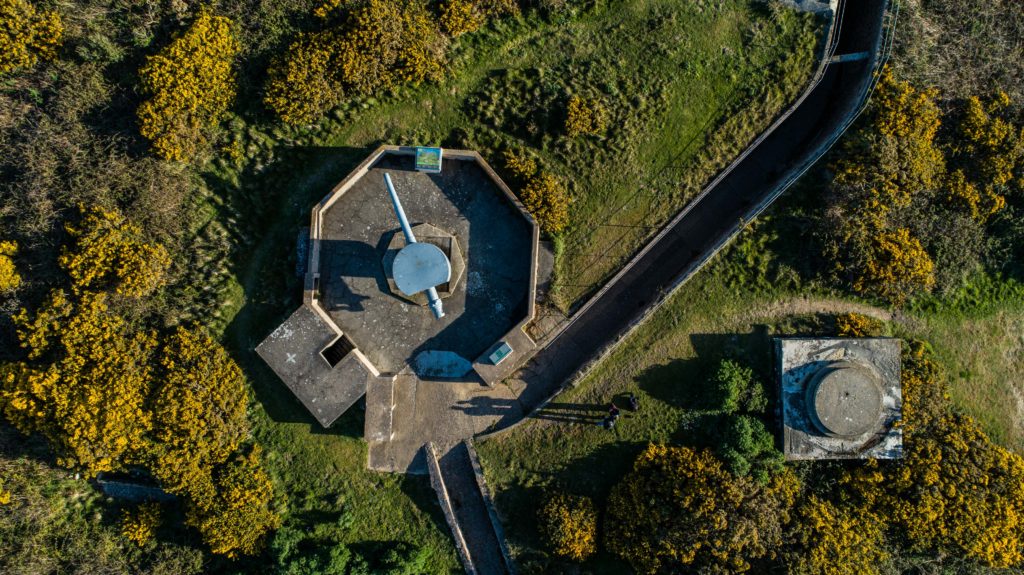
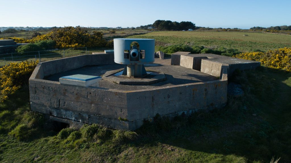
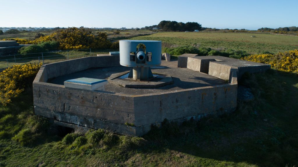
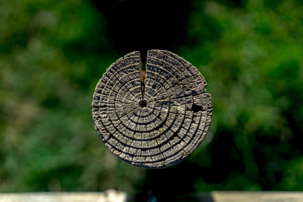
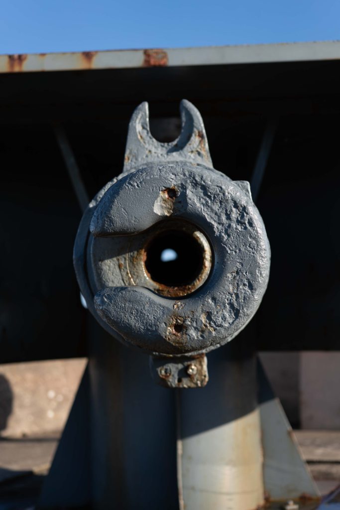
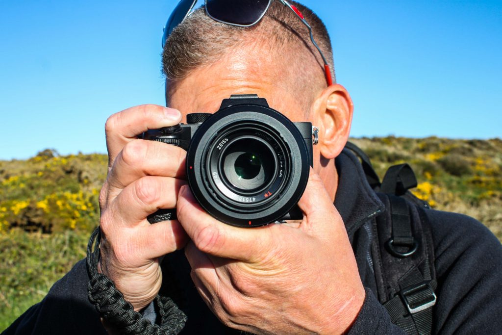
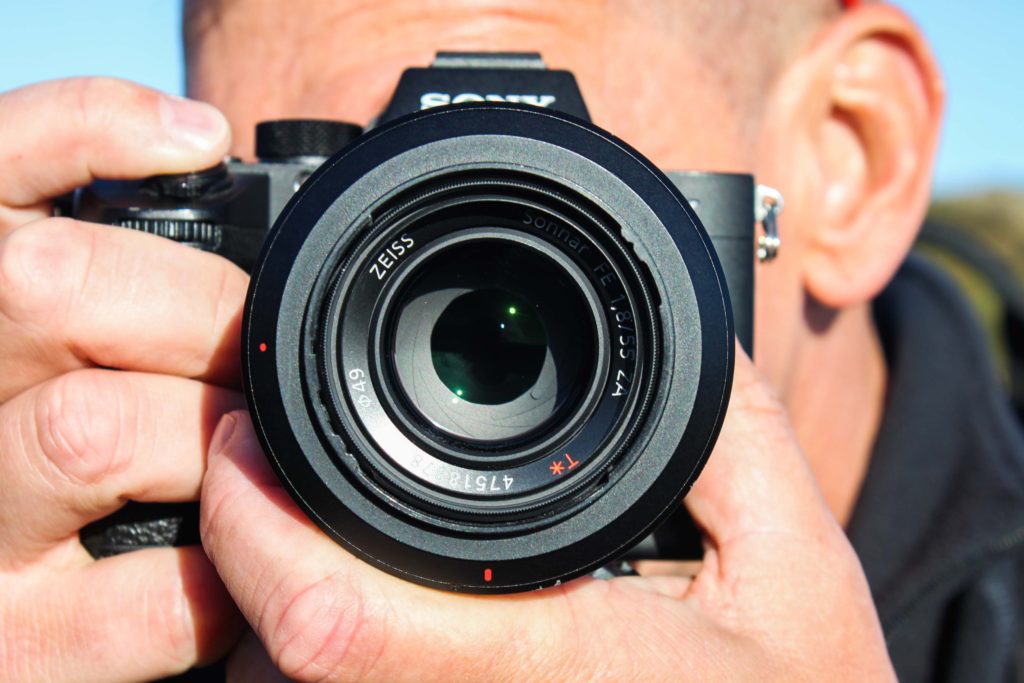
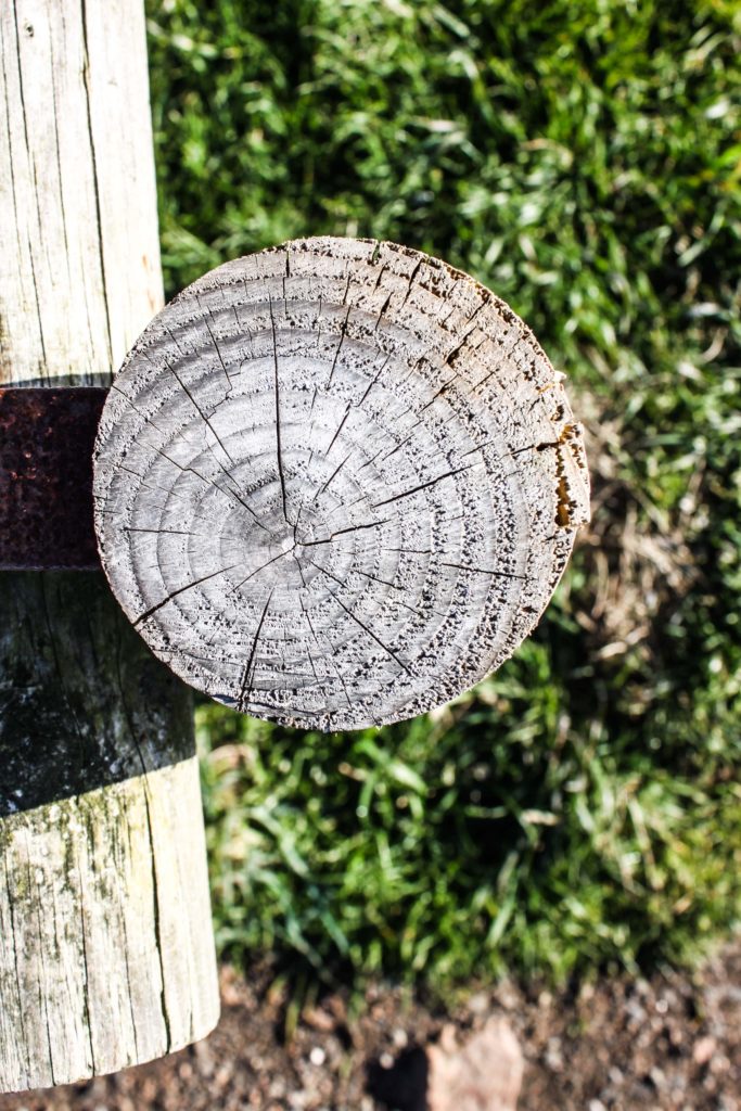
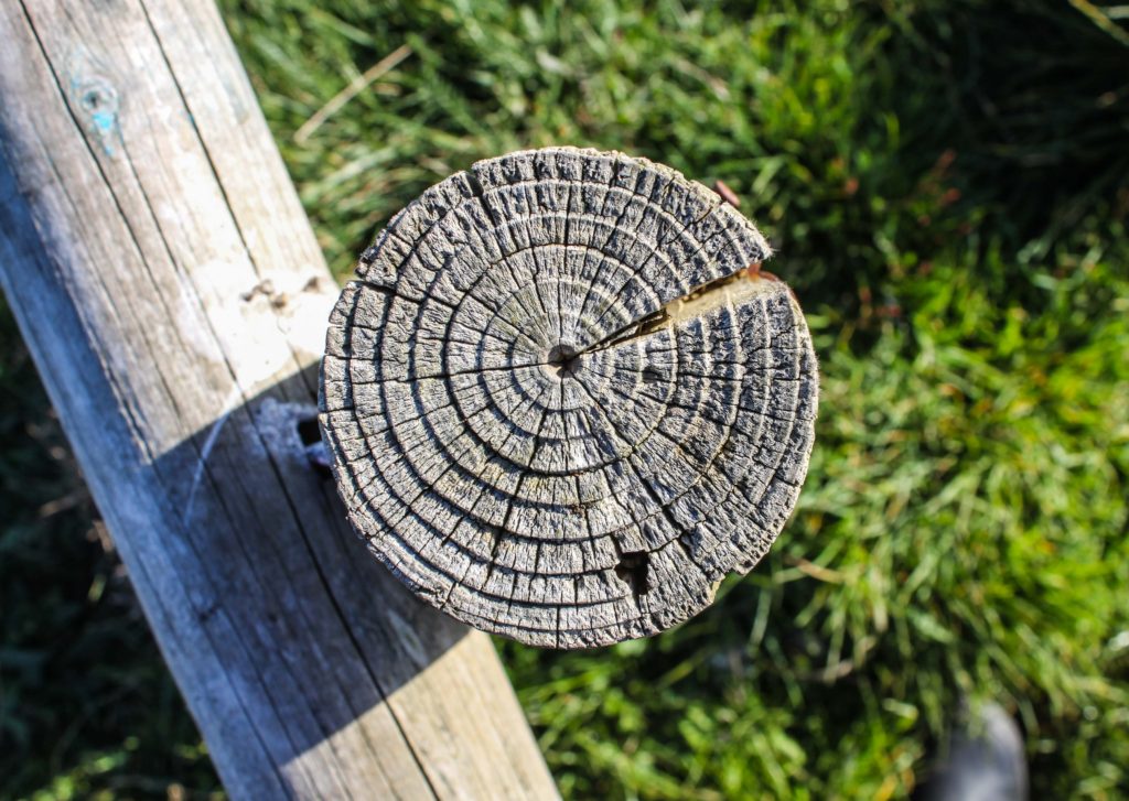
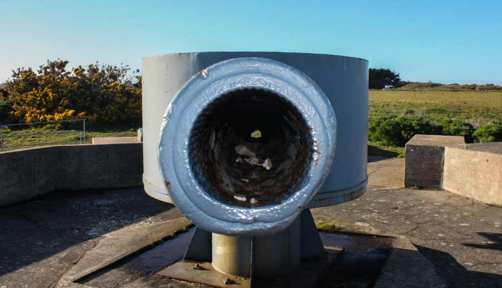
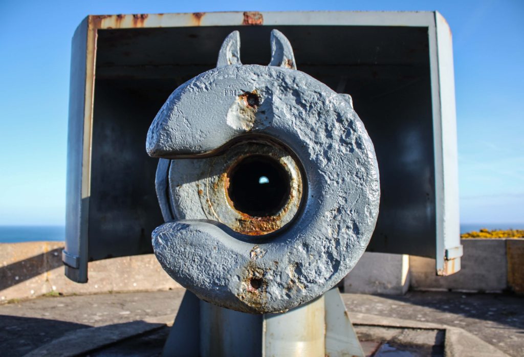
The shoot at Noirmont comprised of air and ground shoots. My main aim was to scout around looking for circles with my camera and snapping what I saw that formed a circular shape, I would also map out places to look at from the air using a drone. I then took the drone up and photographed circular shapes from the air over the Noirmont headland and Janvrin’s Tomb in Portelet.
Below are my final outcomes:


I am very happy with my final outcomes above, they really capture the more rural side of my project and show how circles can be found everywhere.

The above image was a wooden post on the Noirmont headland as part of the shoot you see above. The pole itself caught my eye as I was walking looking for spots to shoot with the drone. I positioned myself above the pole and shot top-down with a low aperture, automatic white balance, 100 ISO and a medium shutter speed. The low aperture produced the effect where the grass below is not in focus yet the pole is extremely sharp. This allows for the viewers eyes to be drawn straight to the pole and have little to distract them, it also makes the image very simple and eye catching.
The rings on the pole are the growth rings of the tree the wood came from. Each year, a tree forms new cells, arranged in concentric circles called annual rings or annual growth rings. These annual rings show the amount of wood produced during one growing season. Therefore this pole shows the life of a tree that once stood and lived and grew, each circle representing the growth and age of the tree and this can be interpreted into human life and human context.
The image clarity really brings out the textures and feel of the wood and you can almost feel is as you see it, you can imagine your fingers passing over it and feeling the roughness of the wood and feel the individual rings. The high aperture creates the effect of blurring the background giving it depth. The colors itself have been brought out through editing, the original image made the wood looked quite pale and the grass quite bright however through editing the nice woody color and textures could be brought out to their best.
As well as my postcard display I have decided that I would also like to make an outcome of some larger A3 sized prints. My idea behind this is that it will show some of the finer details within my photo-montages which may be harder to see in the postcard format. 6 of these prints would be a good idea as I believe threes work nicely in a layout so as a multiple of 3 I think 6 prints will be will be overall aesthetically pleasing. Therefore I also want to have 3 portrait prints and 3 landscape prints as this will balance out the composition of the display. The 6 photo-montages which I have chosen to print in the A3 format are ones which have a lot of intricate detail which I feel like will look great once scaled up. Here are the 6 which I have chosen…
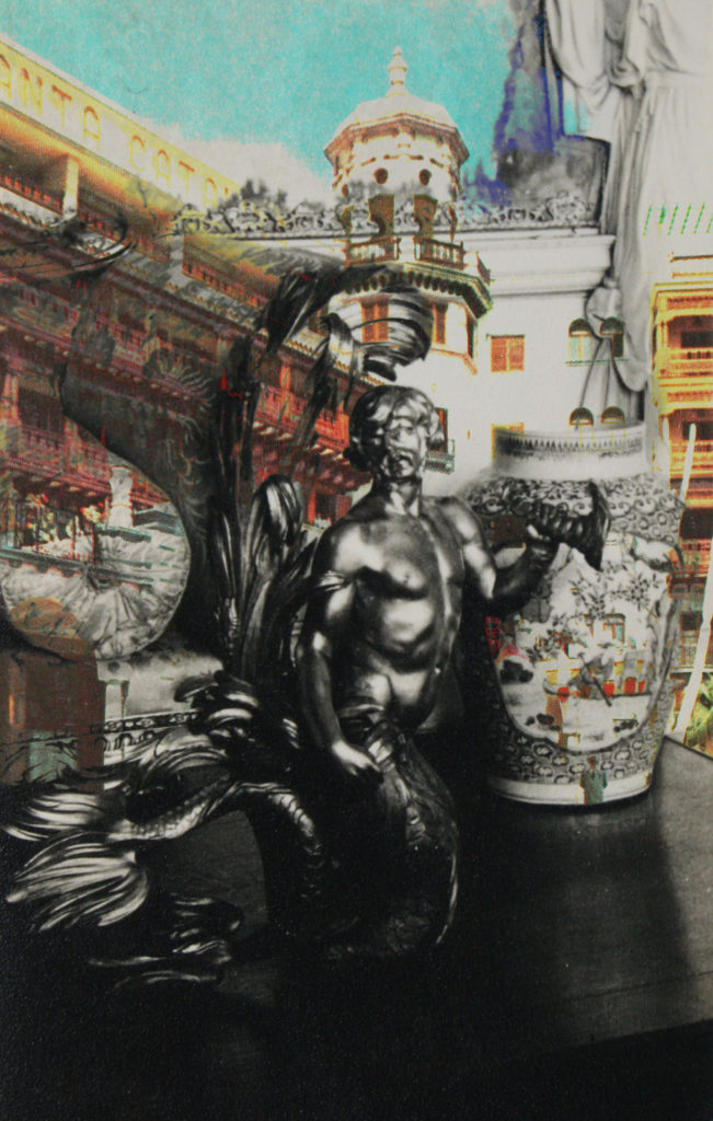
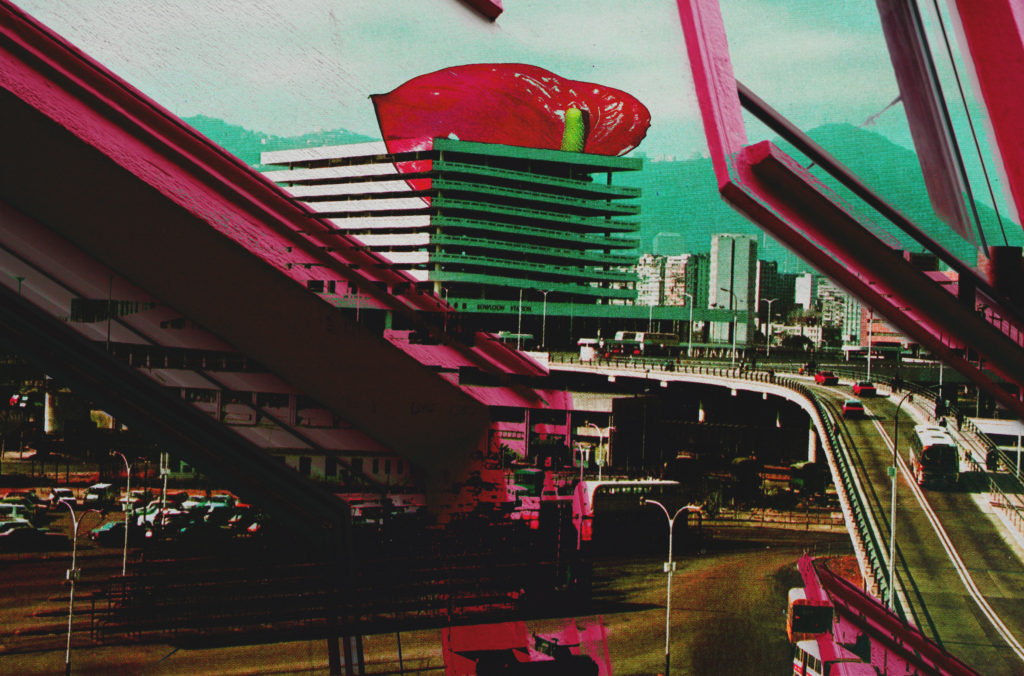
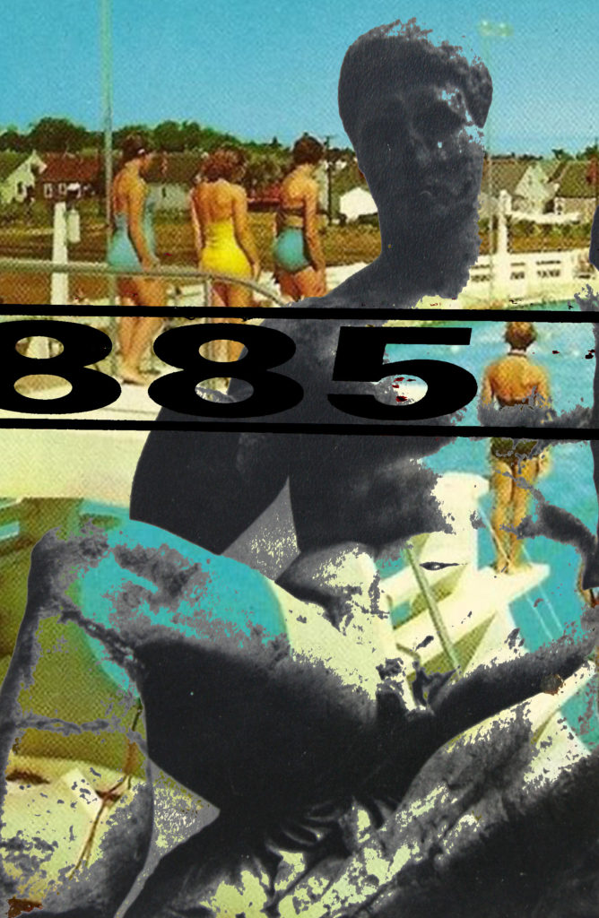
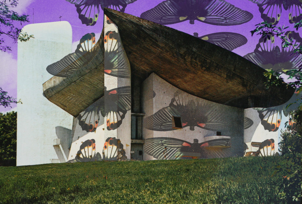
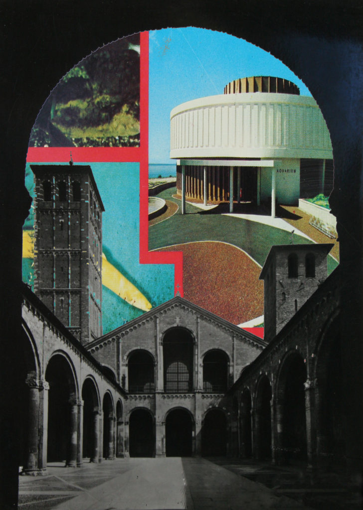
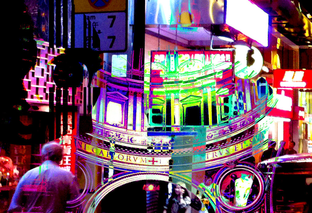
In a following post I intend on planning how I will display these prints as a final outcome.

