

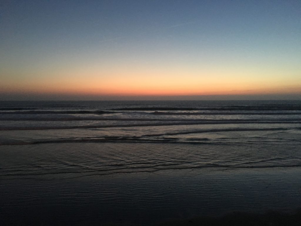
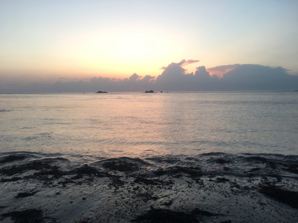
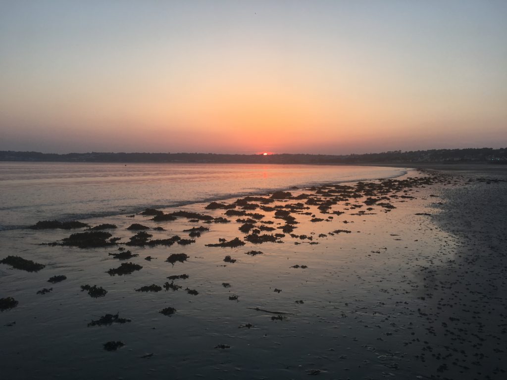
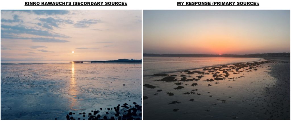
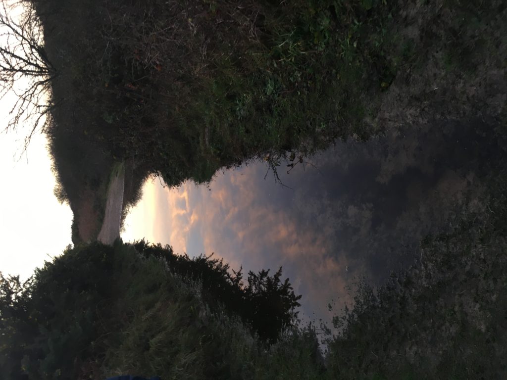
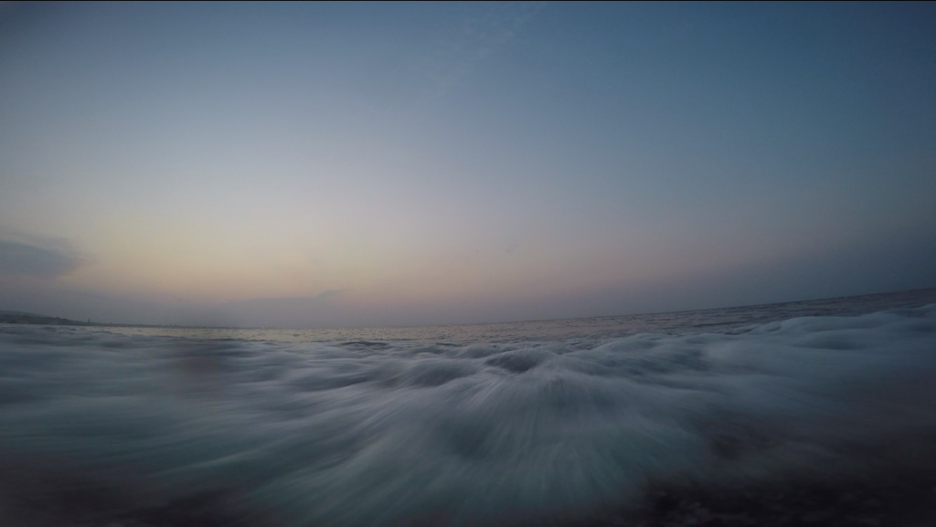
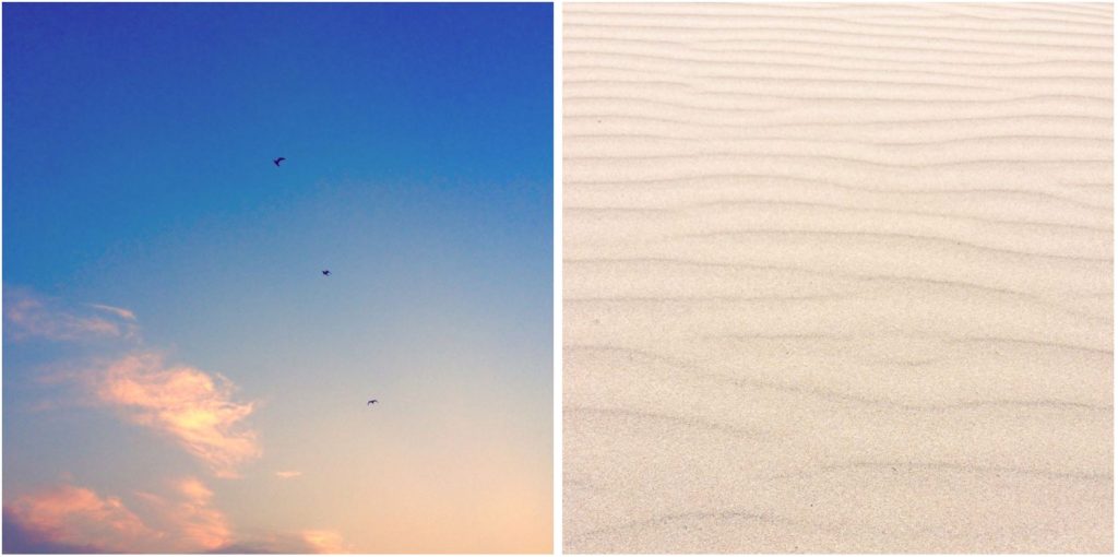
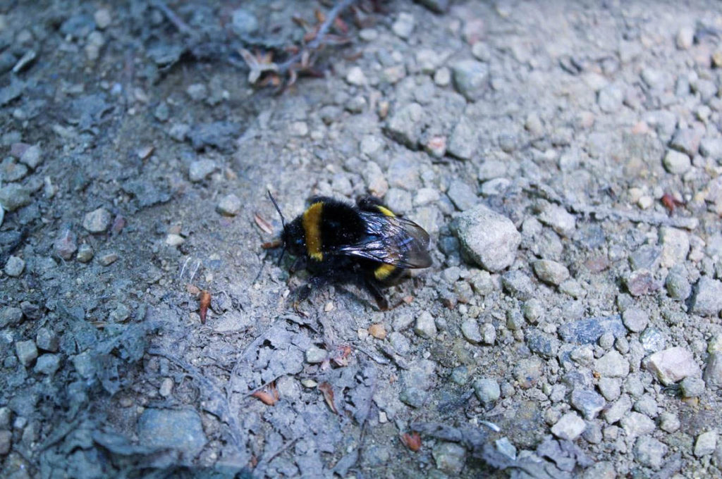
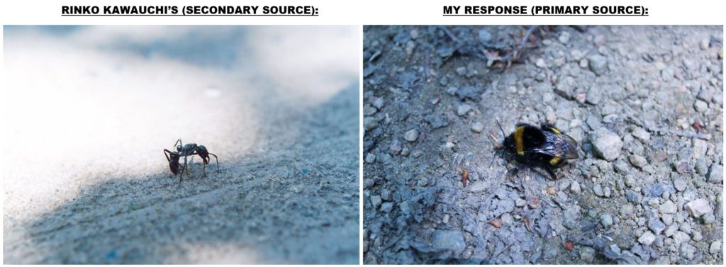
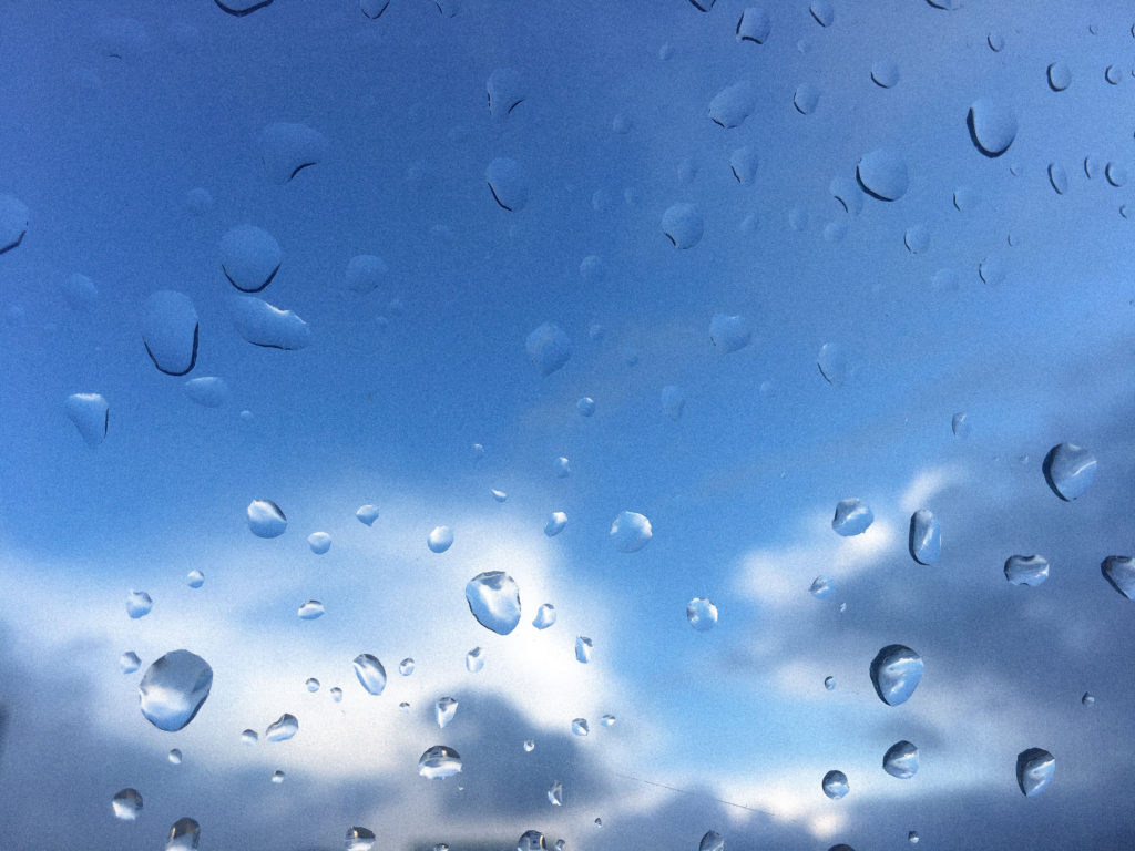
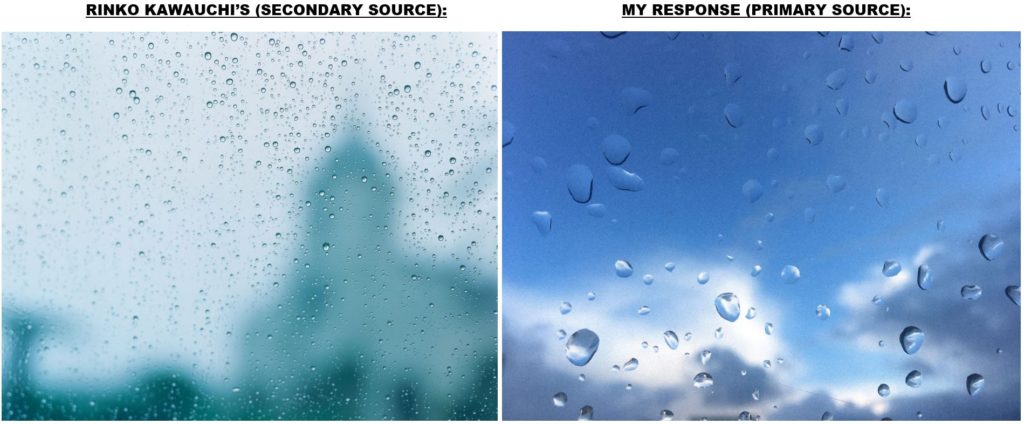
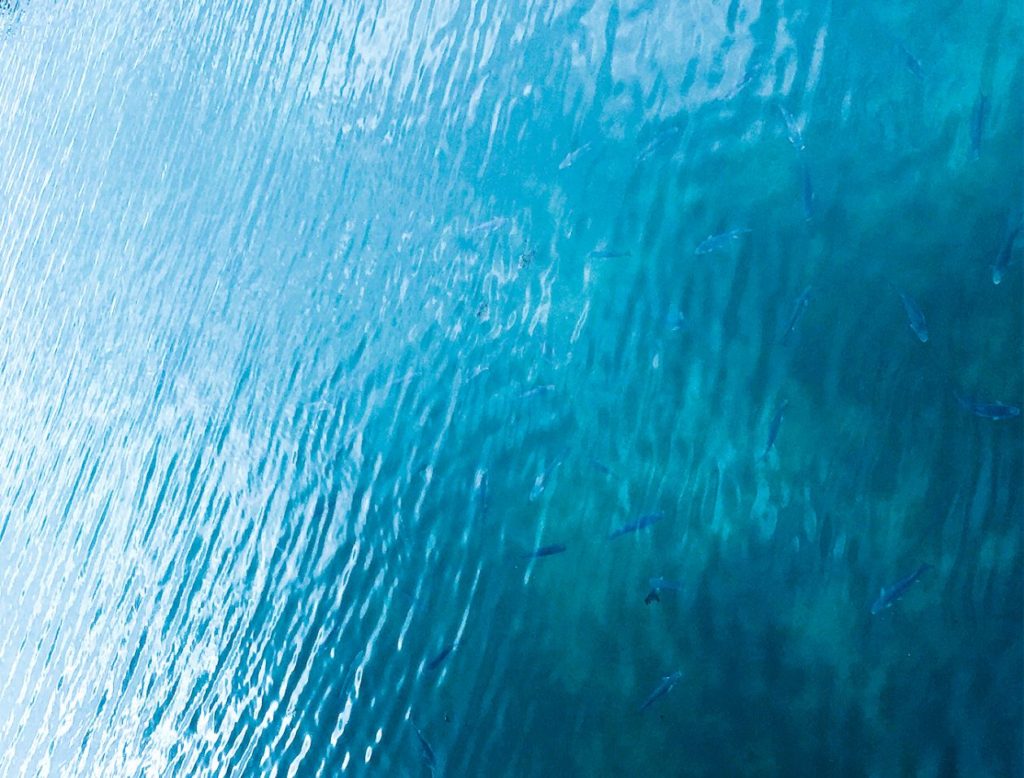
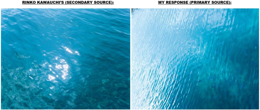
For my 5th photographic shoot, I have taken primary source in response to Rinko Kawauchi’s work. I really like her work as it reinforces the sublime beauty of seemingly mundane things like insects, and skyscapes. She uses the element of light to her advantage and zooms in on nature to produce romantic imagery. Taking inspiration from her areas of study, I have photographed a variety of subjects i.e. the sun rising and setting, patterns in the sand, and a bee close-up. I have included multiple videos to show visual movement where I have photographed, specifically the movement of water, which I can’t present in a still image. I have shown direct comparisons between my responses and her works in multiple images to show clear contrast and similarities.

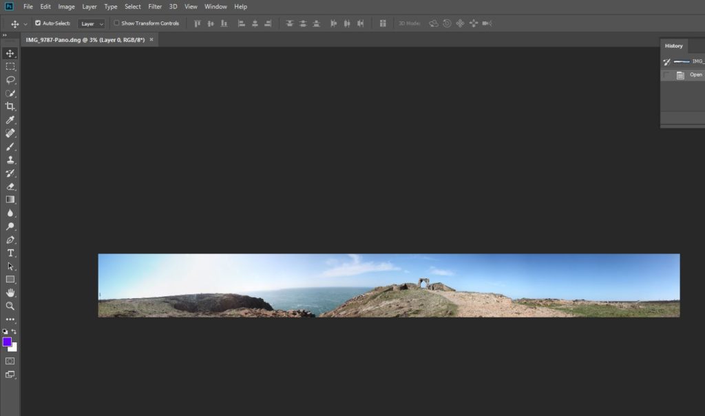
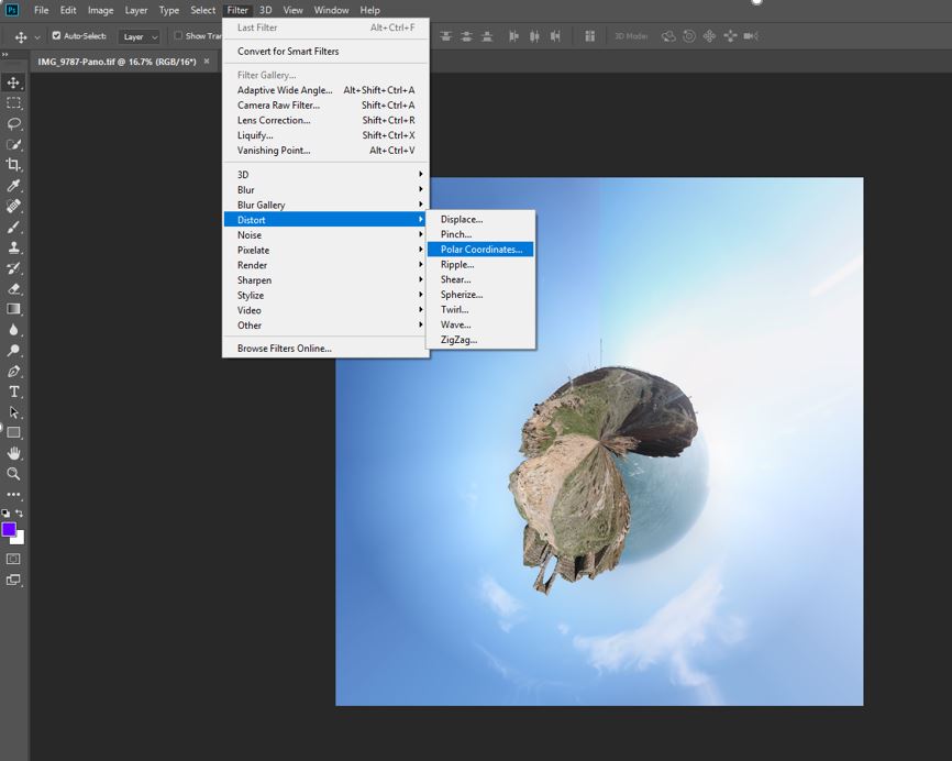
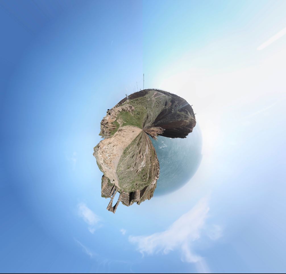
To create tiny planet images, you firstly need to take images. I took 55 images per planet, creating a 350 degree panorama as you can see below.
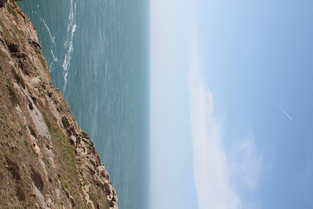
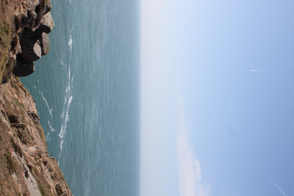
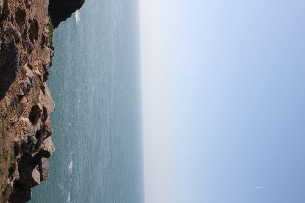
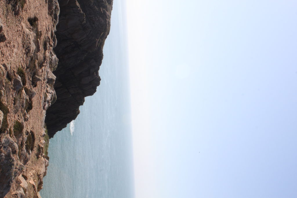
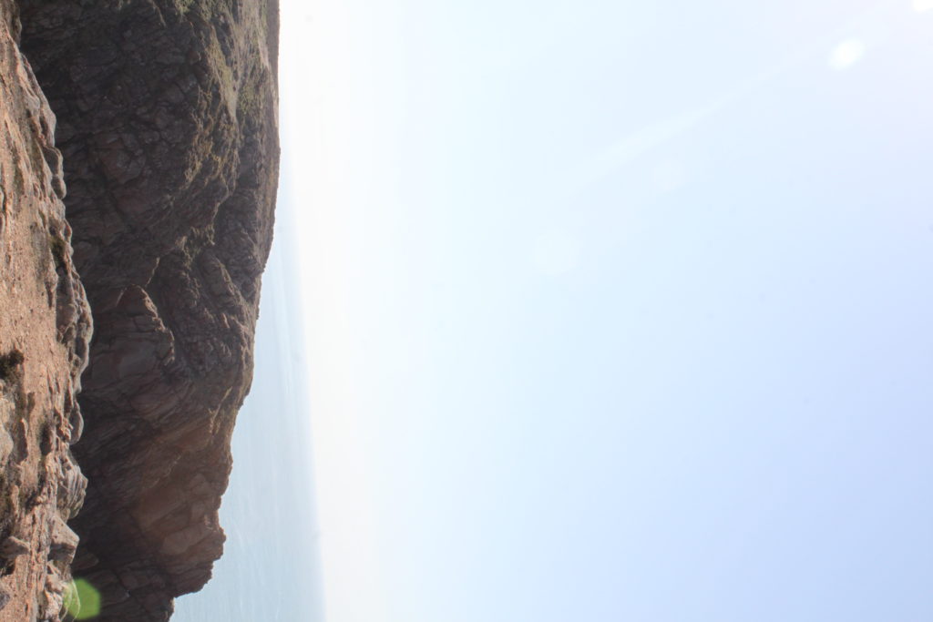
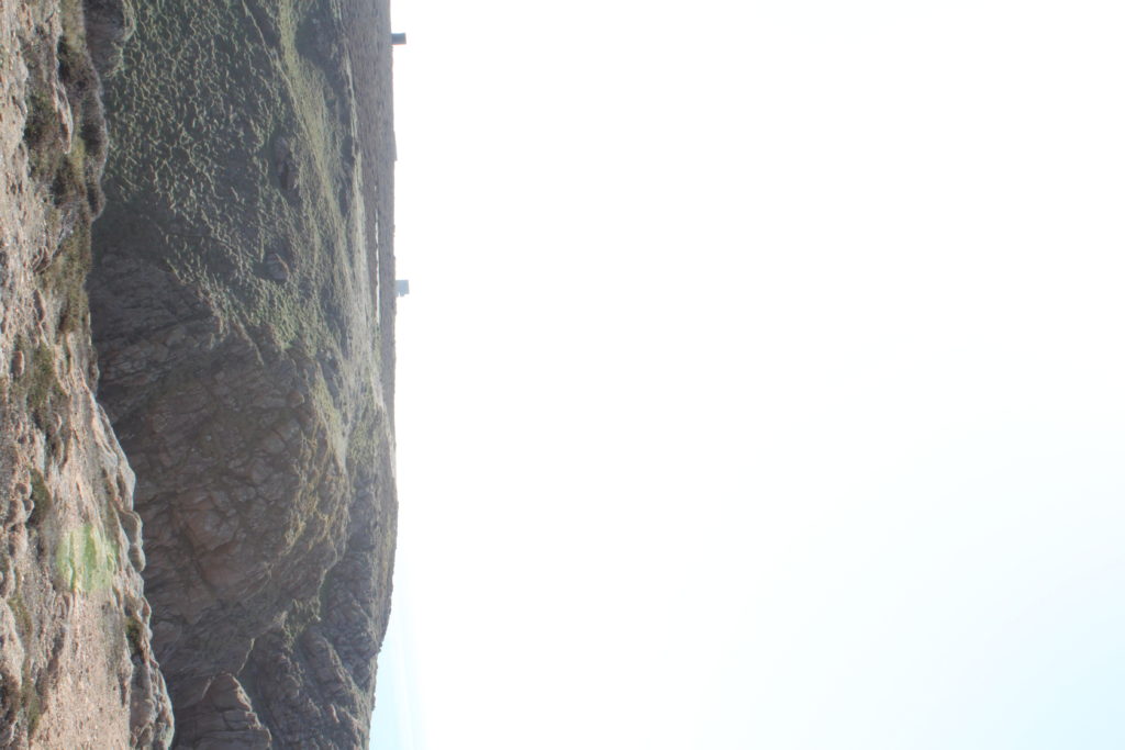
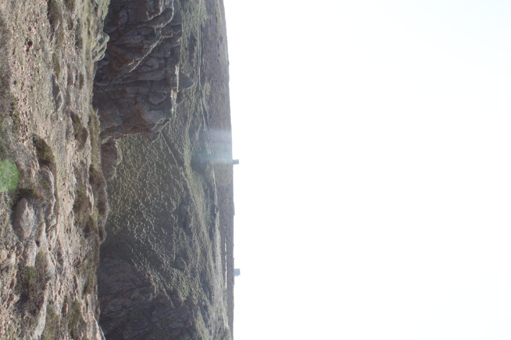
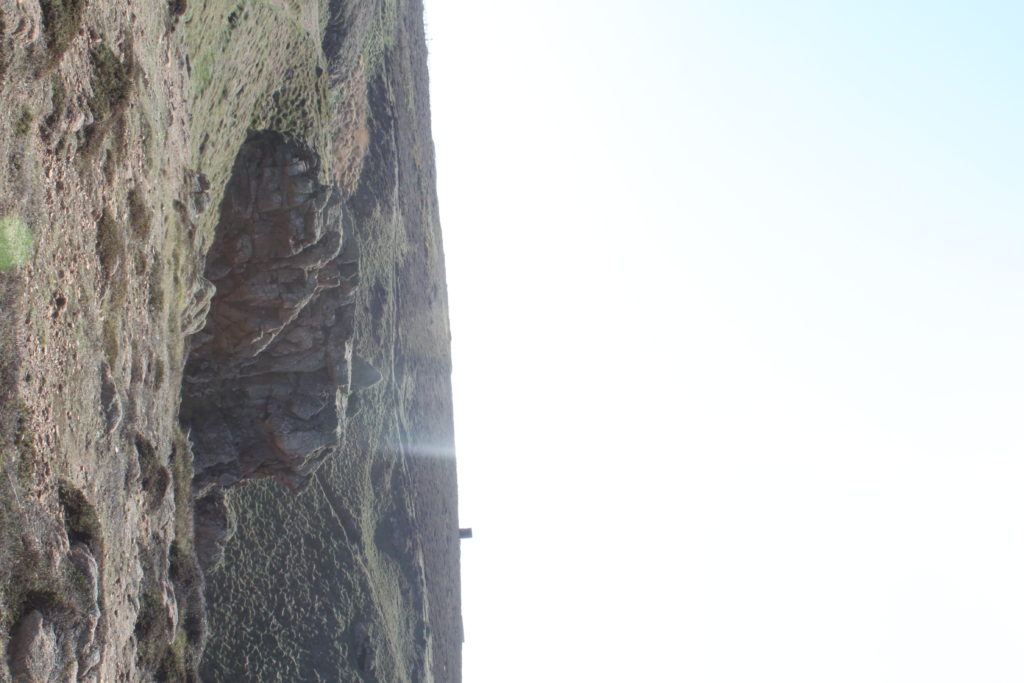
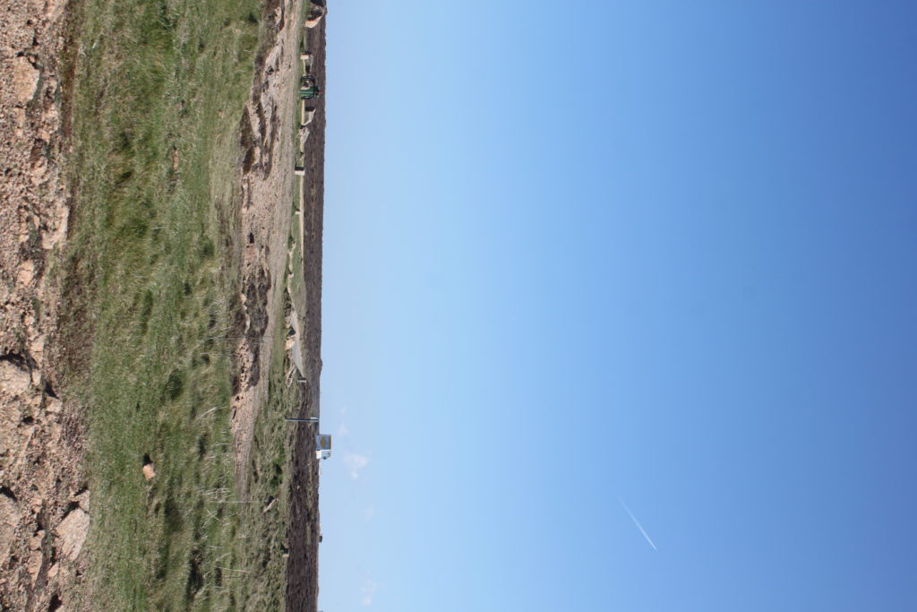
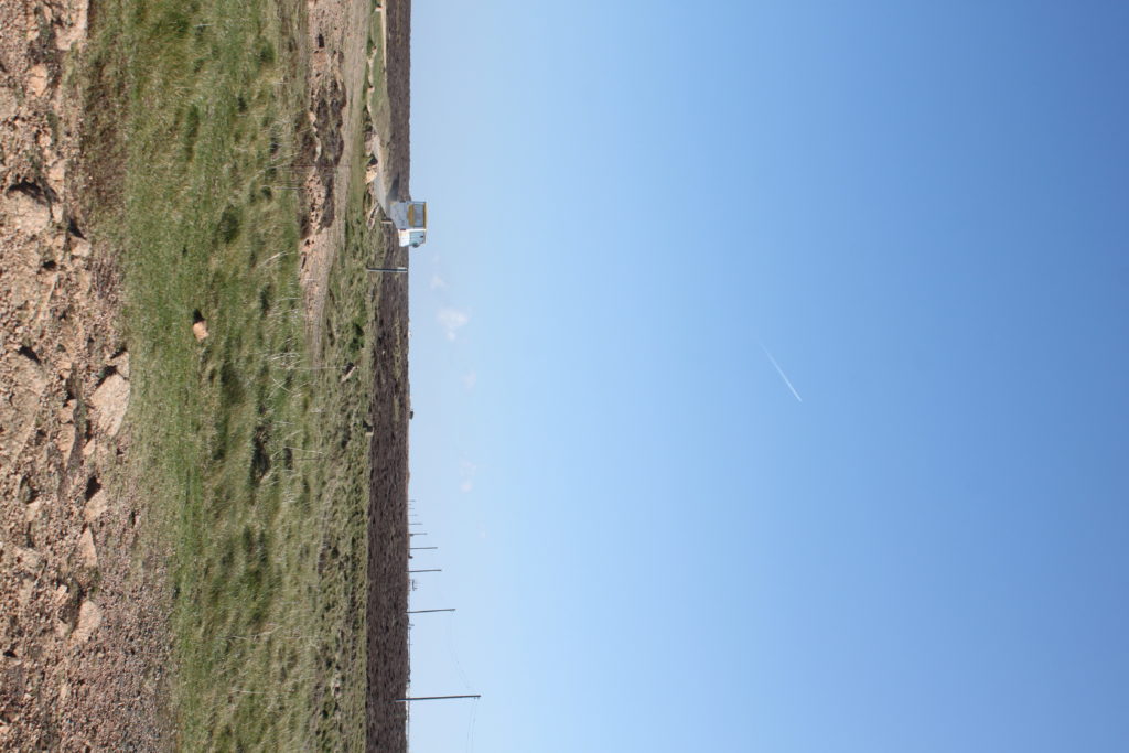
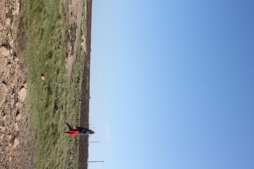

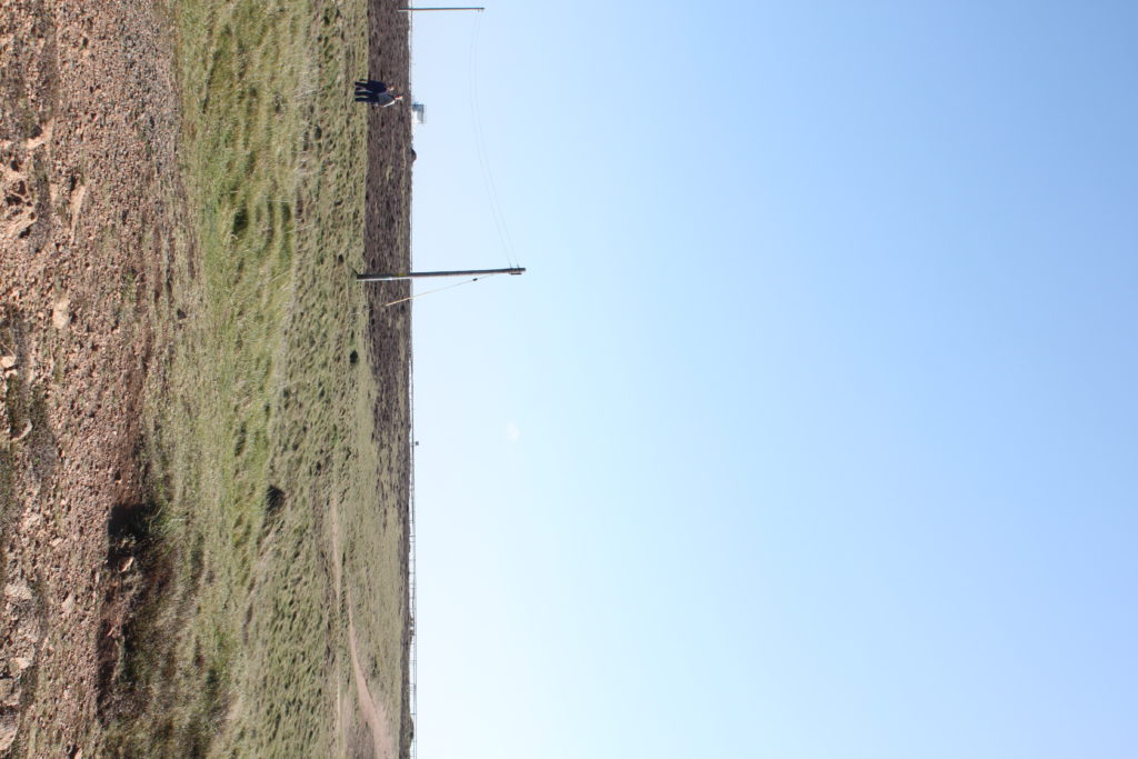
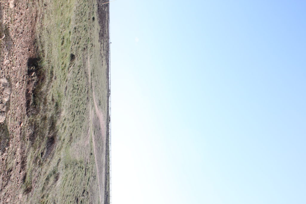

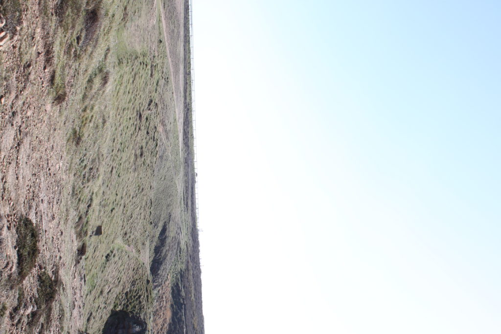
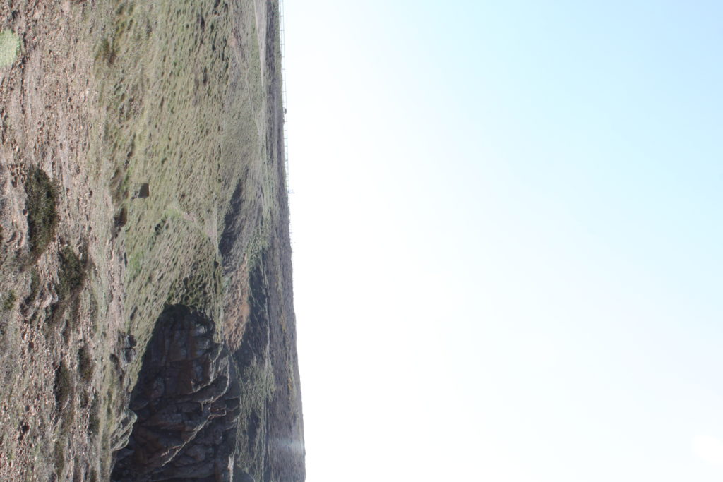
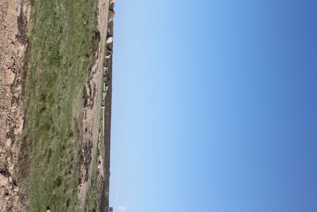
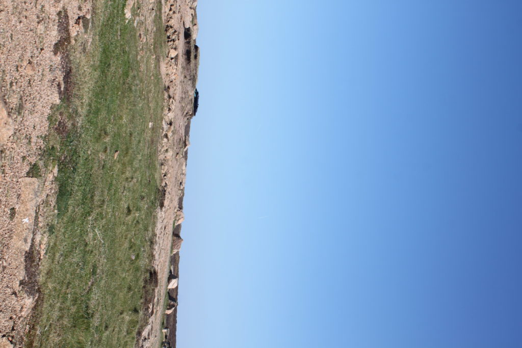
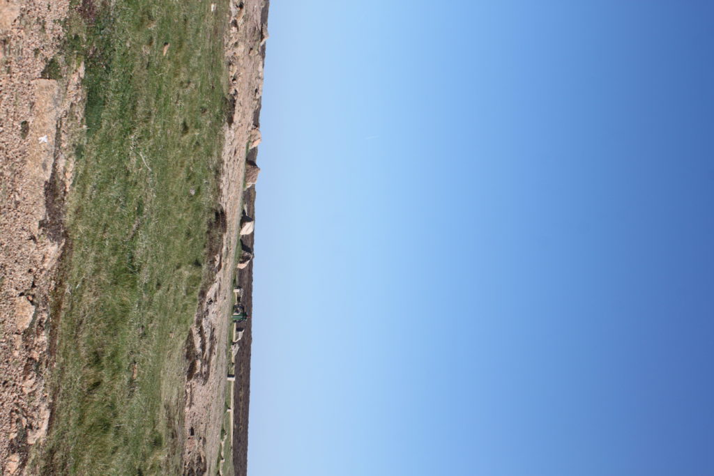
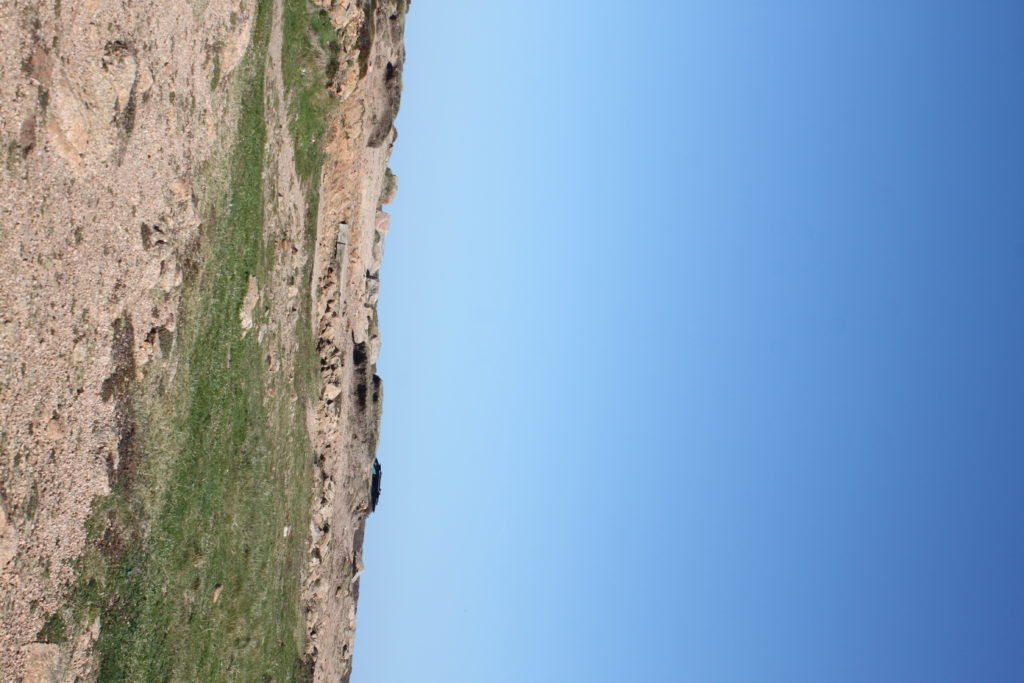

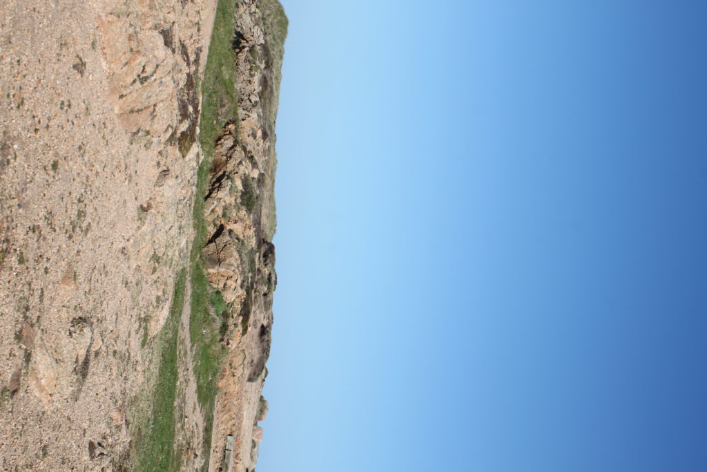
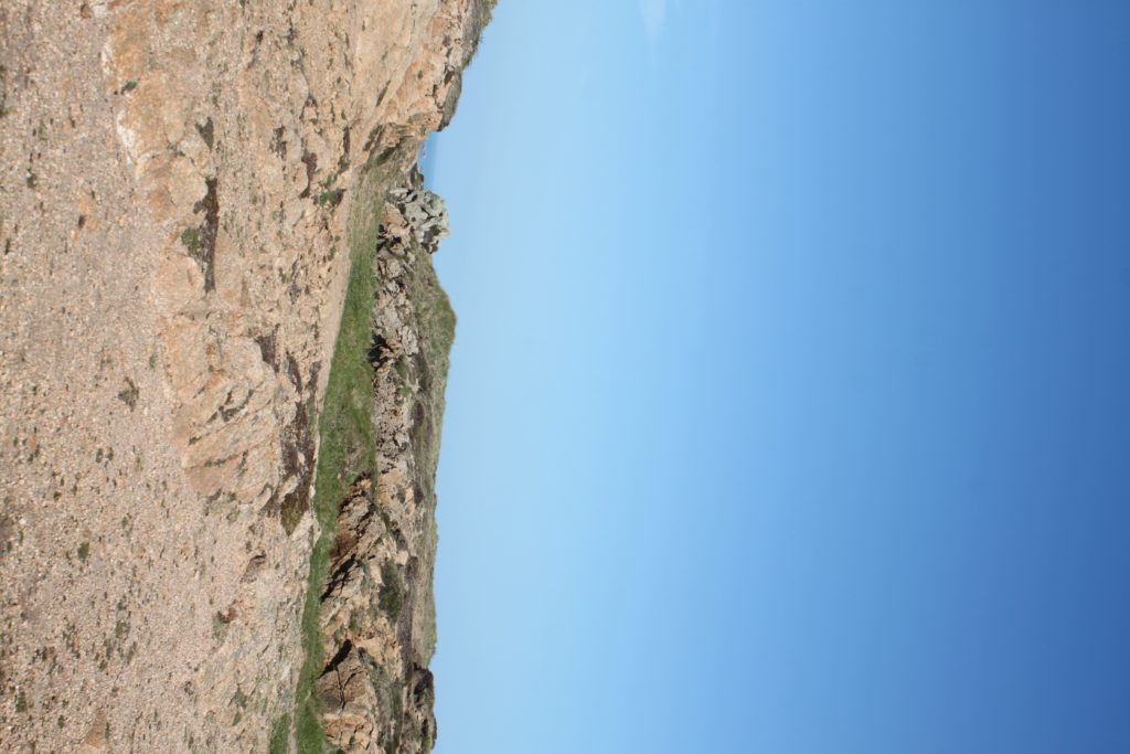
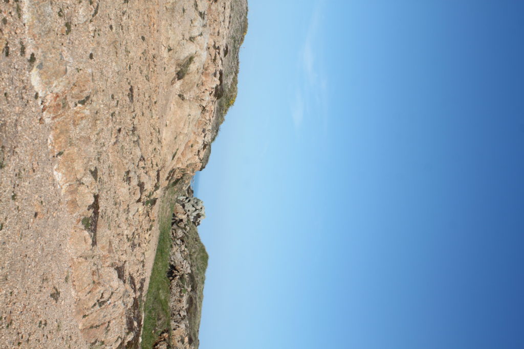
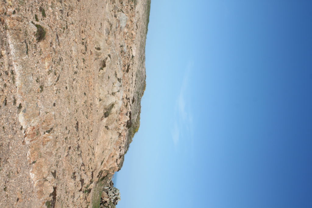


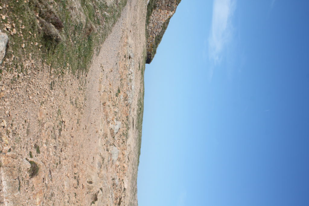
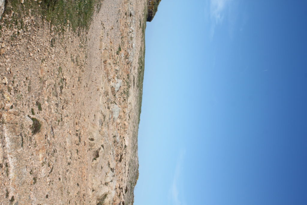
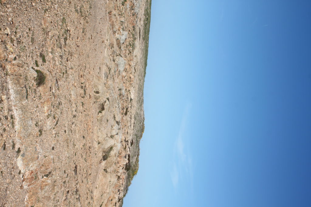
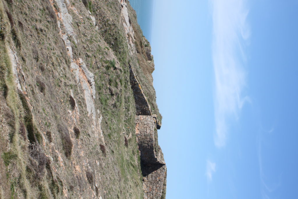
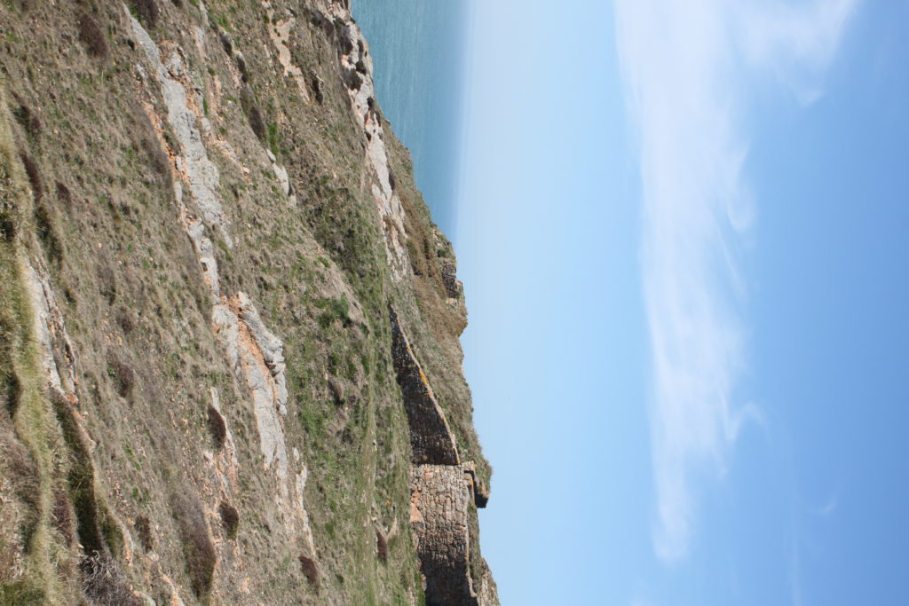
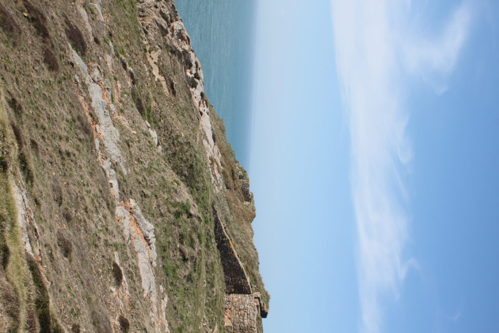
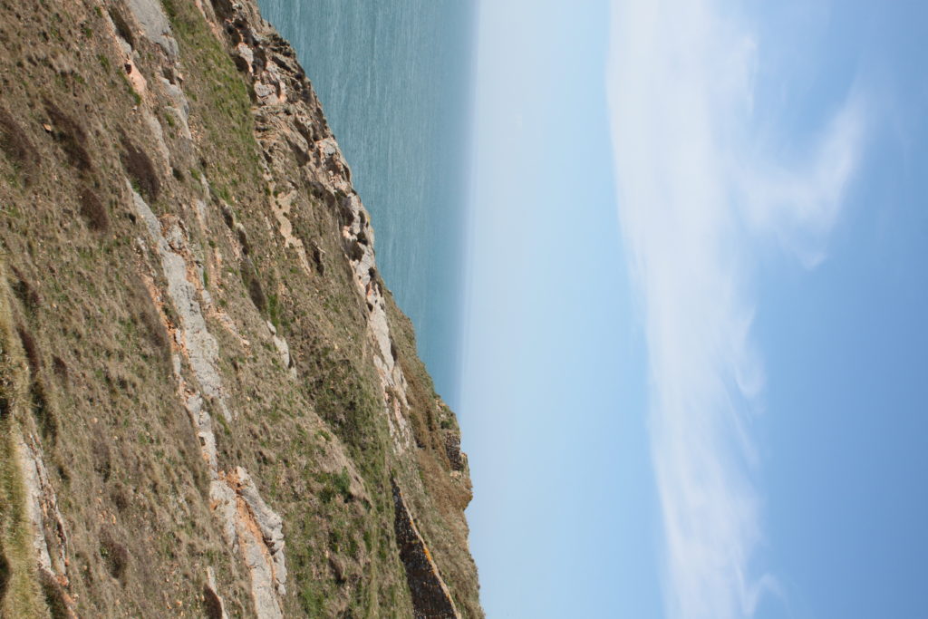
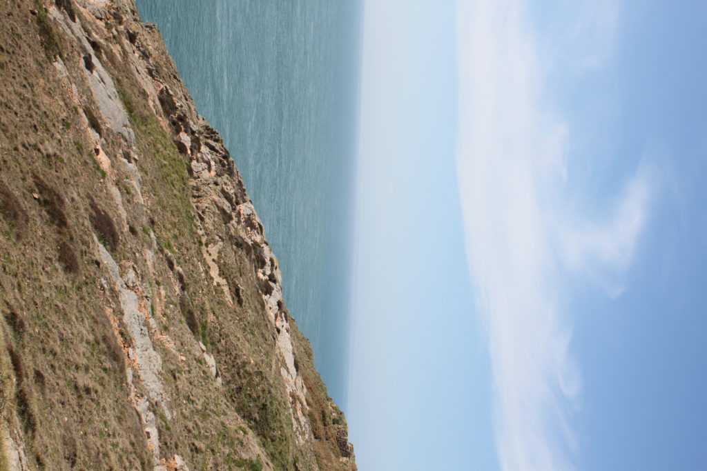
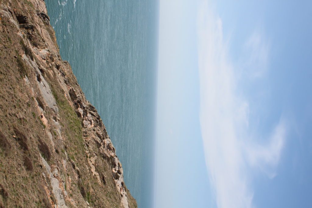
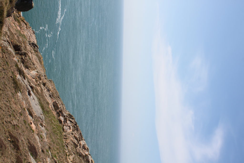

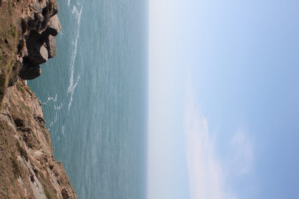
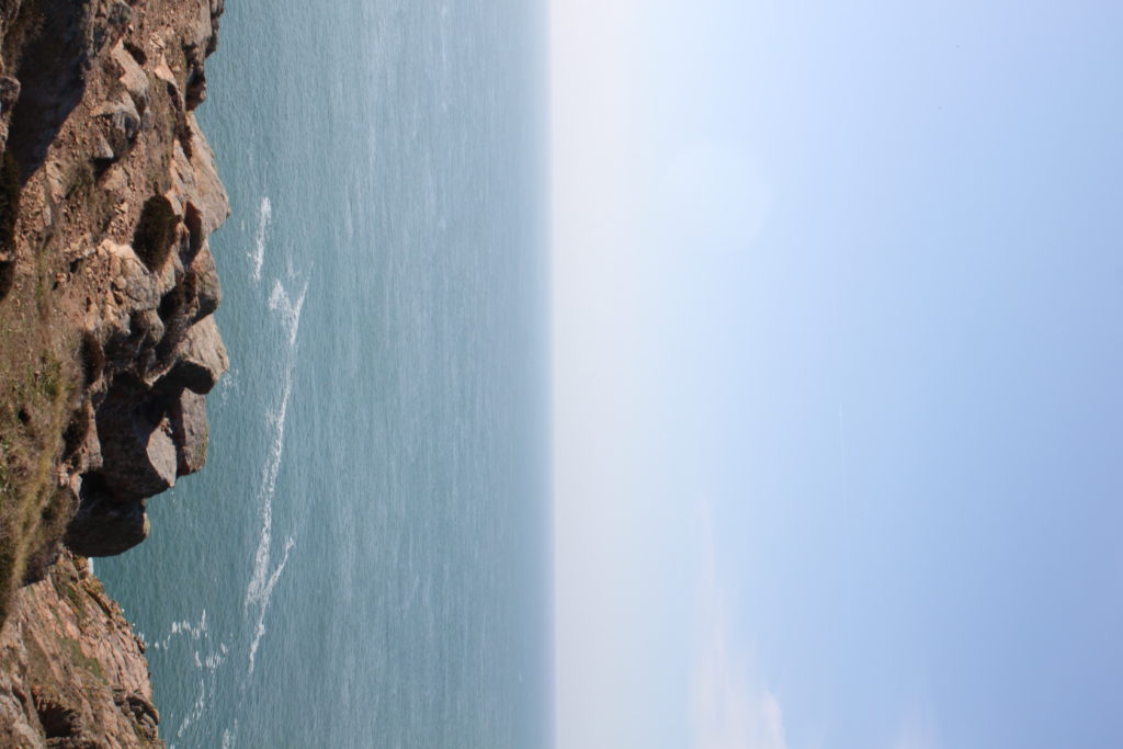
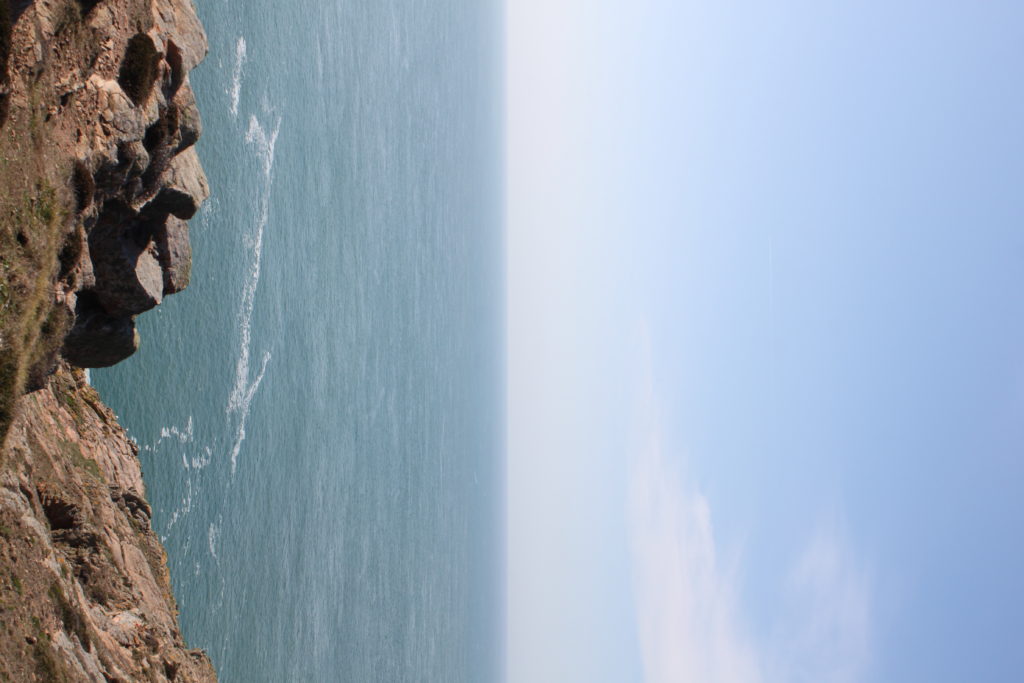
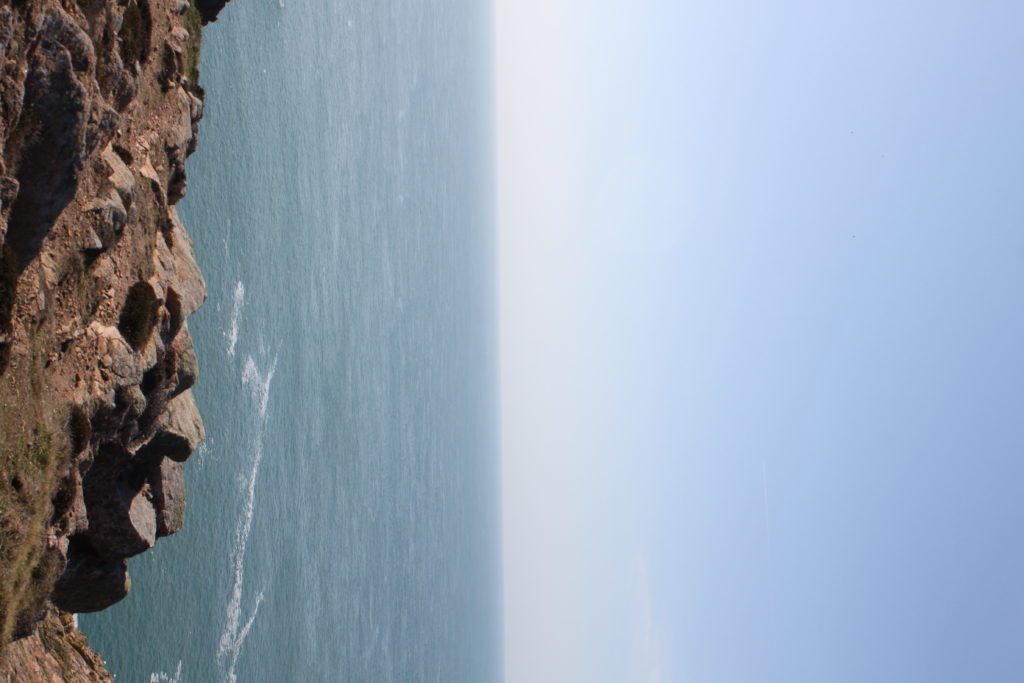
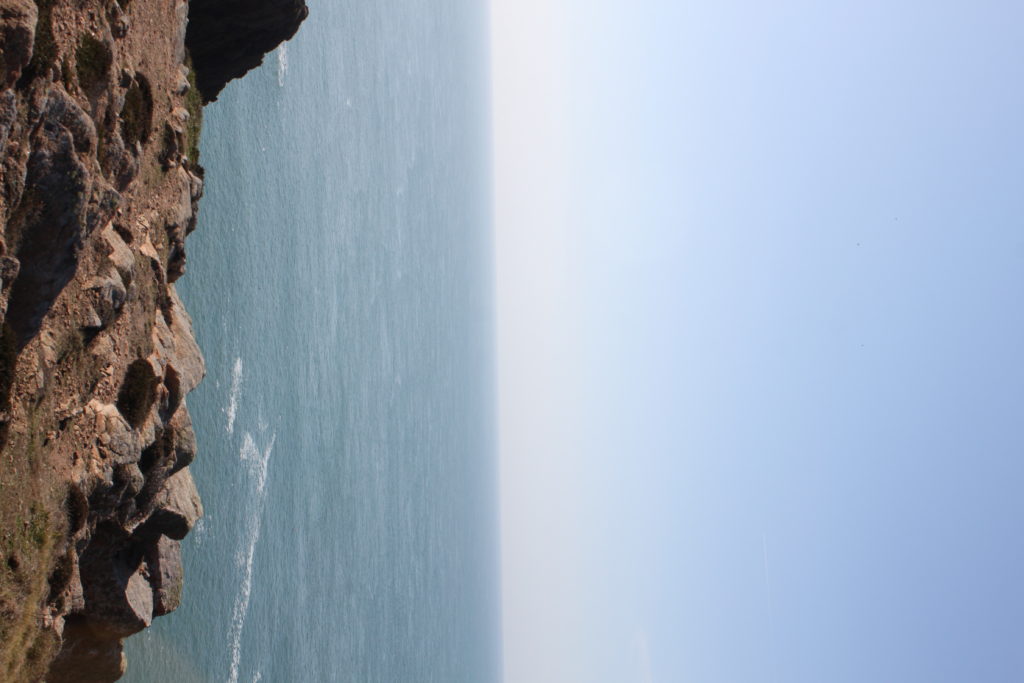

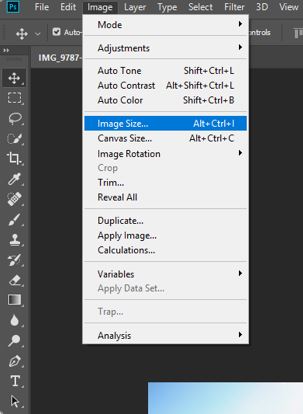
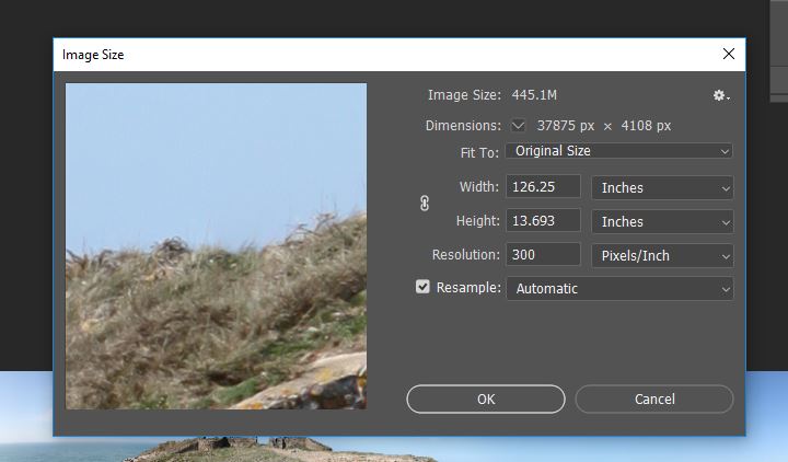
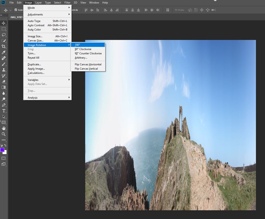
This is the step by step process of turning a panorama into a planet:
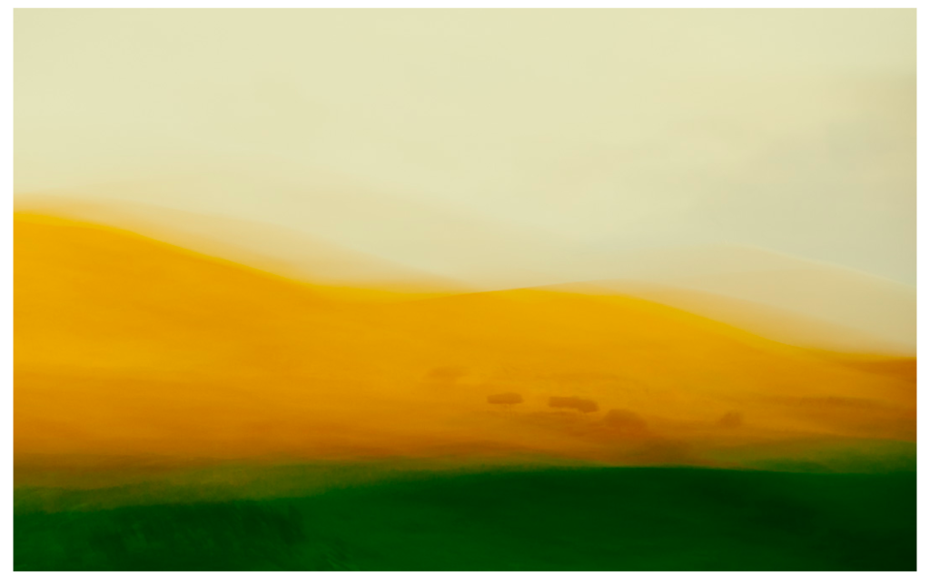
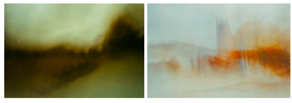
Inspired by the paintings of the old English masters with a mix of camera techniques and post processing I have developed these painterly impressionist images of both recognisable and abstract scenes into a style that goes beyond what many consider photography.
The looseness and ability to play without being tied by the light or weather affecting the scene you’d normally be shooting is the style’s appeal to me, also the chance of creating a scene that was not necessarily there. Using a tool of which its sole function is to capture exactly what is in front of it and then making it almost become a brush with which we “paint” is a joy. The results I have achieved since first experimenting with intentional camera movement (icm) have been more satisfying than any photograph I’ve made previously.
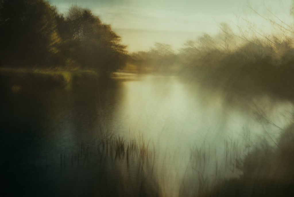
I like this image as you can still see the details of the plants in the foreground, becoming more blurry towards the back of the image. This is effective as it creates a balance between movement and detail on the landscape. I also like how in this image he only emphasised the natural colours in the landscape, rather than changing the colours in editing after the image was taken which is something he does in his photos. I like him emphasising the natural colours as it makes the landscape look more realistic and a true depiction of nature. On the other hand, it takes away from the abstract qualities of his other images where he emphasises bold shapes and bright colours. I also like how he contrasts the bright parts in the middle of the image, to the darker parts around the edges of the image, as it makes it more interesting and emphasises the composition.
With Northumberland as a home its iconic but subtle landscapes, coastline and nature in general have shaped my vision from an early age and continues to inspire me – though the thought of the challenge of a change of scene does appeal now and again. ended up with me all but abandoning the “reality” of photography and instead I use the old English master painters of the 19th century, along with the later impressionists as my inspiration to create the work I currently do. A huge influence and someone I actively try and mimic in form and colour scheme is JMW Turner.
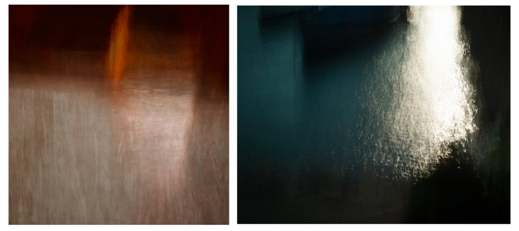
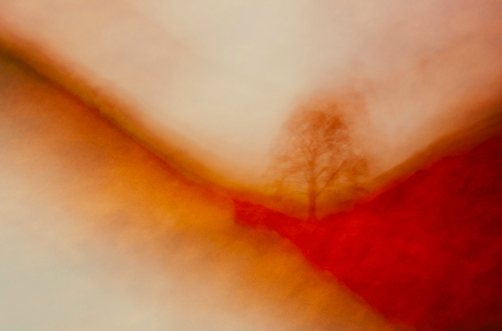
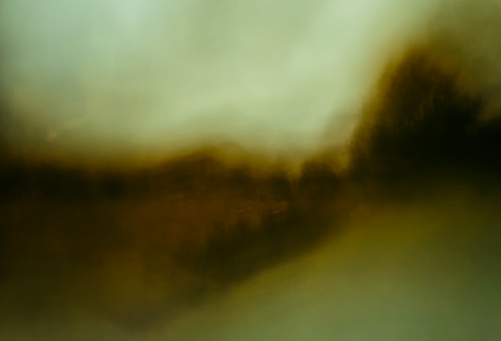
I chose Andrew S. Gray as an artist to take inspiration from as I wanted to experiment with the way I photographed images and thought that the technique he uses, by shaking his camera and editing the images to emphasise the colours, was a good way to do this. I also like how he takes inspiration from old English painters and the impressionist movement through the movement and looseness of the lines in the images, creating a blurred effect, but still being able to see the aspects and colours of the landscape which are important. I also like his focus on abstract shapes and colours which I have done previous research into. He focuses on emphasising the bold shapes in the landscape which is something I will try to interpret. I think that by interpreting this work it will contrast from the way I normally taking photos which is very detailed and precise, always focusing on the composition. By doing this technique it doesn’t allow me to find a good composition as easily through the movement of the camera. With my images that I produce, I want to be able to compare them to images I’ve previously taken in the project and see whither they would be effective to use as final images for this project.
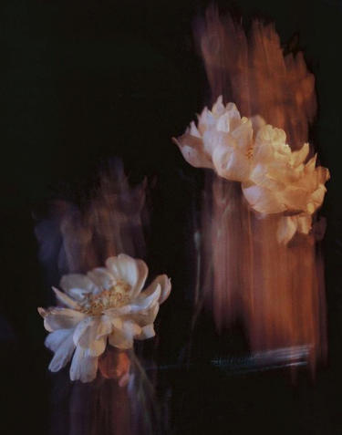
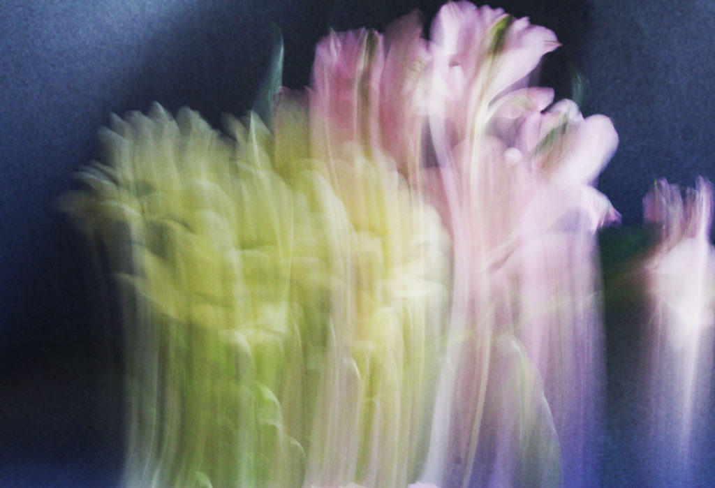
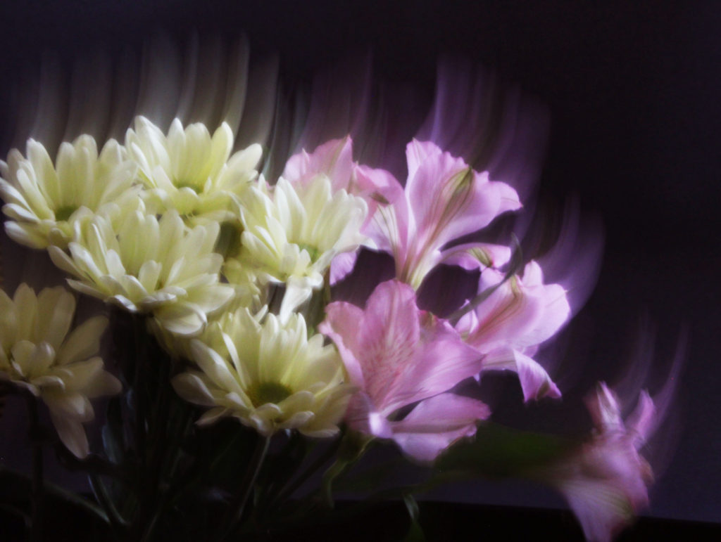
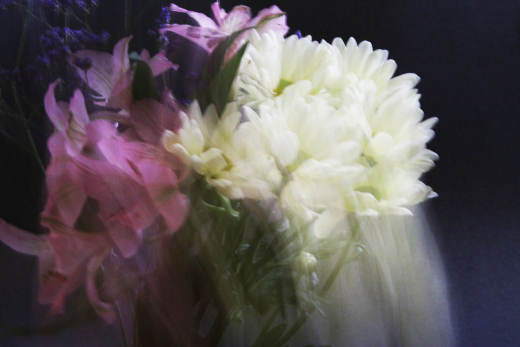
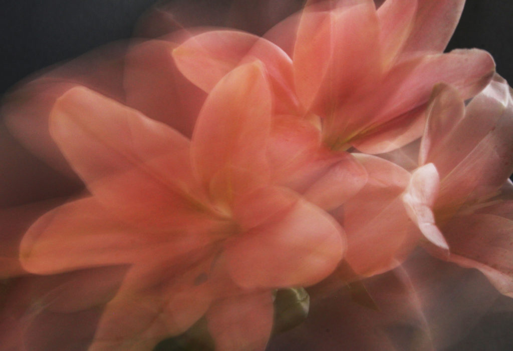
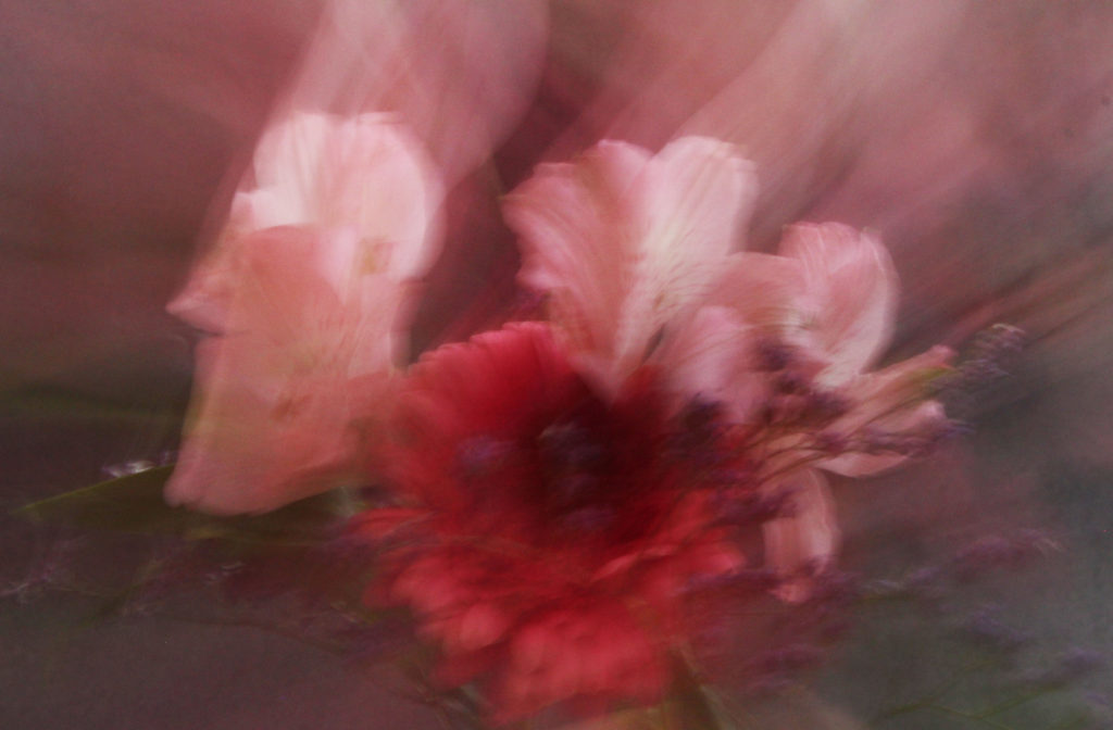
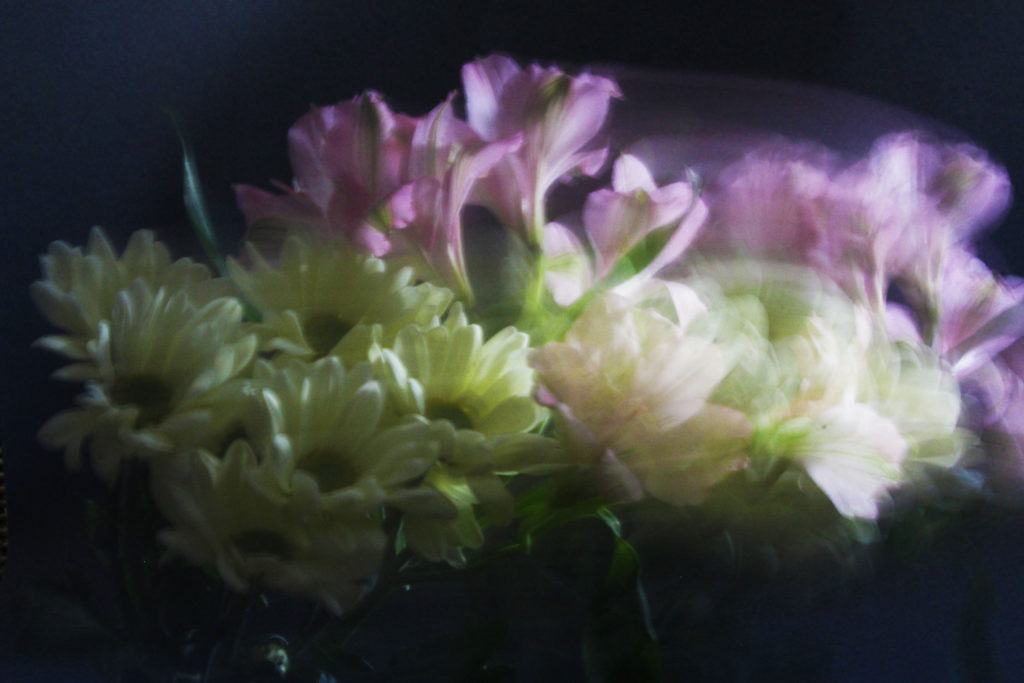
For this shoot I wanted to recreate the style of alexandra Waespi which can be seen in the image above. I did this shoot in my bedroom using a black piece of sugar paper as the backdrop for the images. The reason that I did the shoot in my own home rather than in the studio at school, was the I wanted to use natural lighting rather than artificial, and I would also have more control about the amount of light that comes through.
For this shoot I used a bunch of flowers that I had gotten my mother for Mother’s day. To create the images I slowed down the shutter speed of my camera to around an 8″ of second, I found that if it was any slower the definition of the flowers was lost and if it was any faster the image did not have the effect the ‘drag’ effect which is what I really wanted. To crete the ‘drag’ effect I eaved the flowers around in different patterns and variations, I would take one images then look back at it, decided it I liked the pattern that had been created, if not I would try a different pattern if I did I would try and create it again. When editing the images all I did was increase the vibrance and the contrast in the images, this made the images more impactful and more appealing to the viewer.What I like the most about these images is that they tie into the themes of ‘variation and similarity’ because every image from the shoot has a completely different look and feel to it which is something that I really wanted to achieve.
For this shoot I wanted to create a response to the works of Fontana as I really liked the simplicity created through his highly saturated images. What drew me to his imagery was his use of using the textures and patterns found in nature and man-made objects to create impressions of the landscape around him in a way which would not have usually been percieved. From this shoot I would aim to achieve a new style of photography which I could then go onto incorporate into possible future works especially the aspects of colours, something I don’t normally consider when doing shoots. To create the desired effect I would probably have to manually increase the contrast and saturation within my settings of the camera in order to produce the outcome for the photos I would like. Using Fontana as my main source of inspiration I decided to have a look at some of his works which I found to be of particular interest:
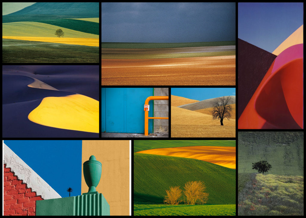
Once I had gone over a few of Fontana’s imagery I decided it was nearly time to go ahead with the shoot itself. However before doing so I wanted to create a mind-map for the goals when taking photographs, by doing so for me it would reduce wasted time as it would allow me to quickly identify what I wanted to capture in order to achieve the results needed. Not only would this stop wasted time but allow me longer to focus on the things that I may not have realised if doing the shoot there and then. Here are some of my ideas:
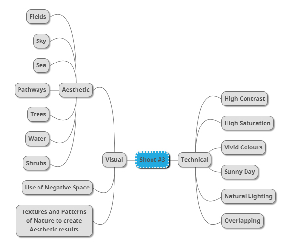
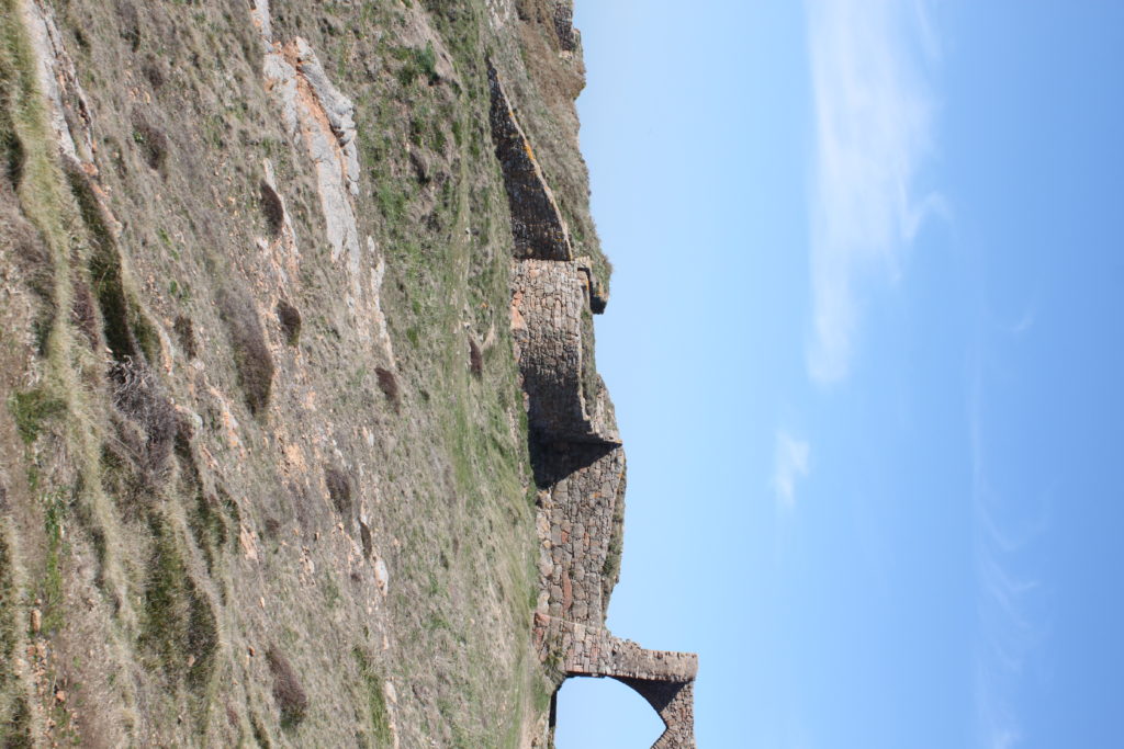
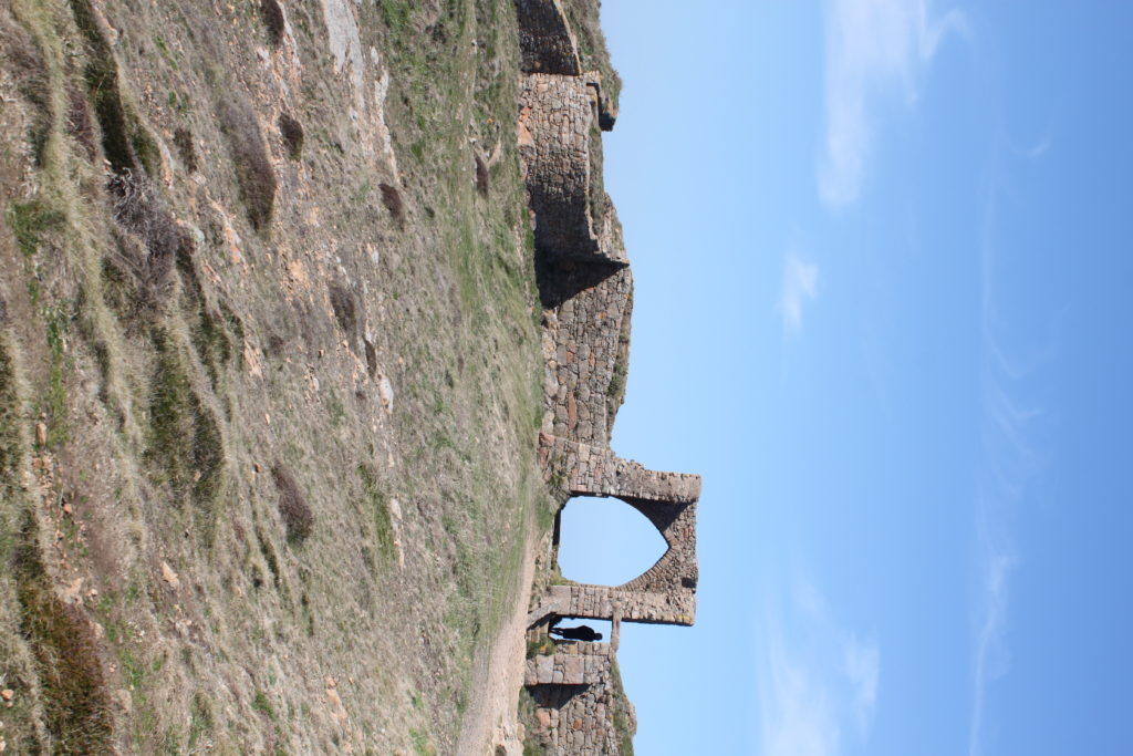
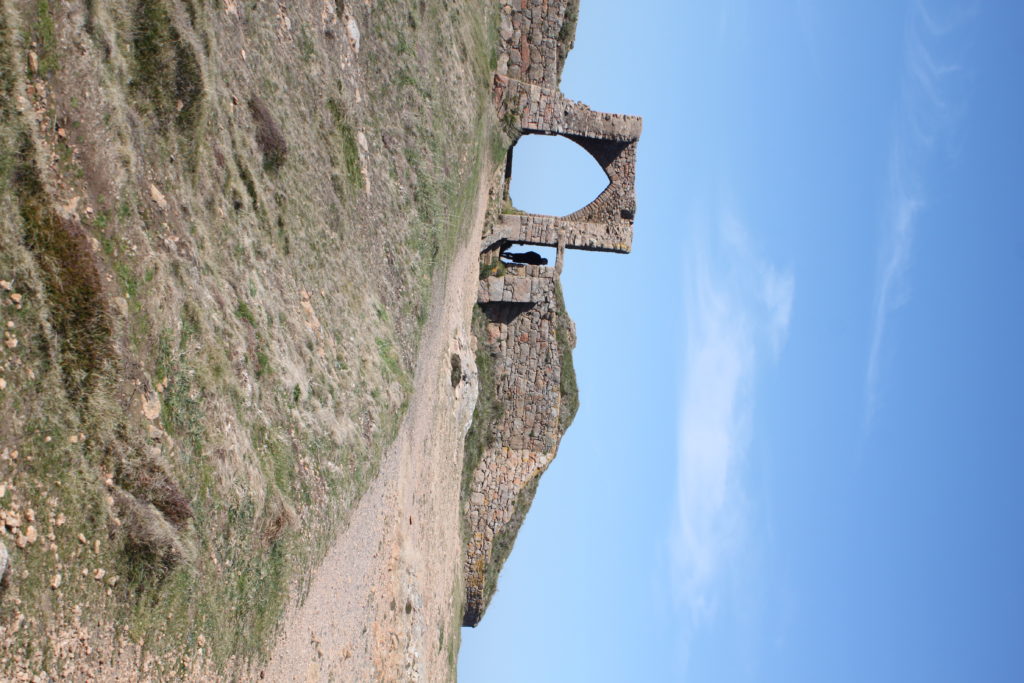
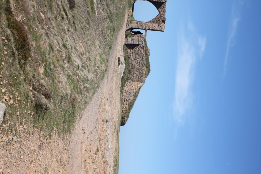
Once I had completed my mind-map I decided it was time to actually go ahead with the shoot. To do this I wanted to explore the area North of Jersey as this area had the highest number of agriculture out of Jersey as it would provide me with the subjects needed to achieve the aims of the shoot. Using my mind-map as my primary source of inspiration and ideas I explored the footpaths which surrounded the North coast looking at how the blue sky could contrast the hills. Here are the results of my shoot:
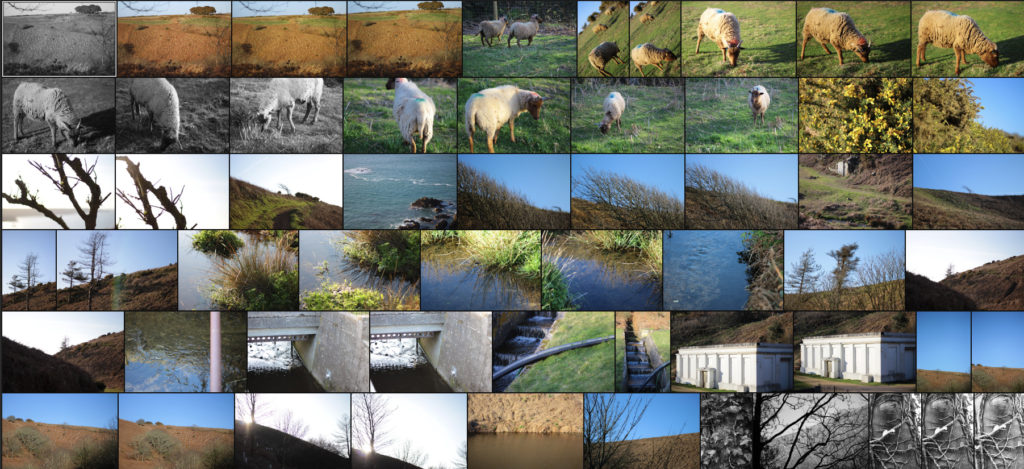
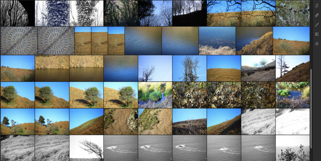

Once I had completed the shoot I then wanted to go onto select out ten images that I thought were most effective and related most to not only the topic title of textures and patterns but also saturation. By doing this it would allow me to reflect on each image and make in easier to choose out a selection of five from that so that I could later on pick one overall image that I thought best reflected my intentions for the shoot. Here is my selection for the ten images I thought were best suited to the topic of saturation regarding textures and patterns:




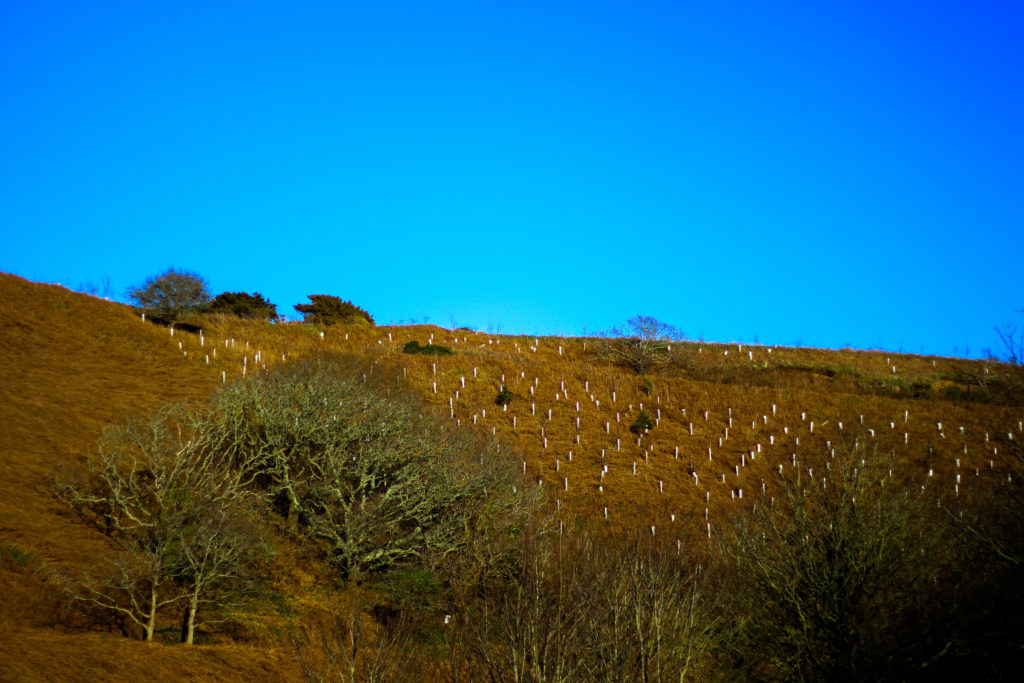


After I had selected the ten images that I thought worked best regarding the topic title I decided to then whittle them back down to five images, by doing this it would allow me to analyse each image in more depth looking at things such as the visual and technical aspect of the pieces that I thought made them work well and link back towards the title of saturation and make my overall choice of best image easier. Here is my selection of the five best images from my shoot:

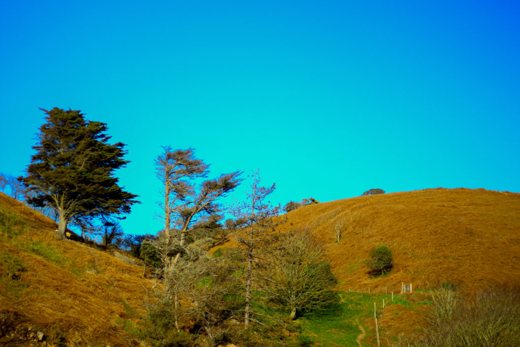
I selected this image because I loved how the orange contrasted the blue sky with the tree breaking up the dominant two colours. What I liked about this was how the two main colours compliment each other, however to stop both colours from becoming to eye-sore to the viewer the use of a lighter shaded tree and its shadow provide us with an implicit focus to what we almost instantly draw our eyes to. I also really liked the symmetry present within the photo as the skyline and pathway with the tree line up against each other as it presented the viewers with an overall sense of aestheticism. When looking over the image I found that it related well in response to saturation evident through the orange grass and the overly blue sky, this sense of other-worldly colour for me gives the viewer the impression of an over exaggerated landscape which has certainly been edited.

What I really loved about this image was the over use of blue to create the impression of an artificial sky, complimented by the patterns created from the tree branches I found that this worked well due to the overcast impression it paints on the photograph. For me I found that the use of the negative space taken up by the blue really brought the image together due to how it prevents the pattern of branches from completely covering the entire composition. The image itself relates well to saturation from how the use of an overly blue sky creates the impression of something to perfect to be true, with the photograph linking to texture and pattern through the branches which grow in random directions that produce a hige sense of aestheticism against the blue sky.

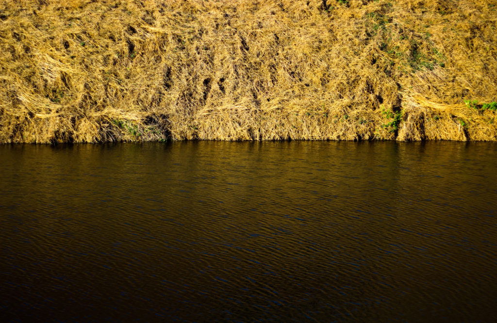
I chose this image because of how I loved the golden colours of the grass contrasted to the rippling water. For me this image represented two over exaggerated aspects of nature, especially as an island where we are surrounded by water presenting both the land and sea side by side in a sort of aesthetic and beautiful state creates the transition between the two as a natural mirror. I found that the gold presenting throughout the image as the main reason for choosing the photo due to it adding character to the water, reflecting the overlapping pattern of the grass as it grows. As a result of this I found that the two contrasting textures present in this image, being the rippling water and the overlapping grass as complimenting each other as one provides a more abstract representation for the other. The saturated golds in the piece also link it to the title through the coloured reflection that would not usually been seen by the everyday eye.

For me I selected this image because of its use of neutral space to create a more abstract impression of the landscape and whats in it. For me the tree against the blue sky was what brought the image together due to how it broke up the otherwise dull composition of the photo, what I found was how the messy texture of the grass completely contrasted the smooth matte texture of the sky which sorts of juxtaposes it. I liked how the composition that took into consideration the angle of the hill made use of the sky and contrasting orange grass surrounding it so that it would not become too overpowering. Overall I find this image did reference well regarding the topic of saturation, however looking at texture and pattern it did not serve a great load towards possible patterns except through grass.

Finally I selected this image because of the natural gradient created by the sun, sky and grass to produce this sort of golden natural film over the waters surface. For me this piece worked well because of how no real use of saturation editing was used due to how vibrant the surface of the water was on that sunny day with only a bit of cropping being needed. I really liked how the composition of the piece was based around a fifty fifty colour wise, with the golds taking the top and the blues the bottom, because of this for me the piece was well balanced with no aspect overpowering the other and creating an aesthetic product. However when looking over the image I did not find it had a great deal to do with saturation due to there being no actual reflection of a saturated landscape.
After looking over the visual, technical and conceptual aspects of the five selected images I was happy enough to come to a conclusion regarding which image would be best to reflect my intentions around saturated photography whilst also looking at the title textures and patterns. Here is my final decision towards the topic of saturation:
Final Image:

I chose this image as my final photograph to sum up my chosen topic because of the contrasting sides to the landscape it presents using highly saturated colours. For me the dominant use of yellows and golds in the photo bring about great aestheticism whilst highlighting how areas of our environment provide us with varying textures and pattern (such as ripples in the water and the overlapping of grass), something that the everyday eye would not take in unless looked upon carefully. Symmetry played a part in this decision due to how it presented the image as visually pleasing, stopping both the water and land from becoming too overpowering.
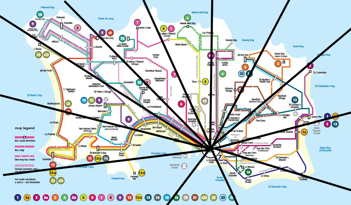
To plan out my shoots I have split up the map of all the bus routes into sections, I will then start by picking a route from each section and taking this bus to the end and back. I will also be starting by doing all my first shoots at a certain time, such as 14:00, once I have completed all shoots at this time I plan to do a second set of shoots at a different time such as 10:00. I plan to capture different perspectives by sitting at different levels on the buses, for example on the lower and upper levels of the double decker buses, by doing this I hope to create two different atmospheres in my photos, one as more of an invisible onlooker and the other as more a member of the crowd and community. My plan is to begin with these 10 routes the cover a wide area of the island, they are routes 12a, 22, 28, 7, 5, 4, 3, 2, 1a and 16.
For this experiment I took six photos to start off and then I went through the process of Creating the GIF. These are the six original photos.
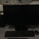
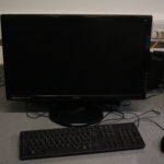
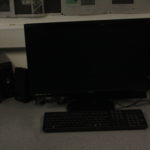
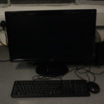
-The process
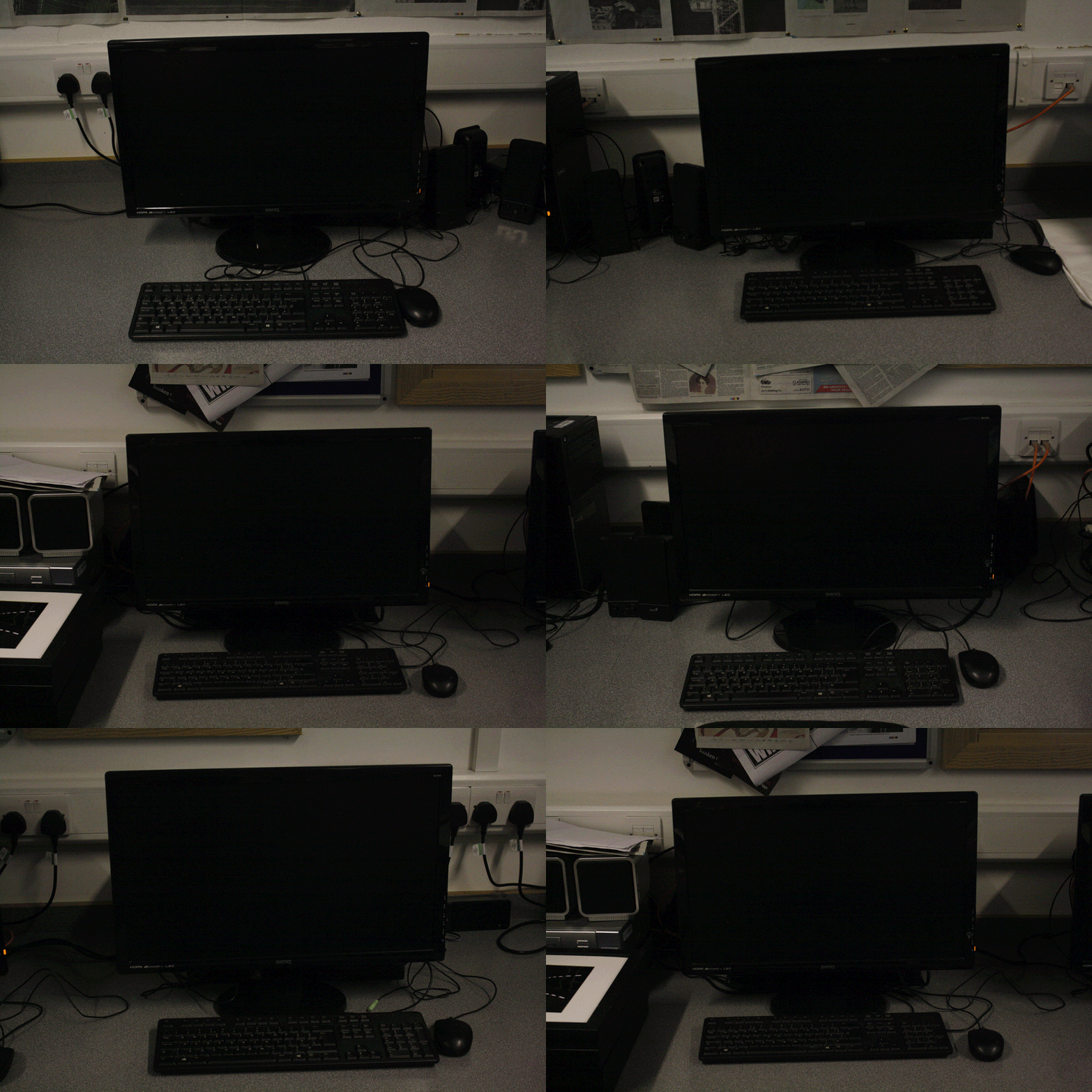
After following the process the final GIF I was left with looks like this. I feel it shows variation and similarities of keyboards, monitors and the mouse, which is the bases of the project I will be working towards.
http://www.alexandrawaespi.com

Alexandra’s work pushes the photographic print further through experimentation with chemical reactions, manipulation of the film’s emulsion, and alternative darkroom and digital processes. She develops color film at home, often with a rough development process, bending negatives in the reel and varying the temperatures and times. In the darkroom she prints on found old paper and applies the developer with a paintbrush.
With the printed image, new layers are added by hand. Her scanner manipulations were first developed in her attempt to archive her work digitally. She believes the manipulations transform her images into an alternate reality, which fuses analogue and handcrafted techniques with digital glitches. After these stages she is left with a tangible object rather than individual photographs.
Her inspiration comes from early 20th century colour photography; particularly the techniques used in hand colouring and toned black and white prints. She is also influenced by the toned prints from Boris Mikhalov and intuitive style of Miroslav Tichy.
This project was created as a collaboration between the Graphic designer and Photographer Alexandra Waespi, they wanted to make a poster representing the month of July last year. July in 2018 was one of the hottest Julys on record for England so they wanted to convey the sense of how hot it really was in the images
To kickstart ideas on their collaborative project, Alexandra and Alexa began by listing words that they instantly associate with July. Alexandra chose descriptive ones, “sun-drenched”, “thirst quench” and “warm nights” for instance, while Alexa opted for “sticky”, “hazy” and “fuzzy”. Alexandra then merged the words into combinations “that could be translated visually.
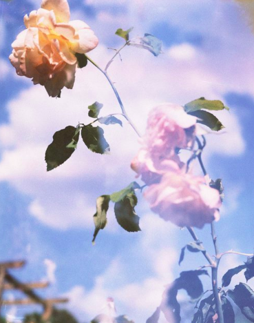
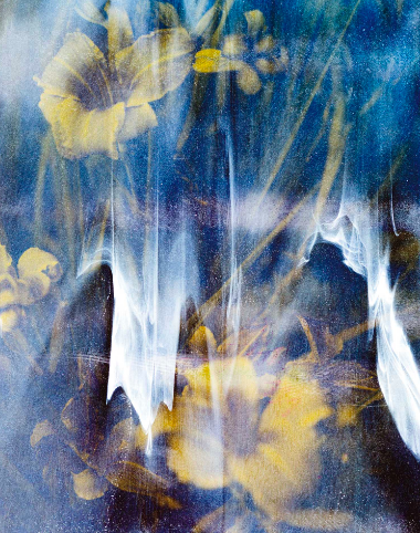

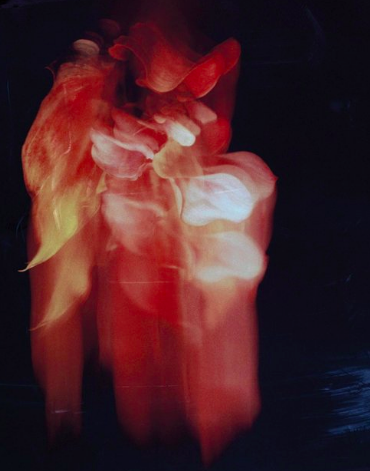
Alexandra introduced the concept of potentially adding image manipulation techniques, to create a melting, photographic effect. For Alexa’s typographic element, the designer wanted the graphics to also reflect this hazy, sunny feeling, suggesting it may “be nice to combine this bleached Polaroid effect with sun prints,”. Sun-prints, is a technique where the paper is overlaid and then left out in the sun until it exposes, leaving a bleaching effect, was an apt way to create typography that happened naturally. I am going to try and attempt to rectre this technique when I do my own version of this photoshoot, but due to the weather recent being overcast and raining in not too sure if this will be possible.
Experiments for Alexandra continued, posting options and options of different flowers and levels of exposure for the pair to discuss on the thread. While Alexandra was photographing, Alexa was reading Maggie Nelson’s mix of poetry and prose, Bluets.Coincidentally, the photographer’s experiments reminded her of the writer’s use of words, but also the duo’s initial lengthy list. First, Alexa decided to experiment with typography digitally before using cyanotype to create the sun-prints as “the texture of those should play really well with these polaroids,” Alexa explains on the thread.
Digitally, Alexa produced numerous examples of how type could interact with Alexandra’s photographs. However rather than poetic sentences, the designer remained drawn to the bolder typography, particularly the word ‘melt’ to describe the project. Being able to watch Alexa work in this way was a treat for the photographer explaining that she “loved seeing Alexa use an analogue technique to put the text down, experimenting with the sun printing”. “To see those chemical stains felt like a real harmony between the ‘stains and dust’ on my images and to have that down in her work as well.” It was also during this period that Alexa felt the poster came together, particular once the pair had decided to “choose a one colour palette for the two elements,” allowing the poster “to come into itself”.
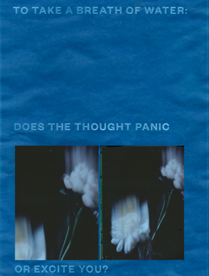
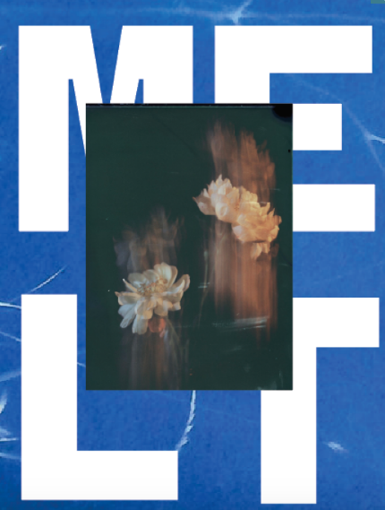
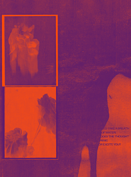
The final poster in Alexandra’s words is a mix of styles and creative disciplines in “a bold blended harmony,” she says. For Alexa she sees more of a message that the poster conveys, believing it “has a bit of mystery to it,” she explains. “Alexandra’s raw images of the flowers on black are striking and a little haunting, that feeling is present in this final outcome.”

EDITS:
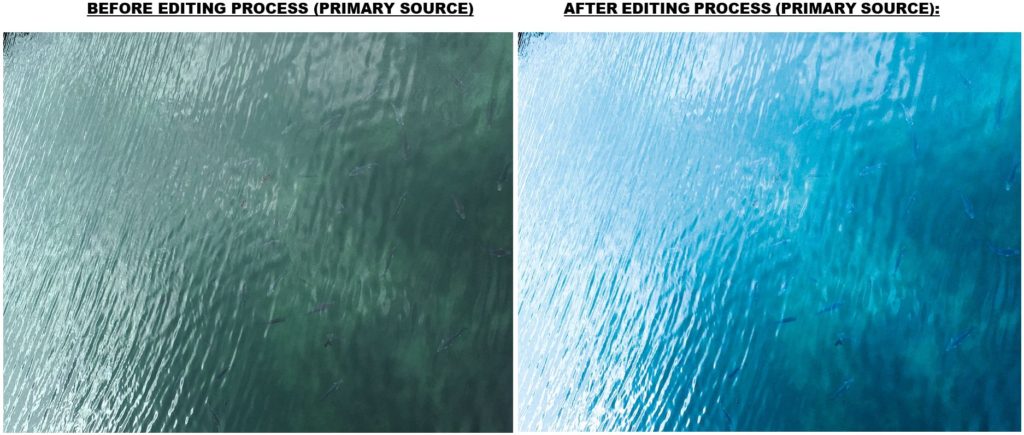
For the editing of the images i edited them all on Lightroom changing the settings to give the desired effects. I then went through a second selection process selecting the images which worked best after editing but then also editing images in green to create a gif.


Final Selection:
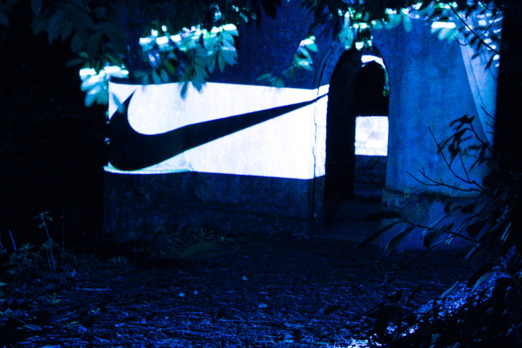
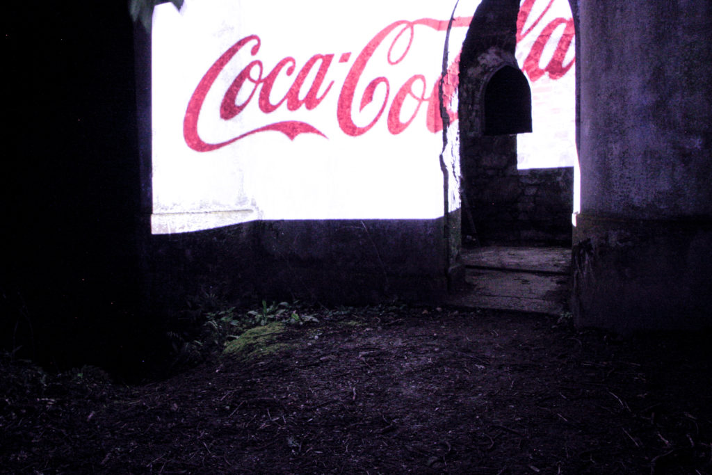
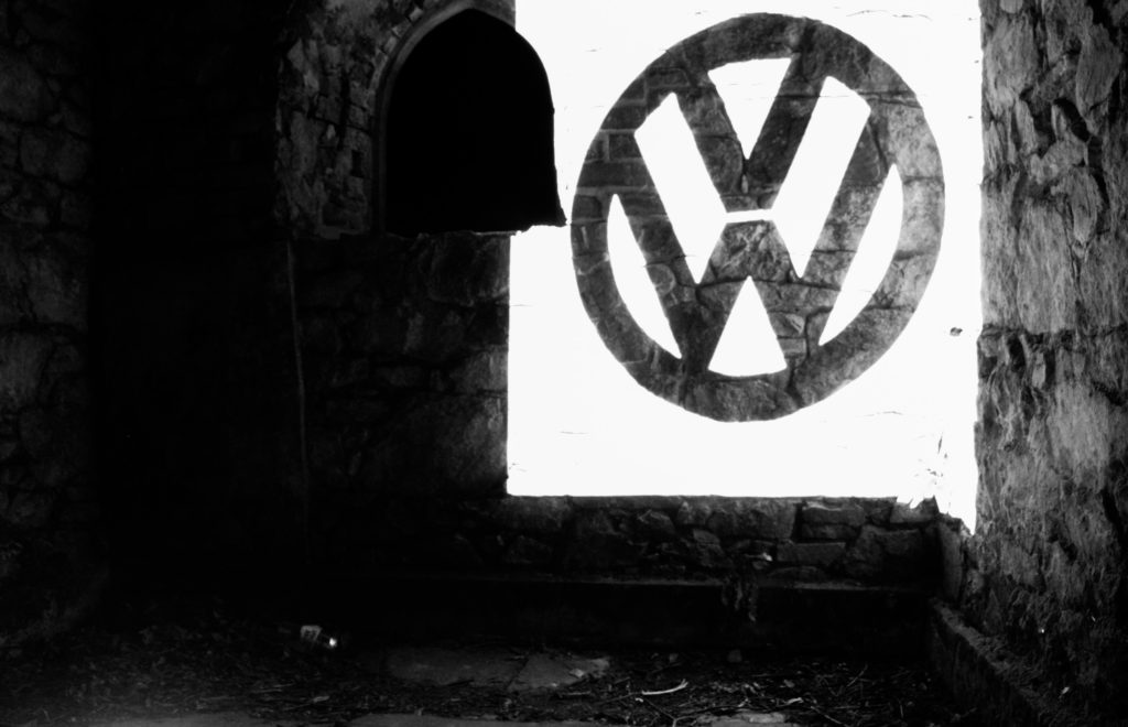
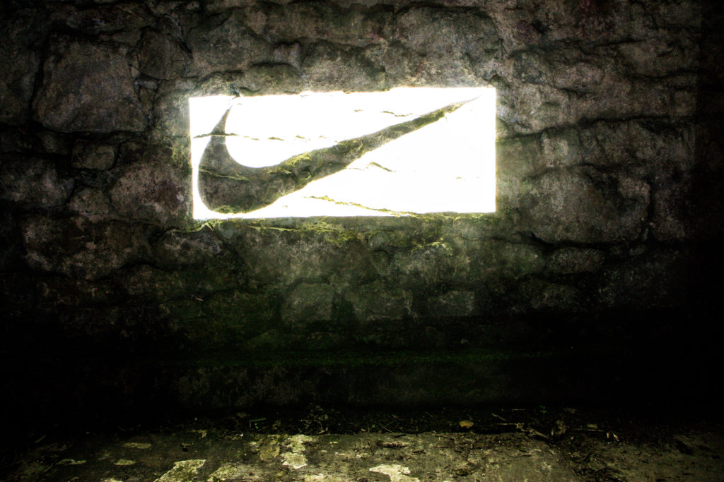
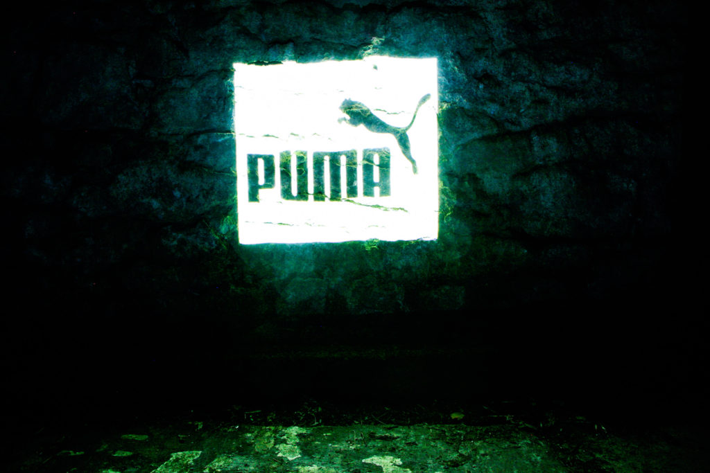

Overall the photoshoot worked well as a response to commercialism as i wanted to created these big stand alone graphics projected onto the area. The photoshoot is meant to question our usage of brands and how in our everyday lives they are everywhere and we have ended up consuming brands more then we consume our natural landscape and spend time outside. If I was to redo the shoot I would select several other outdoor areas or a city area. This shoot required lots of planning so i want to find an easier way to project without requiring lots of equipment.