Case Study on Celebrities in the Media

As part of my project I want to look into the way celebrities and influential people within the modern media are setting unrealistic expectations in terms of beauty. I hope to use the information I find in my project to construct my own photos which subvert and challenge these ideals. In relation to the title variation and similarity I hope to show the limitations of modern beauty standards and how they are being compressed and viewed from a single perspective.

Photos of celebrities and models have been manipulated to look perfect for years fooling impressionable audiences into thinking it is real and untouched. Since the introduction of the internet and social media this issue has only got worse, now not only magazines are editing photos, everyone has the power to improve their appearance at the tap of a button using various apps. Plastic surgery has also grown in popularity with anyone who can afford it making changes to their body. From fat distribution, and hair transplants to boob jobs and lip fillers many people are fixing their personal insecurities. Editing, makeup and surgery has become the norm and it is starting to means people are believing these unrealistic and unreachable expectations and wanting to reach them. Some people are open about the changes they make to their appearance and support the idea of body confidence whether it is natural of not. I want to look at some of the most influential celebrities on the internet and in popular culture as see what messages they are portraying to audiences about body image.

The Kardatian/ Jenner family are widely known for their ‘beautiful’ looks and have made careers from it. With accentuated hourglass figures, golden tanned skin and an endless wardrobe many people look up to them as inspiration. They have millions of followers each and dominate the media meaning the have a large influence of audiences. various members of the family have had cosmetic surgeries and undergo extensive treatments to maintain their looks. With their whole life dedicated to looking ‘perfect’ many people have criticised them for using their platforms and large influence for narcissistic content. Kylie Jenner, known now as the youngest self made billionaire has built her brand ‘Kylie Cosmetics’ by cleverly marketing and selling beauty products online. In the past she was known for her large lips which she claimed for years were natural and just over lined however she eventually admitted to having fillers. During this time a trend went viral where people used a small cup over their lips and sucked to create a vacuum in hope to achieve a similar look to Kylie’s lips, this was a very dangerous activity which could leave permanent bruises to the area and shows how easily audiences can be influenced.
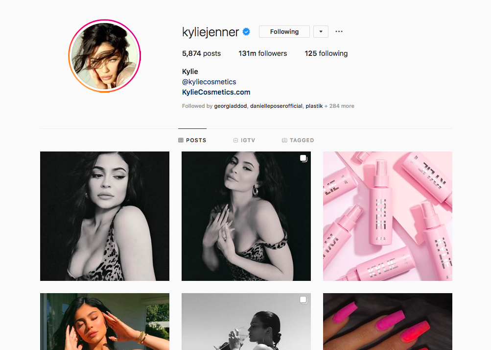
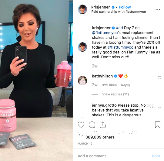
Other members of the family such as Kris (the mum) and Khloe have recently advertised a product called ‘flattummyco’ it is a meal replacement shake which claims to help users loose weight. Product including, hair treatment gummys’, various skin serums and many more a promoted by influencers online daily. For them it is a job, they get payed per post and for the companies this is a highly effective marketing strategy which gets their product into the public eye. These influencers are trusted by their audiences who therefore trust the brands being advertised even when on many occasions the influencers have never used the products.

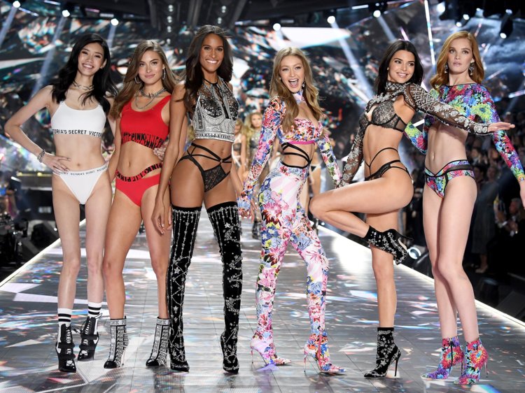
fashion retailers have also been criticised for encouraging unrealistic beauty standard and portraying the ideal look in such a specific way. Victoria Secret a womenswear and beauty product marketer has an annual catwalk show which girls all over the world aspire so walk in. The brand has a very specific look, displaying models with long flowing hair, perfect skin and very slim figures. images from the show are used as marketing material for the brand and are published in magazine, billboards, stores and online. The so called ‘Victoria Secret Angels’ are an aspirational target for many young girls despite it being and unreachable and fantasy goal they are chasing.
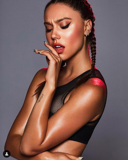
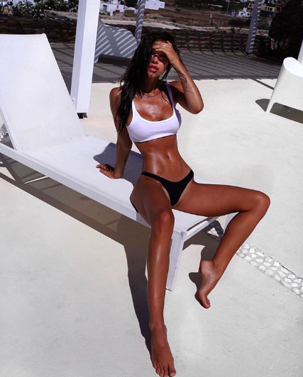
Alexis Ren is a model who found fame on Instagram ultimately due to her looks and ‘perfect beach body’. She has recently been criticised for promoting unrealistic body expectations even after suffering with an eating disorder herself. She admitted to suffering from food guilt and over exercising yet is still a role model for many ‘fans’.

It is now common for people edit their photos to change their appearance, from slimming waistlines to whitening teeth but it is important to remember that what we see on the internet in only a depiction of reality which rarely resembles real life. I want play with this concept and exaggerate it with my photography and editing, the idea, to make people look at fashion and beauty from a clearer perspective.

https://www.boredpanda.com/before-after-photoshop-celebrities/?utm_source=google&utm_medium=organic&utm_campaign=organic
This link shows a few example of celebrities in the public eye who have savourily edited their photos, I wish to use this as inspiration for my own work.

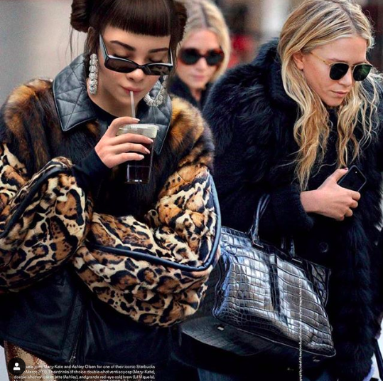
I want to look at the work of modern artists who are questioning beauty ideals and reality in a new digital age. In a world where everything can be edited from looks to lifestyle we no longer know what is real. One digital artist (unknown) has created a fictional character called Lil Miquela who has become well known (famous) on the internet. She claims to be an Instagram model and music artist however does not exist in reality. Her Instagram page displays her living an ideal life  going to the beach, visiting her favourite art galleries, and hang out with other influencers (real and simulated). She is a form of artificial intelligence created my a under the radar company ‘Brud” who kept their intentions and reasons for creating the character quiet, they say she is an Artificial Consciousness in many ways a virtual robot. Many people seen the character as a social experiment playing around with how the internet culture idealises people for their looks and virtual profile. I find the concept fascinating the way reality and fantasy are crossing and becoming one with these images combining photography with 3D digital design.

https://brud.fyi/public-statement.html
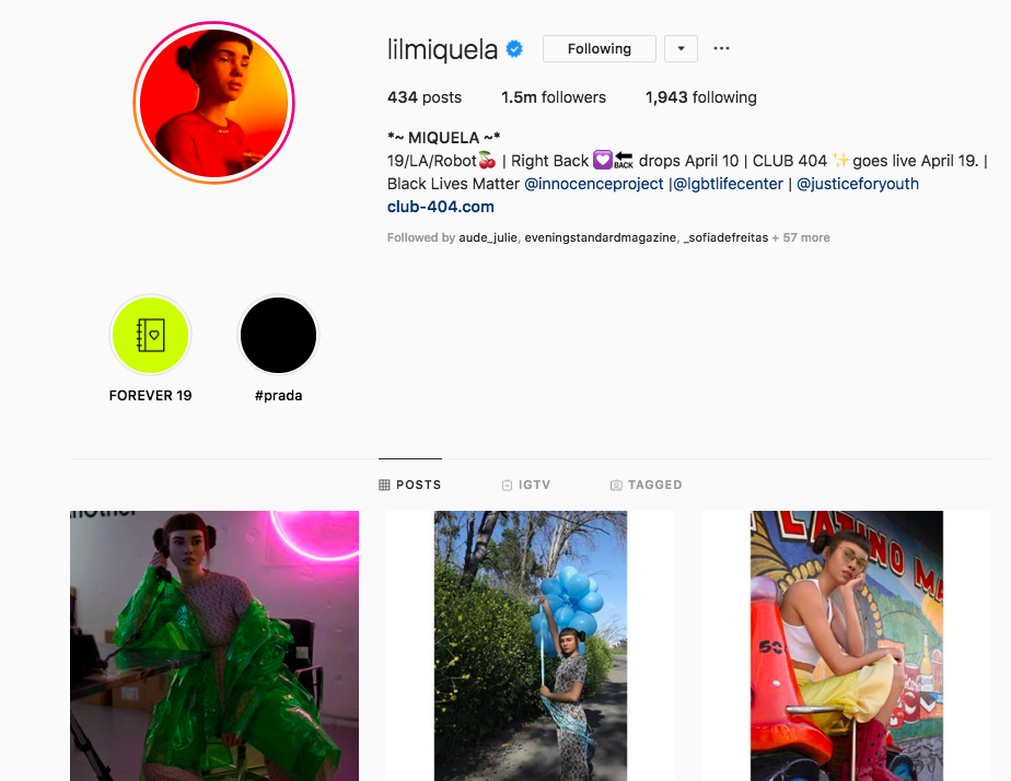
Jean Baudrillard was a cultural theorist who talked about how in postmodern culture blurs the boundaries between the ‘real world and the world of the media, he says that their is no way to distinguish reality and simulation. We can no longer refer to anything as real or original due to the idea of simulacra and technology, being able to edit and adapt things digitally. This links back to the fictional character Lil Miquela who appears online in the same way as real life models and celebrities despite it being fully constructed.

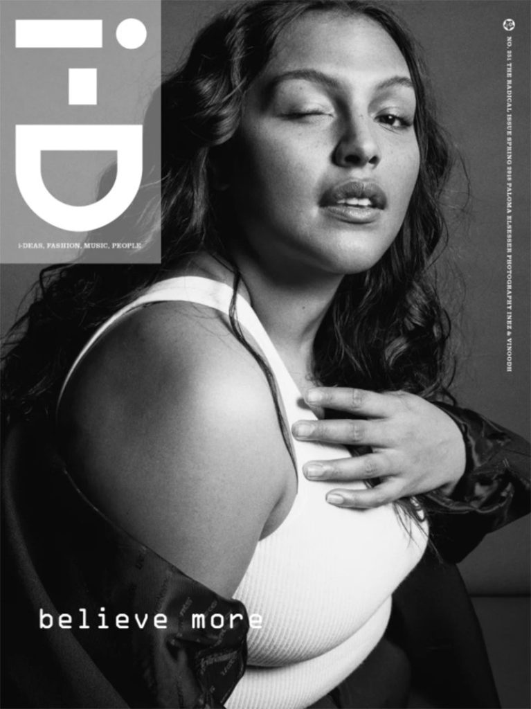
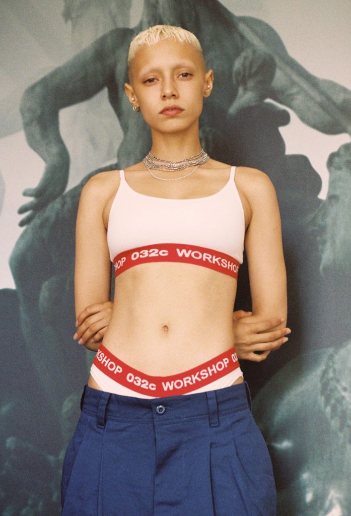
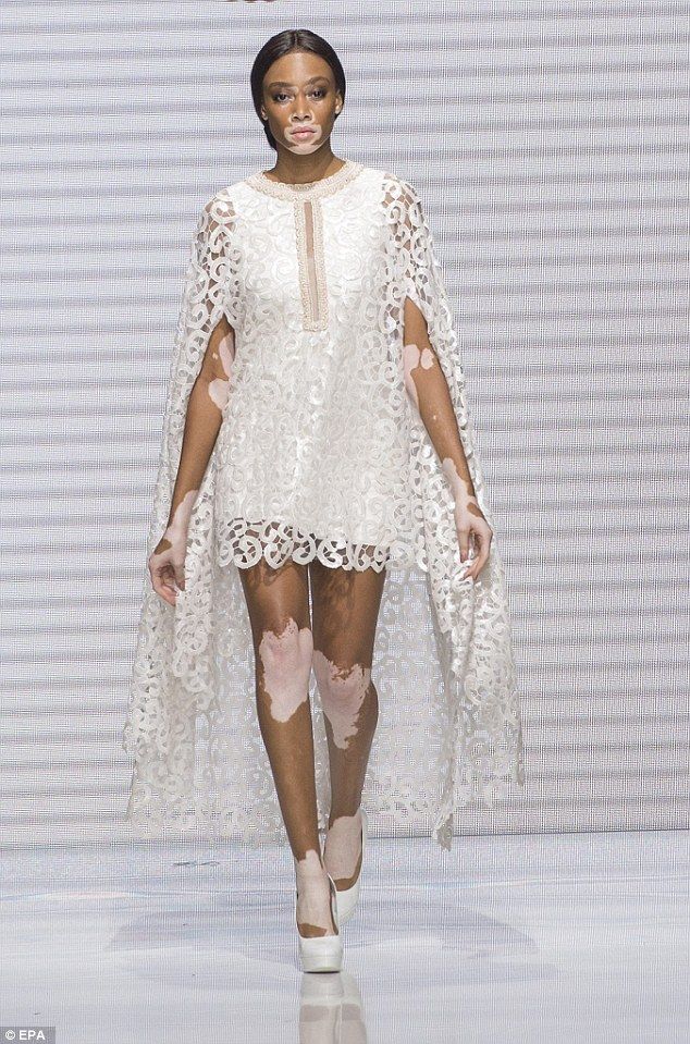
Finally I want to talk about new alternative models who are changing the game and breaking conventions of beauty. Magazines such as I-D and Dazed and brands like Fenty are known for showing diversity in their publications, from age, gender, skin tone, weight and may more these progressive approaches help to spread more positive and universal beauty expectations. Models such as Paloma Elsesser, Jazzelle Zanaughtti and Winnie Harlow (bellow: left to right) are the first of a new era of models who will hopefully help to represent a more diverse group of people helping audiences to feel connected and represented in the media.

https://i-d.vice.com/en_us/article/a3yn9k/jazzelle-zanaughtti-the-new-fashion-rebels-issue

Photoshoot 4

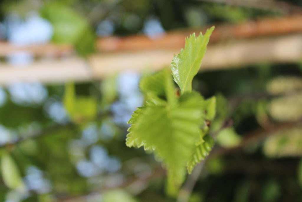
In this shoot I have displayed images where I have tried to focus on close up aspects on the environment that may not be as noticeable, especially on bold colours that stand out from the background of the image, drawn from abstract concepts. I also focused on lines and patterns made from branches. I think that this second photoshoot at Queens valley was successful in me discovering the full concept of my project concerning the relationship between nature and humans.

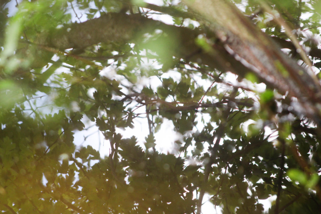
This is one of my favourite images from this shoot. I especially like how the whole image is filled with patterns and texture. I tried to focus on light and the soft colours, so zoomed in on the reflection of the trees on the water and had the leaves close up to the camera so they are blurred, creating a relationship between the camera and nature. I think that this draws on the concept I want to explore of the relationship and connection between humans and nature. By taking the photo within the plants and trees it creates the illusion of being completely surrounded by natural world as the entire frame is filled with natural objects. By focusing on aspects of light on the water reflection, and even in the close up leaves in the left corner, I think this image really draws from ideologies of spirituality and nature being connected in many ways. This is a concept I want to explore and research more in my project to get a better understanding of how nature and humans are connected in ways that many people may not know.

I also like the composition of this image and how the branch in the right corner is out of focus, but creates a break in the image and adds another aspect to look at. I think what makes this image stand out to me is the contrast of the bright white reflection from the sun on the water thats contrasted with the natural green and brown tones surrounded it and reading interesting patterns. I also like how the leaves from the plants that are surrounding the camera are only shown in the reflection of the water.

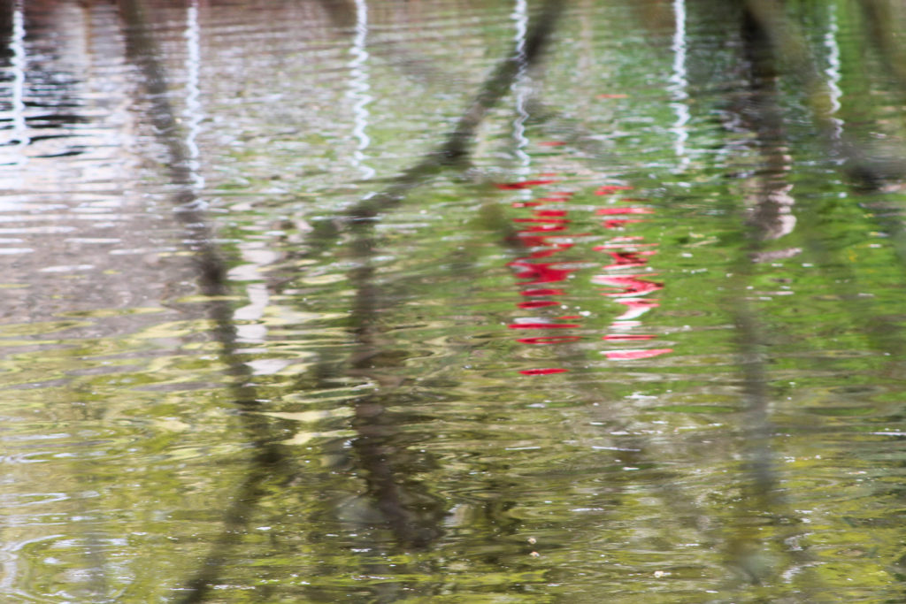
I also tried to focus on bold colours that were different from the surrounding landscape, which I think these two image above do well. The first image is of a reflection of a person walking along the path in a reflection. I chose this as an image to display as I don’t think its easy to tell that the red reflection is a person. I also liked how the red colour was completely different to the surrounding greens and browns, reflecting ideologies of abstract. I also think that the branches in front of the camera that are out of focus create another aspect to the image that makes it more interesting, and creates a similar effect to the first image in my shoot, where the camera is immersed in the nature, creating the the appearance of being surrounded by the natural world. I also think this reflects the theme of humans and nature being connected, as in this image an reflection of a person is shown on the reflection on something natural, connecting the two together.

In the second image I liked the bright orange colour and the shape of the leaf contrasting against the white and brown background. What makes this image more interesting is that patterns created from the sky in the reflection water, the white colour contrasting to the patterns of orange and brown in the image. I like the composition of the leaf in the foreground and the blurred background that is divided into sections of darker and lighter. One aspect I don’t like about the composition is how the second of the orange leaves is half way out of the frame, which doesn’t create a as aesthetically pleasing image to me. Although this composition may be interesting to use in my final images as I normally take images symmetrically or which fit in the frame aesthetically, this image contrasting from what I usually do. I think that the orange colour in this image really emphasises the spirituality of nature and plants, as it stands out from the less bright background of brown, focusing on a smaller aspect of nature and it’s ethereal beauty.

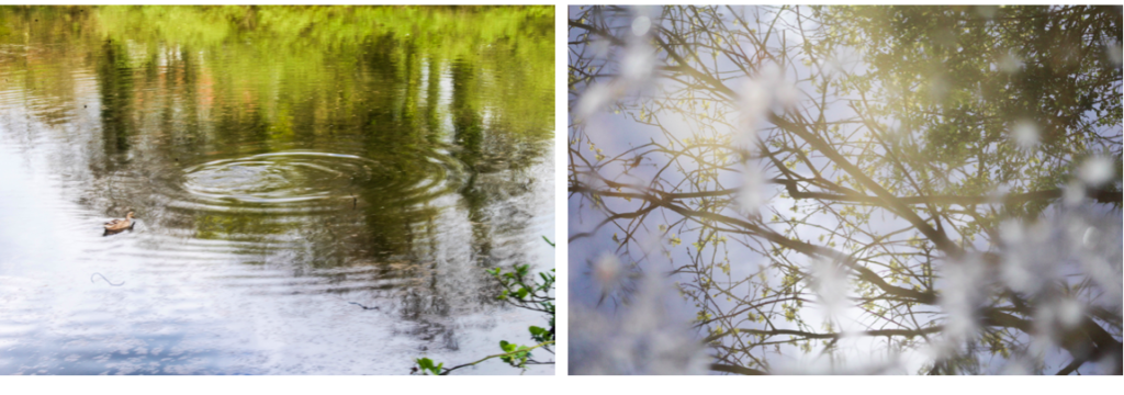
This image stood out to me when selecting my final images for this shoot as I think that has a simplistic and calm appearance that not many of images had. I think this is because in this image the lines/ripples in the water are repetitive and consistent, whereas in most of the other images, I photographed things in the landscape which were more unusual meaning that the patterns and lines were not consistent and more disorderly. I this image the ripples start light towards the foreground of the image and gradually become darker towards the background, creating a more aesthetically pleasing range of colours and composition. What makes this image interesting is the duck which is placed in a unusual place in the frame. Instead of photographing the duck towards the centre of the image, i decided to place it at the top left corner so both the ripples in the water and the duck are seen. I think that this image also reflects ideologies of spirituality and nature through the ripples made by the duck in the water and the undisturbed, tranquil appearance which further emphasises the peaceful nature.

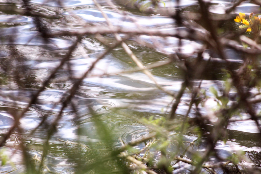
I think this is an interesting image that builds from some f the images I took in my first photo shoot of the same type of water plant in a different area. In my first image i only focused on the plant, with the surrounding water being flat, whereas in this image the plant is surrounded by leaves and sticks fallen from the surrounding nature. This creates an interesting pattern that contrasts from the vertical green lines of the plant coming out of the water. I focused on only photographing one of these plants as i wanted it to seem out of place within the background of the image which is what I think I achieved. In comparison to the background the green tones of the plant are bright an is similar the second photo in this shoot, focusing on a smaller aspect of nature and it’s ethereal beauty. I also like how this plant is growing out of the water as I think it reflects concepts of new life and nature having a spirit.

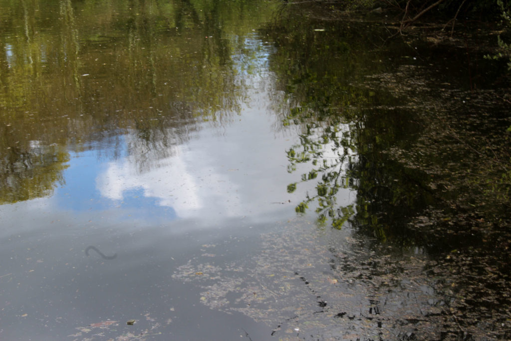
I also decided to take a photo in the same place as my second photoshoot of the reflection of the same plant, as I was interested in how an image of the same natural object can look so different at diffrent time of the day and with different weather. On my second photoshoot the weather was slightly cloudy and overcast, whereas for this shoot the sky sky was blue, which is why the reflection on the water creates a different appearance for the image. I tried to photograph this emphasising the light and the reflection of the blurred white cloud against the water as I think this creates an image that is more spiritual and focuses on the beauty of nature.

Abstract Reflections

In this shoot I also focused on shapes in the landscape that had sections of bold colours, as I wanted to explore ideas of abstract more and thought that by photographing reflections in water creates a distorted appearance of bright colours. The weather on this shoot was good as the bright blue sky contrasts against the clouds in the sky, which I could then juxtapose to the colours in the landscape.

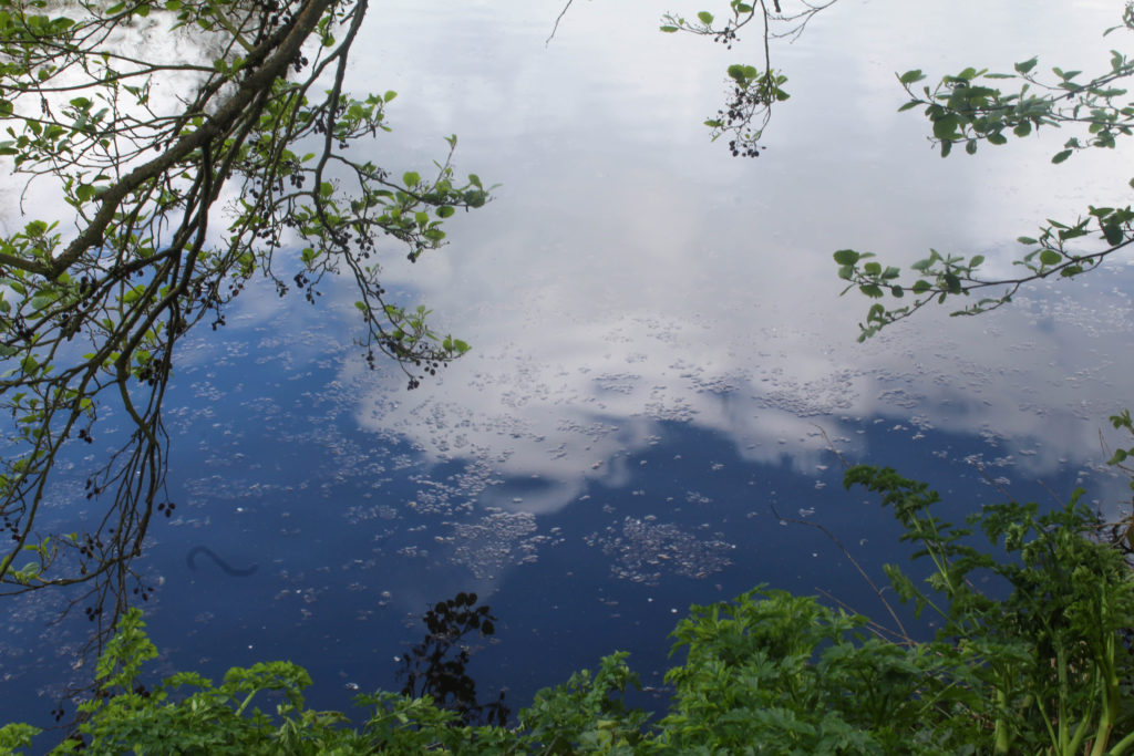
For this image I used a slight longer exposure than the rest of the images when photographing abstract shapes. I think this was effective as it captured the slight movement of the water which made the clouds look less like a reflection and more like part of the water which I think adds to the spiritual quality of it. I like the composition of how mage is framed by the surrounding plats, especially on the left side where the branches from the trees goes close to the water. I also like how the bottom section shows a different type of plants that is more green and is apart of the plants on the ground. I think that this contrast between the green of the leaves and the bright blue and, that is the sky reflected on the water, is effective. It creates sections within the image of different colours with different patterns that I think reflect abstract art and photography.

Andrew S. Gray

I think this shoot also reflects the work Andrew S. Gray similar to my previous shoot, as in some of his landscape images he captures bright solid sections in his blurred photos. In this shoot where I looked at abstract shapes I think that the solid colour sections reflects Grays work. When editing these images I could alter the hues in the natural aspects to be more brightly coloured and abstract. One difference between both out images is that in some he doesn’t pick up the details of the landscape (like the image on the left whereas in my images I still includes the patterns, shapes of leaves and light reflection on water as I thought that these elements were necessary. I didn’t try to blur the images in these shoot, like my previous shoot, as I wanted to try interpreting his work in a different way.

Experimentation: Warm vs Cool

When editing these images in light room and photoshop I tried to emphasise the warm tones and cool tones by creating different variations of the same image, looking at orange, red and blue tones. I think for this image, emphasising the warm tones orange and red was more effective as I feel it further emphasises the spiritual quality that the image has. The colours yellow, orange and red remind me of positive emotions rather than negative. For example, the colour yellow. Nearly all cultures tie this colour to a sense of warmth, both physical and emotional. In Japan it represents bravery. Many religious groups, particularly those from Ancient Egypt and in Hindu tradition align the colour yellow with the Divine. Consider that the halos of the angels typically appear in a yellow or gold colour. Spiritually speaking it represents the element of fire, our sense of vision, energy, harmony and personal identity. Orange is sacred in Hinduism. It is in the Fifth Ray of 7 that classifies humans mystically. In general symbolism, orange brings happiness and health into our lives. In the Tarot it symbolises the intellect and spirituality. Cool colours i.e. blue is often connected with spiritual studies, meditation, and Magical practitioners use blue or purple to represent the Water element. To me the colours orange and red make the image have a warmth and spiritual quality that couldn’t be achieved with cool colours. I also like how this image the close up leaves that are are out of focus from being close the camera are still noticeable and are emphasised with the colour yellow. Because you can see through these sections, it makes the leaves look transparent and emphasises the range tones in the image. The cool editing has a different appearance and an atmosphere thats calming and tranquil, creating a more peaceful image.

Wassily Kandinsky Work

My image above reminds me of this artwork by Wassily Kandinsky through many different aspects. One way is through the colours used, ranging from blue, to orange to red, similar to me editing where I emphasised the cool and warm colours. I also think it links to this piece through the shapes and lines. In my image the reflection of the leaves on the water show the light shine through the leaves, creating circular and interesting shapes, which I think are shown in Kandinsky’s painting where he emphasises circular shapes and rounded lines. The rounded shapes in my image are the small branches that are shown to be above the water, contrasting against the pattern of the leaves the water. One difference between mine and Kandinsky’s painting is that he uses abstract shapes with geometrical patterns, my image does not contain these as they are not shapes that are created in nature and represent Kandinsky’s theories in his book ‘Concerning the Spiritual in Art’ where “This essential connection between color and form brings us to the question of the influences of form on color. Form alone, even though totally abstract and geometrical, has a power of inner suggestion. A triangle (without the accessory consideration of its being acute — or obtuse — angled or equilateral) has a spiritual value of its own.The case is similar with a circle, a square, or any conceivable geometrical figure” I think I could further emphasise these theories in my future work. For example I could like at different shapes as Kandinsky believed that “The mutual influence of form and color now becomes clear. A yellow triangle, a blue circle, a green square, or a green triangle, a yellow circle, a blue square—all these are different and have different spiritual values.”

“Like symphonies, Kandinsky’s great abstract paintings speak directly to our senses and feelings. Their constellations of mysterious marks are like waves of sound that trigger emotions.” For him, the world they pointed towards was a spiritual realm, a hidden truth. I think that some of the images in this shoot, especially the ones where I focused on abstract landscapes, reflect some of Kandinsky’s earlier work where he focused more on landscape. For example in Kandinsky’s painting above, he used tones of the same colour in different sections of the painting, which I think is reflected some of my images, especially when I edited them to have different hues. The difference between these images are that Kandinsky focused on landscapes whereas I looked at reflections on water because I thought that the distorted image of the aspects in the landscape would be effective.

Definition of Perfection and Beauty

Perfection is a socially constructed ideal which varies massively depending on parts of the world and personal preference. I want to look into what perfection and beauty really is in order to develop my project and create images commenting on the negative effects of these ideas.

What I have learnt from looking into these definitions is that beauty is subjective and completely up to perception and personal opinion. Due to mass media peoples opinions have been channelled to view only specific things as beautiful. I want my work to tackle this and help people see this concept from a different point of view and realise that models seen in magazine and online are rarely an unaltered reflection of reality.

I also want to look into the varying beauty ideal around the world, different cultures have their own perspective on how people should look if they want to be considered beautiful. For example in parts of Asia pale skin and double eyelids are preferred and specific surgery, products and treatments are available to help people achieve this. On the other hand in Europe and America people spend time and money in sun beds or getting spray tans to appear to have more golden tropical skin tones. Maori tribes from New Zeland get traditional tattoos to display their status and beauty however in Dubai tattoo must be covered and tourists have in the past been banned from the country for having offensive tattoos on display.

http://blog.tripbase.com/8-ideals-of-beauty-from-around-the-world/

https://www.psychologytoday.com/us/blog/when-food-is-family/201404/culture-dictates-the-standard-beauty

Beauty ideals are socially constructed from physical attractiveness and in the past has been seen as one of women’s most important assets. Throughout history beauty ideal have also changed and developed, during the Edwardian period it was though that pale skin was beautiful this was due to how it showed that someone lived a life of luxury inside being served for rather than working on the land and becoming tanned. over the years as industries changed and people started woking indoors tanning started to become popular as it showed a person have a life of leisure, lying on beaches and enjoying life. Industries and brands tend to exploit and encourage beauty ideals by creating products which can help you achieve the desired look and displaying the supposed results on a ‘perfect’ model.

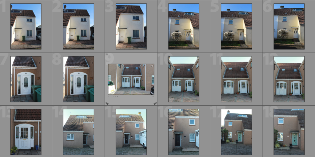
Building Faces Shoot 4 – St. Johns

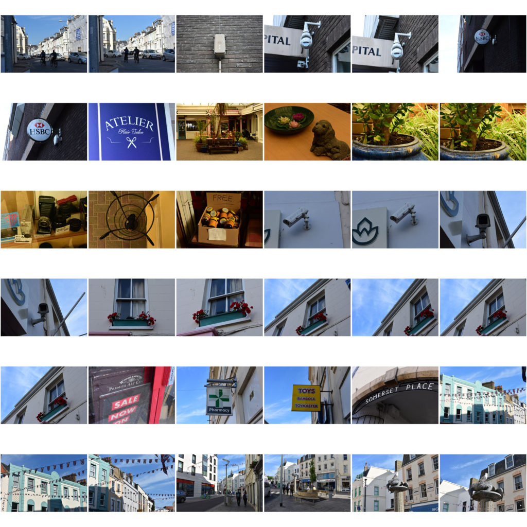
In this shoot I have developed on my previous shoots in which I have looked at the faces of housing blocks, office blocks, houses and other types of commercial buildings within Jersey. In my previous shoots I explored the area of Havre Des Pas, St. Helier and St. Peters and took photographs of houses in the area to demonstrate how the houses can have similar features and materials used due to being in the same geographical area whilst also having these features changed slightly in each house to make each house unique and different. In this shoot I have photographed an estate in St. Johns to show how similar the houses in estates can be – they are often designed in bulk to create a quick and easy building process and so leads to lots of similar houses with the same style and layout. Of course, even when looking at how similar these houses all are, there are lots of features which make the houses individualistic, such as the paint colour or the style of window or the curtains. All of these features go towards emphasising how factors such as personal taste can create something ordinary into an individualistic feature that can make the house stand out from others. The essential idea behind this shoot is to reinforce the idea of variance and similarity in previous shoots and to show how even though something may be produced to be similar, there will always be differences. These photographs will contribute to the material that I have available to me to use in editing with my photographs of steel and granite. I have stayed consistent with using the high-contrast black and white filter with these photographs as I believe that it allows for a strong finish when layered over the photographs of steel and granite.

Edits

Sunset Shoot

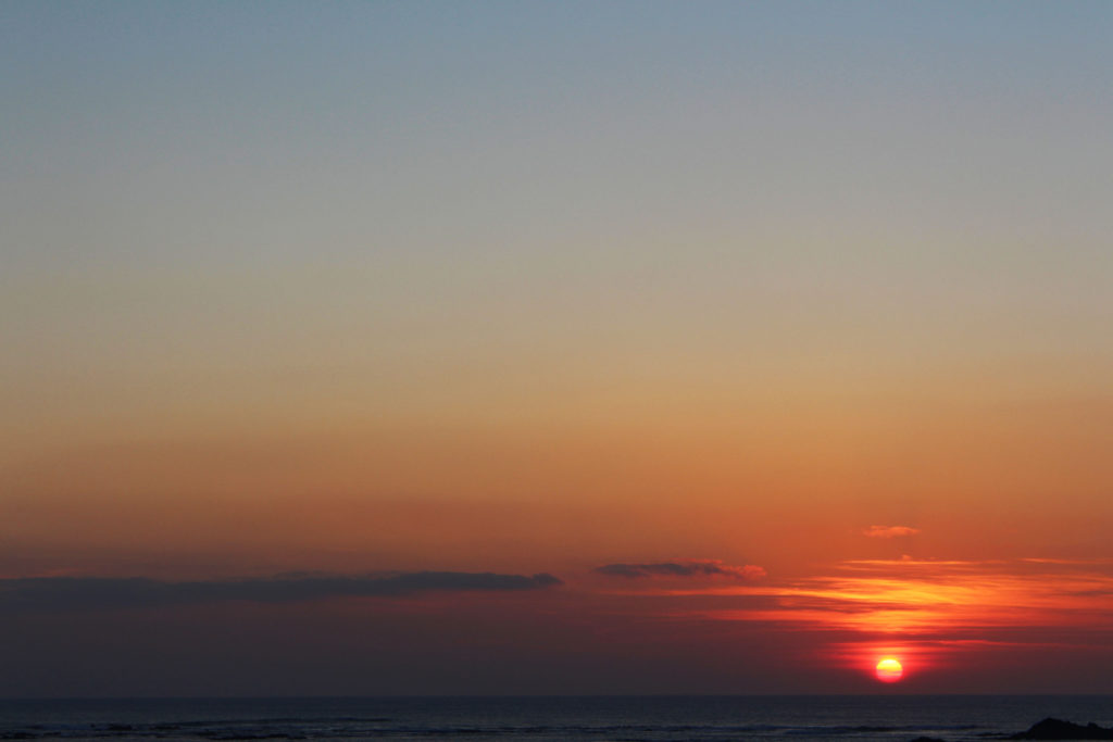
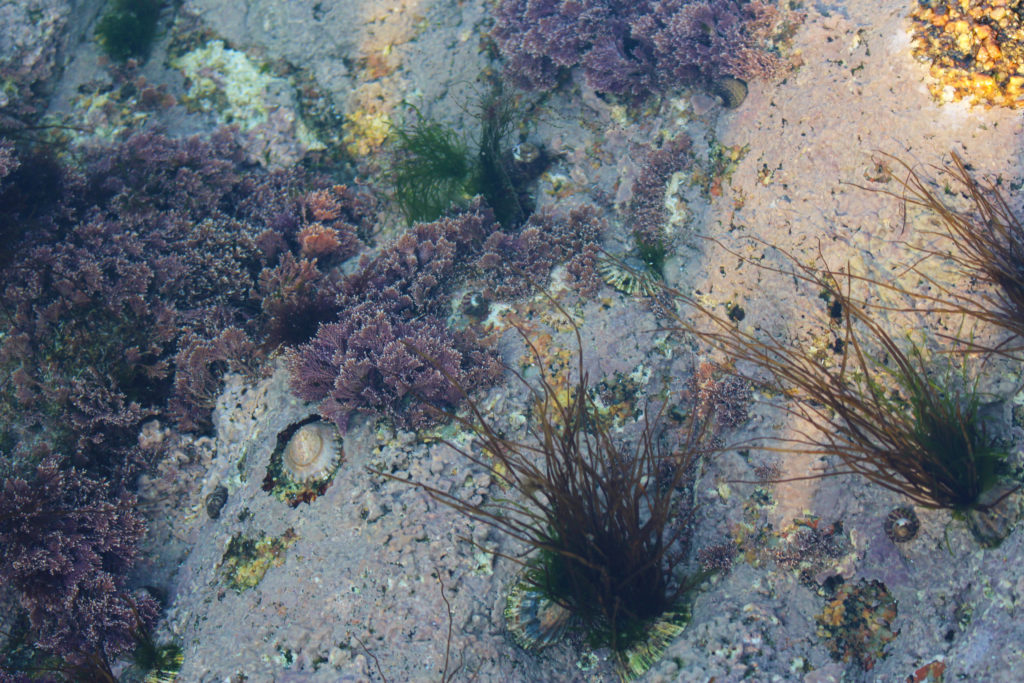
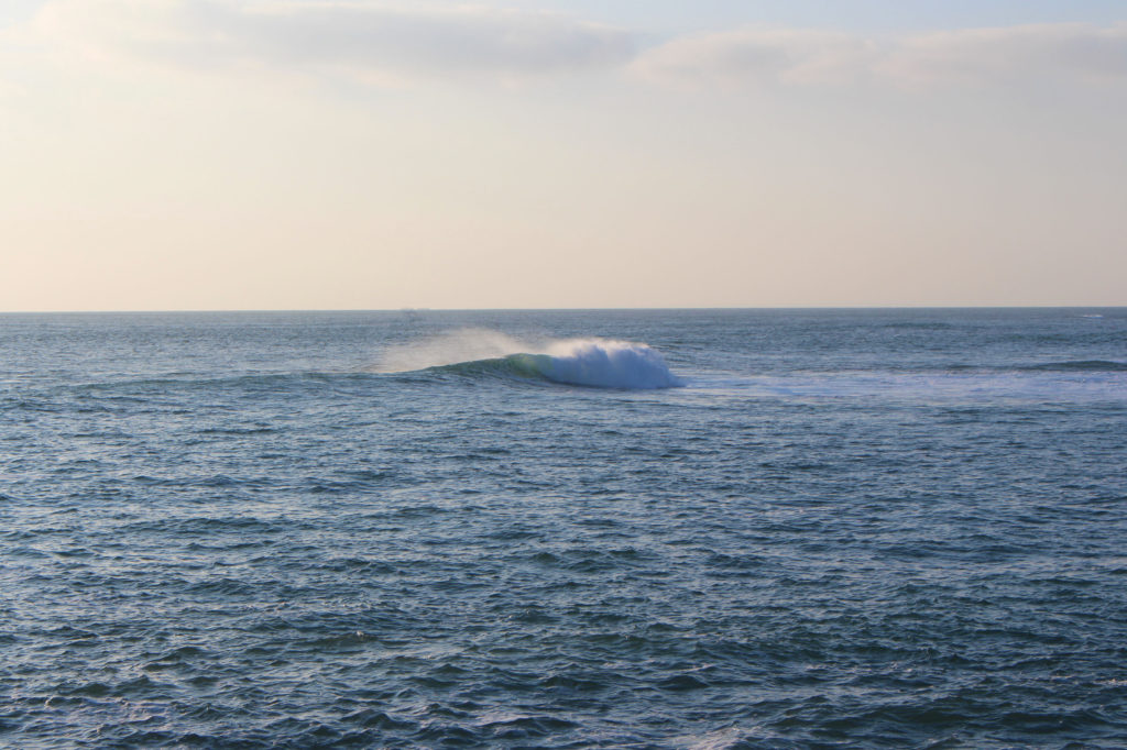
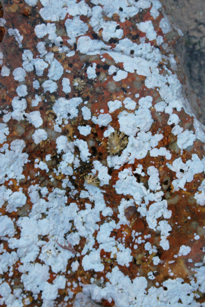
The aim for this shoot was to photograph the sunset and the beach during ‘golden hour’. For the shoot I went to St Ouen’s beach because on this side of the island it is flat and has the perfect view of when the sun is setting and you are able to see the perfect sunset. I got down to the beach a little while before the sun had even begun to set so I went and explored the beach and some of the rock pools near Corbiere Lighthouse to kill some time. A my project is exploring my connection to Jersey and trying to look at the island in a way of beauty. When I was young I always used to come down to Corbiere with my family and try to go fishing in the rock pools there. I was always fascinated with the habitats that had been created in the smalls cracks of rocks . So I thought that by going back here I would be able to look at the place with a sense of nostalgia and would try to communicate this in my images.

To edit these images I used photoshop, I found that mainly all of the images only needed minimal editing because the colours were very vibrant and colourful already. Throughout the whole of this project I have been looking at small details of everyday landscapes and things that we would normally pass by everyday. I have found that I haven’t needed to do much editing in comparison to other projects that I have done. Because when doing those projects I was less thoughtful about what I was photographing and was trying to capture as many images as possible. Which has shown me that if you really take time and focus when out on a shoot, you can save a lot of time in the editing process.

This was the last image that I took on the shoot and has is actually my favorite. The composition of he image I think is really good, as the top half has very neutral colours, blue, pale orange and and beige in the middle. Which is then contrasted with the vibrancy of the sun which is almost red. The sun has clouds covering it which I think has created a misty effect over the bottom half of the image which I really like.

Gallery Visit

The first Exhibition we went to was BEHIND THE LENS (March 8 – April 28) It showcased the unseen aspects of photographing celebrities, from behind the lenses of Carinthia West, Rupert Truman, Storm Thorgerson and Mike McCartney. A photograph that stood out to me was this one by Storm Thorgerson which was used as the album art and cover for Biffy Clyro album ‘only Revolution’ He was the founder of Storm studios formed in the 1990’s who created designs for diverse projects including logos, websites, books, but their most known work existing on album covers.

“In thinking that the music was strong-minded yet lyrical persuaded us to think of material flapping in the wind like flags – the flags of a revolution. Not little flags or small bits of fabric, but enormous flags the size of a modest office block, which we affixed to a scaffold tower on the top of a hill on a windy day. The sound of the undulating material was affecting, let alone the bizarre shapes. The actual cover used red and blue flags to represent the sexes.”

Storm Thorgerson

This photo stood out to me due to its size and attention to detail, the print was suspended on a wall and was around 2metres wide. I have seen this image before as an album cover but when seeing it blown up I noticed small things such as how the flags cover the peoples eyes and how they are holding weapons behind their backs. I also read more into the meaning of the image when seeing it on this scale.

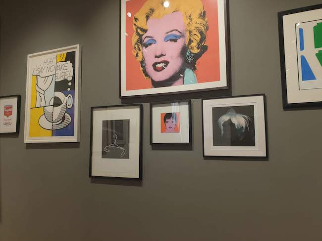
The second exhibition be went to was at the public and private displaying the best of pop art called ‘Pop Icons of the 20th Century’ which featured work from Andy Warhol, Roy Lichtenstein, Sir Peter Blake and many more. Pop art is a movement which became popular in the 1950’s in the UK and US, it challenged traditional fine art techniques by using imagery of popular culture, such as advertising, comic books and culturally popular objects.The two paintings caught my attention due to the use of basic primary colour and mixture between abstract shapes and line figures.

Andy Warhol was an American artist, one of the most well know in the pop art genre. Known for his bold screen prints commenting on the ideas of consumerism and celebrity culture linking with the idea of post-modernism. His most known work was of the Marilyn Monroe the famous American actress, he used an existing image of her and simplified it to show the main textures on her face, he then went over the image will various screen print templates which allowed his to layer up bright colours corresponding will relevant parts of her face. This image was reproduced again and again which degraded the quality creating unique prints with variation. This idea came from his work as a commercial illustrator where he traced or drew by hand using ink and pressed a clean sheet of plain paper onto the tines, creating spontaneous and expressive images.

The idea of consumerism and celebrity culture seen in his work links to my project because of how it promoted the idea that buying branded items and materialism. Modern attitudes towards success root from the idea of being rich, famous and having desirable possessions. It is often through that buying things can make a person more ‘Beautiful’ or desirable, especially in the terms of clothes and beauty products and procedures. This could link to the way products are advertised to sell a lifestyle that people think the product will help them achieve. The following quote sums up the idea of becoming an online celebrities who display the best parts of their lives creating a hyperreality which other people persevere as reality and want to achieve.

In the future, everyone will be world-famous for 15 minutes.

Andy Warhol, Catalogue Moderna Museet, Stockholm
Pop_Icons_Ehxibition.jpg
Photo of the gallery space at the public and private

Sea shoot, above and underwater

DCIM\100GOPRO\GOPR0826.JPG
DCIM\100GOPRO\GOPR0818.JPG
DCIM\100GOPRO\GOPR0844.JPG

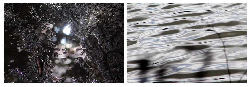
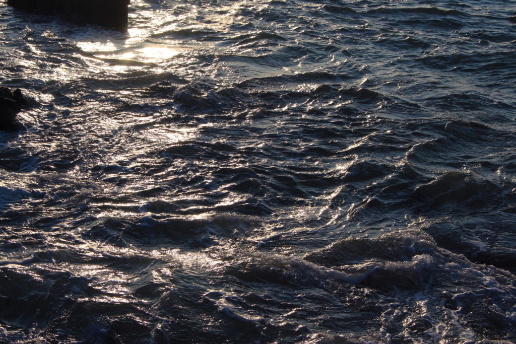
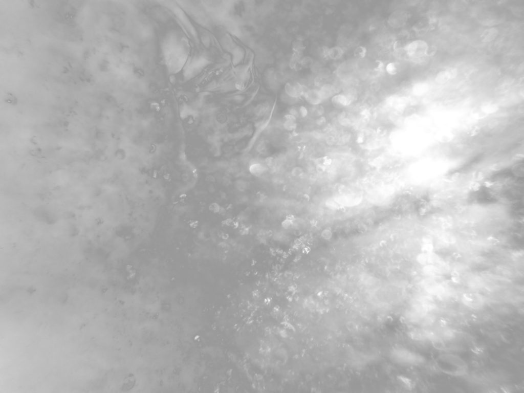
For this shoot I wanted to show both a combination of underwater and both above water photography, I wanted to capture water as I believe it can-stand for two religious sentimentalities, one being the concept of birth and rebirth, forming a new life from water, and the ability to breath underwater. The fluidity of water also shows a sense of vulnerability and also beauty. Another aspect is the power of god, through the ability to create the natural elements, such as through the creations story. I wanted to show an arrange of different white and black tonal colours, as this differers different meaning depending on weather I think that photo should denote strength of beauty.

LOSS AND SKIN SHOOT

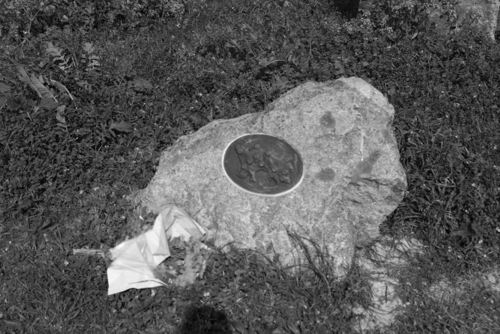
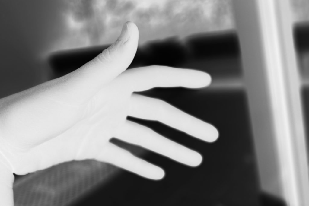
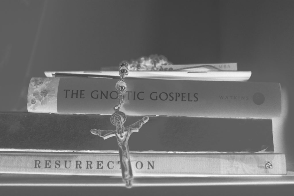
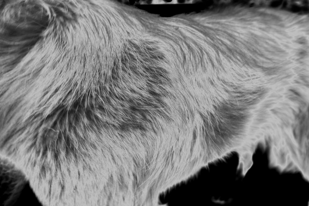
This shoot was about a theme of loss, connoting the themes of death but seen within inanimate objects. I knew I wanted to do a skin shoot in order accentuate personalised aspect of myself into the project. I also wanted it to be used as a comparative to the shoot of the much older skin, to show the progression of skin deterioration . I wanted to take shots as-well of the hands shape without the essence of looking primarily at the texture, this is once again to connote a form of isolation, however, when editing the hand into white, it connotes an essence of the hand of god coming done and allowing a snese of help, a larger presence than our own. I wanted to take macro shots As I believed The small details of looking more at patterns and shapes is almost a personification to see whatever you imagine, it has an aberrant feel of exploring and creating out won inner meaning within each of the photos. My favourite piece form this shoot is the bench, it allows such a light aspects of loss, yet still structured, showing an ability to be remembered, and also showing the bonding of man made creation surrounded by the natural creation.

RELIGION, LOSS, WATER AND TEXTURE SHOOT

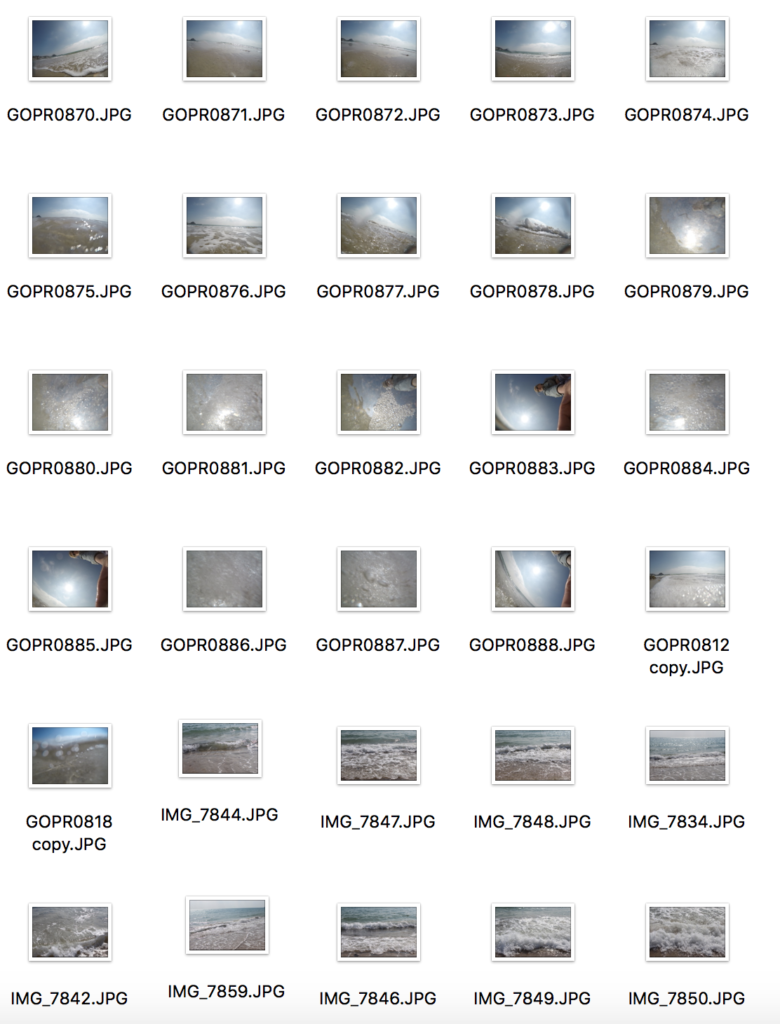
CONTACT SHEET:

OUTCOMES AND EDITS:

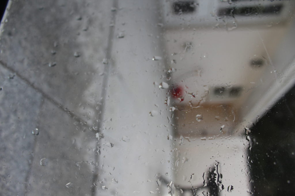
EVALUATION : the intentions for this shoot was to develop a more personal connection to our surroundings, and not to take for granted that of life and creation. I wanted also to accentuate themes of isolation, seen within the objects of an abandoned tea cup. I also wanted to show connections between rain and the element themselves in this shoot, so again gods creation but seen in a more personable way, in relation to god. The different textures and life within nature are done so in order to show a macro affect.