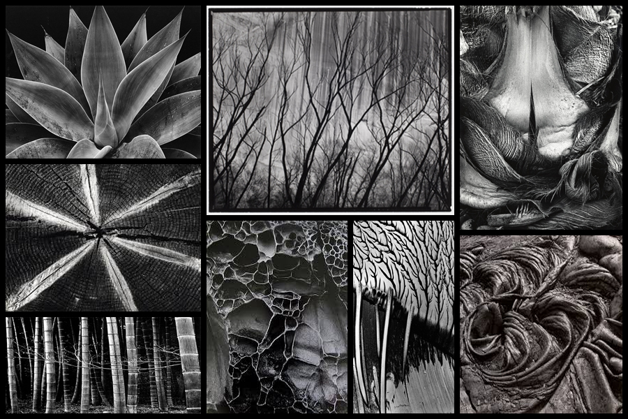
For this shoot I wanted to focus on the idea of abstraction through pattern especially in nature and the urban world. I really liked the idea of basing my photography around capturing everyday scenes of subjects in a new light which highlights the unseen patterns which are present in our everyday lives and the structures of things around us. A photographer I have looked at which I have got particular inspiration from is Brett Weston, someone who has devoted to focusing on natures pattern and the unseen world around us. The images that I found to be more inspiring were his images based around plantation and occasionally the effects of humans on the landscape such as footprints and man made intervention into the natural environment. His skills that I wanted to be able to transfer were surrounding his effective use of a low exposure to create a more dramatic scene surrounding everyday things through exaggeration of shades and tones. Some examples of his work can be seen below:
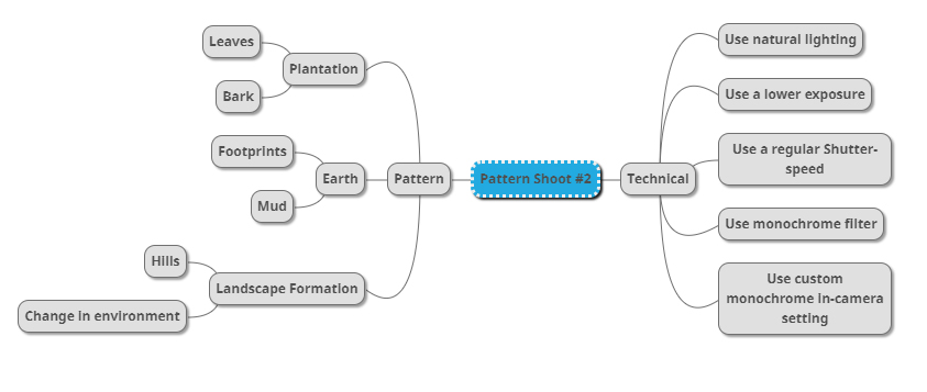
Once I had looked over some of his photos that I found were particularly inspirational for my shoot and its aims I then decided to go onto produce a mind-map. By making a mind-map it would allow me to jot down ideas and aims for the shoot and what I wanted to over achieve, this would also cut down on time wasted on the shoot as I would have a goal of what to produce on me and how to take it with it all the time directing my aims. Here are some of my ideas that I wish to use on the shoot:
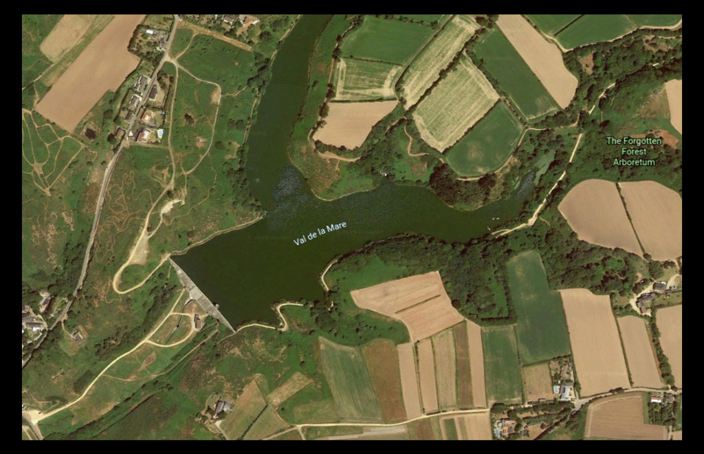
The place I have decided to take the images is called Val De La Mare due to its variety of different textures which can be found alongside the water and the trees. A map of the location can be seen below:
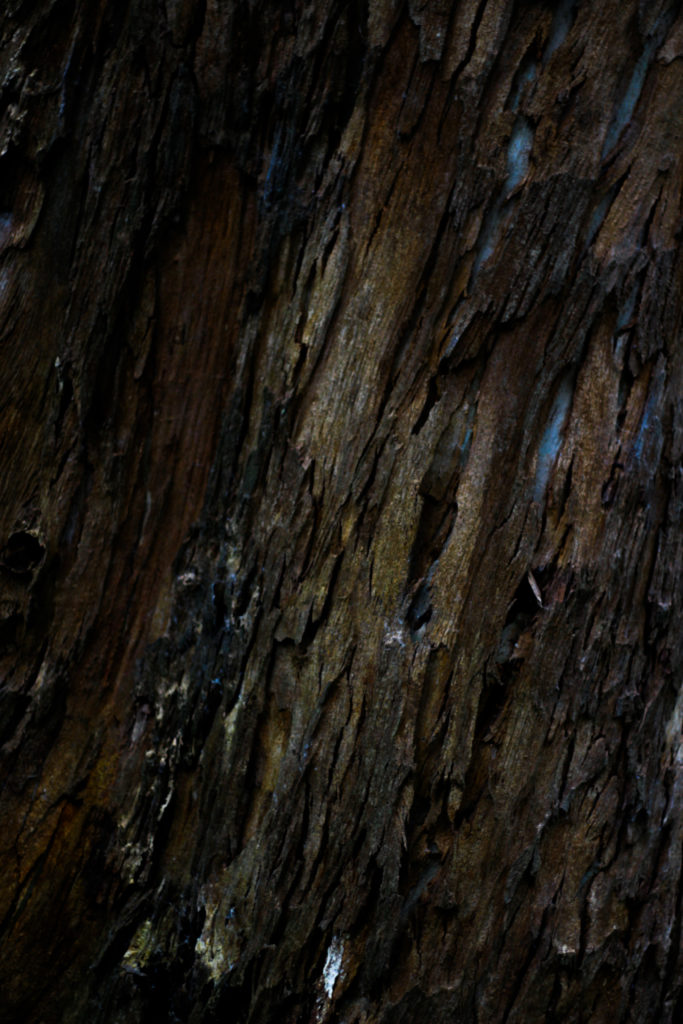
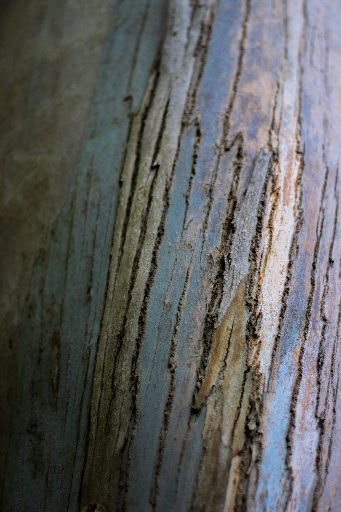
Here are the results of the shoot:
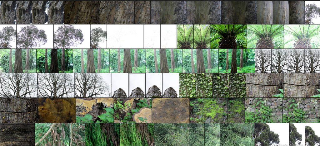
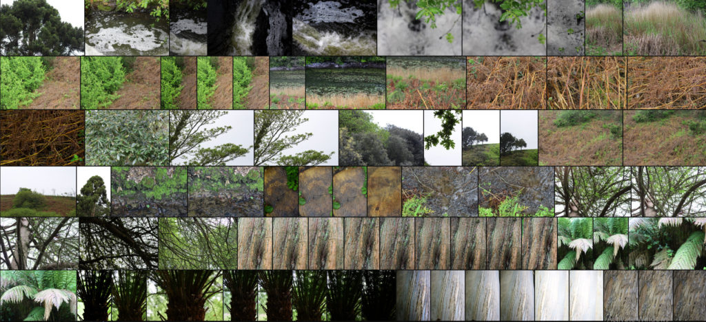
After finishing my shoot I decided to go onto edit the shoot down to only ten images, by doing this it would allow me to identify which were the images that were most effective from the shoot and reflected my intentions the most. Here are my decision on the top ten images of the shoot:
Once I had selected the ten images I then decided to go onto whittle them down once again to only five, by doing this it would allow me to further identify the images which were most effective from the shoot due to analysis in more depth, whilst also making it easier for me to choose an image which best sums up the entire shoot. Here are me selections:
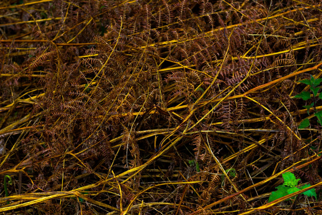
I chose this image because I loved the overall sense of the browns which came through the decaying grass. For me the crushed plants added a cool texture which highlighted the contrasting yellow stalks compared to the rest of the brown leaves. What I particularly liked was how the leaves all faced one direction, allowing for a smoother look to the overall image due to how it all seemingly moves in continual way. Overall I found that the piece did relate to the topic of texture, however I was not too pleased with the outcome as I didnt think it carried enough contrast to emphasize the darkness.
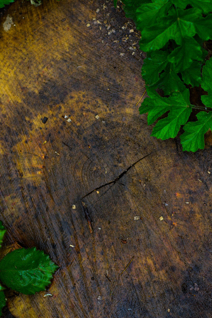
What I really liked about this image was how the green leaves overlapped the darker grain of the wood below. When looking over the image I really liked how the leaves almost presented themselves as a frame for the grainy texture of the wood, preventing it from becoming a present throughout the image and turning into a eye-sore for viewers. As a result of this I found that the contrasting yellows which are emphasized in the wood through saturation really brings more tone into the photo due to it add variation to the texture and overall colours present in the photograph.
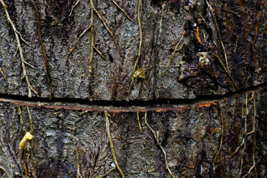
I chose this photograph because of the unusual line which had been cut across the base of the tree trunk. For me this added an extra sense of abstract to the piece due to the surface texture of the wood being disrubted by the cut mark making its way across the entire composition. What I found complimented this was the dying ivy growing down the side of the trunk, for me the lighter brown from this added that bit extra to the piece as it prevented a continual same colour presence throughout, instead breaking it up and adding variety. Overall I was really happy with the composition of the piece due to its unusual element through the cut, with the ivy and the different bark textures adding a much needed variation to the overall piece.
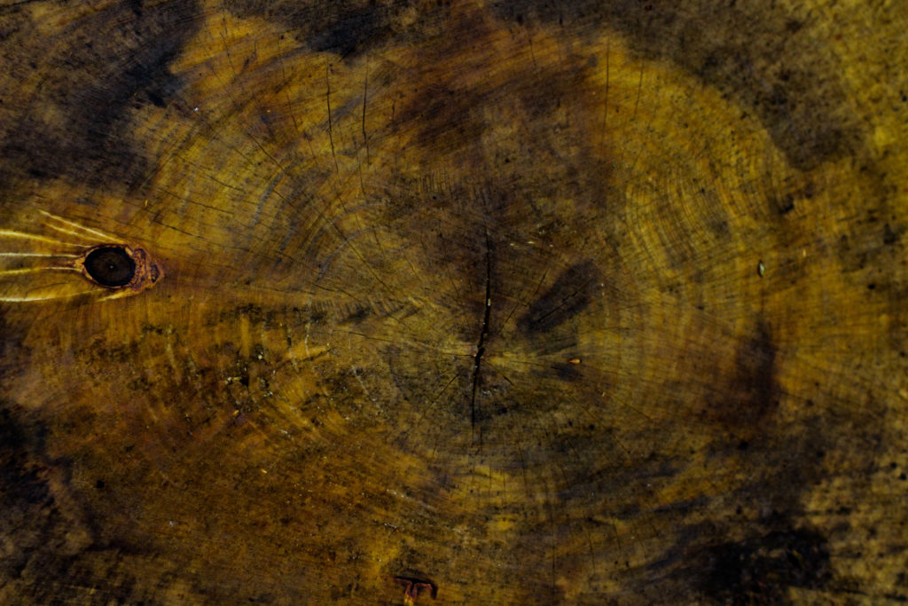
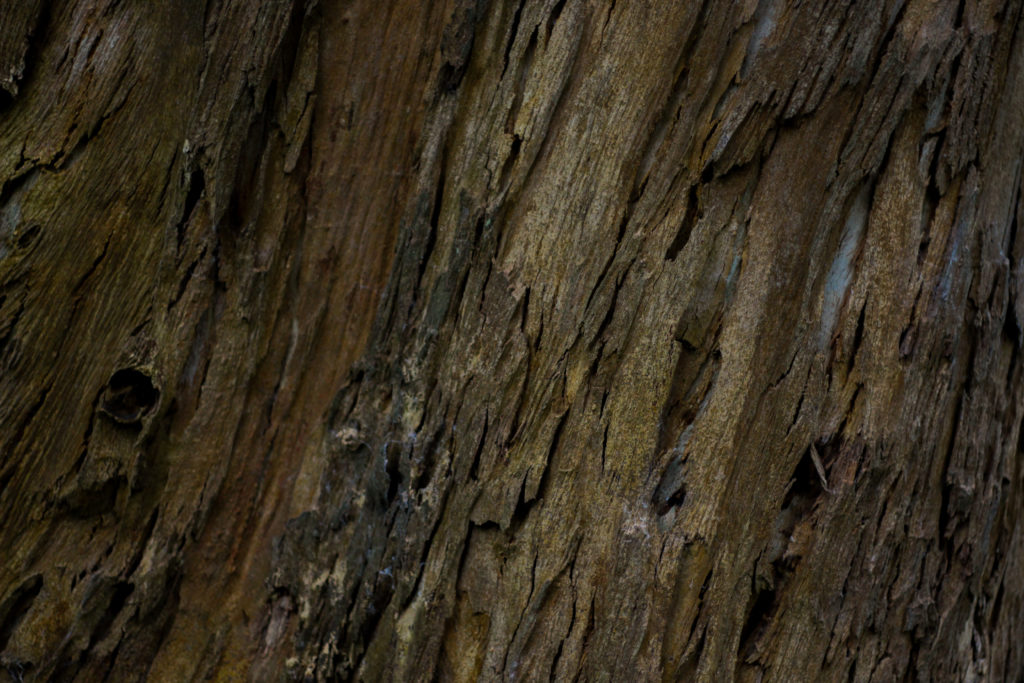
The reason I selected this image was because of it high contrast which highlights the grain and unseen colours really well. For me personally I really liked the variety of different browns and yellows present within the photo as it presents viewers with a different perspective regarding cut wood on a wet day as textures not previously seen are revealed when more closely observed. The grain knot I found broke up the composition and prevented it from becoming too overpowering and generic due to how the added black becomes an instant focal-point for anyone looking at the picture for the first time. As a result of this I am quite happy with the result due to how it provides an unseen insight into the textures present on trunks which previously would be unseen unless further inspected.
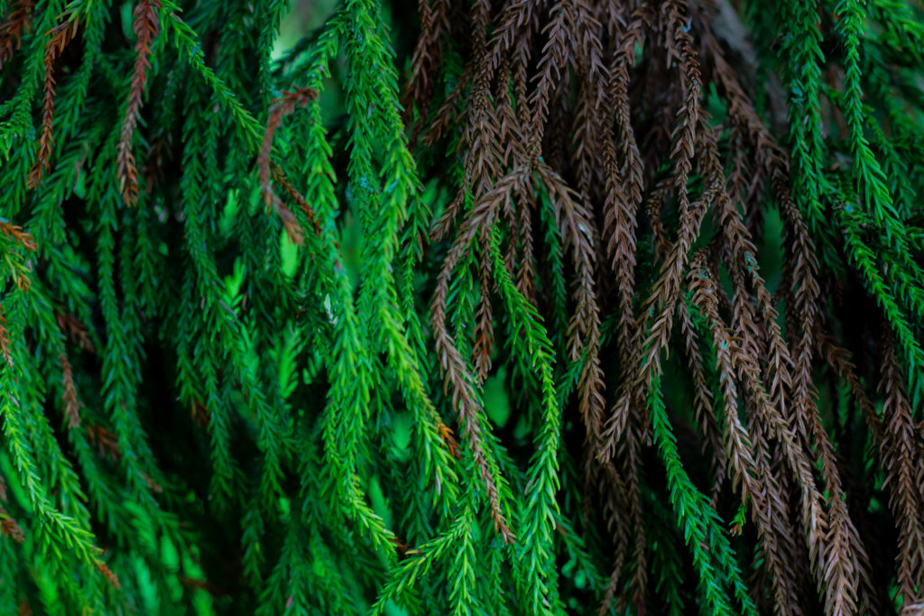
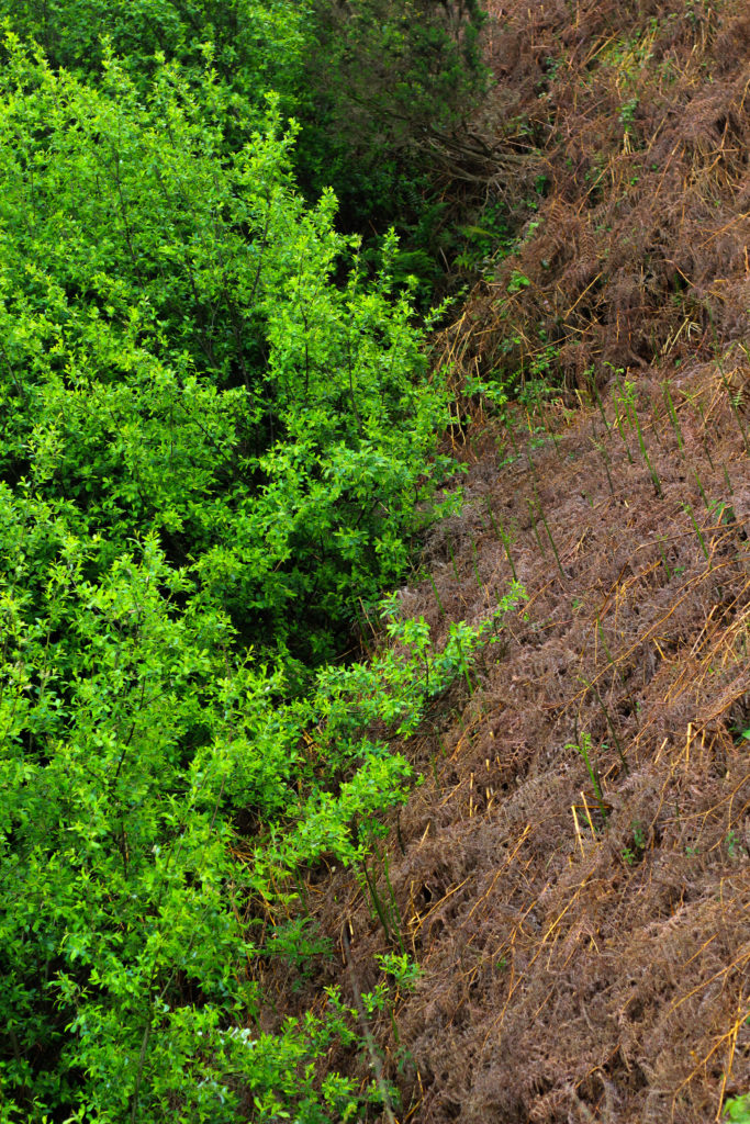
Finally I chose this because I think it really well summed up the idea surrounding the topic of texture through both its green and brown leaves branching out. Because of this I really liked the contrasting dead and lives leaves together as the texture stays the same but rather the colour changes, as a result of this I think it adds a much needed extra bit of texture due to it stopping the otherwise dominant green from becoming too much and detering the viewer. When looking over the image in regardings to the topic of texture, I found that it related well, however I was not too pleased with the overall outcome due to it lacking contrast behind the leaves which would have made it more defined.
Once I had looked at each image in more depth I decided it was time to move onto picking one image to sum up and represent the entire shoot. To do this I would have to consider looking at its visual aspects whilst also its conceptual ones and how well it related to my intentions and overall aims:

Overall when looking over all the images I found this one to be most effective regarding the topic of abstract textures. This was mainly due to the unusual cut mark made across the base of the trunk which for me added an extra sense of abstraction due to it looking a bit surreal and mysterious. This was complimented by the dying ivy which I definitely thought added that needed break between the continual texture and colour of the wood and the dark cut. For me I thought this image was executed the best due to how it represented my initial aims of the shoot whilst also taking into consideration my topic title of abstraction through texture (seen through isolating the subject from its surrounding environment).

