Paul Graham Shoot Plan:

Concept: To capture subjects casually in a social setting, inspired by Paul Graham’s “End of an Age” project.

Lighting: Two portable LED floodlights giving out artificial light to show the subject from different angles. I may choose to use only one when creating shadows on the face.

Props: I will cover the portable lights with blue colour gels, using tape to stick them down, in order to create blue light. In future shoots, I will experiment with other colour gels including red and green

Location: Social occasion at friend’s house

Camera Settings: Raised exposure for low-light situations, Small aperture to allow in more light, I will experiment with shutter speed to produce moving images and still images

B&W edits

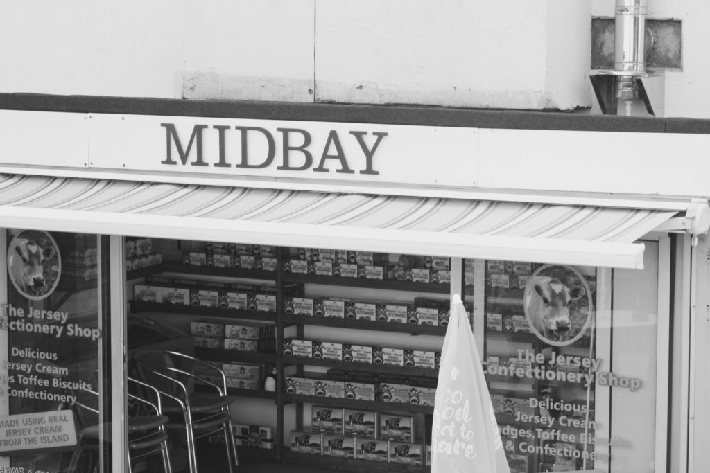
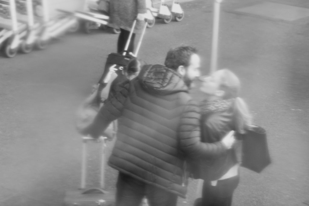
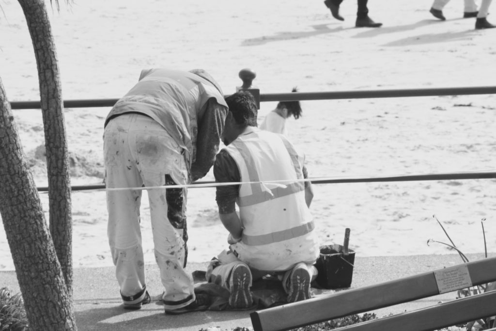
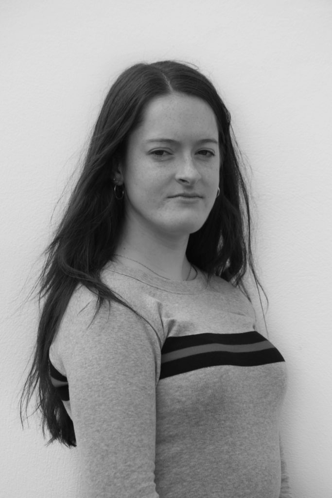
I decided to experiment with some black and white edits with some of the photos from my first shoots, I was inspired by Walker Evans series of black and white subway images and I wanted to see how editing by images in black and white would manipulate them and create a different overall atmosphere within the images. I also thought that pairing my own photos in black and white with some of the coloured postcards from the photo archive could create an interesting juxtaposition.

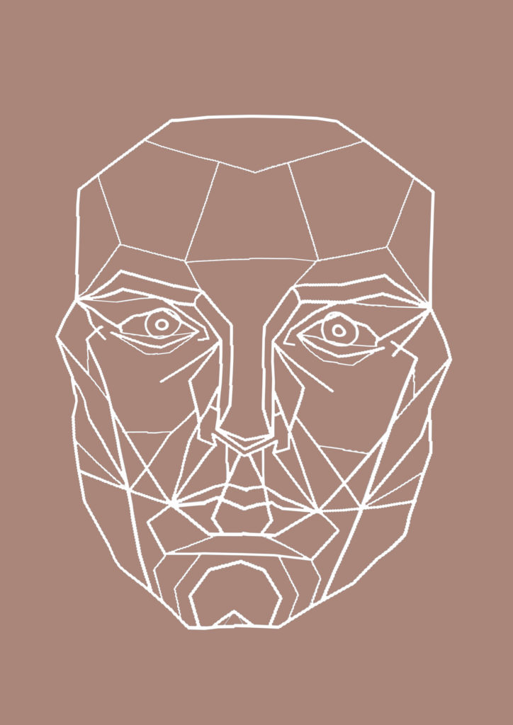
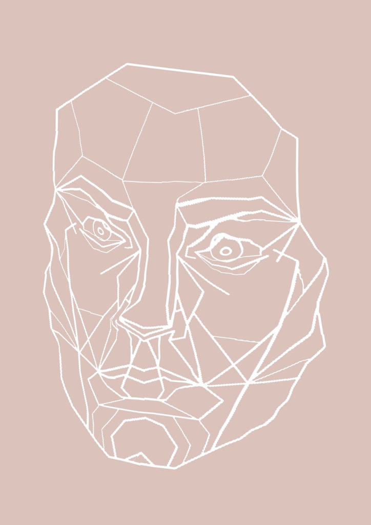
Editing with the ‘perfect’ face

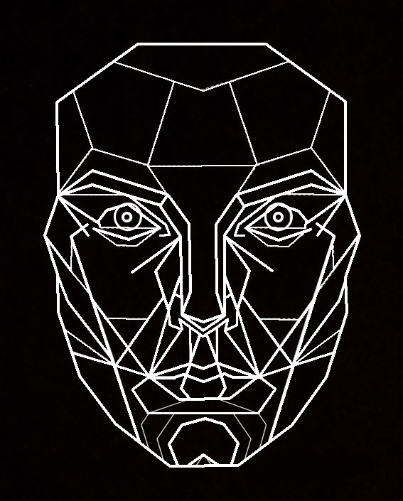
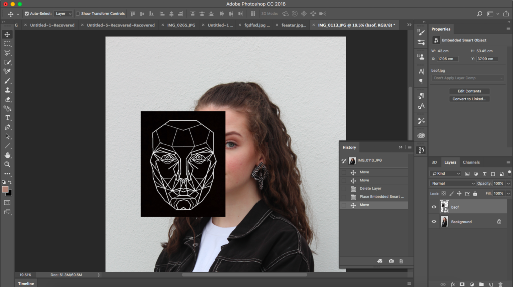
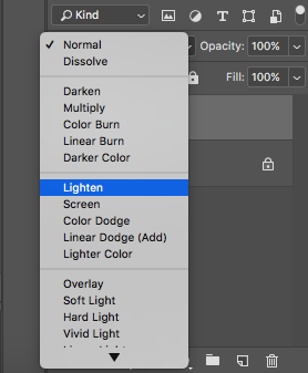
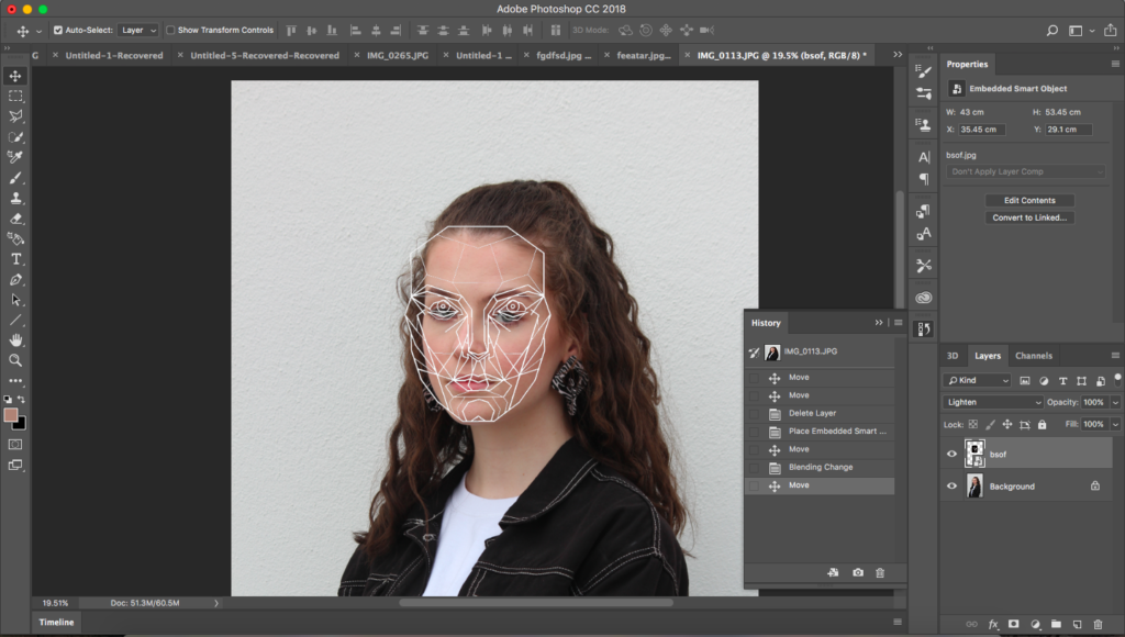
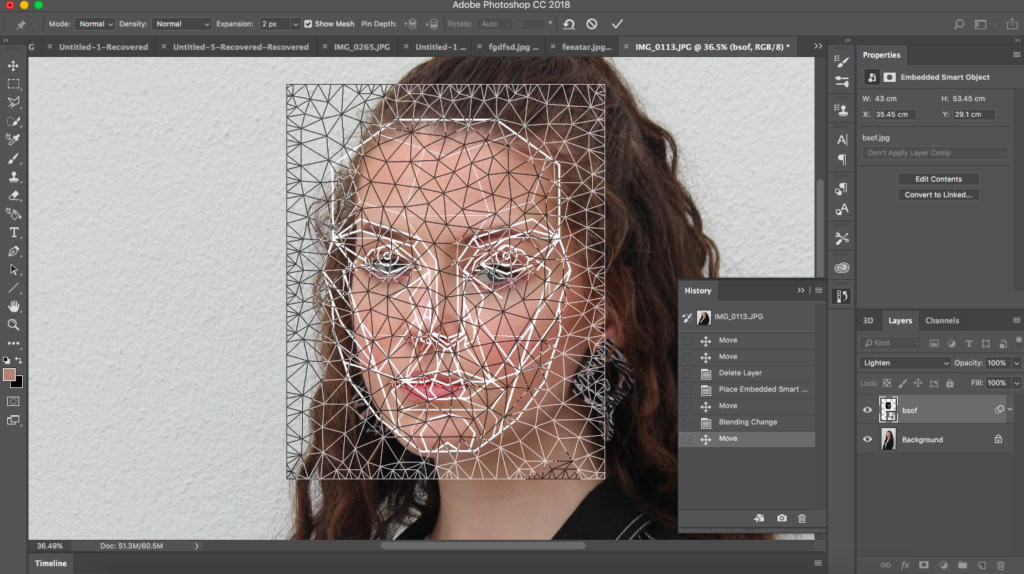
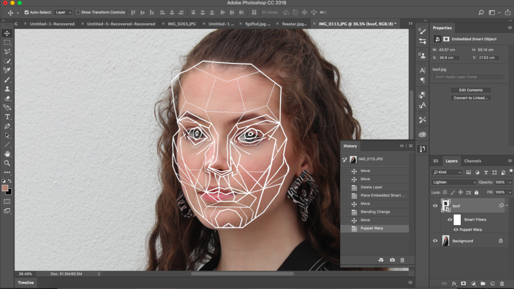
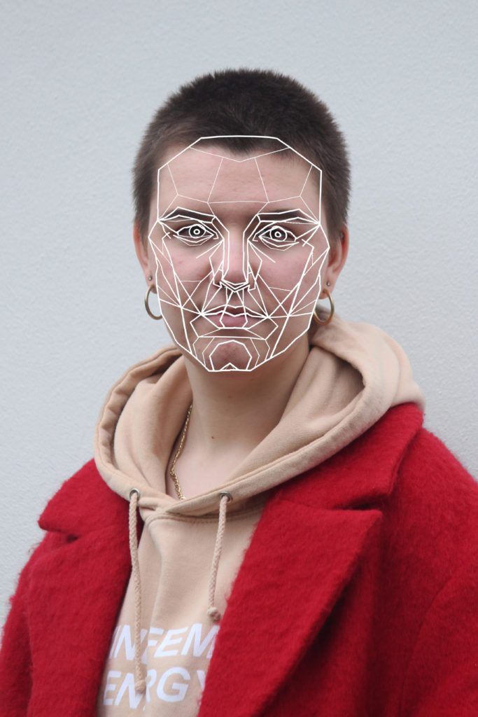
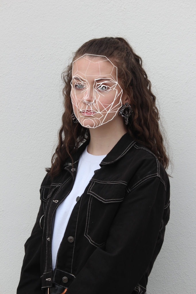
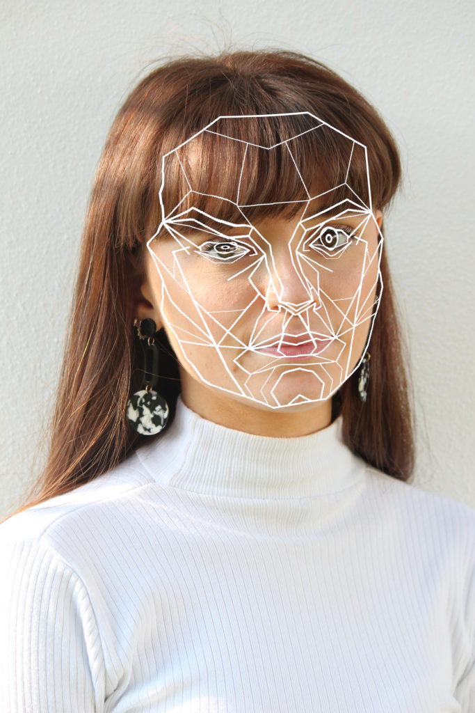
This is a structural plan developed by Dr Stephen Marquartdt of the ‘perfect face’ used by modelling agencies and plastic surgeons to re structure facial features to create a pefectly symmetrical face shapes and spacing. It is called a facial mask which aims to display classic beauty in the form of triangles and geometric shapes. People such as Angelina Jolie share similar facial proportions to this mask. I want to use this mask as an overlay on my portrait photographs, instead of adapting the face to meet the perfect proportions of the mask I want to warp the mask to meet realistic images of beauty showing that people should not have to conform to these guidelines.

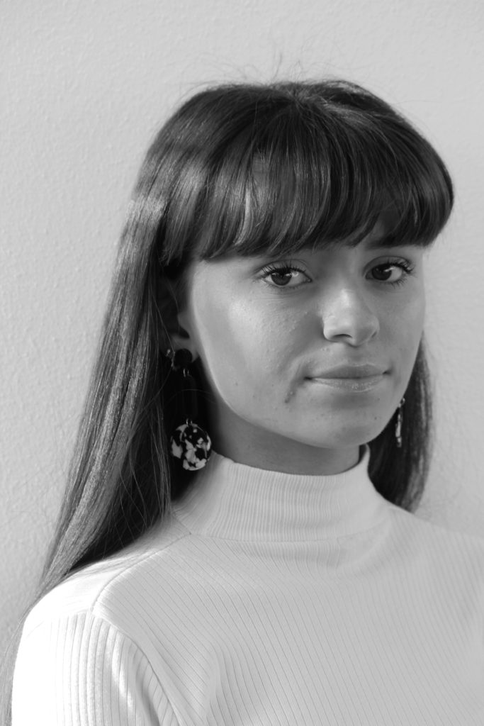
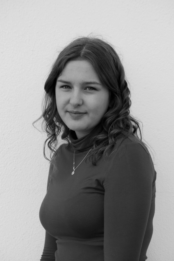
After adding and warping the mask I then copied it to a new page and changes the background to a colour found in the corresponding portrait image. I want to put the photograph alongside the mask image on a double page in the final magazine.

Editing Printed Photos

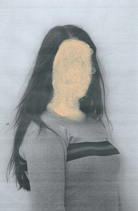
I want to edit some of the images i have taken by hand, to do this I started by changing some of them to black and white. This will help the colours in each image match and will make certain parts of the images stand out. I then printed out the photos on A4 pieces of paper, the quality wasn’t great but I like the way this looked, it deconstructed the perfect style that glossy high quality images have, this goes with the idea of challenging stereotypes on beauty.

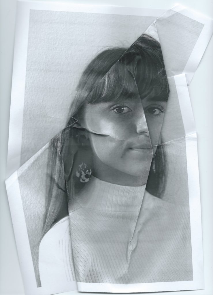
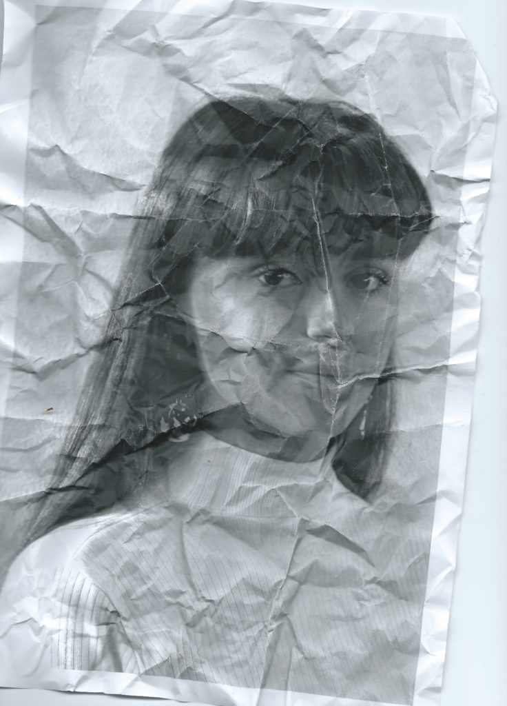
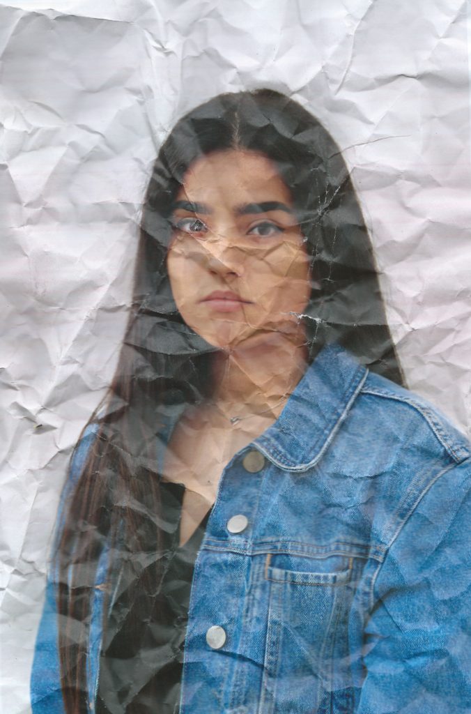
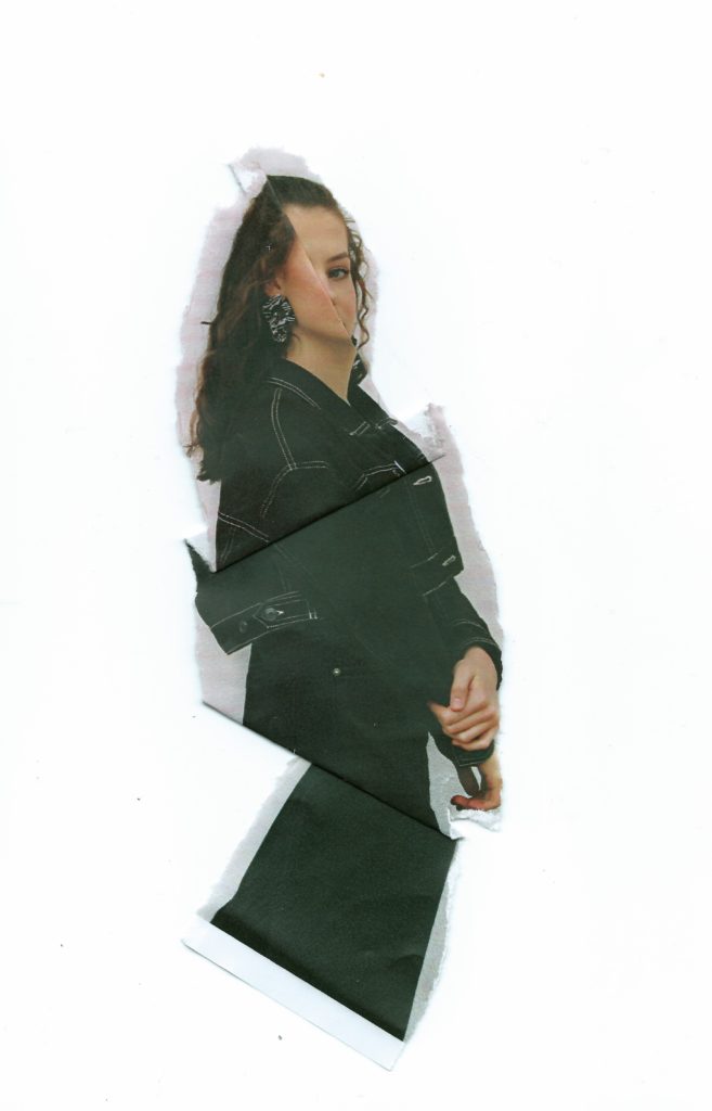
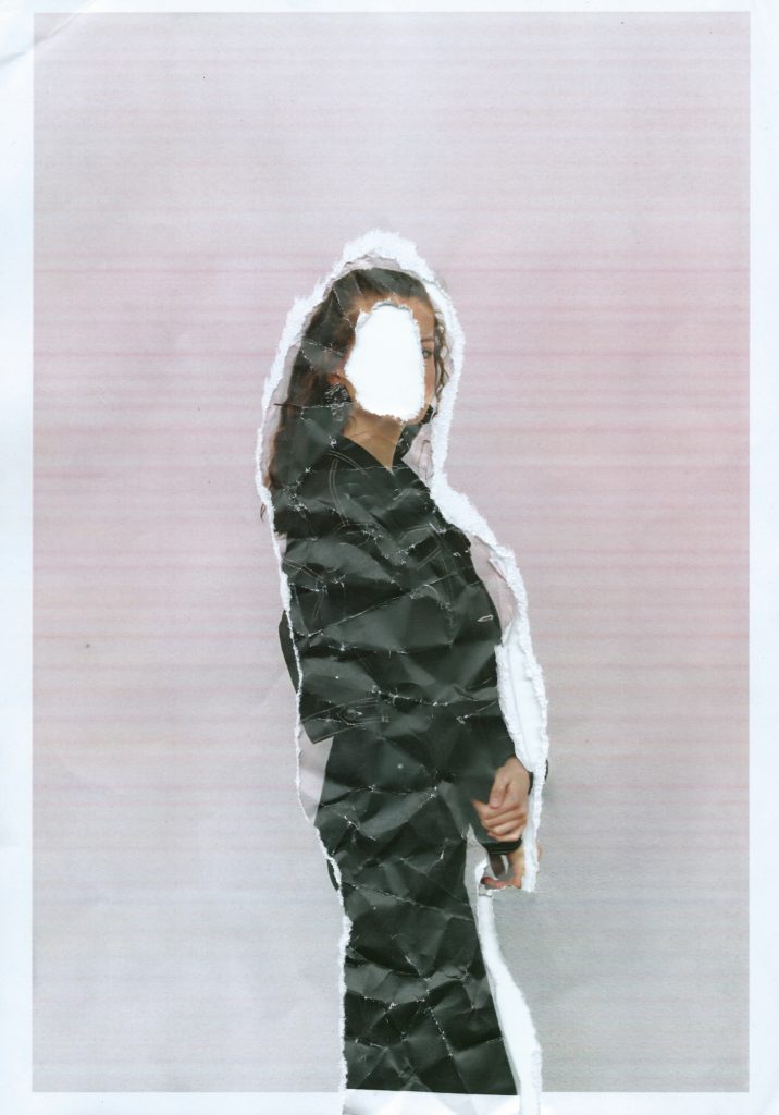
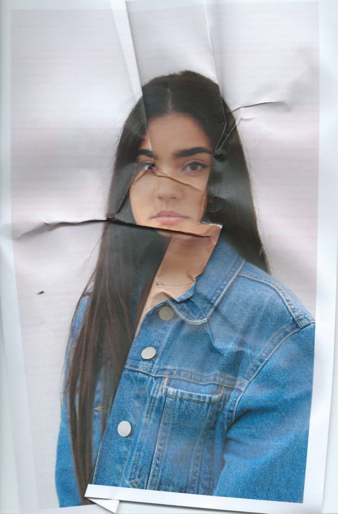
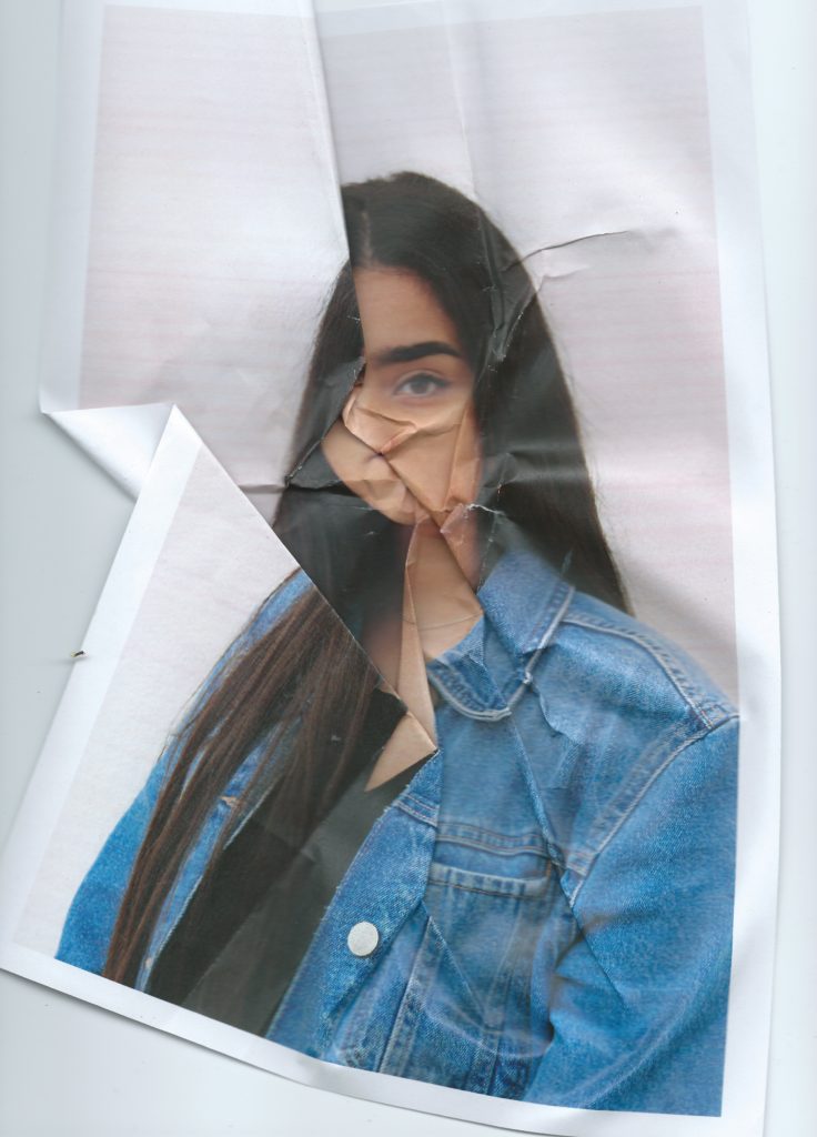
I then begun to manipulate the printed images in the style of Nigel Tomm by folding and crumpling sections to distort the facial features, I started by doing this subtly, choosing where the folds went and gradually became more destructive, crumpling it into a ball and then faltering it back out to create a textured effect. I then scanned the prints which I had manipulated back onto the computer rather than re photographing them, this shows images depth and manages shadows better. I did this with black and white and coloured images, the coloured prints were slightly discoloured and when scanned this happened more, I like the effect and colours this creates, with the pink toned background which creates a more stylised effect.

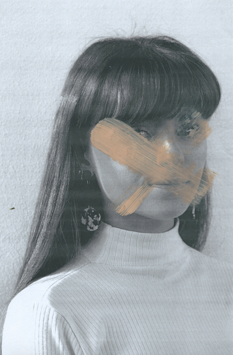
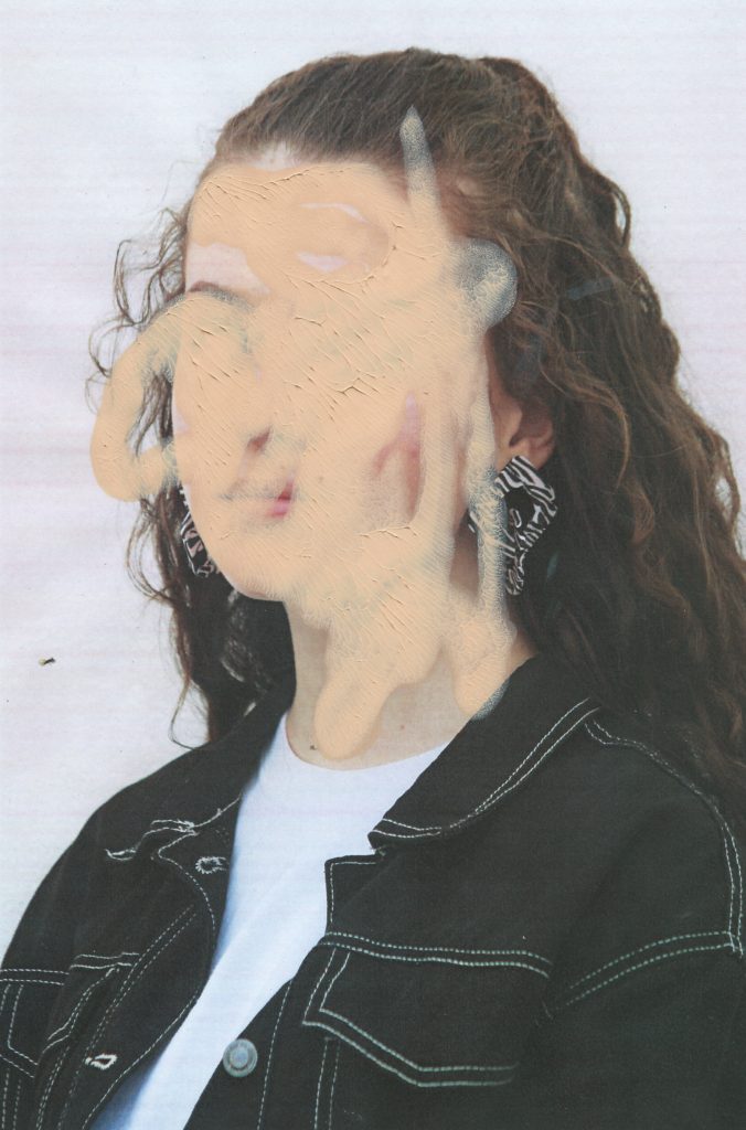
With some of the prints I decided to manipulate them using makeup, the idea being applying makeup to the image rather than the models face. This targets the idea of people using products to erases and mask their natural imperfections, many people use and wear makeup as an art form however their is no doubt that its origin is to enhance or change appearance. It is known that people use makeup to make themselves more confidant some people are even too self conscious to leave the house without it on. I think this concept is interesting to incorporate into my images because it is something that a lot of people can relate with in some way. I have used this idea to edit my prints, I wanted to make it dramatic to obviously show the message. For the first image I applied different makeup products to the relevant parts of the face to create a messy effect reminiscent of when young children try copying their mothers putting on makeup. This shows how children can be influenced by the idea of perfection and beauty from a young age from their own parents. I then continued to use foundation as a paint on top of them prints, using makeup sponges and brushes to cover parts of the face. For one of them I squeezed the foundation on to the photo and pressing it against another piece of paper, this left a textured, caky finish. I then waited for it to dry and scanned them onto the computer.

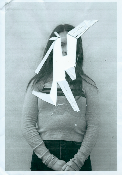
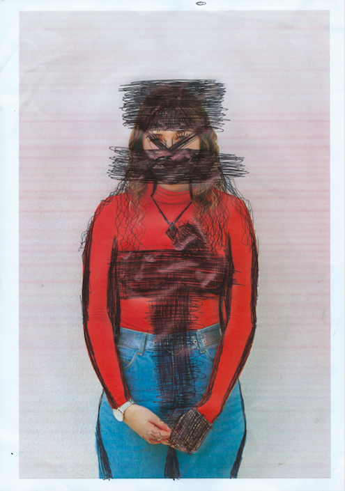
I also wanted my model to edit and destroy their own images, I printed out one photo of each model in low quality giving them discolourations and distortions. I then instructed each of the girls that I photograph to remove their insecurities or destroy the image in any way they wanted. Some of them grabbed a pen and started scribbling on parts of their faces and bodies covering and changing different aspects, other people cut, ripped and crumpled the paper. I then reconstructed the pieces and scanned them in as new photographs.

Noirmont Shoot |Final Outcomes

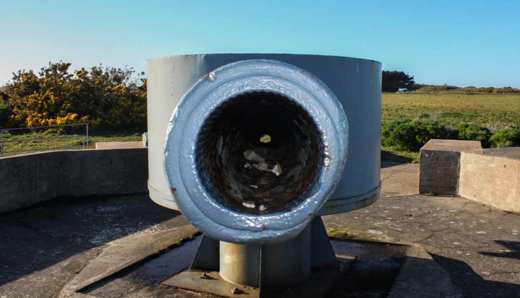
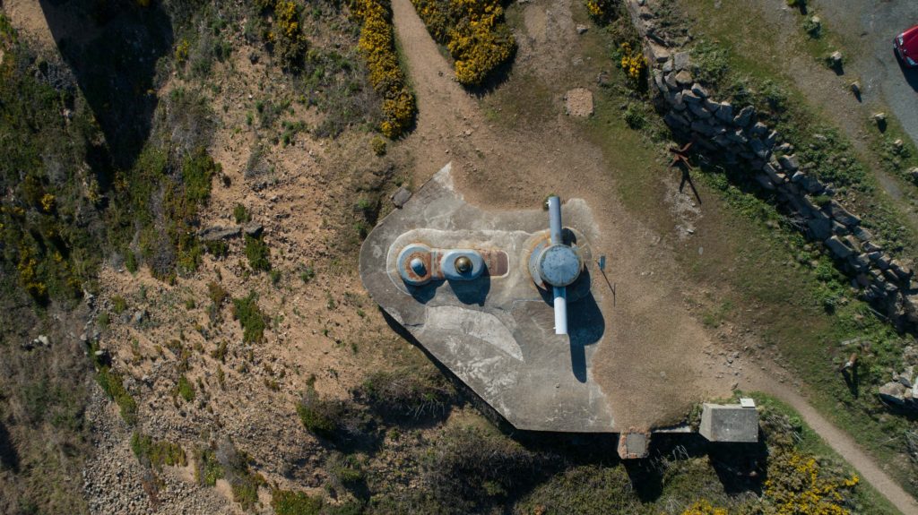
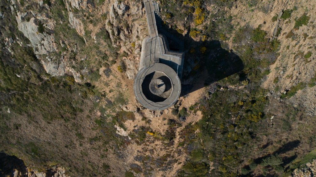
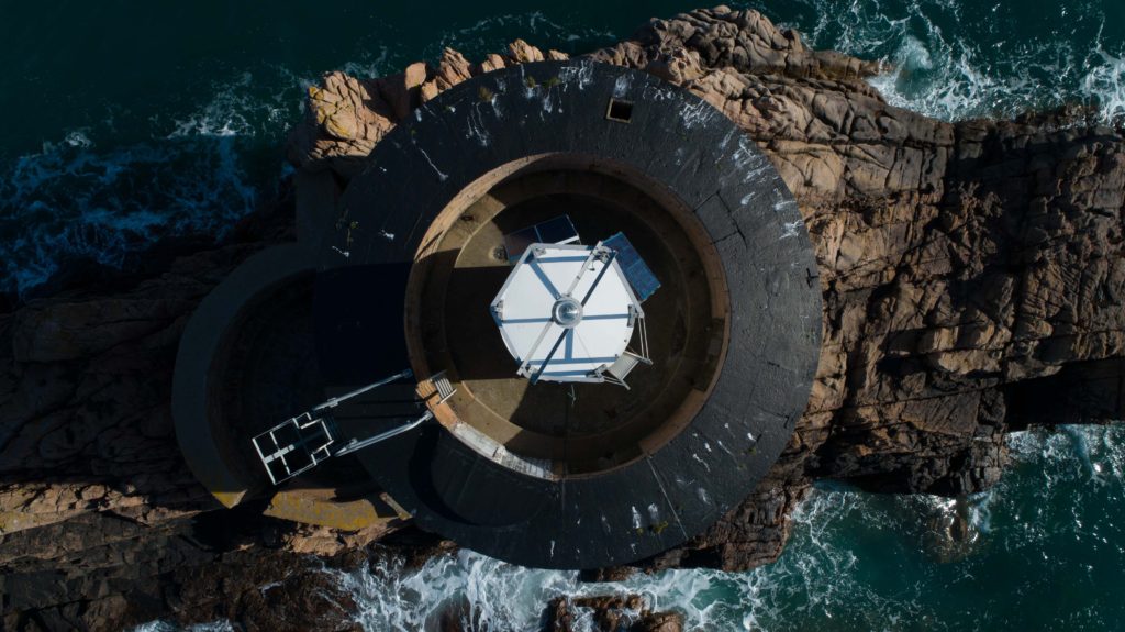
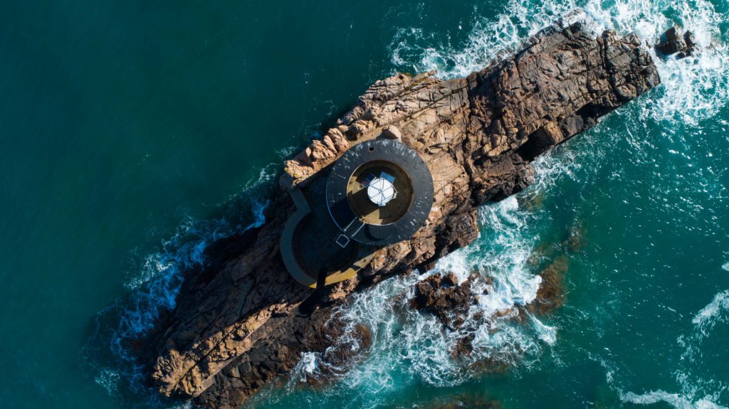
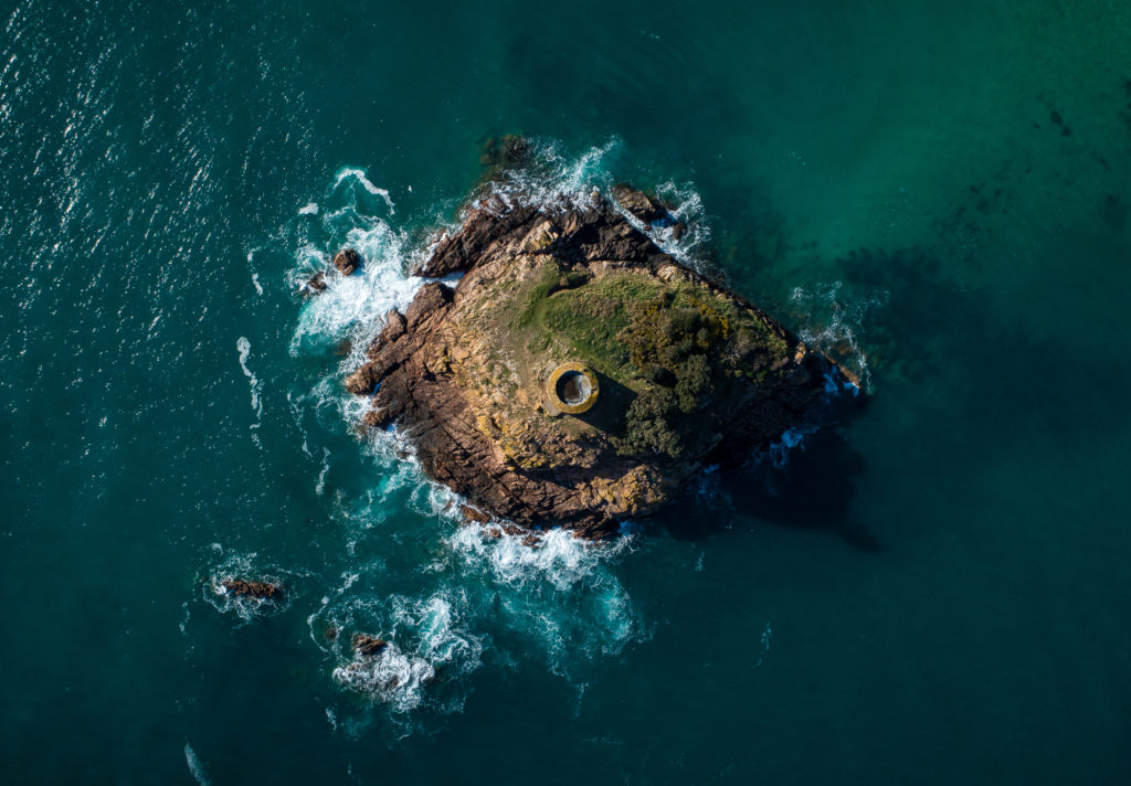
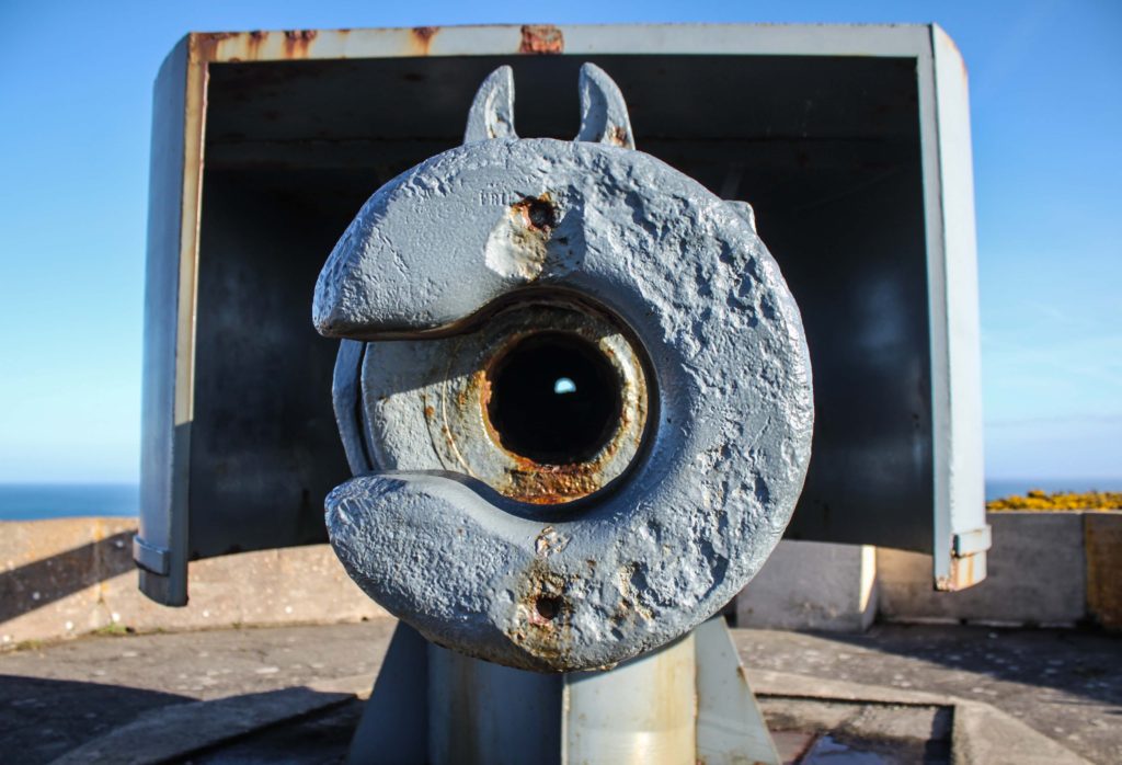
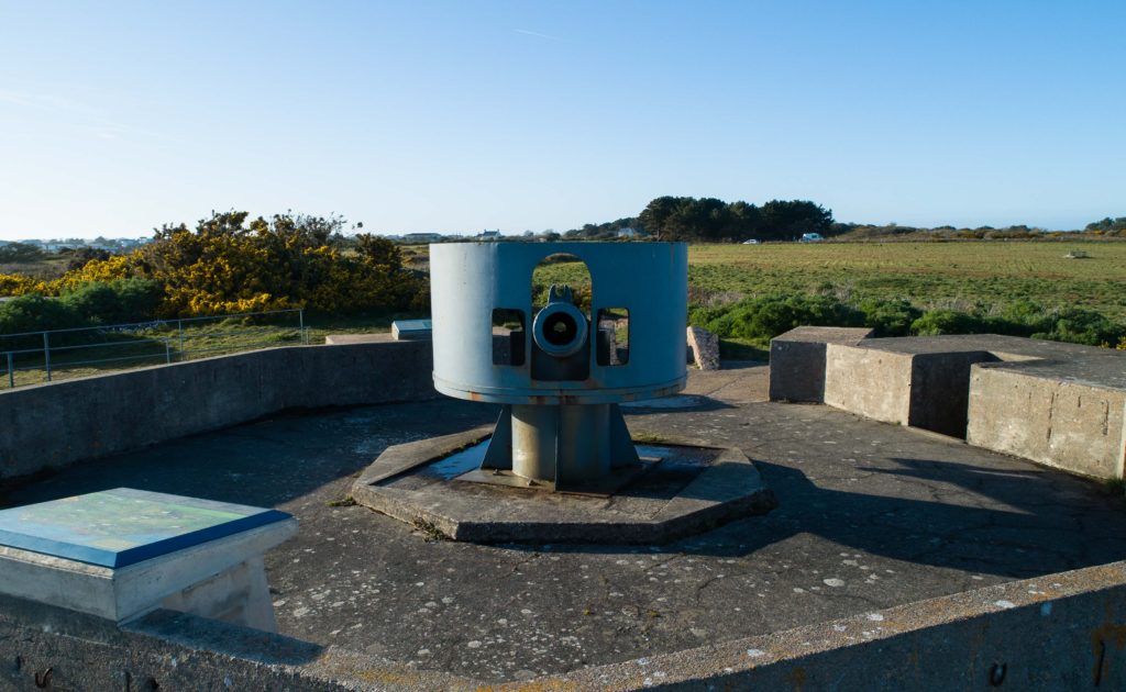
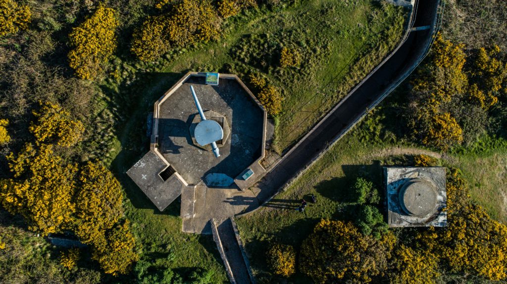
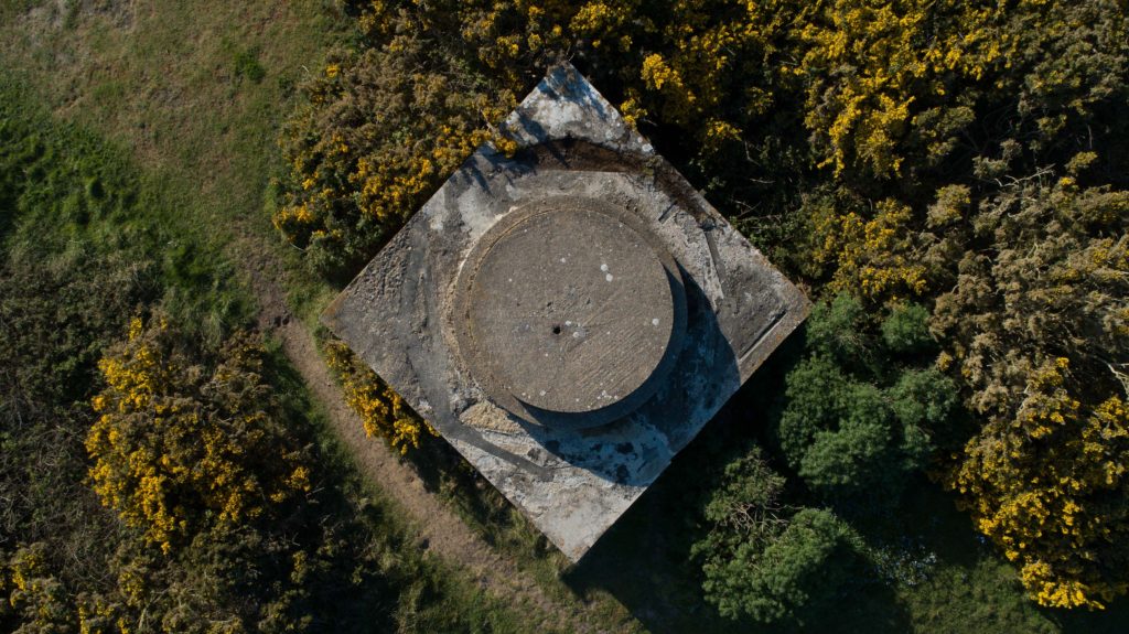
The shoot at Noirmont comprised of air and ground shoots. My main aim was to scout around looking for circles with my camera and snapping what I saw that formed a circular shape, I would also map out places to look at from the air using a drone. I then took the drone up and photographed circular shapes from the air over the Noirmont headland and Janvrin’s Tomb in Portelet.
Below are my final outcomes:

I am very happy with my final outcomes above, they really capture the more rural side of my project and show how circles can be found everywhere.

Image Analysis

Wood

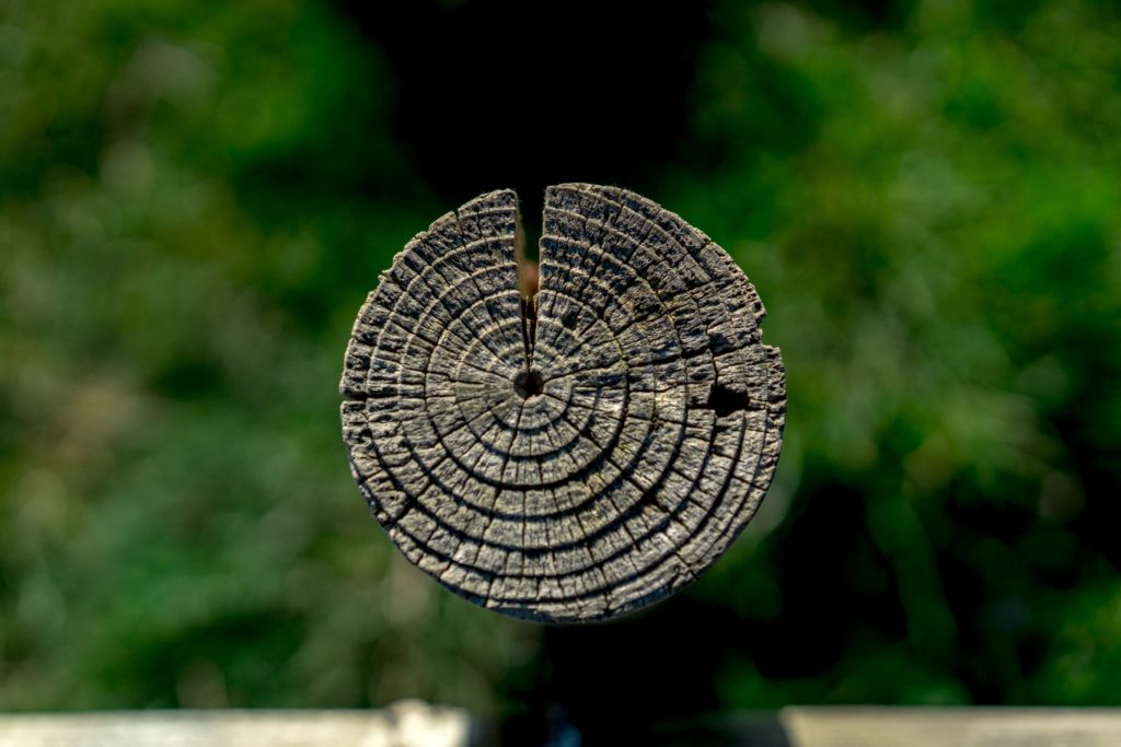
The above image was a wooden post on the Noirmont headland as part of the shoot you see above. The pole itself caught my eye as I was walking looking for spots to shoot with the drone. I positioned myself above the pole and shot top-down with a low aperture, automatic white balance, 100 ISO and a medium shutter speed. The low aperture produced the effect where the grass below is not in focus yet the pole is extremely sharp. This allows for the viewers eyes to be drawn straight to the pole and have little to distract them, it also makes the image very simple and eye catching.

The rings on the pole are the growth rings of the tree the wood came from. Each year, a tree forms new cells, arranged in concentric circles called annual rings or annual growth rings. These annual rings show the amount of wood produced during one growing season. Therefore this pole shows the life of a tree that once stood and lived and grew, each circle representing the growth and age of the tree and this can be interpreted into human life and human context.

The image clarity really brings out the textures and feel of the wood and you can almost feel is as you see it, you can imagine your fingers passing over it and feeling the roughness of the wood and feel the individual rings. The high aperture creates the effect of blurring the background giving it depth. The colors itself have been brought out through editing, the original image made the wood looked quite pale and the grass quite bright however through editing the nice woody color and textures could be brought out to their best.