
Historical Photobook- Photographs of British Algae: Cyanotype Impressions (1843–53)
English botanical artist, collector and photographer Anna Atkins was the first person to illustrate a book with photographic images. Her nineteenth-century cyanotypes used light exposure and a simple chemical process to create impressively detailed blueprints of botanical specimens.


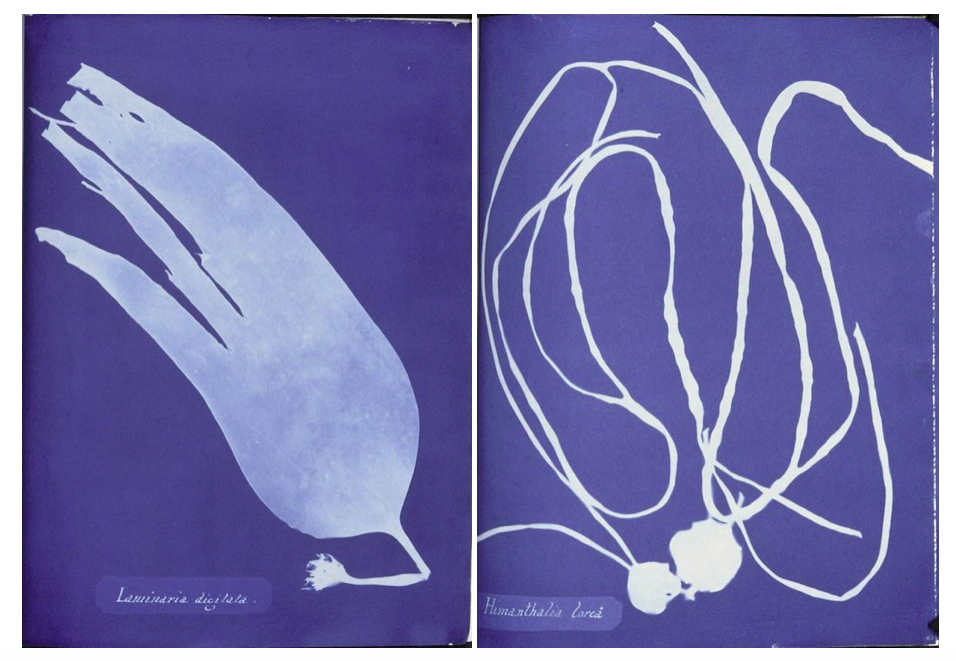
Anna’s innovative use of new photographic technologies merged art and science, and exemplified the exceptional potential of photography in books. Andrea Hart, Library Special Collections Manager at the Museum, says, ‘With the introduction of photography, you get a whole new opening up of how natural history and science can be presented in print. Before the invention of photography, scientists relied on detailed descriptions and artistic illustrations or engravings to record the form and colour of botanical specimens. Anna’s self-published her detailed and meticulous botanical images using the cyanotype photographic process in her 1843 book, Photographs of British Algae: Cyanotype Impressions. With a limited number of copies, it was the first book ever to be printed and illustrated by photography.
‘Before Atkins’s book on British algae and the photographic process, botanical images would have been restricted to the traditional printing processes of engraving or woodcuts, although the art of nature printing was also in its early stages around Atkins’s time’.
Because there are limited copies of this book in the world i couldn’t physically hold this book to analyse the whole inside, but I wanted to use this book as inspiration for my photobook and especially the ways Atkins displayed her cyanotypes very simplistically on each page. This links to my 6th photoshoot where I produced my own photograms responding to my research into Anna Atkins and the history behind how they were first created.
Contemporary Photobook- Rinko Kawachi: Illuminance
I also chose Rinko Kawauchi photobook ‘Illuminance’ to take inspiration from when creating my photobook as I explored her work at the start of my project and think that the concepts of my project now were built from researching her photography and why she takes photos.


” In Illuminance, Kawauchi continues her exploration of the extraordinary in the mundane, drawn to the fundamental cycles of life and the seemingly inadvertent, fractal-like organization of the natural world into formal patterns. Gorgeously produced as a clothbound volume with Japanese binding, this impressive compilation of previously unpublished images is proof of Kawauchi’s unique sensibility and her ongoing appeal to lovers of photography.
- How does the book to look and feel, Cover The book is A4 with a hard cover which is clothbound with Japanese binding, displaying square debossed image printed onto a linen material on the front and another image in the same place/size on the back. I think that these two images are good representations of what is inside the book and interests the reader.
- Paper and ink: use of different paper/ textures/ colour or B&W or both. The title ‘Illuminance’ is a different material to the front cover of the book where is spelt in shiny dots spelling title and her name underneath, linking to the title Illumininace. The colours of these dots link to the colours seen in the image above the writing. The colour of the front and back colour is a dark blue/purple, which complement the glowing pink colour of the plant in the image in the centre of the cover. I think that both these images link together, the image of the back displays a beam of light against a structure, the image in the front as it looks as though light is directly shining on the flower. These links together as through the emphasis of light and making it seem as though the beam of light on the back is on the flower on the front.
- Title: Illuminance I think that this title intrigues the reader as it indicates how the images in her book emphasise light.
- Narrative,Structure and architecture:: what is the story/ subject-matter. How is it told? The images in her book, Illuminance, span 15 years of work, both commissioned and personal projects, and have the ability to make the mundane extraordinary, leaving poetry in the viewer’s mind. A distinctive trait of her work and the book lies in the sequence and the juxtaposition of her images. This editing, she says, “differentiates between a photograph and an artwork. Seeing two images next to each other opens up the imagination and gives birth to something else. Flipping through the pages of the book, it can arouse feelings of excitement, sadness, or happiness—things that are hard [for me] to do with words.” At first glance, her photographs seem simple. But her talent lies in the way she is able to evoke the primal in all of us: a depth of raw human emotion. “It’s not enough that [the photograph] is beautiful,” says Kawauchi. “If it doesn’t move my heart, it won’t move anyone else’s heart.
- Design and layout: image size on pages/ single page, double-spread/ images/ grid, fold- outs/ inserts. Most of her pages display a square image, starting at the top of the page and leaving white space at the bottom. This occurs on every page on the book, except for a few double page spreads where theres only one out of the two pages that has an image. Kawauchi probably did this to emphasise those particular images and to create a few breaks in the sequence of the book.
- Images and text: are they linked? Introduction/ statement / use of captions (if any.) At the end of the book there is a body of text called Weightless Light – David Chandler at end of book which talks about some of her other photo books and and the concepts and meaning behind her images. “Her dramatic twists of subject matter and mood, , leave an overall impression of a first person narrative.” “From page to page ‘Illuminance’ builds into a sustained meditation on light’s miraculous qualities and revelatory power, at the heart of which is a reminder that light is the source of all seeing, and the fundamental property of photography.”
“In the rendering of light in Kawauchi’s work, in the continual sense of matter dissolving or evaporating into air and space, the idea behind to settle of the elemental state where the interconnection between things is also a merging, a form of immanence that suggests the possible terms of the sublime, sensory integration of our being with the natural world. “
I think that by taking inspiration from both Anna Atkins and Rinko Kawauchi when designing my photo book I will produce a body of work that will link together. I will try to interpret the way Kawauchi has connections between her images in her double page spreads. She says that “Seeing two images next to each other opens up the imagination”. This is why I will try to display combinations of images that connect e.g. through colours, patterns or texture. Taking inspiration from Anna Atkins cyanotypes will also add a different aspect to my photo book that will interest the readers and will complement my landscape image.