These are a series of postcards from the Societe Jersiaise photo archive that show the seaside and popular locations from the past that must have been printed to promote jersey tourism, I intend to use some of these postcards within my book with some of my own photos of popular tourist attractions such as the seaside.
Daily Archives: April 26, 2019
Filters
Consumerism Shoot- POP ART EDITS
For these images i wanted to create images similar to Andy Warhol’s Screen prints like his Campbells soup cans. When creating these images I wanted to produce a printed like effect.
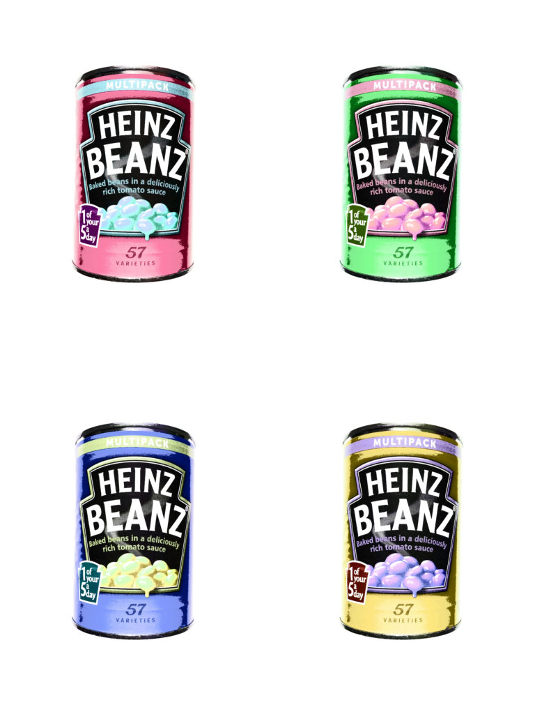
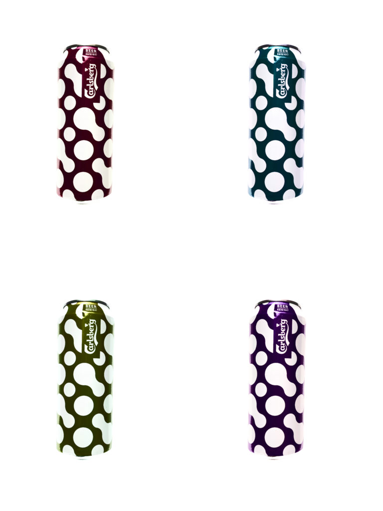
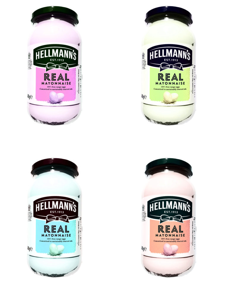
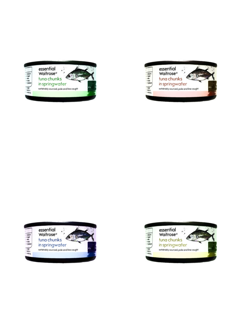
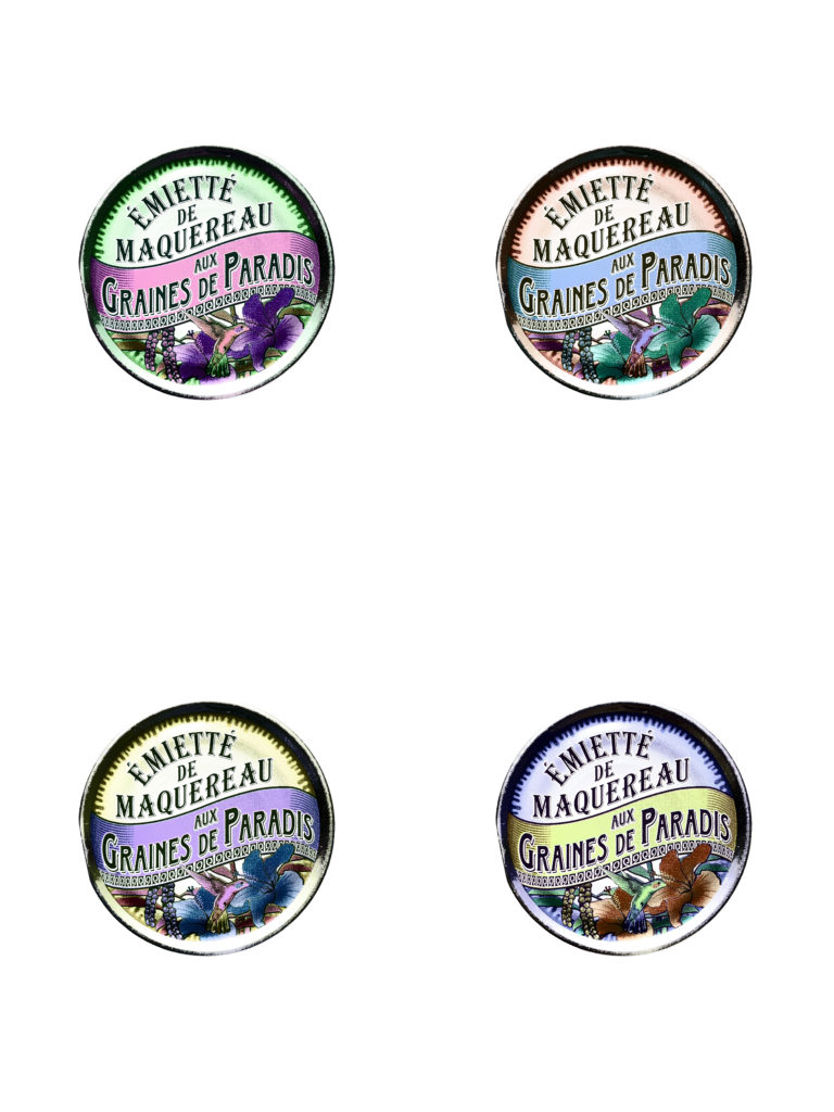
Steps to Create this effect:
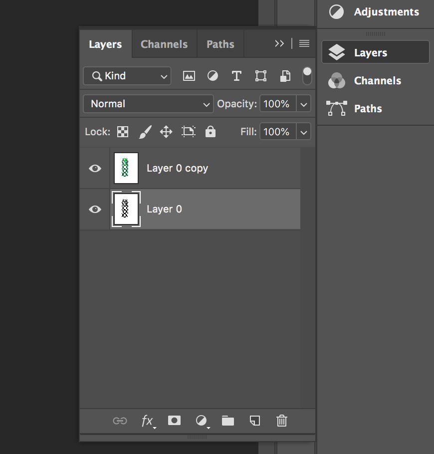
Start by turning the image into a layer and then Duplicating the image. 
Select one of the layers, then click on Threshold 
Then adjust the threshold so that the main features are still intact
(text or shapes)
Finally select the other layer which is the original image. Then click on opacity bringing it down so that there is a faint colour.
Andreas Gursky
Andreas Gursky (born 1955) is a German photographer and professor and the Kinstakademie Dusseldorf, Germany which is the academy at which the Bechers’ taught him and influenced lots of art in the Minimalism movement. Gursky is known for large format architecture and landscape colour photographs (similar to the style in which Lewis Bush photographs in his Metropole project. Gursky studied at the Universitat Gesamthochschule Essen in visual communication, with classes led by photographers Otto Steinert and Michael Schmidt. Between 1981 and 1987 he attended the Dusseldorf Art Academy where he received training from Hilla and Bernd Becher which led to a similar methodical approach in his photography.

Gursky would not digitally manipulate his images before the 1990s however has begun to rely on computers to enhance his photographs. A lot of Gursky’s photographs are taken from a high vantage point which gives an unusual but effective perspective. He tends to focus on large man-made spaces such as offices and high rise buildings. The photographs are printed to create huge panoramic colour prints which can be up to six feet high by ten feet long. Critic Calvin Tomkins described the experience of confronting one of his works in person as having “the presence, the formal power, and in several cases the majestic aura of nineteenth-century landscape paintings, without losing any of their meticulously detailed immediacy as photographs”.
Gursky’s photograph 99 Cent taken in 1999 was taken at a 99 Cents Only store in Los Angeles and shows the interior of the store as a wide composition of parallel shelves with a few white columns to separate up the photograph. The photograph represents all of the individual products as one wave of colour and blocky shapes rather than the brands and products on offer. The photograph supposedly depicts a stretch of the river Rhine outside Dusseldorf.
Andreas Gursky appeals to me because, similar to Bernd and Hila Bechers and Lewis Bush, he focuses on buildings and the patterns throughout them in order to create abstract and intriguing compositions. The photographs produced by Gursky often show the contrast and similarity between products and buildings through a typology approach without using a typology grid, for example in his photograph ‘99 Cents Gursky shows the contrasts and similarities between each of the products in the 99 Cents store. This is shown as the individual shapes of each product can be seen if you look closely but when looking at the photograph as a whole all of the products seem to be the same apart from the colour – the branding that the manufacturers pride themselves on are no longer important as all of the products blend together.

Noemie Goudal – Artist Study
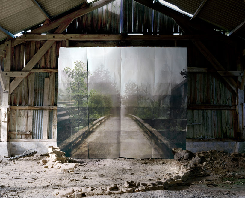

Noémie Goudal is a French artist who graduated from the Royal College of Art in 2010 with an MA in Photography and lives and works in Paris. Noémie Goudal’s practice is an investigation into photographs and films as dialectical images, wherein close proximities of truth and fiction, real and imagined offer new perspectives into the photographic canvas. The artist questions the potential of the image as a whole, reconstructing its layers and possibilities of extension, through landscapes’ installations.
Noemie Goudal works on the land, setting up large paper backgrounds that are deliberately distinguishable. She superimposes them on the landscape, creating an image that sits on the borderline of reality without ever really forsaking it.

Book development, narrative and presentation
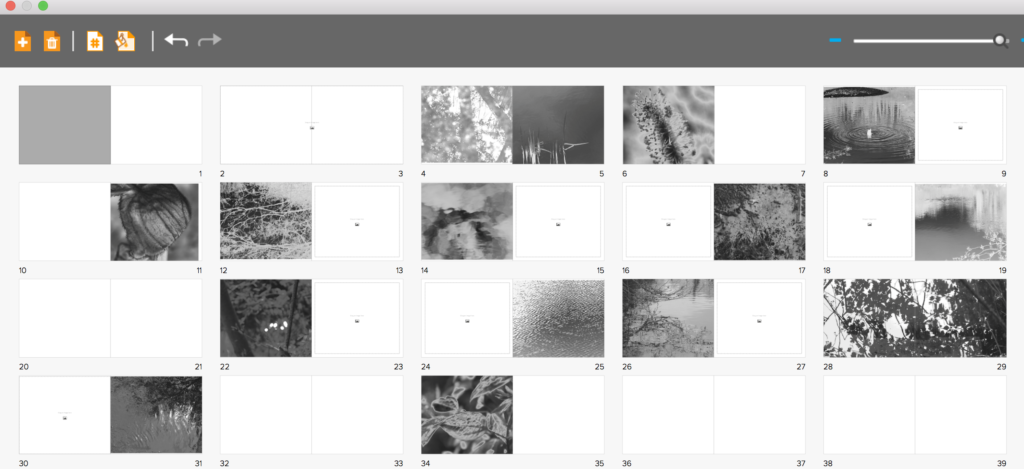
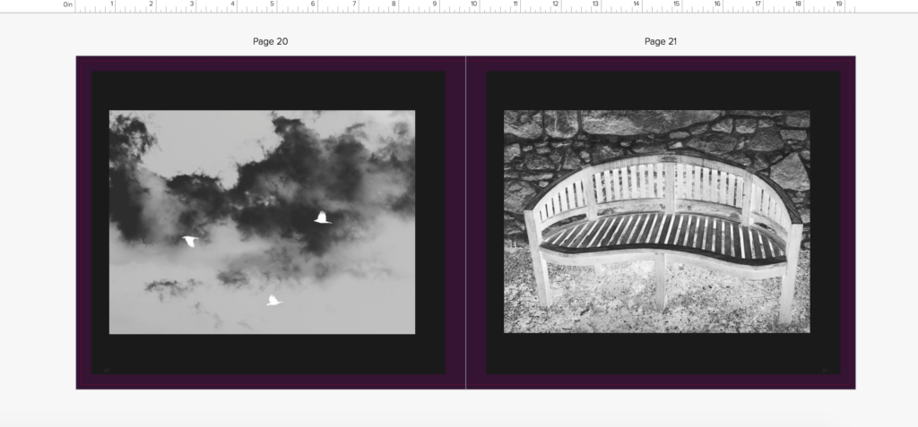
I first started off the development of my book with the inspiration of three artists who all used silver and black ink and focused on a abstract and vivid interpretation of the world. I believed all of their books had an essence of life and a narrative journey within them. I started off my shoots for the book by concentrating on the beauty and birth of life itself in a religious manner. I took around 5 shoots inspired by the beauty found within nature, and placed these images at the beginning of the book as this will be the start of my narrative journey. I wanted to place the images next to another which had a contrasting and oppositional colour inversion, so a light and a dark tonal image next to each other, I believed this attracts the same attention to each image and creates a nice flowing narrative to the book itself.
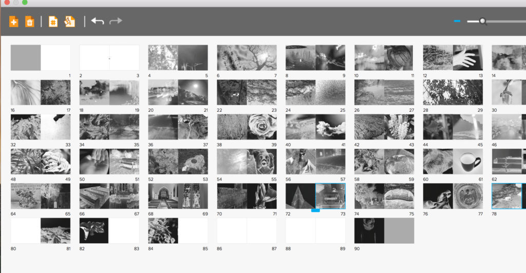
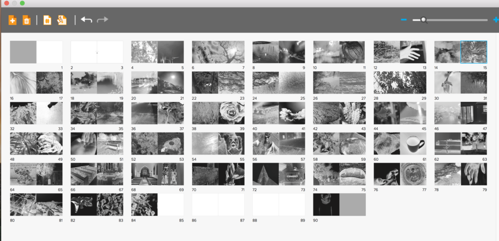
I had soon filled the first part of the book with images of life, I then wanted to show more abstract elements of religion that god was said to create, so showing direct imagery from underwater, animals, and light itself in a more creative manner. I not only wanted to show the world, But too wanted elements of myself to show the human chaos and soon destruction of the world, and the self growth and deterioration throughout the book. As the narrative is about the journey of life of people created and given by god. I decided to add objects which symbolised a life cycle and journey, such as houses, benches and mugs of tea, doing this also constitues a narrative of isolation and loneliness, and presents a sense of abandonment and getting towards the end of life itself. I soon added images from outside and in a church to not only symbolise the end of life, but an evolution of combining the end of life with the original creator itself, reflecting in both the individuals journey of life and religion itself. I also edited the images so they get darker throughout the church imagery towards the end, showing the tonal navigation of light to dark throughout symbolises a pathetic fallacy of death and foreshadowing the gradual end and decay of the book itself,.
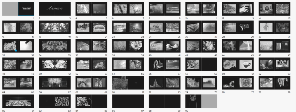
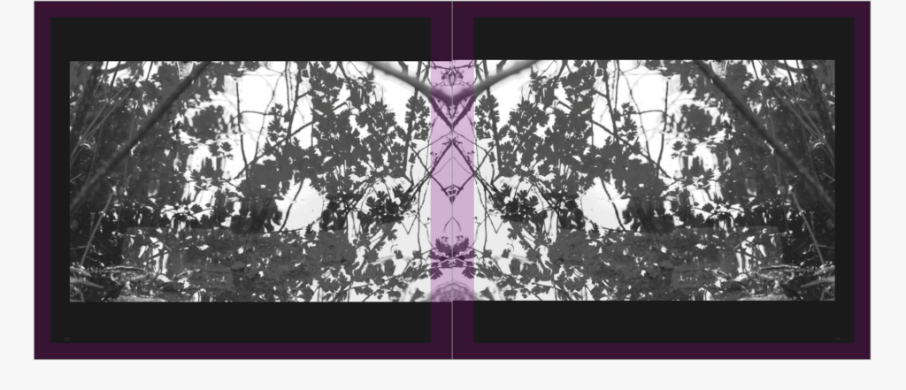
I had soon Finished applying all of the images to the book itself, having both people, nature, objects and a clear narrative both emotional, and chronological. However, after discussing with teachers, we decided to have the book this segregated wasn’t the most successful way in order to show the images, So I re arranged the narrative to show contrasting images, so rarely two nature images are together. I decided I wanted my book to be long in order to have such a strong effect, I also wanted this effect to be heightened by the image on every page always being the same proportion. I believe if you are going to do a book with such a strong concept colour-wise and story wise you need to carry on this strength and not stop the narrative at any-point. However, I thought it would be successful if like two of my artists I showed a continuous black border, which not only exaggerates the colour in the images themselves, but shows a clear narrative colour scheme throughout the book, and doesn’t make the images over-bleed continually on each page. The book itself has the layout of more of lexicon of life, and a clear chaotic feel, as life is not a simple route to the end. I the wanted to show a separating indexical icon throughout, so repeated one image across two pages every 8 pages, to segregate and keep attention throughout the length of the book itself.
