I wanted to digitally edit my images to interpret the appearance of cyanotypes, but I also wanted to experiment with the solarize tool on photoshop which I have previously researched looking at the creation of sabattier effect and solarization relating the the photographer Man Ray. With the cyanotypes, I am taking inspiration from Anna Atkins who is said to be the first woman photographer and made the first photo book. Taking inspiration from both these techniques and editing them digitally, rather than the effect being created inn real life is quicker and easier. I will compare the photograms I made myself using sunlight with the images I’ve post edited to see which ones I like better and to see which ones I will include in my final outcomes for this project.
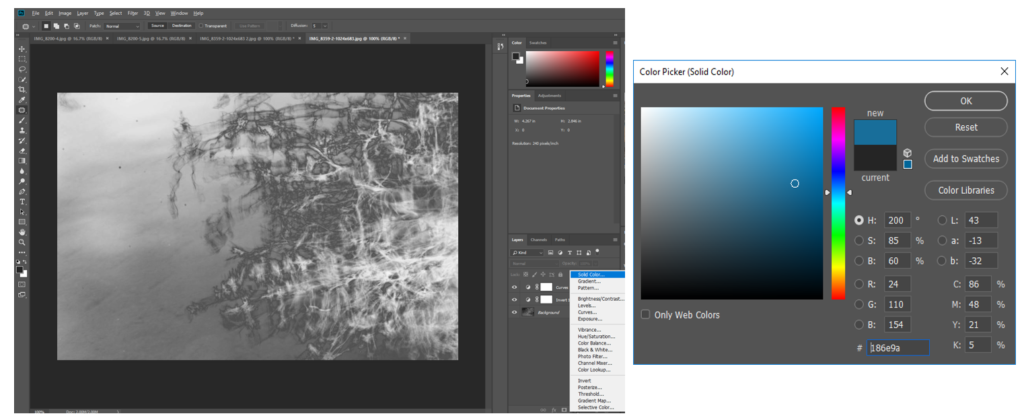
Creating solarization and the appeance of a cyanotype:
- I made the original image image black and white
- Then used the solarize tool on photoshop to create the appeance that
image was recorded on a negative or a photographic print that’s wholly or partially reversed in tone. - I then created a layer and inverted the image to make the darker area lighter, which is what is seen on a cyanotype and adjusted the curves in the image.
- With another layer, I chose a solid block colour, simialr to the colour of cyanotype and overlayed both.
- I also added a blue photo filter to emphasise the blue tones in the image even more.


I think that this process of editing creates a similar appearance of a cyanotype is effective in changing the appearance of my images to make them seem more scientific. I also like how it creates a version that looks completely different from the original and has a completely different atmosphere to it. In the image above I think that the cyanotype edit emphasised the movement and shape of the lines/branch of the plant on the right, as the dark parts became light, and the light arts became dark. This made the lines much more brighter against the water in the background which I think is effective. Because of the slow shutter speed I used to take this image, the edit emphasises the movement and blurriness of the plant, which makes it look more spiritual and other worldly. Although this was not the aim of cyanotypes originally, which were used to make copies of drawing and to scientifically look at plants, I think that this effect builds on the original motives of a cyanotype and emphasises the transcendent qualities, in a not so scientific way.
I decided that I wanted to make solarisation and cyanotype edits of images I have previously taken in this project to experiment and create different versions of the same image to see if this appearance would be more effective for my final outcomes of this project.
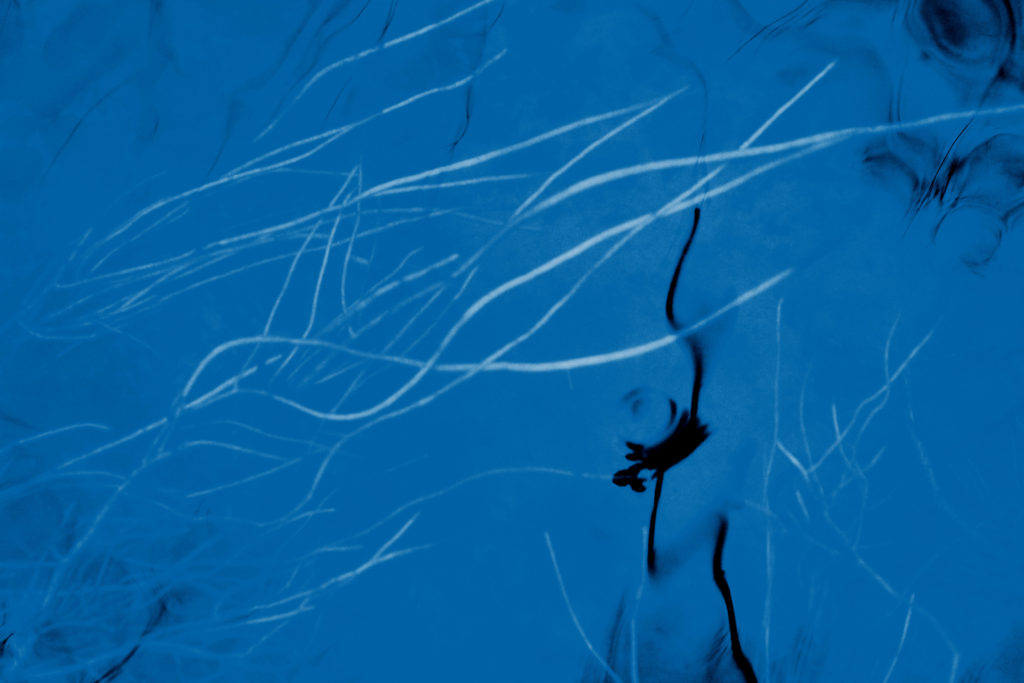
Cyanotype Edits


I think that is edit was one of the most successful as I think it interprets the appearance of a cyanotype the most. This is because of the large amounts of negative space that I turned blue, similar to how in a cyanotype, a lot of negative space is normally seen (especially with plants) as the light only prints the objects on the paper. If this were a real cyanotype then the plants underneath the water would be were the plants would be placed. One aspect that takes away from the appearance of a cyanotype is that I kept the dark reflection of the plant in the water. This wouldn’t happen in a real cyanotype as where the object is placed turns white and not black. I decided to do this as I thought that the contrast of the dark in the foreground to the white plants in the background was effective and created a more interesting image. I also experimented with different tones and intensity of blue as the background from light to dark and found this one was the best as I didn’t want the blue to be too light and take away from the negative space that’s seen.
Solarization Edits

I also experimented by using the solarisation tool on photoshop to respond to my research on the sabattier effect and solarisation and the photographer Man Ray where his experiments with photography included rediscovering how to make “cameraless” pictures, which he called rayographs. Using the tool on photoshop is a much quicker and easier way way to create a similar appearance.
Cyanotype Edits


I think that these edits are also effective as the details of the branches and lines are emphasised even more by turning them from the darkest points to the lightest points of the image. I also think that the balance of light blue to darker blue is good as the darker parts are around the corners of the image, with the lighter parts in the centre, drawing the audience’s eyes to that point. I feel like this is one of the images that looks the most spiritual with this edit, this is because you can still see the connections of the small lines and branches of the tree, through the reflection that are quite far away. I also like how you cannot obviously tell that this image was taken through the reflection of a puddle on the floor, which i think the edits hides even more. The surrounding floor has turned into a blurred pattern around the corners, framing the image.
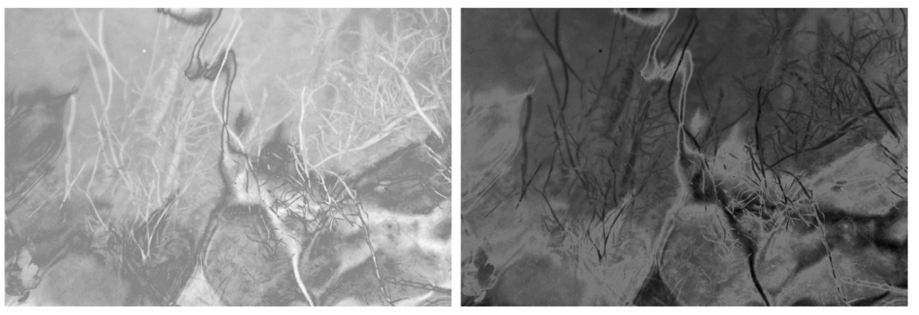
Solarization Edits


I experimented by using the solarisation tool to edit many different images take I’ve taken and found that the most effective were close up images that focus of the pattern in the nature. For example the edits of the water above were effective by completely change the appearance making it harder to tell what the image is taken of. I think that this makes the image more interesting and creates a mystery behind it that wouldn’t be achieved with the original. I also like how the waves on the water are emphasised even further through the different light and dark tones of grey, making it look like a material to me than an aspect of nature. Both of these edits are very different, the first one emphasising the light on the water, by turning the dark areas the image light making it seem softer and more exposed. The second image emphases the dark and shadows through the solarisation tool, which makes the rare light parts of the image stand out even more. I would chose the first edit as a final outcome as I think that it links well to my concept of texture and spirituality by emphasising the light and softer parts of nature.
Cyanotype Edits


When editing this image I found that I preferred how the blue colour wasn’t as intense as the other images and liked how the light pink is emphasised. I think this was because the original light colour of the bubbles is highlighted and the overall appearance of the image is softer. I think that this image will be good to use a final image as it contrasts with other images in my project where i have emphasised the contrast between light and dark colours. In this, the colours complement, rather than contrast which i also think makes the image have a more spiritual quality as i’s focusing on the light. I like how the texture of the bubbles is still noticeable against the light pink background.

Evaluation:
I think that both the physical photograms I’ve created, and the digital experiments I have done with solarisation and cyanotypes were successful. To decide which ones I will include in my photobook, I will try out different combinations of images to see which are the most effective displayed together. I think that I will use a combination of both the physical photograms and the digital edits as they both add a different aspect to my project that wouldn’t be achieved with only my natural landscape images and would create more of a story within my book. I will try to contrast some of these edits with my other landscape images on double page spreads as I think I will like the contrast from personal images that have a spiritual quality to the edits that have bright cool colours.
