Sigmund Freud

Psychoanalysis was founded by Sigmund Freud (1856-1939). Freud believed that people could be cured by making conscious their unconscious thoughts and motivations, thus gaining insight. The aim of psychoanalysis therapy is to release repressed emotions and experiences, i.e., make the unconscious conscious. It is only having a cathartic (i.e., healing) experience can the person be helped and “cured.”

Psychoanalysis Assumptions

  • Psychoanalytic psychologists see psychological problems as rooted in the unconscious mind.
  • Manifest symptoms are caused by latent (hidden) disturbances.
  • Typical causes include unresolved issues during development or repressed trauma.
  • Treatment focuses on bringing the repressed conflict to consciousness, where the client can deal with it.

How can we understand the unconscious mind?

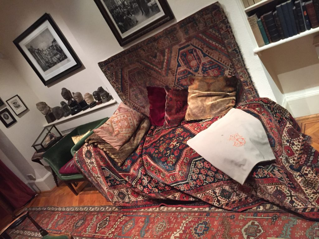
Psychoanalysis is commonly used to treat depression and anxiety disorders. In psychoanalysis (therapy) Freud would have a patient lie on a couch to relax, and he would sit behind them taking notes while they told him about their dreams and childhood memories. Due to the nature of defence mechanisms and the inaccessibility of the deterministic forces operating in the unconscious, psychoanalysis in its classic form is a lengthy process often involving 2 to 5 sessions per week for several years.

This approach assumes that the reduction of symptoms alone is relatively inconsequential as if the underlying conflict is not resolved, more neurotic symptoms will simply be substituted. The analyst typically is a ‘blank screen,’ disclosing very little about themselves in order that the client can use the space in the relationship to work on their unconscious without interference from outside.
Psychoanalysts use various techniques to develop insight into their clients behaviour and the meanings of symptoms, including ink blots, parapraxes, free association, interpretation (including dream analysis), resistance analysis and transference analysis.

– Rorschach ink blots:

The ink blot itself doesn’t mean anything, it’s ambiguous (i.e., unclear). It is what you read into it that is important. Different people will see different things depending on what unconscious connections they make. The ink blot is known as a projective test as the patient ‘projects’ information from their unconscious mind to interpret the ink blot.

– Freudian Slip:

Unconscious thoughts and feelings can transfer to the conscious mind in the form of parapraxes, popularly known as Freudian slips or slips of the tongue. We reveal what is really on our mind by saying something we didn’t mean to. An example of this is where a person may call a friend’s new partner by the name of a previous one, whom they liked better.

Freud believed that slips of the tongue provided an insight into the unconscious mind and that there were no accidents, every behavior (including slips of the tongue) was significant (i.e., all behavior is determined).

– Free Association:

A simple technique of psychodynamic therapy, is free association, in which a patient talks of whatever comes into their mind.  This technique involves a therapist reading a list of words (e.g.. mother, childhood, etc.) and the patient immediately responds with the first word that comes to mind.  It is hoped that fragments of repressed memories will emerge in the course of free association.

Freud reported that his free associating patients occasionally experienced such an emotionally intense and vivid memory that they almost relived the experience.  This is like a “flashback” from a war or a rape experience.  Such a stressful memory, so real it feels like it is happening again, is called an abreaction.  If such a disturbing memory occurred in therapy or with a supportive friend and one felt better–relieved or cleansed–later, it would be called a catharsis.

– Dream Analysis:

According to Freud the analysis of dreams is “the royal road to the unconscious.” He argued that the conscious mind is like a censor, but it is less vigilant when we are asleep. As a result, repressed ideas come to the surface – though what we remember may well have been altered during the dream process.

As a result, we need to distinguish between the manifest content and the latent content of a dream. The former is what we actually remember. The latter is what it really means. Freud believed that very often the real meaning of a dream had a sexual significance and in his theory of sexual symbolism he speculates on the underlying meaning of common dream themes.

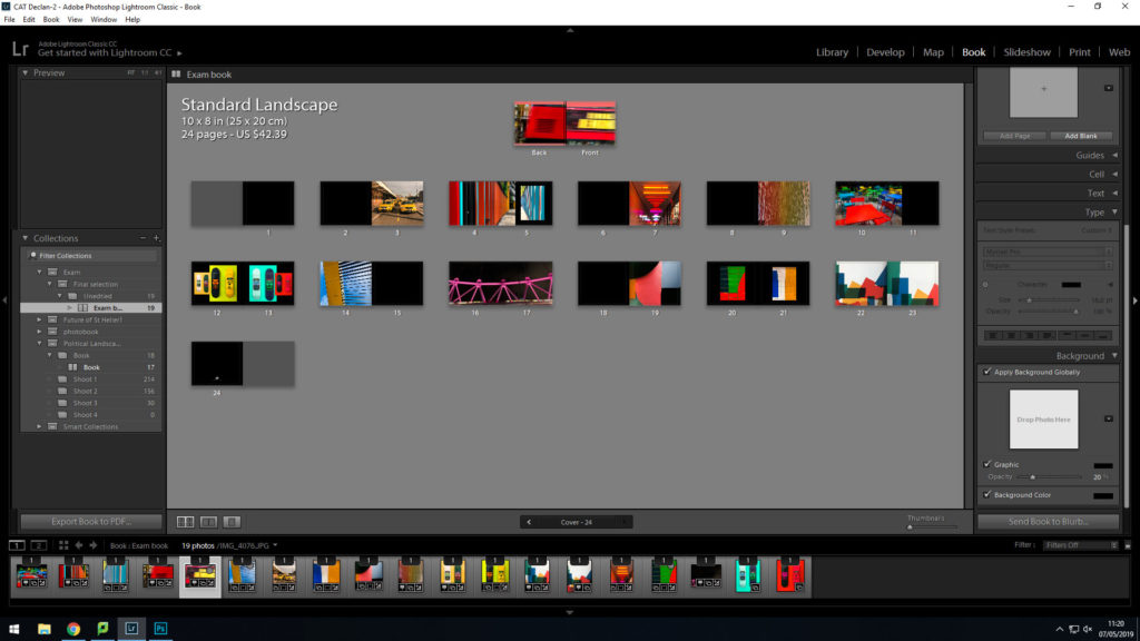
Book Design Experimentation

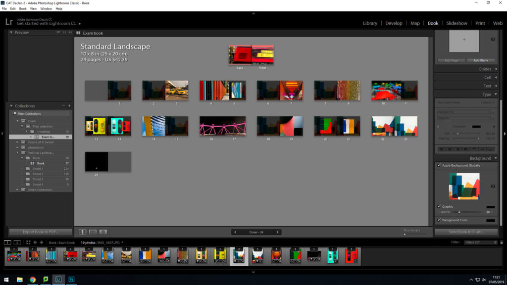
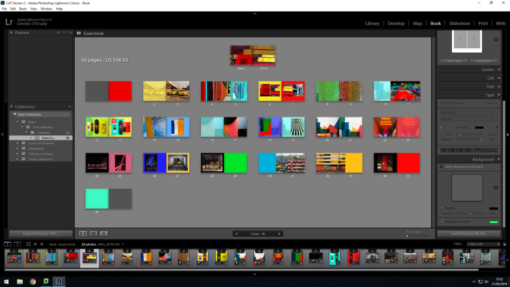
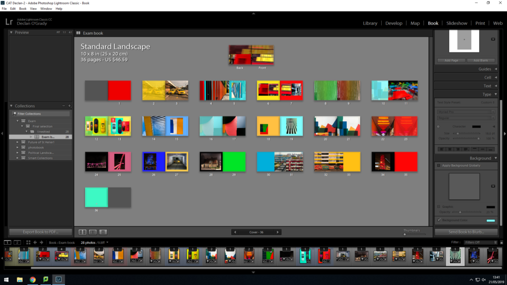
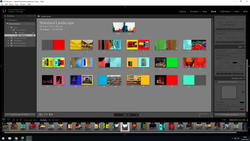
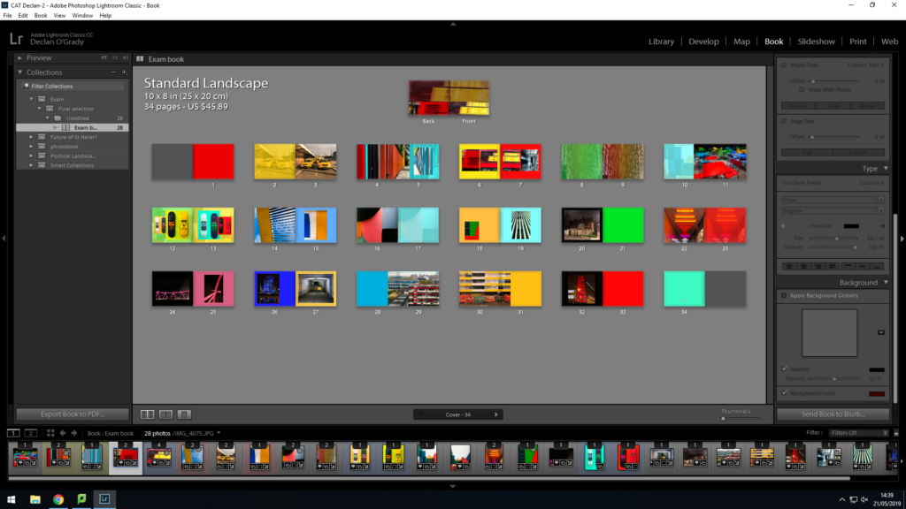
I have decided to make a photobook using lightroom to present my images as i feel that this is the best way to display and collate the images i have produced, focusing on colour photography. I am focusing on including vibrant, saturated and a contrast between dark and light.

From my artist reference on

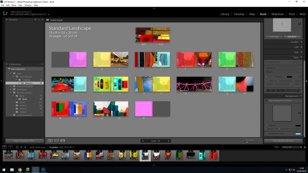
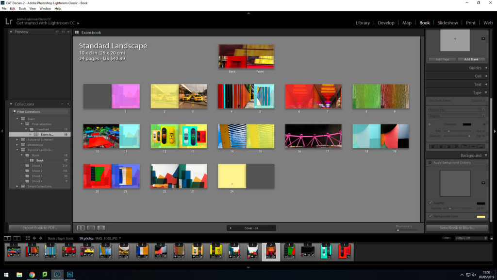
This is my final design:

This is my final outcome for my book design. I think this will be the most suitable design as it meets my book specification.

Consumerism Shoot- B&W Edits

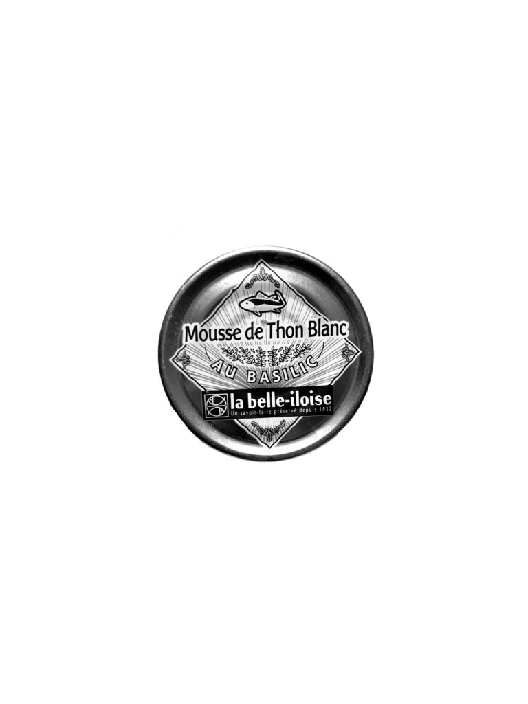
For the editing of these images I wanted to create focus on the tone and shade of the images which gave a different view of these products removing the colour and it meant the focus was more on shape and illustration used in the products. I think the images worked well in black and white as it took back from the vibrant colours which are used to draw people in to buying these products. This meant that the focus looked more at the objects themselves rather then the products they contain.

TYPOLOGY EDIT B&W:

First Easter Shoot (Photo shoot 4)

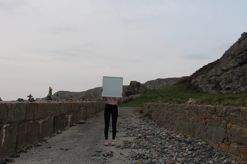
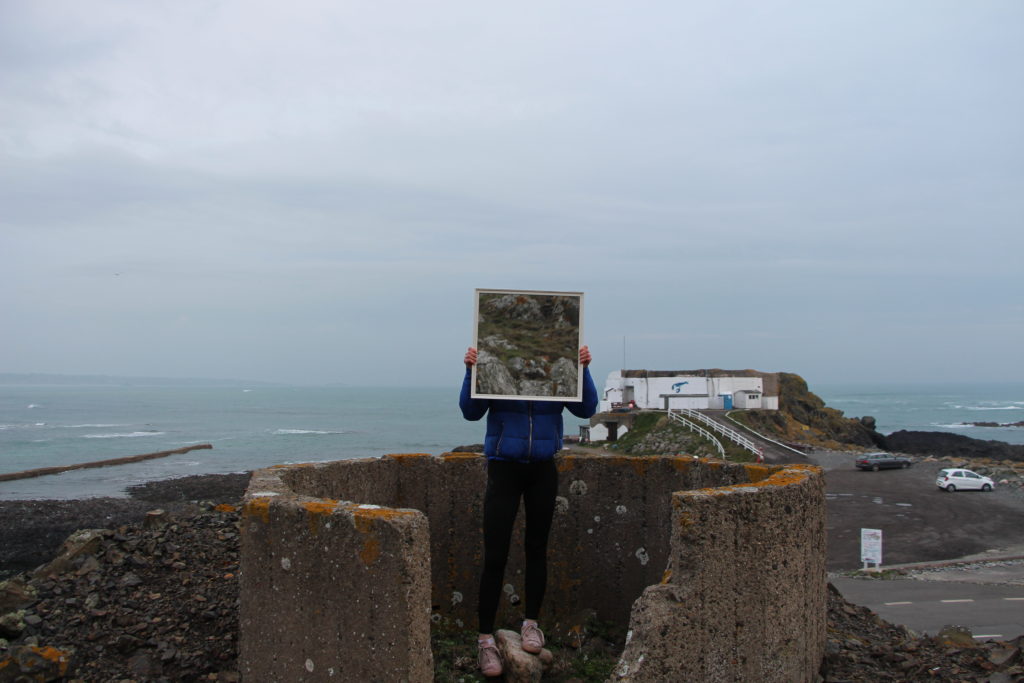
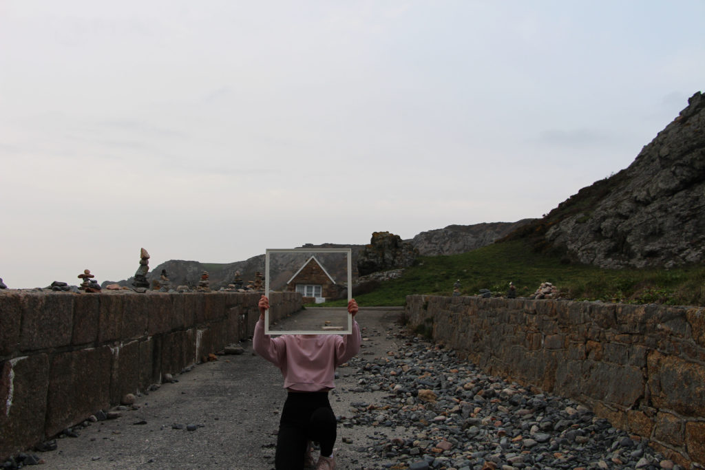
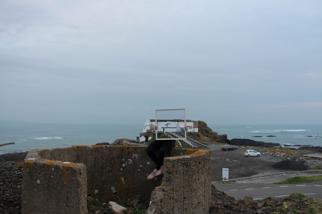
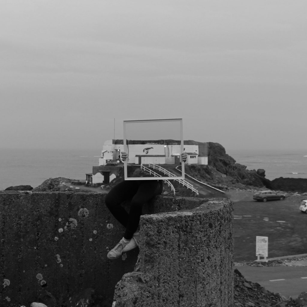
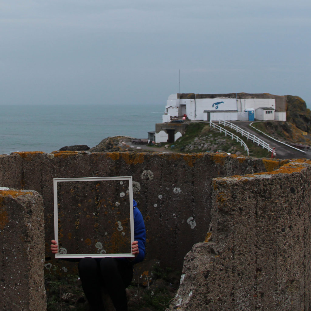
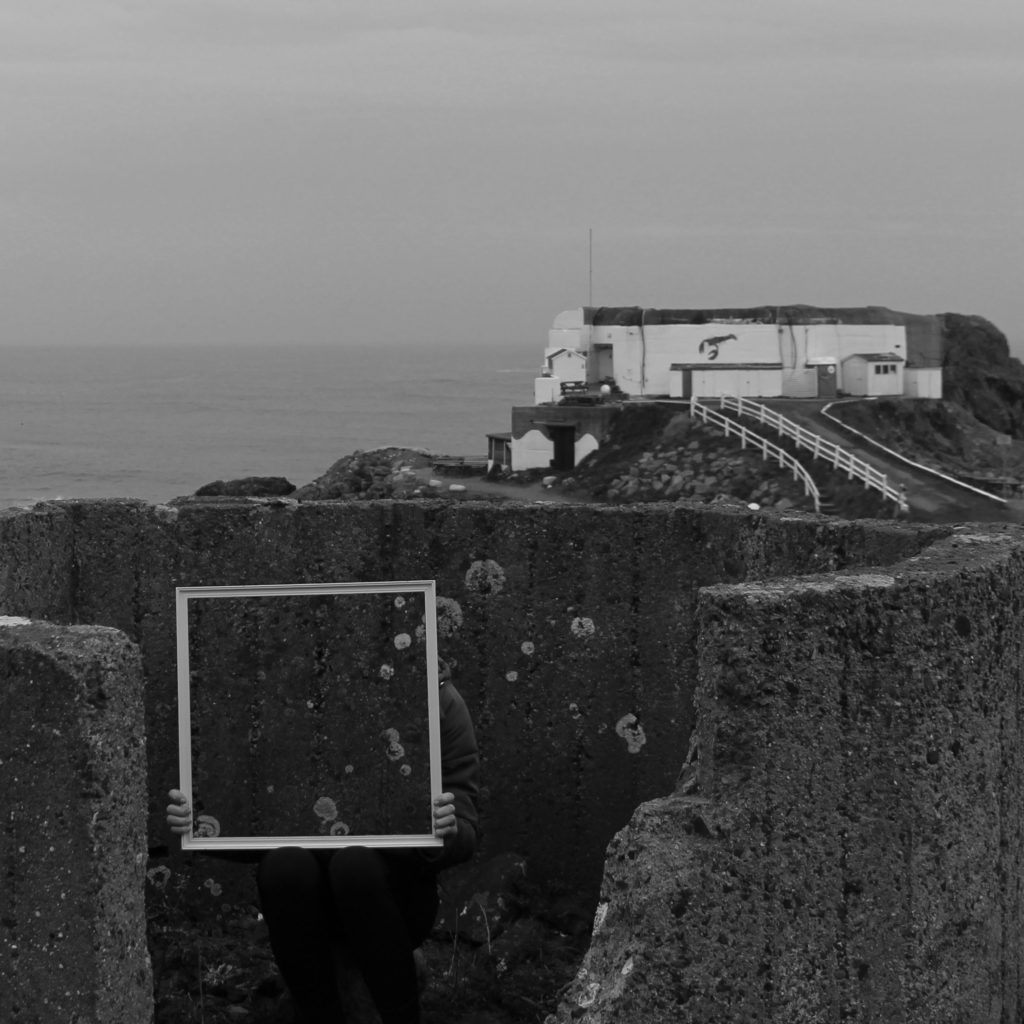
Photo shoot one For my first photo shoot I am planning to further develop my previous mirror shoot by doing a similar photo shoot be in a different location to add to this idea. For the location, I am planning to go to a beach/ rocky beach location. I am also going to try to use different size and shaped mirrors also using a model to hold the mirror. To complete the shoot I will use a tripod to make sure the photos are taken from exactly the same place each time.

This was the first photo shoot I completed over Easter to develop the idea of using a mirror as a frame. After completing and reviewing this shoot, I think in the next shoot using a mirror I should use something like an easel to hold the mirror instead of the person. This is to look the images look more professional and take attention away from the model.

Original unedited images

Edited images

ELDERLY PERSON SHOOT and edits

I wanted to do this shoot as I wanted to show a physical representation of the end of life, and show the complete evolution of what is the religious embodiment of the correct life cycle. When taking pictures for this shoot I wanted to be able to show lines and texture within the afce, and then be able to further emphasise this using the editing technique I have used all along.

When taking the images I did so in front of a window and on the setting of macro so I was able to see a clear transparent representation of the skin itself, and have the clarity of the light to further enhance the photo. I didn’t want to specifically tell her what facial expression to have or what pose, I wanted to have a more natural presentation of ageing, I allowed her to speak throughout and ensure I could show an aspect fo life still within her. As there are only two indexical representations of people within my book this being one, and the other being the boy wrapped in cloth to symbolise the coming of death and lack of identity with body and personality once you have died, I think this shoot really contrasts and also brings a sense of emotion and vulnerability.

SAMSUNG CAMERA PICTURES

Throughout this observation I wanted to make sure I took images sectioned off to different places and areas on the face itself, I then wanted to crop and accentuate the areas which had the most amount of life and obvious lines throughout. My favourite image is the first, as the dividing from black to white resembles a really interesting and successful effective of their contrast between youth and age. it too symbolises a conceptual side of deterioration and the visual representation of slipping into death itself. Overall I think this shoot was successful and a good way forward to show the life cycle of youth.

Experimentation

I wanted to digitally edit my images to interpret the appearance of cyanotypes, but I also wanted to experiment with the solarize tool on photoshop which I have previously researched looking at the creation of sabattier effect and solarization relating the the photographer Man Ray. With the cyanotypes, I am taking inspiration from Anna Atkins who is said to be the first woman photographer and made the first photo book. Taking inspiration from both these techniques and editing them digitally, rather than the effect being created inn real life is quicker and easier. I will compare the photograms I made myself using sunlight with the images I’ve post edited to see which ones I like better and to see which ones I will include in my final outcomes for this project.

Creating solarization and the appeance of a cyanotype:

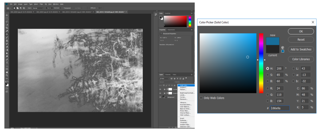
  1. I made the original image image black and white
  2. Then used the solarize tool on photoshop to create the appeance that
    image was recorded on a negative or a photographic print that’s wholly or partially reversed in tone.
  3. I then created a layer and inverted the image to make the darker area lighter, which is what is seen on a cyanotype and adjusted the curves in the image.
  4. With another layer, I chose a solid block colour, simialr to the colour of cyanotype and overlayed both.
  5. I also added a blue photo filter to emphasise the blue tones in the image even more.

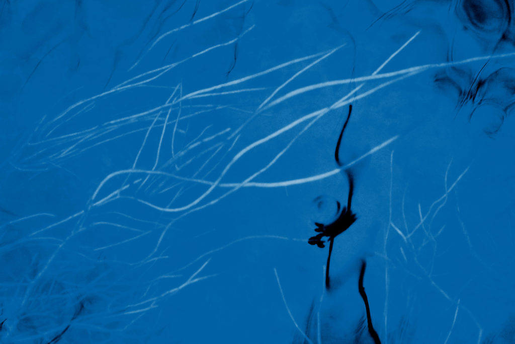
I think that this process of editing creates a similar appearance of a cyanotype is effective in changing the appearance of my images to make them seem more scientific. I also like how it creates a version that looks completely different from the original and has a completely different atmosphere to it. In the image above I think that the cyanotype edit emphasised the movement and shape of the lines/branch of the plant on the right, as the dark parts became light, and the light arts became dark. This made the lines much more brighter against the water in the background which I think is effective. Because of the slow shutter speed I used to take this image, the edit emphasises the movement and blurriness of the plant, which makes it look more spiritual and other worldly. Although this was not the aim of cyanotypes originally, which were used to make copies of drawing and to scientifically look at plants, I think that this effect builds on the original motives of a cyanotype and emphasises the transcendent qualities, in a not so scientific way.

I decided that I wanted to make solarisation and cyanotype edits of images I have previously taken in this project to experiment and create different versions of the same image to see if this appearance would be more effective for my final outcomes of this project.

Cyanotype Edits

I think that is edit was one of the most successful as I think it interprets the appearance of a cyanotype the most. This is because of the large amounts of negative space that I turned blue, similar to how in a cyanotype, a lot of negative space is normally seen (especially with plants) as the light only prints the objects on the paper. If this were a real cyanotype then the plants underneath the water would be were the plants would be placed. One aspect that takes away from the appearance of a cyanotype is that I kept the dark reflection of the plant in the water. This wouldn’t happen in a real cyanotype as where the object is placed turns white and not black. I decided to do this as I thought that the contrast of the dark in the foreground to the white plants in the background was effective and created a more interesting image. I also experimented with different tones and intensity of blue as the background from light to dark and found this one was the best as I didn’t want the blue to be too light and take away from the negative space that’s seen.

Solarization Edits

I also experimented by using the solarisation tool on photoshop to respond to my research on the sabattier effect and solarisation and the photographer Man Ray where his experiments with photography included rediscovering how to make “cameraless” pictures, which he called rayographs. Using the tool on photoshop is a much quicker and easier way way to create a similar appearance.

Cyanotype Edits

I think that these edits are also effective as the details of the branches and lines are emphasised even more by turning them from the darkest points to the lightest points of the image. I also think that the balance of light blue to darker blue is good as the darker parts are around the corners of the image, with the lighter parts in the centre, drawing the audience’s eyes to that point. I feel like this is one of the images that looks the most spiritual with this edit, this is because you can still see the connections of the small lines and branches of the tree, through the reflection that are quite far away. I also like how you cannot obviously tell that this image was taken through the reflection of a puddle on the floor, which i think the edits hides even more. The surrounding floor has turned into a blurred pattern around the corners, framing the image.

Solarization Edits

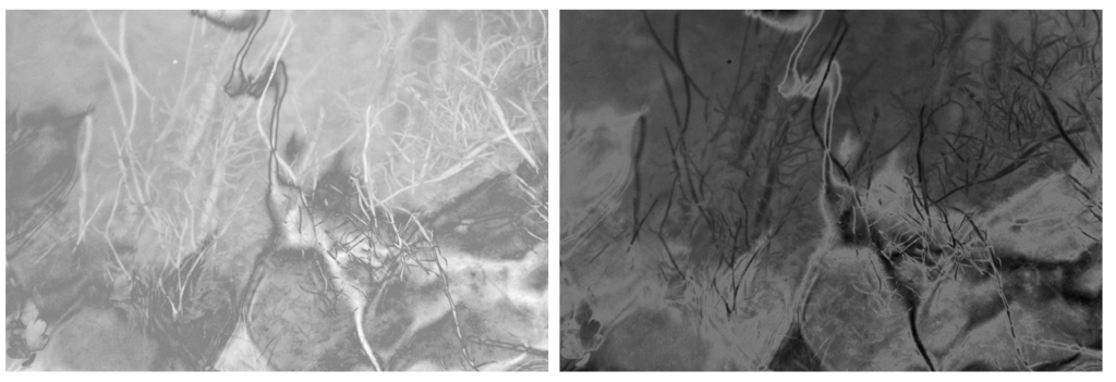
I experimented by using the solarisation tool to edit many different images take I’ve taken and found that the most effective were close up images that focus of the pattern in the nature. For example the edits of the water above were effective by completely change the appearance making it harder to tell what the image is taken of. I think that this makes the image more interesting and creates a mystery behind it that wouldn’t be achieved with the original. I also like how the waves on the water are emphasised even further through the different light and dark tones of grey, making it look like a material to me than an aspect of nature. Both of these edits are very different, the first one emphasising the light on the water, by turning the dark areas the image light making it seem softer and more exposed. The second image emphases the dark and shadows through the solarisation tool, which makes the rare light parts of the image stand out even more. I would chose the first edit as a final outcome as I think that it links well to my concept of texture and spirituality by emphasising the light and softer parts of nature.

Cyanotype Edits

When editing this image I found that I preferred how the blue colour wasn’t as intense as the other images and liked how the light pink is emphasised. I think this was because the original light colour of the bubbles is highlighted and the overall appearance of the image is softer. I think that this image will be good to use a final image as it contrasts with other images in my project where i have emphasised the contrast between light and dark colours. In this, the colours complement, rather than contrast which i also think makes the image have a more spiritual quality as i’s focusing on the light. I like how the texture of the bubbles is still noticeable against the light pink background.

Evaluation:

I think that both the physical photograms I’ve created, and the digital experiments I have done with solarisation and cyanotypes were successful. To decide which ones I will include in my photobook, I will try out different combinations of images to see which are the most effective displayed together. I think that I will use a combination of both the physical photograms and the digital edits as they both add a different aspect to my project that wouldn’t be achieved with only my natural landscape images and would create more of a story within my book. I will try to contrast some of these edits with my other landscape images on double page spreads as I think I will like the contrast from personal images that have a spiritual quality to the edits that have bright cool colours.