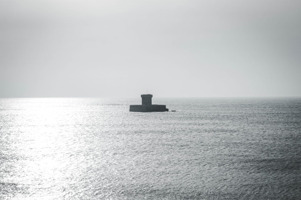
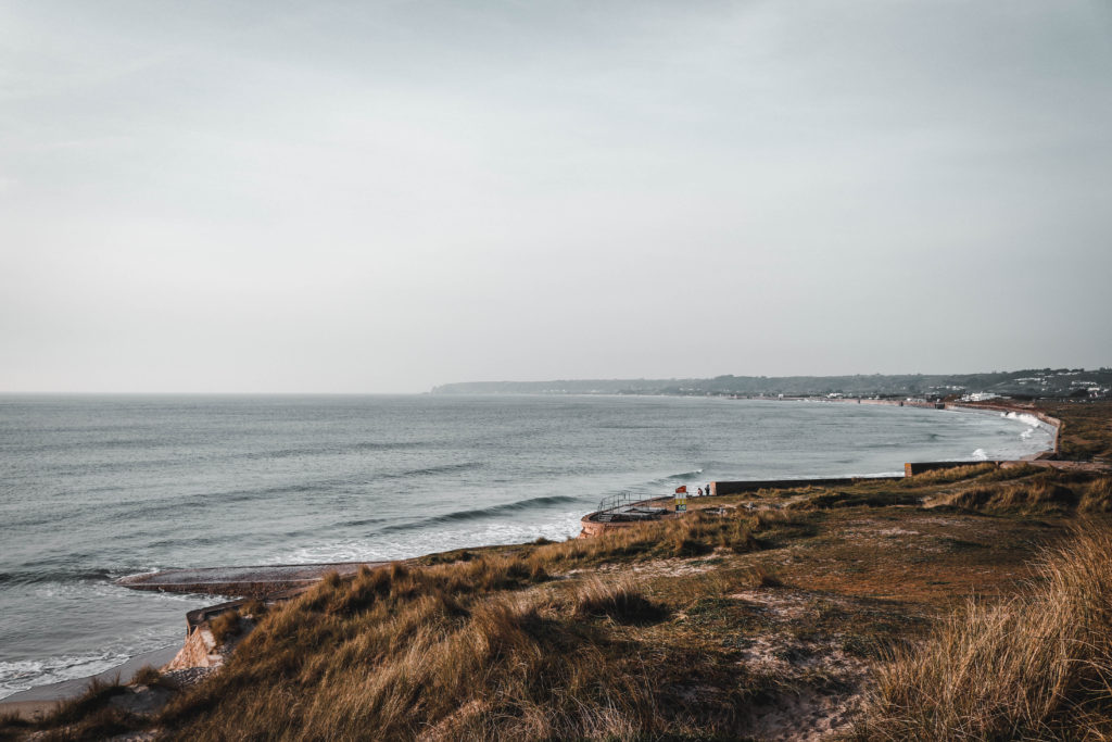
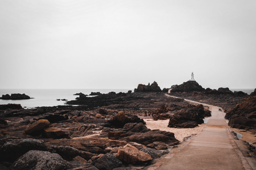
Low Tide Vs High tide shoot comparison

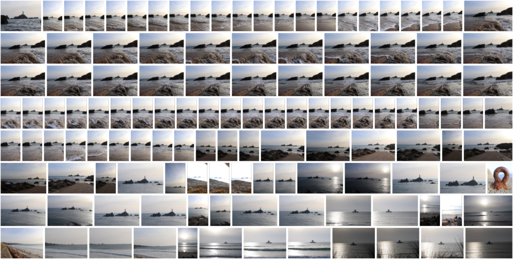
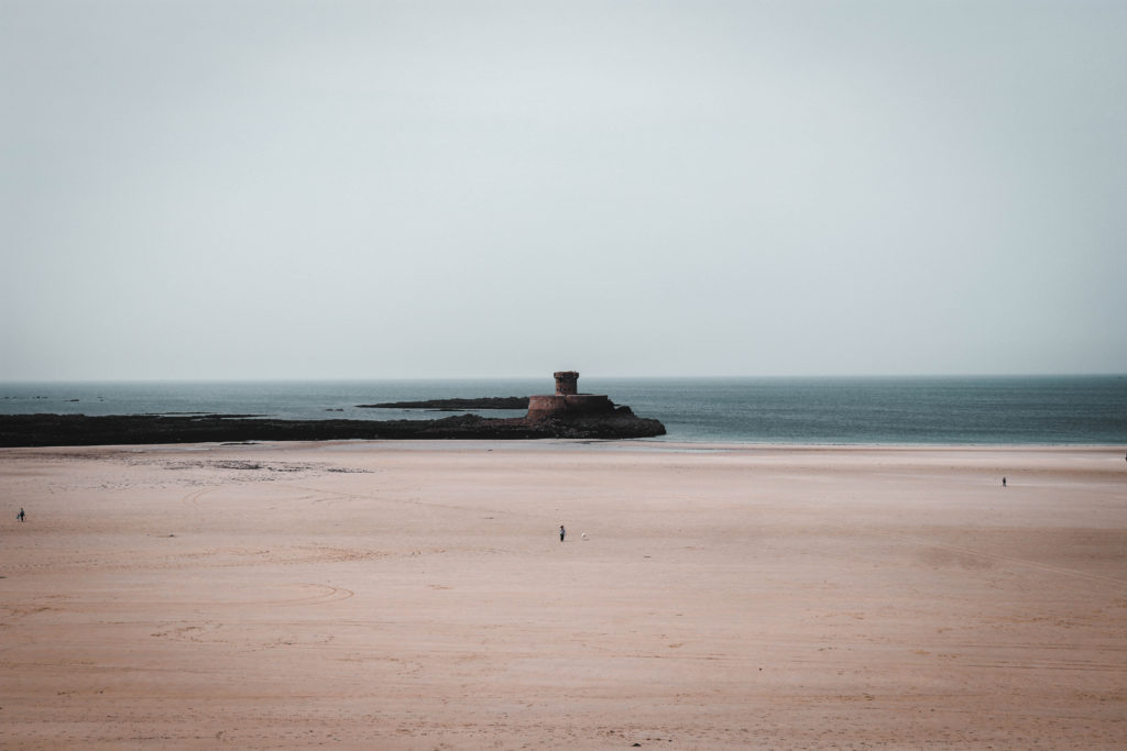
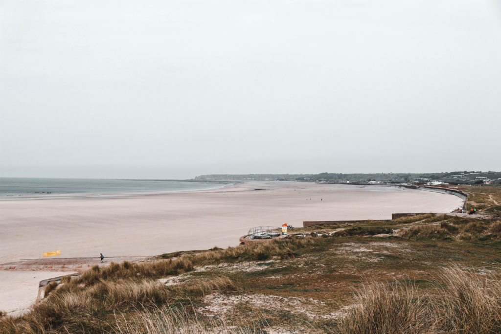
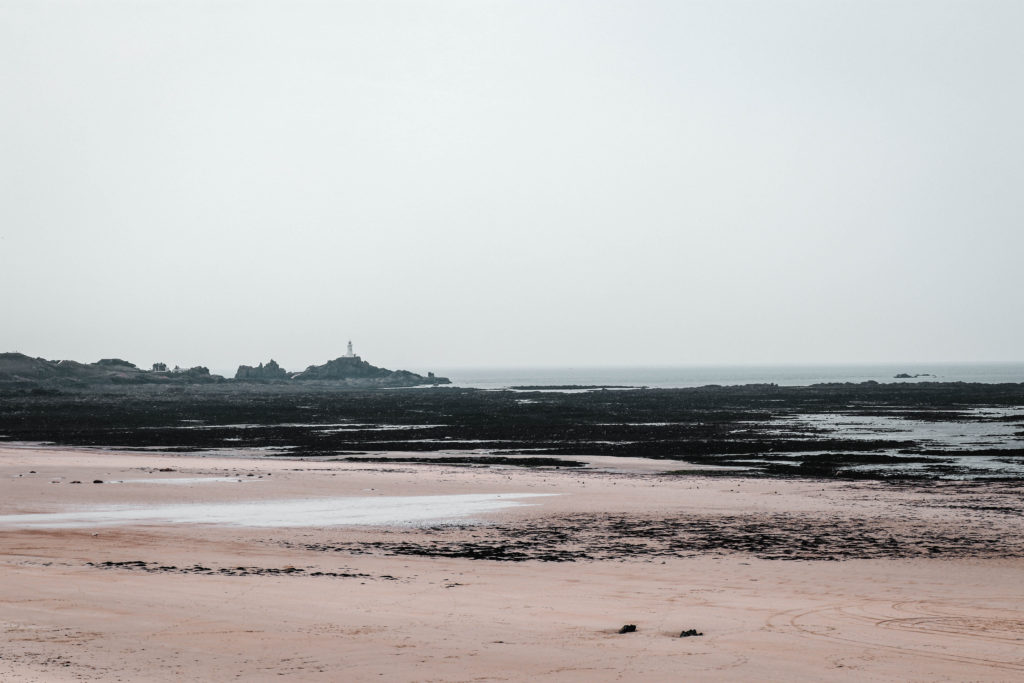
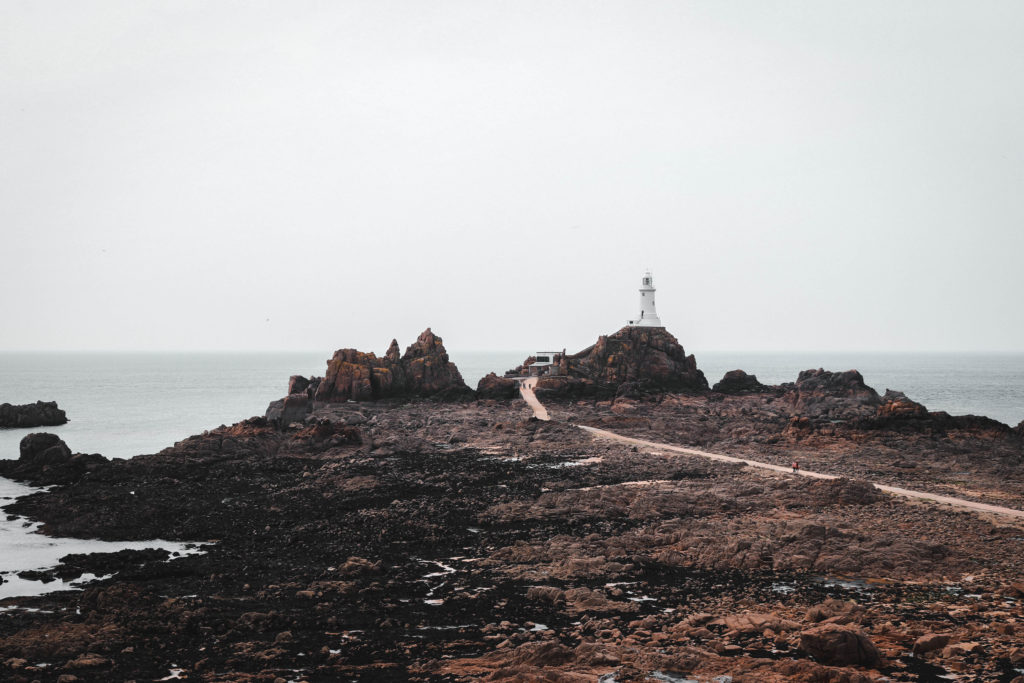
After having completed the two shoots, one at low tide and one at high tide, I wanted to directly compare the photos taken at the same spot. This allows for an easy understanding of how drastic the tidal movement is on our island. It also shows the force and power of nature which is somewhat scary to consider. This was inspired by Micheal Martens photo book ‘sea change’ which I really enjoyed when looking through it. The locations which i chose to photograph are the most commonly photographed locations in Jersey. I wanted to bring a new way of photographing these areas which would be very different from the stereotypical shots. Despite the many photographers in Jersey, I have never seen any images that contrast this tidal movement.

Comparison of work
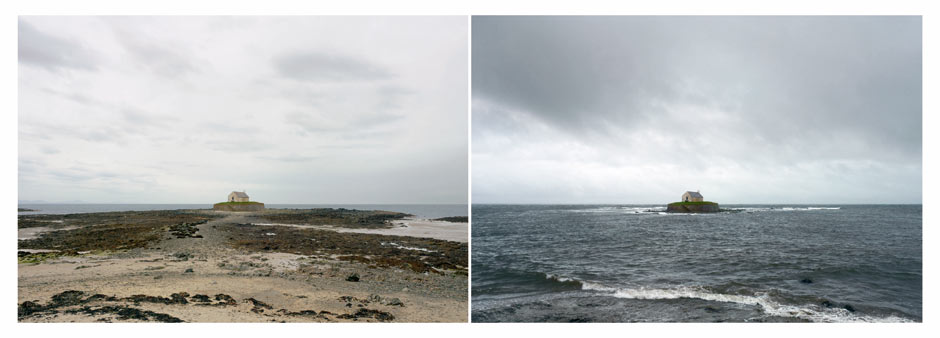
Image result for michael martin sea change
Michael Martens Images

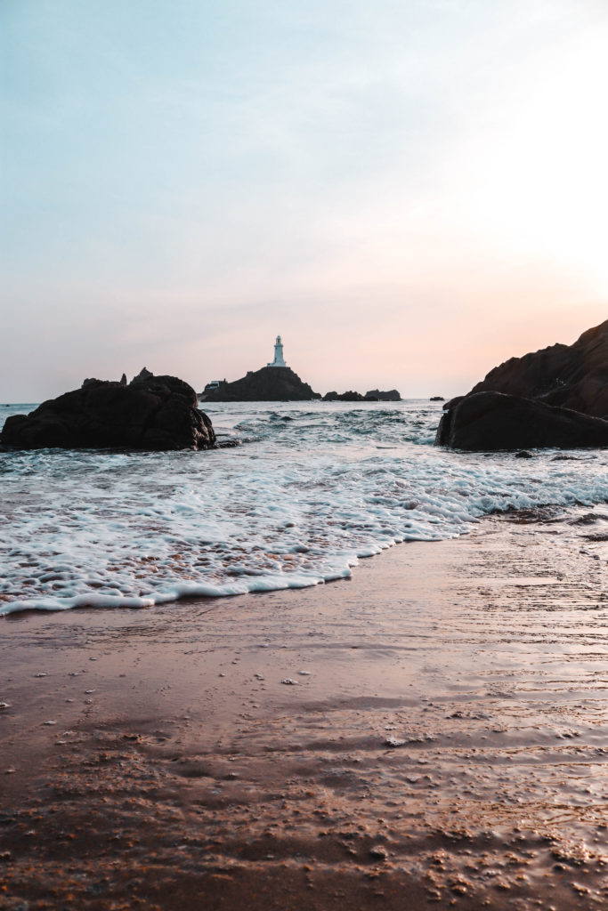
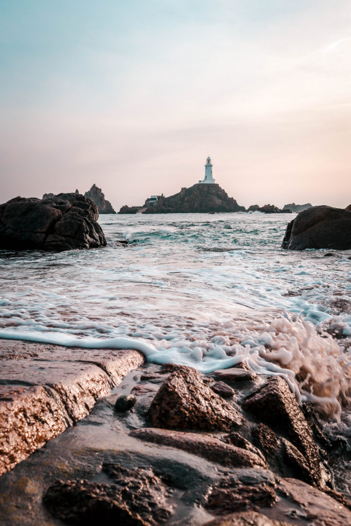
There is a clear similarity within the work that I have produced and Michael Martens too. I ensured that I had a main focal point for the viewer to look at which made the sea change more distinct and easy to see. This is also evident within Martens work where he has a building structure centered in the middle of his image. I took a slightly different route within the composition of my subject. I framed the structure to the right slightly to meet the demands of the rule of thirds which i believe is more aesthetically pleasing. Whilst Marten has a typical one third of sea and two thirds of sky i have opted for half sky and half ocean inspired by Hiroshi Sugimoto. Another difference is the way in which Marten has allowed for similar lighting within the two images where as I have portrayed the changing light throughout the day as well as the changing tide. Thus being reflected through the low tide image being mid day and the high tide image being at sunset.

High tide Shoot La Rocco and Corbiere

After having conducted a shoot at low tide I wanted to return at high tide to show this sense of variety within one place. Personally, I prefer high tide as I believe there is a sense of mystery about what lies beneath the surface. I think it is really interesting to imagine that there is a whole other world under there which makes me appreciate the beauty beyond just the water itself. This links to the ideas of Zen Buddhism and trying to find beauty in everything. For this shoot, I went down to the same locations as the low tide shoot to capture similar images that in post productions i could easily show a comparison.

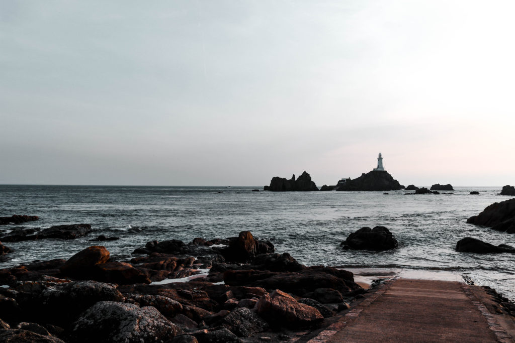
Low tide Shoot La Rocco and Corbiere

Inspired by Michael Martens project I wanted to complete a second shot displaying the large tidal movements here in Jersey. I found it very interesting how significant the sea change plays in changing the landscape causing variation within the same location. The force of nature that is present through the comparison of the low and high tide photos really intrigue me. It is oddly satisfying to see the same landscape with a different sea level which stimulates ideas in my head about the reality we are seeing. With this interest I decided to go to La Rocco and Corbiere to conduct a photo shoot at low tide.

Air Photoshoot

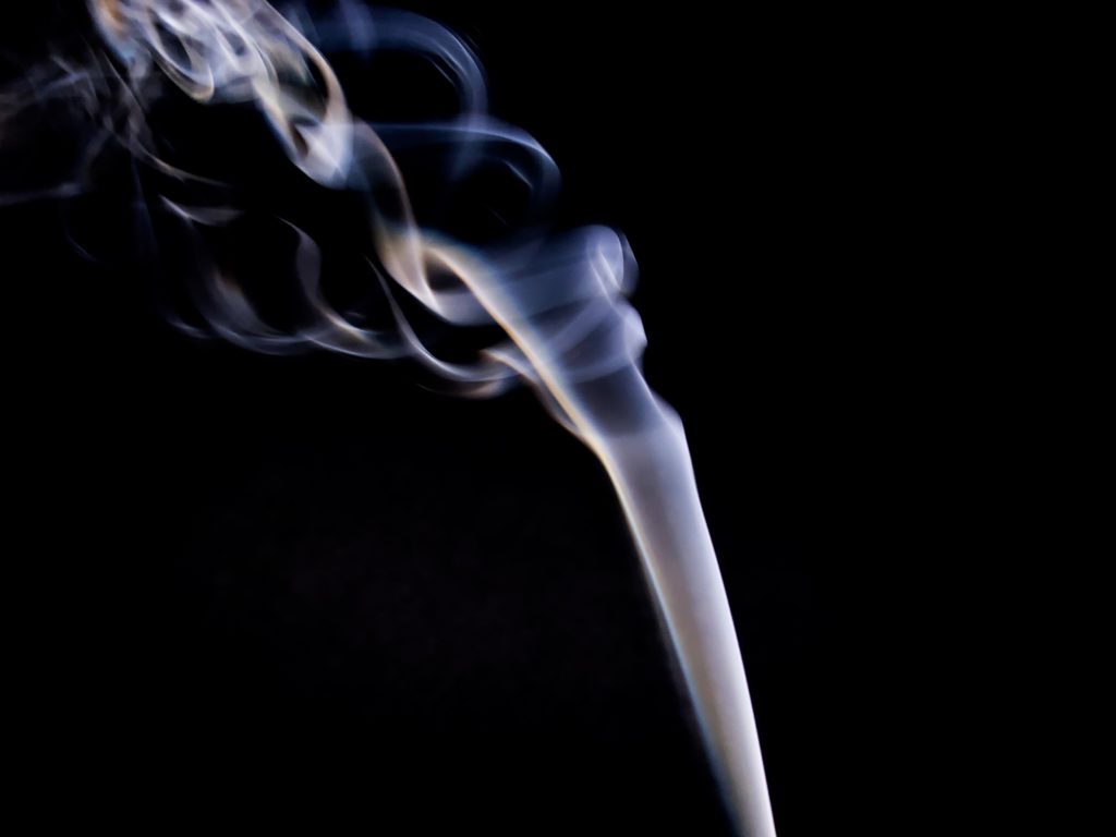
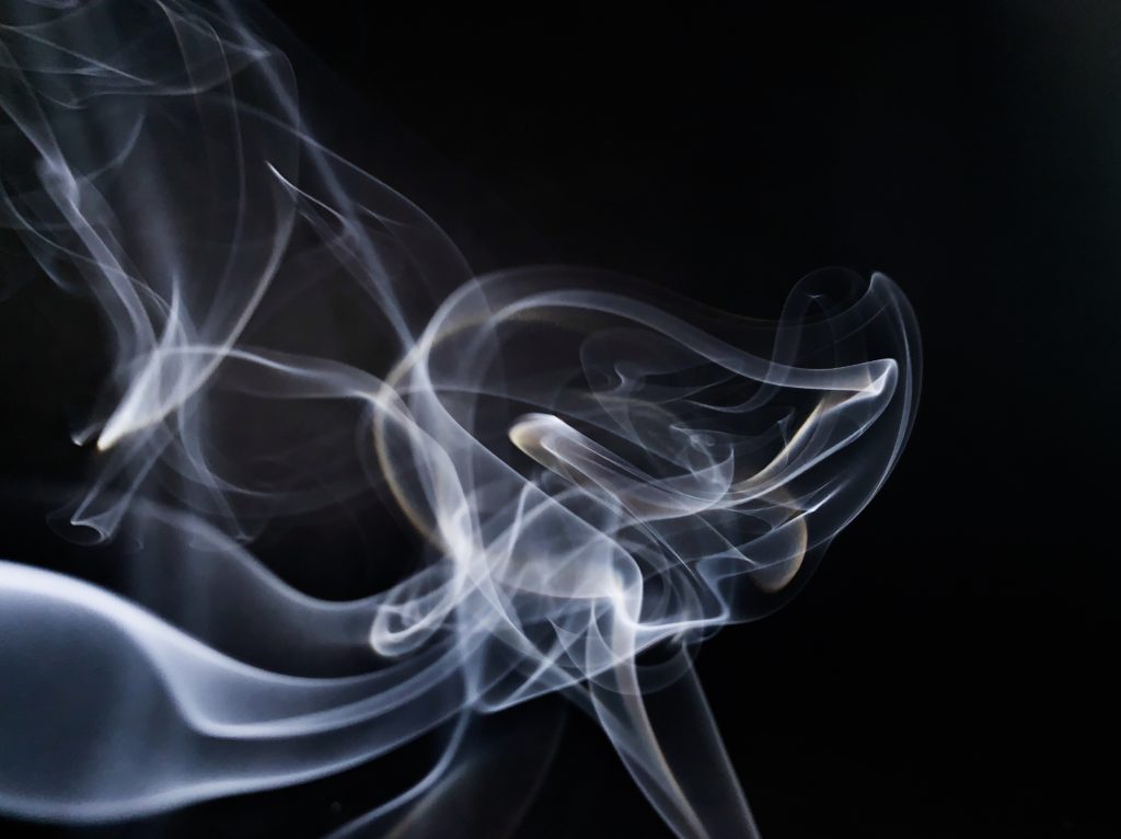
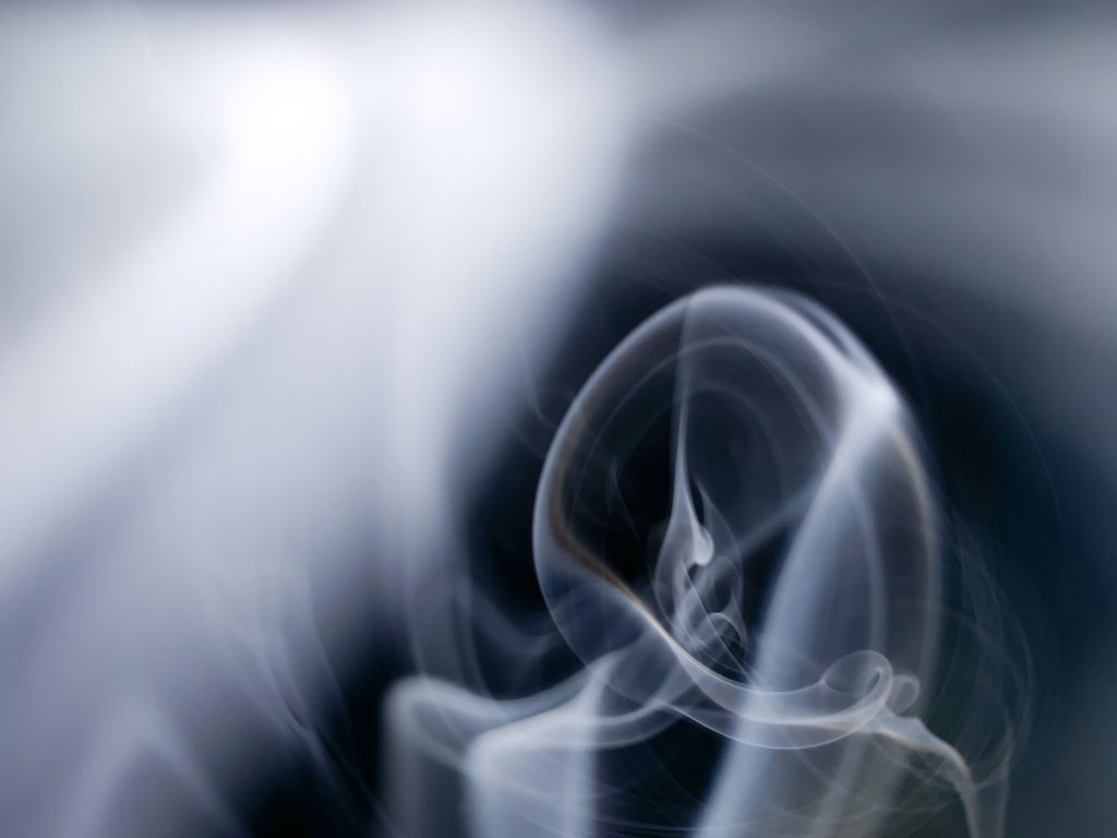
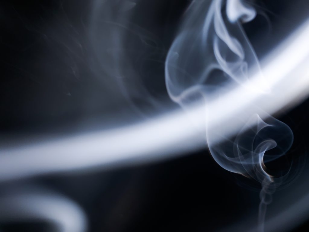
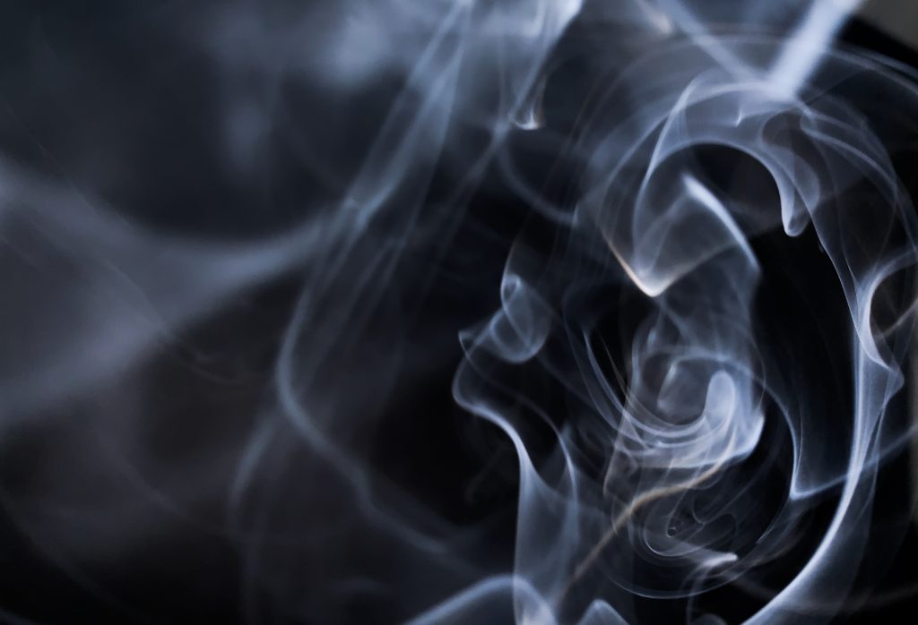
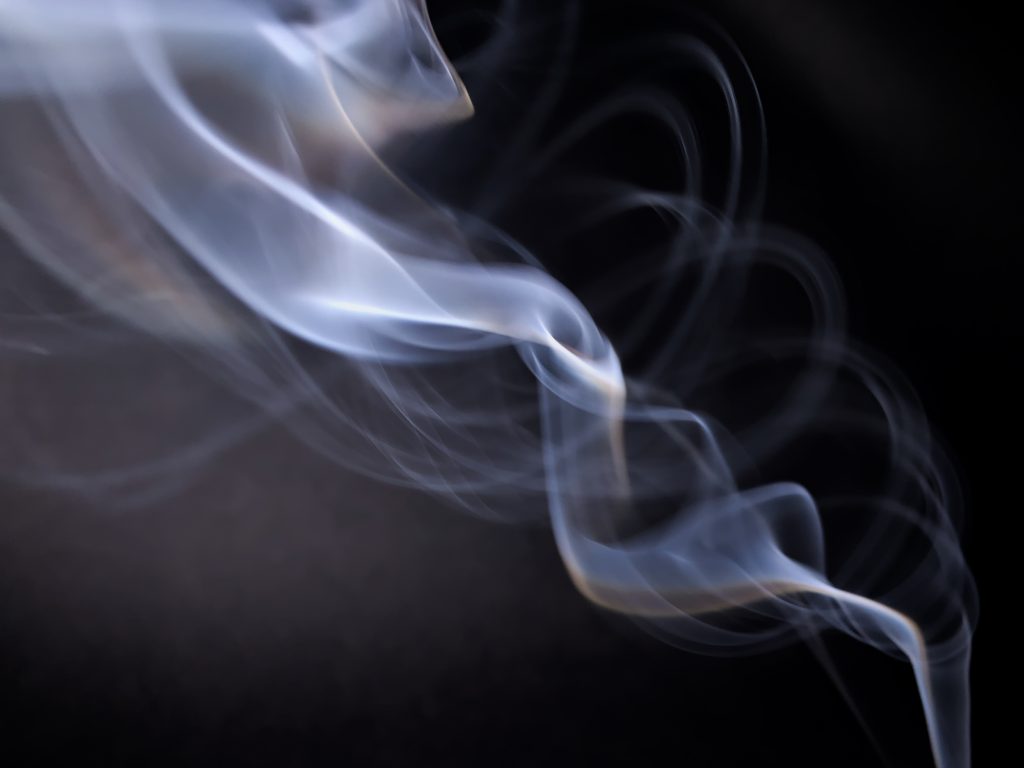
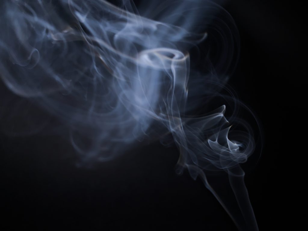
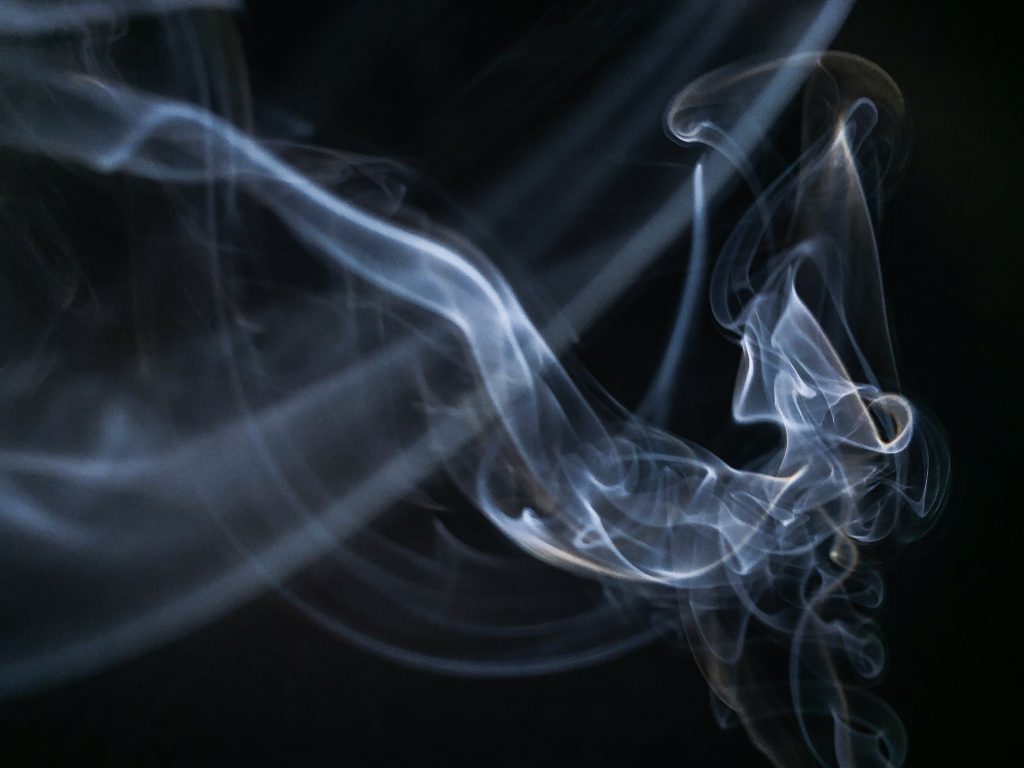
When I first began to think about how to photograph each element I was struggling with ideas of how to photograph air, as it invisible. So I thought of the fact that smoke visualises air. I found some incense sticks that I had in my room and use a backdrop which I had used in previous shoots. For this shoot I had to use my iphone, as my DSLR camera wasn’t able to focus in time to capture the smoke, also when I used the flash it only made the photo overexposed. I edited these images on the Lightroom app on my phone, I didn’t have to do a large amounts of editing only increasing the contrast, vibrance and white balance. This shoot was very successful and I have got a lot of image that I am very happy with, the image that I have created are very contrasting to what I already had for the element of air and had added another perspective of the element.
Book Specification

How you want your book to look and feel

I want my book to be eye catching, i will achieve this by using vibrant and bold colours such as red. The front would be finished in matte to give a clean and professional look and feel.
Format, size and orientation

The book will be in landscape with the dimensions of 25x20cm to fit the average standardised photobook.

Design and layout

The design will vary from page to page to keep each page fresh and different. I will use double page spreads, full bleed and different sized images to create a different atmosphere in shape and colour.

Rhythm and sequencing

Images will be carefully selected to support each other with a strong bond. In this case that bond is colour. Each page will be a different colour from the last.

Structure and architecture

image sizing and shape will vary thought the book. To keep every page unique and important.

Narrative

The narrative of my photo book is based around colour and shape by photographing and pin pointing areas and objects, with vibrant colours, and then capturing those images through carefully thought out shoots throughout London and creating juxtapositions between the images to make the viewer compare the similarities between the two varying images.

Title: The Colour And The Shape

Images and text

There will only be text on the outside of the book, this writing will be my title. I want a bold interesting title so i went with The Colour And The Shape after carefully selecting the most suitable title for my photo book. The text will be in black so that it contrasts with the yellow and red.

Colour and B&W (or a mix)

My photo book will include images of colour only. As this is the main aspect of my photography. Although there will be some dark contrasting images and background colours.

Paper and ink

I will use a matte finished paper texture as it feels smooth and professional. Colour ink will be used to fill in blank pages pages with colour to make the book burst with colour.

CRAIG STECYK

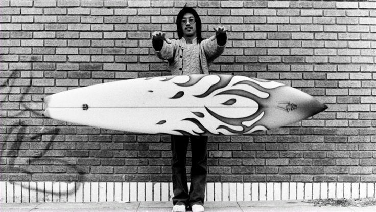
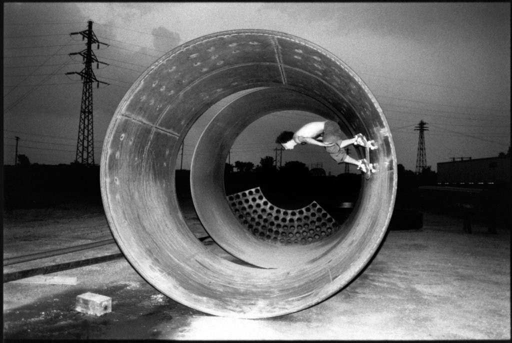
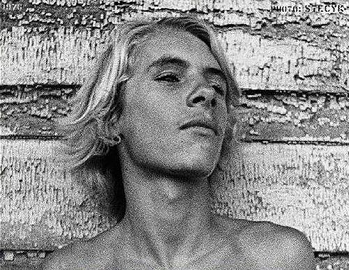
Craig Stecyk is an American artist, photographer and writer. He is mostly known for his conceptual art pieces of the 1970s and ’80s, and for documenting surfing and skateboarding culture in particularly via a series of influential articles for Skateboarder Magazine in the mid-1970s describing the innovative developments of the Z-Boys skateboarding team. Stecyk created designs for the skateboard brand Powell-Peralta, having coined the name of their team, the Bones Brigade, and produced advertizing photographs. Stecyk coined the phrase “Skate and Destroy.” Stecyk was also involved with the founding of the Jeff Ho Surfboards and Zephyr Productions surf shop in Santa Monica, California.

This black and white photograph is of group of skateboarders in the suburbs in New York. This gang image looks to be very grainy and raw which could suggest that this images was taken on film. This documentary style image captures these boys posing in front of the camera in the middle of the street which could suggest that they could be causing havoc whilst skating round. This would link to typical stereotypes of skateboard gangs as they are usually portrayed as causing trouble within populated areas due to skateboarding in areas where they shouldn’t. This image was taken with dull natural lighting due to the fact the the tones and shades of their surroundings are very dull and also the characters themselves. Furthermore, this image projects different races interacting with each other. The three dark skinned boys and the white boy look to be part of the same group which could possibly challenge typical stereotypes as white people usually think they are a superior race and don’t hang out with different races however it is not seen like that within this image as they look to be part of the same group. A fast shutter speed was used as within this image the subjects that have been captured are clear and are all in focus and allows for the reader to focus on more than just the main subjects at the front.