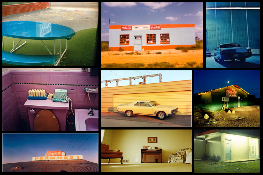
For this shoot I wanted to create a response to the work of Engleston due to his focus around the idea of tone and colour within urban and natural environments. What I found most interesting within his photography was how in most of them there is an overall sense of a single colour such as yellow or red, this has inspired me to create work that relates through the use of incorporating an overlay which can be vaguely seen in each picture. As a result of this I hope to achieve a new style of photography where I can this underlying saturation to produce outcomes for the photos and possible photography book in the future. Using Eagleston as my main source of inspiration I have decided to have a look at some of his works which I found to be of particular interest:
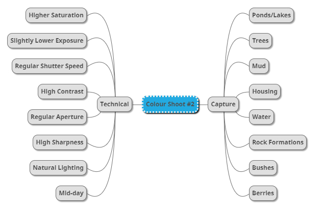
After I had looked over some of his more inspirational work I decided it was nearly time to go ahead with the shoot itself. Before doing this however I would need to create a mind-map, by doing this it would allow me to express my ideas and intentions of what I want to achieve in the shoot. Creating a mind-map not only would help direct my aims of the shoot but also reduce time wasted from deciding there and then what to do and take. Here are some of my ideas on what I want to produce during the shoot:
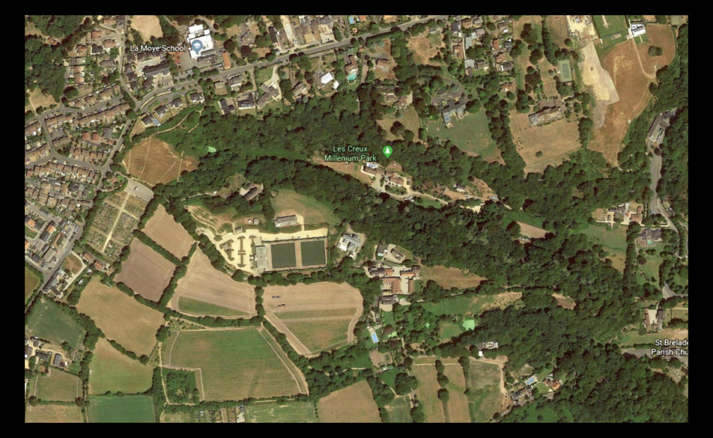
Once I had completed my mind-map I then decided that I would move onto the shoot itself. Using this my ideas noted above as the basis for my goals in the shoot I decided to photograph the area of Les Creux Millenium Park due to the huge range of landscape it possessed in the surrounding area, ranging from houses, fields and woods. A map of the area can be seen below:
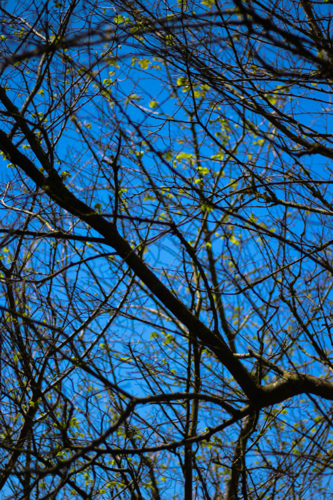
Here are the results of the shoot:
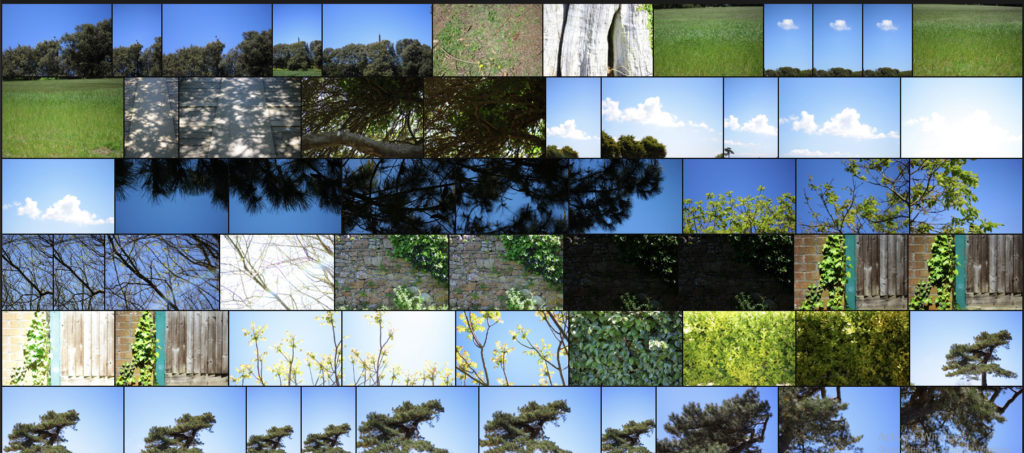
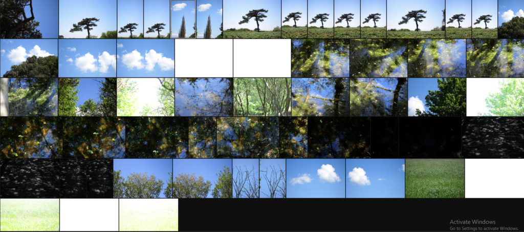
Once I had completed the shoot I then decided to go onto whittle the selection of images down to only ten. By doing this it would make it easier for me to identify which images reflected my intentions for the shoot the best and which ones had the best relevence for my topic. Here is my selection for the ten best images of the shoot:
After I had selected the ten best images I then decided that I would move onto choosing fives images that out of the ten reflected my intentions the most and had the best overall sense of aestheticism. To do this I would have to look at technicality, visual aspects and context. Here are my choices:
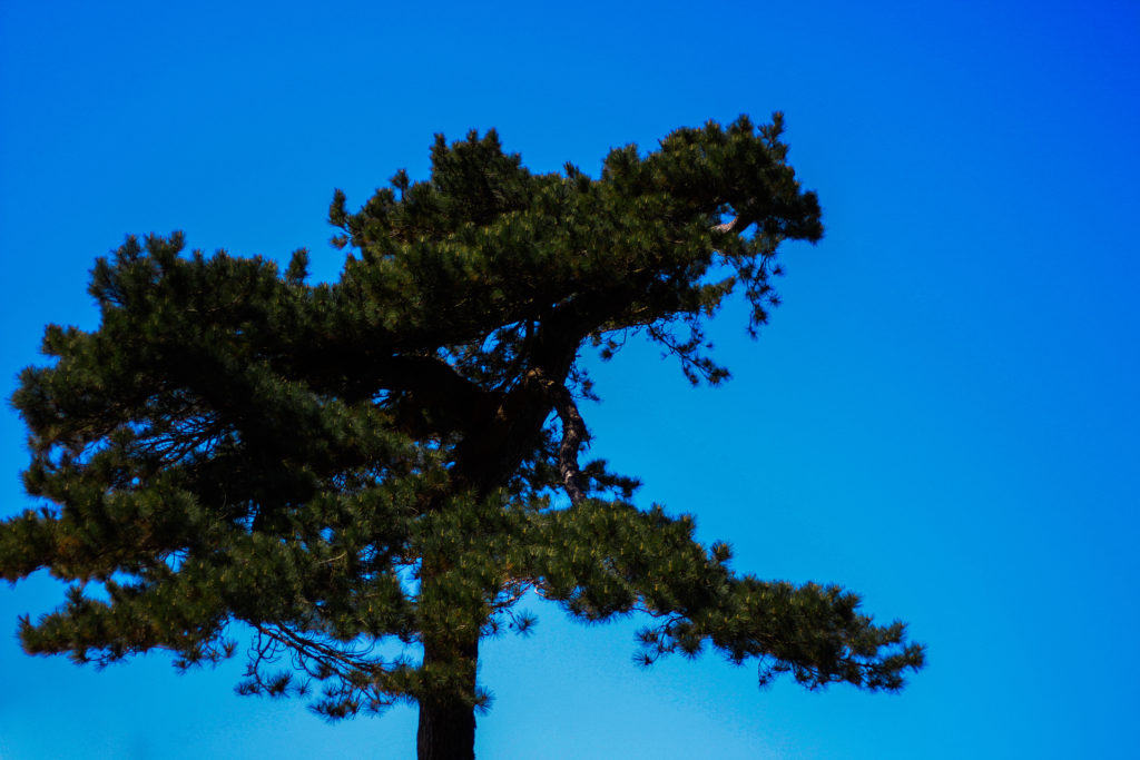
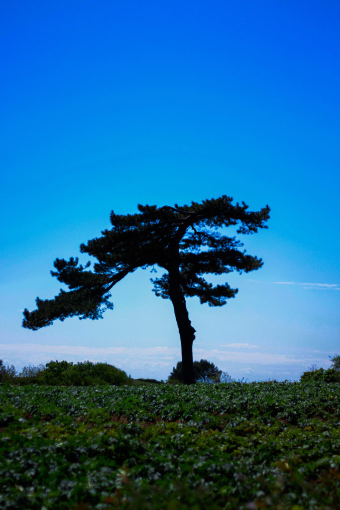
I selected this images because I really liked the defined contrast between the overly blue sky and the unusual shape of the tree. For me the green and dark browns contrasting the sky made the image the most effective due to how they are complimentary colours and so work well side by side producing an aesthetic reault. Composition wise I found that the tree being slightly on the left allowed for the end result to be more impacting because of the way it arches over the landscape filling more negative space in a more unusual way. In relation to the topic of variation of abstraction the image related well as I separated the tree from its surroundings allowed for a unique perspective to be viewed of it where it becomes isolated from its surrounding environment.
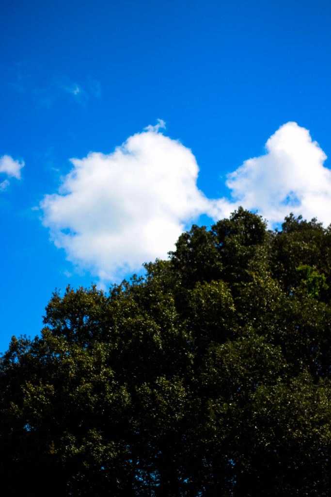
For this image the reason I selected it was because of how the blue sky and tree were complimented by the cloud which sort of transitions into the tree itself whilst merging into the blue around the corners. By the clouds taking over the negative space for me it allowed for a more effective use of the sky due to it otherwise being a bland and boring picture, however the inclusion of clouds prevents this and instead allows for an aesthetic result which could work well in a set of three. In relation to the topic the image goes well as it is evidently saturated too much which as a result produces a more abstract effect which in a way prevents viewers from seeing the tree as it once was, instead looking at it in a new light.
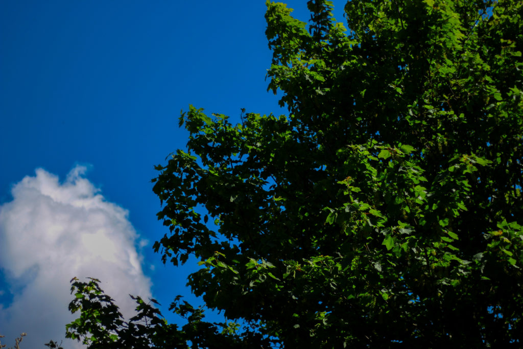
What I liked about this images was the contrasting overly saturated colours that overpower the image. For me this works really well as the image in a way is divided into two sections, one being the sky and the other nature, however I really liked the implementation of the cloud which breaks up the two dominant colour from becoming too overpowering and ruining the piece. As a result of this the cloud enhances the two colours creating an aesthetic result due to both the tree and the sky being in proportion to each others saturation. When looking at the image in regards to my topic of abstract variations I think that it goes well with the rest of the images taken due to how they all present a similar vision where there is a sense of overpowering colour which seem too surreal to be real.
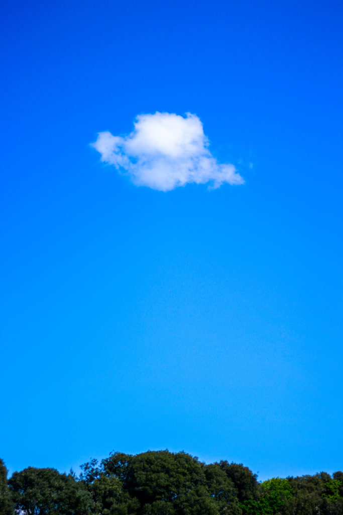
What I loved about this image was its overall simplicity. This is done through a very minimal way where there are only three small aspects to the piece being the cloud, trees and sky. For me they all compliment each other nicely due to how the green and blue contrast with the symmetry of the cloud being in the centre adding too effect from a sense of artificial aestheticism that is created. Overall once again symmetry is the key aspect to this photograph as the cloud be placed directly in the middle adds to effect as its almost as if it was placed there from its unusual position. For me this links greatly to the topic as the colours are so enhanced combined with the weird composition which as a result ends in a abstract portrait of the sky in a block minimalist way.
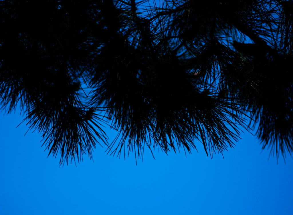
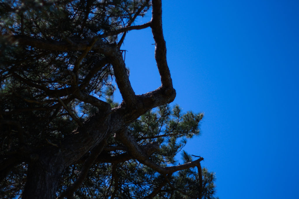
Finally I selected this image because of the huge contrast between the pines and sky which create a silhoutte of the leaves, isolated it from its environment and portraying them in a way that makes them seem as if they were something else. This contrast for me works well with an image in the previous colour shoot which I think when looking towards planning a photo-book would work well due to its similar qualities. As a result this image relates well to the topic but has been selected really in relevance to how it can be linked to the previous shoot in which silhouette of trees can be seen against a harsh blue backdrop.
After looking over all five images it allowed me to come to a conclusion to which images worked well in relation to the topic of abstract variations (this shoot being colour). By looking in depth at each image it allowed me to sum up its qualities as a reflection of my intentions not only to the shoot but the overall topic. This is my final choice for the image that best represents the entire shoot:

The reason I chose this image as the best reflection for the overall intentions of the shoot is because of how I loved the way the composition of the piece induced a sense of an artificial landscape in which it seems almost too surreal to be real. For me the vivid colour combined with the symmetrical composition of the tree really tie the photo together as each aspect of the piece compliment each other which preventing the others from overpowering and ruining the picture from becoming too eye-sore.

