In this shoot I have displayed images where I have tried to focus on close up aspects on the environment that may not be as noticeable, especially on bold colours that stand out from the background of the image, drawn from abstract concepts. I also focused on lines and patterns made from branches. I think that this second photoshoot at Queens valley was successful in me discovering the full concept of my project concerning the relationship between nature and humans.


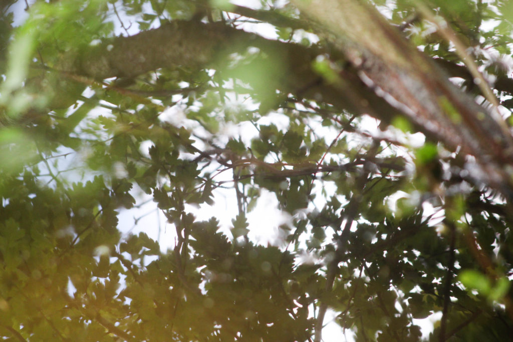
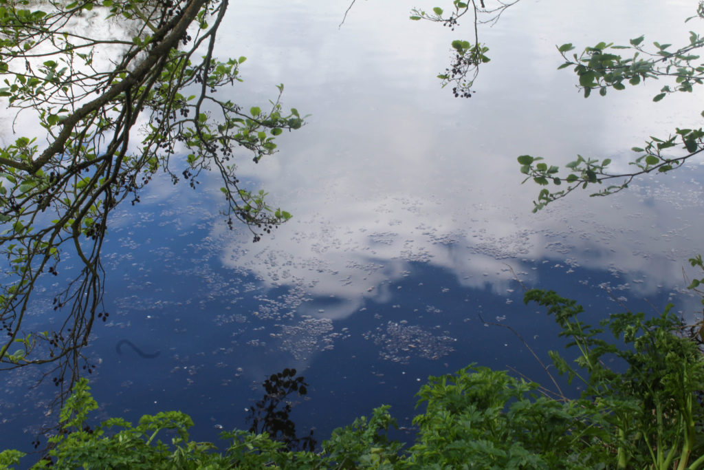
This is one of my favourite images from this shoot. I especially like how the whole image is filled with patterns and texture. I tried to focus on light and the soft colours, so zoomed in on the reflection of the trees on the water and had the leaves close up to the camera so they are blurred, creating a relationship between the camera and nature. I think that this draws on the concept I want to explore of the relationship and connection between humans and nature. By taking the photo within the plants and trees it creates the illusion of being completely surrounded by natural world as the entire frame is filled with natural objects. By focusing on aspects of light on the water reflection, and even in the close up leaves in the left corner, I think this image really draws from ideologies of spirituality and nature being connected in many ways. This is a concept I want to explore and research more in my project to get a better understanding of how nature and humans are connected in ways that many people may not know.
I also like the composition of this image and how the branch in the right corner is out of focus, but creates a break in the image and adds another aspect to look at. I think what makes this image stand out to me is the contrast of the bright white reflection from the sun on the water thats contrasted with the natural green and brown tones surrounded it and reading interesting patterns. I also like how the leaves from the plants that are surrounding the camera are only shown in the reflection of the water.
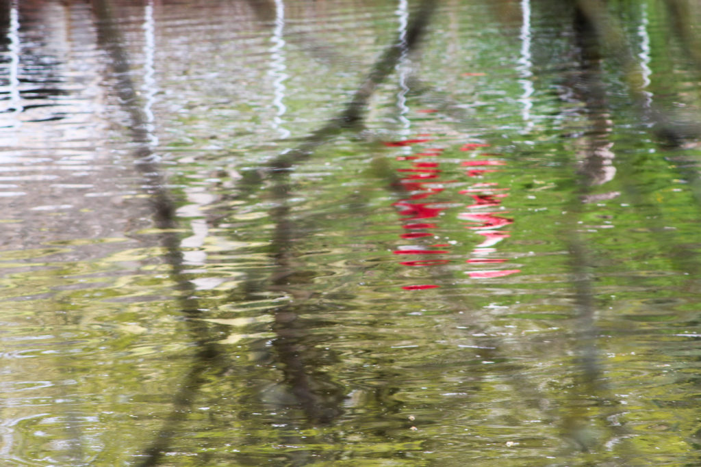

I also tried to focus on bold colours that were different from the surrounding landscape, which I think these two image above do well. The first image is of a reflection of a person walking along the path in a reflection. I chose this as an image to display as I don’t think its easy to tell that the red reflection is a person. I also liked how the red colour was completely different to the surrounding greens and browns, reflecting ideologies of abstract. I also think that the branches in front of the camera that are out of focus create another aspect to the image that makes it more interesting, and creates a similar effect to the first image in my shoot, where the camera is immersed in the nature, creating the the appearance of being surrounded by the natural world. I also think this reflects the theme of humans and nature being connected, as in this image an reflection of a person is shown on the reflection on something natural, connecting the two together.
In the second image I liked the bright orange colour and the shape of the leaf contrasting against the white and brown background. What makes this image more interesting is that patterns created from the sky in the reflection water, the white colour contrasting to the patterns of orange and brown in the image. I like the composition of the leaf in the foreground and the blurred background that is divided into sections of darker and lighter. One aspect I don’t like about the composition is how the second of the orange leaves is half way out of the frame, which doesn’t create a as aesthetically pleasing image to me. Although this composition may be interesting to use in my final images as I normally take images symmetrically or which fit in the frame aesthetically, this image contrasting from what I usually do. I think that the orange colour in this image really emphasises the spirituality of nature and plants, as it stands out from the less bright background of brown, focusing on a smaller aspect of nature and it’s ethereal beauty.

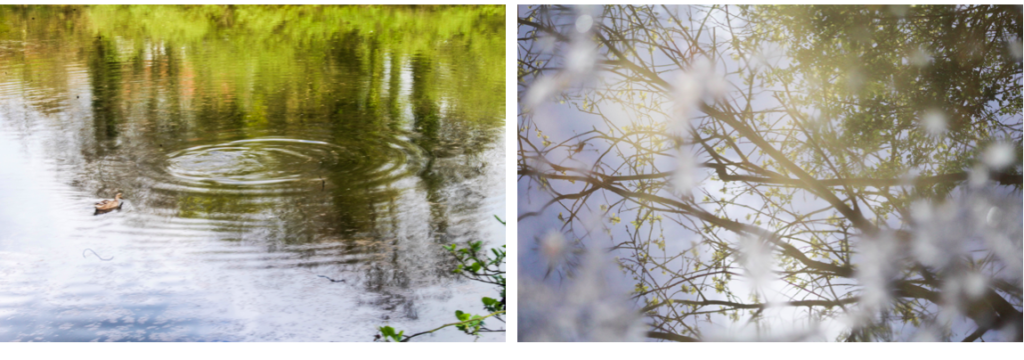
This image stood out to me when selecting my final images for this shoot as I think that has a simplistic and calm appearance that not many of images had. I think this is because in this image the lines/ripples in the water are repetitive and consistent, whereas in most of the other images, I photographed things in the landscape which were more unusual meaning that the patterns and lines were not consistent and more disorderly. I this image the ripples start light towards the foreground of the image and gradually become darker towards the background, creating a more aesthetically pleasing range of colours and composition. What makes this image interesting is the duck which is placed in a unusual place in the frame. Instead of photographing the duck towards the centre of the image, i decided to place it at the top left corner so both the ripples in the water and the duck are seen. I think that this image also reflects ideologies of spirituality and nature through the ripples made by the duck in the water and the undisturbed, tranquil appearance which further emphasises the peaceful nature.

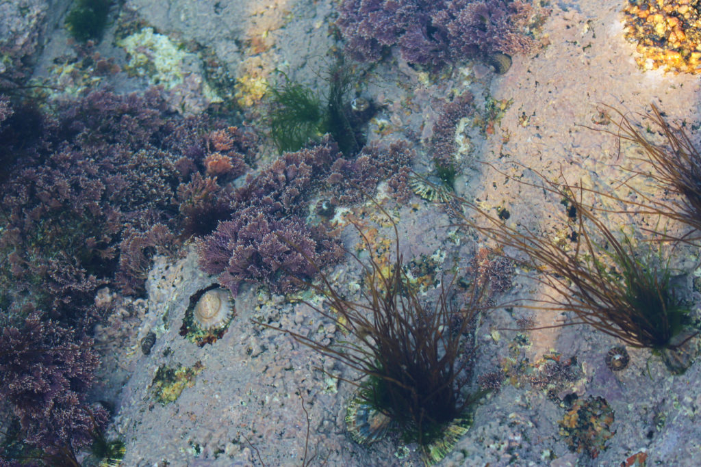
I think this is an interesting image that builds from some f the images I took in my first photo shoot of the same type of water plant in a different area. In my first image i only focused on the plant, with the surrounding water being flat, whereas in this image the plant is surrounded by leaves and sticks fallen from the surrounding nature. This creates an interesting pattern that contrasts from the vertical green lines of the plant coming out of the water. I focused on only photographing one of these plants as i wanted it to seem out of place within the background of the image which is what I think I achieved. In comparison to the background the green tones of the plant are bright an is similar the second photo in this shoot, focusing on a smaller aspect of nature and it’s ethereal beauty. I also like how this plant is growing out of the water as I think it reflects concepts of new life and nature having a spirit.


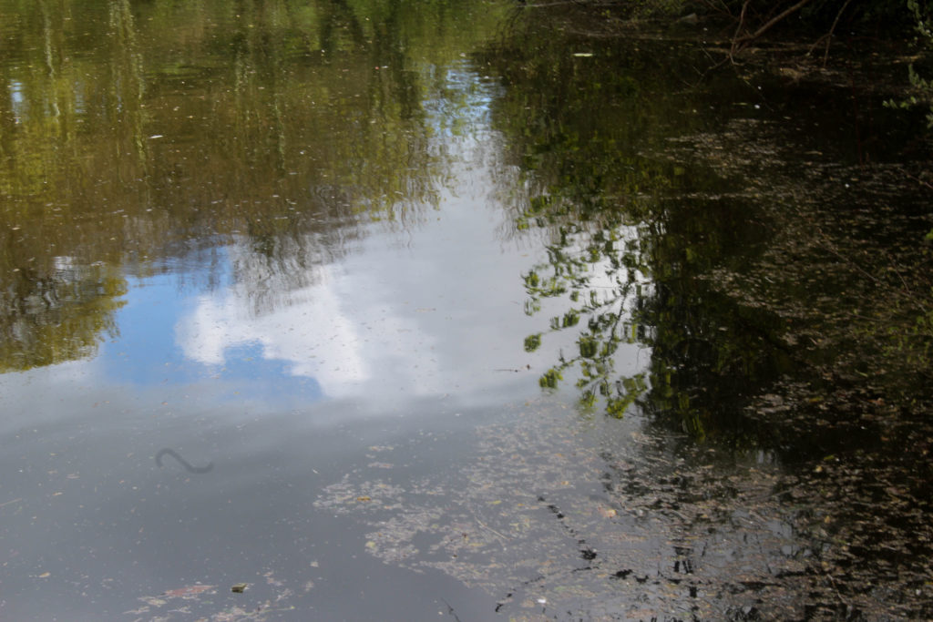
I also decided to take a photo in the same place as my second photoshoot of the reflection of the same plant, as I was interested in how an image of the same natural object can look so different at diffrent time of the day and with different weather. On my second photoshoot the weather was slightly cloudy and overcast, whereas for this shoot the sky sky was blue, which is why the reflection on the water creates a different appearance for the image. I tried to photograph this emphasising the light and the reflection of the blurred white cloud against the water as I think this creates an image that is more spiritual and focuses on the beauty of nature.
Abstract Reflections
In this shoot I also focused on shapes in the landscape that had sections of bold colours, as I wanted to explore ideas of abstract more and thought that by photographing reflections in water creates a distorted appearance of bright colours. The weather on this shoot was good as the bright blue sky contrasts against the clouds in the sky, which I could then juxtapose to the colours in the landscape.


For this image I used a slight longer exposure than the rest of the images when photographing abstract shapes. I think this was effective as it captured the slight movement of the water which made the clouds look less like a reflection and more like part of the water which I think adds to the spiritual quality of it. I like the composition of how mage is framed by the surrounding plats, especially on the left side where the branches from the trees goes close to the water. I also like how the bottom section shows a different type of plants that is more green and is apart of the plants on the ground. I think that this contrast between the green of the leaves and the bright blue and, that is the sky reflected on the water, is effective. It creates sections within the image of different colours with different patterns that I think reflect abstract art and photography.
Andrew S. Gray

I think this shoot also reflects the work Andrew S. Gray similar to my previous shoot, as in some of his landscape images he captures bright solid sections in his blurred photos. In this shoot where I looked at abstract shapes I think that the solid colour sections reflects Grays work. When editing these images I could alter the hues in the natural aspects to be more brightly coloured and abstract. One difference between both out images is that in some he doesn’t pick up the details of the landscape (like the image on the left whereas in my images I still includes the patterns, shapes of leaves and light reflection on water as I thought that these elements were necessary. I didn’t try to blur the images in these shoot, like my previous shoot, as I wanted to try interpreting his work in a different way.
Experimentation: Warm vs Cool


When editing these images in light room and photoshop I tried to emphasise the warm tones and cool tones by creating different variations of the same image, looking at orange, red and blue tones. I think for this image, emphasising the warm tones orange and red was more effective as I feel it further emphasises the spiritual quality that the image has. The colours yellow, orange and red remind me of positive emotions rather than negative. For example, the colour yellow. Nearly all cultures tie this colour to a sense of warmth, both physical and emotional. In Japan it represents bravery. Many religious groups, particularly those from Ancient Egypt and in Hindu tradition align the colour yellow with the Divine. Consider that the halos of the angels typically appear in a yellow or gold colour. Spiritually speaking it represents the element of fire, our sense of vision, energy, harmony and personal identity. Orange is sacred in Hinduism. It is in the Fifth Ray of 7 that classifies humans mystically. In general symbolism, orange brings happiness and health into our lives. In the Tarot it symbolises the intellect and spirituality. Cool colours i.e. blue is often connected with spiritual studies, meditation, and Magical practitioners use blue or purple to represent the Water element. To me the colours orange and red make the image have a warmth and spiritual quality that couldn’t be achieved with cool colours. I also like how this image the close up leaves that are are out of focus from being close the camera are still noticeable and are emphasised with the colour yellow. Because you can see through these sections, it makes the leaves look transparent and emphasises the range tones in the image. The cool editing has a different appearance and an atmosphere thats calming and tranquil, creating a more peaceful image.
Wassily Kandinsky Work

My image above reminds me of this artwork by Wassily Kandinsky through many different aspects. One way is through the colours used, ranging from blue, to orange to red, similar to me editing where I emphasised the cool and warm colours. I also think it links to this piece through the shapes and lines. In my image the reflection of the leaves on the water show the light shine through the leaves, creating circular and interesting shapes, which I think are shown in Kandinsky’s painting where he emphasises circular shapes and rounded lines. The rounded shapes in my image are the small branches that are shown to be above the water, contrasting against the pattern of the leaves the water. One difference between mine and Kandinsky’s painting is that he uses abstract shapes with geometrical patterns, my image does not contain these as they are not shapes that are created in nature and represent Kandinsky’s theories in his book ‘Concerning the Spiritual in Art’ where “This essential connection between color and form brings us to the question of the influences of form on color. Form alone, even though totally abstract and geometrical, has a power of inner suggestion. A triangle (without the accessory consideration of its being acute — or obtuse — angled or equilateral) has a spiritual value of its own.The case is similar with a circle, a square, or any conceivable geometrical figure” I think I could further emphasise these theories in my future work. For example I could like at different shapes as Kandinsky believed that “The mutual influence of form and color now becomes clear. A yellow triangle, a blue circle, a green square, or a green triangle, a yellow circle, a blue square—all these are different and have different spiritual values.”


“Like symphonies, Kandinsky’s great abstract paintings speak directly to our senses and feelings. Their constellations of mysterious marks are like waves of sound that trigger emotions.” For him, the world they pointed towards was a spiritual realm, a hidden truth. I think that some of the images in this shoot, especially the ones where I focused on abstract landscapes, reflect some of Kandinsky’s earlier work where he focused more on landscape. For example in Kandinsky’s painting above, he used tones of the same colour in different sections of the painting, which I think is reflected some of my images, especially when I edited them to have different hues. The difference between these images are that Kandinsky focused on landscapes whereas I looked at reflections on water because I thought that the distorted image of the aspects in the landscape would be effective.