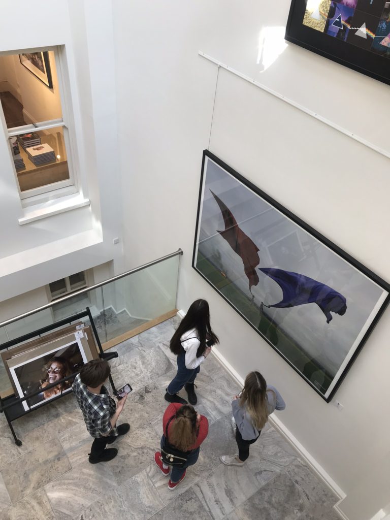
Behind the Lens
This exhibition featured the works of Carinthia West, Mike McCartney and Rupert Truman. The exhibition explores Britain in the 1960s-70s when Rock and Roll made its revolutionary impact on music.
Carinthia West is a photographer and journalist, whose credits include Marie-Claire, Harper’s and Queen, Harper’s Bazaar, Tatler, the LA Weekly, The Independent, The Telegraph, Saga and US magazines, covering travel, lifestyle, humour and (her least favourite subject!) the celebrity interview. She has been friends with some of the 20th century’s greatest names from music, film and society. Anjelica Huston, Mick Jagger, George Harrison, Ronnie Wood, Robin Williams, Paul Getty Jnr, Neil Young, Helen Mirren, David Bowie, Paul Simon, Bonnie Raitt, Carly Simon, James Taylor, King Hussein and Queen Noor of Jordan, are just a few of those she photographed at both casual and private, intimate and poignant moments in their lives.
Mike McCartney was born in Liverpool 1944, he is a British performing artist and rock photographer and the younger brother of Paul McCartney. He attended the Liverpool Institute two years behind his brother. He was a photographer during his entire musical career, and has continued with photography since then. Beatles’ manager Brian Epstein nicknamed him “Flash Harry” in the early 1960s because he was always taking pictures with a flash gun. He has published books of photographs that he took of The Beatles backstage and on tour, and he recently brought out a limited edition book of photographs he took spontaneously backstage at Live8. In 2005, McCartney exhibited a collection of photographs that he had taken in the 1960s, called “Mike McCartney’s Liverpool Life”, both in Liverpool and other venues, such as The Provincial Museum of Alberta. In addition, an exhibition book was published of the collection.
British photographer Rupert Truman began working with Storm Thorgerson in the late 80’s shooting most of the studios output. When Storm died in 2013 he left the StormStudios to Rupert Truman, Peter Curzon and Dan Abott. They have collectively created album covers for some of the most celebrated bands such as Pink Floyd, Biffy Clyro, Muse, Pendulum and The Steve Miller Band to name a few.
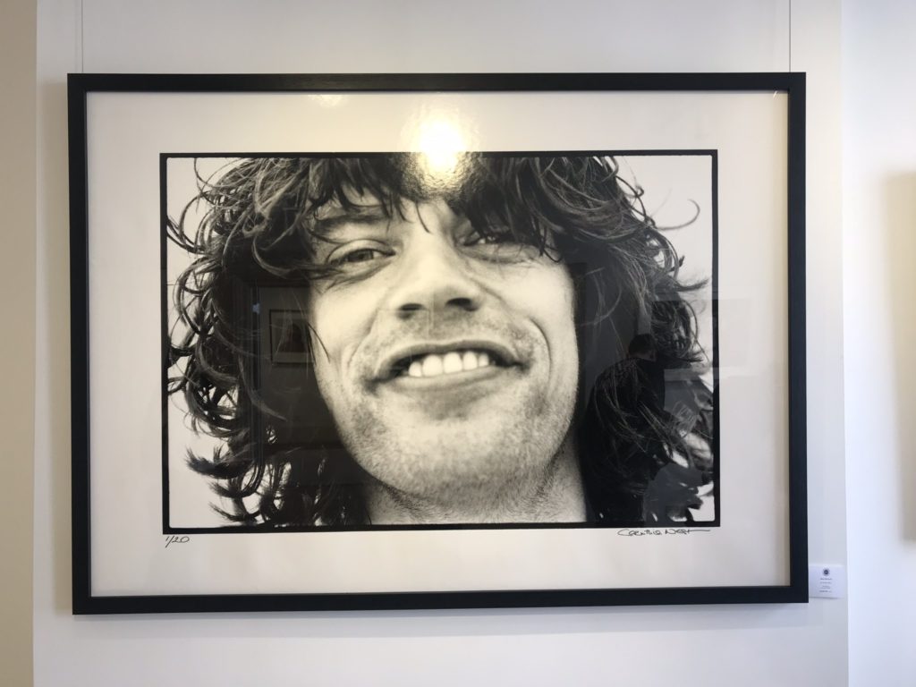
My favourite image from this exhibition depicts Mick Jagger on Malibu Beach in 1976. The image is a black and white cropped headshot. Although simplistic, this image appeals to me as it appears relatable in that Carinthia West captures casual moments when spending time with her friends. The freedom of capturing with little time to compose or adjust settings gives the image a feeling of spontaneity. The image is also one of Carinthia’s favourite shots as a result of nostalgia:
“Not only does Mick look incredibly relaxed, but the day-old growth reminds me that he had probably been up all night, jamming with other musicians at Ronnie Wood’s Malibu Beach house. I took this shot in the early morning after one of these sessions. See if you can spot the diamond flashing in his smile.”

My least favourite image from this exhibition is the album cover of Biffy Clyro’s Opposites, produced by Rupert Truman. The reason I do not like this image as much as the others is due to the combination of reality and simulation, I cannot tell what is real in the image and what is fake. After researching the process, it becomes more clear. The cover is supposed to depict the oldest living tree in the world, located in Chile. Biffy Clyro’s Simon Neil said: “I loved the original image of the tree, and I got thinking about how strong the roots must be, and how strong my band is”. They decided to include variations in the different albums by having two different locations with different objects hanging upon them: one to represent the interconnections of things – tree of life, positive – and one to represent the disconnectedness – tree of death, negative. So, mirrors which reflect, and scissors which sever. Biffy Clyro suggested the bones, to make a third variation. The tree had to be man made and taken to Iceland or it wouldn’t be the same tree on both albums. The hanging objects are central – many cultures have them – often called votive or wishing trees, intended to warn visitors of sacred ground or as offerings to appease the gods.
Pop Icons
The next exhibition we visited reflected on the Pop Icons of the 20th Century through British & American Pop Art, exhibiting artworks by Andy Warhol, Roy Lichtenstein, David Hockney, Peter Blake, Robert Indiana, Tom Wesselmann, Eduardo Paolozzi, Patrick Caulfield and Allen Jones.
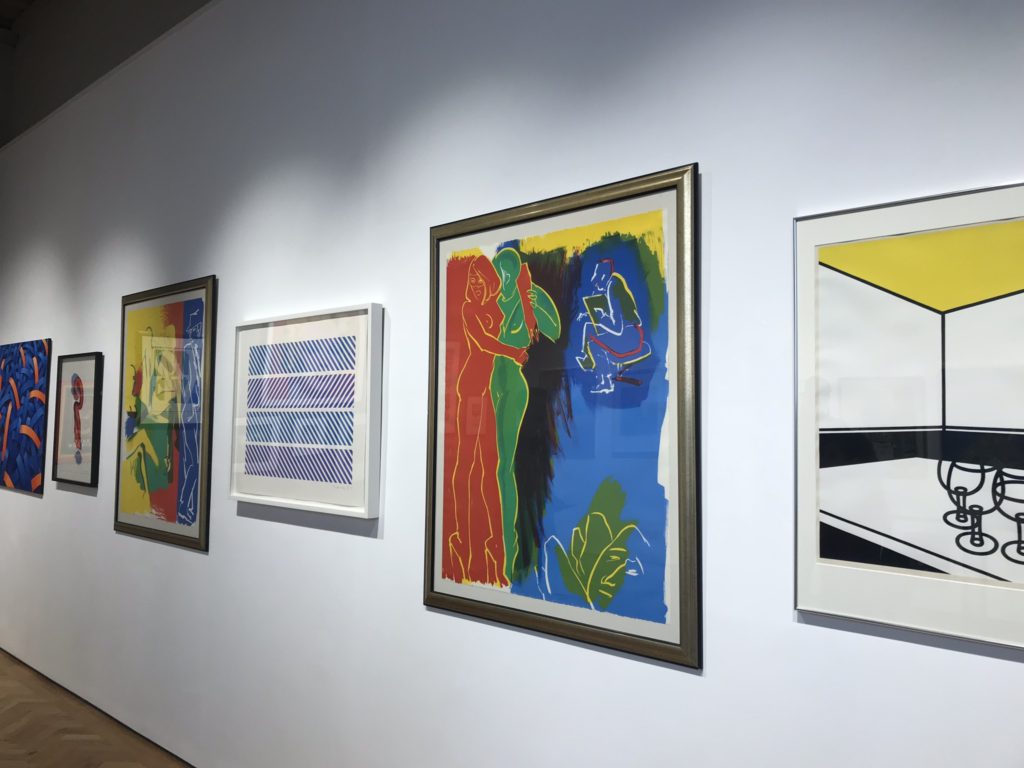
Emerging in the mid 1950’s in Britain and late 1950’s in America, Pop Art reached its peak in the 1960’s and went on to become the most recognisable art form of the 20th century. It began as a revolt against the dominant approaches to art and culture and traditional views on what art should be
Young artists felt that what they were taught at art school and what they saw in museums did not have anything to do with their lives or the things they saw around them every day. Instead they turned to sources such as Hollywood movies, advertising, product packaging, pop music and comic books for their imagery.
Although they were inspired by similar subject matter, British Pop Art is often seen as distinctive from the American version. Early pop art in Britain was fuelled by American popular culture viewed from a distance, while the American artists were inspired by what they saw and experienced living within that culture. In the United States, pop style was a return to representational art (art that depicted the visual world in a recognisable way) and the use of hard edges and distinct forms after the painterly looseness of abstract expressionism. By using impersonal, mundane imagery, pop artists also wanted to move away from the emphasis on personal feelings and personal symbolism that characterised abstract expressionism.
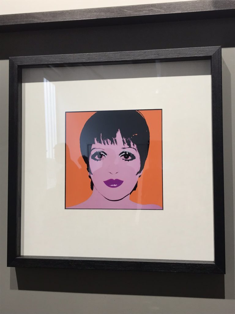
One of my favourite pieces from this exhibition was created by Andy Warhol. One thing I like about his work is his ability to choose the right colours depending on who he is portraying. Liza Minnelli was a friend of Warhol’s, even going on to create a collection of his works worth over $40 million. Her short black bangs, large dark eyes outlined with heavy makeup, and full lips painted a dark red stood out in the print even before they were transferred to silkscreen, which would simplify them even further.
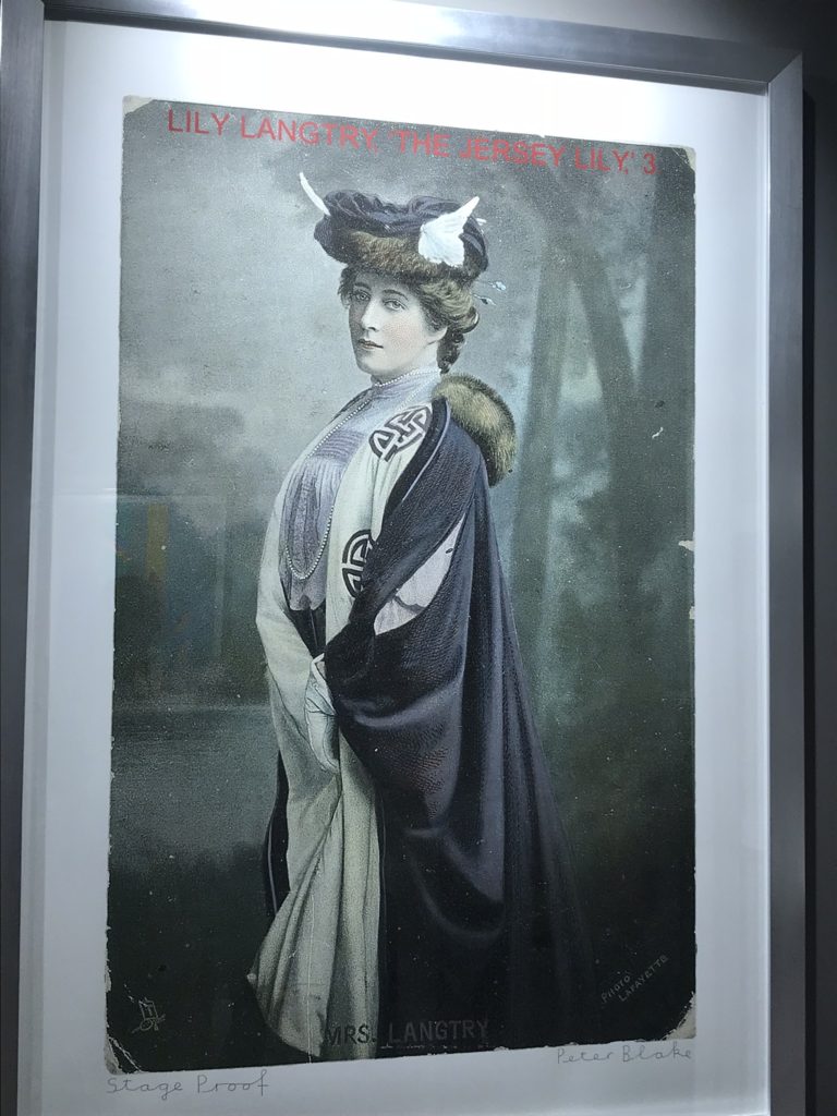
One of my least favourite pieces is this portrait of Lily Langtry, produced by Peter Blake. As I was not familiar with the history of Lily Langtry, the meaning behind the image became less significant to me. However, after researching, I am now more interested.
Emilie Charlotte Langtry, nicknamed “The Jersey Lily“, was a British-American socialite, actress and producer in the late 1800s to early 1900s. Born on the island of Jersey, she was known for her looks and personality which attracted interest, commentary, and invitations from artists and society hostesses, and she was celebrated as a young woman of great beauty and charm. She was the subject of widespread public and media interest.
Being Human
The final exhibition showcases Feminism and represents the artwork of local female artists.
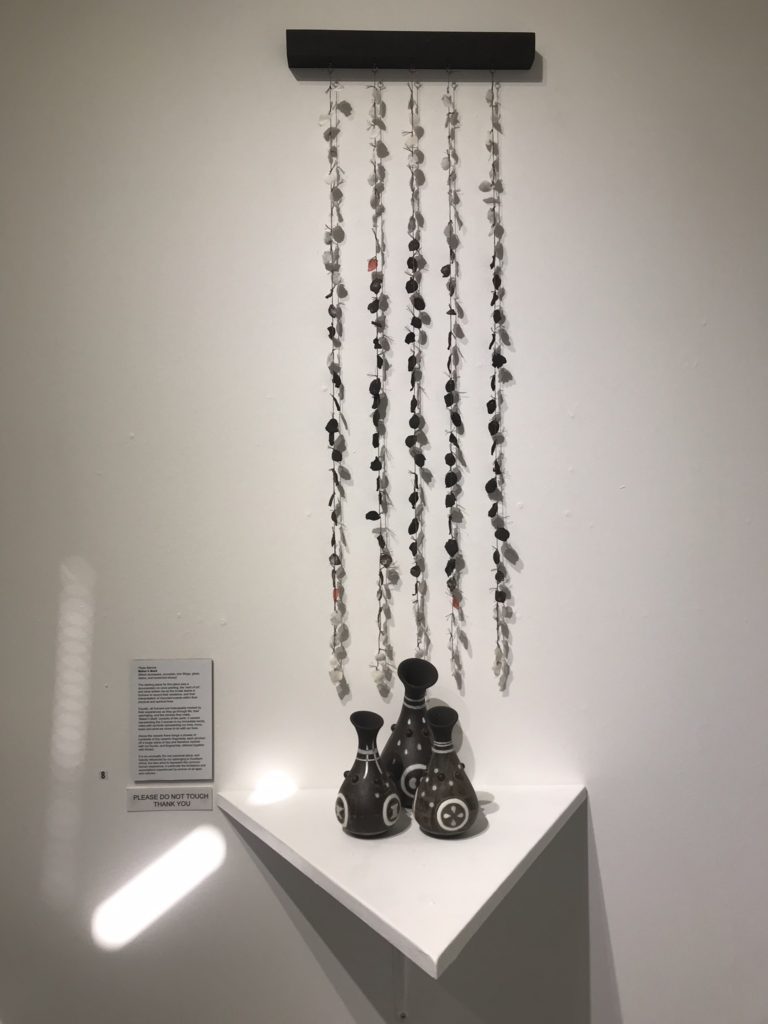
I liked this piece made from black stoneware, porcelain, iron fillings, glaze, stains and reclaimed ebony due to the meaning behind every feature. The idea for the piece originated from cave paintings and the innate desire to record one’s existence.
The 3 vessels represent 3 women in Pippa’s family, inlaid with symbols of love, life and loss. Above them, hangs a shower of hundreds of tiny ceramic fragments, marked unintentionally with the fingerprints of the artist as they pinched off pieces of clay.
The piece is heavily influenced by Barrow’s upbringing in South Africa, but also aims to represent the common human experience, in particular the limitations and expectations experienced by women of all ages and cultures.
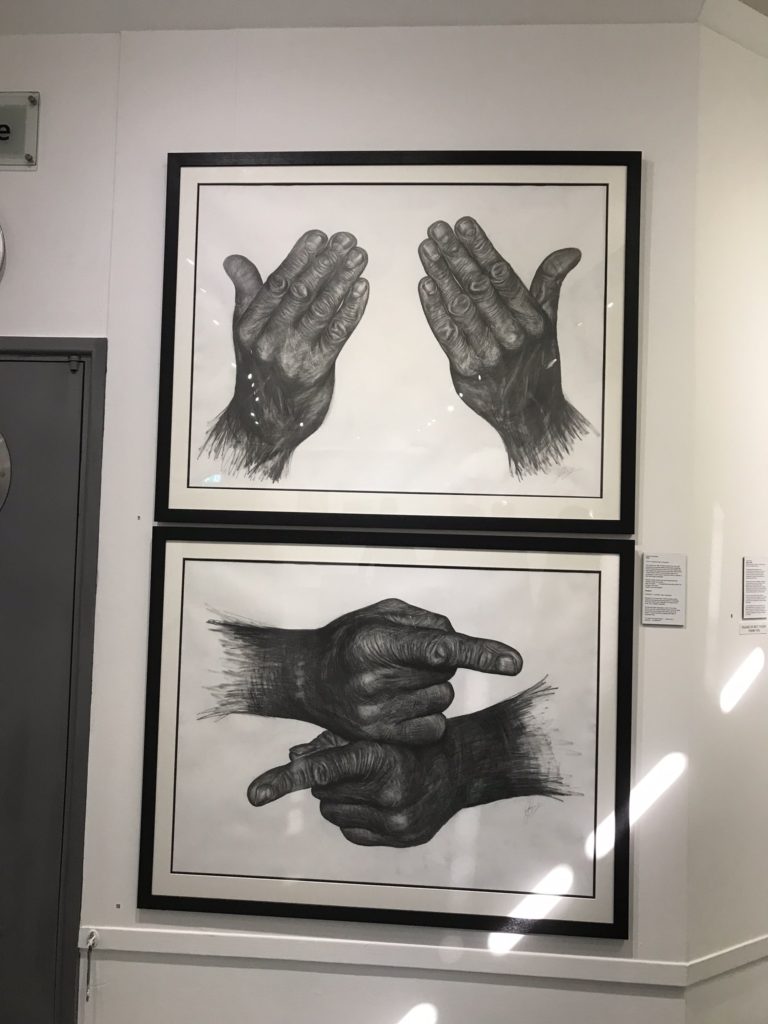
One of my least favourite pieces was this one that looks to be either a biro, pencil or charcoal drawing. I am less interested in this piece as I have seen works like it before, even producing almost identical works myself in my GCSE Fine Art exam. This shows a lack of individuality, however the inspiration may explain the meaning behind it. Both drawings depict two hands pointing in opposite directions. This symbolises the inability for us as humans to co-operate with each other.


