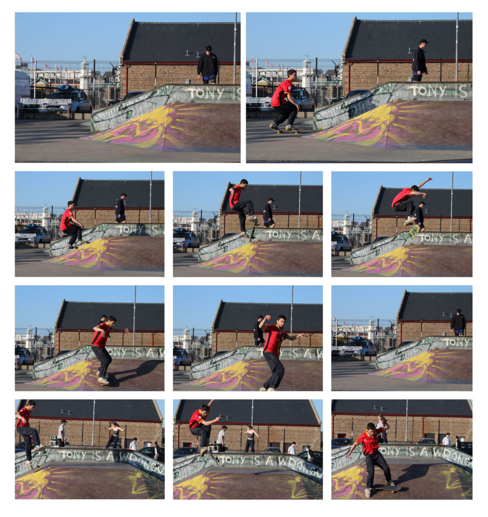
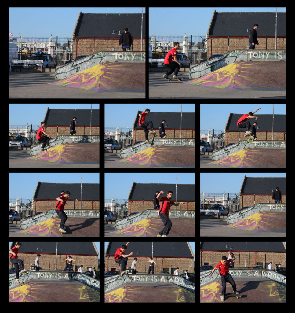
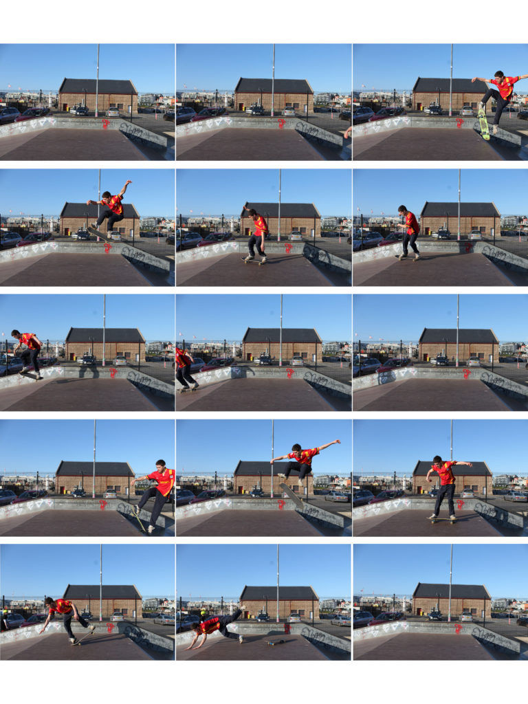
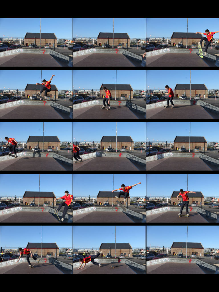
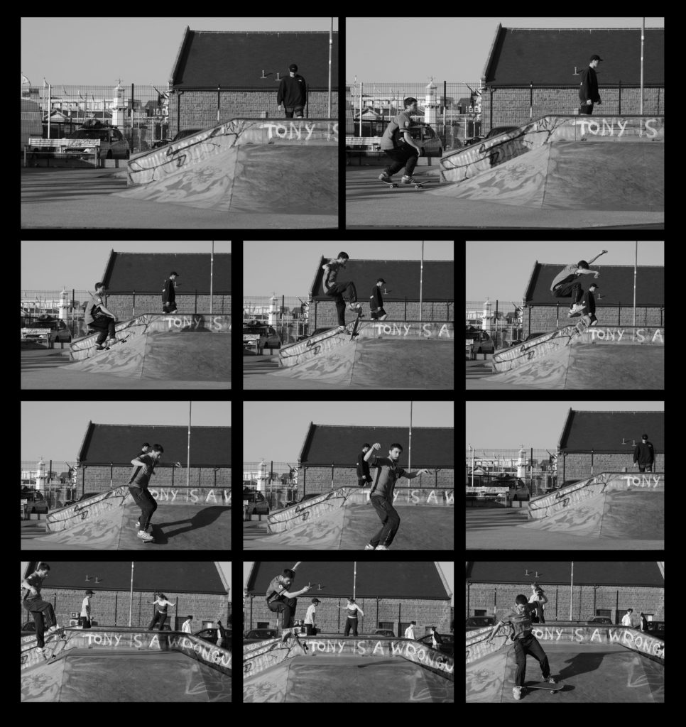
I experimented using different layouts, boarders and colours throughout this process of creating a set of images and displaying them in the style of Eadweard Muybridge however, I found they didn’t really represent his work clear enough. I changed the background colour from white to black which I found allowed for the images to stand out a lot more than they did on the white background. I looked further into his work and realised that all of his images where in black and white and mine where in colour and clearly didn’t have the same effect. I changed my images into black and white and found they looked significantly better especially on the black background. Having them in black and white I found created a more vintage feel to them, which I thought Eadweard’s work did also have aspects of that integrated within his work.

