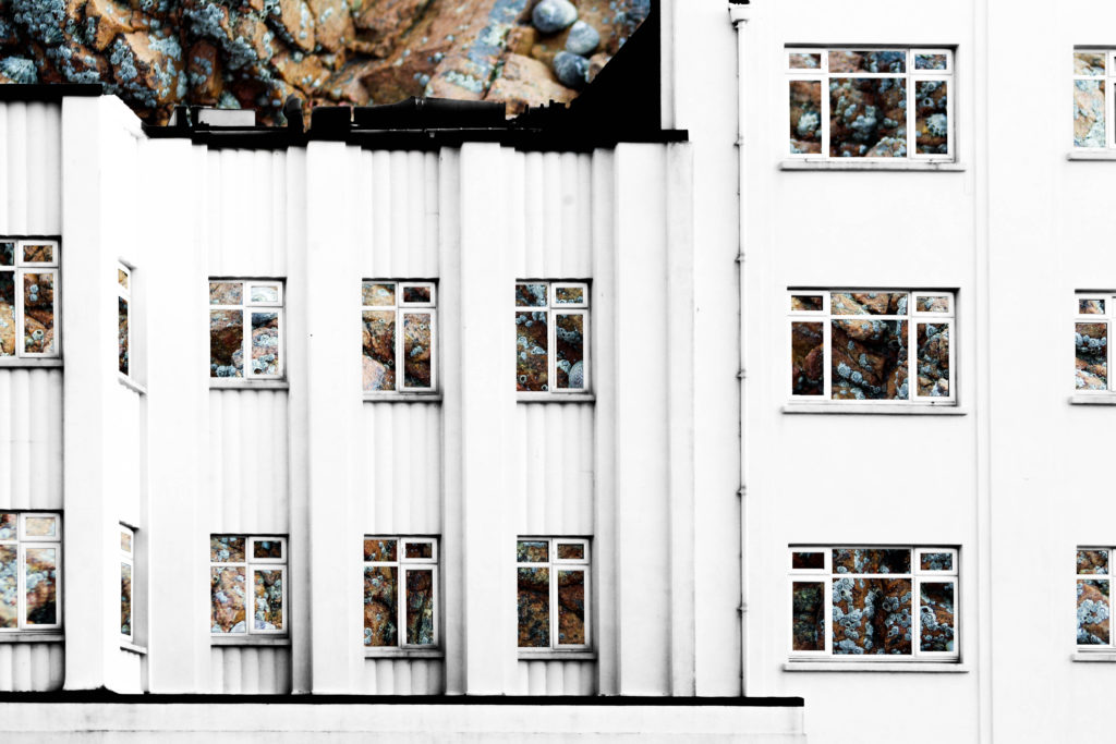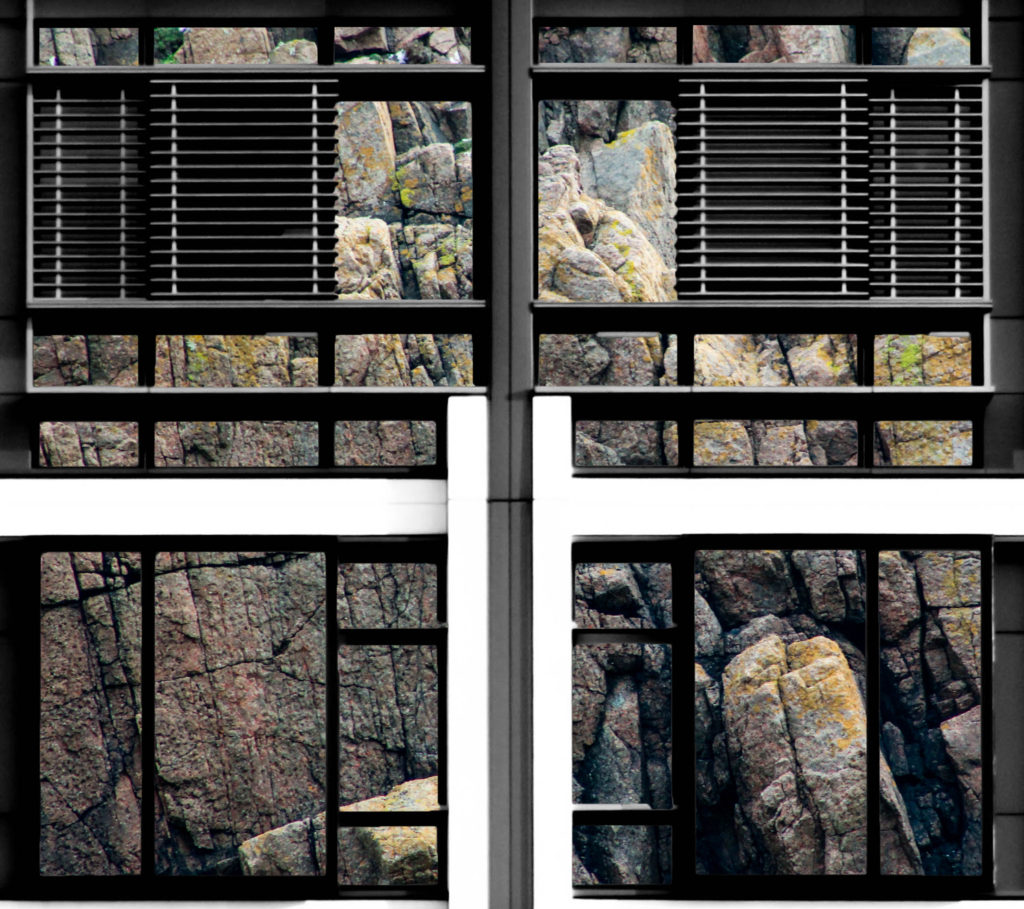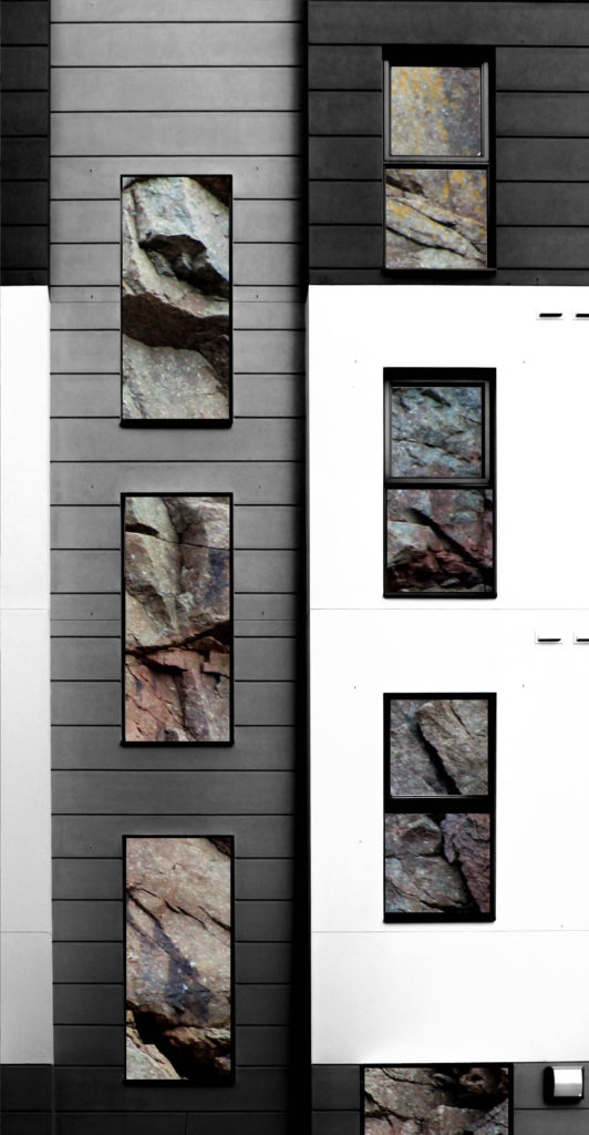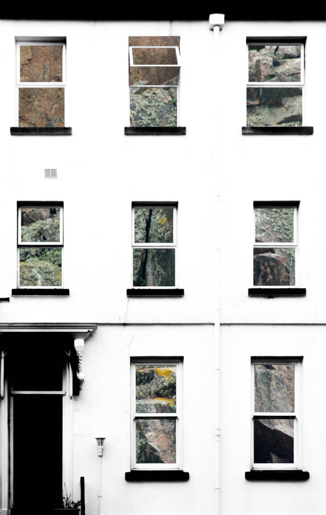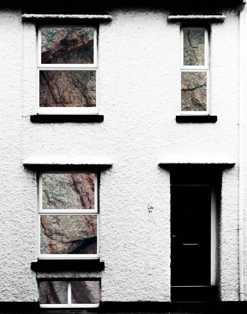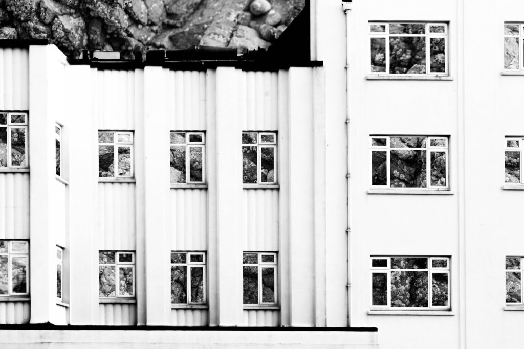
In this post I am showing the outcomes of manipulating both my shoots of building faces and granite faces. Previously I have experimented with removing parts of the building face to reveal other buildings behind it in order to create contrast between the two and to show the similarities and differences between buildings. This experiment draws inspiration from that as I found that it can be quite effective when I remove the natural frames from the photographs to give an insight into the background photograph. I have used this approach when experimenting with integrating the building and granite photographs together – I photoshopped out all windows of the building face in the foreground to reveal the texture and natural colours of the granite in the background. I experimented with presenting the granite photographs in black and white but I found that the outcome was too boring, whereas when the granite photographs were in colour it would bring the photograph to life by contrasting with the high-contrast black and white building face, which would further bring out the colours of the rock. The idea behind these experiments comes from the fact that a lot of houses have granite lying under the decoration and so this represents peeling back the layers of plaster and paint to reveal the base structure.
Analysis
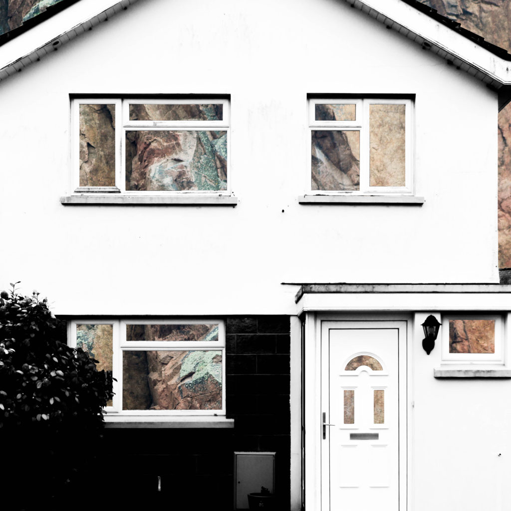
In this composition, natural day lighting was used. Due to the nature of the house face, the natural light only brought out so many shadows and shapes within it meaning that there is only a simple face to it, which contrasts to the rock face in the background which has all sorts of shapes, tones and shadows brought out from the natural lighting. I used a 300mm lens to capture the photograph of the rock to ensure that I could zoom in enough to create the abstract composition as I intended to. I used a deep depth of field as well in order to ensure that everything was sharp and in focus to ensure that the resulting photograph was as of high a quality as possible.
I used an ISO of 800, an aperture of f/8.0 and a shutter speed of 1/500 when taking the rock photographs. The ISO of 800 is fairly high but ensures that the photograph is correctly exposed along with the quick shutter speed of 1/500 that allows the photograph to be sharp and focused when the camera is zoomed in to such an extent. The depth of field ensures that the photograph is fully in focus and is clear. For capturing the building face I only used a shutter speed of 1/100 and an ISO of 100. These camera settings have allowed me to create contrast between the two photographs incorporated into the composition.
The photograph of the house face has been kept in black and white whereas the rock photograph in the background has been kept in colour to create a contrast between the two photographs and to emphasise the natural colours and tones within the rock face. There is also a wide tonal range within the composition due to the editing to create high contrast and to bring out the shadows in both photographs. There is a strong sense of texture within the composition due to the sharp angles and shapes within the rock face, this adds to the aesthetic qualities of the composition. There is also a sense of 3D in the composition for the same reasons – the jagged rock face contrasts with the flat face of the house in the foreground. The unpredictable structure of the rock shapes also contrasts greatly with the house face structure which has been carefully designed and built to meet form and function requirements.
The idea behind these experiments comes from the fact that a lot of houses have granite lying under the decoration and so this represents peeling back the layers of plaster and paint to reveal the base structure. The house face was originally photographed as part of a shoot to show the variance and similarities between houses within a certain geographic area, but I have realised that I can achieve the aim of that shoot whilst being able to add another element of contrast through contrasting the man-made building structures with the natural granite structures.

