CCA Gallery

Mick Jagger ‘double exposure in tube’ by Corinthia West 
Division Bell AM for Pink Floyd by Rupert Truman 
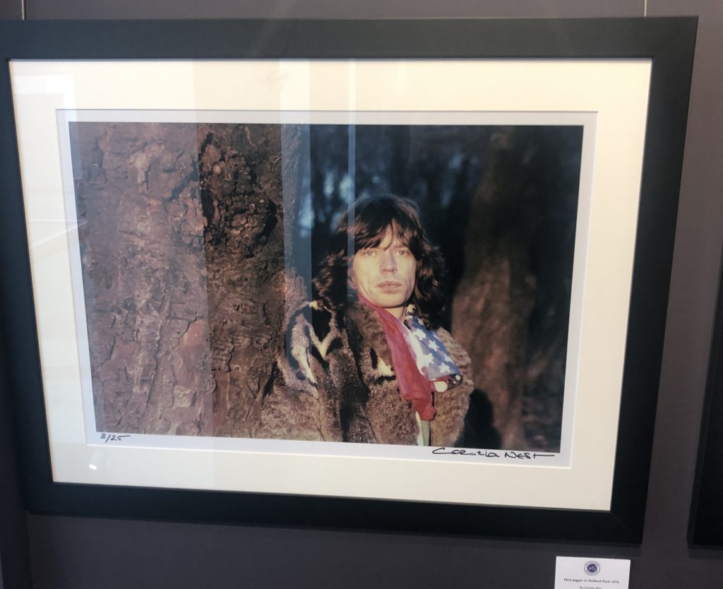
Mick Jagger in Holland Part by Corinthia West
The CCA Gallery was an exhibition by Mike McCartney, Rupert Truman, and Carinthia West. The exhibition showed a range of alternative album covers for artists in the 60’s, such as Pink Floyd, as well as giving an insight into the lives of other 60’s icons, including Mick Jagger. The gallery had a documentative approach in the portrait styles, as seen in the photo of Mick Jagger
One photo which caught my attention was the Mick Jagger ‘double exposure in the tube’ piece by Corinthia West. I think this appeals to me due to the work that I have been experimenting with throughout my ‘Variance and Similarities’ project – I have looked a lot at the use of double exposure and layering photographs over eachother to create a disorientating effect or to add an element of excitement to a typically boring photograph.
Although liking this piece by West, the majority of the west of her work didn’t appeal to me as they were all plain and documentary-style portraits which did not have much to them other than the fact that the subjects were considered icons. As can be seen on the right photograph, her portrait of Mick Jagger is simply him stood next to a tree looking blankly at the camera – there is nothing to catch the eye or add an element of interest to it.
Private Gallery

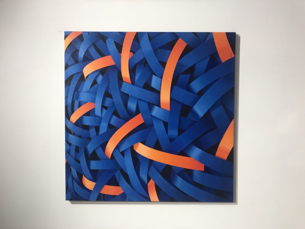
‘Homard Bleu’ by Nick Parlett 
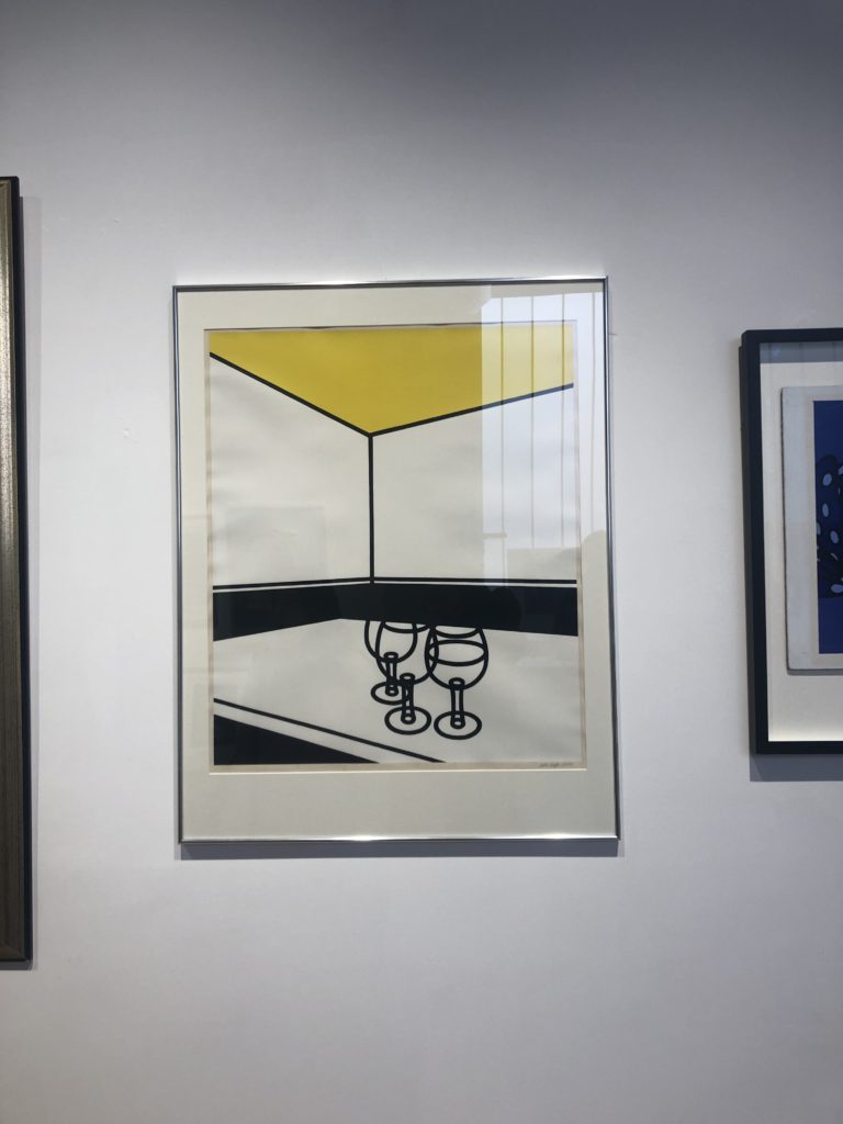
‘Black & White Cafe’ by Patrick Caulfield 
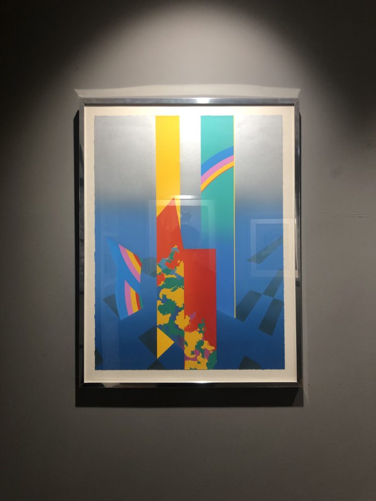
‘Merdional’ by Anthony Benjamin
The private gallery contrasted greatly with the CCA gallery – the private gallery focused a lot more on the culture of pop art. The work consisted of lots of bright colours, abstract shapes, and represented the theme of mass customisation as Andy Warhol intended. The gallery was titled ‘Pop icons on the 20th century, Britain and American pop art’. The pop art movement was around in the 1950’s and peaked in the 60’s but is still widely recognised and practiced today. The work at this gallery had a very contemporary style to it – a lot of the work was art rather than photography but was still relevant as the themes and styles used can be transferred into photography.
One photograph from the private gallery that I particularly liked was ‘Homard Bleu’ by Nick Parlett. The photograph is an abstract painting of what appears to be shiny metallic pieces of metal all intertwined but the painting stemmed from a quick sketch of long grass by the beach side. The story of how the painting came to be really appealed to me because it shows how you can pull abstraction from anything you want to and turn something into something completely different whilst still keeping elements of it.
A photograph that didn’t appeal to me was ‘Black & White Cafe’ by Patrick Caulfield. I think this is because the photograph seems so empty and doesn’t have anything to draw attention to it other than it’s simplicity. Of course it would be harder to paint this composition than it seems but it seemed to lack skill and anything of interest – which I suppose was the idea behind it in the first place.
