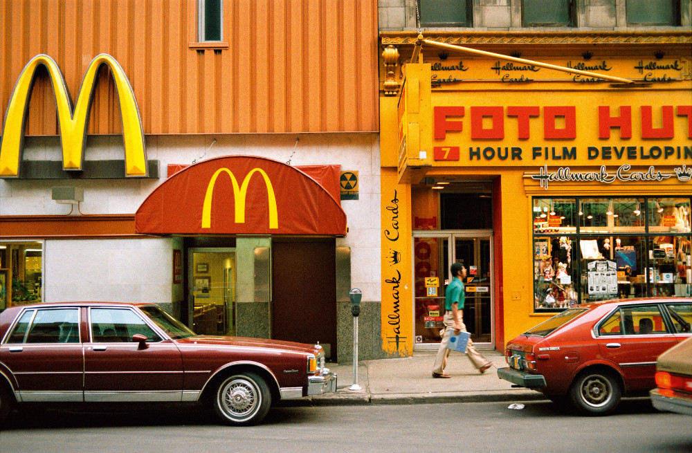
William Eggleston

Image result for william eggleston

William Eggleston born in Memphis in 1939 and is widely credited with increasing recognition for color photography as a legitimate artistic medium.  Since the early 1960s, William Eggleston used color photographs to describe the cultural transformations in Tennessee and the rural South. He registers these changes in scenes of everyday life, such as portraits of family and friends, as well as gasoline stations, cars, things that wee see everyday but never top to apreacte the beauty in these things. Switching from black and white to color in 1956 which then colour transparency became his dominant medium.

William Eggleston, At Zenith I (from Wedgwood Blue), 1979

The book ‘William Eggleston At Zenith’ was created in 2013. He describes his book as“my childhood and adulthood escapes unexpectedly met each other.” 

In an interview by Shahrzad Kamel from ASX magazine William Eggleston describes the book in a lot of detail and goes into the meaning behind it. Within the interview he talks about how he use to lie on the grass as a child and stare up at the sky while forgetting everything. He describes how he watched them move for hours while raising his hands to the sky. He says, “I wished I could touch them, I would dream of riding away on one; imaginary transportation to another universe.” The book contains abstract images of the sky and moving clouds. Although the concept is relatively simple, the meaning and spiritual connotations behind the idea is very powerful. Eggleston wanted his images to be artistic, and to resemble paintings and well as photographic images.

At first I didn’t like this project as I thought that the concept was very simple and the images would be very similar to each other and therefore boring. But I actually really like the simplicity of the images. The contrasting with the white is very eye catching for the viewer, which is something that I want to focus on doing throughout my project. The images are abstract but yet anybody even if they aren’t used to abstract work in photography they will be able to understand and appreciate the images. When he presented this project the environment was plain white which made the images stand out a lot more as the blue is contrasting to the white.
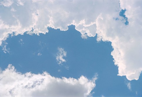
Image result for william eggleston sky

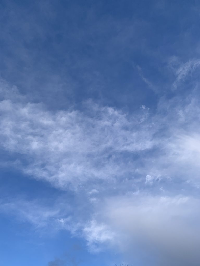
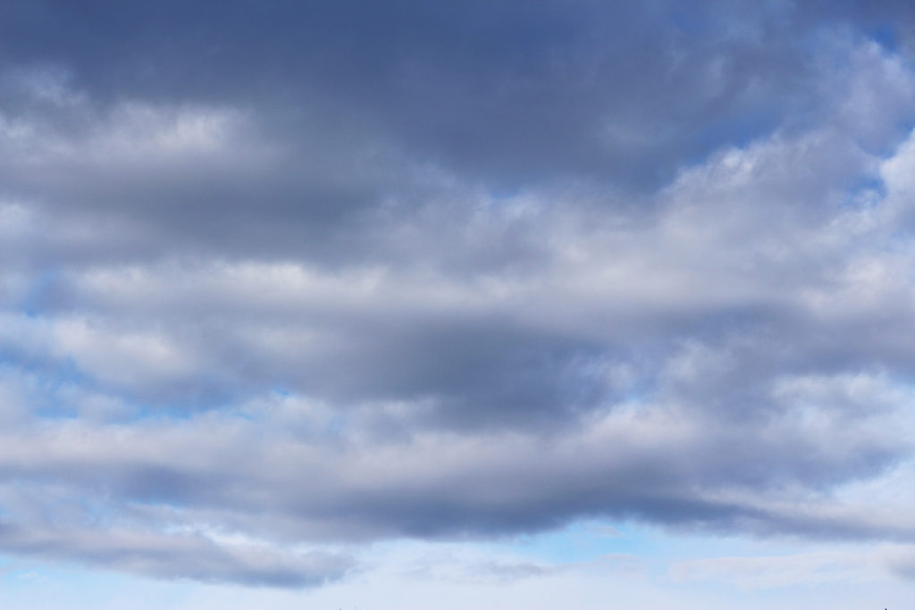
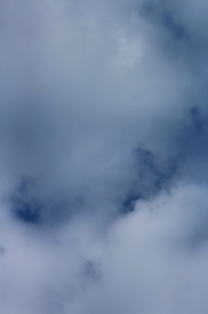
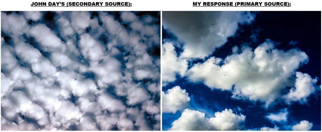
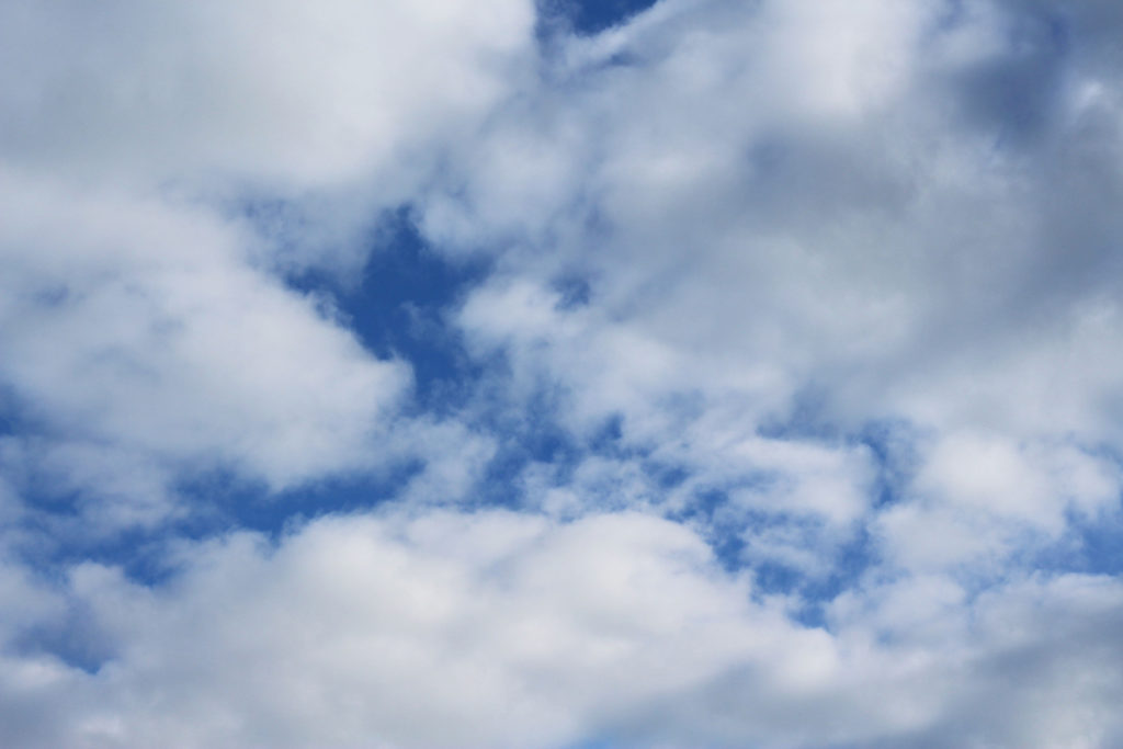
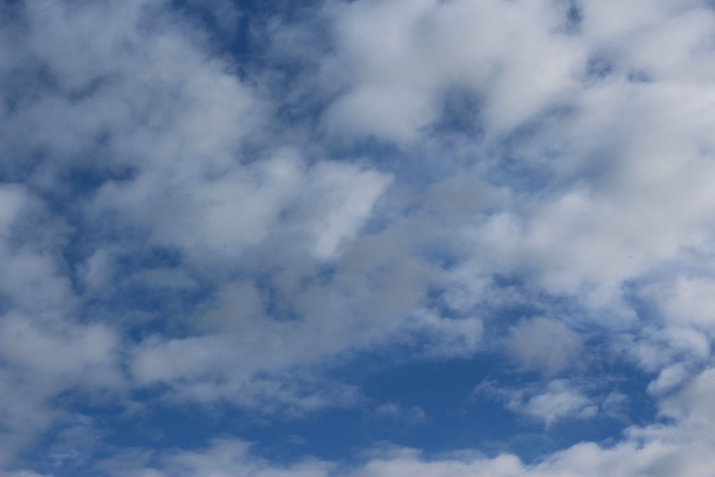
My response to ‘William Eggleston At Zenith’

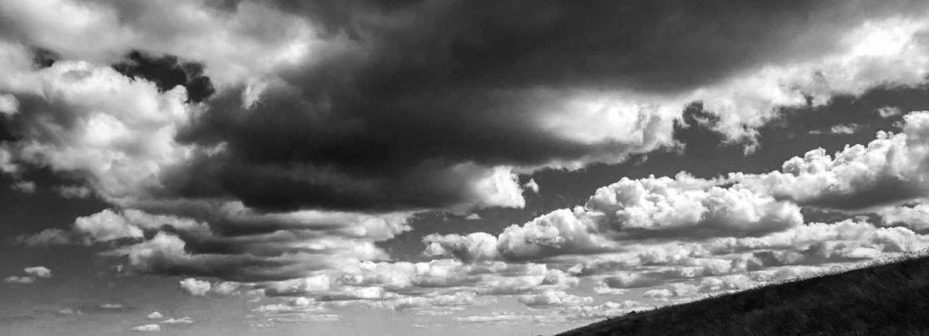
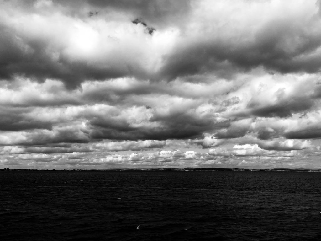
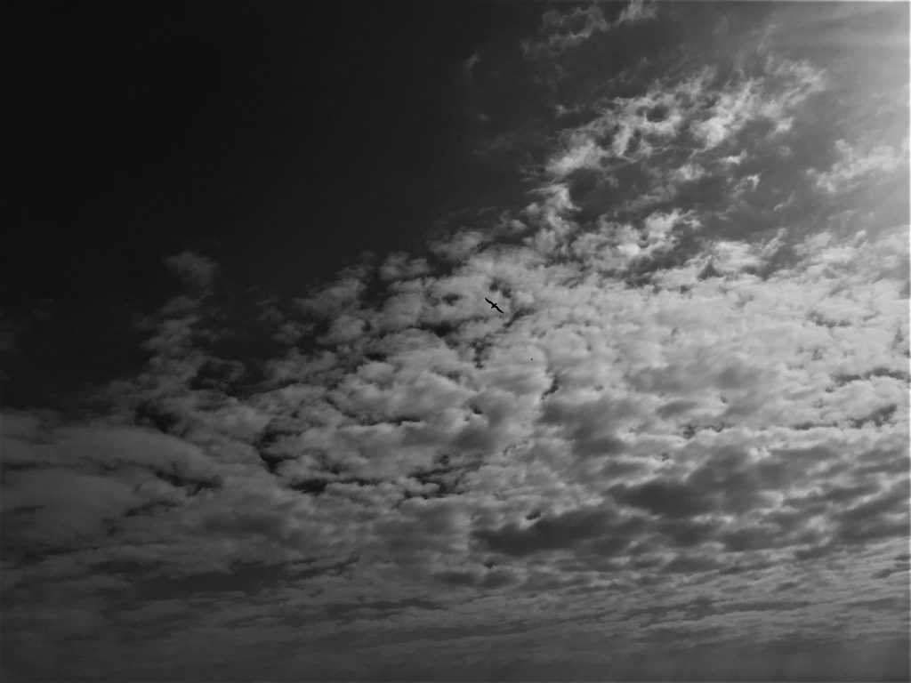
I took these images whilst I was doing a separate shoot, as I wasn’t focusing that much on getting these image, this is why I don’t really like these images. What I don’t like about the images is that all are very similar to each other, I took these image at mid day so I think that if I took them sunrise or sunset, I think that this would some colour and variety in the images. Or if I took images f the clouds throughout the day there would be more variety in the pattern of the clouds this would make the images more interesting
This image has an empty alt attribute; its file name is j-1024x683.jpg
This image has an empty alt attribute; its file name is IMG_5565-1024x683.jpg
This image has an empty alt attribute; its file name is IMG_5566-1024x683.jpg
This image has an empty alt attribute; its file name is IMG_5582-677x1024.jpg

Planning of Photo shoots

Shoot 1: My first shoot will be In the style of Keld-Helmer Peterson. I will look for interesting colouful objects around Jersey I will select my strongest images that supports the theme and style of variation and similarity.

Shoot 2: My second shoot will be City based. I will take a variety of images in London during the day. Some being abstract and others not. This is to create a subtle link to a supporting image using the same colour combinations.

Shoot 3: My third shoot will be in Hyde Park in london. The plan for this shoot is to capture the natural elements in Londons Hyde park. I thought it would be very interesting to visit the area as it visualizes what the area around London would have looked like before mans existence. This will be an experimentation shoot. I want to capture the nature

Shoot 4: My final shoot will be during the night. I decided that i should take images of colour under a dark influence to contrast with daytime images of the othershoots. This would give the images a different feel to them with the new contrasts and tones.

Specification

My idea is to photograph colours and shapes in objects and buildings. I am specifically going to be looking for areas, buildings and objects that have multiple colours. I will produce most of my images whilst in London. London is packed with really historical buildings and at the same time is packed with modern structures. I want to explore how colours patterns and shapes have vary and developed as new design themes were popularised. I will capture both abstract, portrait and landscape images. I drew my inspiration from Siegfried Hansen, Saul Leiter and Keld Helmer-Petersen. All pioneers of colour photography.

The Disposable Camera Project

Colour Box Studio Disposable Camera Project First Edition 2013 installation view. Photo by Shari Trimble.

Colour Box Studio Disposable Camera Project First Edition 2013 installation view. Photo by Shari Trimble.

The Disposable Camera Project was created in 2014 by the Colour Box Studio .Which is a Melbourne based pop up art space and online creative hub. The director, Amie Batalibasi, decided to do a project in which she gave nine participants a disposable camera and where asked to fill up the camera in the space of 24 hours. The project had been going on for 3 years. Each of the participants have their unique style and perceptions. What they view as a good image all varies. The project achieved a vast difference in style of images and subject. A book was created containing all the images called “The Disposable Camera Project.”

Photos by: Cara Thompson, Charlotte Wardell, Nicole Kennedy, Vanessa Lee, Suyin Lim, Emma Numan, Gareth Kaluza, Modesta Gentile and Rahima Miriam.

Photos by Colour Box Studio Disposable Camera Project Participants: Cara Thompson, Charlotte Wardell, Nicole Kennedy, Vanessa Lee, Suyin Lim, Emma Numan, Gareth Kaluza, Modesta Gentile and Rahima Miriam.

What this project does that can’t really be achieved with the use of digital cameras, is the sense of freedom but at the same time develops the photographic process to be thoughtful. As with a film camera you have a limited amount of images before the film runs out. But unlike digital cameras you are not able to look back and view the image, so there is one take to get the time right so each shot is thought through a lot more.But with this project id gives freedom with photography for people who might not be used to using a camera and to be able to capture scenarios and landscapes in a pure and simple way.

The Disposable Camera Project Book.

The Disposable Camera Project Book.

ESA // Michael Marten

MMichael Marten, born in London, has been involved in photography since he was a teenager. For his first job he was caption writer at the Camera Press photo agency. And in 1973 he was one of a group who published ‘An Index of Possibilities’, an alternative encyclopedia of ideas. Since 2003, Michael Marten has concentrated on landscape photogrpahy. His first major series was ‘Sea Change’ (2003-2012).

Michael Marten
Bedruthan Steps, Cornwall. 25 and 31 August 2007. High water 4.30pm, low water 2pm

His series ‘Sea Change’, shows and excellent use of diptych (dictionary def:  a painting, especially an altarpiece, on two hinged wooden panels which may be closed like a book), and trptych (dictionary def: a picture or relief carving on three panels, typically hinged together vertically and used as an altarpiece; a set of three associated artistic, literary, or musical works intended to be appreciated together). An example of a diptych in Michael Marten’s work is the image above of the Bedruthan Steps, Cornwall. An example of a trptych is the image below of St Ives, Cornwall.

Michael Marten
St Ives, Cornwall. 15 and 16 June 2011. High water 6.30pm, low water 12.30pm

He explores low vs high tides to see how it changes the landscape. He travelled to different parts of the British coast to photogrpah identical views at high and low tide, six or eighteen hours apart. His photographs revel how the twice daily rhythm of the sea flowing out (ebb) and the sea flowing back in (flood) can dramatically transform the landscape he was photographing

CCA Gallery / Private Gallery

CCA Gallery

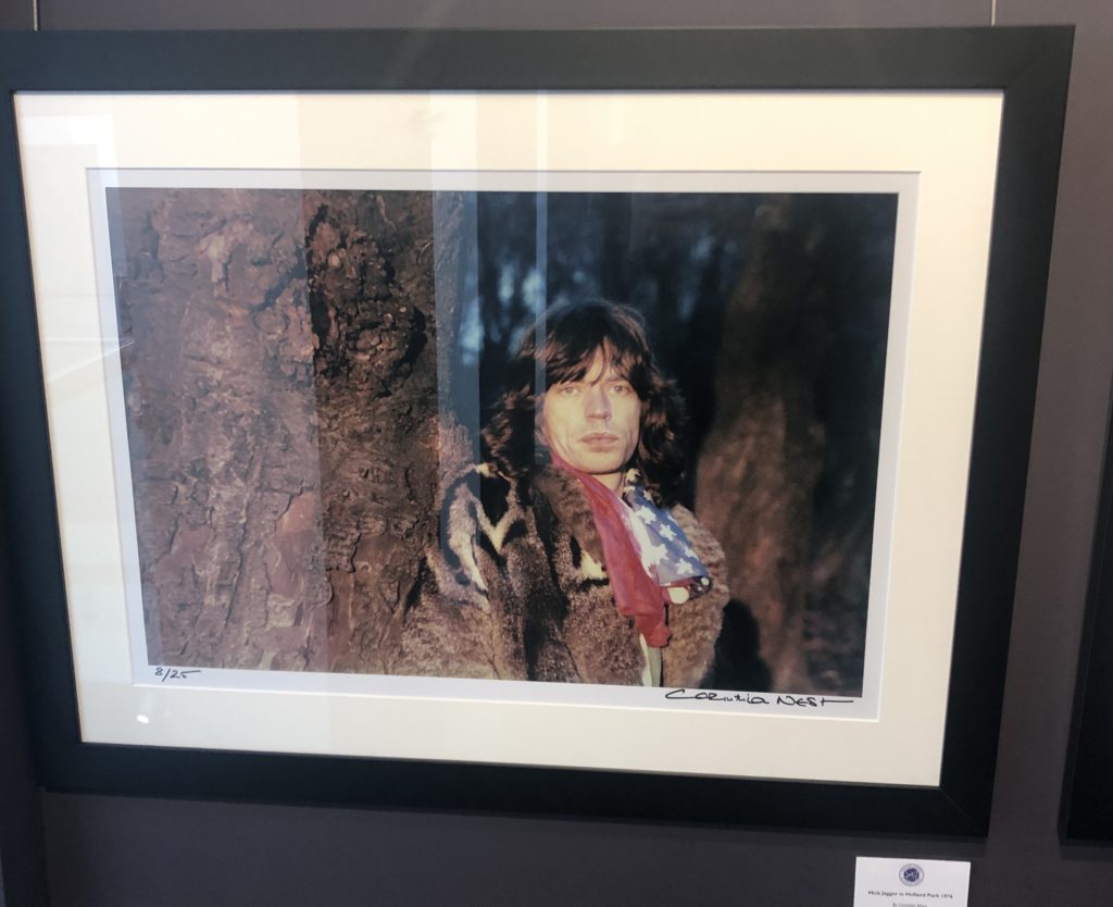
The CCA Gallery was an exhibition by Mike McCartney, Rupert Truman, and Carinthia West. The exhibition showed a range of alternative album covers for artists in the 60’s, such as Pink Floyd, as well as giving an insight into the lives of other 60’s icons, including Mick Jagger. The gallery had a documentative approach in the portrait styles, as seen in the photo of Mick Jagger

One photo which caught my attention was the Mick Jagger ‘double exposure in the tube’ piece by Corinthia West. I think this appeals to me due to the work that I have been experimenting with throughout my ‘Variance and Similarities’ project – I have looked a lot at the use of double exposure and layering photographs over eachother to create a disorientating effect or to add an element of excitement to a typically boring photograph.

Although liking this piece by West, the majority of the west of her work didn’t appeal to me as they were all plain and documentary-style portraits which did not have much to them other than the fact that the subjects were considered icons. As can be seen on the right photograph, her portrait of Mick Jagger is simply him stood next to a tree looking blankly at the camera – there is nothing to catch the eye or add an element of interest to it.

Private Gallery

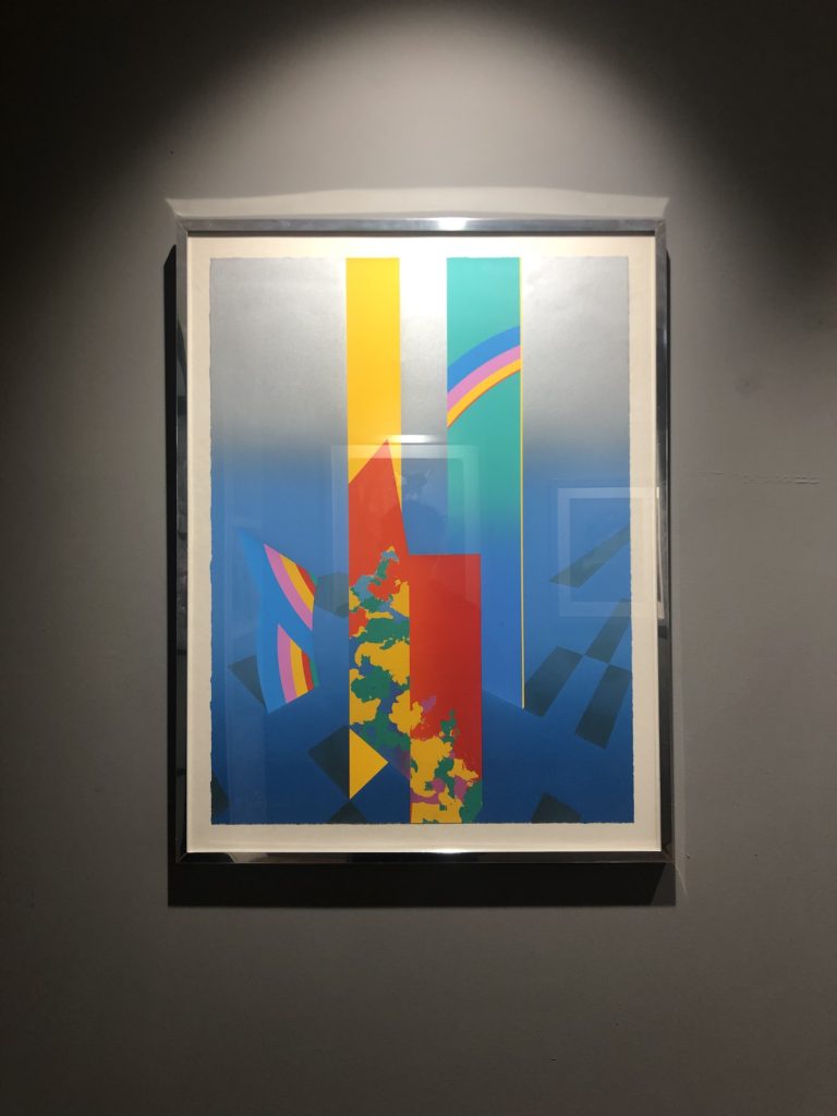
The private gallery contrasted greatly with the CCA gallery – the private gallery focused a lot more on the culture of pop art. The work consisted of lots of bright colours, abstract shapes, and represented the theme of mass customisation as Andy Warhol intended. The gallery was titled ‘Pop icons on the 20th century, Britain and American pop art’. The pop art movement was around in the 1950’s and peaked in the 60’s but is still widely recognised and practiced today. The work at this gallery had a very contemporary style to it – a lot of the work was art rather than photography but was still relevant as the themes and styles used can be transferred into photography.

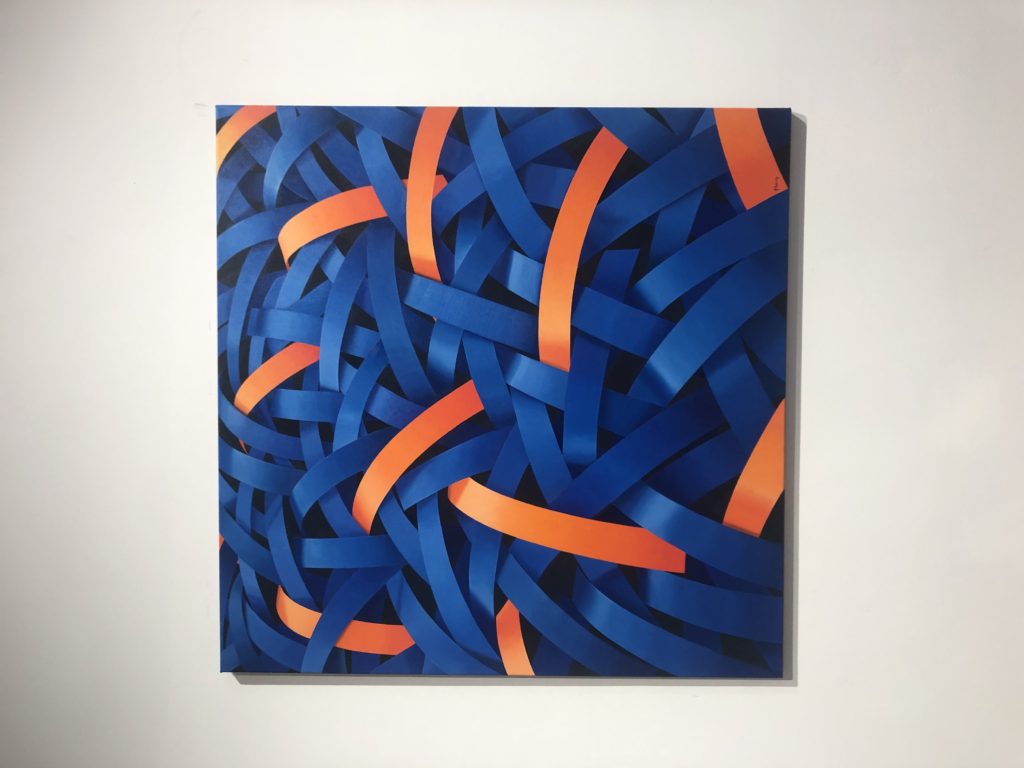
One photograph from the private gallery that I particularly liked was ‘Homard Bleu’ by Nick Parlett. The photograph is an abstract painting of what appears to be shiny metallic pieces of metal all intertwined but the painting stemmed from a quick sketch of long grass by the beach side. The story of how the painting came to be really appealed to me because it shows how you can pull abstraction from anything you want to and turn something into something completely different whilst still keeping elements of it.

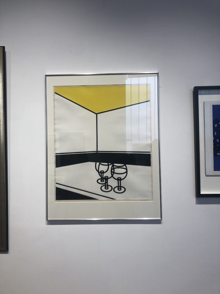
A photograph that didn’t appeal to me was ‘Black & White Cafe’ by Patrick Caulfield. I think this is because the photograph seems so empty and doesn’t have anything to draw attention to it other than it’s simplicity. Of course it would be harder to paint this composition than it seems but it seemed to lack skill and anything of interest – which I suppose was the idea behind it in the first place.

Further experimenting

Changing opacity

Black and white

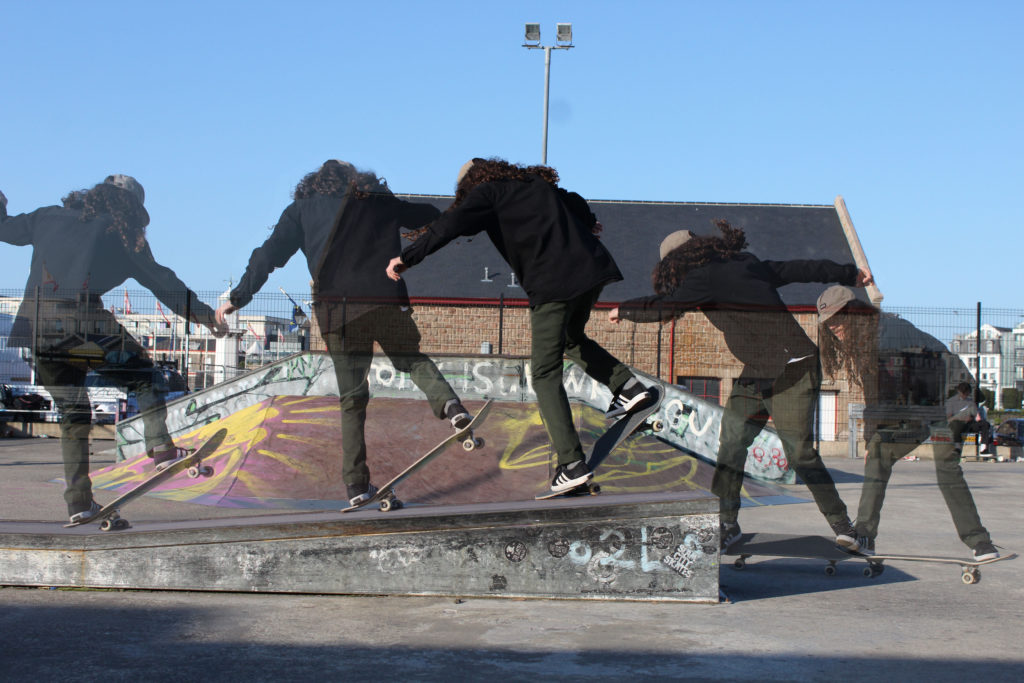
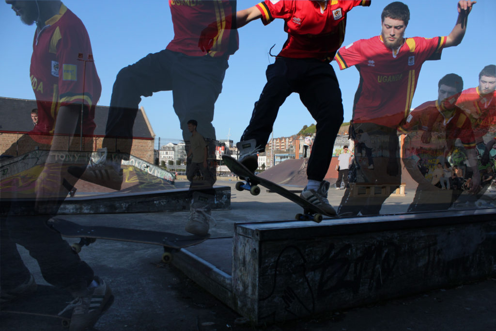
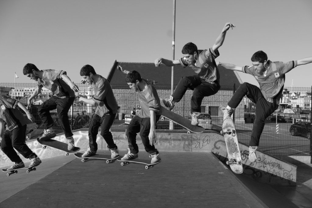
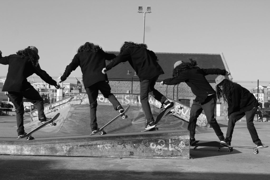
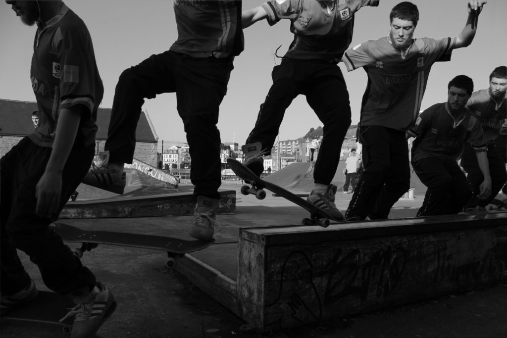
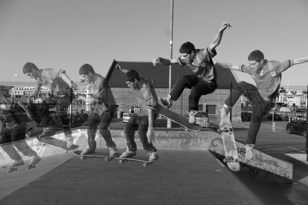
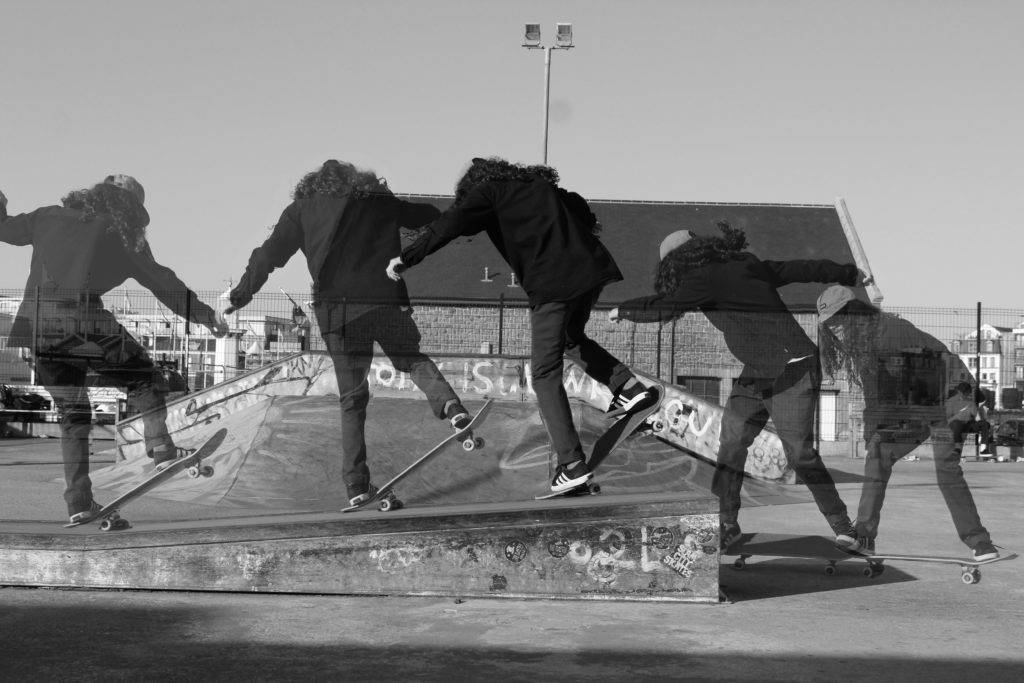
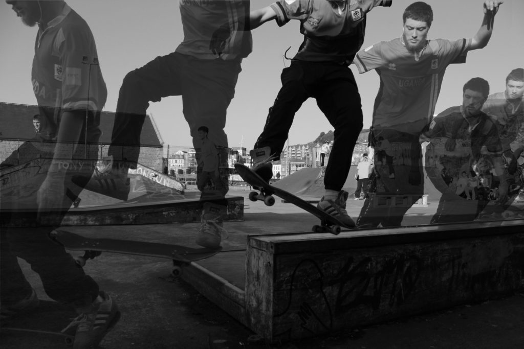
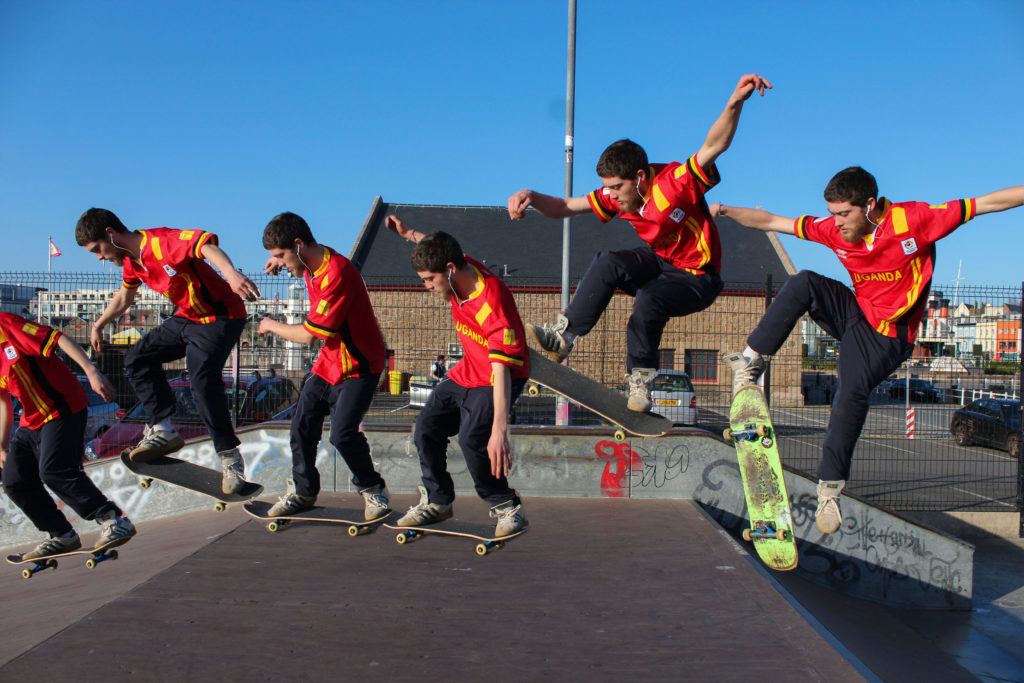
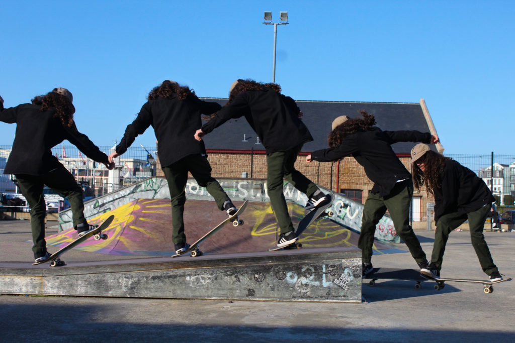
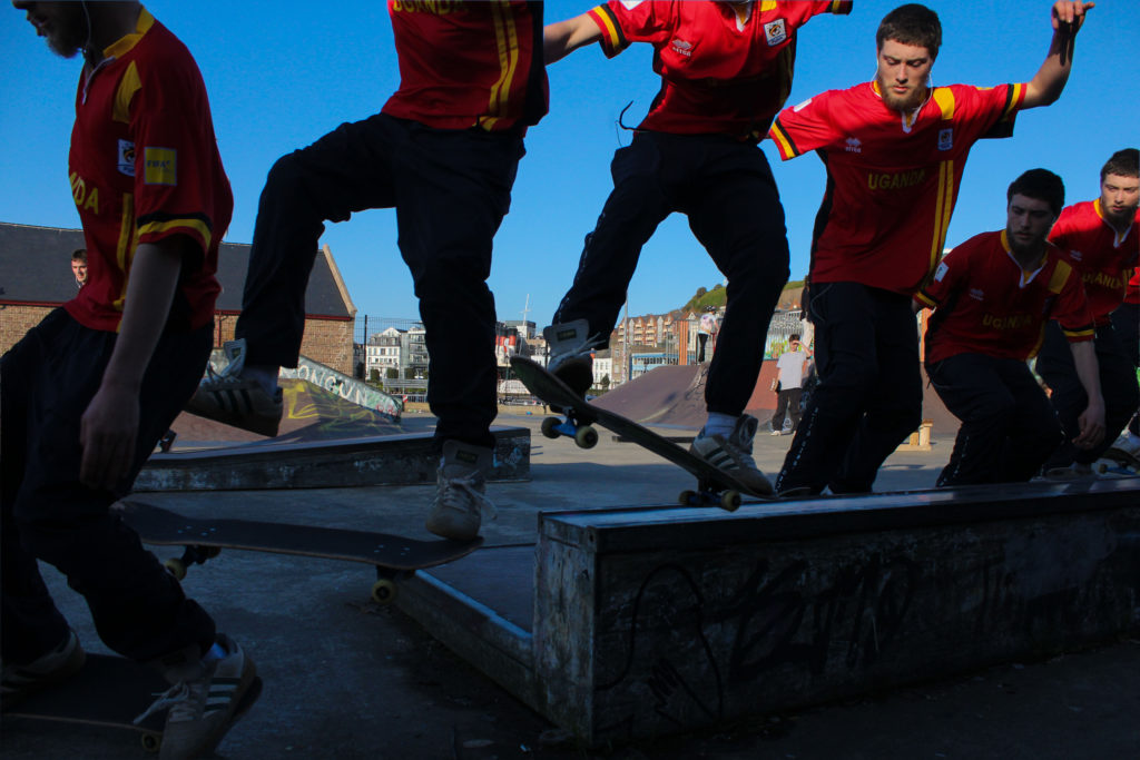
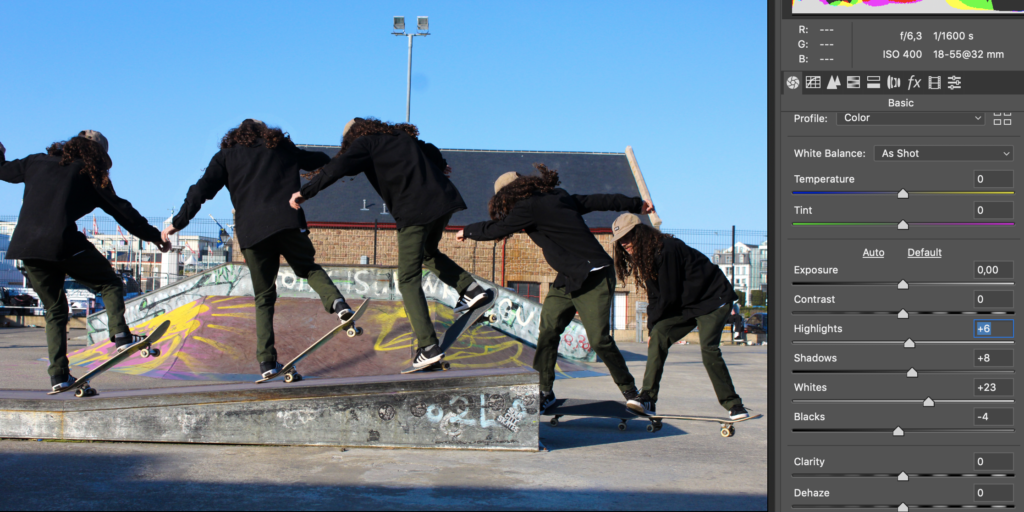
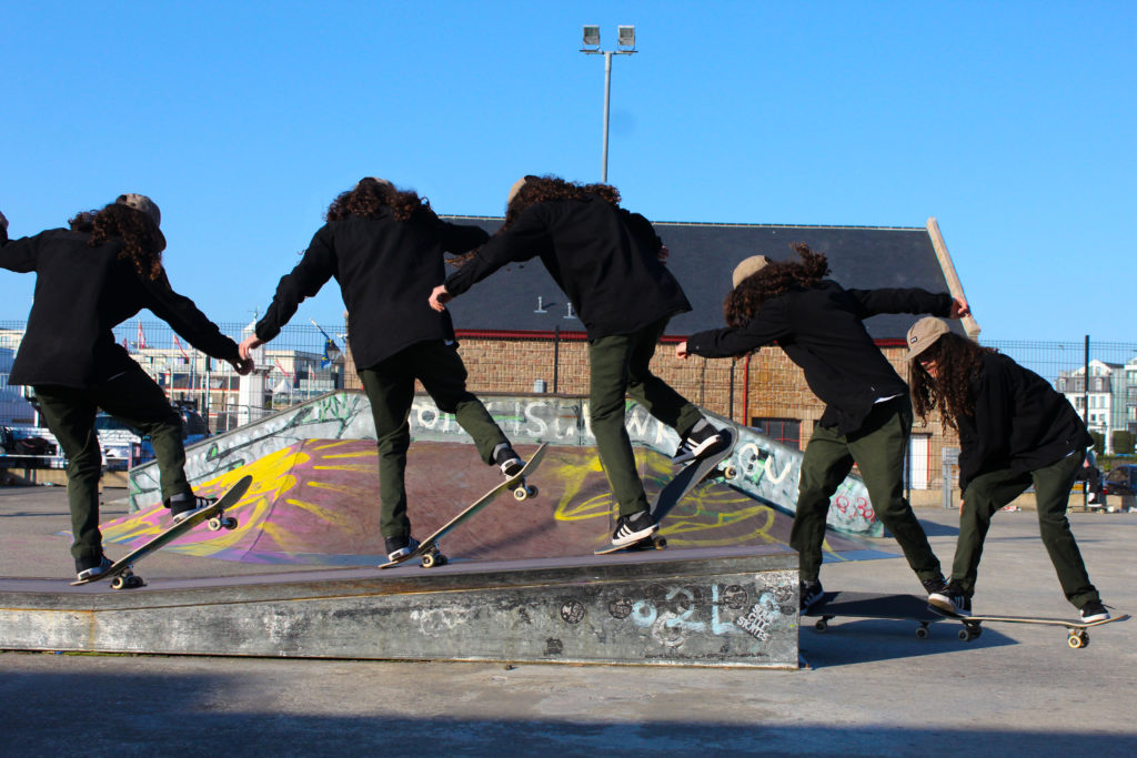
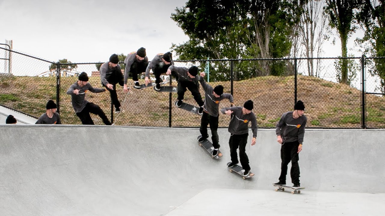
Once I came up with a final edit I thought that the images I created could be made more interesting and edited further. I decided on changing the opacity on every layer but leaving one of the layers at full capacity. I found by doing this not only related to Eadweard Muybridge’s work but created a stronger final image overall. I thought that it clearly displayed the movement of the subject within each image and represented my idea of movement more clearly. I then went on to further experiment with these images more by changing them to black and white and increasing the contrast on each image so the lower capacity images would stand out on the dull background. I found changing them to black and white created a strong effect on each image however I feel they didn’t have the same effect as the coloured images portrayed.
Focusing on movement sequences – Shoot 1

Inspiration

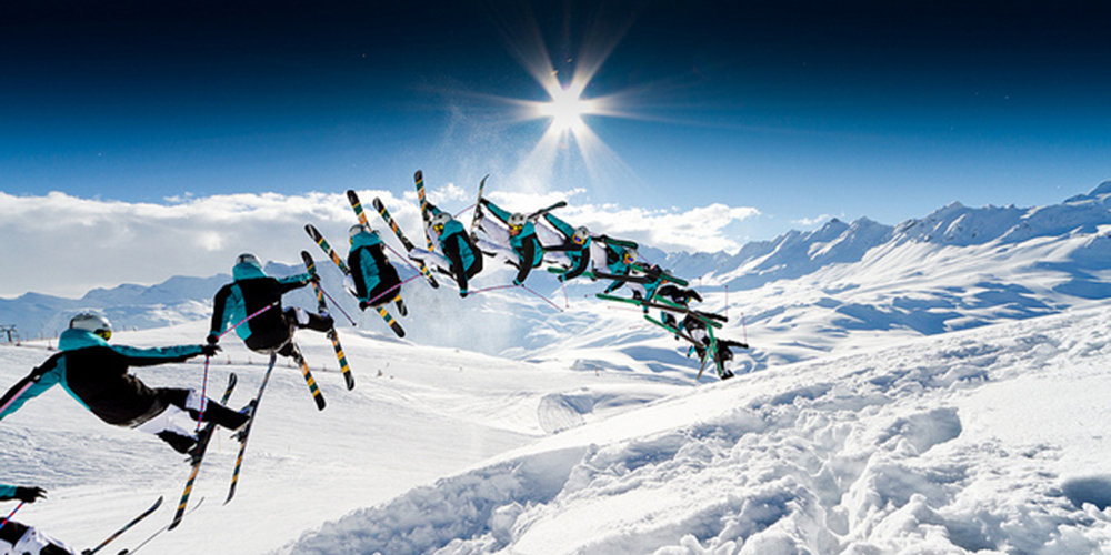
Image result for Sequence photography

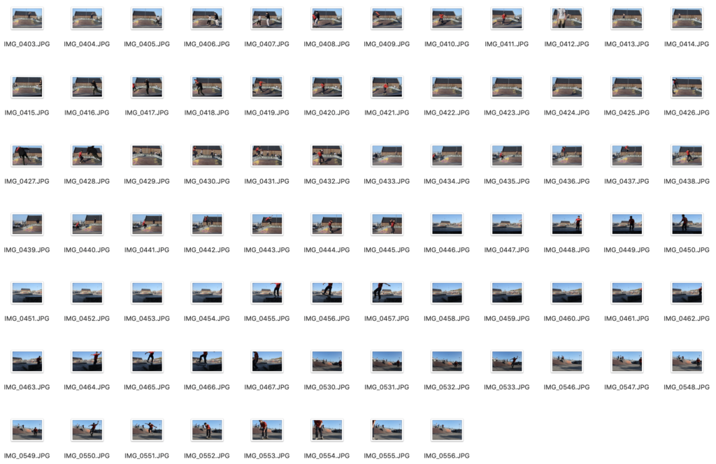
Contact sheets

My Interpretations

Editing process
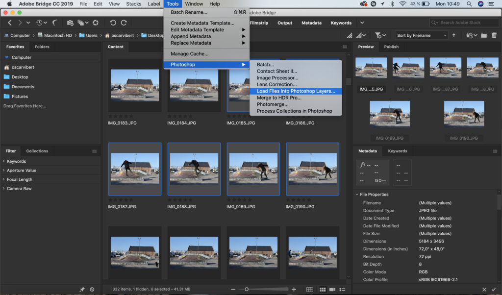
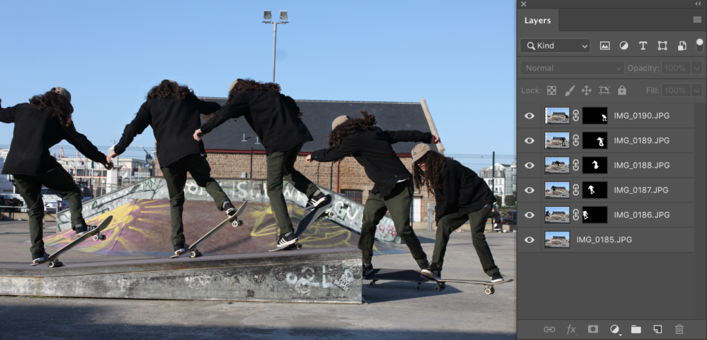
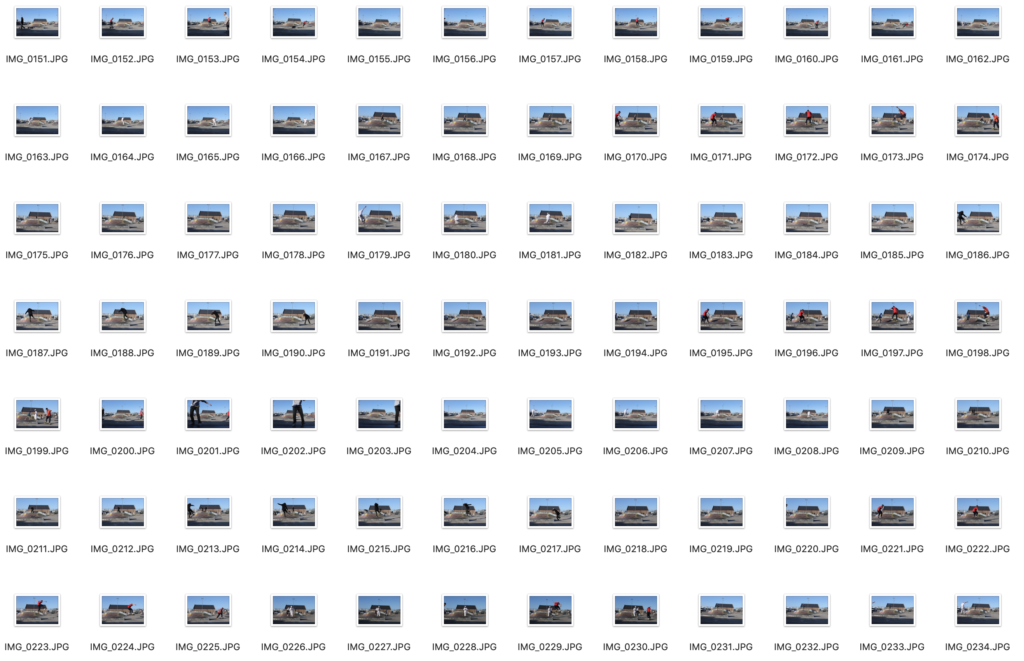
I firstly imported all of my images into Adobe Bridge. I selected the images I wanted to use and then loaded the files into a photoshop document having each image in the same file.
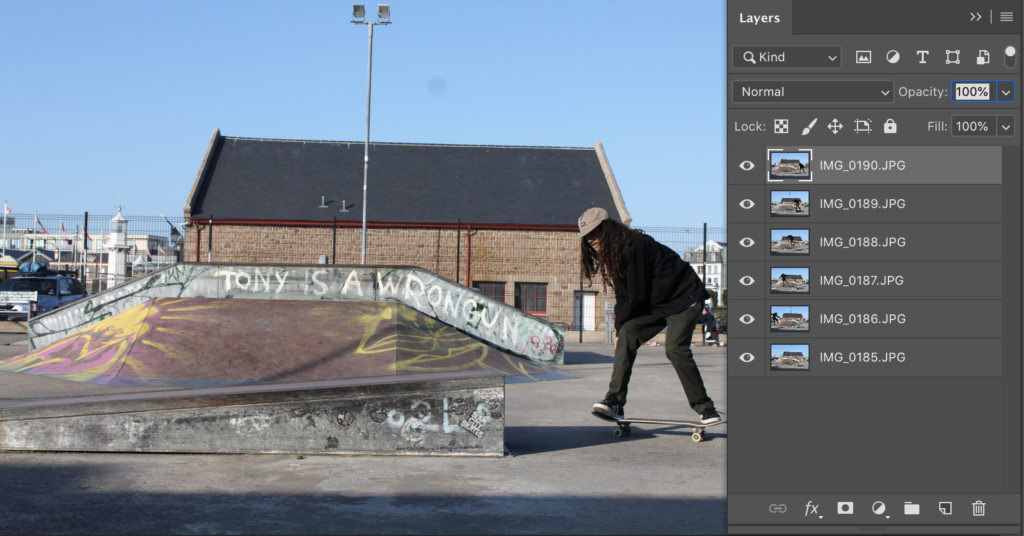
Once the images where in Photoshop I reordered the images into the order I wanted them in having the file image of the sequence being the top layer.
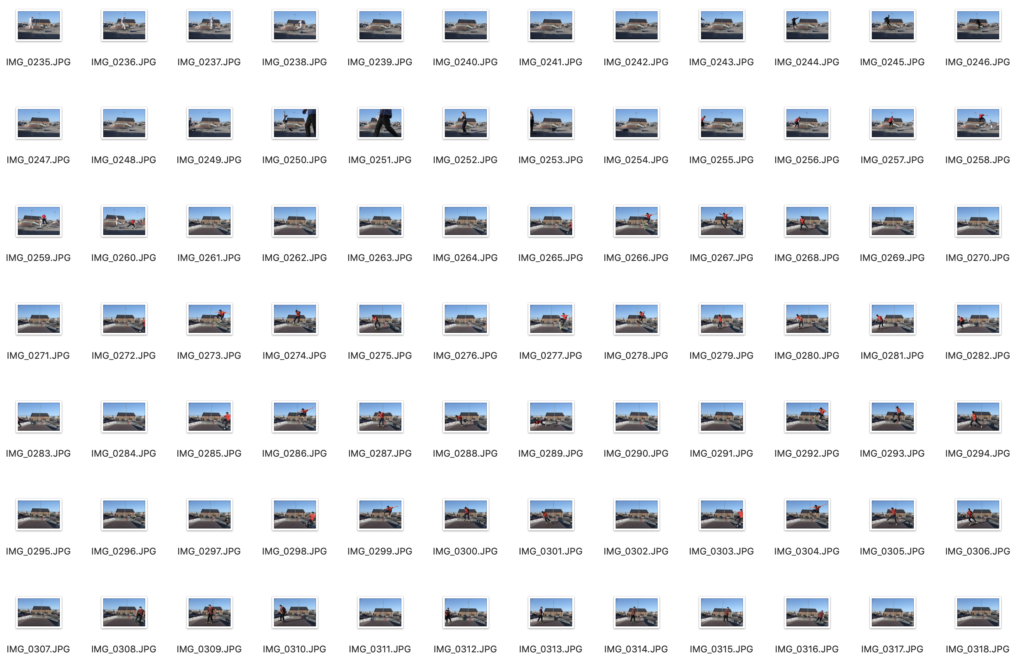
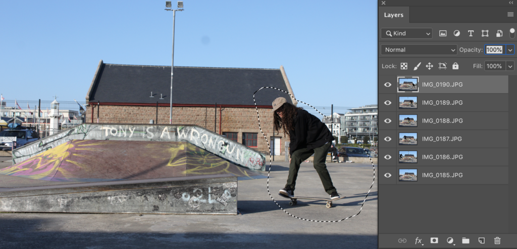
Once the images where in the correct order, I drew round each single image with the lasso tool and created a layer mask for each image.
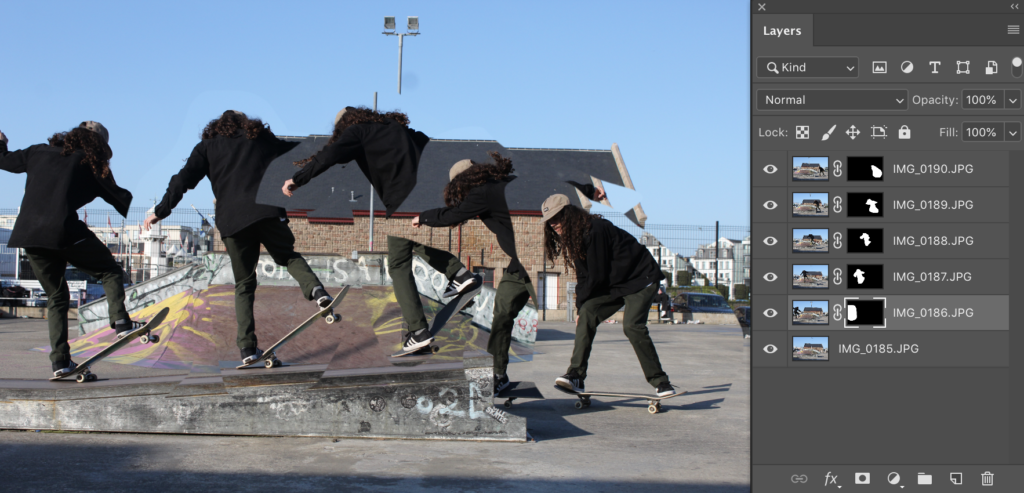
Once I had created a layer mask for each image it looked like this. As the images where on top of each other and had an outline round them it looked wrong which meant I had to erase round the images so that it was just the subject without the background.
This it how it looked when I had erased the background leaving only the subject in the layer mask and slightly moving round each image.
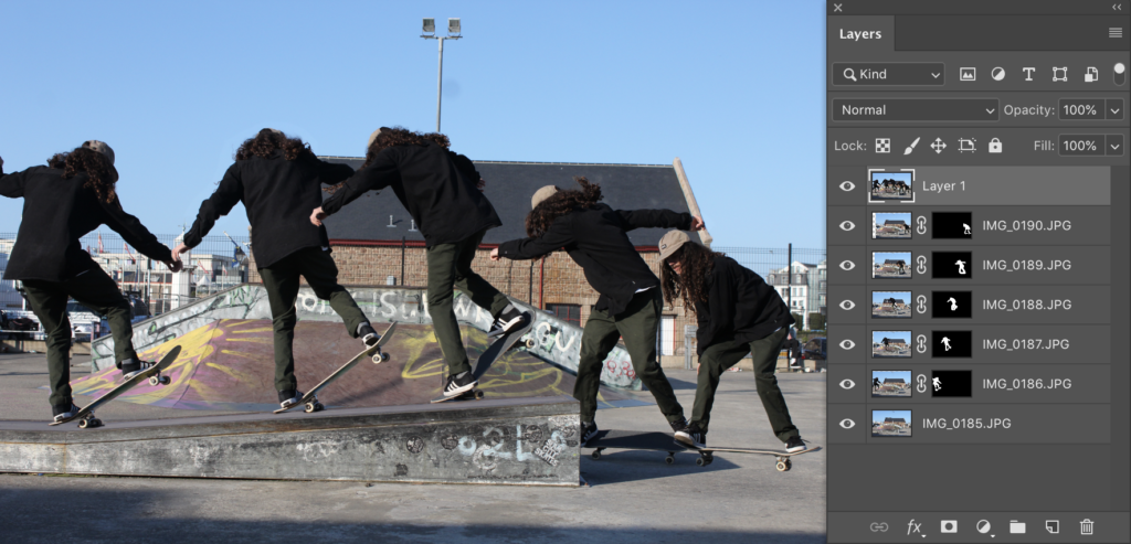
When everything fitted perfectly and looked correct I created a new layer and made a final layer which had all the layers in one.
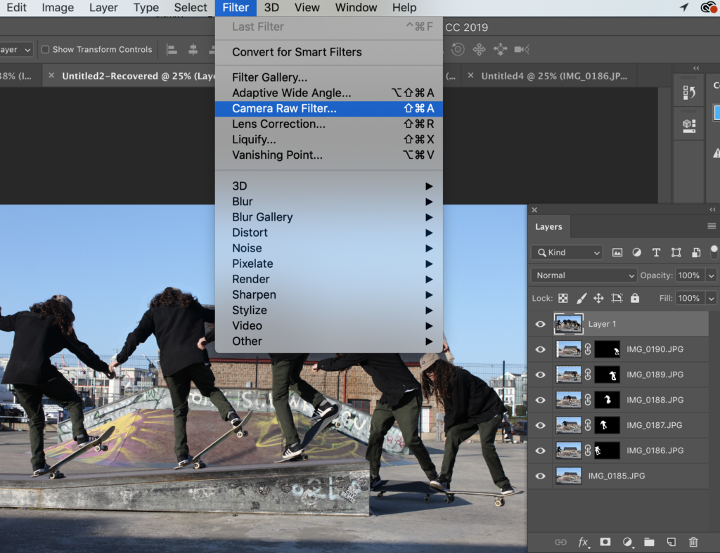
To finish off the image I add the camera raw filter to it and alter the images colours.
Altering the image
Final Image


Evaluation…

SHOOT 3 – CLOUDSCAPES

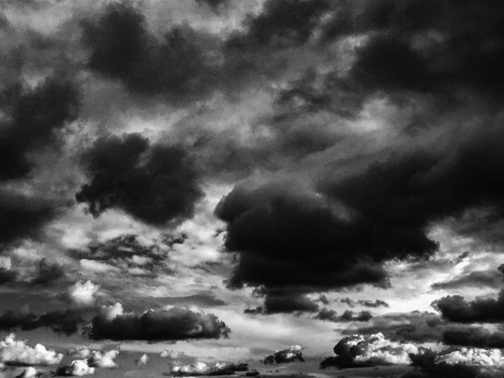
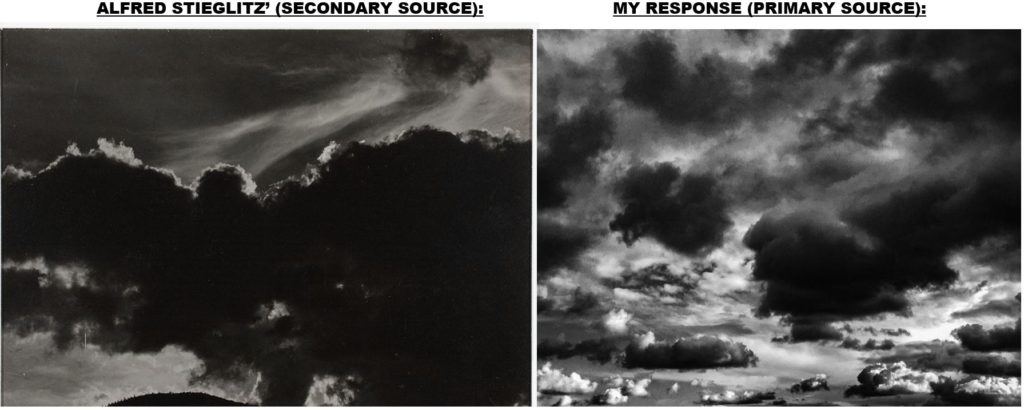
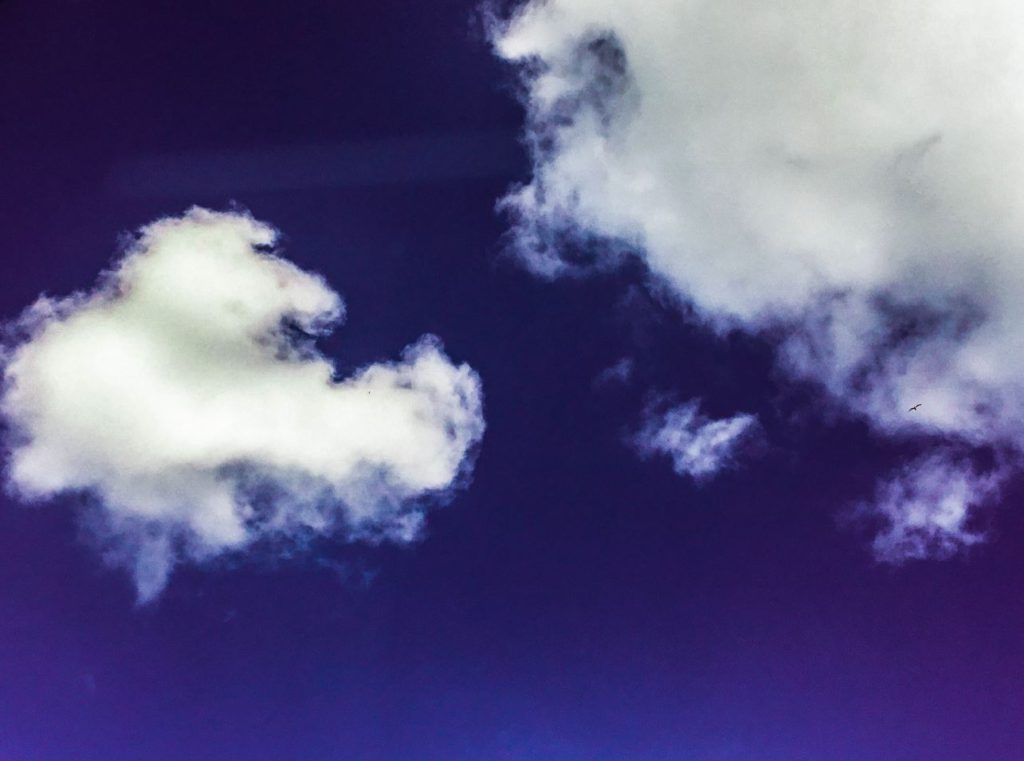
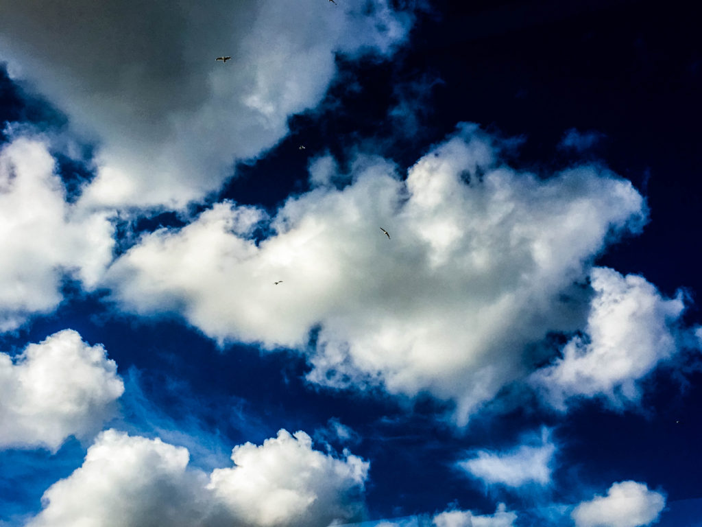
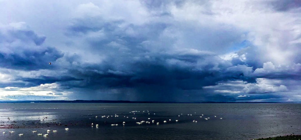
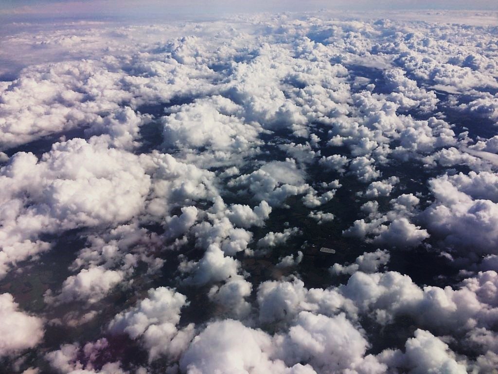
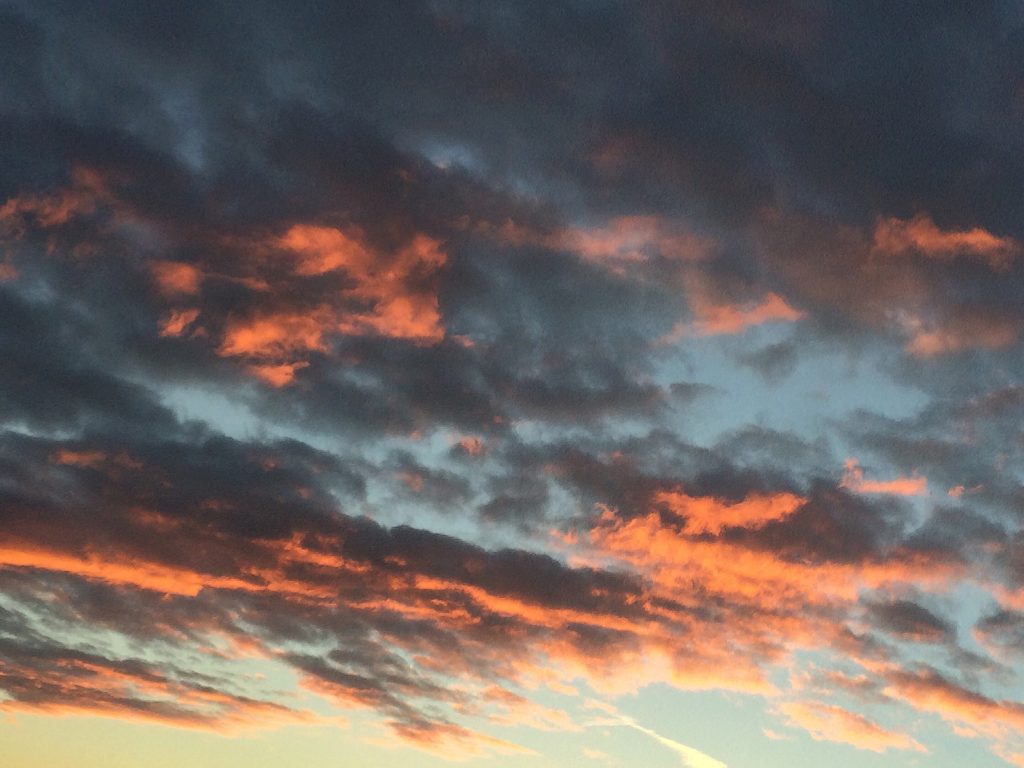
The 3rd category of my nature study is cloudscapes. From previously researching Alfred Stieglitz’s Equivelents and John Day’s photographs for inspiration, I have taken my own photos in response to the artists. In response to Stieglitz, I have captured heavy cloudscapes in times of bad / stormy weather in order to emphasize the dramatic sky like he focused on in Equivalents. John Day approaches cloudsacapes in a complete opposite visual style, with heavy saturation and colour enhancement in order to present the rich and varying colours of the sky above.

PRIMARY SOURCE: