Advertising In The Beauty Industry

Old Fashioned Advertising

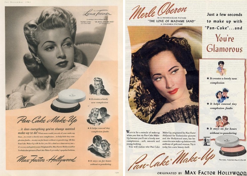
In the past messages about beauty ideals and perfection were obviously promoted to women in advertising for various products. To sell products companies link their brand with a desired look or lifestyle that their customer is looking to achieve, if they believe that buying this product will help them to reach their goals they are more likely to purchase it. Bold statements were used such as “this is no shape for a girl” “great look great body great lash mascara” “how attractive are you on the beach” to target the audiences insecurities directly and make a clear message about the benefits of the product. Although these are old methods of advertising that we would think are now outdated in many ways the same ideas are used in less obvious ways.

Modern Advertising

Modern advertising has a way of being incorporated into every aspect of out lives, there is almost no way to live without being impacted by the messages pushed at us through advertisements. Since the rise of the internet advertising techniques have changed drastically. whilst before they would have been printed in magazines, on posters, billboards TV and Radio they now now have ways of targeting individuals directly. Through the use of HTTP cookies, data is gathered when sent between the website and the users device. They were designed to remember information and interactions users make on the internet, recording their browsing history. this data is bought by advertising companies who use it to specialise and target products towards appropriate customers. Adverts will then appear on various websites, social media platforms and videos.

When looking on my own Instagram to see what products and services were being targeted towards me I found many adverts specific to where I live proving just how much information is collected and used. I also saw a lot of sponsored posts for clothes and beauty products such this teeth whitening kit. This style of modern advertising is more subtle, integrating it into your newsfeed often I will scroll past them without questioning the subliminal messages they are communicating about how purchasing these products is the answer.

On the other hand some commercials and campaigns have started to represent a more versatile group of people, due to the media companies are coming under more scrutiny to more on from traditional beauty ideal and show real people in their adverts.

Barbara Kruger

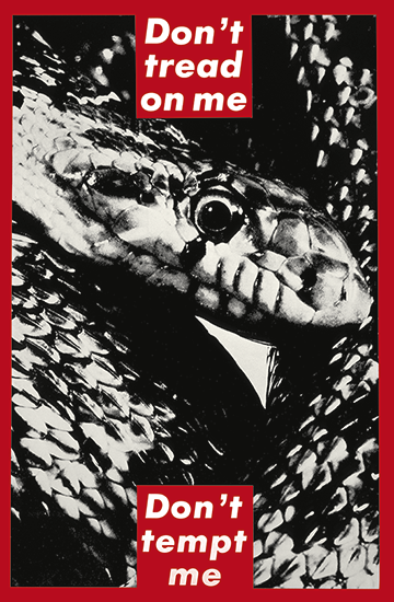
Barbara Kruger, an artist from New Jersey who worked as graphic designer and art director for various magazines created a collection focusing on power struggles mainly for women. By layering photographs she found in existing magazines with aggressive slogans such as “I shop therefore I am” written in white over red boxes to stand out from the black and white backgrounds. They are deigned to imitate the deigns and messages behind real adverts that shout messages at the consumer, and question the viewer about feminism, classism and consumerism. Her work has appeared on billboards, buscards, posters and train stations to further imitate the conventions of advertisements.

Extension rebellion

I also want to look into culturally relevant issues and how they are being publicised, Extinction Rebellion, a current movement against climate change, and the extinction of life due to biodiversity loss and ecological collapse. So far the activists from all walks of life have nonviolently protested in major cities around the world in hope to disrupt daily life and gain awareness from the public and government, some have taken extreme actions to get attention for the cause with over 1,000 people arrested so far. They have a bold memorable logo which is a mix of a cross and a sand timer to symbolise how time is running out for us to change our habit and reverse the effect of climate change. The colour green has been their focus for more of their posters and signs because of its clear links will nature and sustainability along with bold black writing reminiscent of Barbara Kruger’s work and similar persuasive adverts. The middle image shows how the group is using extreme emotive method to display the seriousness of the cause.

Personal Response

After looking at these various advertising methods used to persuade audience into purchasing product or believing in an idea I want to incorporate similar concepts into my work. I have considered adding emotive and brutal phrases into the magazine that go with the idea of beauty ideals and perspectives towards achieving perfection. I also want to create a series of images in the form of modern advertising for example, sponsored ads on social media, posters and product packaging. These will go alongside the magazine to display the idea of how we see messages around this ideal all around us on a daily basis.

presenting my work: Batia suter Lexicon Cycle of life research

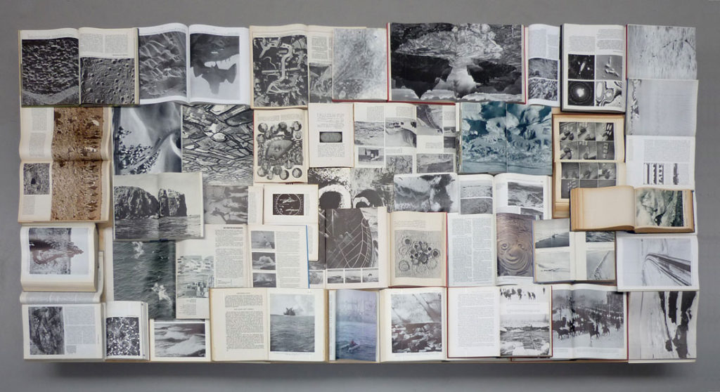
The imagery you can see above is based off of the historical relevancy within the book itself. so not all of these images are form her but the achieve itself. The combination of figurative and literary to my mind is interesting, as it allows myself to possibly think about something I could add into my project. Many of these images are objectivity and not a specific representation of a person themselves. I also like the way in which she chooses to have this sort of loose representation, to my mind this feeling of a scrapbook always has a clear presentation of thought about everything that the book itself contains. From the presentation purpose the huge size of the pieces themselves is something which I believe to be really effective and why I too want to show huge prints, similar to herself. I think using the turn in the wall is also effective, perhaps if I did rows of four within two on each side in the crease, it would allow a much more abstract presentation.

Every page from Sutlers book has a full sized image leaking over the ends of the pages, It both concentrates on this style of a lexicon with an overruling theme. She photographs everything which has some sort of relation through narrative. Due to the sheer size and effectiveness of her pieces, one on every page of full leak, it’s what allows myself to belive if you’re going to go and try to show this monumental representation of everything, you have to really go hard.

Biography:

Swiss-born, Amsterdam-based artist Batia Suter (b. 1967) studied at the art academies of Zürich and Arnhem (NL), and was also trained at the Werkplaats Typografie. Suter produces monumental prints of digitally manipulated images for specific locations, and works on photo-animations, image sequences and collages, often using found pictures. In 2007 she published Parallel Encyclopedia (Roma 100), followed by Parallel Encyclopedia #2 in 2016 (Roma 284), containing a large composition of images taken from books she has collected along the years. Surface Series (Roma 160), published in 2011, is an evocative montage of found images exploring the diverse resonances of geological landscape and visual surface. The underlying themes of Batia Suter’s practice are the ‘iconification’ and ‘immunogenicity’ of images, and the circumstances by which they become charged with new associative values. Her work intuitively situates old images in new contexts to provoke surprising reactions and significative possibilities. By this method, and with an attuned sensitivity to hidden harmonies and expressive accidents, Suter thus generates hypnagogic spaces where pictures can communicate by their own logic, in a force field of imaginative metamorphosis.

lexicon means a collection fo items all represent as though ti i . dictionary fo images. I felt as though ti was important to research this as my book is similar to a lexicon I the fact that it focuses on the narrative of life and death and everything that concerns it.

I decided through looking into how this artist presents her work, usually, having a continuous over-flowing page, I decided I should create a narrative which too allows my theme of black and yet too has these large strong images. I believe this presentation is the best and possibly the final,. I might start developing some new photo possibly with over ruling images and creating a new possibly more interesting composition, and possibly adding in more chaos photos of the pressed jar shoot.

Evaluation of Progress

How well have ideas developed? I have an idea I am following and I am expanding that as I do more shoots.
Are ideas explored and selective appropriate to intentions?
I believe they are as I shot what I thought suited the topic and the project idea I am following
Are they sustained and focused?
I have been following one idea and have stuck to it.
How many responses/ shoots?
I have produced 2 responses so far and plan for a further 2 if not 3 in the coming weeks.
What are the overall quality of the images? The final outcomes I have selected so far have been of a high standard and I am proud of the way the have turned out so far.
How do they respond to research? My images so far have followed my theme of circles, I have explored circles in different way through changing location, subject matter, style and Urban/Rural environments.
How do they relate to artists references? I have chosen my artist references for a reason. Each artists I have explored has inspired me imagery wise or conceptually. Each artist has produced images that could be circle related or follow a conceptual path that relates to my project.
How do the interpret exam theme? Circles follow the exam theme by looking at the similarities of the shape but in different environments and contexts.

Guillaume Amat and Robert Smithson: Time Crystals – Artist Study

Guillaume Amat

Image result for Guillaume Amat


Born in 1980, based in Paris.  He is dedicated to long-term projects which produce photographic narratives. Aiming to adapt the camera to the subject and the way in which to narrate a story by using different types of cameras, formats and sensible surfaces. With his images he build stories which navigate between documentary and poetry.

Robert Smithson: Time Crystals

Image result for Robert Smithson: Time Crystals

Robert Smithson: Time Crystals is the first exhibition in Australia dedicated to the work of American artist Robert Smithson (1938-73). Best known for his radical land art of the 1960s and early 1970s, Smithson is now widely recognised as one of the most influential artists of the twentieth century. Inspired by ideas of crystalline geometry and non-biological time, he redefined abstraction and challenged art history, declaring that ‘Nature gives way to the incalculable cycles of non duration.

FINAL PRESENTATION IDEAS

Full-size prints:

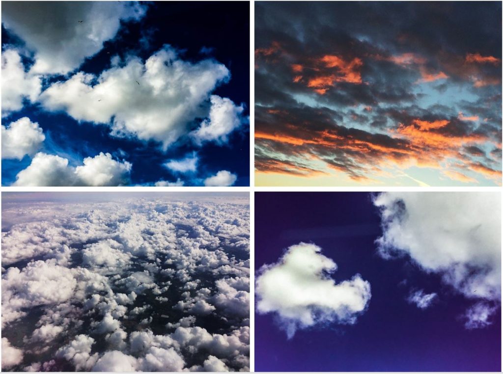
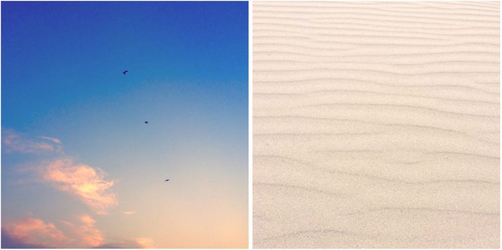
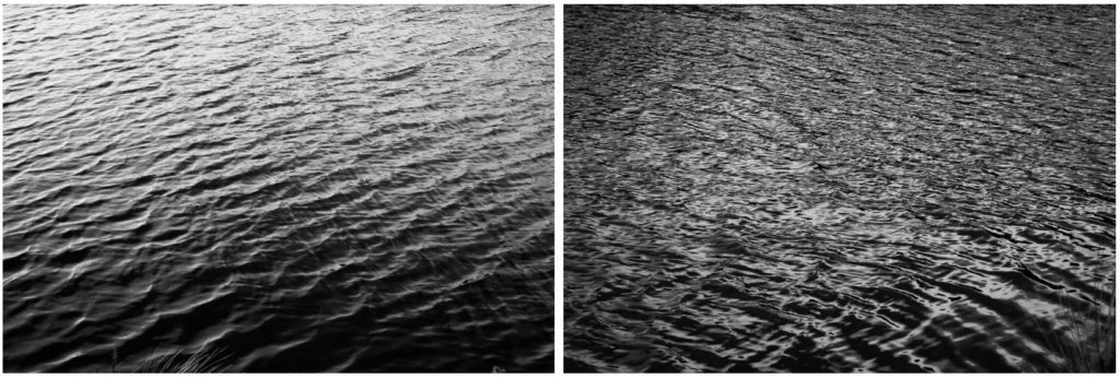
Coming towards the end of my project, I have started to think about final presentation ideas. I have come up with the idea of full-size prints, grid format, photo collection and photobook. I will definitely present at least one of my final prints alone and full-size. Full-size prints are a good presentation method for strong composition and visually interesting image. Pictured below are two photographs I feel I could present alone, however this is not certain as I am still to finalize my favourite prints. I may mount my photographs onto card or use spraymount to stick them down and present them.

1.

2.

Grid format:

I like the idea of using grid format to present multiple of my images at once. Grid format is a good idea for images that aren’t very visually strong presented alone. I have exprimented with this grid format before my final exam to test the idea, presented below. I think the grid format works well as I am able to show 4 of my images in one collection, images that are interconnected and are all brought back to the idea of nature.

3.

4.

5.

6.

7.

Photo collection:

Photo collection is similar to the grid format, but I am able to place more or less than 4 of my photographs together and in a different style i.e. side by side or one below another. Again, I have experimented before the exam with numerous primary source photos below. I am happy with my edits and think my individual images work well together.

6.

7.

8.

Photobook:

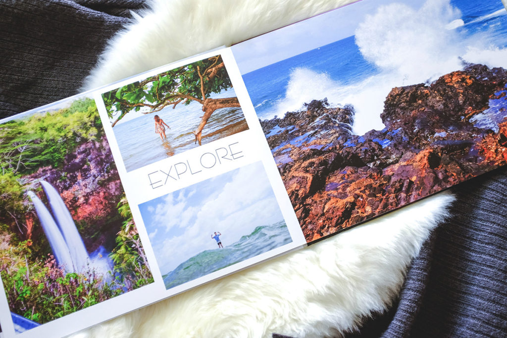
A possibility for presenting my final prints is by photo-book. This is a relatively lengthy process however the final product would be a successful way of presenting the different categories of nature and my wide variety of photos. If I am to create a photobook I would create it using Blurb and Adobe Lightroom CC.

Modernism and Post Modernism

Modernism

Modernism is a general term used to describe trends in photography from around 1910-1950 when photographers began to produce works with a sharp focus and an emphasis on formal qualities, exploiting, rather than obscuring, the camera as an essentially mechanical and technological tool.

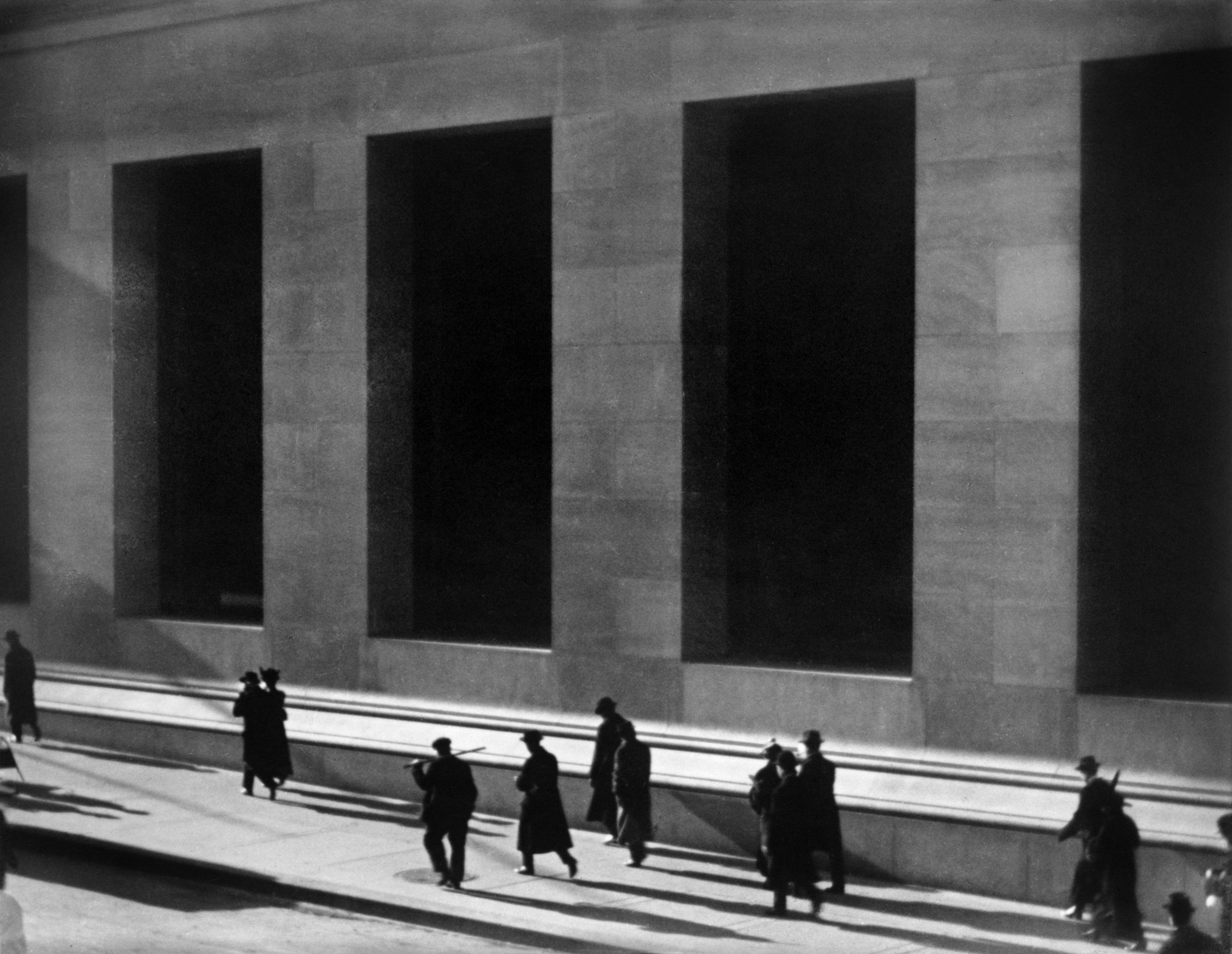
Paul strand was an American photographer born in 1890 in New York, who was one of the pioneers of photography in the 20th century. From the 1950-1960 he travelled around producing different photo books. One of Strands most well recognised photos is “wall street” which was taken in 1915. It shows a moment in time where workers are walking past the J.P. Morgan and Co. building in new York on Wall Street, where the image takes its name. The photograph is most famous for its reliance on the sharpness and contrast of the shapes and angles that lead to its abstraction. This photograph is considered to be one of Strand’s most famous works and an example of his change from pictorialism to straight photography. Strand moved from the posed to portraying the purity of the subjects. It is one of several images that stand as marks of the turn to modernism in photography.

See the source image

Post-Modernism

Postmodernism is defined as a late 20th-century style and concept in the arts, architecture, and criticism, which represents a departure from modernism and is characterized by the self-conscious use of earlier styles and conventions, a mixing of different artistic styles and media, and a general distrust of theories.

Hiroshi Sugimoto is a postmodernism photographer born in japan in 1948 his most famous work is his seascapes work which has a minimalistic approach. One image from this work is the Aegean sea, pillion image, which shows an image of an ocean taken from a spot around japan which many of his images were like in this project.

See the source image

3-DIMENSIONAL PRESENTATION

Letha Wilson:

http://concrete.keenonmag.com/19/

Letha Wilson is a mixed media artist who was born in Honolulu, Hawaii, raised in Colorado, and currently lives in Brooklyn, New York. Letha Wilson is known for combining photography with industrial materials like concrete and steel. Wilson cuts, tears and shapes her photographs, pushing and pulling the prints into place and then encases portions of the composition in cement. Using architecture and three-dimensionality as both frame and armature, Wilson reclaims the photographic image, exploring the medium’s inability to encompass the site it represents.


“MY ARTWORK INVESTIGATES RELATIONSHIPS BETWEEN ARCHITECTURE AND THE NATURAL LANDSCAPE, AND THE NAVIGATION OF BOTH URBAN AND WILDERNESS SPACES.”


Felicity Hammond:

https://www.bjp-online.com/2017/10/felicity-hammond-ipa-2016

Felicity Hammond is an emerging artist who works across photography and installation. Fascinated by political contradictions within the urban landscape her work explores construction sites and obsolete built environments. In specific works Hammond photographs digitally manipulated images from property developers’ billboards and brochures and prints them directly onto acrylic sheets which are then manipulated into unique sculptural objects.


“THE WORK DOESN’T JUST COME OUT OF MY IMAGINATION. IF I AM GATHERING ALL THESE IMAGES AND RETURNING TO THESE LANDSCAPES AGAIN AND AGAIN, I’M ENGINEERING THE OUTCOME THAT BECOMES HYPER-REAL. MY WORK DEFINITELY COMES FROM MY MEMORY, AND THE SIGNS AND SYMBOLS I CREATE; A SPACE FOR MOURNING, TRAGEDY AND MORE.”


Triptik Photo-book Inspiration – Robert Frank

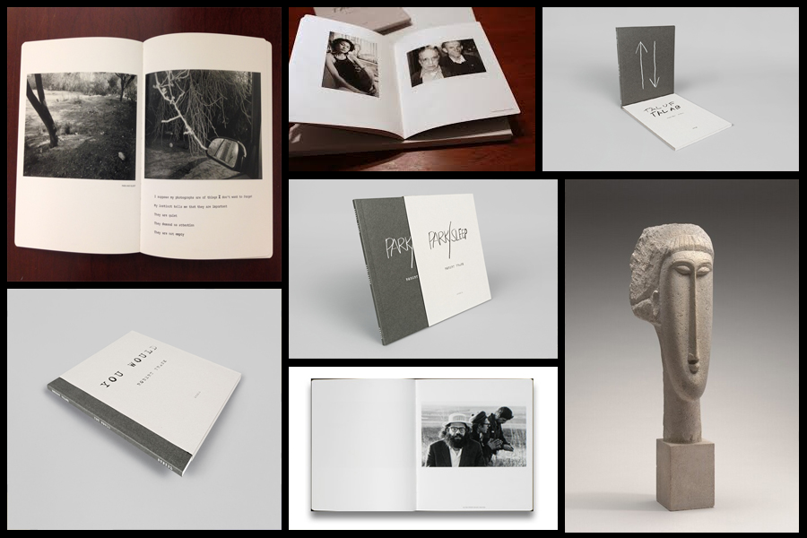
Before going a head and creating my three photo-books I decided to look at a photographer who had produced work in a style that was vaguely similar to the outcomes I desired. The books I found to be particularly inspirational were ‘You Would’, ‘Tal Of Tal AB’ and ‘Park Sleep’, what drew me to the designs in particular where how each was encased inside a brown cardboard folder which fitted the dimensions of each book perfectly. For me this was an idea I wanted to explore as I previously had aimed to produce the three books and store them in a hand-made sleeve so that could be viewed collectively but viewed individually. When looking over the books I found what drew me to them was their minimalist covers which only contained the title and authors name against a predominantly plain backdrop of textured grey card, this was very effective in regards to the book cover being a darker version of the grey which compliments the actual cover which as a result produces the impression of the binding of the sleeve being different. Some pictures of the books can be seen below:

Who is he?

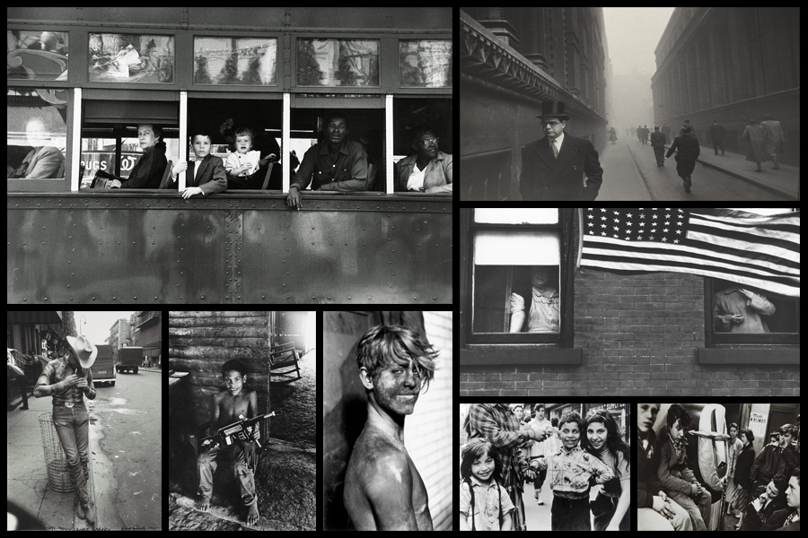
Robert Frank, born November 9, 1924, Zurich, Switzerland, Swiss American photographer and director who was one of the most influential photographers of the mid-20th century, noted for his ironic renderings of American life. Frank became a professional industrial photographer at the age of 22 and in the 1940s became a successful fashion photographer for Harper’s Bazaar magazine in Paris. He felt, however, that the scope of the work was too limited. He abandoned fashion photography about 1948 and went to the United States and then to Peru to explore the expressive possibilities of the 35-mm camera. After photographing in Europe in 1950 and 1953, Frank returned to the United States. Between 1955 and 1956 he drove across the country, taking a number of photographs. Of those, 83 were ultimately published as The Americans, 1959, a French-language version, Les Américains, had first appeared in 1958. Photographs such as Chicago, 1956 in The Americans revealed Frank’s mature style, which was characterized by bold compositions and ironic, sometimes bitter, social commentary. Their publication established Frank as a major creative photographer, and the book was widely hailed as a classic. Examples of his photography can be seen below:

When making my books I would like to explore the use of composition carried about by using singular images over a two page spread which add to the overall effect of any image you want to exaggerate or over-emphasize. For me personally I would like to incorporate mono-printing to produce the cover of my sleeves, this is because of how it would create a newspaper effect where the font thickness and size would be inconsistent and slightly faded, which as a result produces an ink collage effect.

Before ordering and making the book I would need to consider the colour of both the sleeve and books front, this is because of how I want them to be colour coordinated so that they both compliment and contrast each other which creates a more aesthetic result.

Andreas Gursky 99 Cent II Diptychon, 2001

Image result for andreas gursky 99 Cent II Diptychon, 2001

TECHNICAL:

The image uses artificial lighting from the lights in the store which gives a cold feel to the light in the image. The use of the store lighting gives a more natural feel to the photograph but has slight over exposure which is nice as it creates perfect reflections on the roof in the background of the image reflecting the products bellow. The overall image has a large tonal range in both colour and shadow having a very high contrast. This image was most likely taken using a wide angle lens as the image has a very wide view but would have also had a higher number of F-stops as all of the image is in focus and has a large depth of field. The image most likely was taken using a tripod as the image is perfectly upright and the shutter speed would have been a reasonably high speed but low enough to give it a slight over exposure. The ISO would have been very low as the image is very sharp and crisp without any grain or blur.


VISUAL:

The image has a very large tonal range as well as range in colour. The image has a very wide range in vibrant colours seen in the bright packaging of the products ranging from bold red and orange colours to poping blues and pink colours. The image also has very soft neutral colours which are seen on the walls of the shop with cream colours and in the shop logo. In the image there is very clear lines which give strong compositional structure to the image from the lines in the rows dividing the products to the lines in the beams of the building which create a very interesting aesthetic to the image. The reflection on the roof almost is almost unrecognisable as it could almost be mistaken for more rows of products with its almost perfect reflections giving an aesthetic which is particularly interesting to the image.


CONTEXTUAL:

The image was produced by Andreas Gursky in 1999 as a part of a two-part photograph. The image was printed into a single large-scale image which is a digital montage from multiple images taken in a 99 Cents Only store in Los Angeles, the seemingly endless rows of stuff, with shoppers’ heads floating ­anonymously above the products, more closely resemble abstract or Impressionist painting than contemporary photography. Gursky who is a German Architect and photographer is known for using digital manipulation to create scenes that turn almost everyday experiences into art. In 2006, in the in the days just before the Great Recession, 99 Cent sold for $2.3 million at auction. At the time this broke the record for a contemporary photograph but this also moved contemporary photography into the auctions alongside paintings and other highly expensive artworks.

CONCEPTUAL:

The image is a very clear reflection consumer culture which we live in, where their is almost an infinite choice in what to buy and a constant demand for different and fighting for brands to be on the top choice. The image is almost like a criticism on how we live our lives with the rows and rows of products that are all consumed in different ways and almost questions the viewer of the image to say is all of this consumption needed and are we thinking about what we are actually buying.

Golden Hour Shoot (changing light)

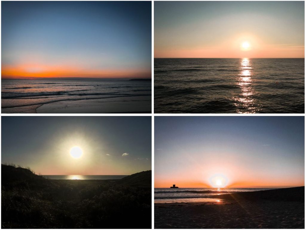
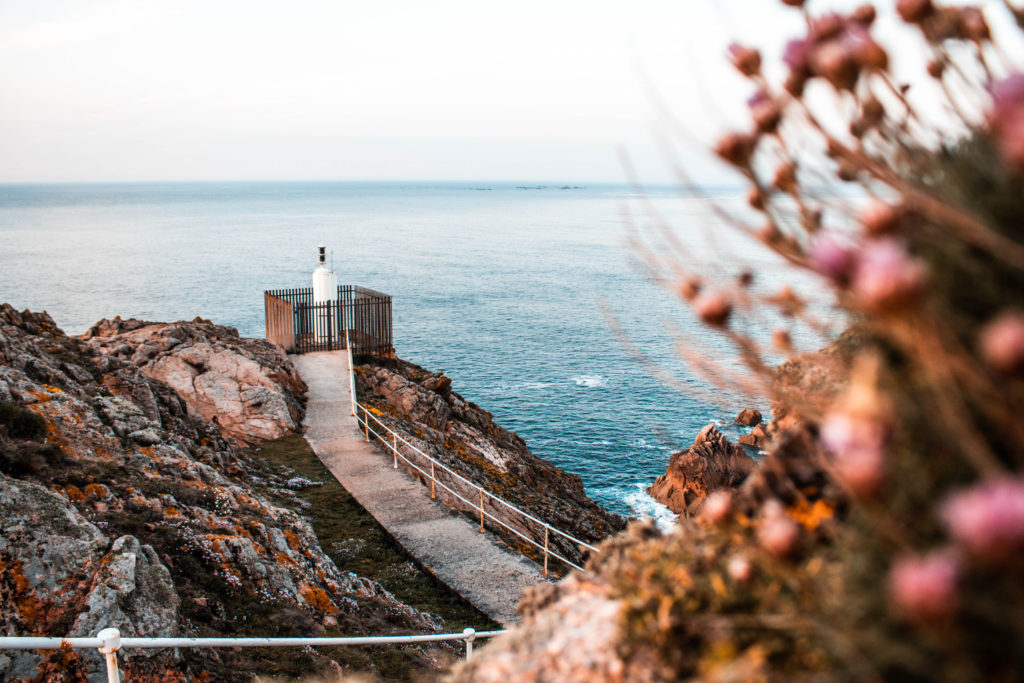
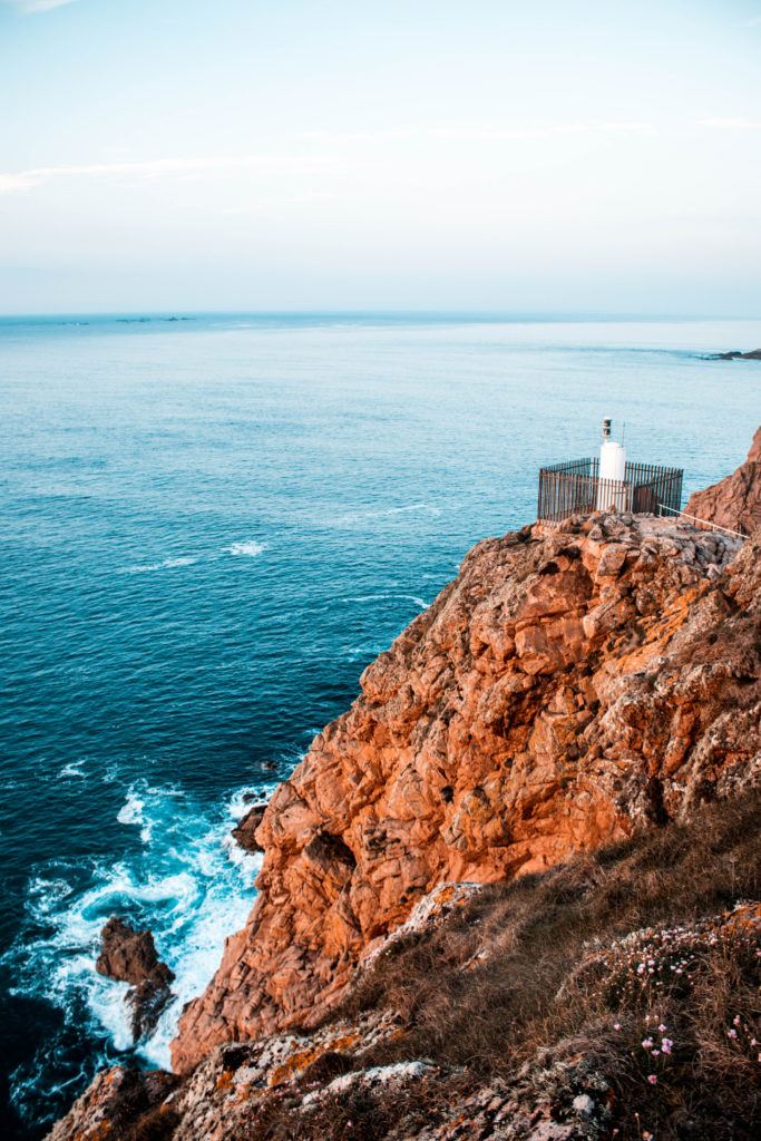
To juxtapose with my previous shoot, i returned to the same location to capture a variety of similar images but this time at sunset. Returning at sunset would give me golden lighting that would illuminate the cliffs in a completely different way to my first shoot on a stormy day. I ensured that it was a clear day to allow for the suns rays to create the most interesting colors upon the surroundings and therefore give a direct contrast between the two shoots in this location. I find it really interesting how much impact the lighting and weather have on a location and this is why i keep returning to the same locations at different times and at different days to see how the change in these external factors convey a completely different story/mood.

Contact Sheet