Kanghee Kim

Kanghee Kim is currently 27. She was born in Korea but moved to New York with her family when she was 14. At that time, there was a need for more nurses in the USA, and her mother was helping to fill that gap – but their lawyer missed a deadline. Kim was never able to secure a citizenship. Eventually, she was protected under the DACA (Deferred Action for Childhood Arrivals) policy, but her status has made leaving the country too much of a risk. She states: “I really miss Korea, especially over the last few years. Korea is the motherland. Whenever I see photos or hear about it I feel a bit torn.” Kim only got into photography in her final year of studying painting. It was this time that smartphones and cameras (technology) were improving; she was frustrated by how much space and materials were needed to paint. “I love walking around and being outside. Approaching photography as a painting was solving that problem” – Kim states.
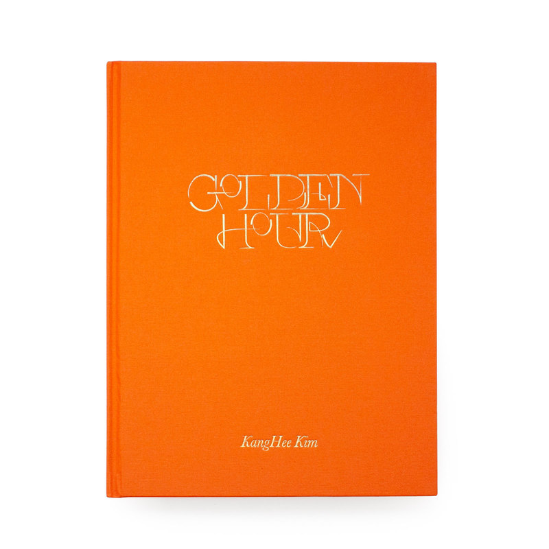
Image of her book “Golden Hour”

Golden Hour is Kim’s second book to be published by Same Paper, (who are based in China). Its carefully-assembled pictures are taken during the magic of the “golden hour” – the moment immediately before sunrise or sunset. This is part of her ongoing body of work, “Street Errands”Most of Kim’s images are taken in New York, California, Colorado, and Hawaii, the furthest place she could go within the states. “When I first went to California, I was pretty shocked. The sky felt so close to me. I saw palm trees for the first time, I’d only ever seen them on the internet.” says Kim. She was inspired to work with images of the sky, after visiting the West Coast. By using photoshop to manipulate and edit her images, Kim feels that she can escape, creating a “new space that feels almost like travelling to an unknown place. When I’m working on these images, it feels very therapeutic. I’m so focused I don’t think about my problems”. Making these surreal images has also been a way for Kim to appreciate what she can do within her current situation. “I used to get bored of doing the same things in the same surroundings, so finding the moments that I really like and layering them helped me to not be so pessimistic or self-pitying.”
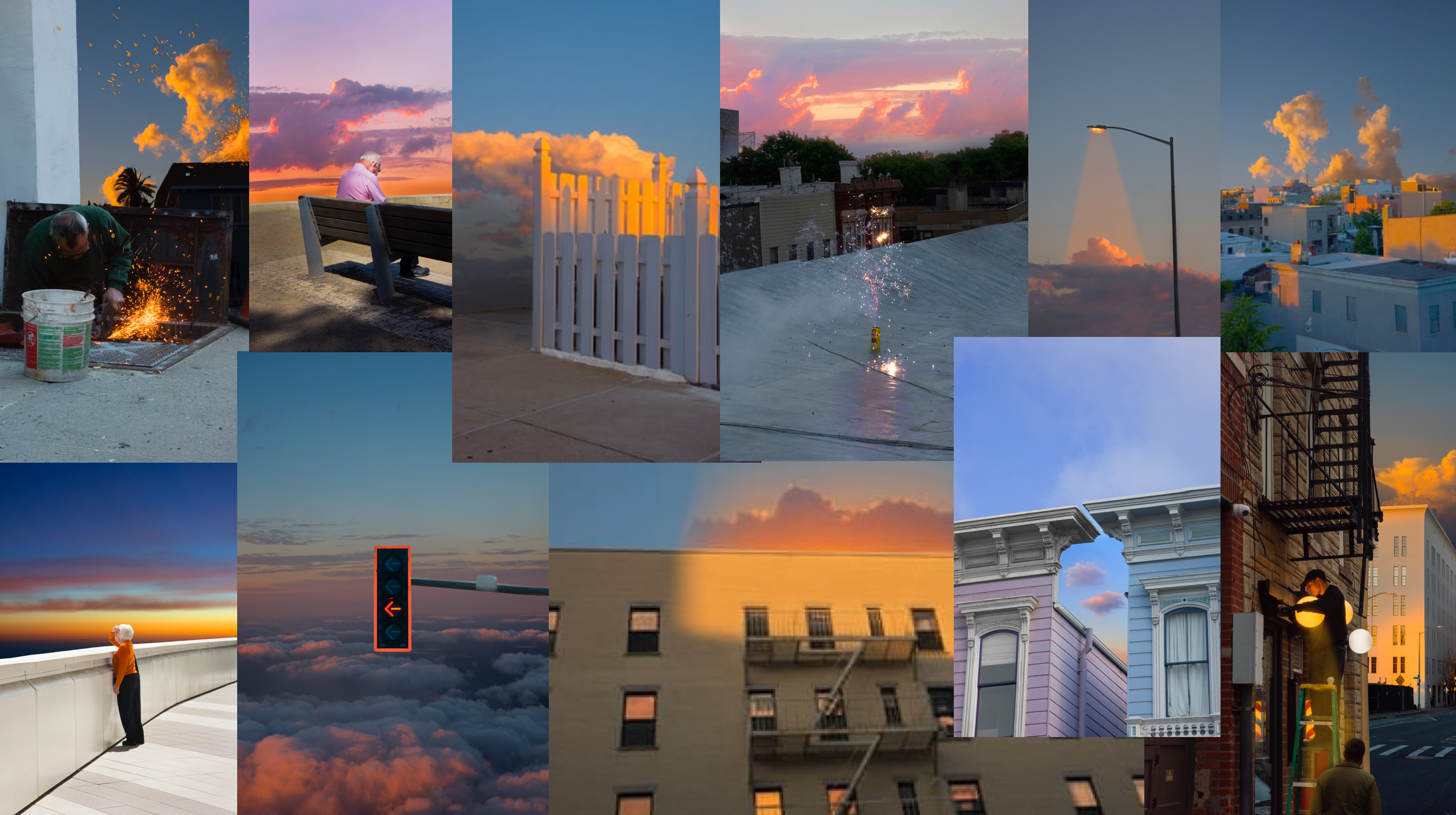
Mood-board of Kangehee Kim’s images from her photo-book “Golden Hour”

Image Analysis

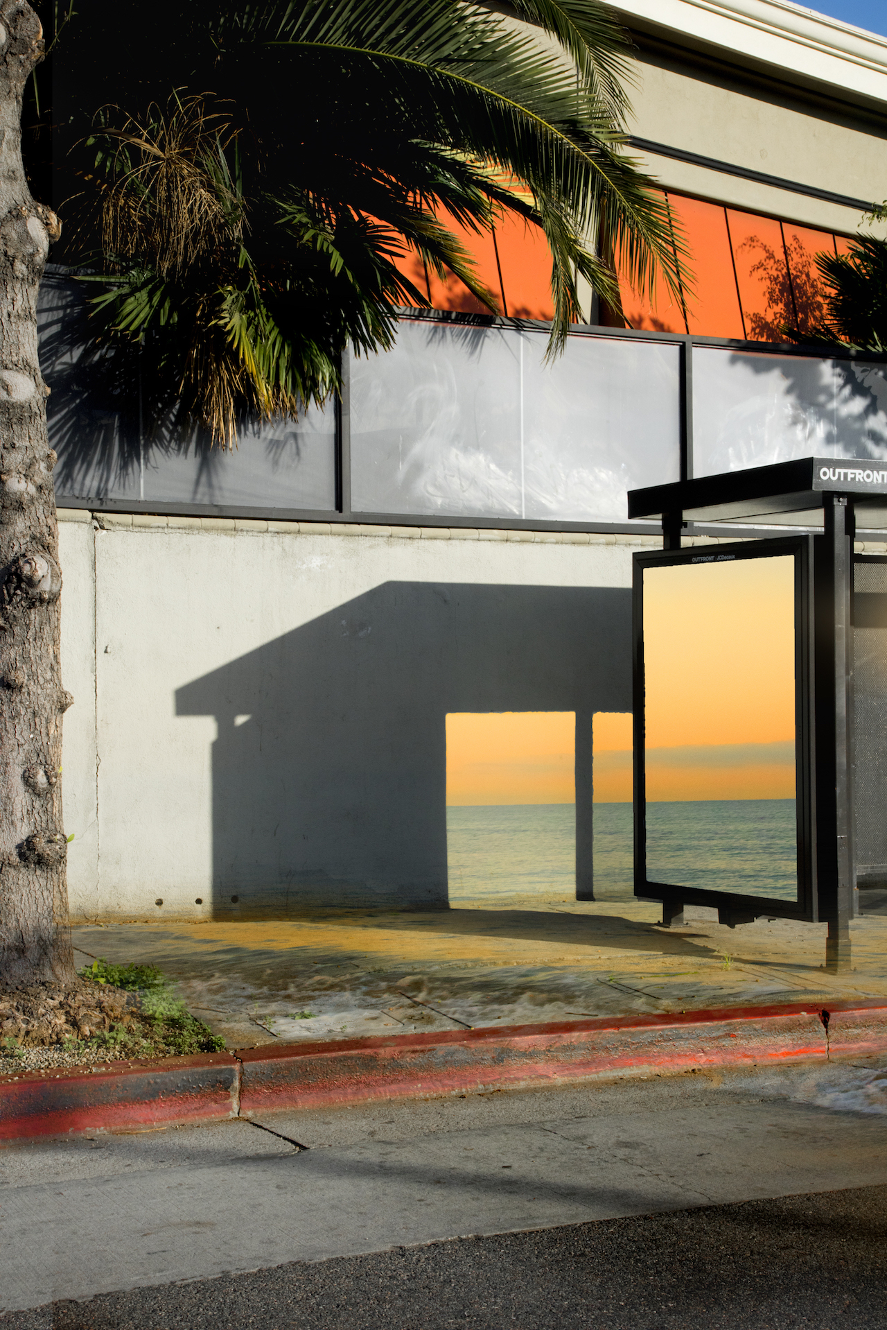
Golden Hour by KangHee Kim

This image taken by Kim is a very surrealist type of image. The way that she is focusing in on the effects of the sun during the ‘golden hour’ in the US creates this dream-like series of images. This image in particular, is portraying how sunlight creates this huge effect of beauty onto a normal scene. I like how Kim has used an editing technique process; she has manipulated the side of a bus stop (along with its shadow it creates) and placed a beautiful image of the blue sea, contrasted with the bright orange blossomed sky. She has also used a technique to make sea waves appear as if they are on the pavement. She has done this because she wanted to show that although she misses her place of birth, (Korea,) she has interpreted her current home place (the United States) to be as beautiful as her original home-town, Korea. She is implying that she loves to see a beauty in everything, and using the sun as a main focus point helps create this aspect of dream-like subject matters – this street she has photographed to incorporate images of the sea and sun would have been a plain, standard image but her surrealism artist traits has made her work much more outstanding and unique. I also like how she has made the orange sun that is being reflected on the windows of the top of the building a lot more vivid and bold; although the sun may have been reflected on these windows, it would’ve been no where near as pretty as she has edited it out to be. She really wanted to make sure each and every image in her “Golden Hour” photo-book is showing bold features of the sun and the sunlights beauty. This makes her work have an attractive aesthetic, with an orange, welcoming cover and a warming golden typography. The colours in this image are really standing out – I also like how in the top right corner of this photo, you can see a bold colour of sky blue. Her touch of surrealism has really made me intrigued into her work, and has made me realise that the sun is such an amazing factor to base a photographic piece of work on.

Kim’s work of the ‘golden hour’ links to the exam title ‘variation and similarity’ because she has made every image take an approach that pinpoints the sun as its reason of beauty and boldness – they are all similar due to the fact that they are brightly coloured and consider eat sun within some part of its photo. Yet, each image is varied from the other, as she uses different settings, as well as people, to create her creative series of photos. I have chosen this artist as one of my artist references because I am keen to follow the route of light and shadows as my exam project. I want to contrast these 2 aspects of everyday life to show how different and the different effects they create; as Kim has shown in her project, light creates a very warming, happy aesthetic, which I could want to incorporate into my work that explores light. Kanghee Kim has been a great influence into my inspiration to photograph light, as I am intrigued to do a few shoots on the effects of sunlight on different scenery. However, (as I stated in my specification,) I want to explore light as a whole – not just sunlight. This may mean I will have to capture some shoots in a studio or a dark room in my house, and use artificial sources of light, such as lamps, lighters, torches etc.

CCA/Private Gallery Visit

Private Gallery

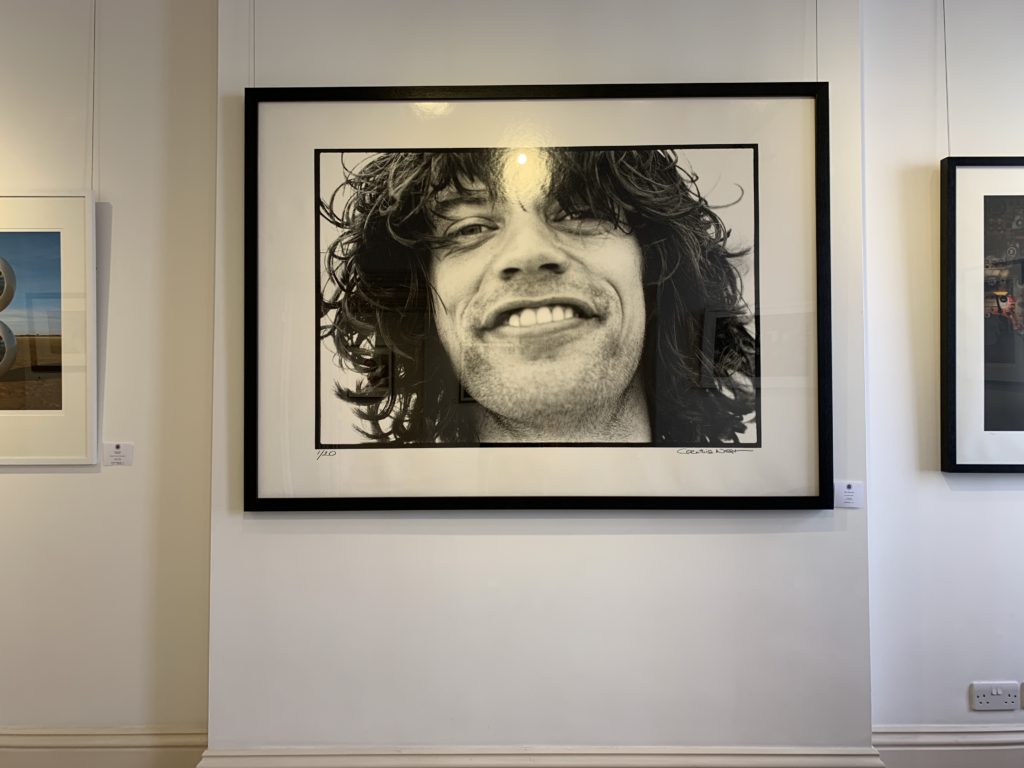
Mick Jagger in Holland Part by Corinthia West

The images in the CCA Gallery were and exhibition by Mike McCartney, Rupert Truman, and Carinthia West. In the images in the exhibition was very diverse some of the images gave an insight to the lives of the stars of the 60’s such as Mick Jagger and David Bowie, as the photographer Carinthia West was involved in this world she was able to photograph the stars as regular people, which normalised them in a sense which is something that I really liked.

CCA Gallery

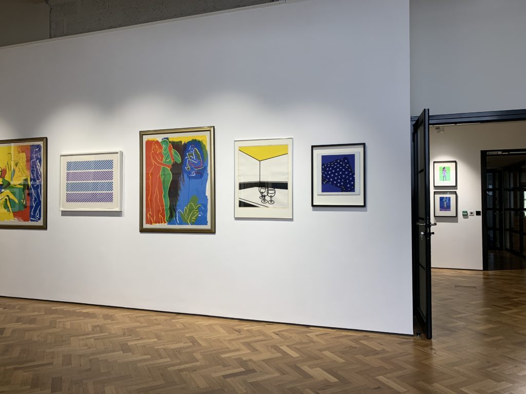
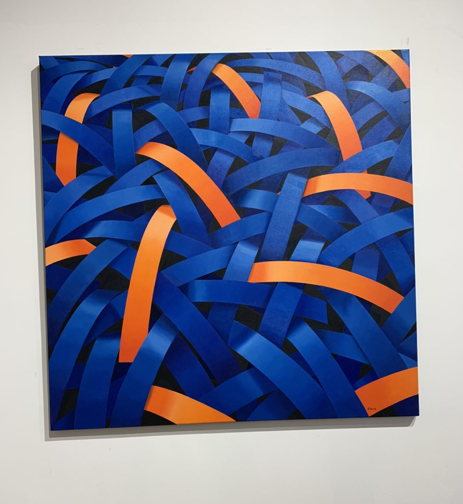
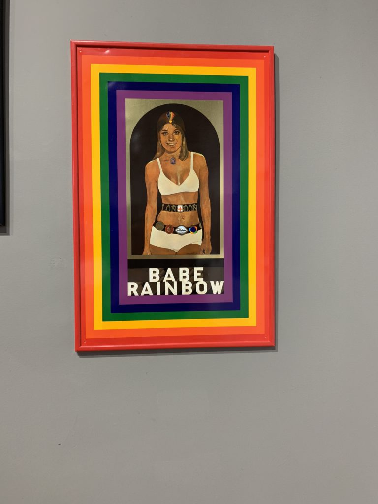
The images in the private gallery greatly contrasted what was being exhibited in the CCA Gallery. The style of the images in the Private Gallery focused on the art and culture of the pop art movement. In the gallery the works were more paintesing than they were photographs. The work consisted of bright colours, abstract shapes and abstract painting. The gallery was titled ‘Pop icons on the 20th century, Britain and American pop art’. The pop art movement was around in the 1950’s and peaked in the 60’s but is still widely recognised and practiced today

‘Homard Bleu’ by Nick Parlett

Jersey’s relationship with the Sun

Jersey is the biggest of the islands within the Channel Islands, between England and France. “A self-governing dependency of the United Kingdom, (with a mix of British and French cultures,) it’s known for its beaches, cliffside walking trails, inland valleys and historic castles.” Jersey is also the sunniest place in the British Isles; in 2010, Jersey saw 2403.2 hours of sunshine – the sunniest on record, outshining other sites across the British Isles. The island of Jersey has a close relationship with the Sun.

Mark Leonard sun photography in Jersey Channel Islands

Amateur landscape photographers in Jersey

Steve Wellum was an amateur photographer in Jersey, He has now retired, but was known for his beautiful photo-shoots he created for families, weddings and other events.

In the 1960s, 1970s and 1980s, tourism was a huge part of Jersey, with its many hours of sunlight persuading people to come and visit Jersey. There were many aspects of Jersey that adapted itself to a tourist island; there were historic landmarks that have become tourist sites, meaning Jersey soon became a place of museums and historic viewings, gaining money from its castles, (Mont Orgueil and Elizabeth castle) and the War Tunnels. This pleased the community of Jersey, as the island was becoming more popular and well-known, and it also pleased the tourists – they were more intrigued to visit Jersey with these interesting places to visit. Additionally, Jersey’s Sun meant that Jersey’s beautiful beaches and scenery became more and more visited on a daily basis.

Archival images as a postcard of Jersey landscapes

Laura El- Tantawy

Image result for laura el tantawy photography

Laura El-Tantawy is an Egyptian photojournalist and artist based in London, England. She was born in Worcestershire, England, in 1980 and grew up between Saudi Arabia and Cairo, Egypt. Given her multicultural background, she has found solace in photography not just as an artistic form of expression, but also as an inner voice to reflect upon her own identity and how it relates to the world around her.

Laura  El-Tantawy recently did a project called Beyond here is nothing at all. She described the project as ‘Beyond Here Is Nothing’ is a photographic meditation on the notion of home. ‘To be home is to feel a strong connection to a land and a grounding to its roots’. The image below is taken from this project, many of the images in this project have a sense of dream like and fantasy to them.

This image is taken from the project ‘Beyond here there is nothing’ in this project Laira is exploring the meaning of home and the connection to home. As Laura is living in a different country to where she is originally from this image might be a reelection of how she is dreaming of what her home is like. The tree in the bottom right is a palm tree which are typically found in warm countries, not in England. To create this image Laura has used the technique of double exposure and layering to the sense of all the images being together as one. So this is something that I want to experiment with in this project.

El-Tantawy studied journalism and political science at the University of Georgia in Athens, Georgia. In 2009, she received a research fellowship from the University of Oxford, where she researched the impact that Internet blogging and independent newspapers were having on pushing the boundaries of free speech in Egyptian media.

“My photographic interest in a project typically stems from having some personal connection with the subject matter,” she said. “Having lived between East and West much of my life, I have often felt lost between the traditional ideologies instilled in my upbringing and the extremely liberal practices of the West. I had to find a defining balance for myself as an individual, and my work as a documentary photographer has helped me do that. Dealing with who I am as a person and my position on the critical social issues facing the world today—particularly those pertaining to my background—is at the heart of all the themes I take on in my work.”

In 2002, El-Tantawy started her career as a newspaper photographer with the Milwaukee Journal Sentinel and Sarasota Herald-Tribune. In 2006, she became a freelancer so she could focus on pursuing personal projects. Her work has been published and exhibited in the United States, Europe, Asia, and the Middle East. She lives between the U.K,  her country of birth, and Egypt, with which she associates most of her childhood memories.

Laura recently produced a project entitled ‘ The Veil’. The images in this project has been made to be ‘bad’ on purpose, she was trying to capture the movement and the hustle and bustle of the city that she lives in, the project was focusing on how most women wear veils to  cover up as part of their religion and how this might clashing in the 21th century.

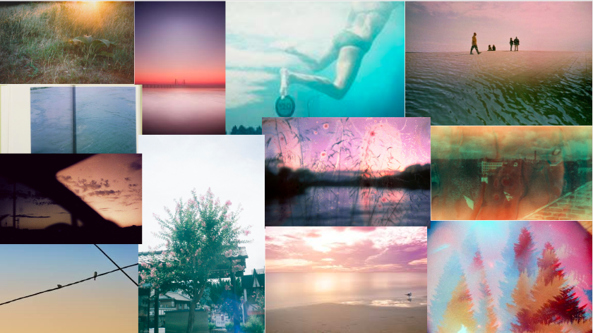
Mood Board for the project

For the project I want to do more research into the spiritual aspects of photography, and how to photograph a world that isn’t really there. And small details of everyday life can be seen as a thing of beauty. Rather than photographing whole frames of landscape images, I plan to capture my images with a more abstract view. Many of the images in the mood board have been taken on film cameras, as this is something I have always had an interest in this aspect of photography but never really experiment that far into it so this will be a challenge for me. I also love the colours tint that film camera give to the images. But the main aim of the project is for me to take a different approach on the way that I see the island.

Geology and Vernacular Architecture

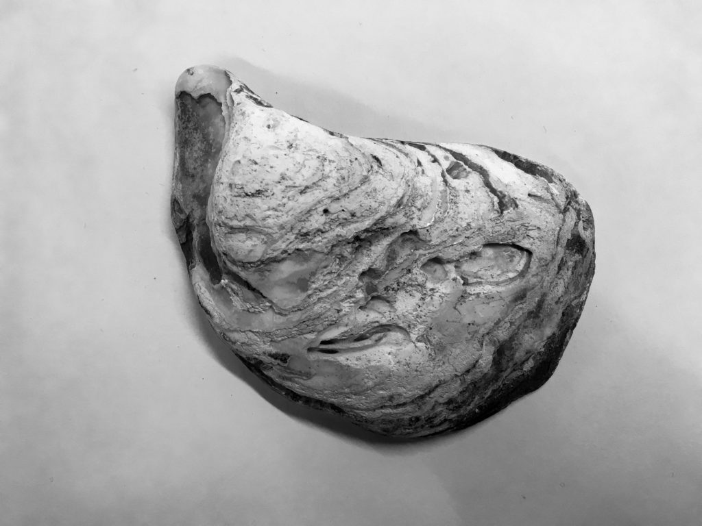
Geology (coming from the greek gē, meaning ‘earth’, and -logia meaning ‘study of’) is an earth science which is concerned with the solid aspects of the Earth, the rocks which make up the Earth, and the processes of how they change over time. Geology is not specific to the Earth – it can be applied to any planet or moon. The evidence for processes such as plate tectonics, past climates and evolutionary history come through geology. There are three main types of rock – igneous, sedimentary, and metamorphic.
The word ‘vernacular’ in terms of architecture means the structures and buildings that are built in a functional way that is unique to that geographic area and which suits the area by using the main abundant natural resources available. Vernacular architecture can reveal the culture of the society slightly through showing the patterns, materials and elements that are unique to the area. The origins of vernacular architecture came from the design skills and tradition of local builders, who were to use the particular materials indigenous to the region and would use the local traditions and cultural practices that they are used to.
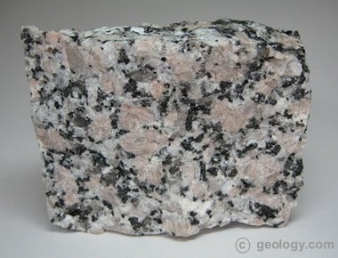
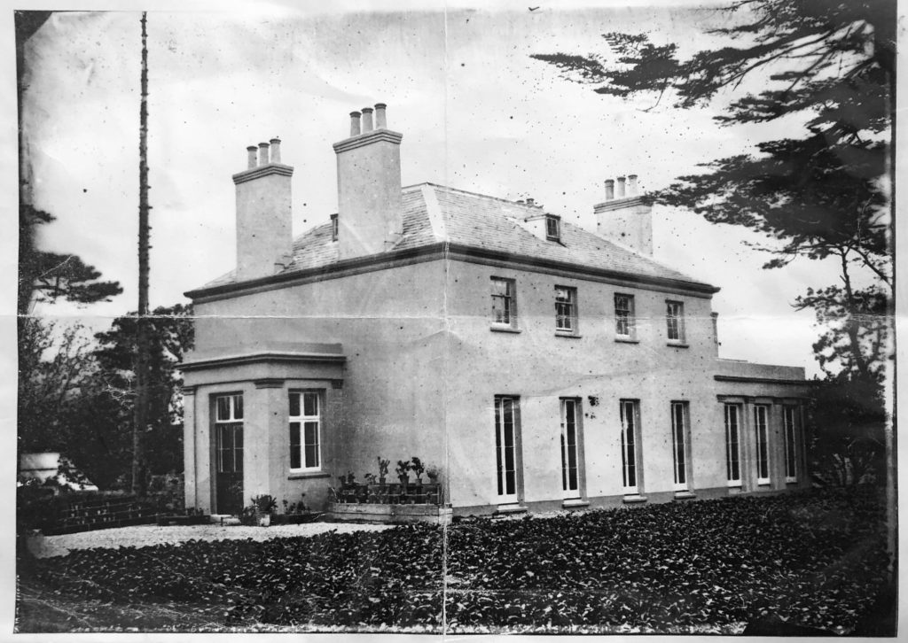
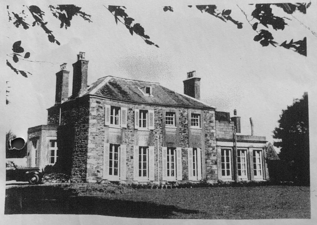
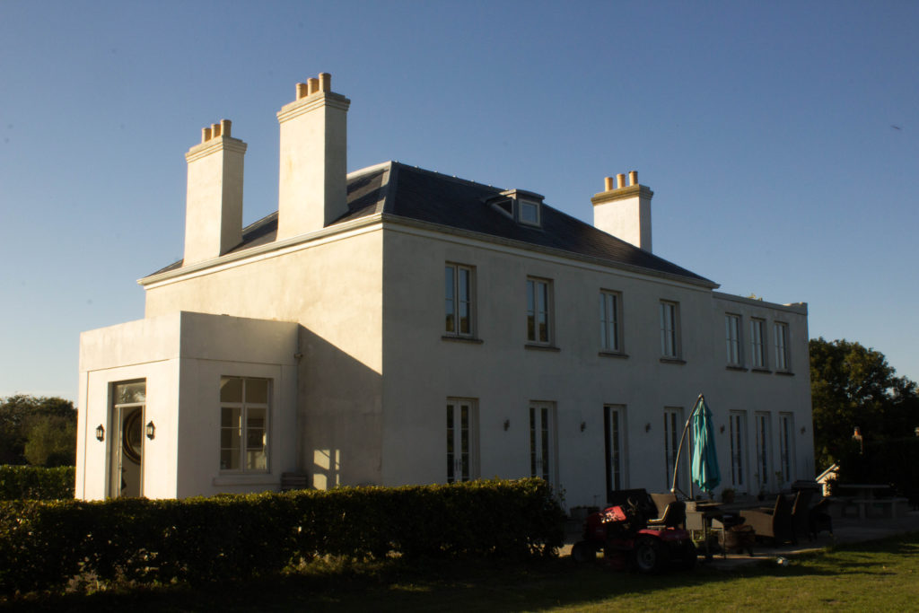
Granite is a key part of Jersey’s vernacular architecture. It is completely abundant in the island and is a common type of feslic intrusive igneous rock that is granular and phaneritic in texture. The fact that it is igneous means that it is formed through the cooling and solidification of magma or lava, also because the granite is rich in elements that form feldspar and quartz it is described as ‘felsic’. The word ‘granite’ comes from the Latin granum. Granite is used as a base structure for the majority of houses in Jersey but is covered by plaster and paint in most cases. The exposure of granite in houses comes and goes as fashion changes – an example of this is my own house. Below is a set of photographs of my house over a period of time. The first photograph shows my house in 1862, the second one in the 1950’s and the third one taken this year. As you can see in the first photograph the house is plastered and painted as doing this was seen as a sign of wealth, but in the second photograph the granite has been exposed due to it being a trend at the time. In the third photograph the plaster and paint has been reinstated leading to the house looking more like the original photograph than the second photograph because the trend of using plaster and paint has come round again but the whole time the granite had been present.

I want to explore granite in Jersey by photographing the large formations of it in our beaches all around the island as it is such an abundant and important resource to the island. I will be planning on photographing the rock to fill the lens to create a slightly abstract composition that focuses on the shapes and formations within the granite rock. I will then explore exposing the variance and similarity within this rock by comparing them side by side or along with the building faces that I have been photographing.

Photoshoot 2

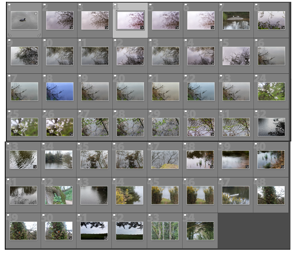
For this photo shoot i decided to explore shooting videos to portray nature as i wanted to show the movement which isn’t shown in a still image. I particularly wanted to show the flow of water in a stream or lake and thought that a reservoir would be a good place to shoot as it has different aspects of nature surrounding the water i.e. plants, trees, and animals that i could capture in video. I was also interested in recording the sounds in the landscape. As I walked around the area I took videos and pictures of aspects of the landscape that I found interesting and beautiful. I also took inspiration from abstract art in this shoot, trying to focus on lines and shapes in the landscape.

Videos

One aspect I like about creating videos of what I was originally photographing is that the different shots change after each other, comparing each angle to the one before. I also like how in each video there are different sounds of the surrounding wildlife because I am in different areas. I wanted to emphasise the fragility, beauty and existence of the plants and water and think I did that effectively. I like how in some of the shots you can tell that I am holding the camera up because of the movement giving the video a more personal effect, emphasising how I have just noticed these aspects of nature on a walk.

Images

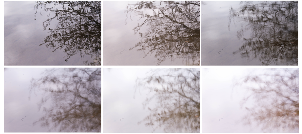
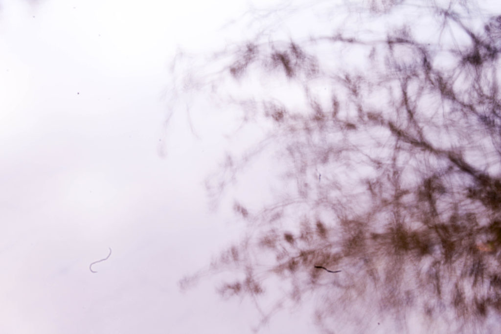
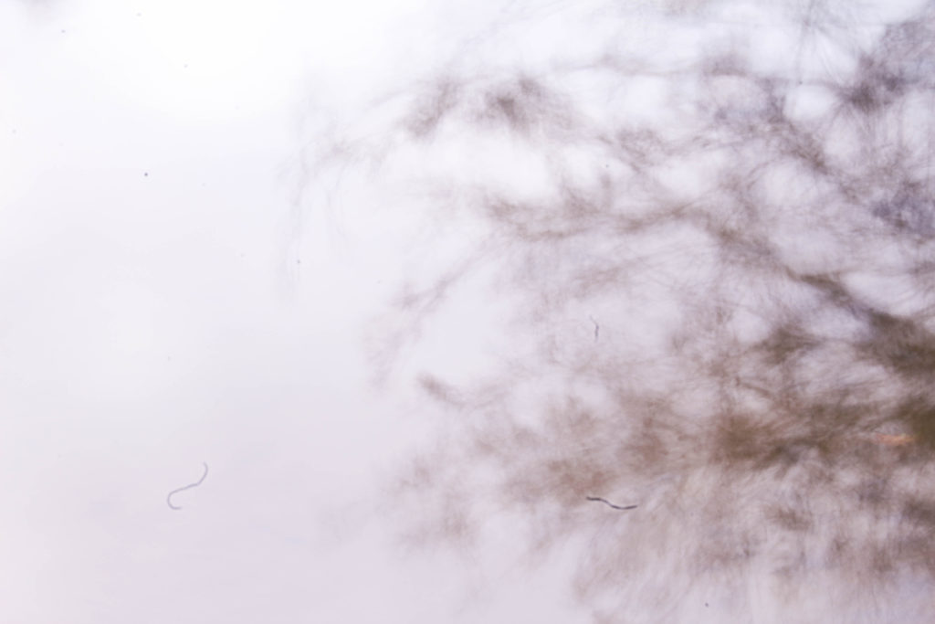
I took photos as well as videos on this shoot so I could compare to see which was most effective. I also wanted to experiment with these images by manipulating the colours and tones within them to see if they make a more interesting image. I first started experimenting with shutter speed as I wanted to see how the images would look when I photographed moving water and the reflection of a tree. I thought that this would create an interesting series of images of the same subject of nature.

I like these images displayed together as it shows the different effects created by the faster and slower shutter speeds. The first image I chose to display was the third shutter speed I experimented with. I like this image as it still shows the details of the branches and the shapes of the leaves, but has a blurred effect from the movement of water. I don’t think that it’s bios that this image is a reflection in water and makes the reader questions what the image is of. The second image I chose to display shows less of the details in the branches and has a more exposed appearance, making the image brighter. The shares of the branches are still noticeable against the white water, but it still contrasts to the first image which is darker. If i wanted to edit these images further i could manipulate the tone and underlying colours in these images so that they could contrast even more i.e. i could edit one to be a cool tone and emphasise the warm tones in another. The third image I displayed is the slowest shutter speed I used and is the mot exposed. I also like this image as it creates a emphasised blurred effect that contrasts to the other two images, making it even harder for the audience to see what the image is of. I think that this series of images really reflects the fragility of nature through the soft blurred lines of the slow shutter speed that making the plants seem more transparent and other worldly.

In future shoot where i want to experiment with shutter speed i could use a tripod to see the effect o the water of the camera being even more still. I could also experiment with different aspects of the landscape that aren’t moving, and physically move my camera to created blurred effect.

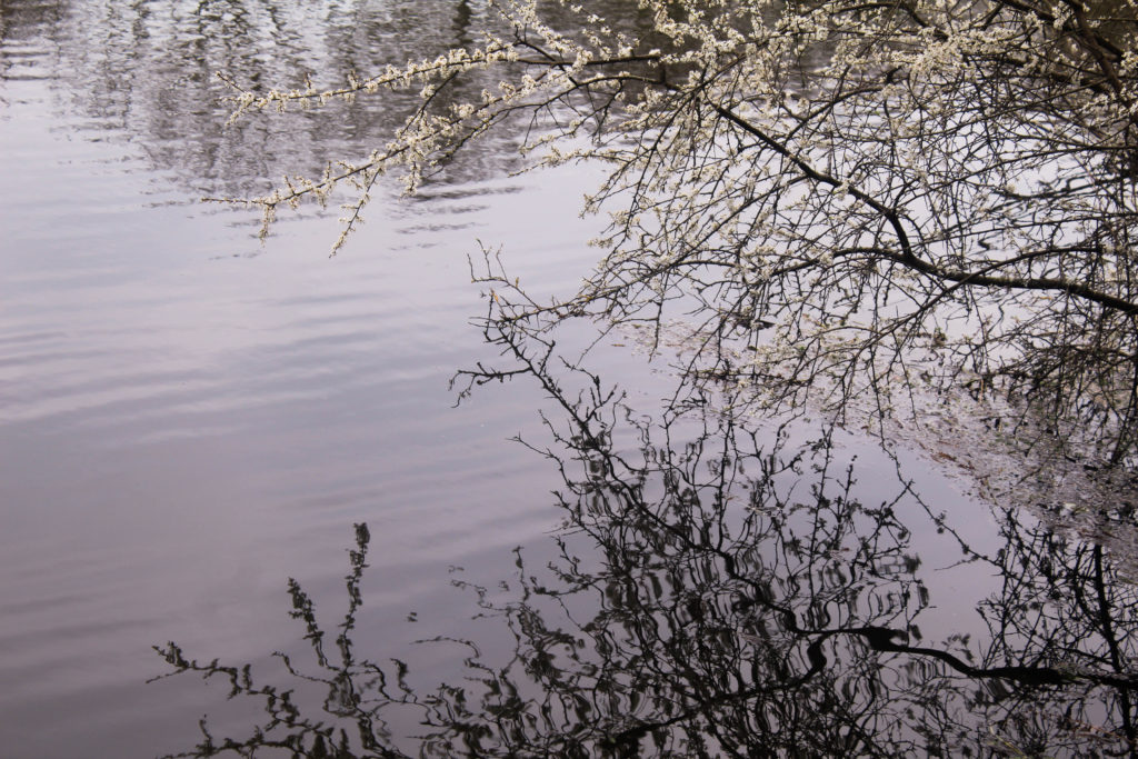
I like these two images of elections of plants o the water as they contrast with my images from my experiment with shutter speed as they are much more detailed as they were taken with a faster shutter speed. This allow for the different directions of the ones and shapes of the branches to be noticeable. In the first image I wanted to include the tree with flowers as I thought this reflected ideologies of beauty and thought that the shape it created in the reflection was interesting. One aspect I don’t like about this image is the composition as I think that they is too many details that are over powering. I think that the combination of the flowers on the tree and the reflection is effective, but I think that the reflection in the top left of the image makes it too chaotic. If i wanted to use this image as a final outcome, I could edit out the reflection in theta left to make a more atheistically pleasing image.

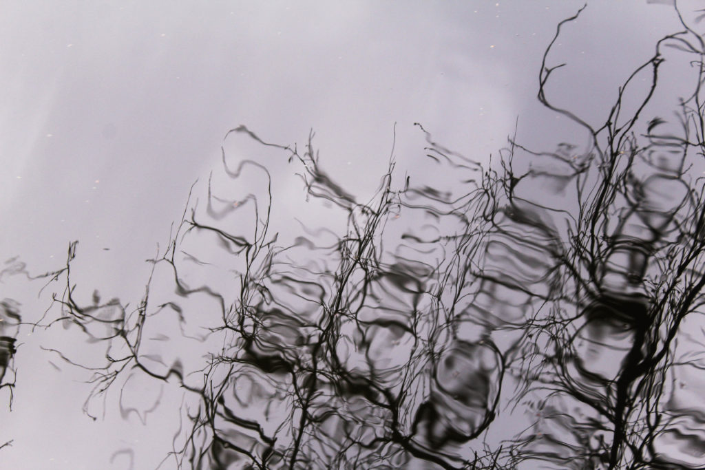
The second image is he more abstract image and is harder to identify as a reflection than the first image.This is my favourite image out of the two as its composition isn’t too overpowering with the negative space at the top of the image which is then continue in the pattern of the reflection. I also like how the plant is distorted through the ripples in the water as creates stretched blurred shapes which makes a more interesting image.

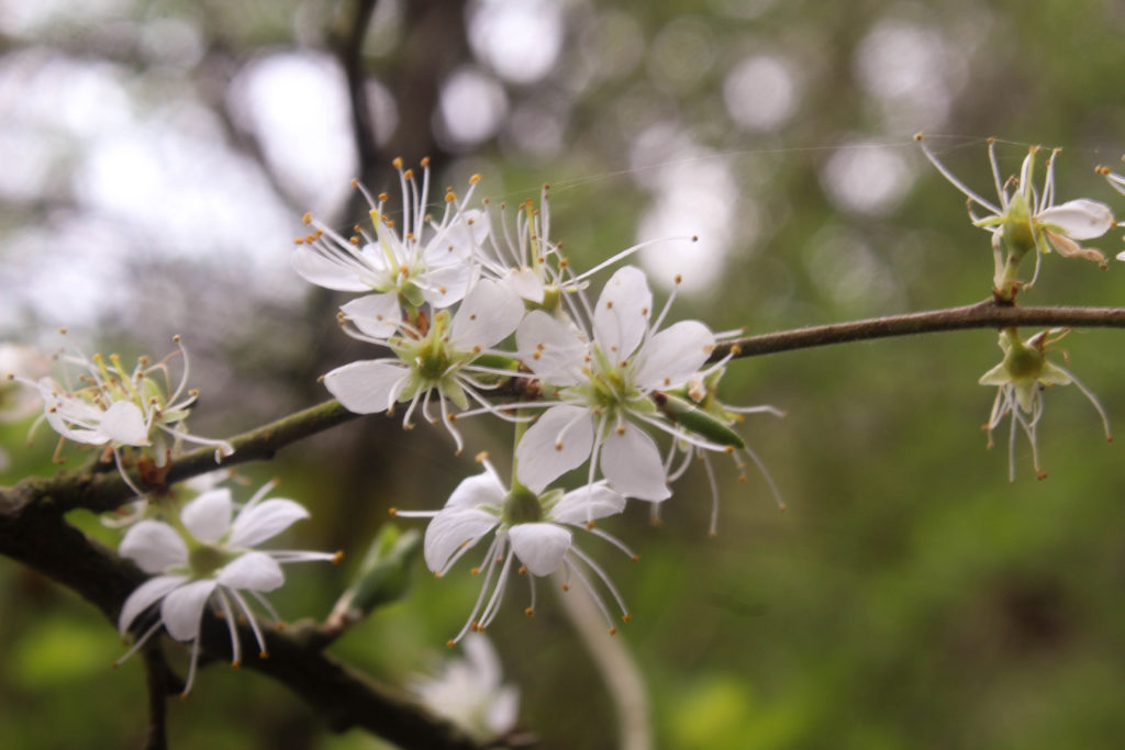
I also focused flowers and plant in this shoot by themselves and in water. I chose the first image above of the whit flowers as I liked how the background was out of focus with the flower in the foreground being in focus. This makes the colours the background blend together, making the areas where the sky is more brighter. One reason I took this image is the spider web which is hanging from one flower to another on the branch. I also like the round shapes on the flowers that emphasise stereotypically feminine shapes.

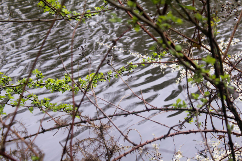
I displayed the second image looking through plants to show moving water. This was one of the angles I used in my video. I wanted to display it as an image as well as i thought i could compare the two. I think that the video is more effective as it showing the fast moving water in the background which isn’t shown in the still image. Also the movement of the plants in the wind shows them more naturally. I liked the composition of this angle as the surrounding plants and leaves frame the image and make it seem as though you’re looking down through the plants. I think that the plants in the foreground being blurred is effective, with the water being in focus, as it turns the audiences attention to the bright water. I also like how the plants go across the frame in different direction as it creates a more detailed, intricate composition and how the pattern made by the ripples of the water contrasts to the pattern made by the plants.

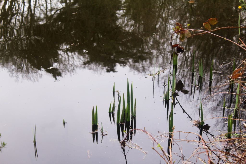
I included the third image as it reminded me of an image I took in my first photoshoot with the same type of plants in water. This image is completely different to the first as it shows the reflection of the trees above the water. I like how the shapes and branches of the trees are still noticeable even in the reflection and make the composition of the image much more interesting than the first. I also like how there are a few brown plants in the right side of my image, adding to a range of different colours in the image.

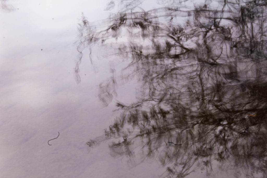
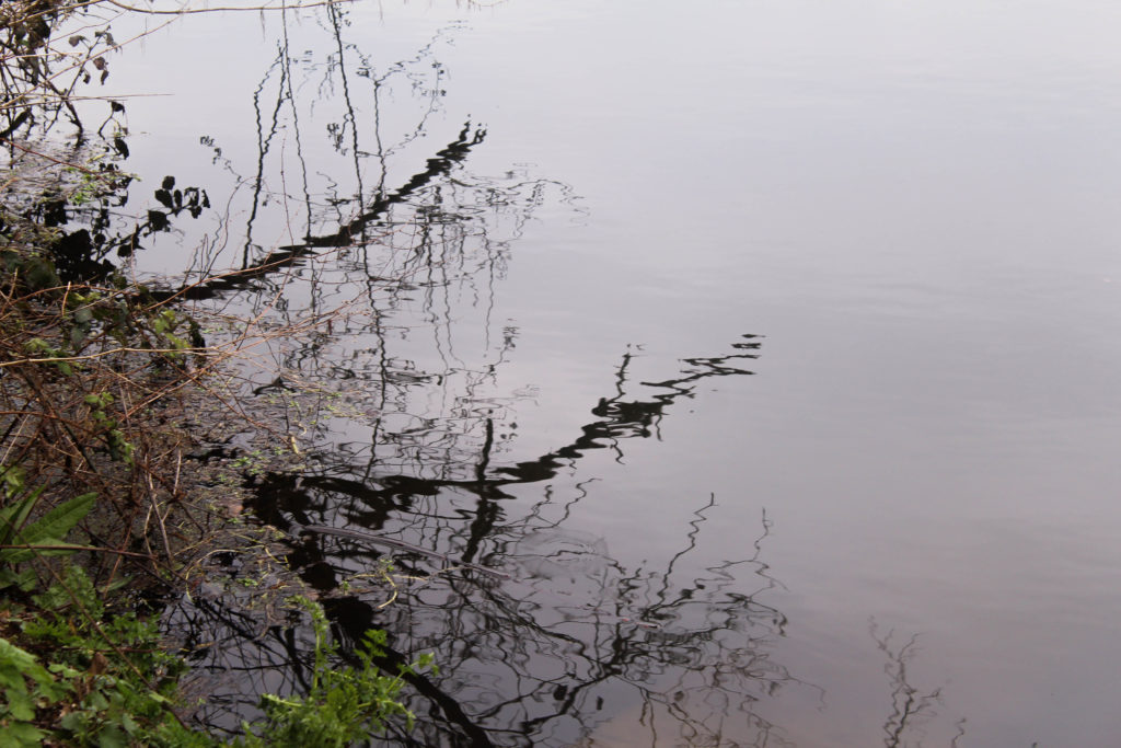
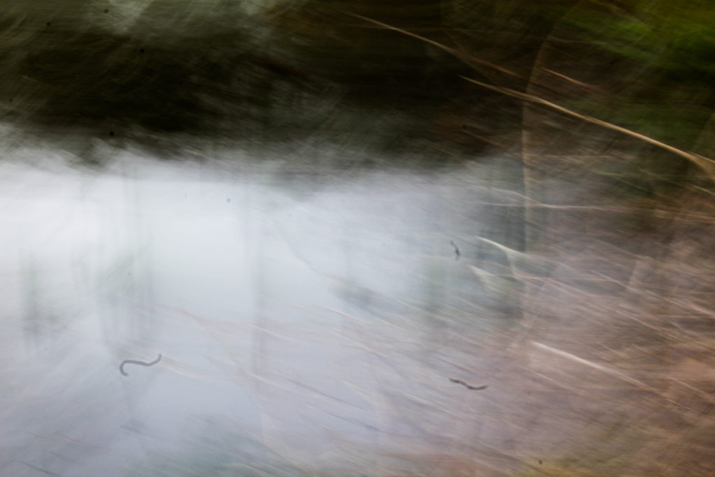
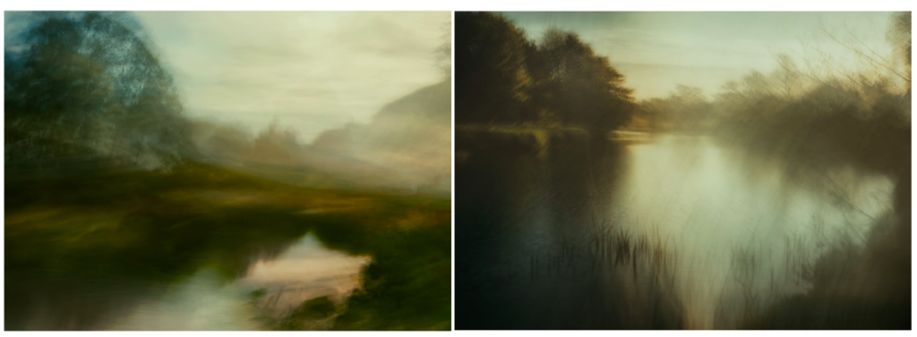
This is another image where i experimented with shutter speed. I found that this image reminds me of the photographer Andrew S. Gray’s work who explores abstract landscape photography by moving his camera when taking pictures. He says that ‘The looseness and ability to play without being tied by the light or weather affecting the scene you’d normally be shooting is the style’s appeal to me, also the chance of creating a scene that was not necessarily there’. I think that this concept is seen in my image as the detail of the branches in the right side of the image are still noticeable, but are blurred enough with the trees in the top on the image to create an image of ‘something thats not necessarily there’. I also like the composition in this image as it’s split into three sections of different colours, reflecting ideologies of abstract art. I want to experiment with this camera technique more i future photoshoots as I think it’s effective. I will look more into the work of Andrew S. Gray.

Examples of his work:

Evaluation

Overall I think this shoot went well in exploring the movement of nature and the sounds in the surrounding area. I think that shooting videos was good way to show plants ad water naturally. For this project I still feel as though I don’t have a developed concept so I will continue to research different artists and art movements to inspire me and give me ideas. I also want to explore more with shutter speed and the movement in nature linking to fragility in nature and draw more inspirations from abstract art.

SHOOT 2 – NATURAL FORMS

My second photographic shoot to gain a wide collection of primary source to furthermore develop and edit, was focused on natural forms. I captured images of plants, leaves and flowers, concentrating on the intricate detail and pattern of these forms. Adrienne Adam, a photographer I have studied has created sublime photographs of specifically the patterns of nature, therefore making her my main basis of inspiration for my second shoot. Adrienne Adam usually works in colour to highlight the vivid, bold colours of her photographic subjects, so I also did so, furthermore enhancing the contrasts, saturation, tones and vibrancy of my primary source.

Specification

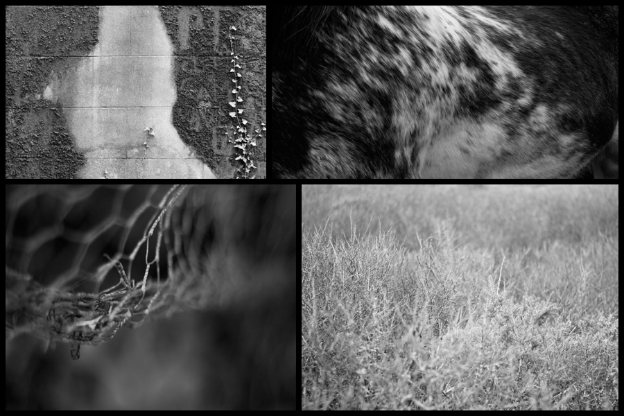
Currently for my project regarding variation and similarities I have decided to look at the topic of abstractions through things such as saturation, pattern and texture. I have chosen this topic because I am exploring how the textures, patterns and saturation within certain landscapes reflects how the environment in that area looks, this led me to look at photographers Aaron Siskind and SiegFried Hansen, both people who have looked at using the textures and patterns of areas to reflect the political stance of urban areas within cities. Personally photographer Aaron Siskind has proved to be of particular inspiration for me due to how he uses over and under exposed imagery to create piece which stray away from portraiture and instead focus on aesthetic objects to reflect who the people are and their views. Here are some examples from a previous shoot reflecting the more agricultural side of island life:

My main ideas that had risen from this are repetition found in nature and the bleakness that can accompany it. Because of this I have focused predominantly in monochrome filters as a means of highlighting this abstraction without the colour distracting the viewer from the overall composition. For me the houses and the fields which surrounded it provided most of the landscapes needed because of its wide range of plants, wildlife and man-made structures. Regarding my future plans I intend to explore other environments such as urban life and harbors, this is because both will contain completely different things which I could abstract and isolate from the environment such as reflections and glass structures, things that would not be typically seen in farmland areas. When taking the images I found a higher aperture really worked well in highlight shades and forms, which as a result produces a ghost like effect on to the plants and land, presenting the viewer with a new interpretation of what they would usually see.

A2 Photography Exam – Compare and Contrast – Dafna Talmor

As a key artist reference to my work, Dafna Talmor’s Constructed Landscape project has a been a massive influence to my final images and work in general. The way Talmor cuts up her images is a more manual way from what I did. She refers to her technique as slicing, splicing and merging. The way I created my images was through the use of the magic wand tool in photoshop, I made sure that I didn’t create straight line cuts and made very rough tear like cuts to replicate the process that Talmor did.

Also something I picked up from Talmor’s work, was the natural side to her work, in her actual images she’s taken photos in woods and on beaches. But to contrast her work slightly, I went to an urban landscape (carpark) and took photos for my images there too.

Another contrast to her work is that her work uses natural colours that fit in with her natural photos, and I used really vibrant colours to represent the combination of urban and landscape.