Experimentation With Images – Cutouts

After my initial experimentation with images, using color to respond to John Baldessari, I decided to create another response in which I would become more practical with my ideas and actually cut out parts of the image itself. To do this I would need to use a small circular object which I could proceed to cut around as an outline for the areas of photo I wanted to take out. Using a Stanley knife and a small cup I traced the outline and cut around the outskirts of the edge trying to be as neat as possible, after cutting out wanted areas on all of the photos I went onto experiment with their presentation, linking areas and using the off-cuts to put back onto the photos. Once I had create four different layouts I photographed them against a black piece of card so that more definition could be created. Overall I decided to do this because I wanted to become more practical like Baldessari who would go out of his way to make certain scenes happen, and so by me creating a response like this it would allow me to be in control of the image taken completely, warping it so that it links into my intended outcome. Here are the final developed cut-outs of the photos taken and their various experimentation’s:
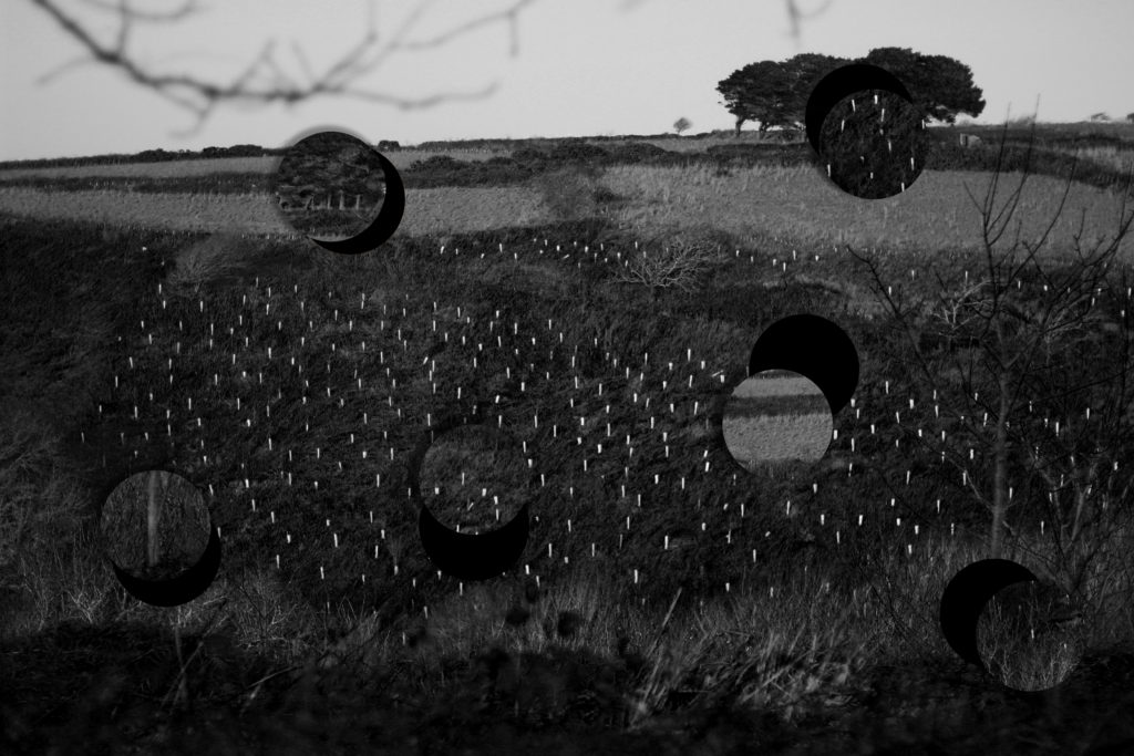
For my first edit I decided I wanted to make use of the parts cut out, this is because I loved the idea of placing parts of an environment that would not typically be seen in any other location elsewhere. I chose to use the circles as a theme because of how their repetition linked into Baldessari’s work that centered around figures and form, and so by placing things in usual ways presented aestheticism for the viewer who is drawn to how the locations don’t fit into where they are placed.
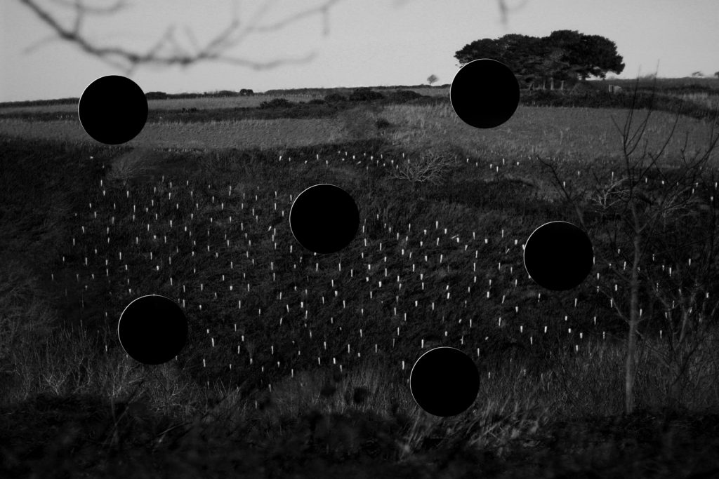
For this image I wanted to layout the basis for branching various ideas for designs off on, this could consist of various linking techniques towards each circle and where they could start and end. I selected the areas with the photo which I thought captured the essential patterns and textures seen such as trees, card, sky and fields. These three different areas of the environment make up the piece and so by taking a section of it out impacts the outcome much more than it initially did.
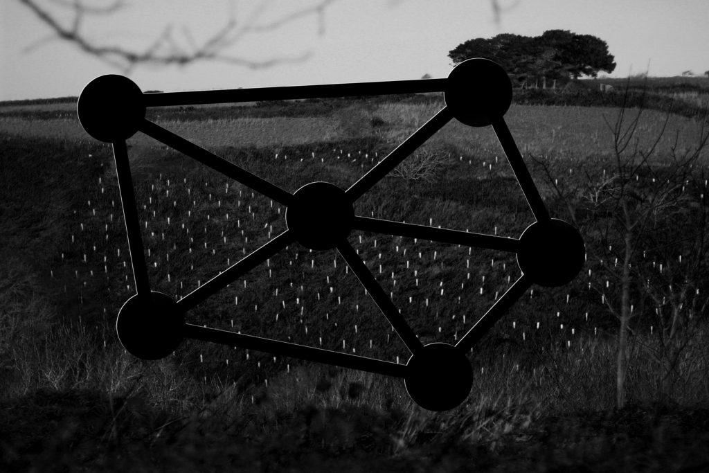
Firstly for this image I decided to link together each circle to one another, giving each three links with the exception of the middle one having five in order to connect it to every other one. The idea behind this was to essentially link together each of the different sections of the landscape together and present the piece with an abstract and unusual object within, making the viewer think about how each area impacts the next.
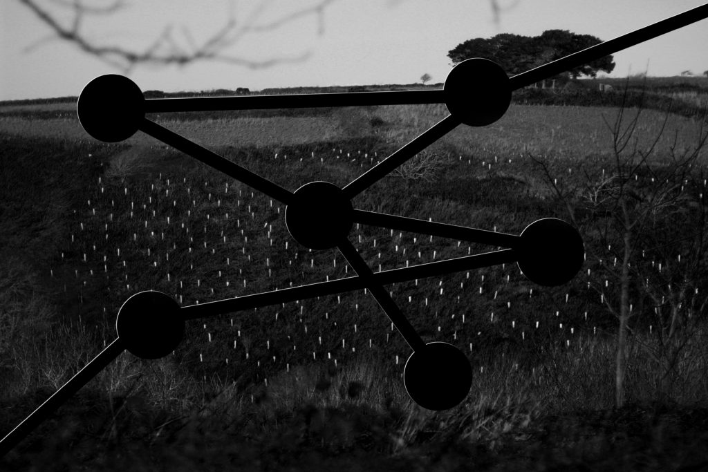
Finally for this last experiment I tried to randomize how the layout of the cut-outs experimentation look completely. To do this I randomly linked together various circles making sure that two circles had a link to the border of the photo. I tried to make sure the path of the links was completely uncoordinated leaving me to cross over various paths to make a form with no actual structure in the photograph.

Overall I found that my experimentation using the four images went well due to it pushing me to create more edits outside of software, making me more practical with my photographs whilst involving me more with the actual process and outcome of each piece. I chose to use this image as the experiment because of how I thought it presented the most diverse textures and patterns within a landscape found in most of my photos.

Cubism

During the early 1900’s a revolutionary new approach in art which involved the representation of reality emerged called cubism. It was elevated by artists such as Pablo Picasso and Georges Braque who both used different perspectives and views of the subject into one image. This created fragmented images with an abstract tone. The name ‘cubism’ came from the geometric shapes seen in the work, it became one of the most influential styled in the 20th century. Artists aimed to show one object of figure for various view points at one time breaking away from linear perspective which had been around since the Renaissance Cubism in turn lead onto other art movements such as constructivism and neo-plasticism which also both incorporate sharp geometric shapes and outlines but in a more simple and abstract way.

Image result for cubism

This painting by Pablo Picasso named ‘girl with mandolin’ shows a fragmented version of reality. The neutral colour scheme helps us focus in on the shadows and helps the cube shapes stand out. Painting with a model in front of him his work manages to show one image from various angles all joined together to create an impossible image, one which could not be seen by the human eye.

Image result for cubism original

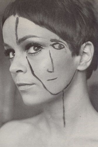
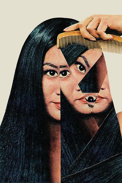
I want to look into cubism and how the idea has ben used I photography by various artists. Photography and the editing software which is now available such as photoshop makes it a lot easier to create cubist art. Images can be cut up, re sized and re constructed creating a similar effect to those of the original cubist artists. Bellow i have collected work by various artist showing new interpretations of cubism, the first mixes mediums to create its effect. A face had been painted onto the side of the models face, one of the real eyes coincides with where the drawn on would be creating an interesting illusion reminding us of the ‘old hag and young women’ illusion which questions our perspective and view of different content. The middle image is by Nigel Tomm and show and crumpled and distorted magazine page. His work tackles the idea of perfection displayed in the media by models and celebrities and follows similar conventions to cubist art.

A2 Photography Exam – Evaluation

Overall my final images turned out exactly the way I wanted them too, as I followed what I put into my action plan to the word as I knew back then that these techniques would provide the details that I wanted.

The photoshoots went exactly to plan and gave me more than enough material to play with in my edits, by using the figures and parts of the images such as branches and rocks to move around and space in my images.

The shapes and 3d edits together provided the extra colours in my final images that weren’t expected from my action plan, but in my opinion this made my images better in terms of visual aesthetics.

After doing those edits, creating the tear like cuts with the magic wand tool in photoshop worked perfectly and provided the exact details I needed for my images, if I were to have used straight line cuts it would have looked odd and out of place so i feel these worked well.

After these I overlayed some over contrasted and brightness, black and white images over the top of the cut edits to create even more detail over the already very detailed images I have made.

Finally my final pieces look exactly how I wanted them to look from my drafts, if not better as the space I have put in between the images has given the smaller images the space to show off those as well. But also as both final pieces are spaced in different orders it also provides an interesting layout for the viewer to look at.

Researching Data & Statistics (Employment, Trade & Population)

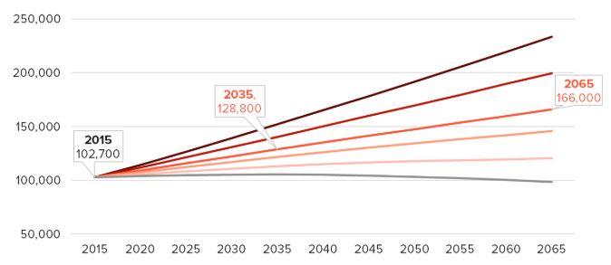
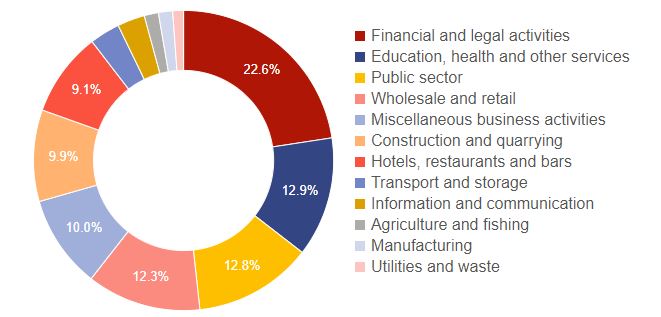
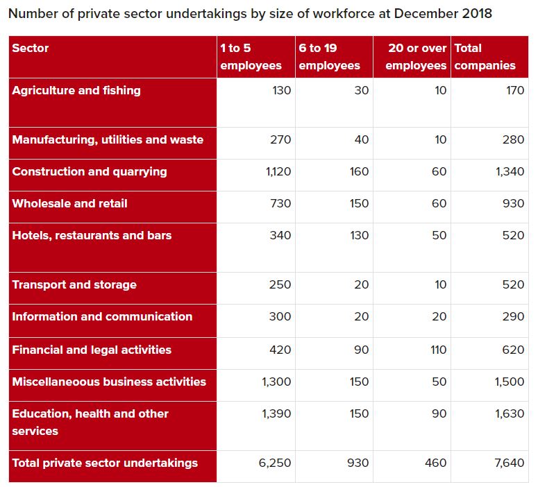
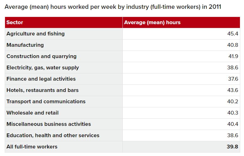
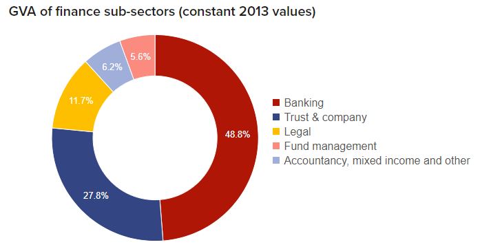
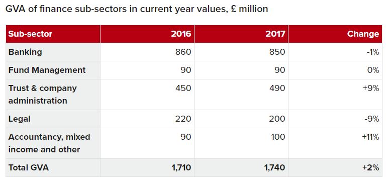
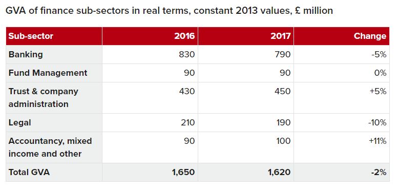
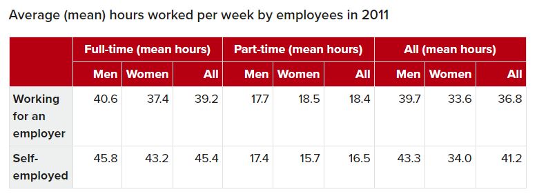
In order to get a much better understanding of how Jersey stands in terms of its statistical goings-on, I decided that it would be a great idea to look into the statistical data provided by Jerseys government in terms of social factors such as employment, trade, housing and population. Having the knowledge of these factors within the local society will give me more ideas on how to approach this project and on how Jersey is linked with the rest of the world through various aspects. Overall allowing me to back up my initial concepts on how to approach the project as a whole. Here are just some visual sets of data such as graphs/tables that I came across and looked into when doing this research…

What I can quite simply conclude from the data which I have looked at is that 1. population in Jersey is rapidly increasing and is projected to continue in this way 2. Jersey is becoming more and more of a diverse and multicultural society as time goes on (connecting it even more with the world than ever) 3. Over time Jersey’s leading sectors/industries of trade have changed, but currently Jersey’s most predominant sector is the financial and legal sector which takes up 22.6% of Jersey’s economy and employment. I believe that is would also be interesting if in some of my photo-montages I could incorporate figures and statistics from these sets of data in order to give subtle meanings within some of the pieces which I produce.

asking people abouty beauty

I will start off by doing some market research as what is considered to make people most happy and what people think is most beautiful about themselves, And ways in which I could evoke these emotions and objects through my own work. I will do so by asking many people where I live and my friends, and possibly too looking into past research across the globe, and if what we see as beautiful is dependent on our culture and how much money and wealth we grew up with. This could also be 5 questions in relation to beauty and happiness. These questions will be

1.How would you describe beauty?

1st person: an individual idea that is a cliches within the eye of the beholder. 2nd: It is a construct of an individuals happiness. 3rd: something you personally believe to be over exceptional a personal belief 4th: well… specific to a person and what makes someone happy.

2. What or who is the most beautiful person of thing you have ever seen?

1st person: I believe the most beautiful thing I have ver seen is a new born baby, and puppies, innocent new life, something which is full of hope. 2nd: I think…the most beautiful things are the masters of art and architecture. 3rd: A landscape an idealistic landscape 4th: in a landscape the sun, nice weather , a reflection of happiness, you feel happier

3.What brings you happiness?

1st person: living in the moment, the comfort of my family and the stimulation of books. 2nd: Living without stress. 3rd: food, art my friends and sleeping 4th: music pop and a singalong

4.Where is the one place across the world that brings you the most joy and why?

1st person: Jersey, it is home and if it is beautiful, I love jersey. 2nd: being at home in jersey. 3rd: my grandparent house in France 4th: Corbier, it was were my pops used to visit form the age of 19-79

5.what are you most grateful for?

1st person; I am most grateful for love. 2nd: Health 3rd: being born into a privileged society. 4th; family friends and opportunities.

12:01 AM, January 1, 1990. The Grateful Dead perform their traditional New Year’s show at the Oakland Coliseum. Photo by Stephen Dorian Miner

This is not only an insight to the subjectivity once again of the fine art of beauty, but the imagination of each individual mind. Due to the results from this, I believe people in jersey especially are able to see their privilege and do not take for granted, they love landscape new life innocence and health, to my mind they have perfectly described what theatre of life describes, they turn personal connections and emotions into locations. Also something which I find very interesting is that no one said beauty is people, most people associate within a landscape something they love or an experience, and I think this allows myself to see I am working in the right direction.

The natural elements: rain, wind, fire and light

light

So far my project has been about the bad is of looking more towards accessing different versions of light and more abstract communicates of nature, I believe this could perhaps be one of the large influences of my book. If I was to start breaking doen my project into four key factors is light even make the capturing of these factors easier to see.

Light is the most important basis of my project as whole. Light has the power to present and change how something or someone looks completely and whole. Because of this trying to photography light is an interesting and also a very applicable way which I could look into capturing my own work. Due large areas of my work begin more prominently focused on the presentation of landscape and flowers and natural beauty, many fo the shoots will be taken during mid day, this is interesting as this is possibly the hardest time in order to couture an achieve the most successful photos. Mid day light can be harsh and increase strong shadows and strong inflictions of heavy light, making anything look worse and showing an inability to really see the piece itself. However I too belive I could use this as an advantage. The over- exposure of light can also be seen as a heavenly and almost romantic way in which you can see something, daylight can elevate an image and bring about an almost type of romanticism. I must be aware o the image I am trying to capture and the effect that I want. However I believe with the availability to change the iso and exposure I should just have a large range of capabilities with what I am able to capture within my work.
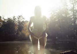
This image in particular inspired me as their is a mystery, lack of identity yet still and evident and frankly obvious sense of beauty. Perhaps I too could bring someone when photographing my resivour shoot in order to help show copious amounts of ways I could express beauty within the water, landscape , light and yet almost the person themselves. Another part of light every different some this, is the slo shutter speed high exposure of night time shoots, trying to show a diffuse of movement is hint the light. I believe this shoot is also extremely important because you are theoretically appointing with light itself.

rain

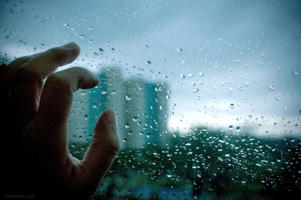
Rain as natural element go is probably the most negative one when comparing it with its connotations and associations of sadness and dull. however this is why I think it would be so beneficial to capture it as an elements of beauty, and perhaps even happiness. Rain as we know already can be seen as a very romantic elements, where people fall in love of where peoples emotions are susceptible to the most vulnerability. Due to rain falling and being seen in so many different forms, the ability for this shoot is so much. I want to show different variations of how one elements can be shown romantically and to be an expression of self beauty and or a reflection. Perhaps I could even add in people to make the photos themselves more poetic as a whole composition itself.

I belive using the way different ways of tracing rain and using a piece of glass as the first shoot, to be able to show the droplets of water. Secondly I believe I am able to capture a more heavenly approach to the done full of water if I were to go out a night whilst it was raining and shine a torch in order to highlight and show a strong bright light, capturing the soft little sports of the other after.

Fire

fire is the subject which is probably the less applicable shoot for my project itself, as it is the most tricky to photograph and also as I do not. know how fire will directly fit into my narrative. My artists ads their own personal emotional influence on what they believe to be beautiful. Fire is a natural element which causes happiness but mostly chaotic fear, however if I were to concentrate more on the contrast between finding life within the chaos and pain of the world and still showing elements such as fire to be beautiful, it would benefit me to do this shoot. Despite water having sad connotations, it does posses the power to kill, unlike, it is not the same as the aggression and mass pain fire can size to cause. Water is meant to be beautiful even when drowning, however, fire is smoke, burning and a strength which I think people find hard to romanticises. The closest aspect tot his element I could fine within my work, is accessing the ability to capture light in such a bright or vicious way.

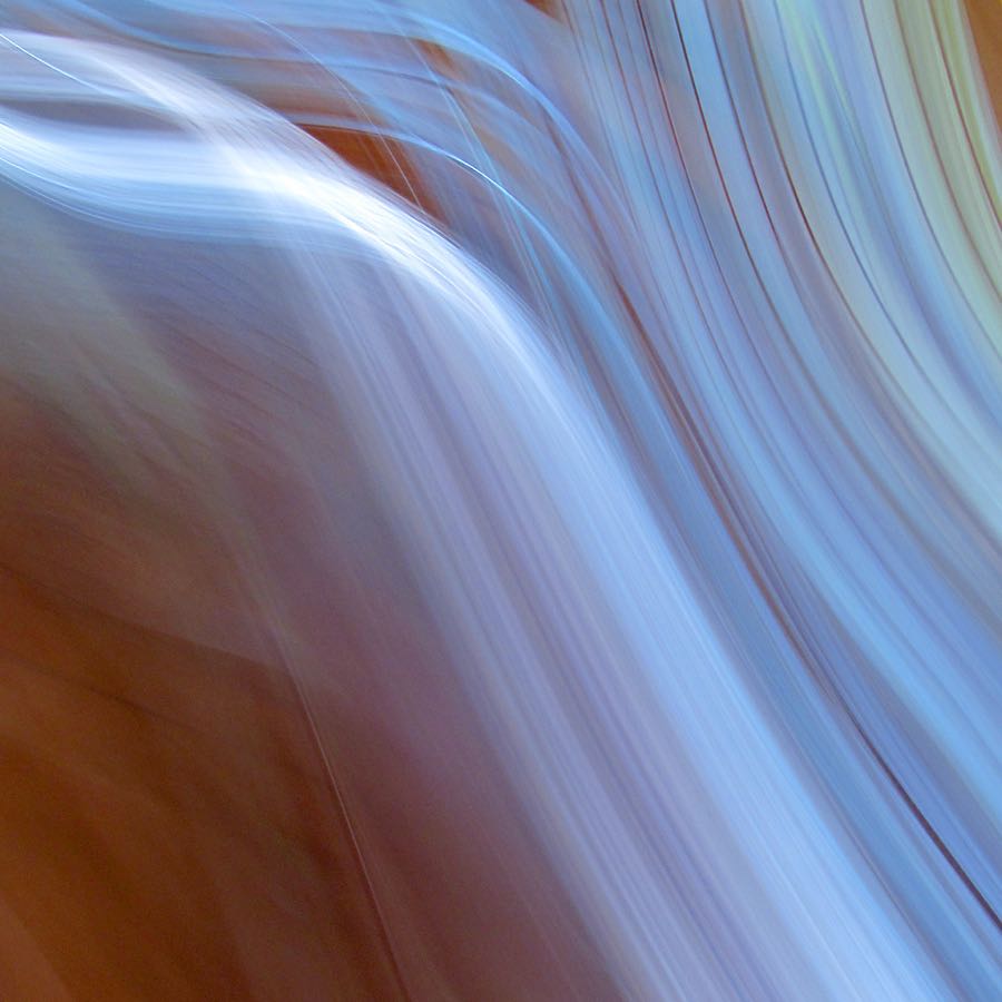
I do belive it would be interesting to experiment within the way you could show the same element of attitude of fire without the same colour tones, because of this I chose the image above as I believe it has the same movement and hectic feelings and attitudes that could too be seen within the elements of a real fire. I belive it could be the colour connotation are the areas which effect the negative feelings towards the aspect of fire, so changing the colour could make it beautiful without having to be over aware off the aggression of violence ability of the fire itself.

Wind

Wind is a natural element which has the ability to form and create new compositions, it allows something that used, to be still or static with hardly any life of movement to be a free flowing. wind is an element which can be described in many different mannerism ‘ a sea breeze’ a hurricane. These differentiating aspect create the difference between love and fear, which is interesting as this too has connotations between that of beauty and chaos. However I believe you could use the power of wind in order to create a beauty and movement within flowers and natural elements. in relation to god, wind could be perceived as an element of the trinity, due to this much of the experience seen to be a gust of wind in many religions is perceived to be an act of great power.

This shoot is similar to my first shoot, focus on blurring of the elements of the power of wind, and creating a fluidity within a solid structure, perhaps I could add elements from my pre existing shoots to help me discover and develop additionally shoots I could take in order to access a new more religious value to my work.

Building Faces Shoot 3 – St. Peter

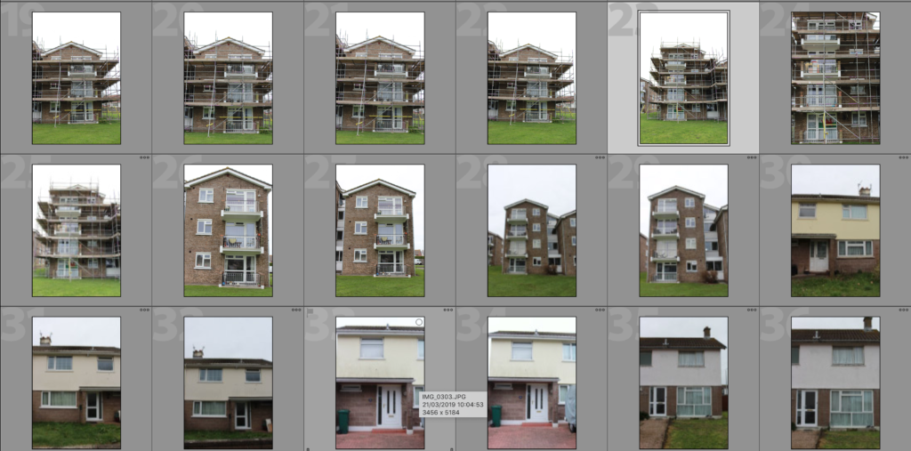
In this shoot I have developed on my previous shoots in which I have looked at the faces of housing blocks, office blocks, houses and other types of commercial buildings within Jersey. In my previous shoot I explored the area of Havre Des Pas and took photographs of houses in the area to demonstrate how the houses can have similar features and materials used due to being in the same geographical area whilst also having these features changed slightly in each house to make each house unique and different. In this shoot I have photographed an estate in St. Peters to show how similar the houses in estates can be – they are often designed in bulk to create a quick and easy building process and so leads to lots of similar houses with the same style and layout. Of course, even when looking at how similar these houses all are, there are lots of features which make the houses individualistic, such as the paint colour or the style of window or the curtains. All of these features go towards emphasising how factors such as personal taste can create something ordinary into an individualistic feature that can make the house stand out from others. The essential idea behind this shoot is to reinforce the idea of variance and similarity in previous shoots and to show how even though something may be produced to be similar, there will always be differences.

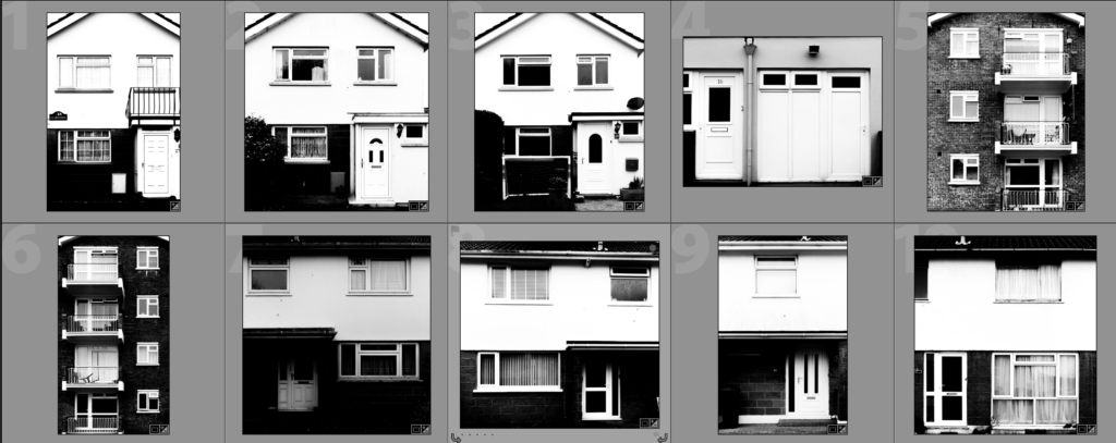
Below I have continued to edit these photographs in a sharp black and white in order to emphasise the individual features of the houses and apartments. I originally decided this due to inspiration from Tim Booth who, when photographing portraits through hands, found that the black and white prevented the viewer from just focusing on colour and rather focusing on the deeper features and shadows that are brought out when using a strong black and white. I believe that it is important for me to continue to use this contrasting colour scheme as it makes it effective for when I make edits with these photographs later on, such as with GIF’s or with double exposure edits. With some of these edits I am going to experiment cutting out natural frames and layering it over photographs of natural rock faces as I begin to study geology and granite in Jersey.