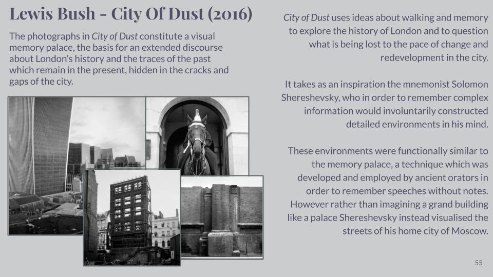
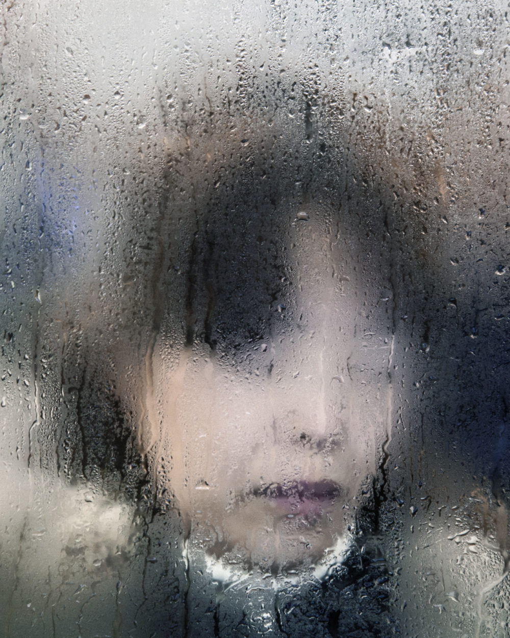
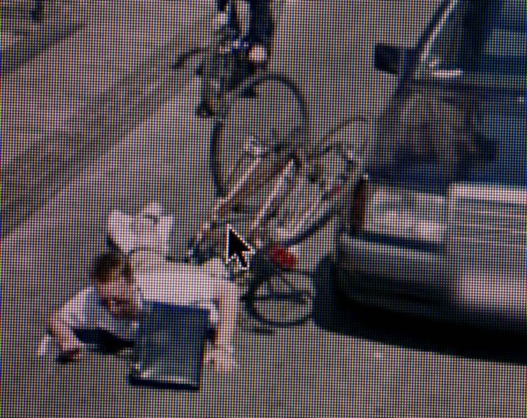
Artist Research – Lewis Bush

sources:

A2 Photography Exam – Artist Research – Civil War Stereography

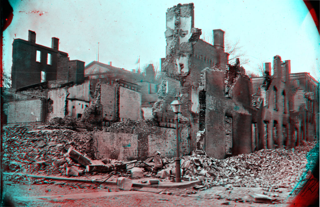
The American Civil war started 158 years ago, and back in 2011, it was its 150th anniversary. To commemorate this milestone, The Atlantic made a special issue featuring photographs from the civil war itself.

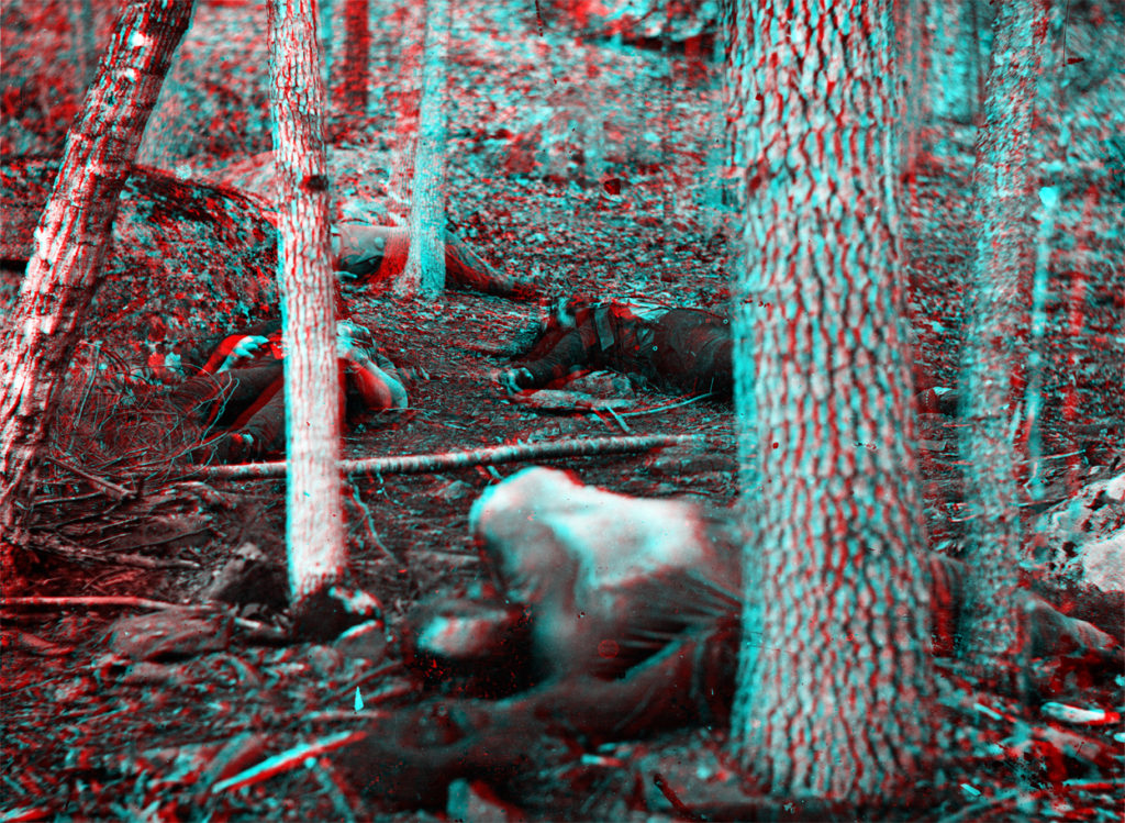
The “Slaughter pen” at foot of Round Top, after the Battle of Gettysburg, in Pennsylvania in July of 1863.

These photos were taken by war correspondents to bring the ugly visuals of the frontlines to those at home, in a realistic and modern way of viewing them.

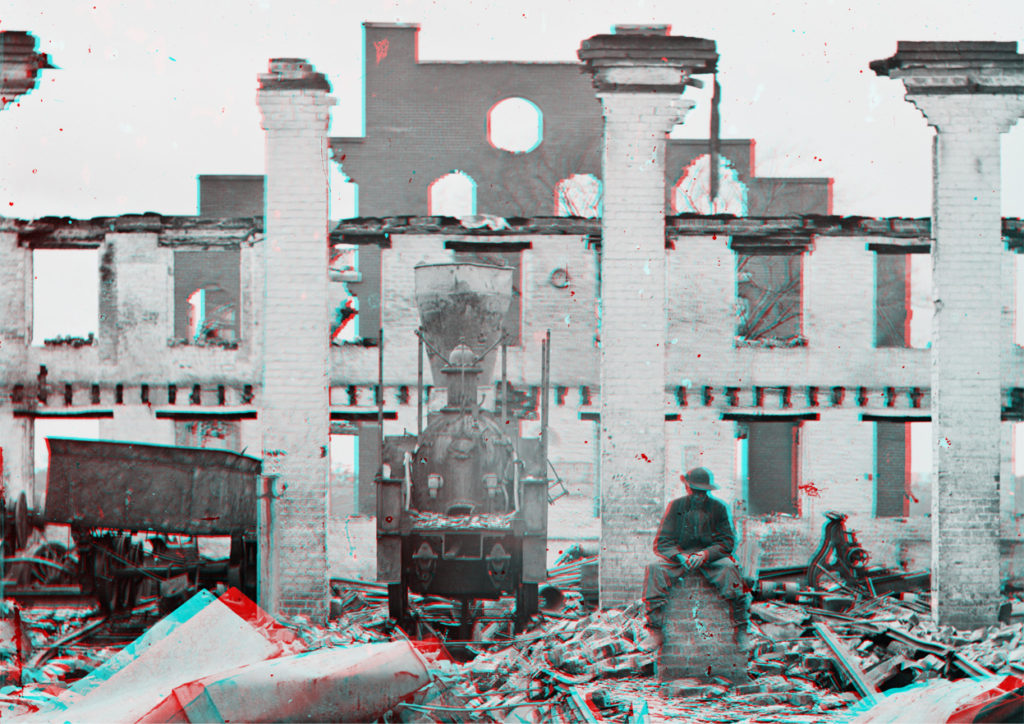
A damaged locomotive among the ruins of the Richmond & Petersburg Railroad depot, in Richmond, Virginia, in April of 1865.

This new way of viewing and photography process was called stereo photography, also known as stereography. This was one of the first uses of a type of three dimension photography that was accessible to the public, providing they had access to a stereoscopic viewer, which is what created the 3D effect that has been kept alive and modernised through the years.

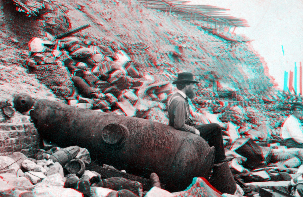
Outside view of Fort Sumter, in March, 1865. Foot of slope on southwestern front, looking southeast.

Also as these photos were taken over 150 years ago, they were taken with plate cameras so you can see the lens edges and exposure lines on the sides.

Details from the “Burnt district” of Richmond, Virginia, photographed in April of 1865.

Photography presentation on lorna simpson

Analysis:

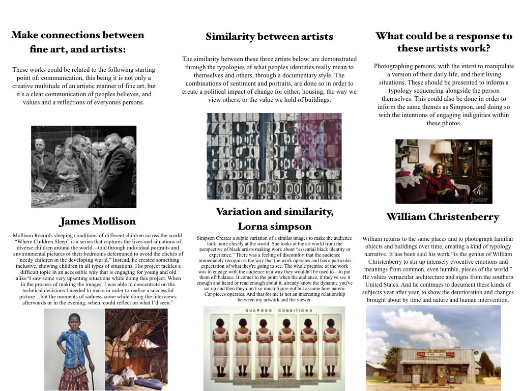
Her work combines factors of identity, race, culture, history and memory. I think it is evident throughout all of these artists work, there is a defined clarity to their relation to that of similarity and variation. However it is divided into the narratives of peoples, places and an emotional responses to the title. I started off with looking at ‘Simpson’ She uses her work in order to repeat an understanding of peoples lack of attention, and their uncomfortablity within learning and seeing new aspects of people. She claims to create a dynamic which makes people uncomfortable, as it is within the open relationships of artworks and viewers, that they grow and become more susceptible to understanding a narrative, and learning from the piece of art themselves. I Believe her work is work which becomes more interesting once you know and have learnt the understanding to why she has done what she has done. To my mind, her work is slightly repetitive with a lack of change, I would rather she expresses a narrative thought ,rather than a repeated image, however, this was her aim when creating this art form. Her work not only has her own influence of her black identity, and narrative of peoples lack of attention. But it too links to connections of fine art being multitude of creative mannerism, clearly influencing her work.

Hiroshi Sugimoto | Artist Reference

Hiroshi Sugimoto is a Japanese born photographer, who first began taking interest during his time in highschool. Although Sugimoto studied Politics and Sociology at university level in 1970, he decided to ratrain in 1974 and recieved a BFA in Fine Arts at the Arts Centre College of Design.

Image result for hiroshi sugimoto

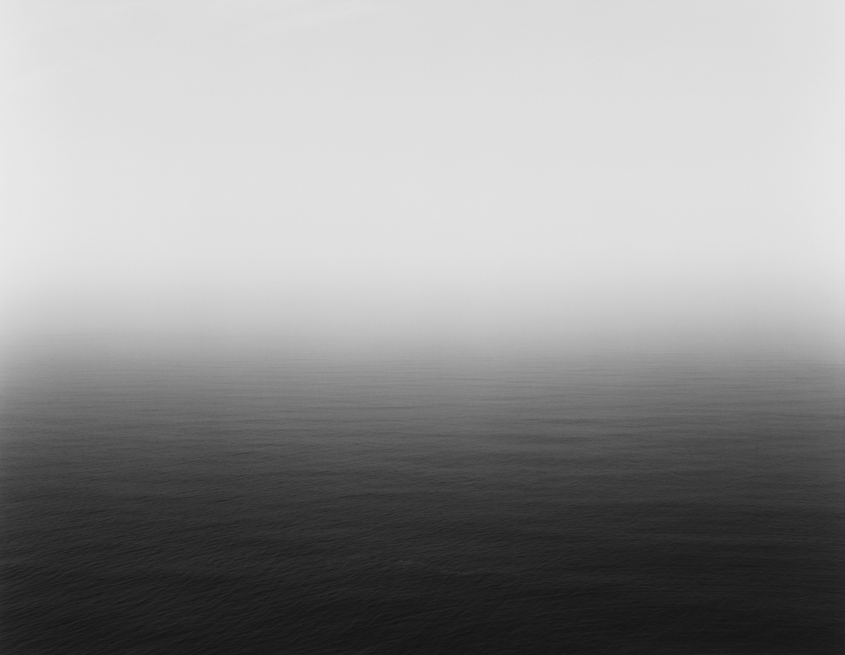
Sugimoto describes his work as an expression of time exposed photographs which act as a time capsule for a series of events in time.

Image result for hiroshi sugimoto

Many of Sugimotos photos lack the physical detail which would allow the photos objects to be distinguished, and instead strongly focuses on the lighting and textures. Sugimotos photos do not follow a certain pattern, and his images do not specify the subjects in which we are looking at,suggesting that he follows the surrealist movement.

Sugimoto produces a vast amount of his images using a large 8×10 format camera on a long exposure, creating the blurred effect that some of his images have.

Variation and Similarity planning

We thought that this artist linked in well with page 8 of the exam booklet, which is the fine art response to variation and similarity. This response was based on the artists Nick Greaves and Bluegreen Pictures.

Eadweard Muybridge

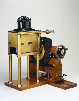
Eadweard’s photography of moving animals captured movement in a way that had never been done before. His work was used by both scientists and artists. He developed a miraculous process for capturing movement on film. This approach to photography influenced media and other motion animation industries to produce picture animation. In 1872, Muybridge began photographing a galloping horse in a sequence of shots. He eventually came up with a more complex method of photographing horses in motion. By 1879, he had proven that they do at times have all four hooves off the ground during their running stride. Over the next few years, he produced thousands of photographs of humans and animals in motion. Eadweard presented his photographic methods using a projection device he’d developed called the Zoopraxiscope.

Muybridge’s Zoopraxiscope, 1880
A picture disc for the Zoopraxiscope developed by Eadweard Muybridge (Wikipedia, 2015)

This image portrays several images of a pig running. The sequence of photos shows how the pig is moving. The colour isn’t natural because of the camera that Muybridge used. This old camera that was used in the 1800s creates a sepia, vintage effect. He usually uses images of horses, but in this particular image, he used a pig to show the contrast between the two animals, and how they move in a similar way. The repetition of the images shows the variance of each image, and how each photo differs from the others due to the pigs movement. The way they are produced in a grid makes it easier to compare all the images.

Nick Greaves

He studied geology and environmental sciences at the University of Aston in Birmingham, England. His passion and interest in Africa took him to Southern Africa in 1976. Greave’s interests in wildlife, conservation & photography originally developed independently, but slowly all these came together over the years, and he was able to combine all these passions into his current position as a multi-tasker, dividing his time as a professional safari guide, photographer and author. Nick’s love of wildlife and the outdoors quickly led to an interest in photographing the world around him, and over the years his photography has become a never ending search to capture the moods and wildlife of Africa and elsewhere. This interest has led to a full portfolio covering much of the flora, fauna, culture, and heritage of Southern Africa.

Corpinus Disseminatus Trooping Crumble Cap photograph, Nick Greaves

This image taken by Greave’s is portraying the mushrooms that appear as part of the wildlife’s nature in Africa. The repetition of the mushrooms that spiral up the branch of the tree trunk shows the variance between the mushrooms- although, they are all of a very similar size, shape and colour, which makes all the mushrooms seem very alike – this is similar to Murbridge’s work as they both take photos of the same object, yet they all vary in their own ways. In Greave’s photo, he only displays his repeated objects (mushrooms) in one single image, instead of in a grid format like Muybridge portrayed his work. Maybe this was because in Greave’s photo, the mushrooms were all bunched together already, so that it was easy for him to take his repetition photography in one image instead of putting them together in a grid layout like Muybridge did. This photo has a lot of natural colours, due to Greaves taking this image in 1996; the technology of cameras and online software at this time is obviously a lot more improved than when Muybridge took his series of images of animals in the 1800s.

Michael Wolf | Artist Reference

Michael Wolf was born in 1954 in Munich, Germany and was raised in the United States, Europe, and Canada. He attended the North Toronto Collegiate Institute and the University of California, Berkeley. In 1976 he obtained a degree in visual communication at the University of Essen, Germany.

Wolf began his career in 1994 as a photojournalist, spending eight years working in Hong Kong for the German magazine Stern.

Wolf states that a decline in the magazine industry led to photojournalism assignments becoming “stupid and boring.” In 2003 he decided to work only on fine-art photography projects.

Wolf’s current works are spread between Hong Kong and Paris mainly and
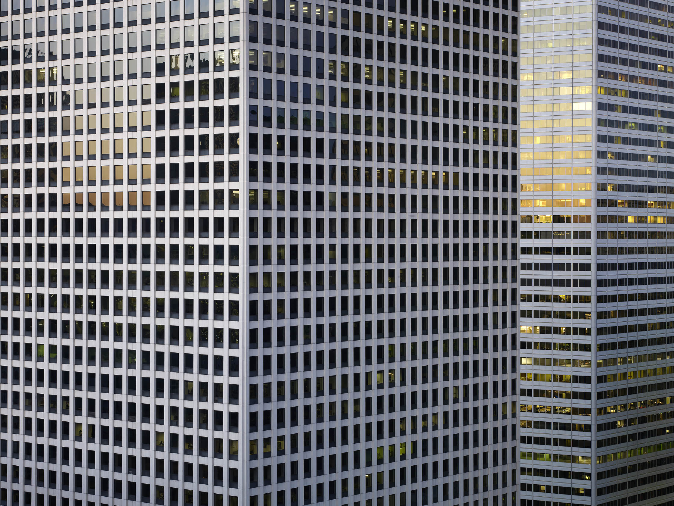
his work focuses on the structure and repetitiveness of daily life in big cities. He has has many notable projects such as ‘100×100’, ‘Bastard Chairs’ and ‘Tokyo Compression’.

GIF Experimentation

What is a GIF?

A GIF (Graphical Interchange Format) is an image format invented in 1987 by Steve Wilhite, a US software writer who was looking for a way to animate images in the smallest file size. In short, GIFs are a series of images or soundless video that will loop continuously and doesn’t require anyone to press play. This repetition makes GIFs feel immediately familiar, like the beat of a song.

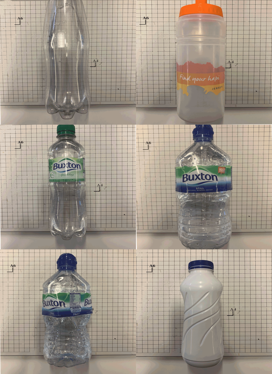
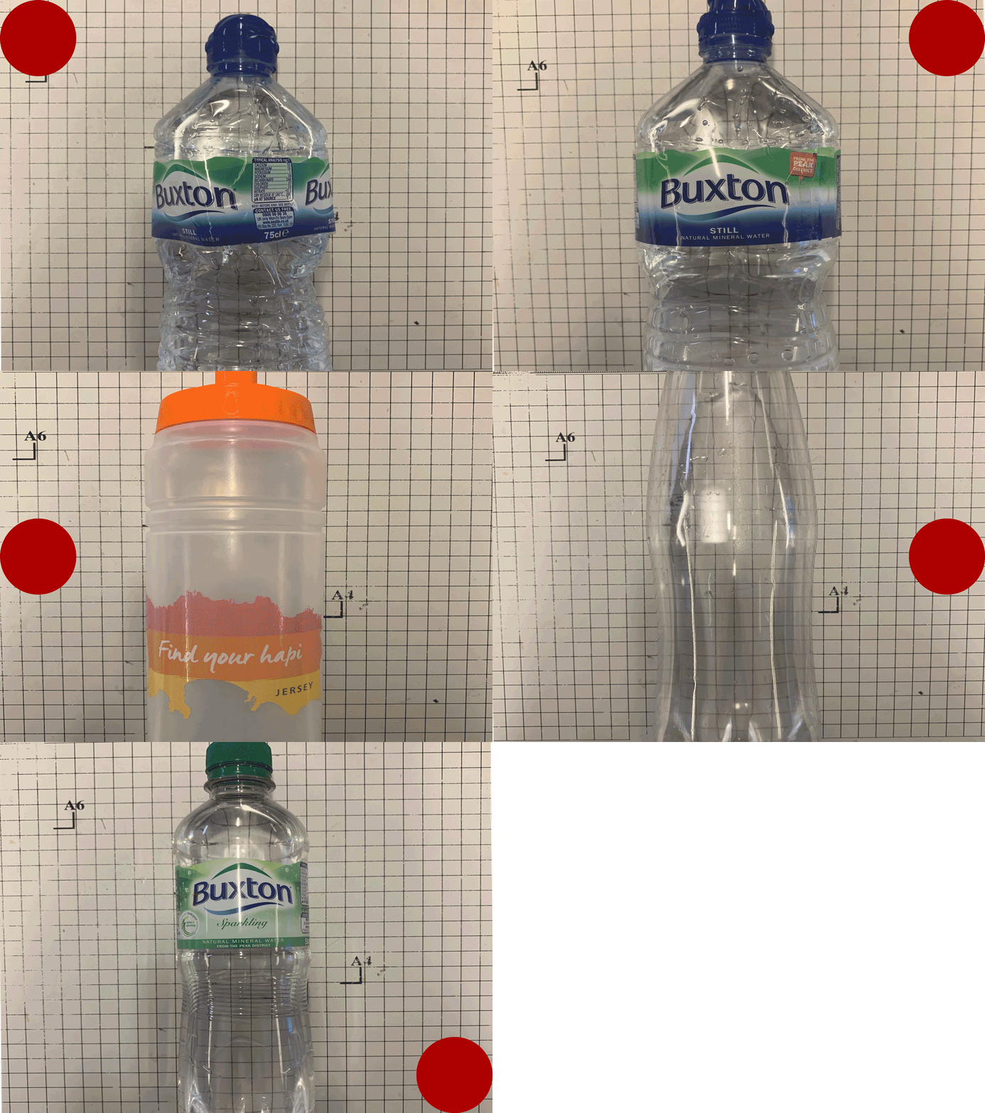
I then wanted to go one step further and develop my own GIF use the software Adobe Photoshop. Before doing this I would have to photograph one specific objects and variations of the objects shape and size, the object I decided on were water bottles. I chose bottles because of their common use in the everyday world and how easily they can be obtained, I then gathered together the classes bottles and proceeded to photograph them in the same position as the first, giving off the impression of the bottle changing as the frames moved. For one of the animations I wanted to add shapes moving around the screen to see whether it would effect the overall outcome and create a more aesthetic result. When I came out with the final result I made sure to put each frame at 0.2 seconds so that the animation seemed more fluid, these were my results:

Once I had made the GIFs I found that they related to the topic of variation and similarities through their constant transitioning between different styles of bottle. By doing this in future posts it would allow me to experiment with variations of some of the things photographed such as reflections and rock formations but taken in a topographic way where all subjects are taken in the centre of the image so that their transitions in the animation are smoother.

Roni Horn – You Are The Weather

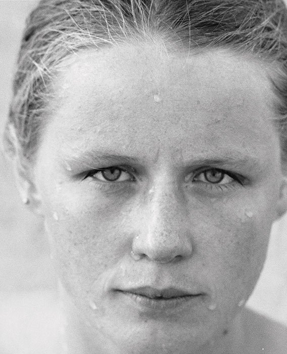
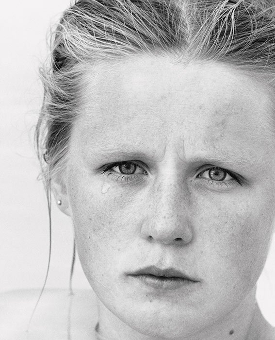
“I photograph this woman, Margrét, in the water. This optic matrix was very important, as water is a true key phenomenon in Iceland. It was a quite easy relation. I did not say anything about what she had to do. She simply got into the water and I began to take photographs. In sunlight or under a stormy, cloudy sky – the water surrounded her, was on her and her hair was sometimes wet and sometimes tousled by the wind (…) You do not look at this woman in the traditional manner of nude photography. You look at this woman, who is also looking at you (…) Through her relation to the weather, the light or the wind, she takes on these different personalities.”
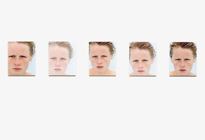
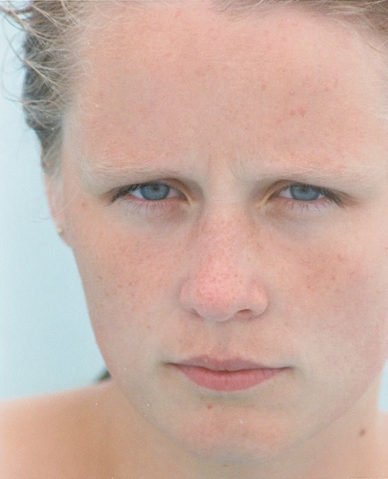
Horn’s photographic series ‘ You are the Weather’ show a young woman emerging from a geothermal pool in Iceland. Each photo taken milliseconds apart show minute and subtle differences in character almost indistinguishable from image to image.

The series beautifully demonstrate that due to small differences in circumstance and weather, we are not the same from moment to moment, mutated by environments and by others. 


Since the late 1970s, Roni Horn has produced drawings, photography, sculpture and installations, as well as works involving words and writing. Horn’s work, which has an emotional and psychological dimension, can be seen as an engagement with post-Minimalist forms as containers for affective perception. She talks about her work being ‘moody’ and ‘site-dependent’. Her attention to the specific qualities of certain materials spans all mediums, from the textured pigment drawings, to the use solid gold or cast glass, and rubber. Nature and humankind, the weather, literature and poetry are central to her art. 

‘Big enough to get lost on. Small enough to find yourself. That’s how to use the island. I come here to place myself in the world. Iceland is a verb and its action is to center.’-Roni Horn on Iceland

Image Analysis
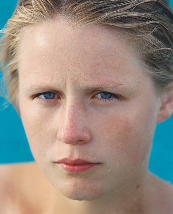
‘These photographs were taken in July and August of 1994. For a six-week period I traveled with Margrét throughout Iceland. Using the naturally heated waters that are commonplace there, we went from pool to pool.’

Horn uses the natural lighting of Iceland to light up the model.

The image appears saturated as the red colour in the woman’s face stands out, however this may just be due to the cold weather of Iceland. The images also feels cold due to the blue background and the blue undertones in the skin.

The images are Close-Up as they are focusing on the differences in the woman’s expressions. A Shallow Depth Of Field is gained by using a larger aperture. Amongst the series, the composition changes to have the woman facing slightly to the right, or in this case, to the left. The use of negative space around her, presenting what is around her, helps to emphasize how her expressions change with the weather.

The series reflects aspects of Minimalism, which Roni is apart of. The series puts a big focus on the relationship between all images rather than as individual images. By offering many perspectives, Horn opens the possibility for infinite mutability and denies the viewer the satisfaction of “knowing” a subject through film.
Impressionism – Historical Context

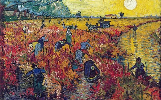
Impressionism is a 19th-century art movement characterized by relatively small, thin, yet visible brush strokes, open composition, emphasis on accurate depiction of light in its changing qualities (often accentuating the effects of the passage of time), ordinary subject matter, inclusion of movement as a crucial element of human perception and experience, and unusual visual angles. Impressionism originated with a group of Paris-based artists whose independent exhibitions brought them to prominence during the 1870s and 1880s. The impressionist artists were not trying to paint a realistic picture, but an impression of what the person, object or landscape looked like to them. This how the name of the movement came about – impressionists. They wanted to capture the movement and life of what they saw and show it to us as if it is happening before our eyes.

Image result for impressionism

The sudden change in the look of these paintings was brought about by a change in methodology: applying paint in small touches of pure colour rather than broader strokes, and painting outdoors scenes to catch a particular fleeting impression of colour and light. The result was to emphasise the artist’s perception of the subject matter as much as the subject itself.

Impressionist art is a style in which the artist captures the image of an object as someone would see it if they just caught a glimpse of it. Usually when you imagine a scene you view this the same all the time, however it should differ as time goes on because the lighting is always changing. Impressionists paint their pictures with a lot of color and most of their pictures are outdoor scenes. Their pictures are very bright and vibrant with the absence of detail but with bold colors. Some of the greatest impressionist artists were Edouard Manet, Camille Pissaro, Edgar Degas, Alfred Sisley, Claude Monet, Berthe Morisot and Pierre Auguste Renoir.
Monet was interested in subtle changes in the atmosphere which I have taken a particular interest in shown through my previous shoots.

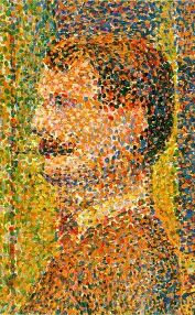
Impressionist covers much of the art of this time, there were smaller movements within it, such as Pointillism, Art Nouveau and Fauvism. Pointilism was developed from Impressionism and involved the use of many small dots of colour to give a painting a greater sense of vibrancy when seen from a distance.

Image result for Pointillism

Before impressionism, landscapes in art were often imaginary and painted perfectly from a studio. The impressionists changed all that. They painted outdoors and on the spot. As they were outside, they looked at how light and colour changed the scenes and painted what lay in front of them. The technique of impressionism allowed the artists to quickly paint what was in front of them resulting in what some people argued to be ‘messy’. Lots of people didn’t like impressionism as they thought it was a bit messy and that the paintings looked unfinished. They thought art should be neater and that subjects in art should be more important than just everyday scenes. I argue against this point and believe that it is an interesting technique that allows an appreciation for the depiction of light which is often overlooked when looking at an art piece.