ESA// Hiroshi Sugimoto

Hiroshi Sugimoto is a Japanese photographer and architect. He was born in 1948 in Tokyo, Japan. In 1970, Sugimoto studied politics and sociology at Rikkyō University in Tokyo. He retrained as an artist in 1974 and recived his BFA in Fine Arts at the Art Center College of Design, Pasadena, California. He later settled in New York City and soon started working as a dealer of Japanese antiquities in Soho.

He has spoken of his work as an expression of ‘time exposed’ or photographs that serve as a time capsule for a series of events in time.

In 1980 he began working on an ongoing series of photographs of the sea and its horizon, Seascapes, in locations all over the world, using an old-fashioned large-format camera to make exposures of varing duration (up to three hours).

The black-and-white pictures are all exactly the same size, bifurcated exactly in half by the horizon line. Many of his images lack any physical detail which would make the objects of his photographs easily distingushable , instead, he strongly focuses on lighting and textures in his work.

Aegean Sea, Pilion
photograph

This photo has been taken using natural lighting while being carefully positioned in order so that the horizon in the middle of the photograph. This taken rule of thirds seems to have been considered in terms of the shading differences in the background and foreground. There is a large tonal range of grey, where there is a gradual shade change, from the darkest point along the bottom of the image and the lightest being at the top. There is a very short depth of field considering that the photo is mostly blurred from the fog. However the foreground of the image is the only part to be in focus and where textures can be seen from the small ripples in the sea, although it is very still. The dark, grey/blue tones bring a cold temperature to the photograph along with the low light sensitivity where we can just about see the horizon in the middle of the image. Although the image is blurred and obscure there are no rounded or curved shapes. Everything is very straight but there are no outlines.

Sugimoto’s image brings a sense of romanticism in their evocation of landscape, related to Ansel Adam’s approaches to photography. This image shows how he sees nature. Sugimoto has said: ‘When I look at nature I see the artificiality behind it. Even though the seascape is the least changed part of nature, population and the resulting pollution have made nature into something artificial’.

Possible responses could be:

  • Seascapes
    • At dusk/sunset
    • At dawn/sun rise
    • On an overcast day to have a similar hue over the entire photograph

Origins of Conceptualism

Mood-board of various conceptual art

DEFINITION = Conceptual art is art where the idea (or concept) behind the work is more important than the finished art product/object.

It emerged as an art movement in the 1960s and the term usually refers to art made from the mid-1960s to the mid-1970s. When an artist uses a conceptual form of art, it means that all of the planning and decisions are made beforehand and this has greater importance that the artists final outcomes. Conceptual art can be anything – the overall visual aspects of conceptual art may be confusing, misleading or it could be boring or interesting. The reason that it became an art movement is because of its intriguing features – many people look at conceptual art and wonder why an artist has displayed something in this form. There are many artists that had made conceptual art, but it was only defined as a distinct movement in an article written by Sol LeWitt in 1967. The link attached shows many of the artists that have formed conceptual art, and many of their exhibitions. Some of these are Bruce Nauman, Martin Creed, John Baldessari and Bernd Becher and Hilla Becher. They all take approaches to this that have influenced many other artists and artworks. For example, Bernd and Hilla Becher focus their work on typologies.

Variation and Similarity

Variation and Similarity is the given title for our exam. I In this post I will be showing my understanding of this title as well as looking at ways in which I can explore it.

Variation 

Definition

A change or slight difference in condition, amount, or level, typically within certain limits.

A different or distinct form or version of something.

Synonyms regarding variation

Difference, Contrast, Variant, Form

My understanding of the word variation is that features or characteristics can vary massively between subjects and so give these subjects different characteristics.

Similarity 

Definition

The state or fact of being similar.

A similar feature or aspect.

Synonyms regarding similarity

Likeness, Sameness, Parallel

My understanding of the word similarity is that two things that have similarities have many things which are somewhat parallel to each other and so have things in common that are comparable.

John Baldessari

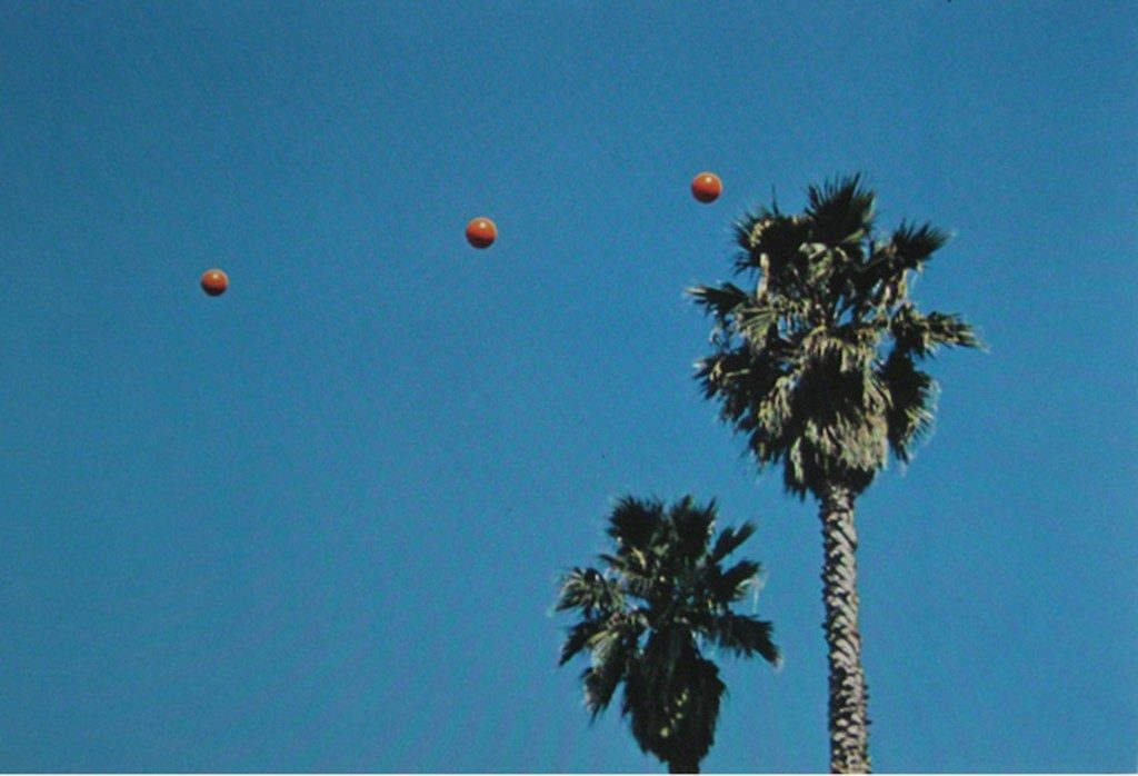
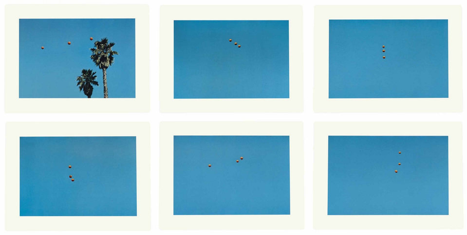
This photo series documents John Baldessari’s repeated attempts at throwing balls in the air, hoping they form a straight line. Baldessari invented and pursued this seemingly meaningless challenge. These photographs demonstrate Baldessari’s interest in exploring the structure and limits of games and language. 

My response

Dan Baldwin (Artist Research)

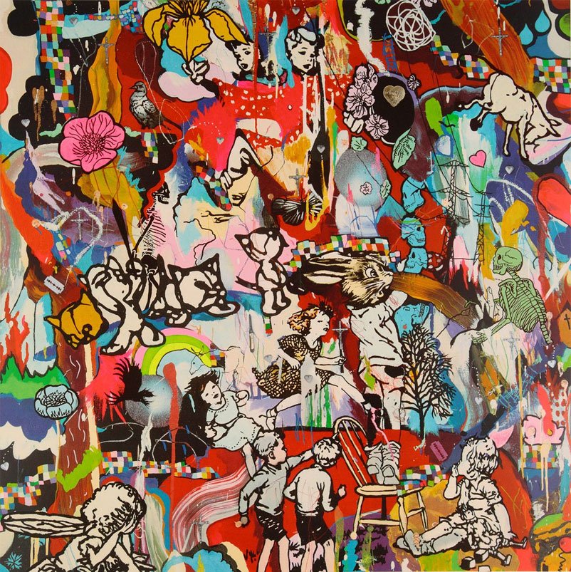
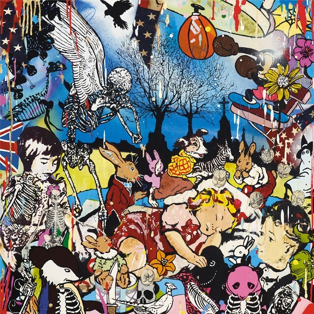
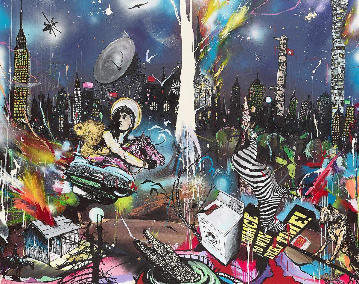
Baldwin is best known for his chaotic and dramatic multi-media paintings, which show both beautiful and jarring imagery all compiled into one. Baldwin received his BA in Communication Media and Illustration from Kent Institute of Art and Design in Maidstone. He graduated with honors in 1995. As well as his best known iconic paintings, Baldwin has also produced other work such as book covers, album covers and ceramic work. I first became familiar with the work of Dan Baldwin when I saw his work exhibited in the Jersey CCA galleries. My initial thoughts about his work were that the chaotic nature caused me as a viewer to be able to notice different elements and aspects each time I looked at one of his pieces, which for me was a great characteristic of the work as it made it very interesting to view. This chaotic nature of the work is executed as I mentioned before using a multi-media process in which he combines screen-printing techniques, household paint, found objects, and spray paint, and other creative materials.

Below are some examples of the work which I have spoken about…

Analysis Of Dan Baldwin’s work…

Modernism Vs Post-modernism – Research

Modernism

” Modernism was generally based on idealism and a utopian vision of human life and society and a belief in progress. It assumed that certain ultimate universal principles or truths such as those formulated by religion or science could be used to understand or explain reality. Modernist artists experimented with form, technique and processes rather than focusing on subjects, believing they could find a way of purely reflecting the modern world. ”

Image result for modernism art

Modernism in art and photography was very showing things and portraying scenes in the way the photographer / artist thought they

Post-Modernism

“Post-Modernism collapsed the distinction between high culture and mass or popular culture, between art and everyday life. Because postmodernism broke the established rules about style, it introduced a new era of freedom and a sense that ‘anything goes’. Often funny, tongue-in-cheek or ludicrous; it can be confrontational and controversial, challenging the boundaries of taste; but most crucially, it reflects a self-awareness of style itself.”

Image result for postmodernism art

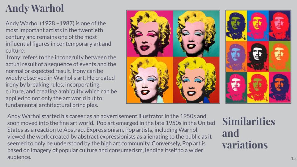
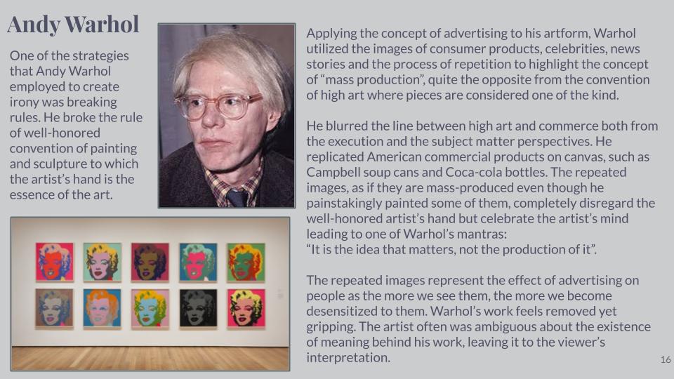
Artist Study – Andy Warhol

Sources:

John Baldessari: Play experiment

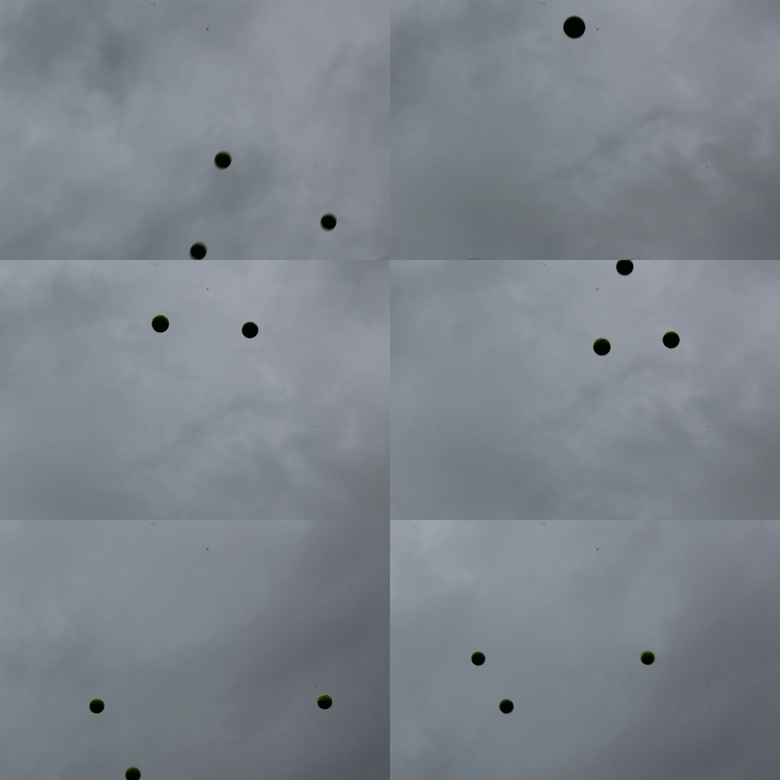
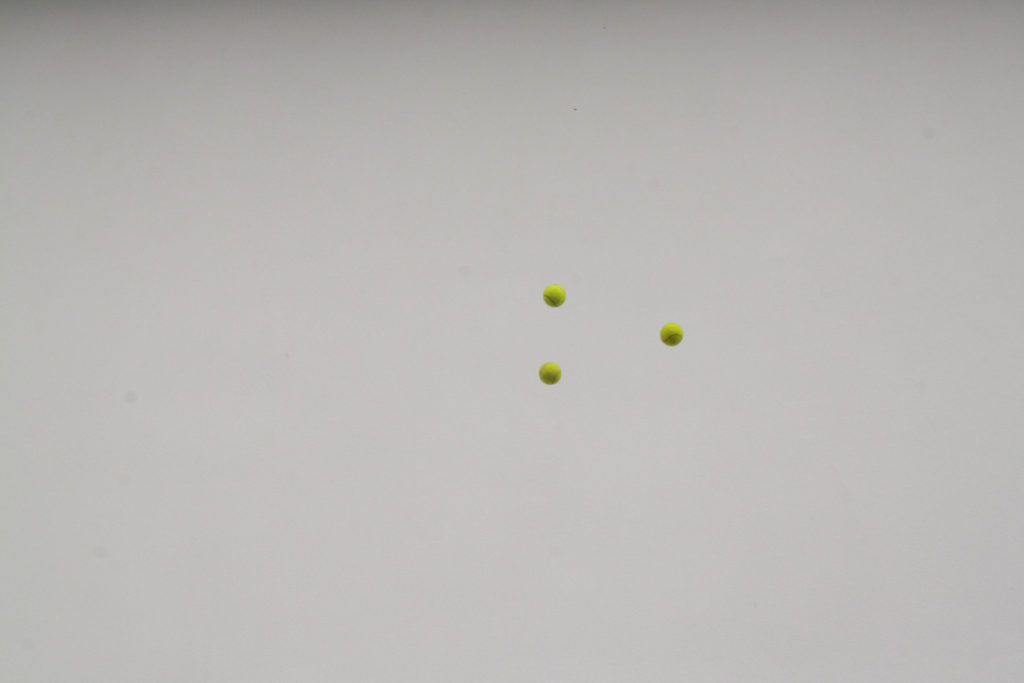
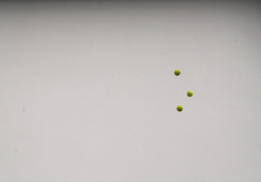
The theme of variation and similarity can be seen throughout many types of work one of which is an experiment by Californian photographer John Baldessari. This experiment was influenced by Baldessari after he did it in 1973. His aim was to get all three balls to line up mid air and take a picture as they do so. it was really challenging to throw them up and get them lined up and take the picture at that exact moment.

My Attempt:

Hiroshi Sugimoto | Image Analysis

Image result for hiroshi sugimoto

This image of Sugimoto’s expresses his style. Evidently, the black and white theme continues but he uses animals instead of people or objects as his subject.  In the image, Hyenas, Jackals and Vultures appear to be fighting over something, likely a kill.  This fighting is a fine line where life meets death, the kill itself is represents the dark side of that spectrum. The weather also plays a vital role in exposing this theme which is only emphasized by the black and white. The horizon marks the border between the light and the dark, the margin that represents the border between life and death.

Despite the image being constructed post shoot, it looks very real and to the viewer, it creates a sense of fear perhaps and an exaggeration of the line between life and death. Visually, the image stands out by being unique and interesting with its wild subjects however the composition of the image itself increases the image’s likability. Being black and white, the image attracts a nice contrast between light and dark, linking to the theme of life and death that we see in the subject matter. Further,more, the sky has little structure and retains a rather smooth texture yet the shading adds a real depth to the image and almost sets the brightness of the entire image and creates an effect making the image appear brighter yet still having a meanness to it.

This image, despite using fake subjects, is quite a fascinating image when it comes to the taking of the image itself. It could appear that Sugimoto put himself in danger being so close to wild predators. He captures a lot of lives in that image and that fact even further expresses how fragile that can be as they fight over a kill. I would think that he used a wide angle lens at quite a close range, maybe only 5-10 meters from the subjects. I would believe he used a faster shutter speed and a medium ISO to capture the birds flying perfectly still but also having the light in the image to light the foreground but not too much to have the background (sky) to be over-exposed.