John Baldessari Response

Who is he?

John Baldessari is renowned as a leading Californian Conceptual artist. Painting was important to his early work: when he emerged, in the early 1960s, he was working in a gestural style. But by the end of the decade he had begun to introduce text and pre-existing images, often doing so to create riddles that highlighted some of the unspoken assumptions of contemporary painting – as he once said, “I think when I’m doing art, I’m questioning how to do it.” And in the 1970s he abandoned painting altogether and made in a diverse range of media, though his interests generally centered on the photographic image. Conceptual art has shaped his interest in exploring how photographic images communicate, yet his work has little of the austerity usually associated with that style; instead he works with light humor, and with materials and motifs that also reflect the influence of Pop Art. Baldessari has also been a famously influential teacher. His ideas, and his relaxed and innovative approach to teaching, have made an important impact on many, most notably the so-called Picture Generations, whose blend of Pop and Conceptual art was prominent in the 1980s.

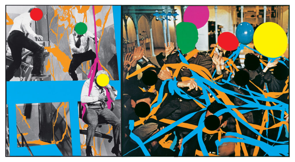
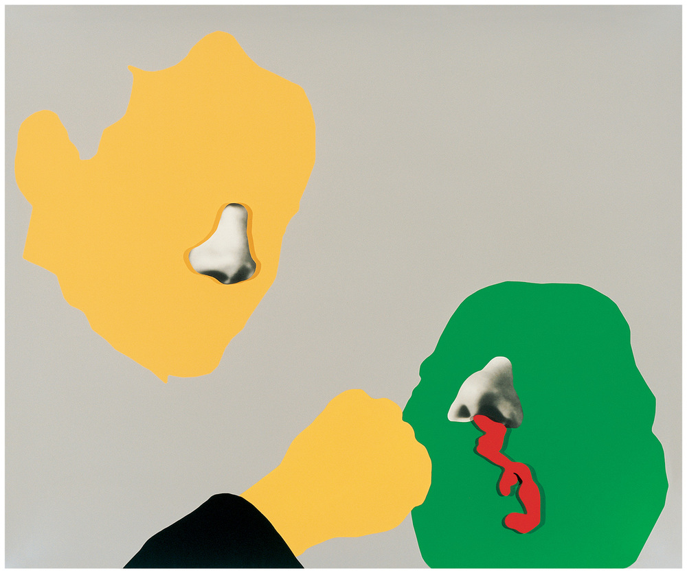
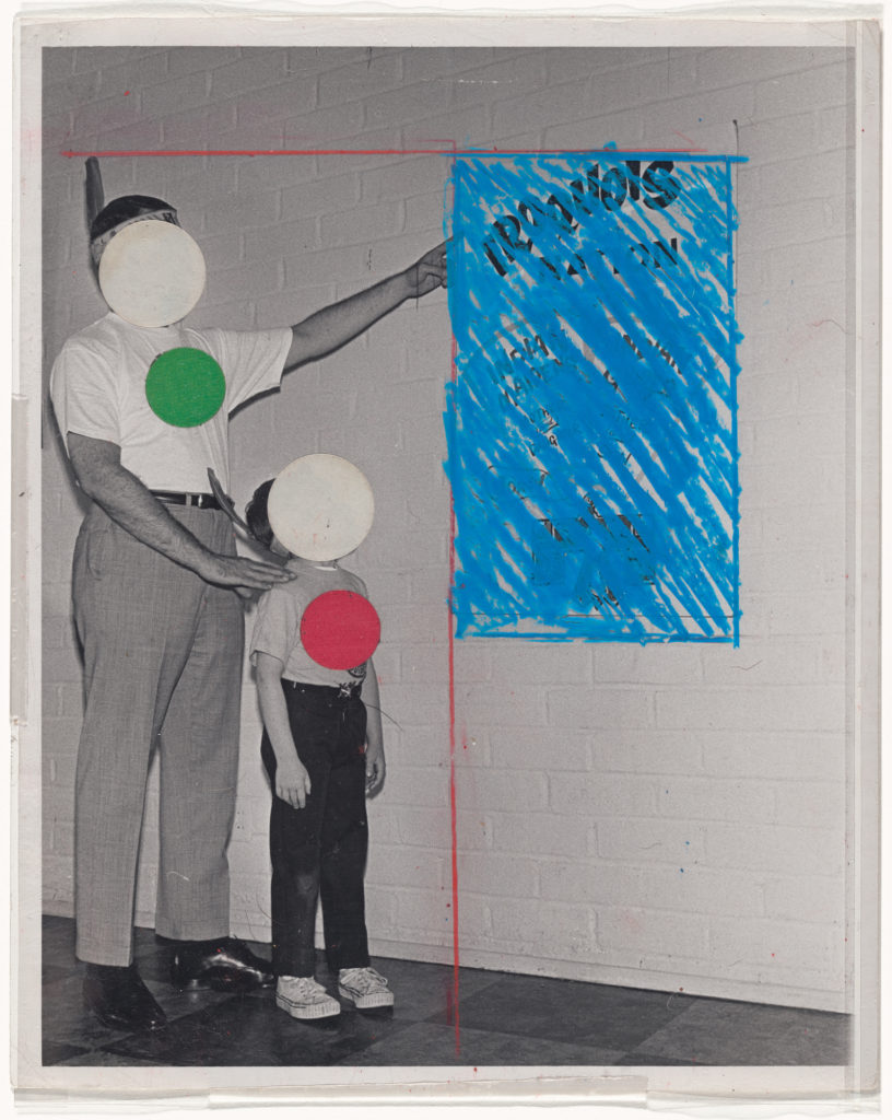
Baldessari first began to move away from gestural painting when he started to work with materials from billboard posters. It prompted him to analyze how these very popular, public means of communication functioned, and it could be argued that his work ever since has done the same. He invariably works with pre-existing images, often arranging them in such a way as to suggest a narrative, yet the various means he employs to distort them – from cropping the images, to collaging them with unrelated images, to blocking out faces and objects with colored dots – all force us to ask how and what the image is communicating.A crucial development in Baldessari’s work was the introduction of text to his paintings. It marked, for him, the realization that images and texts behave in similar ways – both using codes to convey their messages. Text began to disappear from his work in the early 1970s, and since then he has generally relied on collage, but his work has continued to operate with the same understanding of the coded character of images.

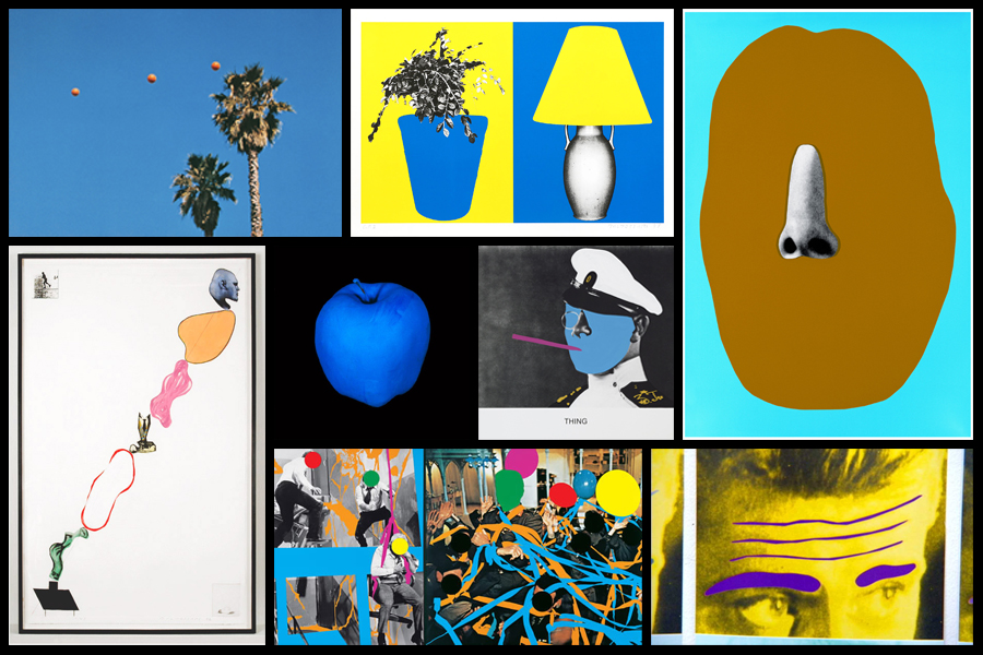
Typically, he collages together apparently unrelated categories of image or motif, yet the result is to force us to recognize that those images often communicate similar messages.On a visit to the Metropolitan Museum in New York in 1965, Baldessari was struck by the use of unpainted plaster to fill in missing shards of Greek vases. This prompted his interest in how images are effected by having portions removed or blotted out, and he has continued to explore this ever since. Often, the result of his alterations to photographs is to render them generic, suggesting to us that rather than capturing a special moment, or unusual event, photographs often communicate very standardized messages. Here are some examples of his works:
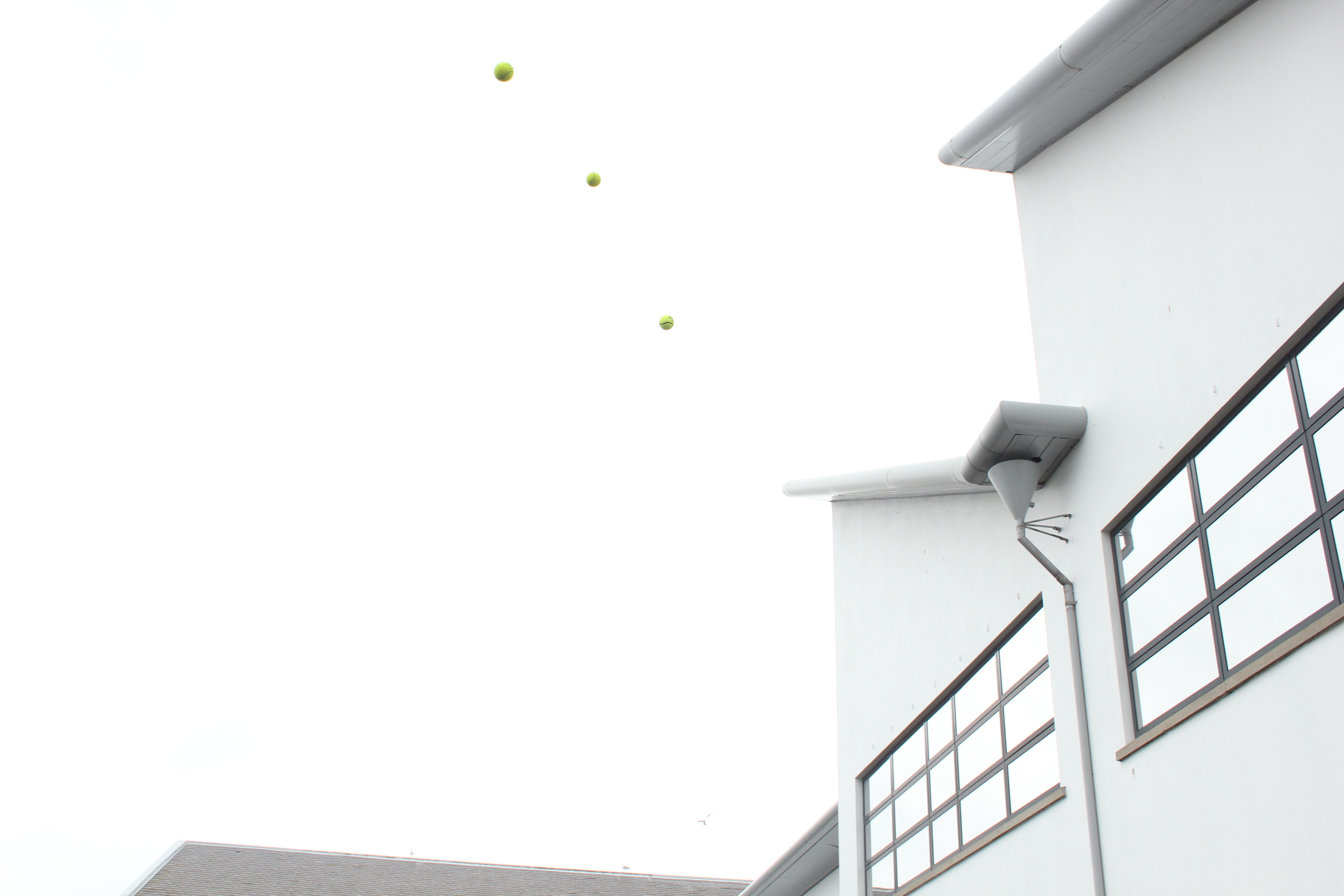
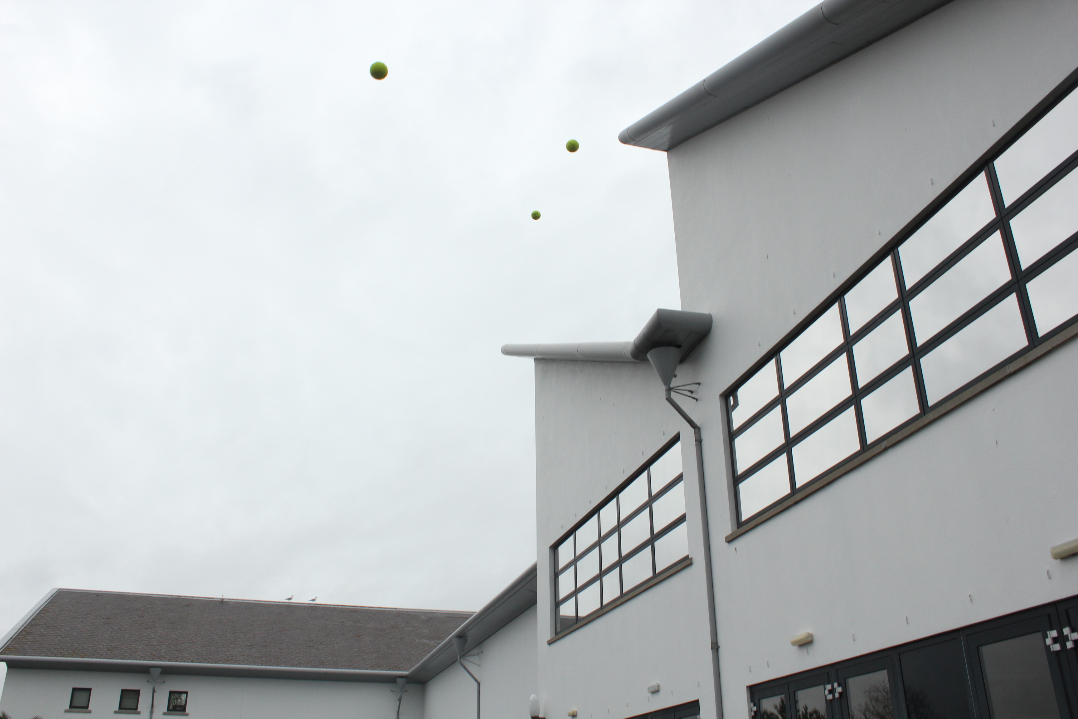
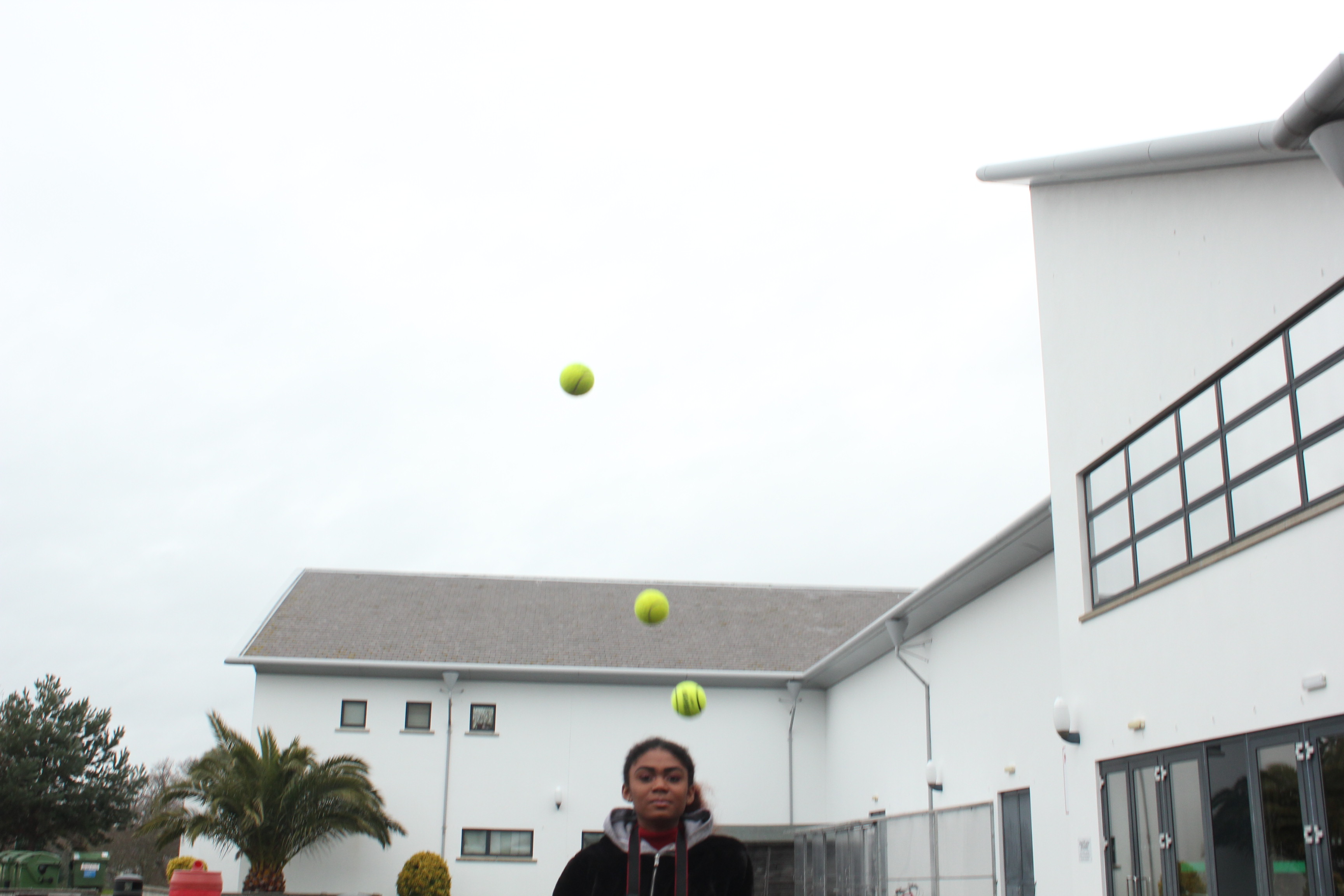
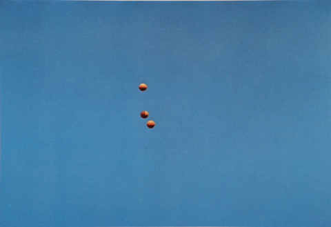
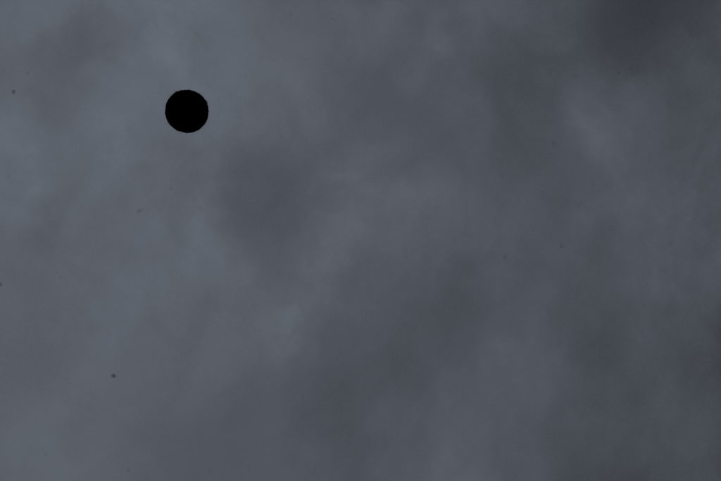
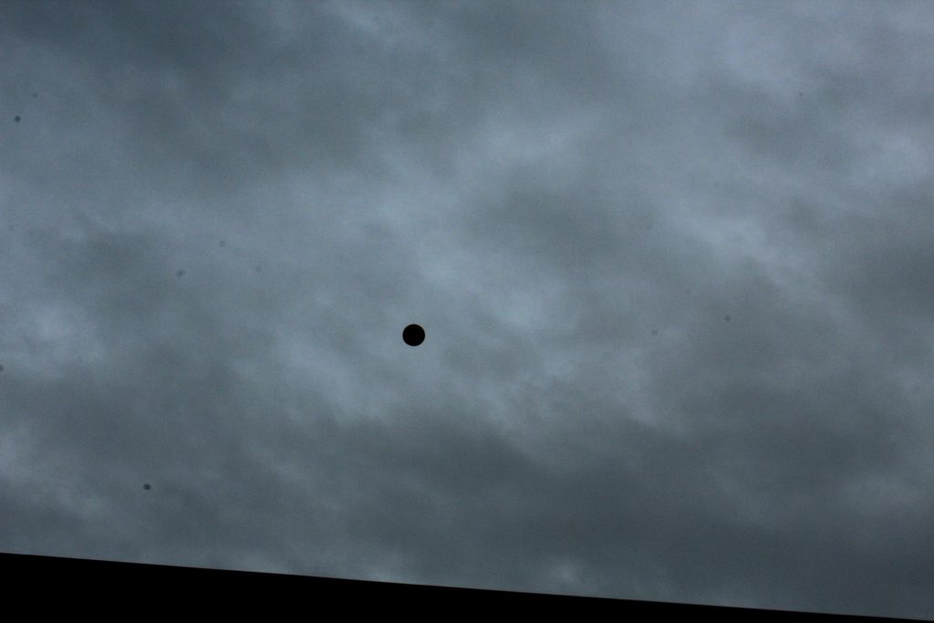
After looking over some of his work I decided to create a response to the project he worked on called Throwing Three Balls in the Air to Get a Straight Line. This project attracted me because of how bizarre and unique it was, using the formation of randomized ball positions in the air to create ‘art’. I then proceeded to make a response to this by throwing various balls in the air and attempting to capture them mid-flight, using only the backdrop as the main form of contrast in the photo. I would also experiment with shutter speed where I would try to capture other moving subjects, here were my results:

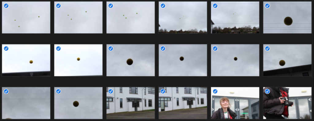
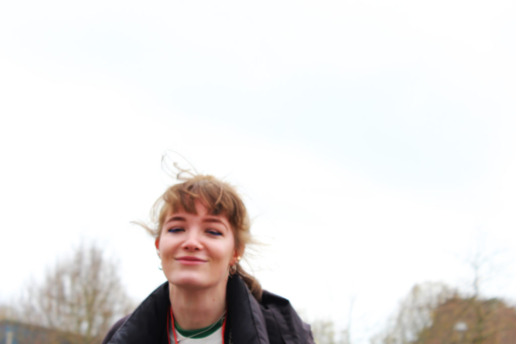
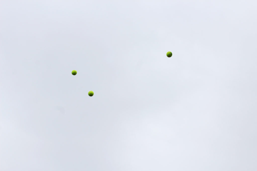
Once I had completed this task I decided to pick out the three images that I thought best reflected what I wanted to experiment with, here were the results:

I really liked the idea of capturing a subject mid movement as it allowed for a new stance of photography I had not previously explored. In future shoots I could look at things like birds mid-flight or people and shadows, this would open up opportunities for further abstraction of the environment photographed as by incorporating moving things it could bring the image into life.

A2 Photography Exam – Artist Research – John Baldessari


John Baldessari, born on the 17th of June 1931 in California, is a photographer, artist and teacher of the arts. Since the 1950’s he has been creating artwork by using techniques from various subjects such as painting, photography, montaging and text to create his own meaning behind his art.

As he was born in National City, California, he has a key artist within the west coast, as he himself and his style was completely different from other uprising artists from the same area as him.

Baldessari’s main goal was to challenge the standard ideas of art, by using imagery from films and advertisements, and using in your face contrasting shapes or textures, and covering photos, with shapes in appropriate places to fragment the photos.

My experimentation

Experiment 1:

GIF of my experiment 1

I was inspired by John Baldessari to capture images of a model moving and dodging the camera, due to his photographic art being humorous, so I experimented with something that I could create into a style similar to his. I wanted my model to appear as if she is boxing, hence why she is clenching her hands into a ball to appear as if she has boxing gloves on. On my camera, I used the setting Tv, put the white balance to cloudy (approx 6000K on my camera), and set the ISO to 1/200 for this first shoot. This made my images quite sharp and clear, due to a fast shutter speed.

Experiment 2:

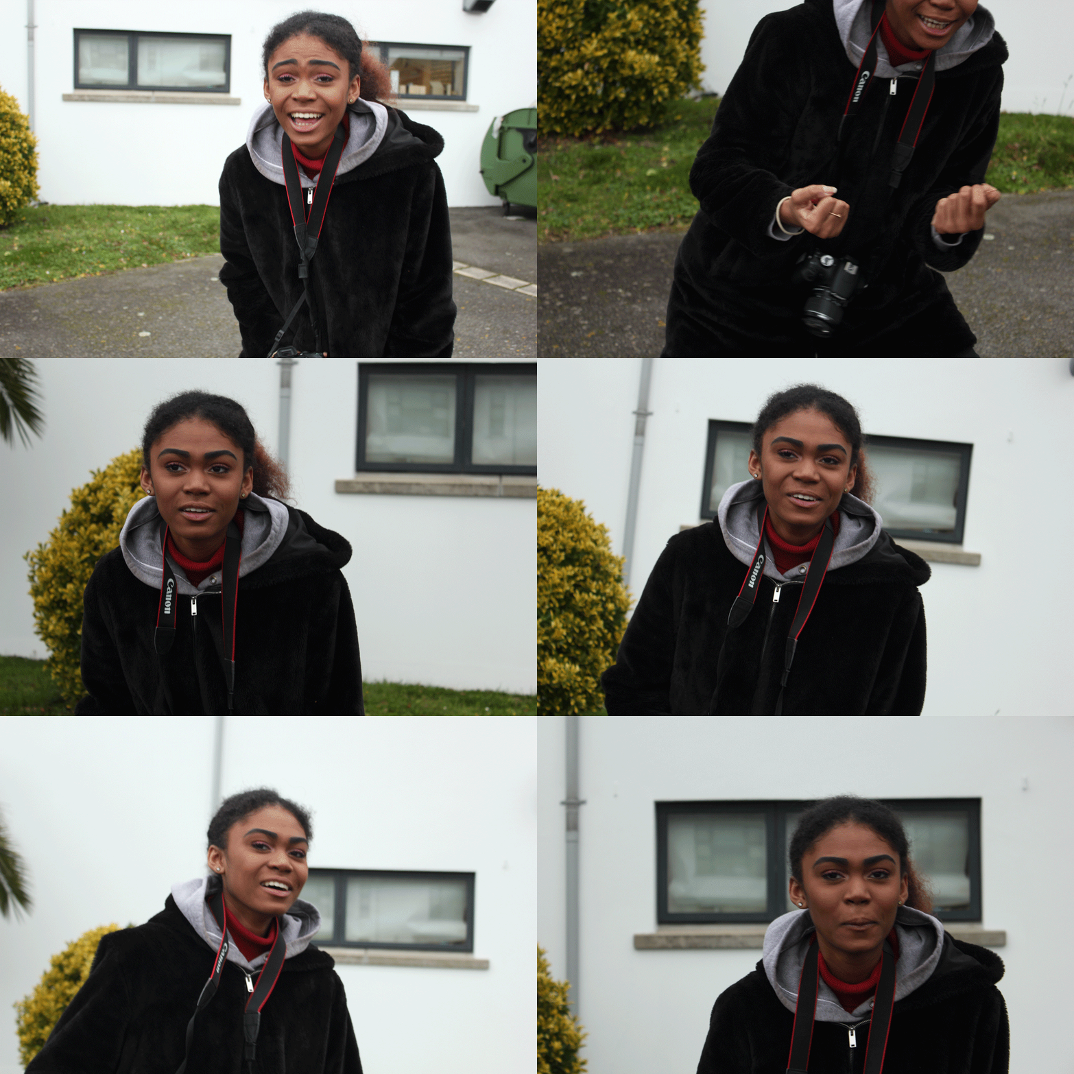
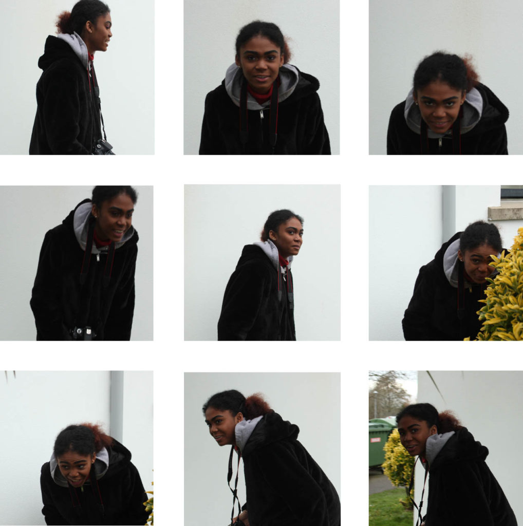
For this experiment, I changed my camera settings; I kept the white balance and camera setting ‘Tv’ the same, however I lowered the ISO to 1/160. I told my model to do the same technique and movements as the last shoot, where she had to try and run around and dodge to camera. I decided to make a grid layout as I felt that this repetition of similar images is easy and interesting to look at from this sort of format.

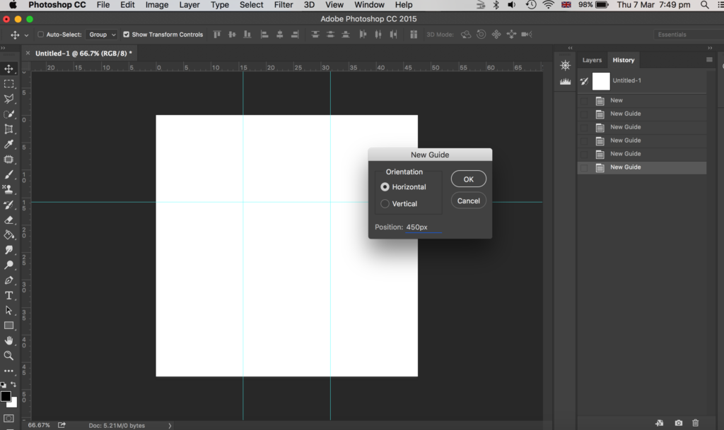
To make this grid layout, I used photoshop. My first step was to create a square canvas. Next, I went to view, new guides and clicked horizontal 450px. I did this again but changed the px to 900px. Then I repeated this for vertical guides, where I chose 450px and then did it again with the vertical option selected and put 900px.

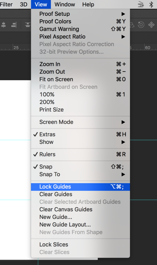
Then I went to view and chose lock guides.

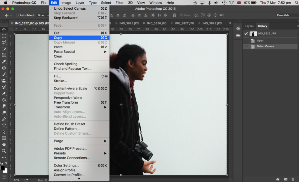
Then I opened up all my images on photoshop that I wanted to use – I chose 9 images of my model dodging the camera. I went onto each photo in photoshop and went to select, all and edit, copy.

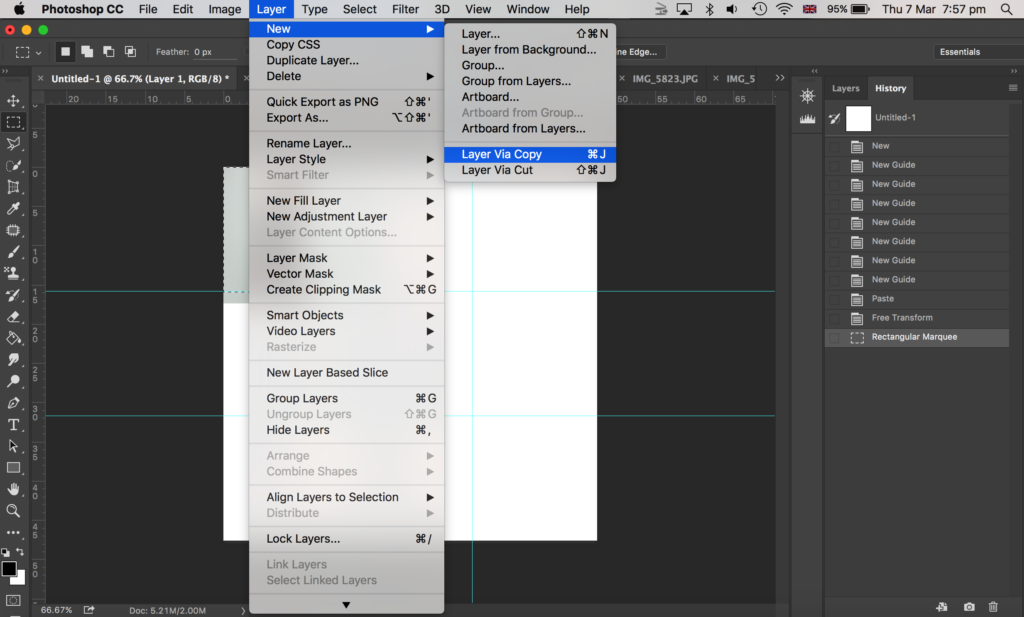
Then I went onto the canvas I made with guides and went to edit, paste. To make my image smaller to fit on the canvas I went to edit, free transform where I could then adjust my image size. I placed it within one of the squares the guides had made. I then got the rectangular marquee tool and made a selection of what part of the image I wanted to get rid of; I wanted the image to be square, with a white border in between the image and the guidelines. Then I went to layer, layer via copy.
After that, I went onto the layers panel to the right side of the image shown above, and deleted the original layer of that image (before I cropped it) so that I was left with a cropped version of that photo which I made as a square shape.

Grid layout of experiment 2

Here is my final outcome as shown above.

Experiment 3:

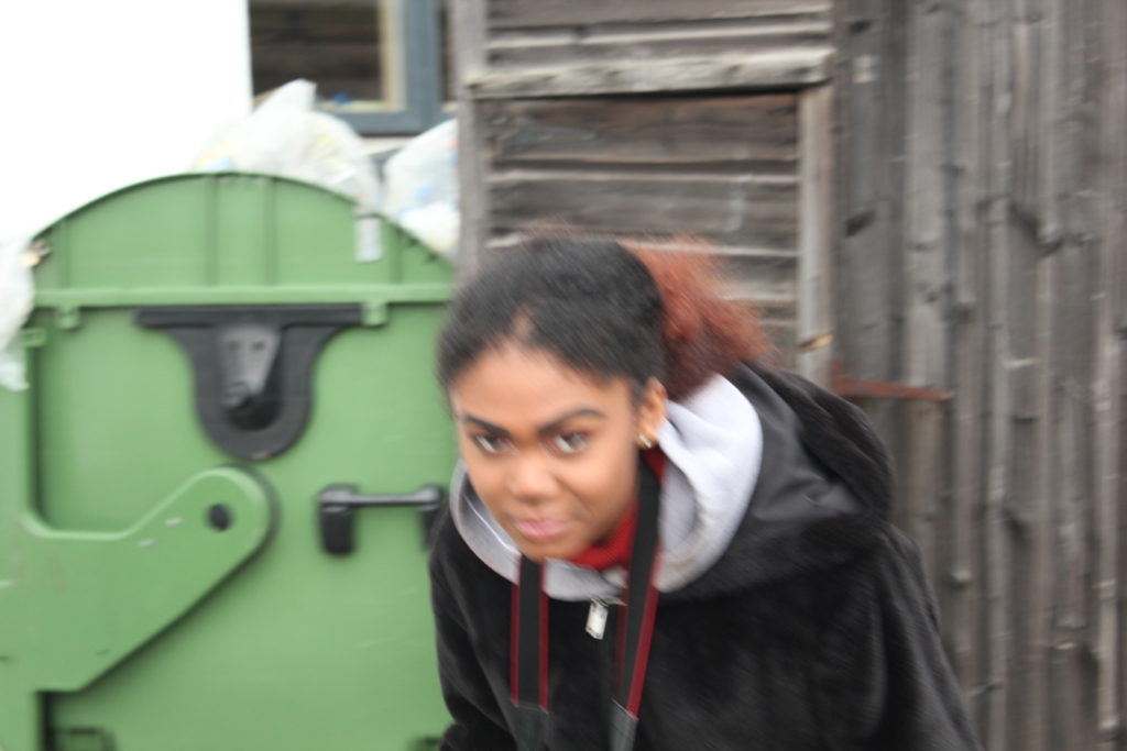
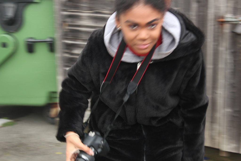
I did the same game of play, where the model had to run round and dodge the camera and make actions as if she was boxing, yet I wanted to experiment with the ISO again. So, for this experiment, I lowered the ISO to 1/100. This made the images blurrier due to a slower shutter speed.

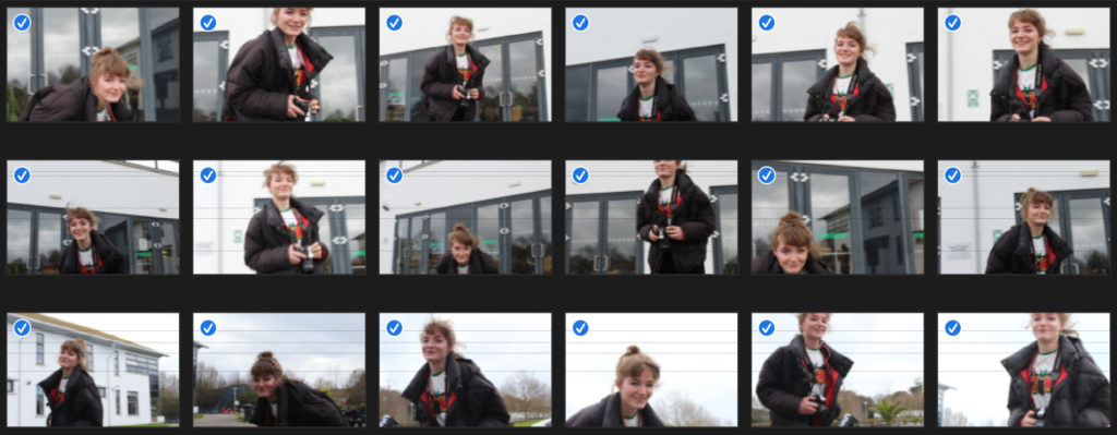
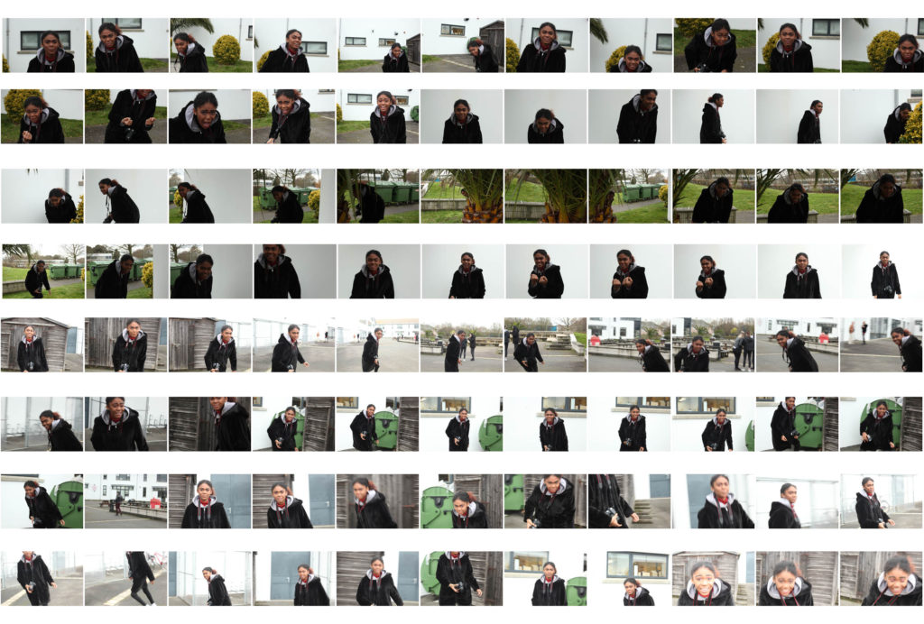
Overall contact sheet of my first ‘play’ shoot:

Here is a contact sheet of all the images of my first play experiment of using my model and getting her to dodge the camera as if she was boxing.

Experiment 4:

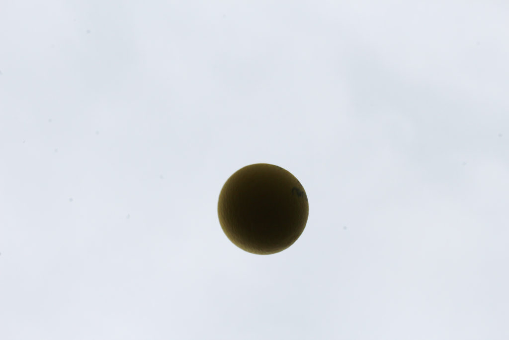
For this experiment, I got my model to throw up one yellow ball in the air. This was an idea inspired by Baldessari, again, as he throw oranges up into a clear sky in California. However, because the sky was cloudy and grey (unlike Baldessari’s blue sky,) I chose a yellow ball to throw into the air as I felt this would be a clearer colour to see in the dark, gloomy sky. I experimented with the ISO; the first image is with an ISO of 1/200, which made my image appear lighter. The other 2 images are where I experimented with a lower ISO so they appeared darker.

Expriment 5:

My attempts of throwing balls into the sky, inspired from Baldessari

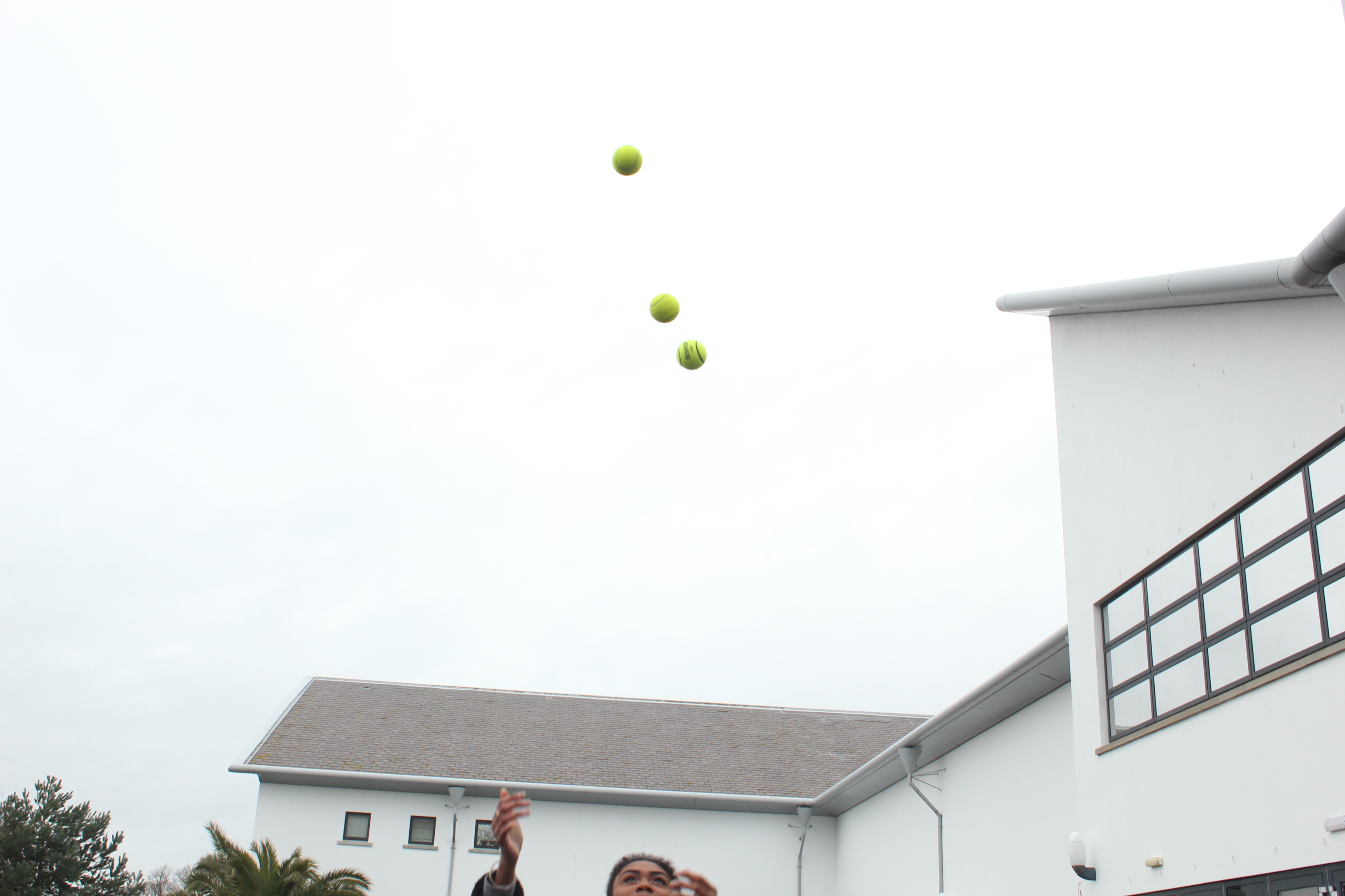
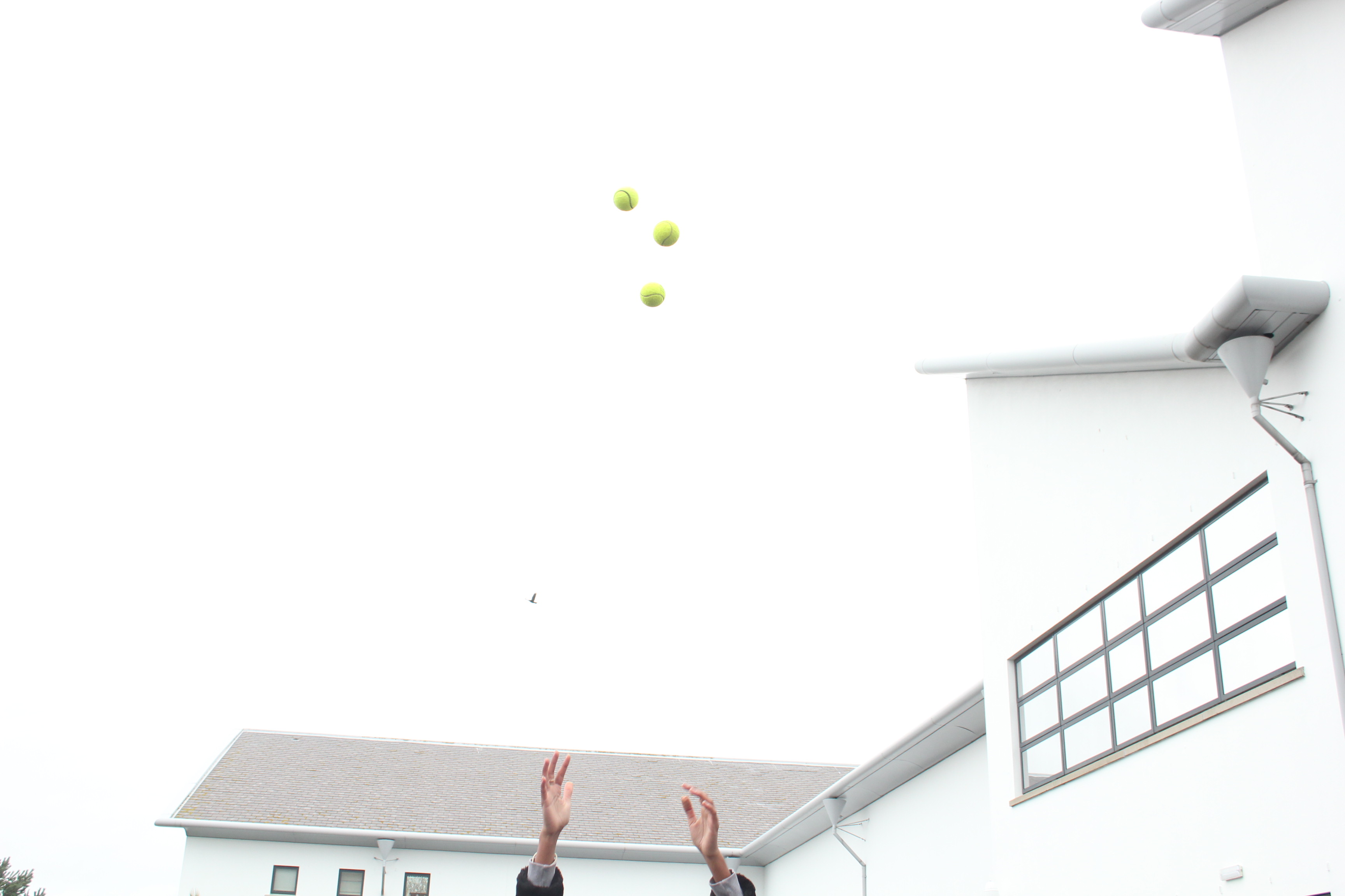
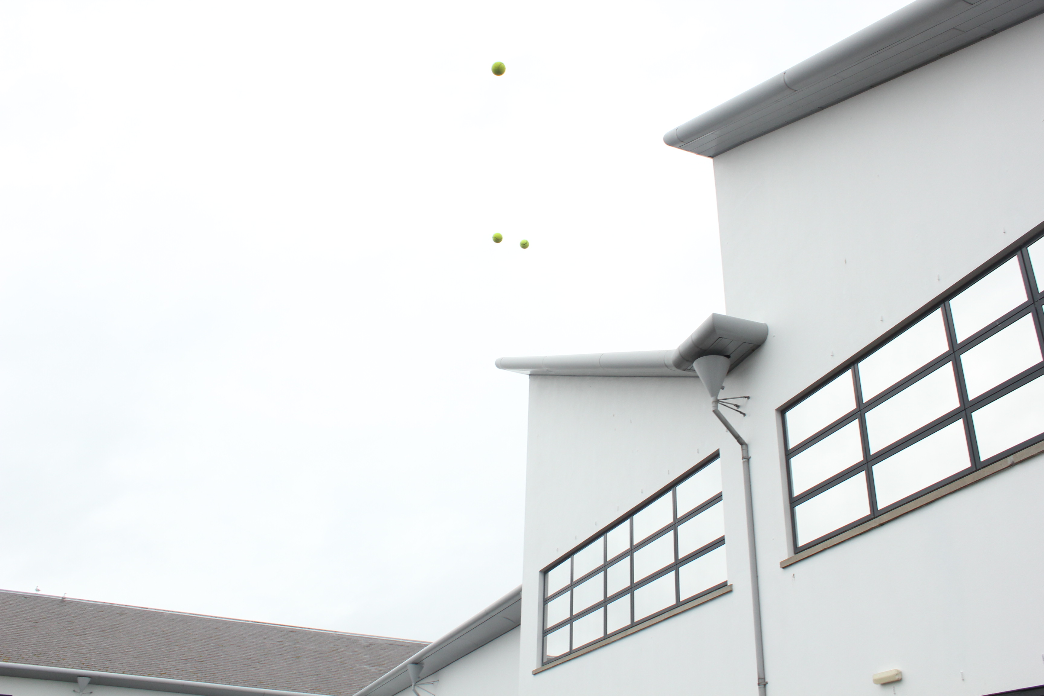
With this experiment, I then used 3 yellow balls and got my model to throw them up into the air, again, like Baldessari’s work of throwing oranges into the sky. To achieve a similar image to his, I got my model to throw all 3 balls at the same time, so that it created a line of the 3 balls.

John Baldessari’s image of throwing oranges into the sky

John Baldessari

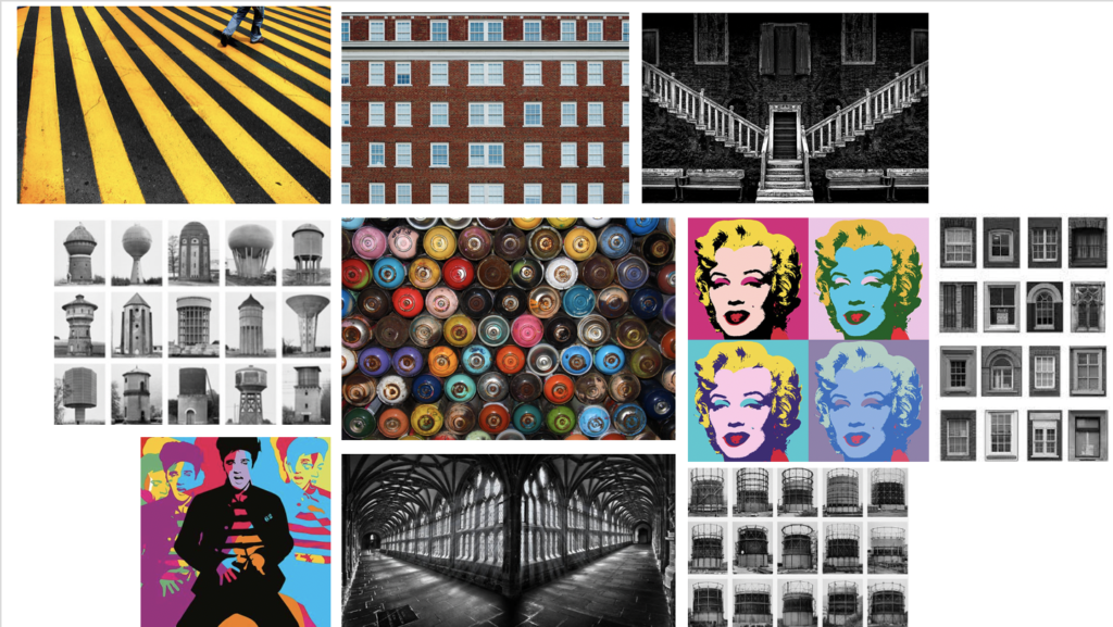
Mood-board of Baldessari’s work

John Baldessari was a leading Californian conceptual artist. Painting was important to his early work, but by the end of the decade he had begun to introduce text and pre-existing images to create riddles that highlighted some of the unspoken assumptions of contemporary painting. In the 1970’s, he abandoned his interest in painting and began to make a diverse range of media, though his interests were based on the photographic image. Conceptual art has shaped his interest in exploring how photographic images communicate. However, he works with light humor and materials and motifs that reflect the influence of pop art. He works with pre-existing images, arranging them in a way to suggest a narrative. He seems to distort his images – from cropping the images, to collaging them with unrelated images, to blocking out faces and objects with colored dots; this all forces us to ask how and what the image is communicating.

Image result for john baldessari
John Baldessari, 421 Artworks, Bio and Shows on Artsy

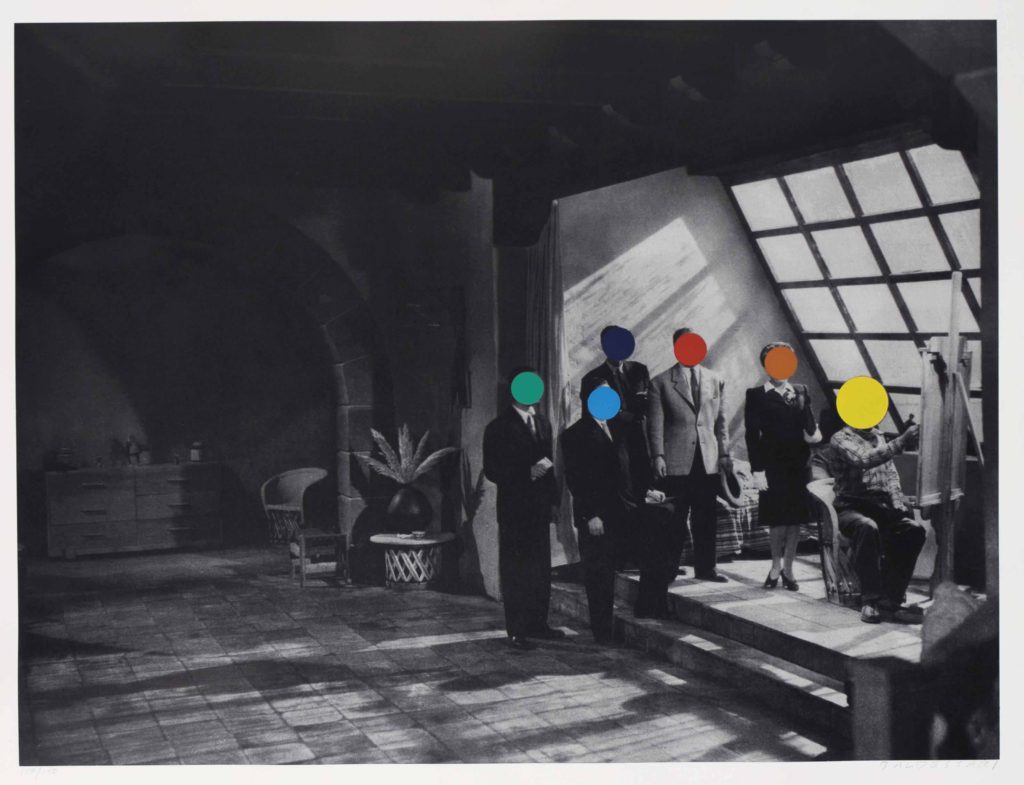
The image above is part of Baldessari’s approach to conceptual art during the 1970’s. This photo is of 6 people who seem to be dressed smart and professional. The image portrays normality, as it is a simple image of 5 men and 1 women that are staring out the window. Baldessari liked to incorporate into various features into his work, such as leaving us with questions about what the image is communicating and showing or trying to tell us. This aspect of the photo, where all the models seem to all be bunched near the slanted window creates this sense of uncertainty and leaves us wondering what are they all so attached on looking at? What is so interesting about what they can possibly see out the window? Additionally, Baldessari was interested in using parts of pop art in his work, as well as collaging his images with unrelated art or other images to block out objects or faces (as he has done in the image above). He has made these models faces invisible – so we don’t know what they look like, what their facial expressions are displaying, if they are talking with each other or where they are looking. Instead, he has used coloured dots to cover their faces which is similar to aspects of pop art, such as artists like Roy Lichtenstein and Andy Warhol., who use small coloured dots to make up their images. Again, this makes the us as an audience of his work, consider all these different factors that he his hiding from us. This is what makes his art and photographic images so intriguing, and why I was influenced to do something on a similar level to Baldessari.

JOHN BALDESSARI, REPONSE

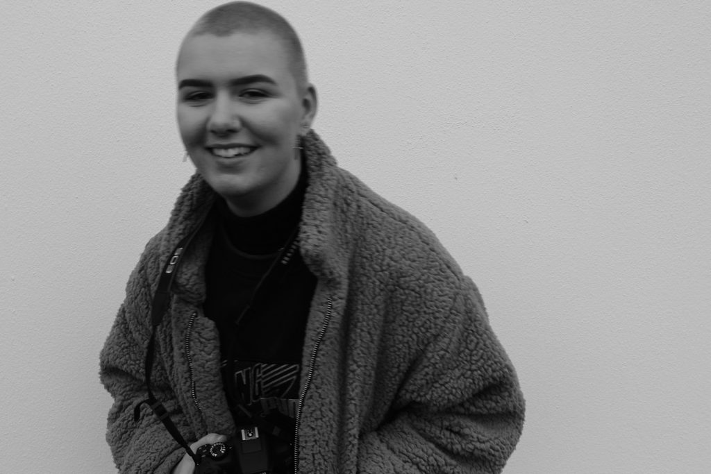
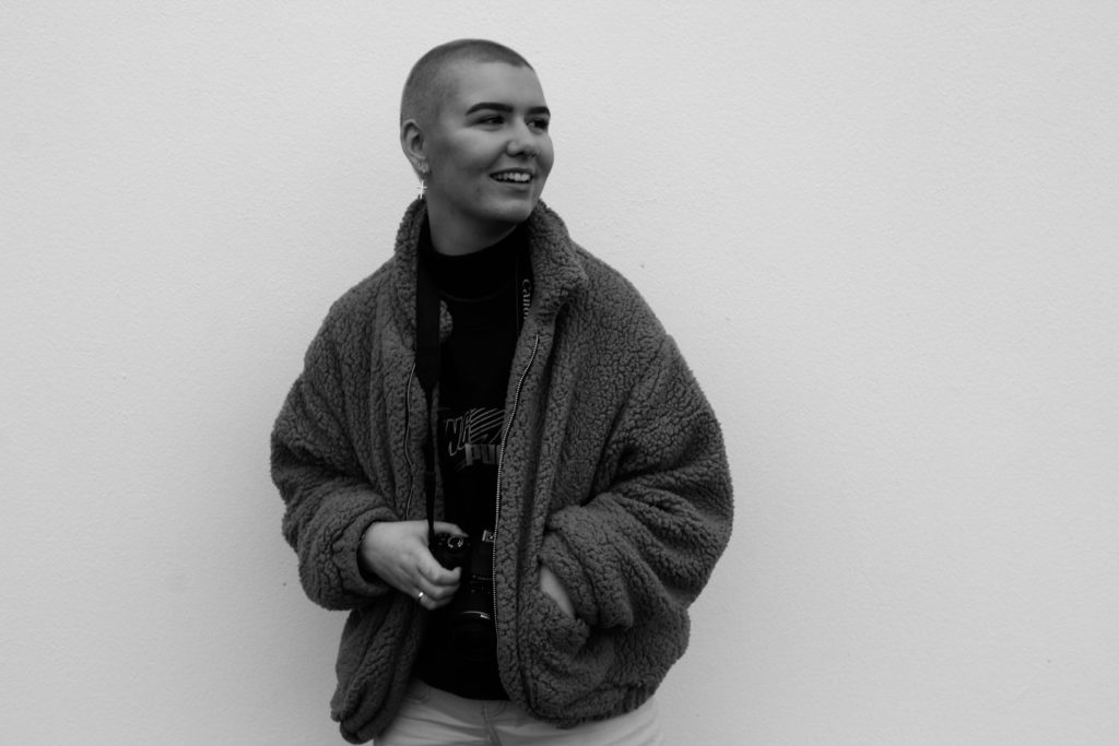
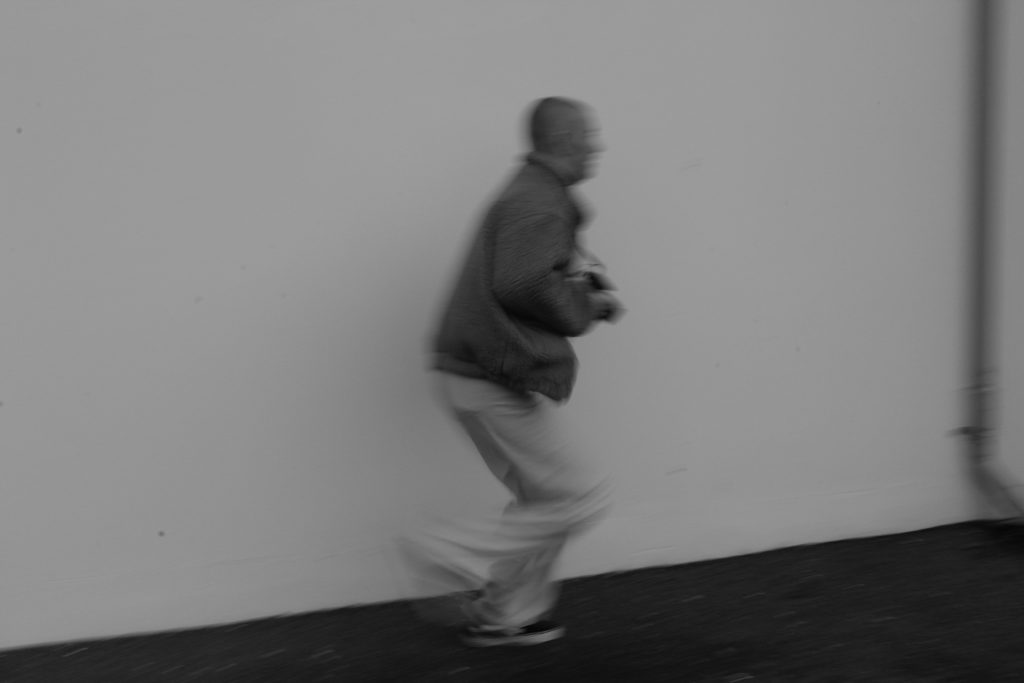
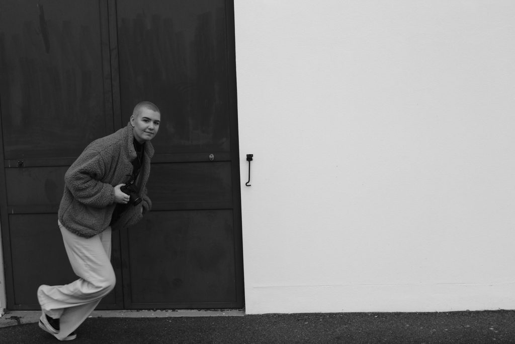
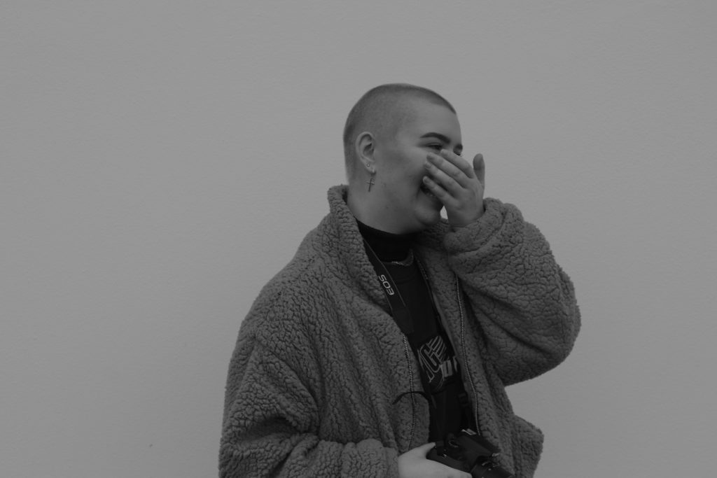
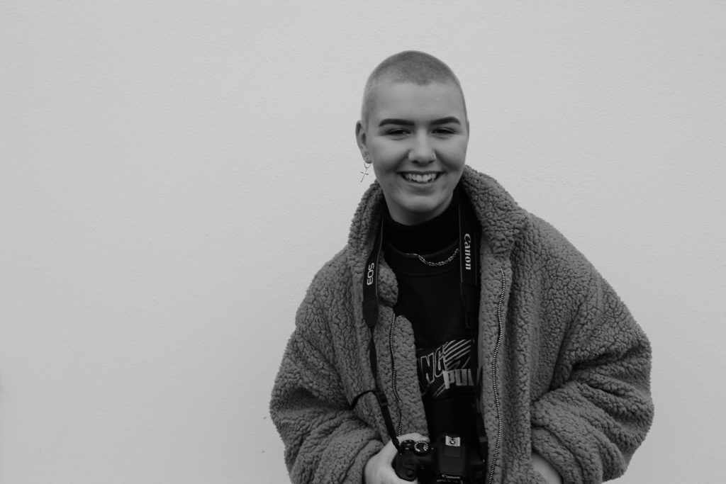
This shoot was inspired by both Baldessaris video of what is art, and then subsequently a response to throwing and lining up balls in the air. Although I believed I have mimicked the same or similar composition, and a real raw reflection of motion and a sense of reality within the images themselves. I have edited the images above to be in black and white, much like the video itself, I believe this also brings more of a directed narrative to the central character of the girl herself, and her emotional expressions of her own artistic voice. I believe I could further these images of the girl, with small aspects of coloured dots, possibly on her, to enforce more of his more pop culture concerned themes. I wanted too to capture images showing movement of her running, as this shows a more realistic approach of herself. My favourite image is the one on the bottom right, when she is running yet has direct eye contact at her camera, This demonstrates a breaking of the third dimension and relationship to which she is addressing and almost questioning the viewer on her actions.

Analysis: For this shoot it is evident that I was inspired by the artists own work of capturing ‘ a line of three tennis balls’, however, evidently I decided to focus on one larger ball, and have not successfully achieved a line of all three. Although, I belive using just one ball too creates an interesting more centered composition to the piece itself. I could however, edit the image and create an illusion of three balls, despite The fact that I could, I do not think this is the approach Baldessari would use. I believe if I was to repeat the shoot with a larger multitude of time and shots, much like the artists himself, the odds would be much greater.

A2 Photography Exam – Civil War Stereography response

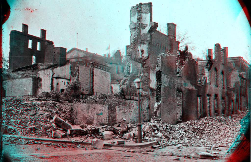
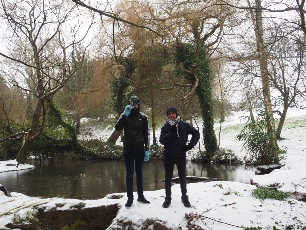
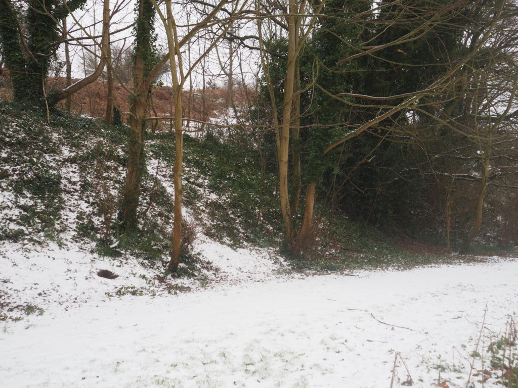
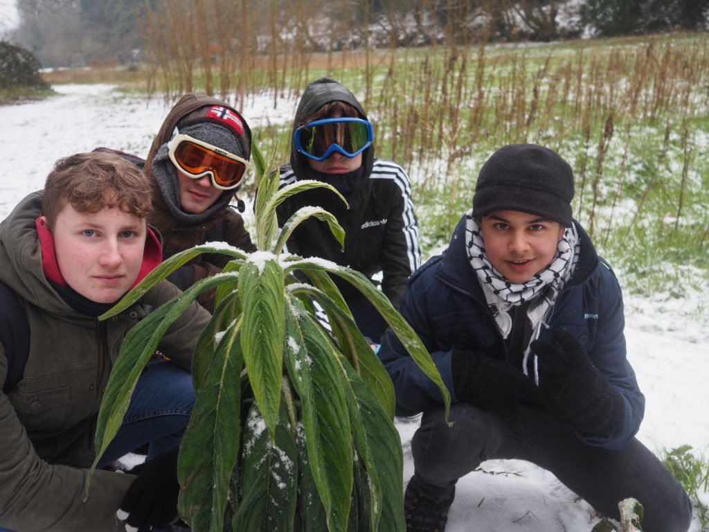
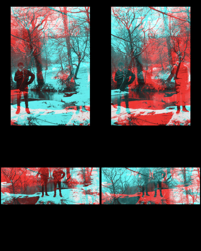
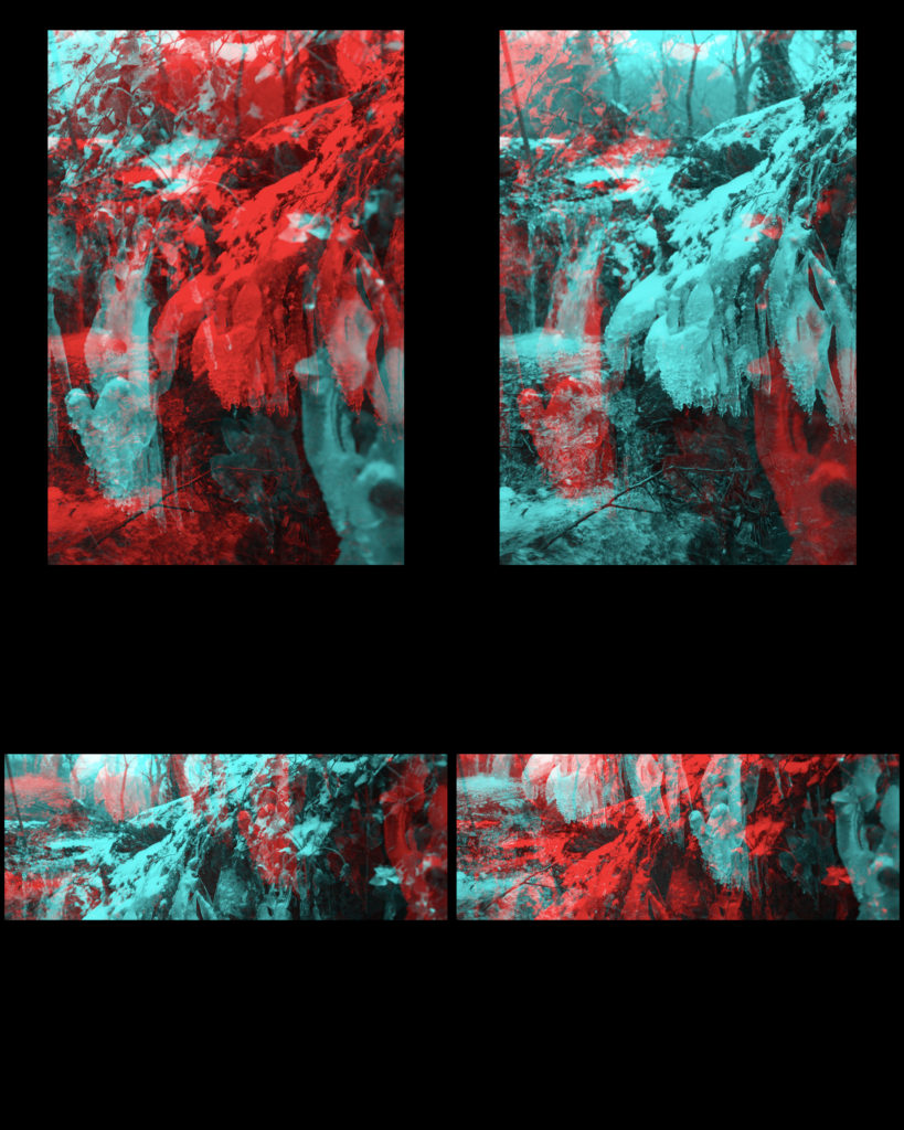
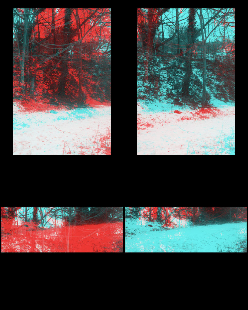
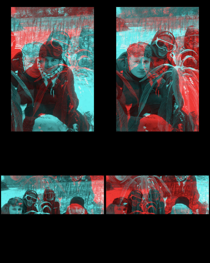
For my response to the Civil war Stereographs I will be using this photo as reference and I will be using these images for the edits.


To create these stereographs I used an application called XstereO Player, it allows you to use red and blue, or green and magenta. I used photos that I took on a snow day a while back. The image shapes you can get are a standard portrait, or a wider landscape.

My Response to Huang Qingjun

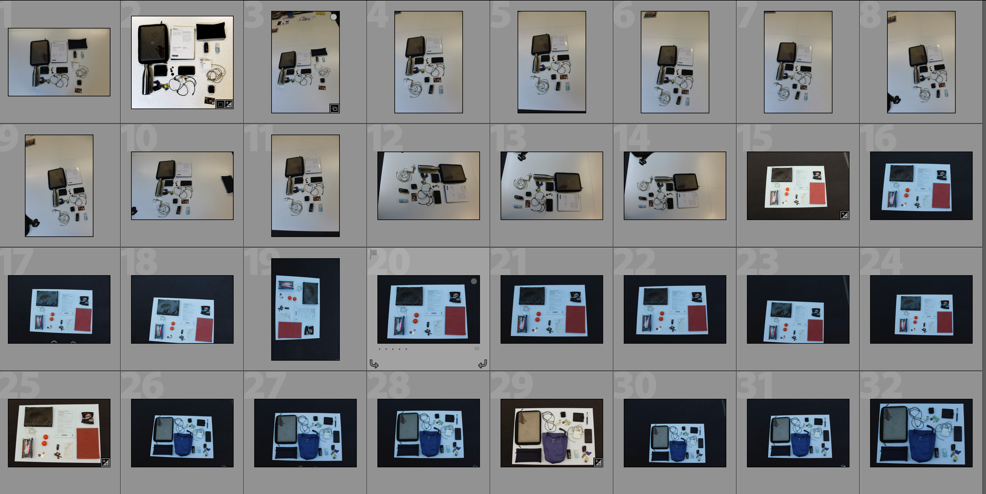
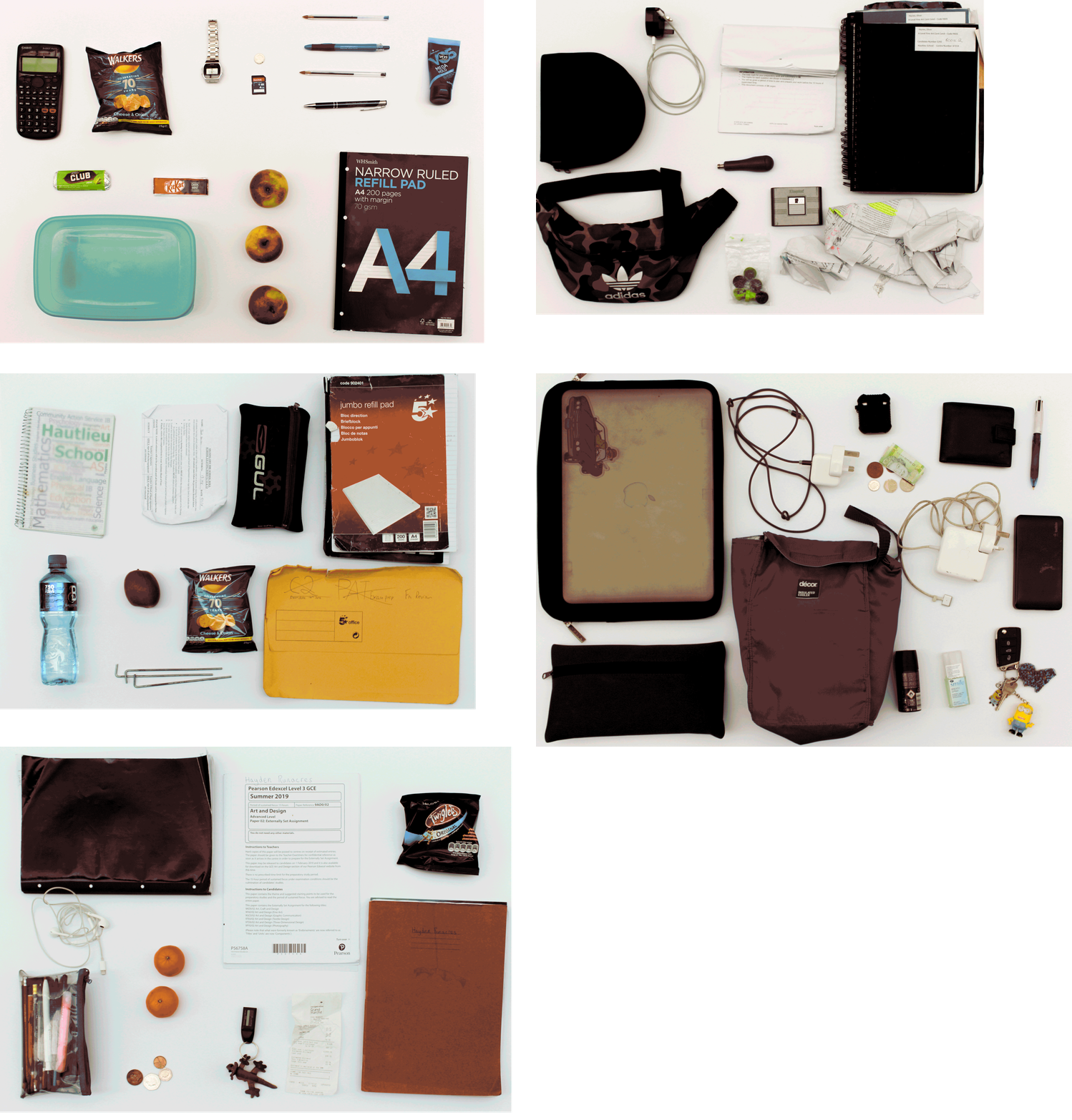
The idea behind this shoot is to explore the different items that people regularly carry around in their school backpack in order to look at the similarities and differences between the contents as well as giving a slight insight into who the person is and what their interests are.  Some of the bags that I took photographs of contained only the minimal indicating that the person may be very organised or may not like to carry much on them whereas other bags had lots of random items in them which may suggest they like to ensure they have what they could possibly need throughout the week on them at all times and may not mind having clutter in their bag.  This shoot relates to ‘Variance and Similarities’ as it can show how one standard thing that everyone does/has can vary so widely but then at the same time they will all have similar items within the bags, such as pencil cases or lined paper.  The shoot takes inspiration from Huang Qingjun’s ‘Jiading’ meaning ‘Family Stuff’ and shows an insight into the unlimited variety of combinations of different belongings that people may carry around with them.

In order to capture the photographs I would empty out the bags onto a blank sheet of white paper and arrange the items into a displayable arrangement with slight separation between each item in order to allow each item to be observed individually.  A would then photograph all contents from the same height facing the camera directly towards the floor.  I edited the photographs to create the outcome achieved by first editing the distortion of the picture and the perspective so that the photograph would be face-on to the camera and then I would crop it so that only the white background can be seen.  I then changed small features such as white balance, exposure and contrast to create a more visually aesthetic composition.  The idea behind the editing was that each photograph would have the same setup to allow the features to be compared side-by-side.

Experimentation with GIF’s

Below I have experimented with presenting my outcome in the form of a GIF.  The first GIF shows each frame for 0.2 seconds whereas the second GIF shows each frame for 0.5 seconds.  I have included both speed of GIF’s as I feel that they present the photographs in different ways – the faster GIF creates a more abstract approach where the viewer has to concentrate closely to pick apart the individual photographs whereas the faster GIF’s allow the viewer to focus more on each individual photograph and to compare the photograph’s features more.  The use of a GIF allows for quick comparison of the photographs in an interesting way and suggests how different each picture is even though they have a different layout because the first thing the viewer notices is shapes and colours and then they have to look closer to understand what the photograph is showing them.

Analysis

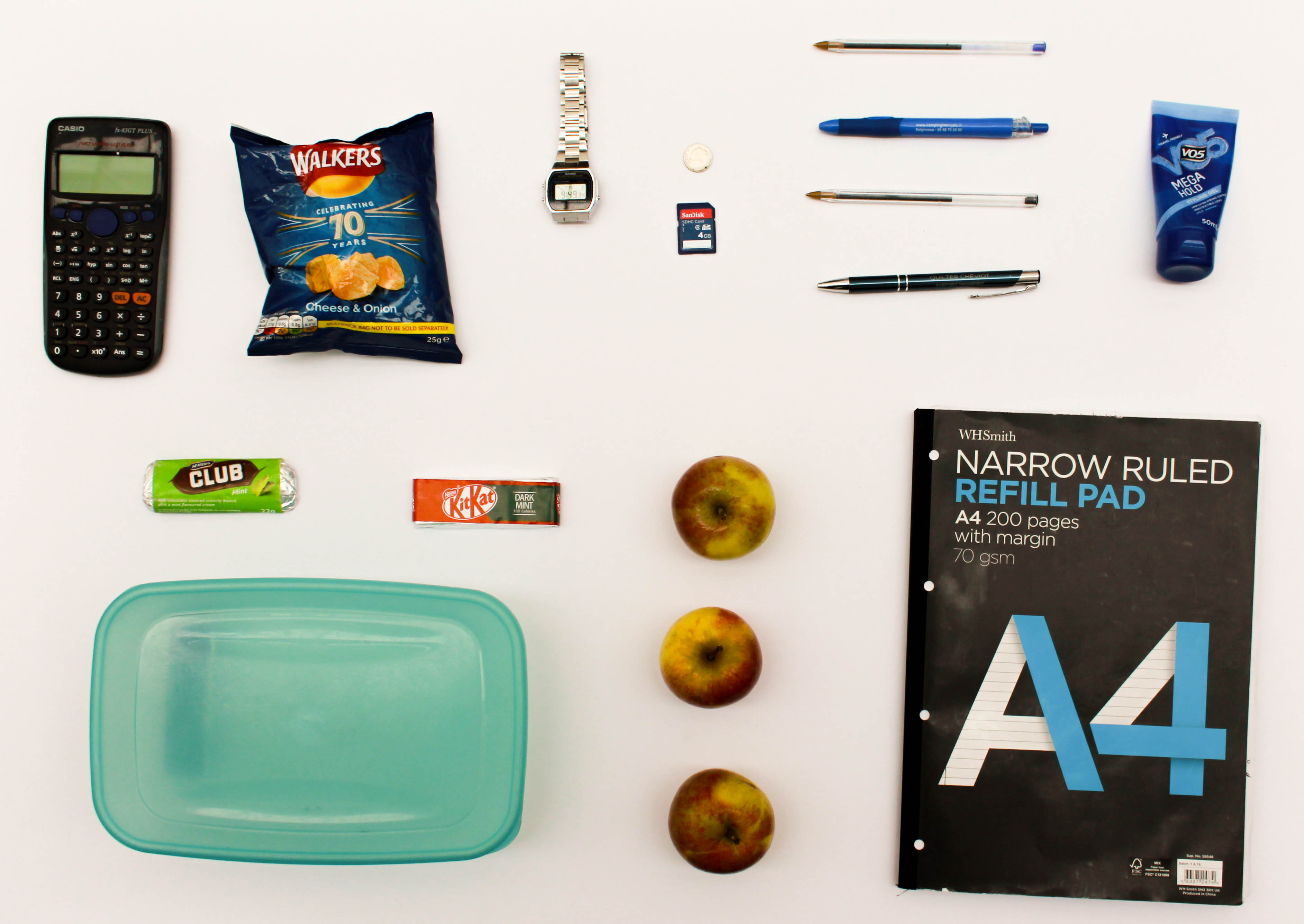
In this photograph I have used the natural lighting from the roof windows in order to ensure that a consistent light is spread across all of the items within the photograph.  The skylight also allows for the light to shine directly down onto the items from the bag and so reduce the shadows within the photograph to emphasise the difference between each item and the shapes within them.  Due to using a sharp white sheet as the background for this photograph there is a clear contrast between the items, such as the apples, and the background.  This has also allowed for the tones within the photograph to be more clearly defined.  I used a deep depth of field to capture this photograph as I wanted to ensure that all of the items featured in the photograph were clear and sharp because each item featured gives an insight into the personality and life of the person to which the items belong.  I used a shutter speed of 1/60 when taking this photograph as well as an ISO of 100.  The low ISO ensured that the noise within the photograph was kept to a minimal and that the photograph was as of high quality as possible – the 1/60 shutter speed paired with this to ensure that there was enough light entering the lens from the surrounding environment and that the photograph was correctly exposed.  There is a slightly warm colour cast to the photograph which reflects the fact that this shows items which everyone is familiar with, and so creating a warm feeling.

This photograph contains a wide variety of colours due to the fact that there are varying items that use different colour schemes to appeal to their target market, such as chocolate bars using colourful packaging and note pads using more subtle grey tones.  Using the white background to place the objects on has allowed the shapes of the items to be clearly defined as well as the textures within them – the shininess of the crisp packet and its creases can be seen for example.  There is also a slight 3D effect due to this reason and slight shadowing – this helps to emphasise the individual features of each object.  The objects have not been set out in any specific way or pattern; they were set out in a way that displays each of the objects individually therefore the layout is quite random and forces the writer to focus on each subject rather than as a collective.

The idea for this shoot comes from Huang Qingjun’s ‘Family Stuff’ project in which he would photograph the rural residents of China outside of their houses along with all of their personal possessions.  My work on this shoot links to this work by Qingjun as these contents of an individuals bags give an insight into who the owner of the bag is, in the same way as the possessions of the Chinese residents gave an insight into the way in which those people lived.  When the photographs in this shoot are paired together it creates comparison between the different contents of bags to show both variance and similarity between people and the objects that they tend to carry around with them in a school bag.  The variety of items that are carried in each bag show whether the person likes to carry either the minimum with them or carry clutter, as well as often showing an insight into their diet.  Small details such as these start to paint a bigger picture of who these people are.