Experimenting with GIFs

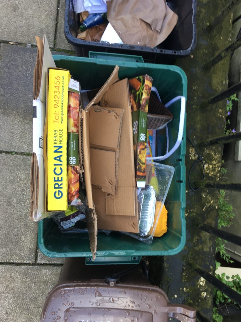
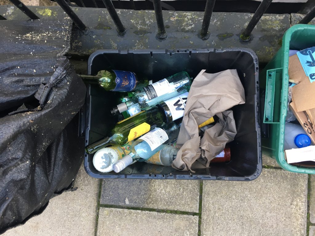
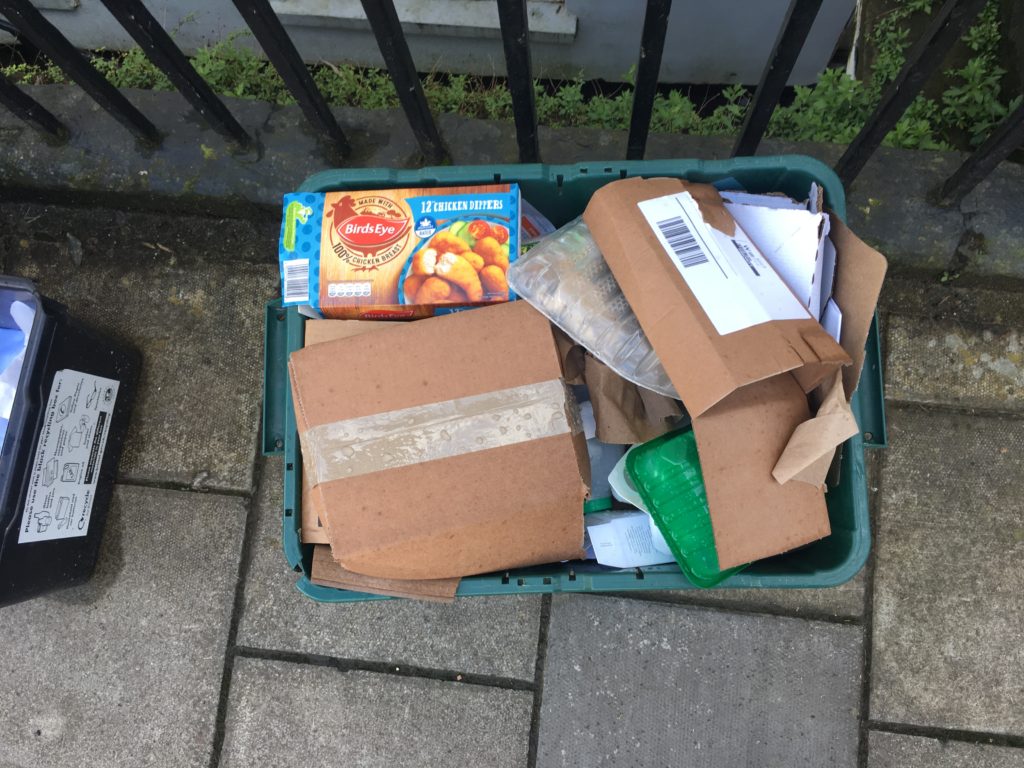
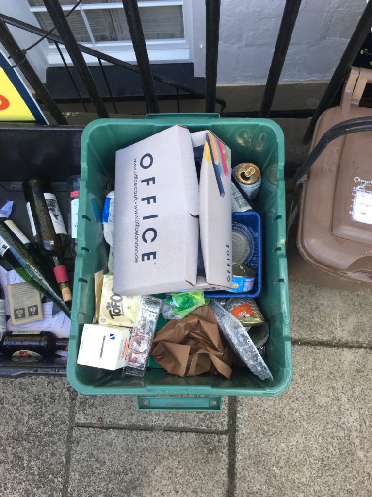
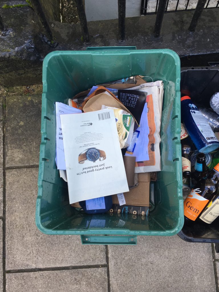
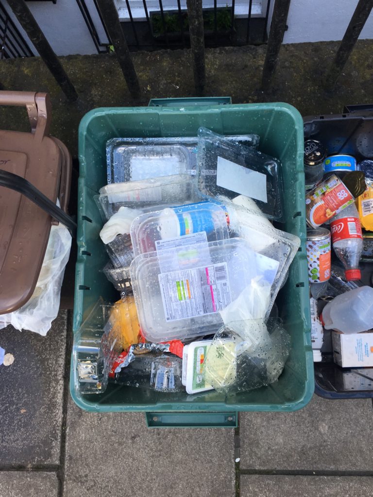
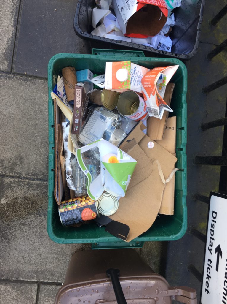
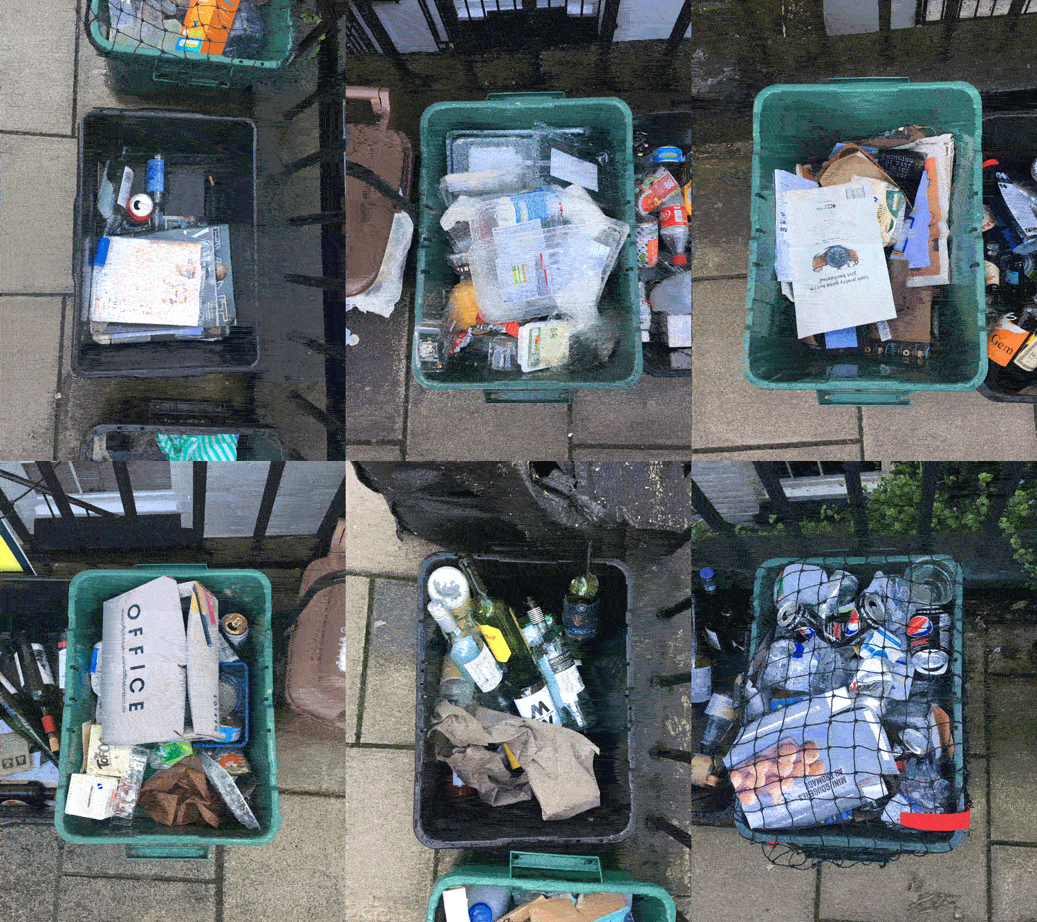
Whilst in Bristol I saw an opportunity to continue to experimentation with GIF’s, along most streets, outside each house were a collection of recycling boxes. The pavements seemed to be covered in these boxes, presumably because it was collection day however it did ruin the overall look of the area. There were a mix of green and black boxes containing various packagings to be recycled, for example Glass, plastic bottles and cardboard. I decided to take pictures of these boxes from a birds eye angle framing the rectangle shape in the centre. I was interested in the variety of thing in the bins and how they differed from house to house and how they reflected the lifestyle of the people living in each house. I cropped all these photos to the same size and orientation so that they all followed the same shape conventions. I then proceeded to bring them into photoshop and turn them into a GIF, each frame lasting 0.1 of a second. The final GIF flicks through the photos showing the variation and similarity between each recycling bin.

This image has an empty alt attribute; its file name is Gbins.gif

Artist Research – Bernd and Hilla Becher

Sources:

Photoshoot 1- Planning

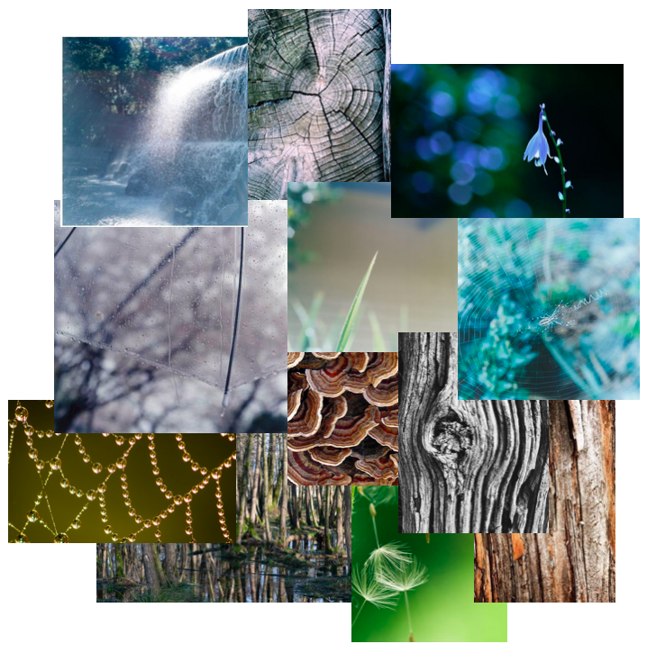
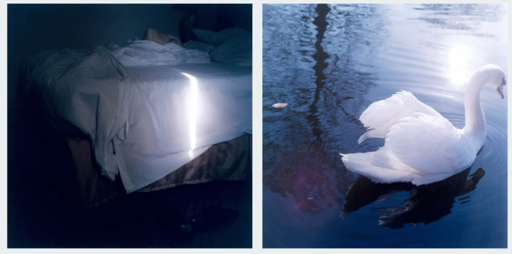
For my first photoshoot I wanted explore repetition in nature, looking at the soft shapes that plants and natural objects create and to emphasise the fragility and beauty in the shapes using light. I am taking some inspiration from the photographer Rinko Kawauchi as i like how she focuses on everyday situations and objects, emphasising their beauty, especially in nature.

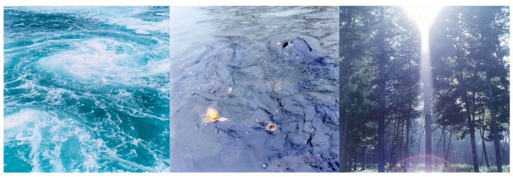
I want to go to a natural area to take photos and I think that a woods would be a good place to explore as there many different things i can take images of and would be easy to find repetition. I plan to take pictures including water i.e. the shapes of waves/ripples, reflections of trees and plants on water, things you can see through the water underneath. I also want to take photos of patterns on trees, plants and in the landscape, hopefully helping me generate more ideas for my project. The lighting in the photos i take will depend on the weather that day.

Taking inspiration from Rinko Kawauchi where she looks at the opposition of light versus shadows and life versus death, Rinko believes the fleeting nature of these dualities is what ultimately determines our fragile existence.  According to Shinto, all things on earth have a spirit, hence no subject is too small or mundane for Kawauchi’s work; she also photographs “small events glimpsed in passing, conveying a sense of the transient. 

Beauty and Nature

The beauty of nature can have a profound effect upon our senses, those gateways from the outer world to the inner, whether it results in disbelief in its very existence as Emerson notes, or feelings such as awe, wonder, or amazement.  

Emerson offers is that “the simple perception of natural forms is a delight.”  When we think of beauty in nature, we might most immediately think of things that dazzle the senses – the prominence of a mountain, the expanse of the sea, the unfolding of the life of a flower.  Often it is merely the perception of these things itself which gives us pleasure, and this emotional or affective response on our part seems to be crucial to our experience of beauty. Nature is beautiful because it is alive, moving, reproductive.  In nature we observe growth and development in living things, contrasted with the static or deteriorating state of the vast majority of that which is man-made.

(Harvard University- Beauty in Nature)

I want to try and emphasise these concepts within my photography and throughout my project. I think that this is an interesting concept and is something I have yet to explore in my other photography projects. I will also look more into ideologies of beauty and picturesque in my project. For this shoot i plan to start generic images that i can develop from in my next photoshoots. I also want to photograph relations in water as I think it’s an interesting way to look at an objects from another perspective, epically in nature.
First Photoshoot

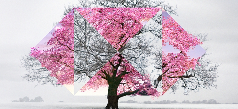
The final outcomes of this project are going to have two overlapping images of the same location, in contrasting weather to create an image which is similar but greatly different at the same.

Image result for hsbc airport adverts
This is similar to what I want the final outcomes of this project to look similar too.

For this shoot I went to four different locations around the island, for this shoot I need to take two sets of images, essential a before and after set of images. The first set of images are going to be of icon jersey landscapes on a day where the weather isn’t the nicest, so cloudy and windy. The next set of image are going to be taken during the summer time, when the weather is nicer. I will then get these two images and create images similar to the one above. Overall I think that the shoot went really well, from the shoot I got a range of different types of images, some of them the weather is very dark and cloudy whereas in others the landscape is very dramatic and almost looks like and image from the Romanticism period.

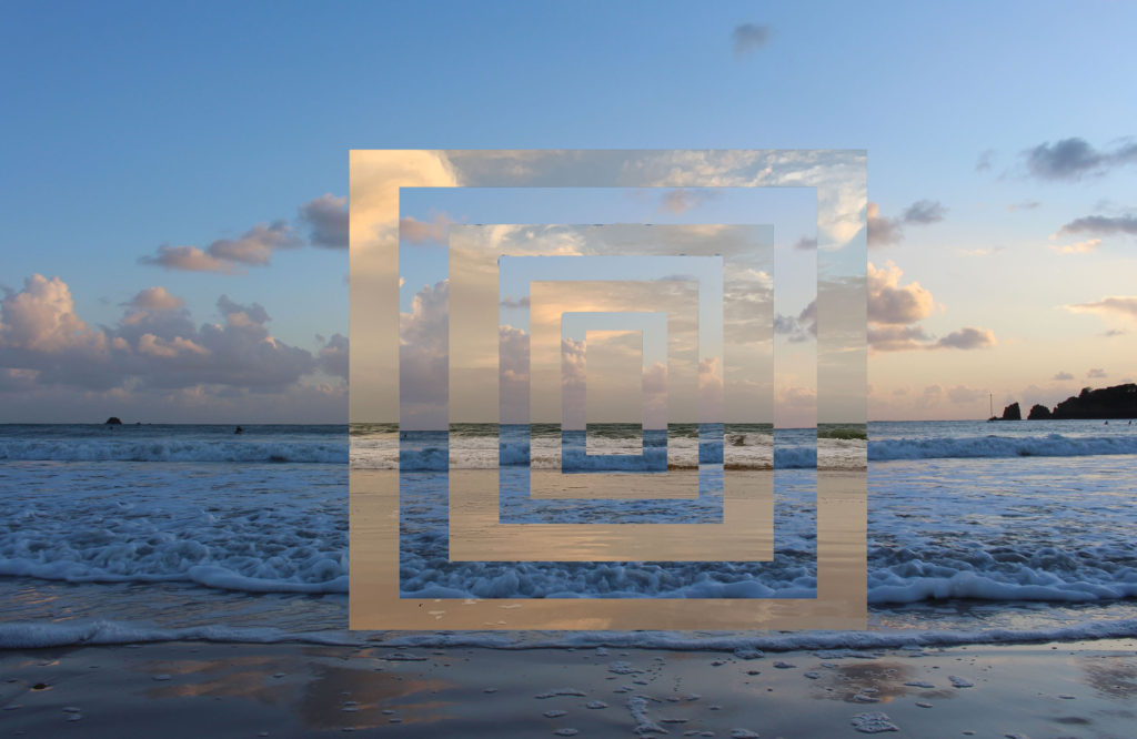
These images are only first experiments, to figure out which designs/patterns look the best, I have overlapped some of the designs with other images from the shoot to have an idea of what the final outcomes of the project are going to look like.

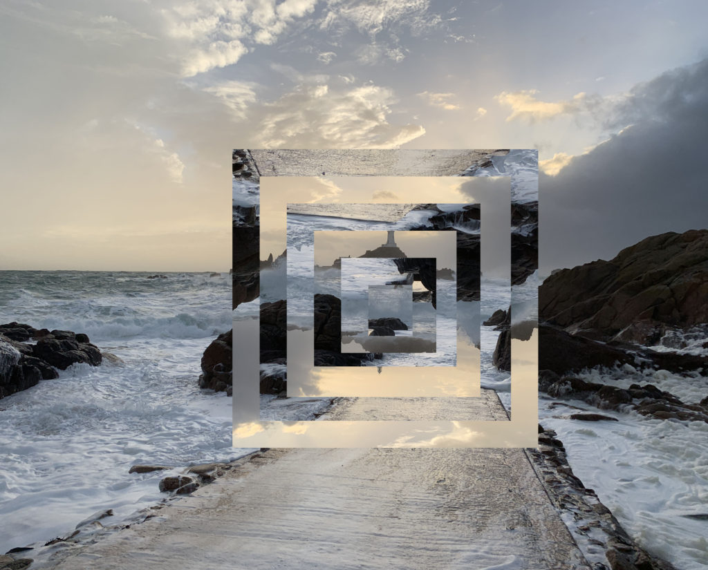
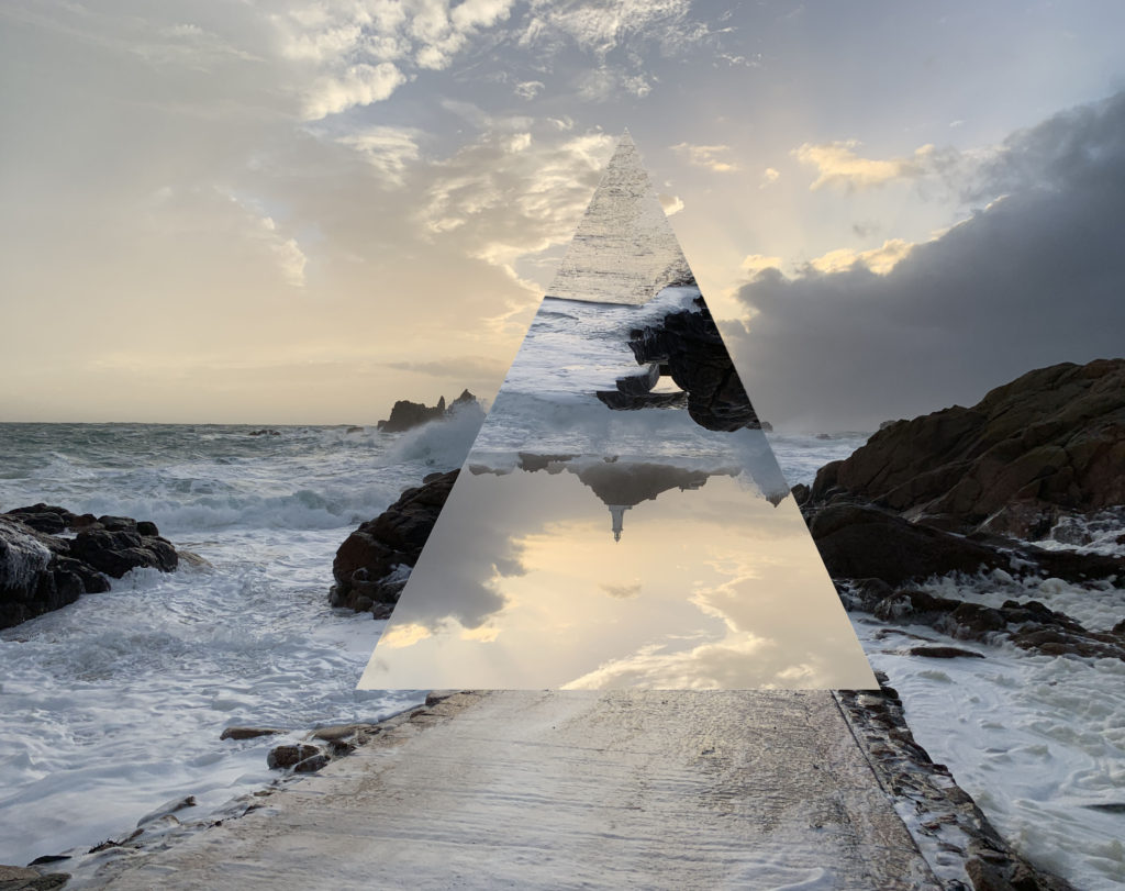
I think that this is the best image that I have produced from this experiment as I think that it is the most effective and precise technically. I think that pattern is the design that I want to carry on with throughout the project, as it looks the most effective, even if it is slightly harder to do. For this image I went down to Coriber lighthouse, this was towards the end of the shoot. I knew that I wanted to come to this location last as I knew that this was the time where the water would be at its highest and the sun would be setting so the image would have lost of different elements to it, as I think that the images that I have taken so far in this project have been very basic and and not very interesting visually so I think that this image has added another dynamic to the images.
In this image I have overlapped two different images in the attempt to recreate my own version of the HSBC advert, which can be seen above. I think that this image is good but could be improved massively. I think that I will go back to take more images, as the two images are very similar in the colour pallets so it makes the athletically less pleasing. The other issue with this images is that the waves in the images don’t line up perfectly which then throws off the whole of the image, This is a result of rushing during the editing process so I will have to take more care when editing these images.
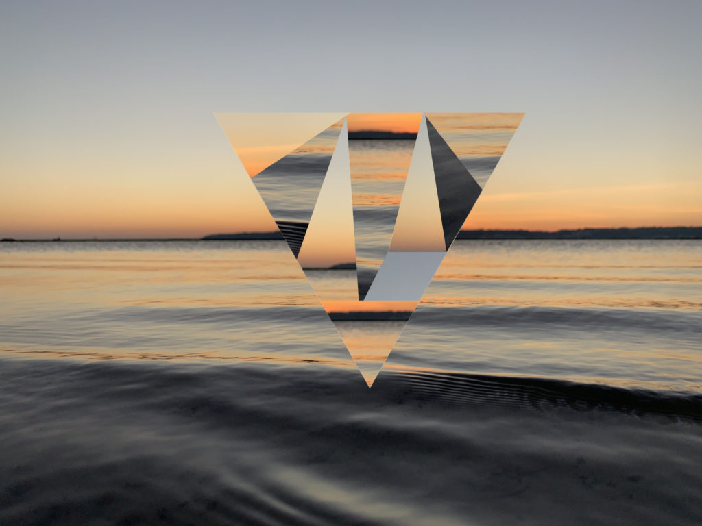
I have mixed feelings about this image I really like like pattern on this image, as it is simple but yet effective as it draws the on lookers eye to the center of the image. This design works well with this image, as the image has a center focus, and the rest of the image is very dramatic and has a lot going on. but if I used this pattern on another image I’m not sure hoe it would look as the design is very basic and plain.

A2 Photography Exam – Action Plan

My Plan for my shoots and my edits are as follows:

I am going to take 3 photoshoots so that I can use three different locations as I want to create my own landscapes by filtering 3 photos. The first location I am going to take photos at is the woods behind Longueville Manor known as Swiss Valley so I can catch twigs and branches in the top areas of my photos. The second location will be Le Mare beach so I can get a rocky area with some flat parts to provide a stable base for my edits. For the third location I want something modern to be a part of my edits so the natural things like trees look like they are growing in this place, so I will be going to Pier Road Car Park for the blocky effect I want in my edits.

For my edits I will be doing images that comprise of 3 filtered images that have been colour balanced to a reddish yellow, using shadows, midtones, and highlights, and by adjusting the opacity accordingly and increasing contrast and brightness, so that all 3 images can be seen clearly.

I will then be putting variating coloured circles over the faces that are in my photos using the app Sketchbook.

After that I will use the app XstereO Player to do my stereographs in landscapes and portraits, red and blue, and green and magenta. so I have many variations of colours and combinations.

Once I’ve done that I will start cutting my stereographed edits into tear like parts using the magic wand tool, so I can move them across to a black landscape base and create a collage like piece.

And finally after all that I will be using images from my shoots to turn into very contrast and brightness black and white images, to then overlay them on top of the cut images to add even more detail.

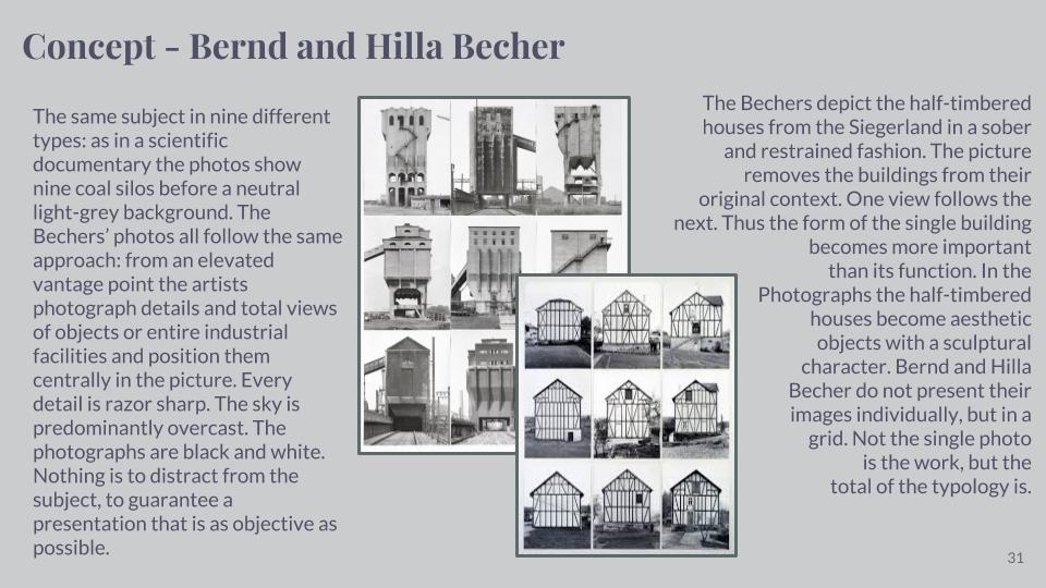
Bernd and Hilla Becher

Mood-board of typologies created by Bernd and Hilla Becher

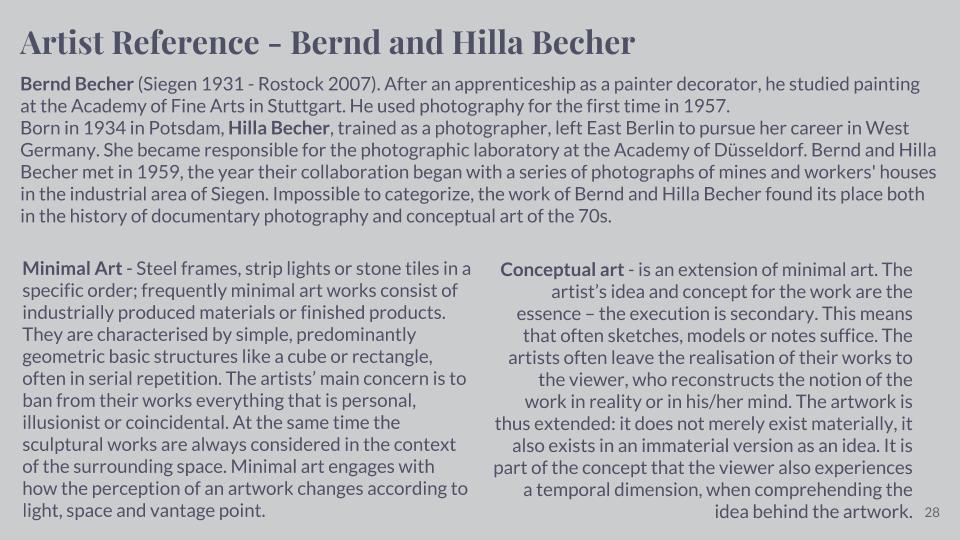
Bernd and Hilla Becher were German conceptual artists and photographers working as a collaborative duo. They are best known for their series of photographic images, (or typologies,) of industrial buildings and structures, often organised in grids. They influenced many documentary photographers and artists.

Bernd Becher was born in Siegen. He studied painting in Germany from 1953-1956, then typography (the art and technique of arranging type to make written language legible, readable, and appealing when displayed) from 1959-1961. Hilla Becher was born in Potsdam. After Hilla’s time studying photography at the Kunstakademie Düsseldorf from 1958-1961, she had completed an apprenticeship as a photographer in her place of birth. They both began working as freelance photographers (self-employed) for the Troost Advertising Agency in Düsseldorf, concentrating on product photography (advertising or commercial photography). The couple married in 1961. Bernd and Hilla Becher first collaborated on photographing and documenting the disappearing German industrial architecture in 1959. The Ruhr Valley, (where Becher’s family had worked in the steel and mining industries,) was their main focus. They were fascinated by the similar shapes in which the buildings were designed. After capturing thousands of pictures of individual structures, they noticed that the various large buildings, (of cooling towers, gas tanks and coal bunkers, for instance,) shared many distinctive formal qualities. In addition to this, they were intrigued by the fact that so many of these industrial buildings seemed to have been built with a great deal of attention towards its design. Together, the Bechers went out with a large 8 x 10-inch view camera and photographed these buildings from a straightforward “objective” point of view. They only did their shoots on overcast days, (to avoid shadows,) and early in the morning during spring and autumn. Objects included barns, water towers, coal tipples, cooling towers, grain elevators, coal bunkers, coke ovens, oil refineries, blast furnaces, gas tanks, storage silos, and warehouses.

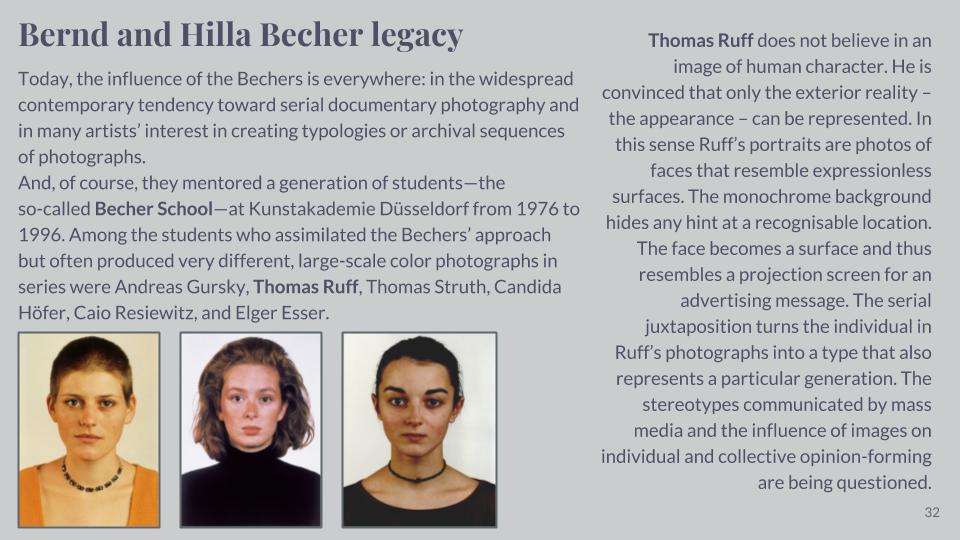
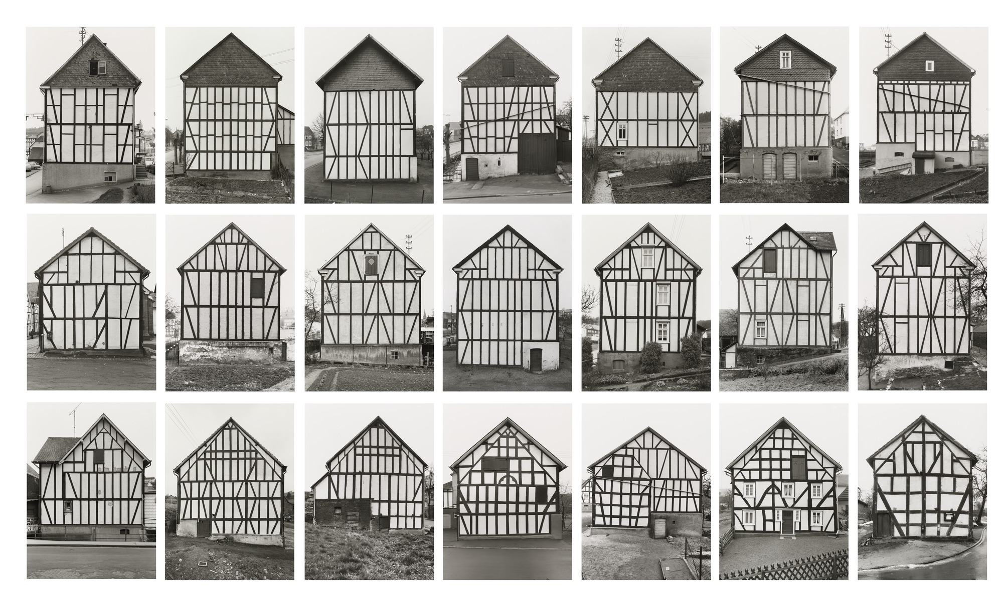
Bernd Becher, Hilla Becher Framework Houses 1959-73

This typology created by the Becher’s shows their objectives of conceptual art. They wanted to create a series of images where every object showed similar characteristics. These images were taken in Germany, as their images were based around the German industrial architectures. Each image is similar to the other, because of the repeated lines of wood that are used as part of each houses construction. This repetition effect is something that intrigues me towards these series of images. I like how each house has a triangular rooftop – the houses are a classic shape and although they seem like original shaped houses, they all have their own speciality that differentiates them from each other. For example, on the bottom row, second image from the right, this house appears to have 5 rectangular windows with a variance in how the panels for the window are displayed. The white panels all determine how many small squares there are inside of the window – some windows have 6 small squares, some only have 2 squares and 2 long rectangles. This same house has 1 door that has 2 slight windows either side of the door. This house is very different to the houses around it on the grid format, that the Becher’s used to create their typology. However, they all have similar shapes and objects that create the houses.

Postcards Photo-shoot

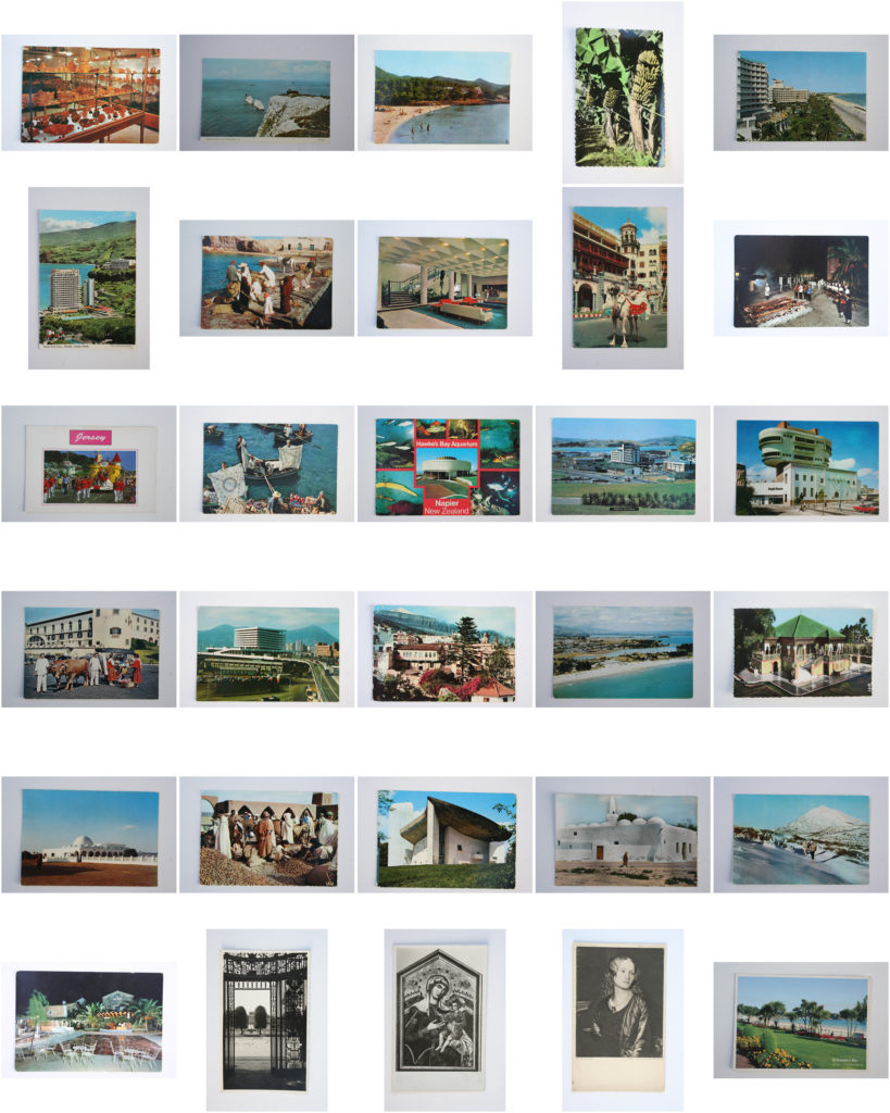
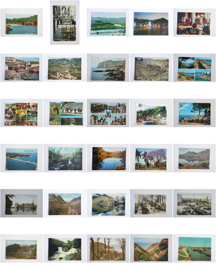
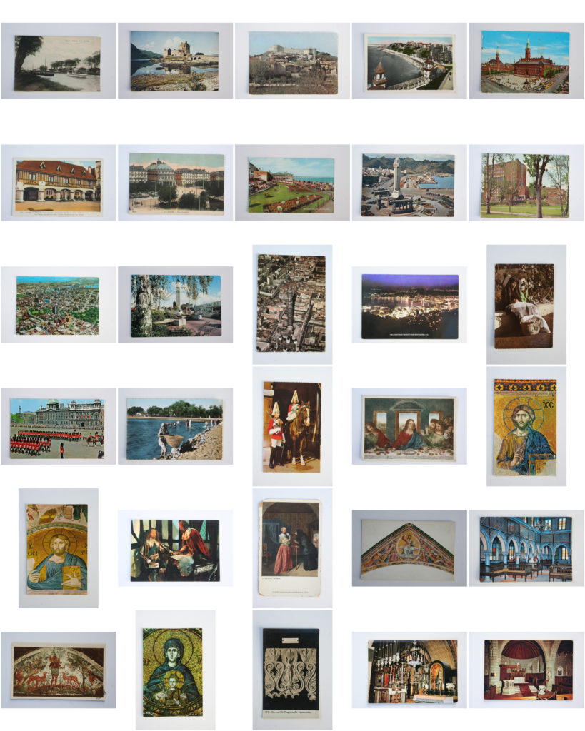
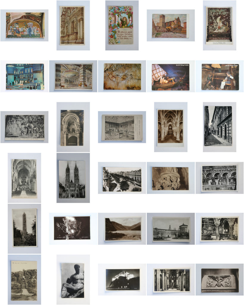
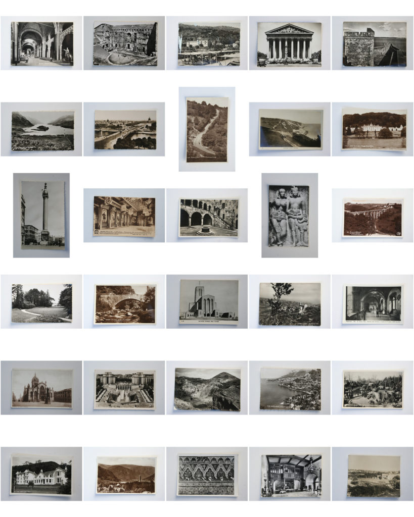
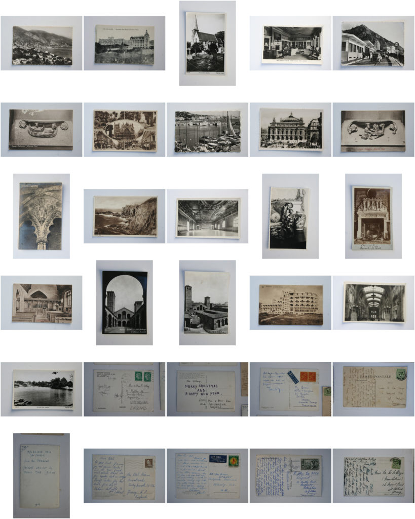
Here is my photo-shoot in which I planned to record the 171 postcards which I bought with the intention of using in this project (Plan on previous post) I believe that this shoot was successful as I closely followed my photo-shoot plan and was lucky enough to have a good source of natural sunlight on the day which I did the shoot. These postcards show the connections between Jersey as the rest of the world which I intend to explore with this project and therefore I thought they were very appropriate to use in photo montages and collages. The dated aesthetic running through the majority of these postcards is firstly something which I believe successfully shows the history of development due to modern systems around the world. And secondly I believe these visual qualities will make for an unusual and interesting outcome.

Specification

How, Who, When, Where and Why? 

To start my project I intend to explore ideas of sublime and beauty within nature, focusing on emphasising light and fragility within the natural world. I want to be able to express an emotion through my photos, whether that be using shapes, shadows, reflections and light.

The photographer Rinko Kawauchi is an artists who interested me, inspired by Japanese art and her ethnic religion, looking at portraying nature in a feminine light. This is where I will explore ideologies like beauty and the sublime and styles of Japanese art, as well as form and shape related to femininity. When I do a shoot in this concept I will emphasise the light, similar to Kawauchi.
I also want to explore uses of colour and texture and the opposing shapes and forms that are associated with the ideas of masculinity and femininity. For example to explore stereotypical views on masculinity i could photograph geometric bold structures in the urban environment, I could juxtapose these images to natural ones to represent stereotyped femininity. I will focus on soft shapes in comparison to angular ones and create a contrast between the two, perhaps looking for similar shapes within the images to connect them.
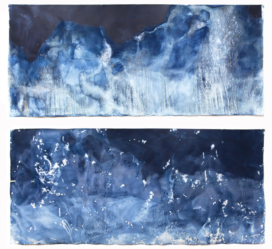
I am also inspired by the artist Meghann Riepenhoff who produces seascape without a camera looking at the tidal patterns made by ocean waves creating more abstract images. She describes her photos as a 'series of camera-less cyanotype'. I am interested in exploring her work and interpreting it as for my political landscape project I explored ideas of light sensitive paper and cynotypes and tried to recreate them. Exploring that in this project will follow on from my previous work and gives me a better understanding.
The work of Meghann Riepenhoff also links to the work of Susan Derges which is another photographer I will take inspiration from in my project. She also specialises in cameraless photographic processes, most often working with natural landscapes. Exploring the movement of water and the texture it creates is an concept i want to explore in my project.To interpret their work I will try to create cynotypes myself. I want to do this as I think it creates an interesting aspect to my project where they are photos that aren't taken by a camera, creating an effect that wouldn't be produced with a digital images.

Example Meghann Riepenhoff Work:
Example of Susan Derges:
As I continue through my project I will develop it further by evaluating what I have done successfully and work from that. I will start by exploring shapes and forms within nature that soft and rounded linking the ideas of beauty from a feminine point of view in my first shoot.  I then plan to explore the movement of water/ocean in my second shoot and will continue by researching cyantypes by Susan Derges and  Meghann Riepenhoff to do an interpretation in my third shoot. I then want to focus on abstract shapes looking at light and shadows within a landscape in my forth shoot. I am particularly interested in exploring nature and beauty as I consider it something that influences me as an individual.  

FINE ART INVESTIGATION

Variations in the time of day, season or weather can instantly transform a familiar landscape, whether urban or rural. One heavy rain or low cloud formation reflecting the evening sun’s rays can make us aware of places we normally take for granted. Many artists have documented the same views again and again to demonstrate the beauty of such ephemeral events. Monet’s Haystacks and his studies of Rouen Cathedral demonstrate these effects with sensitivity and keen observation. Other artists inspired by these dramatic shifts are Camille Pissarro, Joan Eardley, John Virtue, David Tress and David Prentice.

David Prentice:

David Tress:

David Tress (born 11 April 1955) is a British artist noted particularly for his deeply personal interpretations of landscapes in and around his home in Pembrokeshire, southwest Wales. He combines the techniques of collage and impasto with conventional painting and drawing to produce results that have been categorized as a form of abstract expressionism. Deciding that he had reached the limit of what he could achieve with realism alone, he instead developed an aggressively expressionist style that involves physically scraping or cutting the painted surface and then repairing it, building up layer upon layer as if to mimic the seasonal sequence of decay and regrowth. Tress makes sketches in the field but the final paintings are done in his studio, relying as much on memory and emotional response to the subject as on the original drawing. Although much of his work borders on the abstract, some, particularly his graphite drawings, is intensely realistic, taking on an almost photographic quality when viewed from a distance. As well as Wales, his subjects include landscapes in Scotland, the Lake District, Ireland and southern France, along with cityscapes of London.

Joan Eardley:

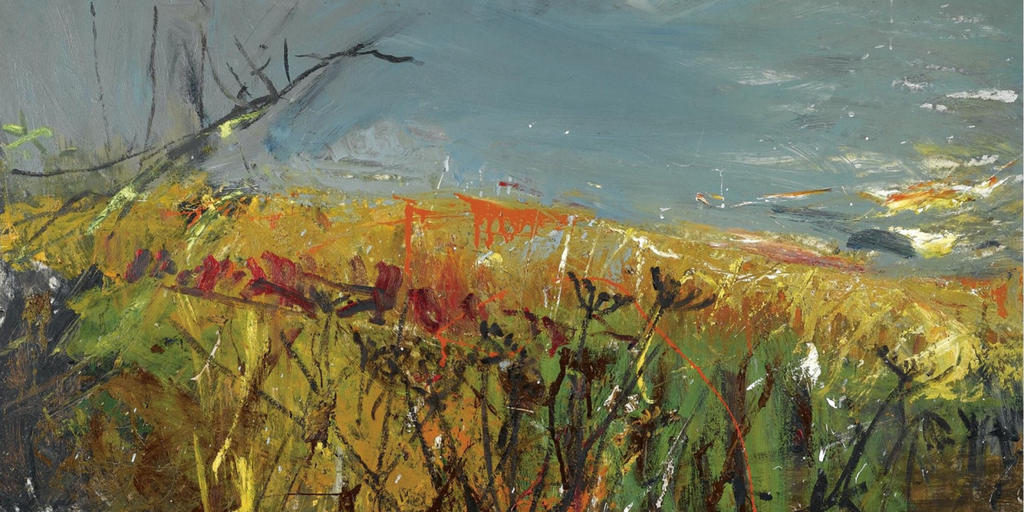
Joan Kathleen Harding Eardley (18 May 1921 – 16 August 1963) was a British artist noted for her landscapes of the fishing village of Catterline and surroundings on the North-East coast of Scotland. Her artistic career had three distinct phases. The first was from 1940 when she enrolled at the Glasgow School of Art through to 1949 when she had a successful exhibition of paintings created while travelling in Italy. From 1950 to 1957, Eardley’s work focused on the city of Glasgow and in particular the slum area of Townhead. In the late 1950s, while still living in Glasgow, she spent much time in Catterline before moving there permanently in 1961. During the last years of her life, seascapes and landscapes painted in and around Catterline dominated her output.[

Brainstorming ideas:

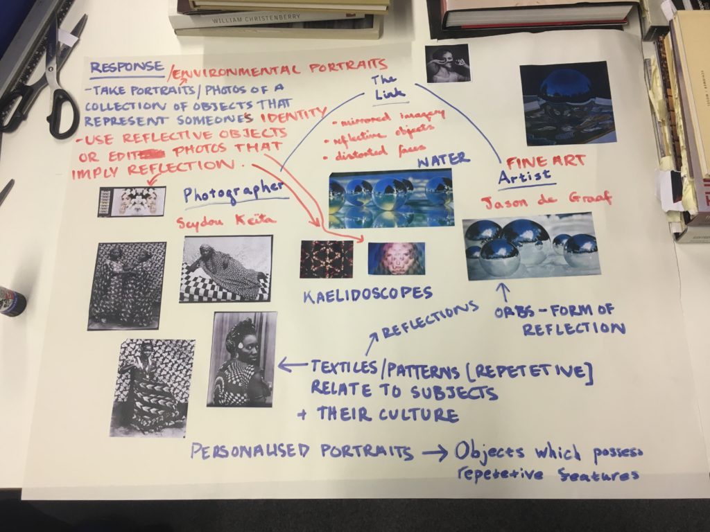
I have created a brainstorm linking the fine artist Jason de Graaf with Seydou Keita, based around portraiture and mirrored imagery. However, after brainstorming the links and ideas between the two, I have decided to go down the route of landscapes rather than portraiture for my project.