Artist Research: August Sander

August Sander, born 17 November 1876 – 20 April 1964, was a German portrait and documentary photographer. Sander’s first book Face of our time was published in 1929. Sander has been described as “the most important German portrait photographer of the early twentieth century.”

Image result for august sander typology

Sander was born in Herdorf, the son of a carpenter working in the mining industry. While working at a local mine, Sander first learned about photography by assisting a photographer who was working for a mining company. With financial support from his uncle, he bought photographic equipment and set up his own darkroom.

He spent his military service (1897–99) as a photographer’s assistant and the next years wandering across Germany. In 1901, he started working for a photo studio in Linz, Austria, eventually becoming a partner (1902), and then its sole proprietor (1904). He left Linz at the end of 1909 and set up a new studio in Cologne.

In 1911, Sander began with the first series of portraits for his work People of the 20th Century.

His work includes landscape, nature, architecture, and street photography, but he is best known for his portraits, as exemplified by his series People of the 20th Century. In this series, he aims to show a cross-section of society during the Wiemar Republic. The series is divided into seven sections: The Farmer, The Skilled Tradesman, Woman, Classes and Professions, The Artists, The City, and The Last People (homeless persons, veterans, etc.). By 1945, Sander’s archive included over 40,000 images.

Image Analysis

I haven chosen this photograph of Sanders to analyse because this photograph is a similar style to the type I want to photograph in my third photoshoot, a model in a open natural landscape. I like this photograph because the backdrop of the fields creates an interesting effect in the way that the fields create a very nateral backdrop, its very simple and allows as much attention on its self as the model, creating a perfect balance. The model is an interesting factor in the photograph, oppose to being stood still, lifeless, he is stood in an intriguing pose, creating a more engaging photograph. The texture of the mud creates a noticeable contrast within its self and the model and fields, dividing the photograph into sections, allowing there to be more to look at within the photograph. In conclusion this photograph is simple but engaging and similar to what I hope to photograph myself for my project.

4 SHOOT PLAN

Shoot 1: Trees

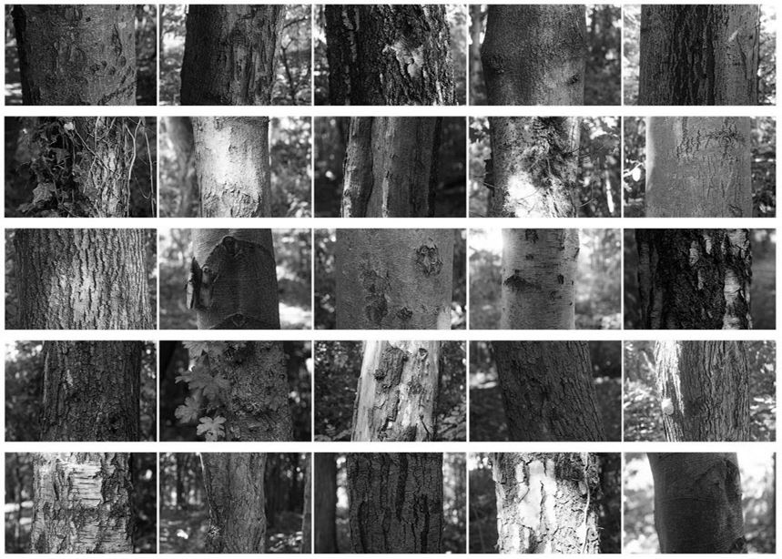
My first Variation and Similarity photo-shoot will be based around the typology of trees. I will experiment with presenting my images in a grid format in the style of Bernd and Hilla Becher. As I am looking at the variations and similarities within the landscapes around me, and zooming in close on the environment, trees are a good subject as they show diversity within their origin, patterns of bark, size, form etc.

Shoot 2: Flowers / Leaves

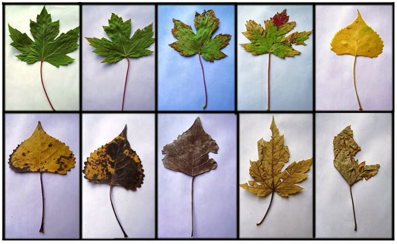
My second shoot will aim to capture the variety of leaves and flowers within nature’s woodland and coastline. This shoot will focus on the variation aspect of my project and highlight the range of natural objects and the sublime beauty they hold. I will photograph the vibrant, summer leaves and flowers and the contrasting duller autumnal leaves to highlight the different products of seasons.

Shoot 3: Clouds

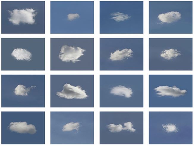
Clouds are an interesting topic of the natural world as they show such diversity depending on the given weather. I will hope to capture images of the sky during storm, rainy weather and juxtapose these photographs with ones taken at calmer, serene times.

Shoot 4: Water

For my 4th shoot, I will look at water; the forms, patterns and colours. I will edit a number of my photographs in the style of Hiroshi Sugimoto in black and white, exploring a deeper conceptual meaning behind water and the spiritual notions behind his work. Places I will visit will include St Ouen’s bay and Plemont.

GIF

The graphics interchange format (GIF) is a bitmap image forma that was developed by a team at the online services provider CompuServe led by an American computer scientist Steve Wilhite on June 15 1987. It has since come to widespread usage on the World Wide Web due to its wide support and potability. Giffs are  less suitable for reproducing color photographs and other images with color gradients, but it is well-suited for simpler images such as graphics or logos with solid areas of color.

Typologies

What are typologies?

Typology is the study of types, and a photographic typology in a set of images or related forms, shot in a consistent, repetitive way.

Bernd and Hilla Becher

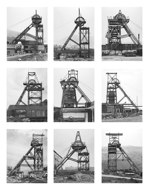
The couple where conceptual artists and photographer who worked together. They were best known for their extensive series of photographic images, or typologies, of industrial buildings and structures, often organised in grids.

Each series of images are capturing typologies, types of things. Each image is taken from the same perspective, angle and distance from the subject, this is an essential reason for why the series’ are so effective. All the images in each series have something in common which links them together, for example the images below the darkest part of the image is always in the middle of the building.

Image result for typologies

John Baldessari

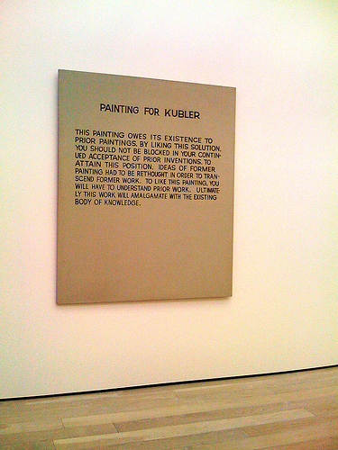
John Baldessari (born June 17, 1931) is an American conceptual artist living and working in Santa Monica and Venice. Baldessari was initially a painter with his early major works being canvas paintings that were empty but for painted statements coming from contemporary art theory. Baldessari’s work ‘Painting for Kubler’ presented the viewer with theoretical intructions on how to view it as well as the importance of the context within his previous works. referenced art historian George Kubler’s book ‘The Shape of Time: Remarks on the History of Things’.

In 1970 Baldessari and some friends burnt all of his paintings created over 13 years to create a new piece, titled ‘The Cremation Project’ and baked the ashes from the paintings into cookies then placed them into an urn leading to an art installation consisting of a bronze commemorative plaque with the destroyed paintings’ birth and death dates, as well as a recipe for making the cookies. Through this project Baldessari drew a connection between atistic practice and the human life cycle.

Baldessari began to experiment with bringing texts and photo into his canvases and then later began to work in printmaking, film, video, sculpture and photography in the 1970’s. His work shows the narrative potential of images and often incorporates language within his art. His art has been featured in more than 200 solo exhibitions in the US and Europe and has influenced artists such as Cindy Sherman.

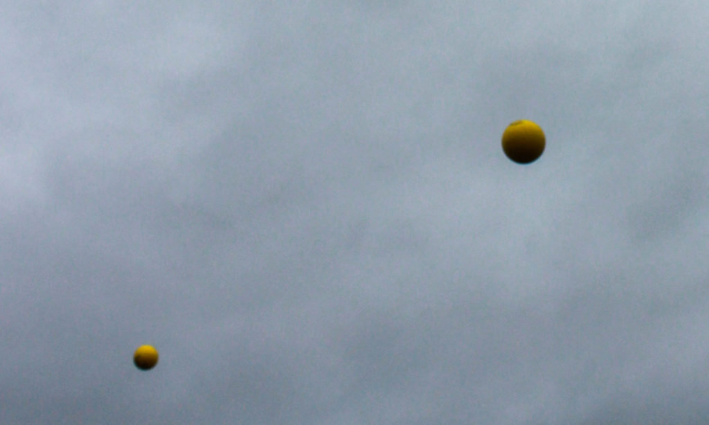
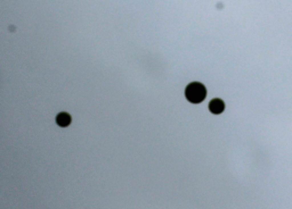
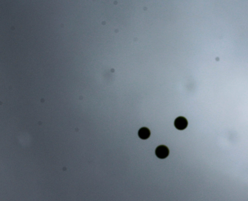
Many of Baldessari’s works are sequences showing attempts to accomplish an arbitrary goal – an example of this is Throwing Three Balls in the Air to Get a Straight Line (1973) in which Baldessari attempts to do exactly as the title describes and then photographed the results. This project is an early-example of post-conceptual art. Another example of Baldessari’s work that links to post-conceptual art is when he used circular adhesive dots to cover up the faces of subjects which led to him being known as ‘the guy who puts dots over peoples faces’ – the inspiration for this work came from the brightly coloured price-stickers seen on sale items. As part of an experiment coming under the title ‘Play’ I responded to Baldessari’s post-conceptual work; this experiment drew inspiration from both ‘Throwing Three Balls in the Air to Get a Straight Line’ and his work with brightly coloured dots as I attempted to capture three balls in a straight line as Baldessari did. I used the idea of throwing balls in the air to bring in inspiration from Baldessari’s work with brightly coloured dots by throwing a bright yellow dodgeball into the air to contrast with the dark grey sky in the background – this created the same effect as Baldessari’s work by creating an abstract composition that has high contrast between colours and backgrounds.

“Cutting Ribbon, Man In Wheelchair, Paintings (Version

On his work with placing colourful retail stickers over photographs, Baldessari says “I just got so tired of looking at these faces… If you can’t see their face, you’re going to look at how they’re dressed, maybe their stance, their surroundings” which supports the view that Baldessari’s motivations behind this work was to force the viewer to view the photograph or subject in an unconventional way, a feature often attributed with post-conceptualism. When asked why Baldessari only leaves the mundane parts of the photograph, as the face is the most interesting part, Baldessari responds “I think you really sort of dig beneath the surface and you can see what that photograph is really about, what’s going on”

Post conceptualism is an art theory that builds upon the legacy of conceptual art in contemporary art, where the concepts involved take a bit more priority over the traditional concern for aesthetics. The term first came into art through the influence of Baldessari in the 1970’s through his work Throwing Three Balls in the Air to Get a Straight Line. The movement focused on the idea behind the art and questioned the traditional role of the object.

WILLIAM YE STUDIO SHOOT 2

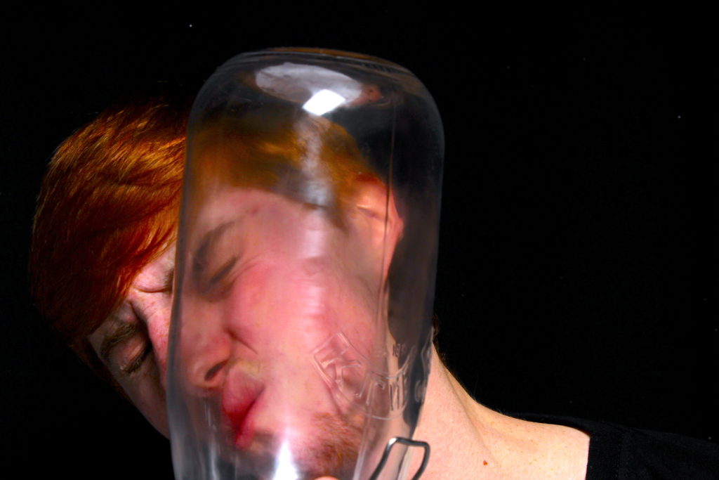
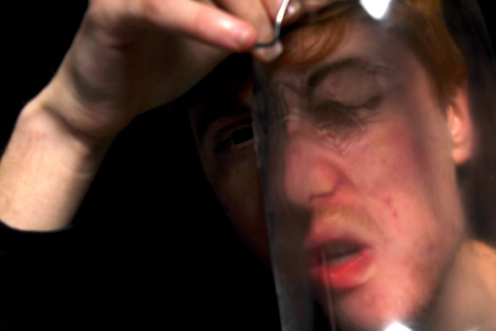
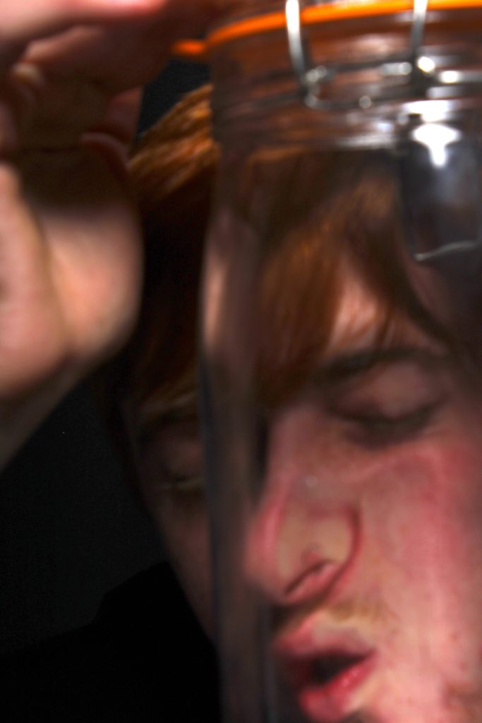
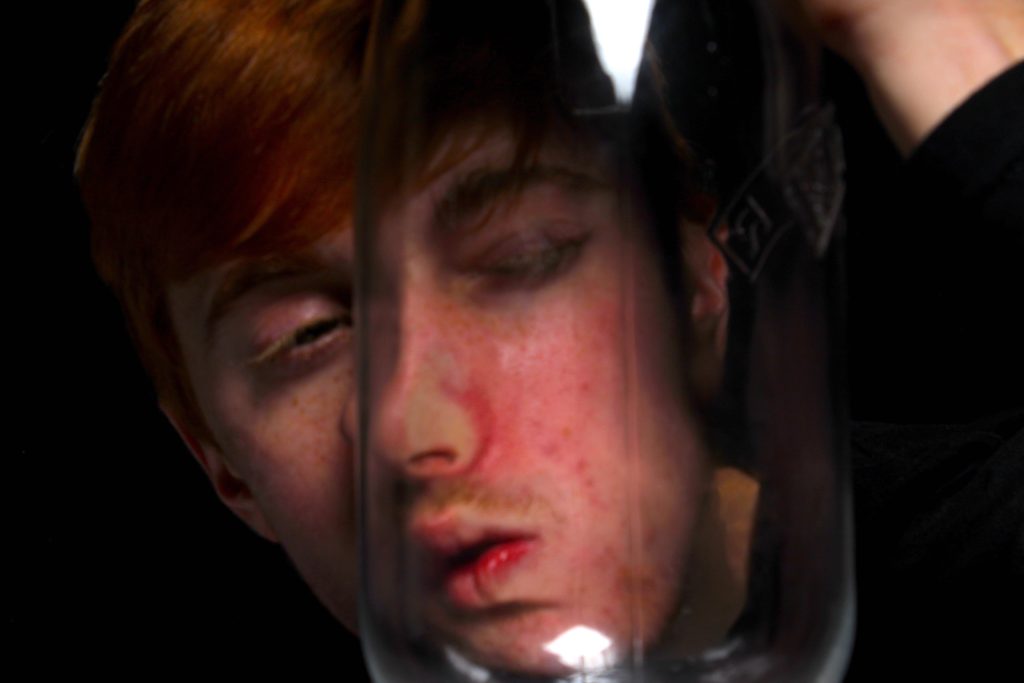
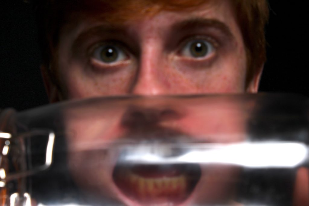
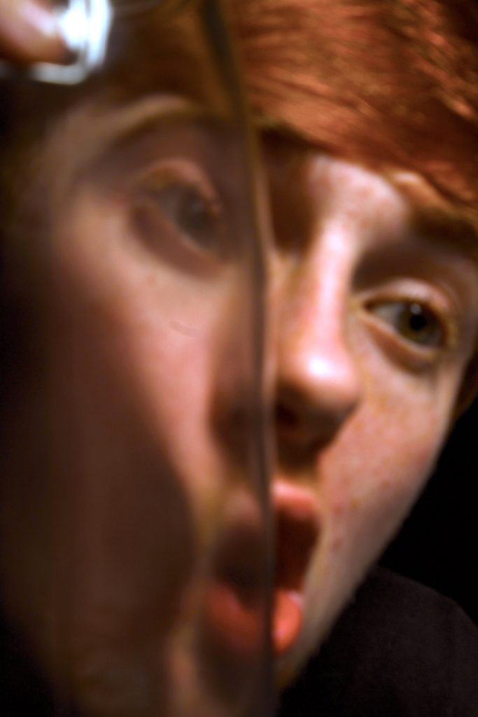
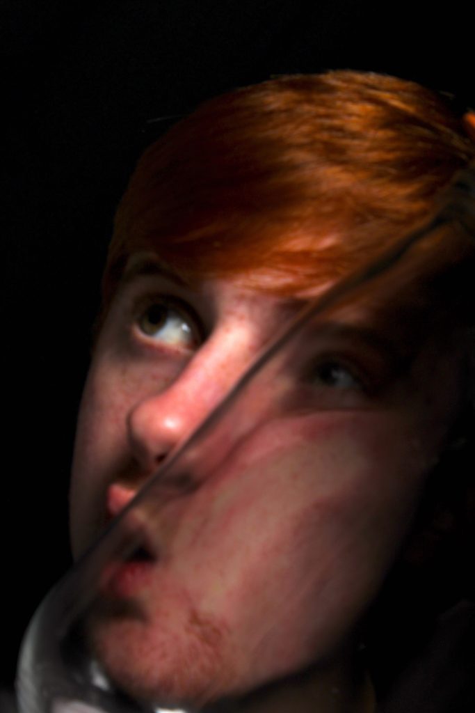
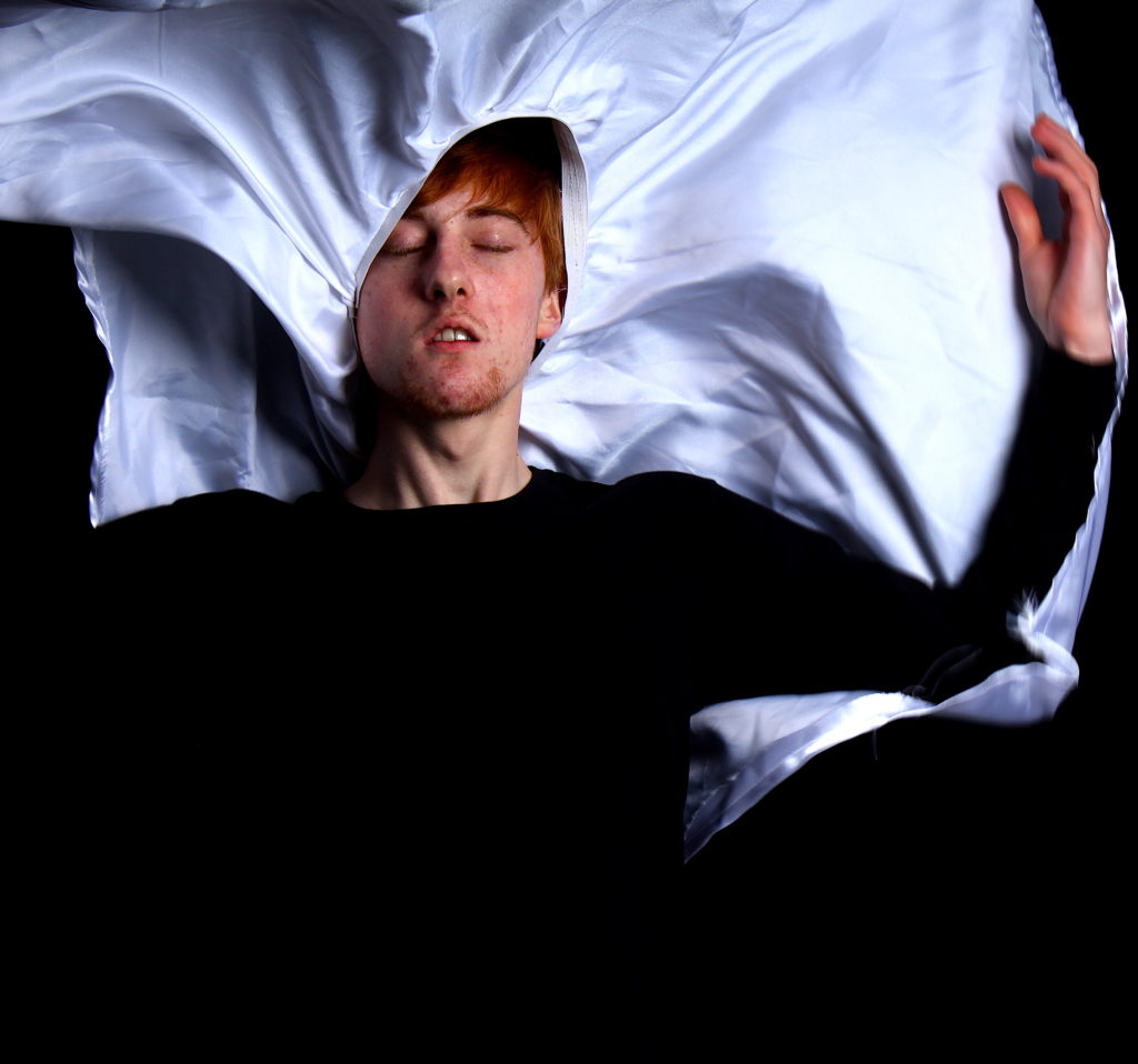
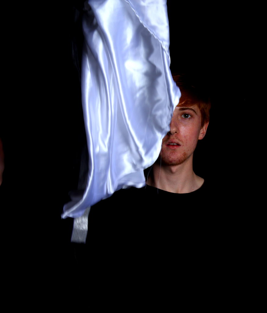
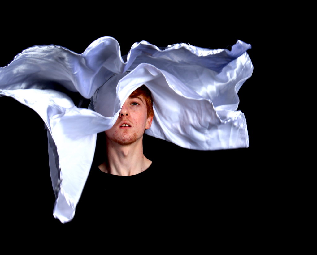
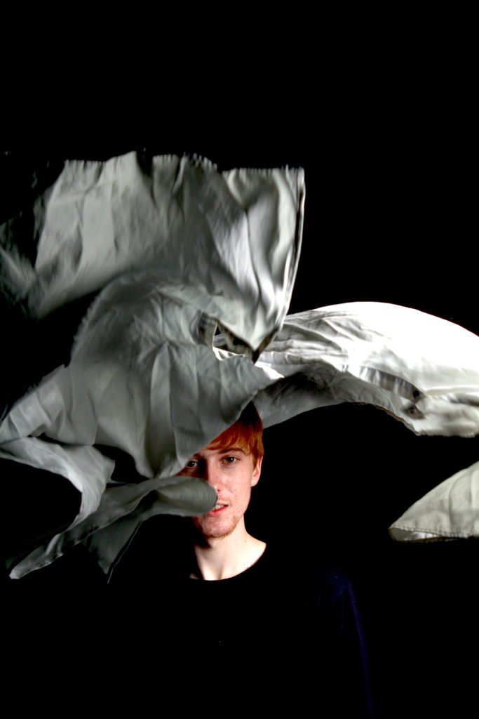
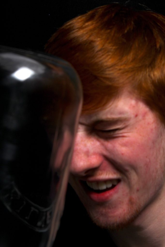
INSPIRATION: My inspiration for this shoot was both the combination of William ye, which is evident, And how he uses a large jar and conceptually takes images of people through it in order to extend and manipulate their faces and make a more abstract representation of people and their emotional wellbeing. However, my other inspiration is a much more abstract and once again fine art related artist, who presses faces up against jars, and then paints and manipulates the images themselves in order to create a much more worked into and unique colour and composition.

WHERE NEXT: As this artist, clearly works and edit more into their work, I believe next I should experiment with developing these images further, and possibly even doing so with the intent of creating a small representation and grid of the images similar to above. Due to these shoots being a-lot more dark and brutal to my current theme exploring the essence of beauty, I belive I should connect this shoot with the media and the relation of emotional well being linking to chaos in the news. And how we should ignore this to see the beauty within the world.

Modernism Vs Post-Modernism

POST-MODERNISM AND MODERNISM

Postmodernism was a reaction against modernism. Modernism was generally based on idealism and a utopian vision of human life and society and a belief in progress. It assumed that certain ultimate universal principles or truths such as those formulated by religion or science could be used to understand or explain reality. Modernist artists experimented with form, technique and processes rather than focusing on subjects, believing they could find a way of purely reflecting the modern world. It is generally very simple and non decorative. Modern art rejected tradition so it looked very different to anything anyone had seen before.

Image result for modernism art

While modernism was based on idealism and reason, postmodernism was born of scepticism and a suspicion of reason. It challenged the notion that there are universal certainties or truths. Postmodern art drew on philosophy of the mid to late twentieth century, and advocated that individual experience and interpretation of our experience was more concrete than abstract principles. While the modernists championed clarity and simplicity; postmodernism embraced complex and often contradictory layers of meaning. Cultural identity was a big part of postmodernism, with people realizing that modernism was dominated by straight white men. Within post modern art, it is popular to include quotes or words on their art since it fits with the idea of questioning things. There are no rules about what postmodern art is but there tends to be a lot of contrasting and questioning. The works of post modernism are often abstract and somewhat strange. There is an objective to display that everyone has different reality and there is such thing as human nature instead of nurture.

Image result for postmodern art

The modernist approach links to my previous studies of Sugimoto and Monet’s Hay Stacks that focus on mainly the depiction of light and how it shapes the environment. Rather than focusing on subjects these artists use lighting and textures as a way of reflecting the modern world.

Modern Art

Time Period – From 1450 – 1960

Gender Spread – Most of the artists in the modern times were male

Mindset – Go with the ideas in every way

Influence – Political and society pressure

Postmodern Art

Time Period – From 1960 to present

Gender Spread – Mixture of both

Mindset – Question the changes and movinf towards new ones quickly

Influence – Free of any pressures

In the Modern work, whatever the meaning was given by the writer was considered to be the only meaning but in postmodern times, people tend to make their own mind and deduce the idea according to their will. In modern era people tended to enjoy the modernism but in the postmodern era, people are questioning the changes and moving towards new ones quickly. Arts in the modern times was influenced by political and society pressure while the postmodern art is free from all those factors.

William Ye Studio Shoot

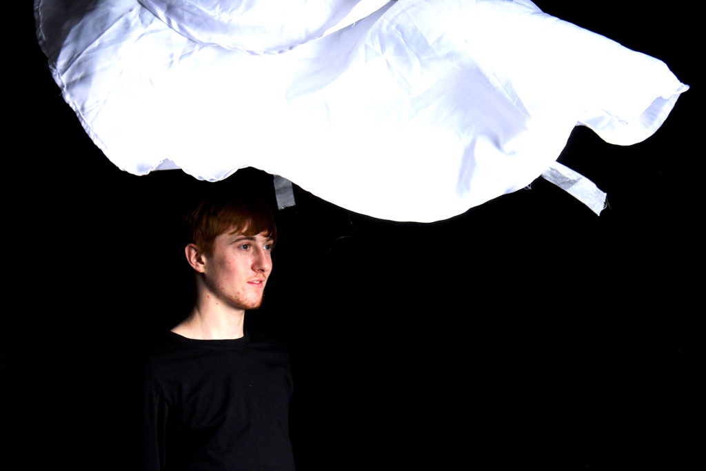
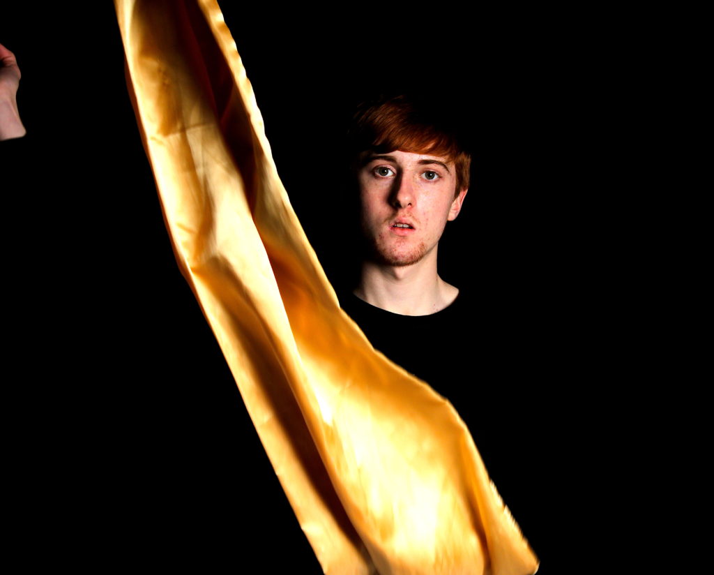
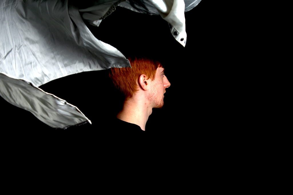
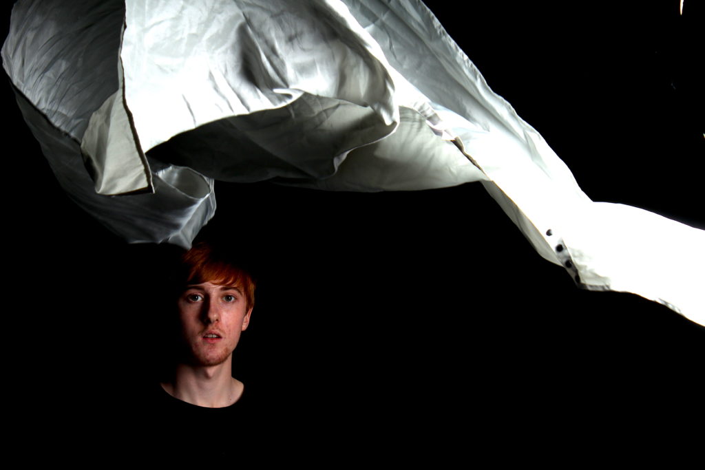
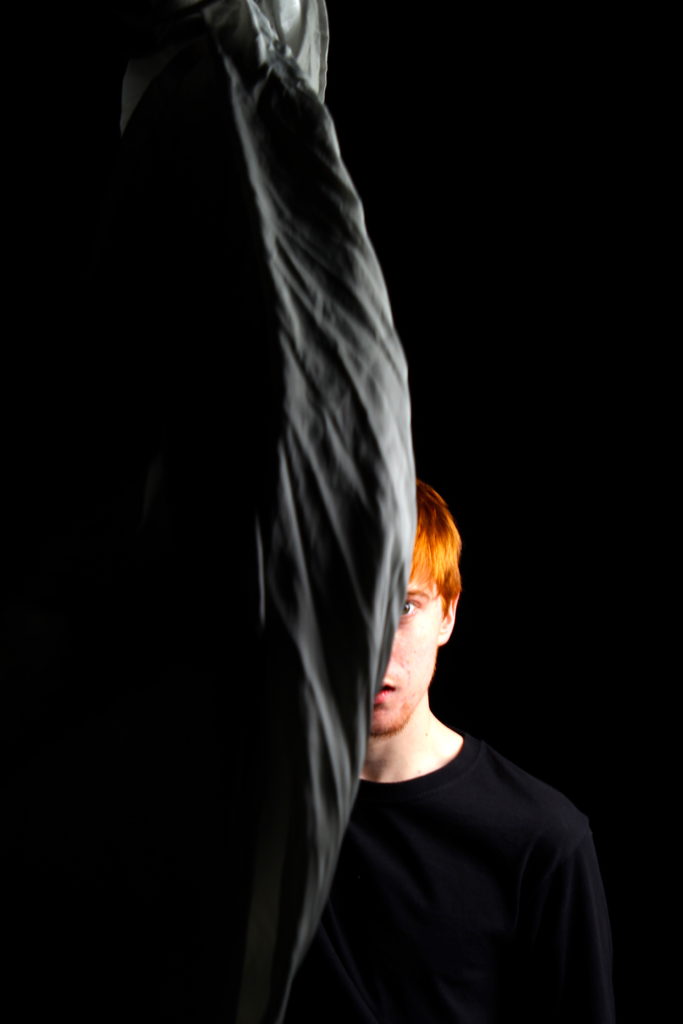
EVALUATION: For this shoot I wanted to re create Williams Ye’s moulding of structure from a fluid object in order to connote themes of fine art. I wanted to use a variation of different colour, in order to create and highlight different tones on the central character himself. When setting up for the shoot I knew how pivotal it was for success that my lighting was able to capture the colour of the fabric without brightening the black background. Not only does this shoot represent a more fine art freedom sense of beauty, but I belive this shoot does too fit with my new themes of self love beauty with the everyday and a certain haiku of femininity and masculinity seen within this performance. There is an artistry of abstraction throughout this shoot. I think-it is fascinating even though how planed this shoot and how it was taken in the studio, there was still a sheer unpredictability to the formation of where the boy would be standing or how the sheet itself would fall. I choose a very quick shutter speed in order to access the clarity of the images that I wanted. My favourite image from this shoot is certainly the use of the gold being thrown and wrapped around the boy. Not only does it shoe a conceptual infraction of our own being and personality being executed as a piece of fine art, but it too is an exploration of identity and the unpredictability of life. The bright gold creates a bright contrast the the dark tonal black background, and the direct eye contact Is too fascinating. From this shoot I will now experiment with one other ye shoot, in which he uses a jar, to conceptualise the behaviours and feeling of someone and what they feel to be trapped inside. As this shoot was planned nearer the beginning of my project their are more links with fine art and the influence from the media, however it will definitely still help achieve the further experimentation to my final narrative project.
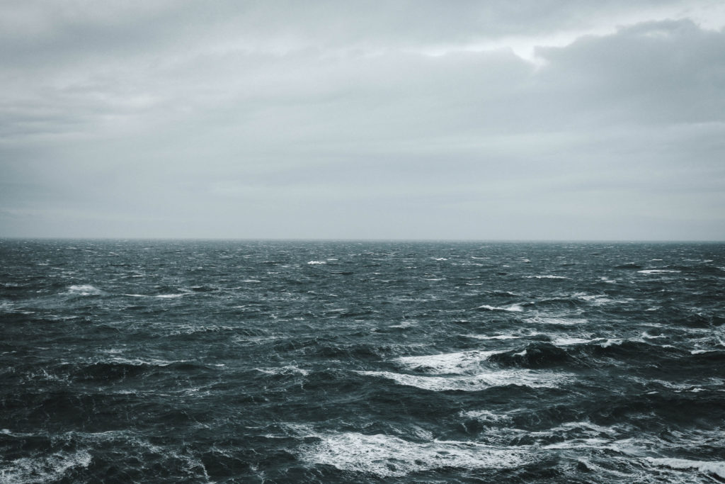
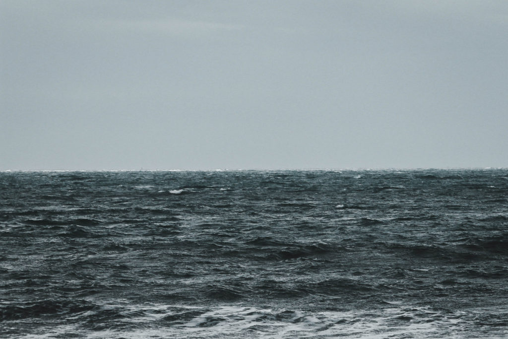
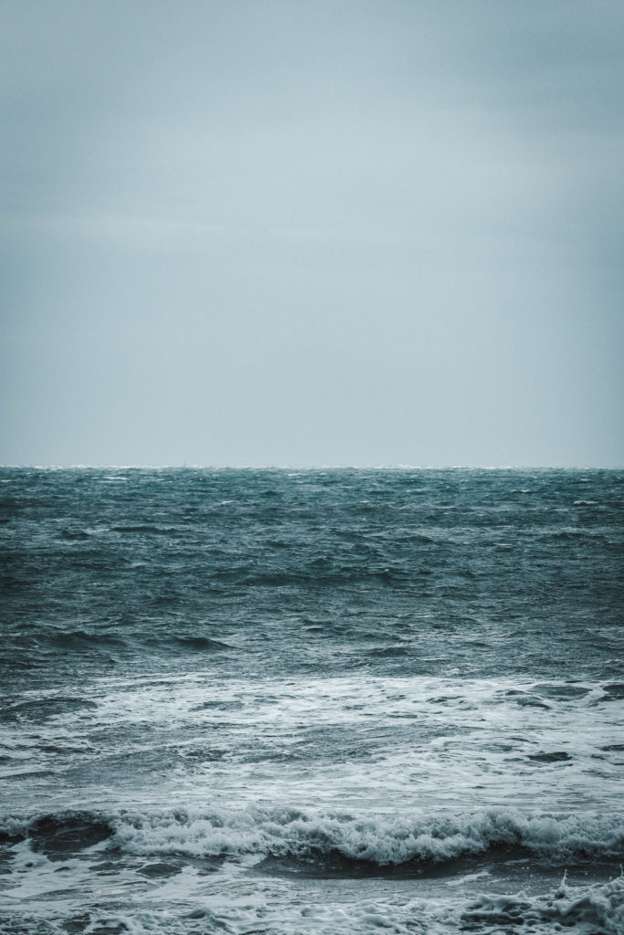
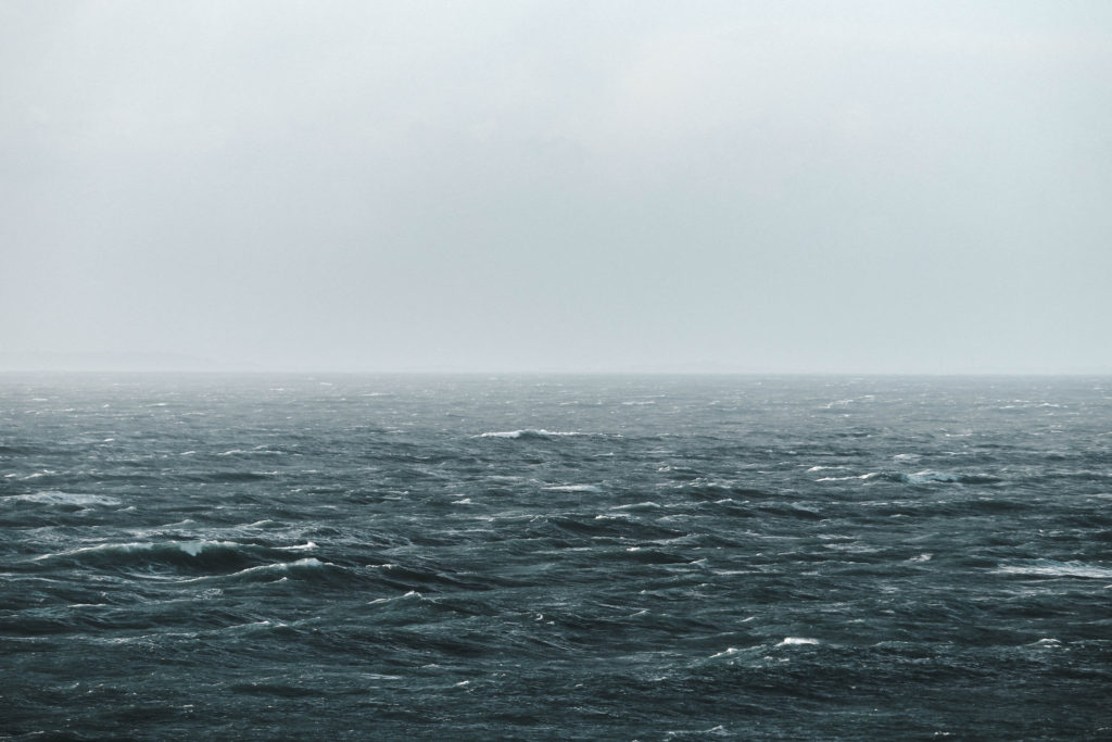
Second Response to HIROSHI SUGIMOTO’S // Repetition

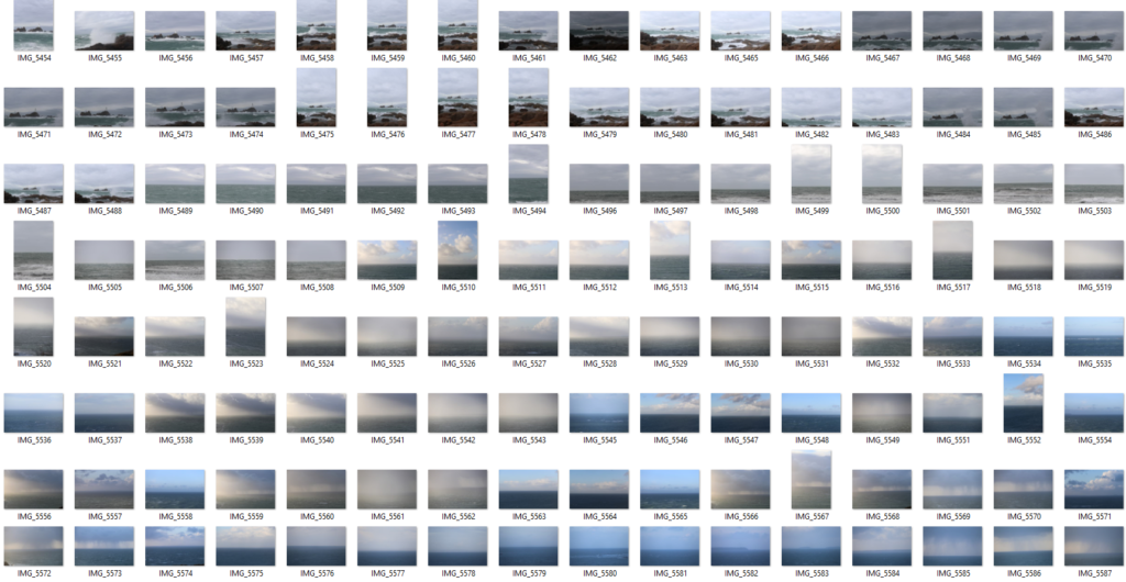
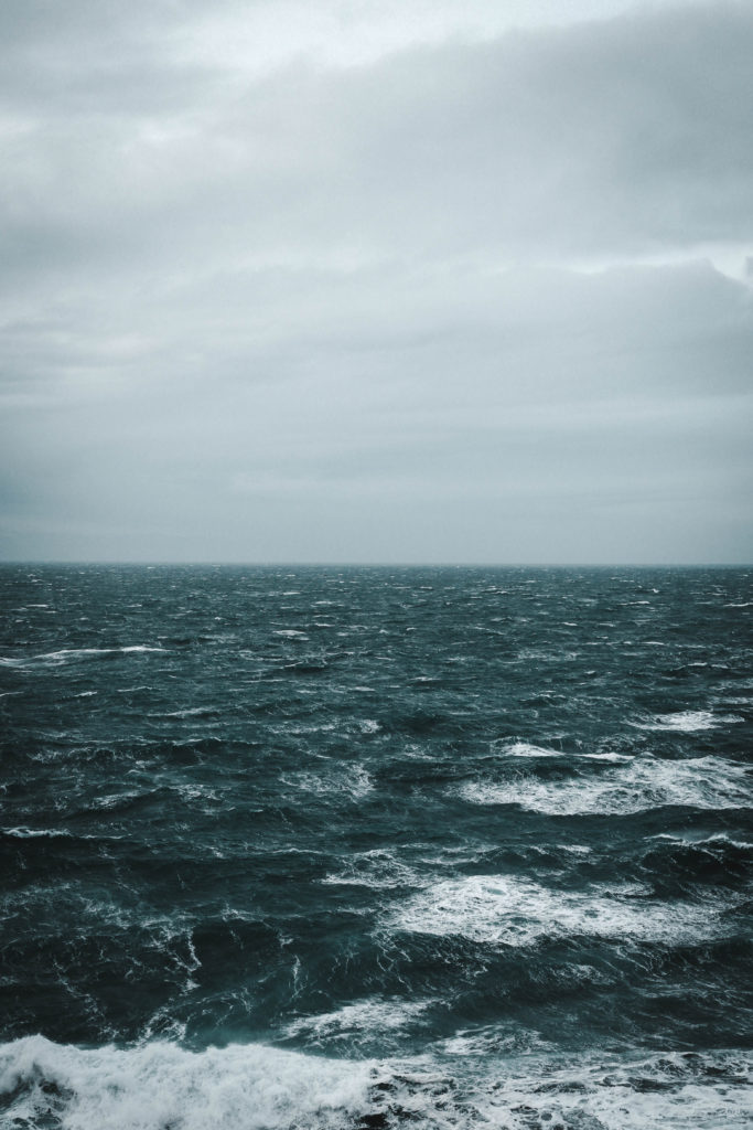
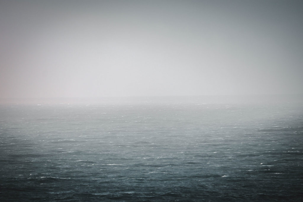
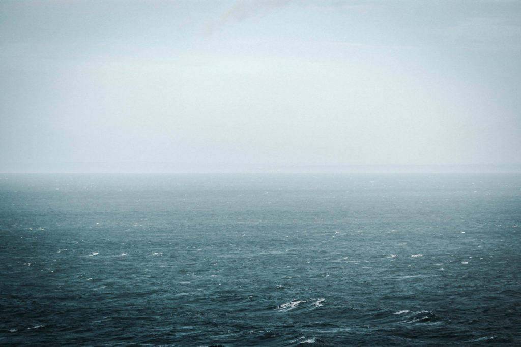
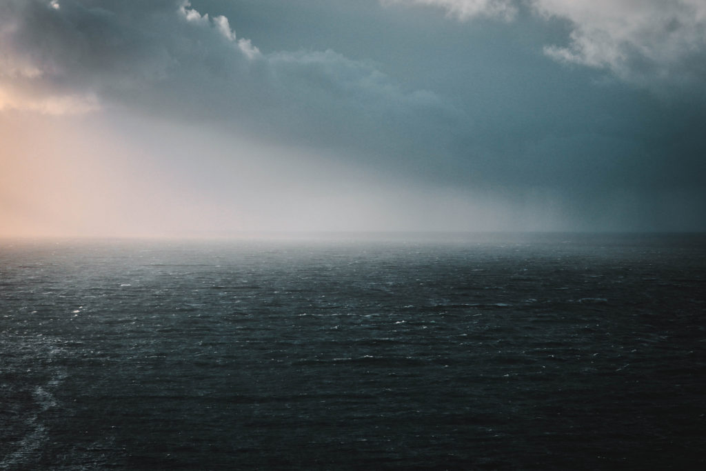
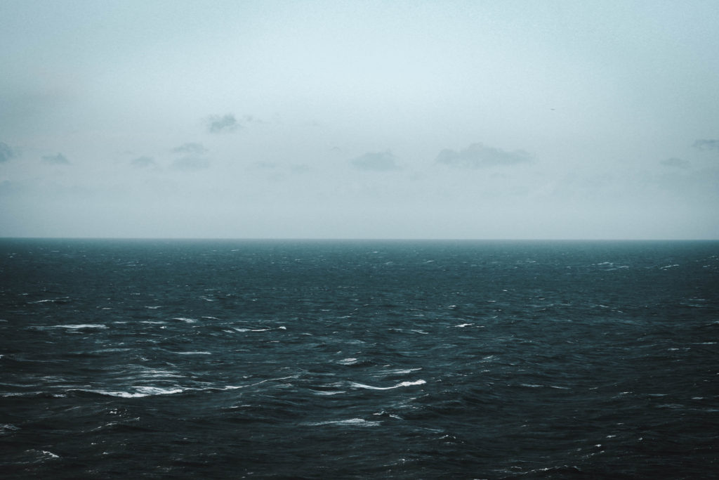
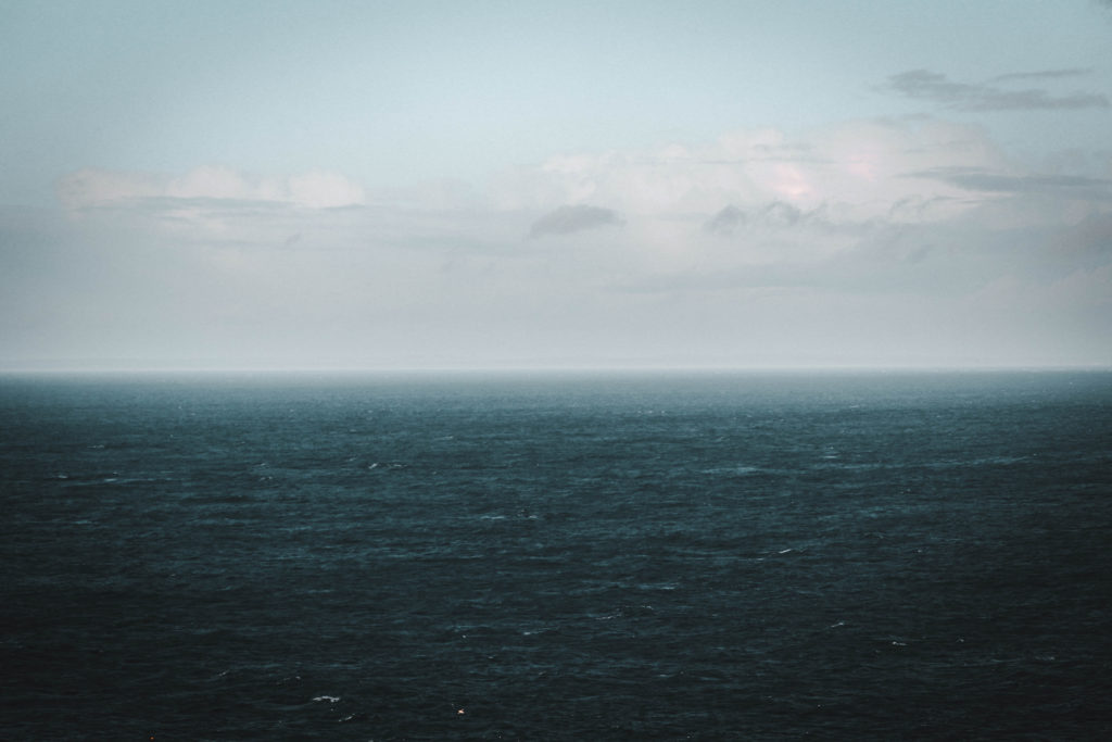
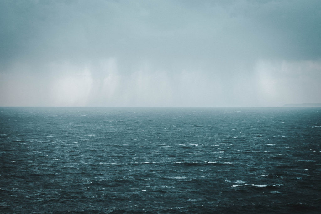
For this shoot I wanted to capture the repetition of the view that is shared by everyone all around the world should they come to the edge of their country/island. Thus view being the ocean. I wanted to travel around the island I live on capturing the repetitiveness of the view experienced when i reached the edge of the land. I think through this particular shoot I want to create a sense that, regardless of where we are, we could all go to a large body of water and see the same thing. The fact that we would share the same visual experience regardless of if we did that now, in the past or in the future. Our internal experience stimulated by the view will be more individual and vary from person to person. 

Contact Sheet

Edits


Overall, I am very happy with how this shoot went and even more so with the edits. Through the editing process, which I undertook in Adobe Lightroom I have increased the saturation of the blues and made the images pop by increasing highlights, whites, clarity and contrast. Also, I cropped each image to ensure that the horizon splits the image in half directly through the center like Sugimoto has done within his project. I took this series of images across a whole day which allowed for a change in weather and lighting, altering the aesthetics of the images slightly. This links to my previous study of Sugimoto and Monet’s hay stacks paintings in the way they focus on the depiction of light.

My interpretation of typologies

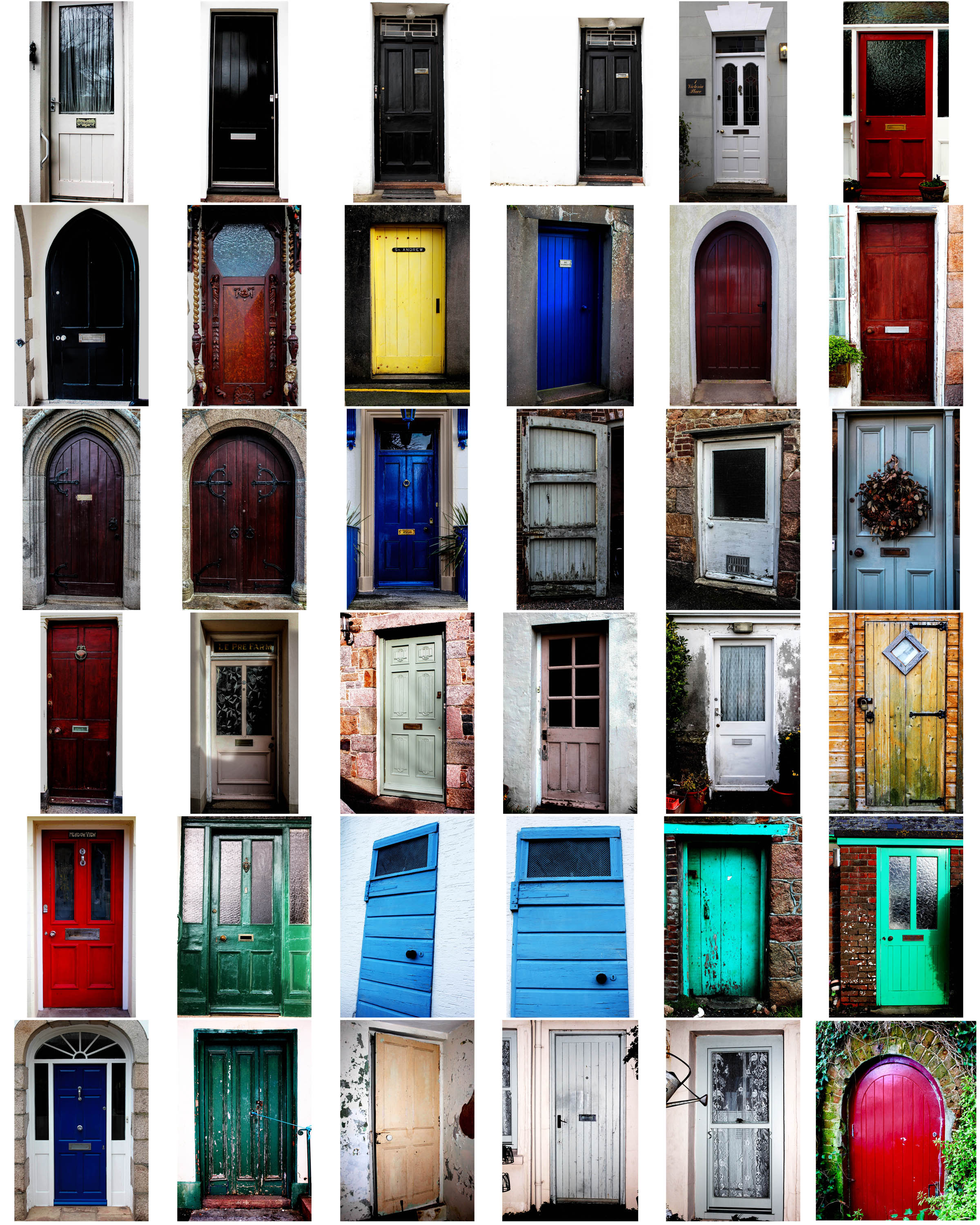
I wanted to experiment with something similar to the Bechers, where I would photograph similar objects to create a repeated effect. I thought that photographing different windows and doors around the area I live would create an interesting effect as they all the same objects as they all do the same thing, yet they are all completely different in terms of colour, size, shape, texture and tones. My experimentation with typologies is shown in the 2 shoots below.
Shoot 1: Doors

Contact sheet of various doors

For this shoot, I made sure I captured each door I wanted to photograph from a face on perspective, so that they all had a similar viewpoint. I did this as I was inspired by the Becher’s to create multiple photos of the same object from the same camera angle. I edited all my images in lightroom, where I adjusted the brightness and contrast, as well as the exposure to make the photo colours more vivid and bright. I kept my images in colour because I felt that this was more appropriate for the shoot I was doing; I wanted to show the variance of different colours and textures in all the doors I photographed – a black and white effect would’t have made this same effect. Although the Becher’s did this, I wanted to differ from their typologies because their work was carried out in the 1900s, whereas my interpretation is more modern, with more modern and bright doors.

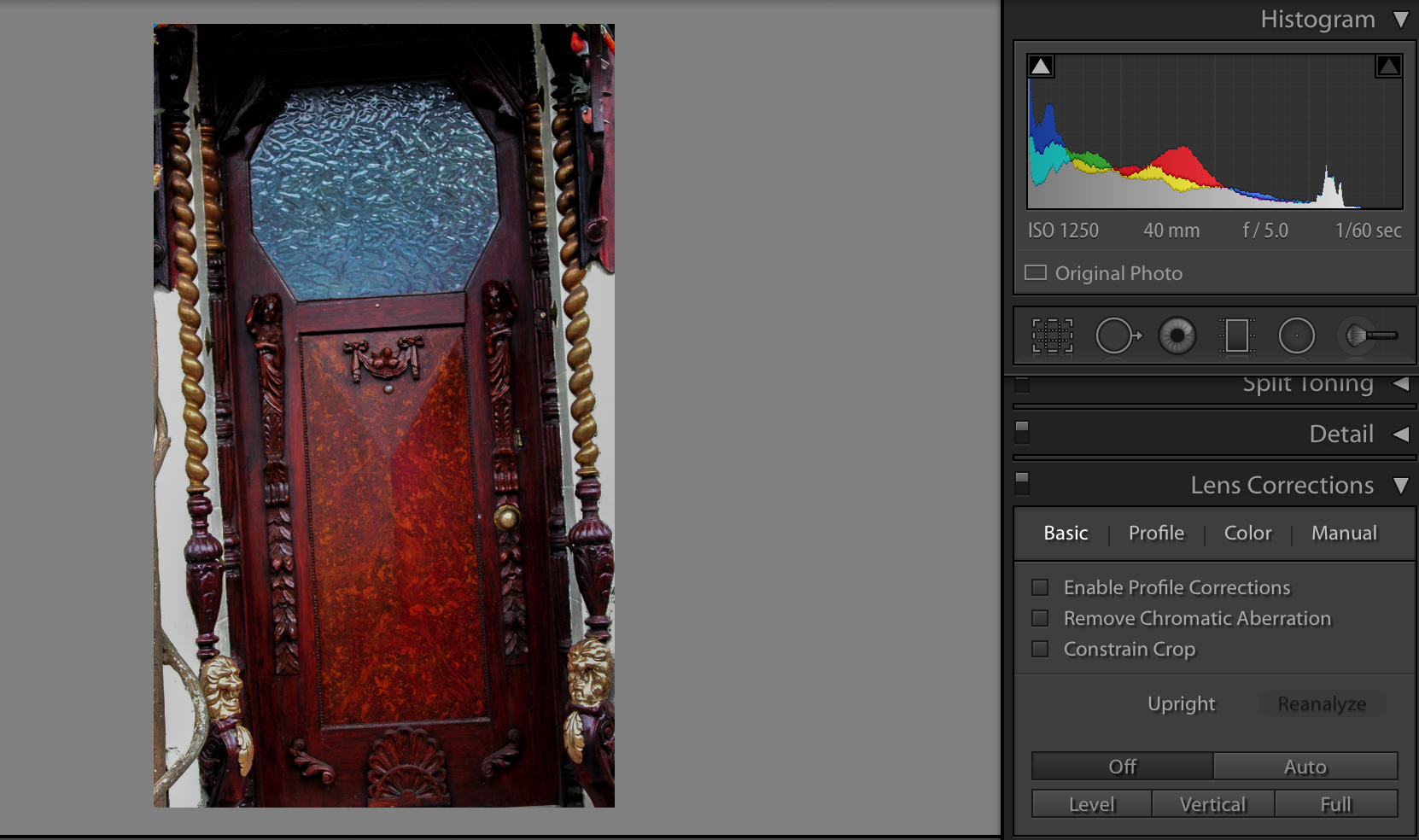
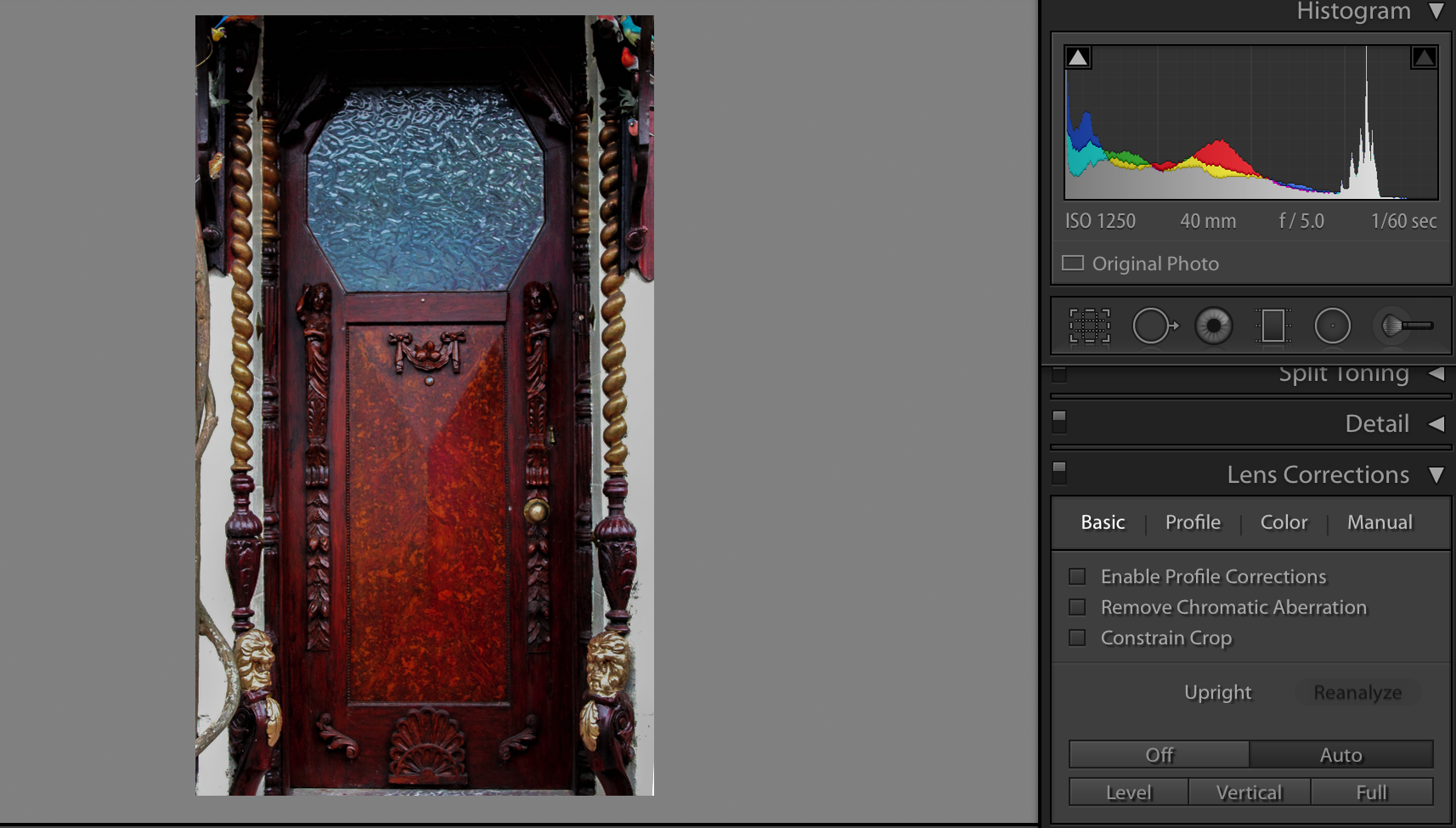
Additionally, I adjusted the lens correction for most of my images so that they all had a face on perspective. For instance, the screen-shots below is a valid example of how I used the lens correction to straighten up my images:

Image without lens correction
This image has an empty alt attribute; its file name is Screen-Shot-2019-03-13-at-09.42.31.png
Image after using the lens correction and selecting ‘auto’

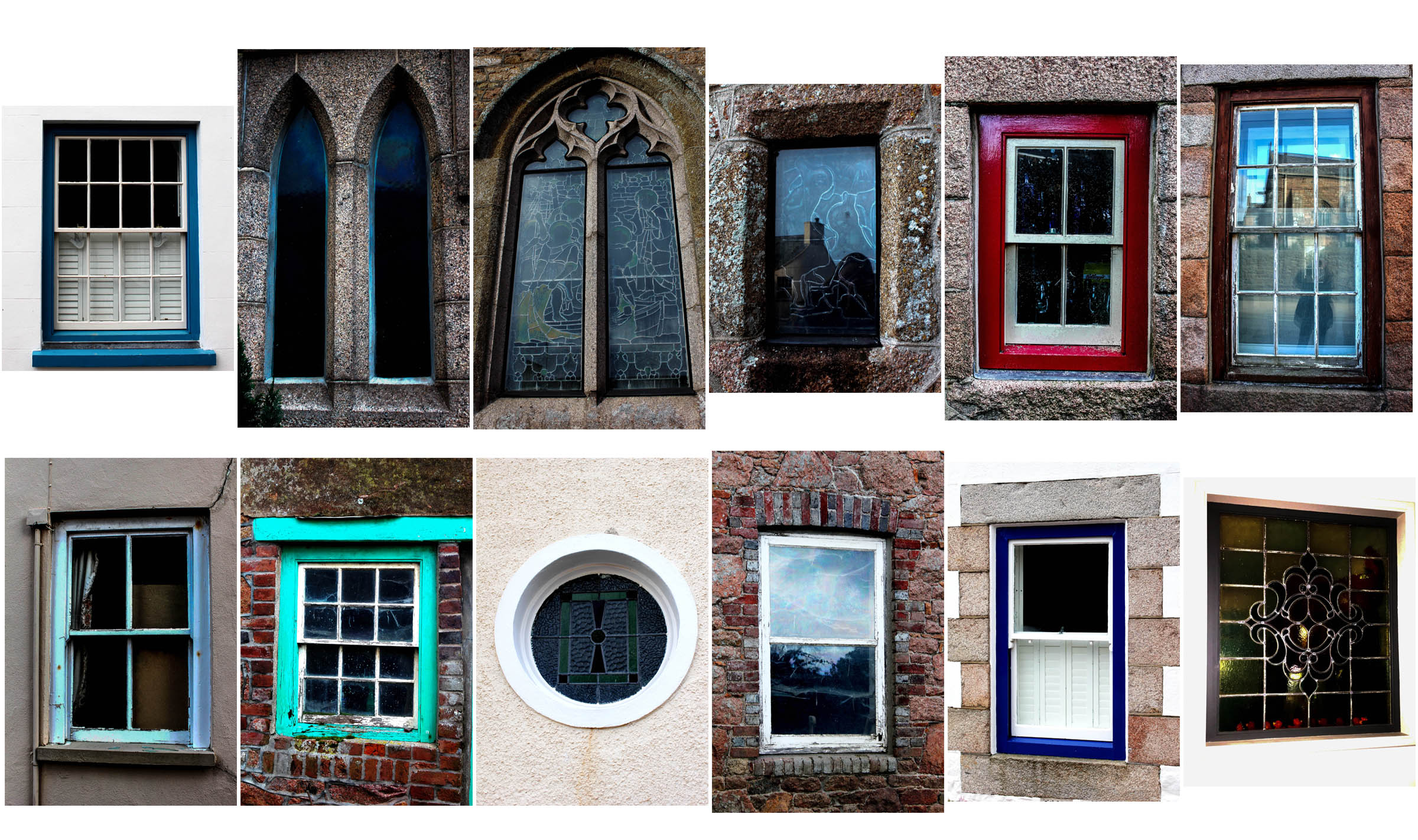
Shoot 2: Windows

Contact sheet 1 of various windows
Contact sheet 2 of various windows

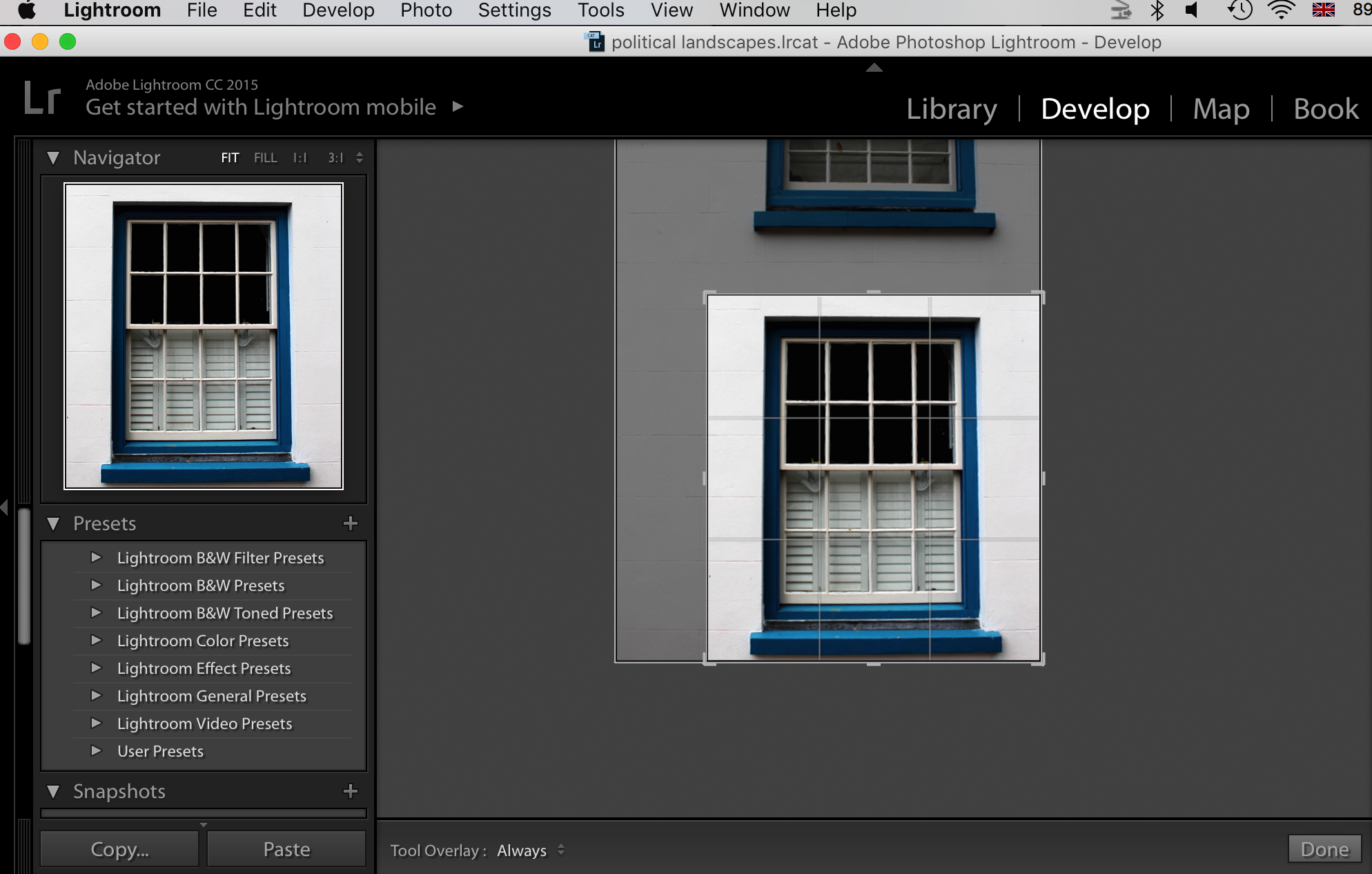
For this shoot, I took the same approach as with my first shoot of doors, but used windows as my main focused object instead. Again, I took all my images from a straight on perspective and edited them all in lightroom.

I cropped every image that appeared less straight on than others, so that they all were cropped to show an even photo. For example, I cropped this image here as I realised I wanted to create a consistency between my series of images of doors and windows, and so only showing one window an image would work best to create a repetition effect.