What are field paintings?
Field painting was a term that originally was applied to the work from about 1950 of three American abstract expressionist painters, Mark Rothko, Barnett Newman and Clyfford Still. The words ‘colour field painters’ was the title of the chapter dealing with these artists in the American scholar Irvine Sandler’s ground-breaking history, Abstract Expressionism, published 1970.
From around 1960 a more purely abstract form of colour field painting emerged in the work of Helen Frankenhaler, Morris Louis, Kenneth Noland, Alma Thomas, Sam Gilliam and others. It differed from abstract expressionism in that these artists eliminated both the emotional, mythic or religious content of the earlier movement, and the highly personal and painterly or gestural application associated with it. In 1964 an exhibition of thirty-one artists associated with this development was organised by the critic Clement Greenberg at the Los Angeles County Museum of Art. He titled it Post-Painterly Abstraction, a term often also used to describe the work of the 1960 generation and their successors.
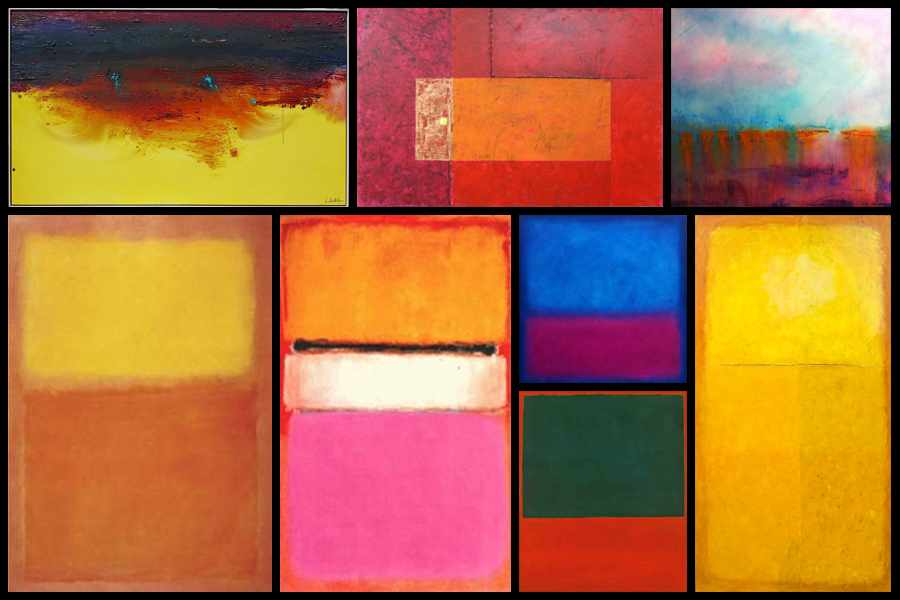
In Britain there was a major development of colour field painting in the 1960s in the work of Robyn Denny, John Hoyland, Richard Smith and others. Some examples of field paintings can be seen below:

Color Field Paintings emerged out of the attempts of several artists in the late 1940s to devise a modern, mythic art. Seeking to connect with the primordial emotions locked in ancient myths, rather than the symbols themselves, they sought a new style that would do away with any suggestion of illustration.The style was championed most enthusiastically by critic Clement Greenberg, who acclaimed the advances it achieved in the realm of form and composition. Bemoaning what he saw as the increasingly imitative, academic qualities of some action painters, he argued that Color Field Painting represented the way forward. His advocacy of the style proved highly influential.
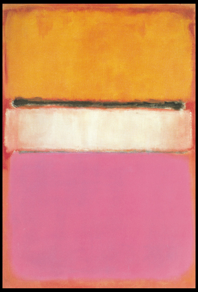
From here I wanted to explore the typical aspects that could be found within many field paintings. To do this I would need to analyse a painting and look at the technical, visual and conceptual ideas behind each brush stroke. By doing this I would like to take inspiration from this and use it towards a future shoot regarding Franco Fontana, using a highly saturation landscape to create abstract work which highlight the texture and patterns that can be found in everyday life regarding hills around the coast. The painting I have chosen to analyse is called White Center (Yellow, Pink and Lavender on Rose) by Mark Rothko:

Technical:
The painting, top to bottom, signifies Rothko’s multiform style of abstract painting. A rose ground, darker in color on top and paler at the bottom, holds a horizontal yellow rectangle, followed by a black horizontal strip. A white rectangular band is in the center of the painting, and the bottom is lavender. Several tones of the colors were used, establishing the effect of a wide range of mood and atmosphere. Whilst not being that technical, the lack of form or structure presents the viewer with a piece that becomes aesthetic to the eye, however its simplicity provides effectiveness from how it allows the viewer’s mind to wonder and interpret each painting to a more personal level.
Visual:
Mark Rothko continued to simplify the compositional elements of his paintings. In 1950, he began to divide the canvas into horizontal bands of color. Despite the frontal composition and absence of spatial illusionism in these works, the broad bands of color appear simultaneously to float in front of the picture plane and to merge with the color field upon which they are place, as in White Center (yellow pink and lavender on rose), 1950. A luminosity results from the repeated layering of thin washes of paint, which allows some underpainting to show through the upper coats. In each work of this period, Rothko sought only subtle variations in proportion and color, yet achieved within this limited format a broad range of emotions and moods. The photo at the top displays this painting’s supreme color choices, namely yellow, pink and lavender on rose.
Conceptual:
The piece represents Rothko’s love for reduction, colour, shape, balance, depth and composition, all of which are surrounded by cloudy edges against a undetermined backdrop. The idea behind the piece was to reduce the colours and the forms expanded in size, dwarfing the background which disappears behind the towering coloured forms. Many can interpret it as a dominance of colour using vivid and lush colours provide contrast and symmetry, for many it presents us with the idea that Rothko is enveloping the viewer and inviting us to contemplate and emotively respond to the space he has created.
