SPECIFICATION

My initial ideas taken from the exam paper, Similarity and Variation have stemmed from the artist Jason de Graaf from the fine art section where reflection is a prominent aspect in his paintings. I want to take ideas from this artist and use it in my photography in regards of reflection. From this I can explore natural reflections, mirrors, kaleidoscopes and layering images to repeat subjects and objects like the repetition and reflection of mirrors. For example, some of Claud Cahun’s work shows layering and reflection of images to create surreal images through photo montages and performances.

I also want to explore creating GIFS, which takes the idea of moving through similar images to create a moving action or performance. For example Edweard Muybridge took pictures of animals walking and running to understand the way they moved. This then created a series of photos that represented film but in the form of a series of still images. Following up on the idea of montages, Thomas Florschuetz creates interesting compositions of individual images to create new images of abstract forms from portraits.

Étienne-Jules Marey was a French scientist, physiologist and chronophotographer. His work was significant in the development of cardiology, physical instrumentation, aviation, cinematography and the science of laboratory photography. Most of his photographs demonstrated and documented movement. All of his photographs are layered individual photos to evaluate movement in one photo. This also directly links to variation and similarity as each everyday movement that people and animals make, from walking to dancing is a variation of different and the same, simple movements.

CONCEPTS

As a drama student, movement is very important to completely portray another person. Whenever I am assigned a new character for a play, I constantly study the people I interact with. I analyse their mannerisms and pick up on the way the repeat movements when expressing themselves in certain emotions or storytelling or interactions with other people. Mannerisms tell a lot about a person, whether they have many or little movements. Even facial expressions are important to create a profile of someone. Certain facial expressions effect the way a person talks and of course, is the direct indicator of someones mood, equally so with their mannerisms. Also linking personalities with movement explains people and helps me understand varied characters that I meet in a day to day basis.

Relating to my previous project based on representation of women and how gender is performed, this analysis of movement highlights the divide between gender. Usually, you can tell when someone is acting in a certain way because they are aware how they are representing themselves and are self-conscious to fit into a particular stereotype that is constantly reinforced and pressured upon them, and when someone is not conscious of this fact. I think documenting simple acts like eating, walking and talking then comparing mannerisms and their performance with other individuals, particularly people of the opposite sex to see how far people have divided themselves within gender.

In this project I would like to research various playwrights who focus on movement rather than words, such as Antonin Artaud ‘Theatre of Cruelty’, and theorists such as Judith Butler and her ‘Performative Theory’.

Nigel Tomm

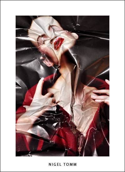
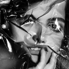
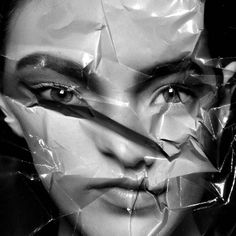
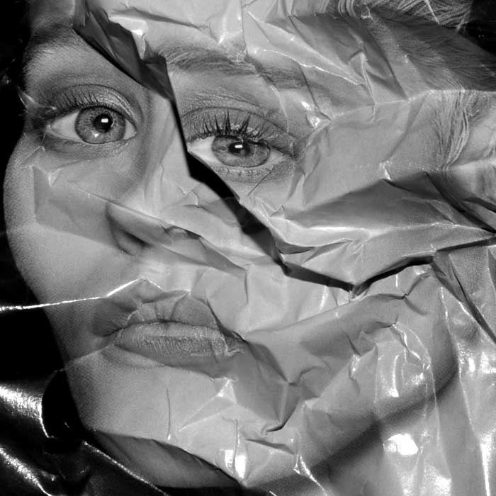
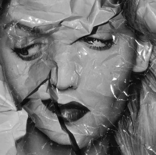
Nigel Tomm is a modern artist whose work has great parallels with cubist art. He is most knows for his manipulation, distraction and recreation of existing image. Working with pre-existing photographs from magazine he tackles the issue of perfection in the media displayed by celebrities and models. The magazine images he choices are often from editorial, beauty or glamour shoots, they show a glimpse of the beauty standards which are pushed to audiences every day. He manipulated them by crumpling the glossy images, randomly folding sections over and distorting to original. He then partially flattens the images back out an re captured them either using a camera in a studio with bright lights making reflections or a scanner which gives clean crisp look. These final images are then either turned to black and white or left in colour creating abstract pieces. His work subverts the conventions of beauty and critiques the these editorial publications which portray ‘perfect’ people. His work mixes the idea of beauty and ugliness two polar opposites which people have very fixed ideologies. In a way his work brings the ‘beautiful’ models and celebrities in the original photos down to a realistic level of beauty. He works with the idea that consumers are no longer looking to attain perfection but rather to be real instead, letting imperfections shine through showing a more modern surrealist approach.

This photo is a hand manipulation of an existing image in a beauty an fashion magazine. the original image would have been taken in a studio with bright lighting helping the evenly illuminate the models face. When the magazine page was distorted and re captured bright studio lights would have been used again, this helps to show off the glossy pages which we link with editorial images. These lights also create shadows which highlight the texture in the page and give it a more warped effect. The photo has a very high contrast because of the lights used and the shadows and highlights created on the paper. The magazine photo would have also had a high contrast because this is often a a technique used to help make editorials images stand out and look larger than life helping to exaggerate models features. This photo is in black and white which helps to simplify it and helps the viewer focus on the interesting shapes and distorted features. The form of the image has been reconstructed by the random crinkles inn the paper, although the photographer has considered the placing of the the folds he did not have complete control over it making the image more spontaneous. We can still tell the image was originally of a beautiful model however this idea had been challenged, the once smooth skin is now covered in lines from the creased paper and the proportions have been disfigured.

REVIEW AND REFLECTION

After completing two photographic shoots so far for my Variation and Similarity project, based around the diversity of nature and zooming in on the sublime detail, I have decided to review and reflect my current work:

How well have ideas developed?

I believe my ideas have developed to a good extent after completing thorough research of photographers, contextual studies and artists before-hand. This research has enabled me to have a clear focal point of zooming in on the four categories of nature I have chosen: water, natural forms, trees and cloudscapes.

Are they sustained and focused?

Creating a 4 shoot photo plan early on in the project has really helped me to photograph what I want in a sustained way. It has given me basic guidelines to follow so I am not taking photographs randomly and unpurposefully.

Are they reviewed and refined?

Giving myself four categories to focus on photographing has helped refine my project, as nature is such a broad spectrum with so many aspects I could look at.

How many responses/ shoots?

I have so far only completed two photographic shoots, but have spent time editing and experimenting so I will end up with the highest quality images possible. I intend to complete at least two more shoots, with additional images if I am unhappy with my edited collection and feel I require more to strengthen my work.

Understanding of composition/ considering quality of light

I have completed my first photo shoot in the day time where the light is prime so I could gain the best photographs of trees and bark patterns. My shoot location was in an area of shade due to the large collection of trees, meaning I had to use the optimum amount of light so my photos wouldn’t turn out too underexposed. I completed my second shoot of natural forms early morning as the sun was beginning to rise, and there was sources of natural light I was able to use to highlight the colours and patterns up close of my photographic subjects of flowers and plants.

What are the overall quality of the images?

I am photographing using a Canon 1300d, a camera that produces good quality images. I have experimented with using a range of camera settings, like landscape and close up, white balance and ISO.

How do I respond to research?

I have conducted research on contextual studies of abstract photography, photo-realism, the sublime, and fine art. This gave me a good pedestal to base my work off and begin photographing from. Looking at and photographing nature so up-close often leads to abstract images focusing on the patterns and colours rather than the form as a whole.

How do I relate to artists references?

I have been studying a wide variety of artists and photographers, from Hiroshi Sugimoto who I will base my 4th shoot of water on, to Karl Blossfeldt and Charles Jones, who have inspired my second shoot around natural forms. My large source of photographers who I have researched online have enabled me to look at the different ways people have responded to nature in. Instead of taking inspiration from just one artist, I intend to take source from multiple so I get the best final products possible.

How have I interpreted the exam theme?

From the specification title of ‘Variation and similarity’, I have interpreted this within the natural world to zoom in on the environment closely and look at the miscellany of nature and the intricate detail within the sublime e.g. weather patterns, plants. I have looked at mundane things that are passed off as being uninteresting e.g. trees, and have tried to photograph and emphasize the beauty and spiritual nature they hold.

I currently estimate my work to be around a level 3/4 due to having a smaller collection of primary source images, but by the end of my project when I have completed all my shoots I hope to be around a high level 5/6.

Reviewing and Reflecting My Work

How well have ideas developed?

I feel as if my work has developed into a sustainable idea that is consistent with it’s approach and has a clear focus. The focus of my work is the changing light and tidal movement that shape our landscape and alter our perspective on things. This, provoking the ideas about what exists beyond our reality since at a particular time of day we view everything in the same light and also at high tide we cannot see what lies beneath the surface.


Are ideas explored and selective appropriate to intentions?

My ideas that i am exploring have a specific intention to explore the ideas of spirituality, perspective and zen Buddhism. By looking at external factors that shape our environment brings a different type of thinking and shows importance in these things which are often over looked. This is a part of Zen Buddhism and Japanese culture seeks to do, seeing beauty in everything.


Are they sustained and focused?

I feel as if I have a sustained focus on the depiction of light within the series of shoots i have completed at the ‘white house’ location in St Ouens. I think it would be more interesting if i could go to the location a few more times which would allow me to clearly show the changing light at many points within a day. I have been to the location 3 times now, once at golden hour (low tide), once on a stormy day (low tide) and once at a large spring tide. It would be interesting to construct a typology with all the different types of light at the same location for example I would need to go at night, blue hour and sunrise. I could also use another location to show a clear focus on this topic and then do a similar thing with tidal movement too. So far, I have completed one shoot that has a clear focus on the tidal movement in a particular location however i want to complete several more. With these tidal movement shoots, there is also a sense of changing light because they are obviously taken at different times in the day.


How many responses/ shoots?

So far I have completed 6 photographic responses to my ideas associated around depiction of light and tidal movement. I intend to complete at least 1 more at the ‘white house’, 2 more shoots that reflect the change in water level and another series of shoots at another location focusing on how the light shapes the landscape at different times of the day.


Command of camera skills/ photographic techniques and processes

I have clearly demonstrated my use of camera skills and my ability to adapt the settings to meet the particular requirements of the location and lighting. I have yet to explore further with creative techniques and processes however i do not feel as if it is appropriate for the ideas which i have because i am dealing with documentation of lighting and tidal movement that needs to be truthful and trusted. My projects usually consist of manipulation and digital re-touching however this documentary approach is challenging my creativity and allowing me to show my other skills I posses.


Understanding of composition/ considering quality of light. What are the overall quality of the images?

I think my images are strong in the way they have been composed and framed. With the absence of any digital manipulation I need to be strong with the framing of my images to ensure they are aesthetically pleasing and draw the viewer in. I feel as if there are potential areas for improvement to get a little more creative when framing my images however overall they are strong and of a high quality.


How do they respond to research and artists references?
?

My photographic images were inspired and therefore respond to the research i have completed on Hiroshi Sugimoto and Michael Marten. Additional research that has inspired my work has been impressionism and Zen Buddhism which has changed my way of photographing to try and see beauty in everything and disconnect the mind from any logical thinking. I feel as if I need to try and develop my own unique style inspired by all these things which make my work unique and stand out from my inspirations.


How do they interpret exam theme?

Changing light is clearly an example of variation due to the way it is constantly changing and looks different/makes things look different. The light helps us see everything in our world which too is an example of variation. Within our world there are things which are similar too and the light helps us view these similarities. Lighting can also be similar in the way it is similar at different times of the day for example at sunset there are sometimes similar colors. The tidal movement is also a clear example of variation and similarity. It is always moving either up or down changing the way in which we see our landscape. However can also be seen as a similarity because it causes the landscape to look similar when comparing it to another time the tide was at the same place.

Contact Sheet | Tiny Planet Photoshoot

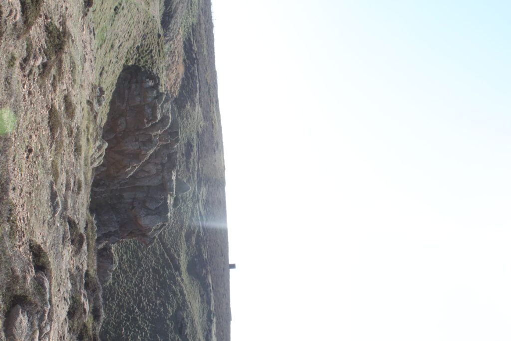
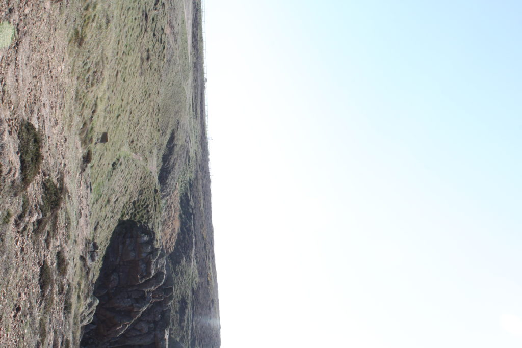
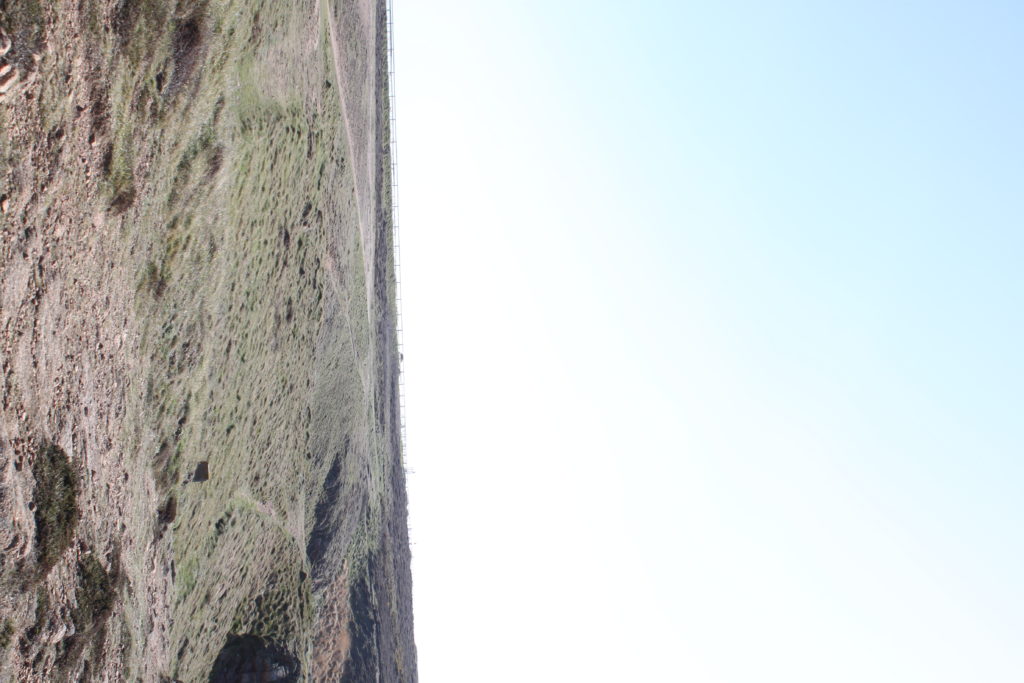
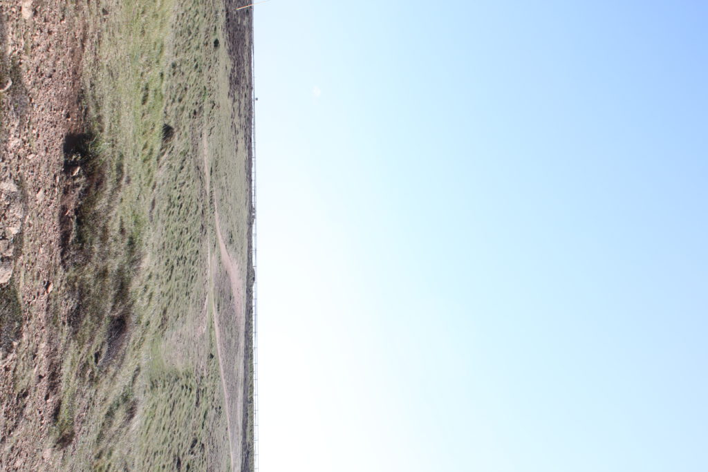
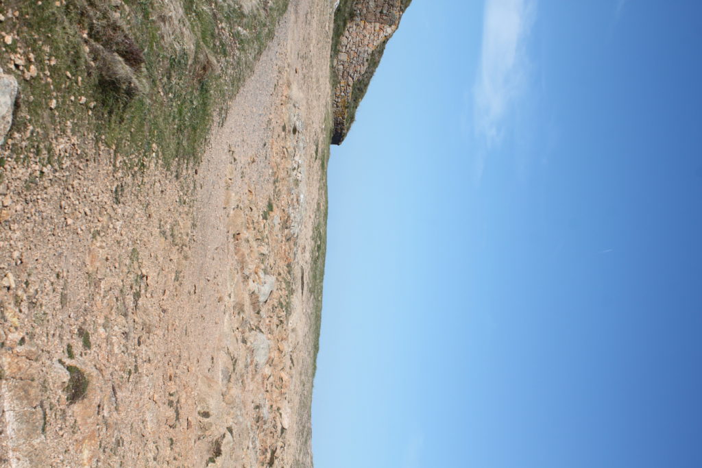
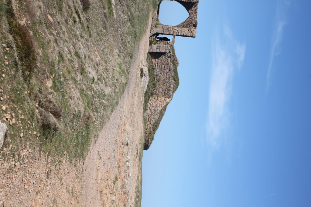
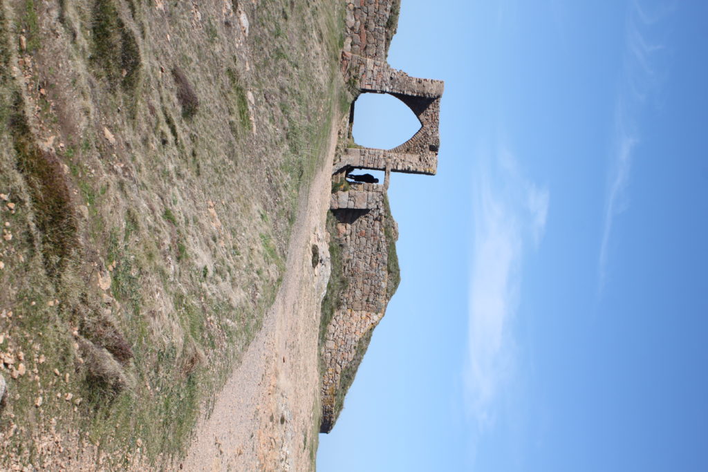
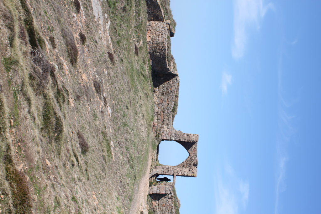
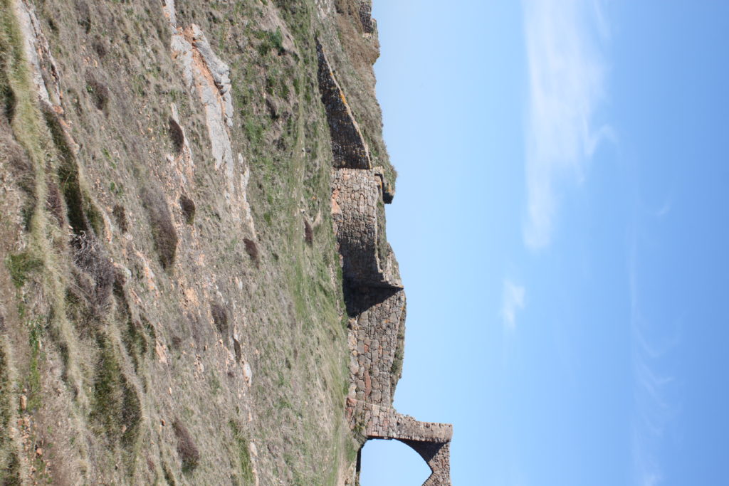
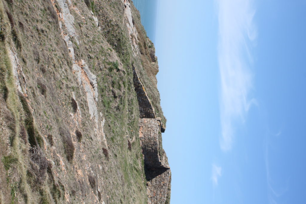
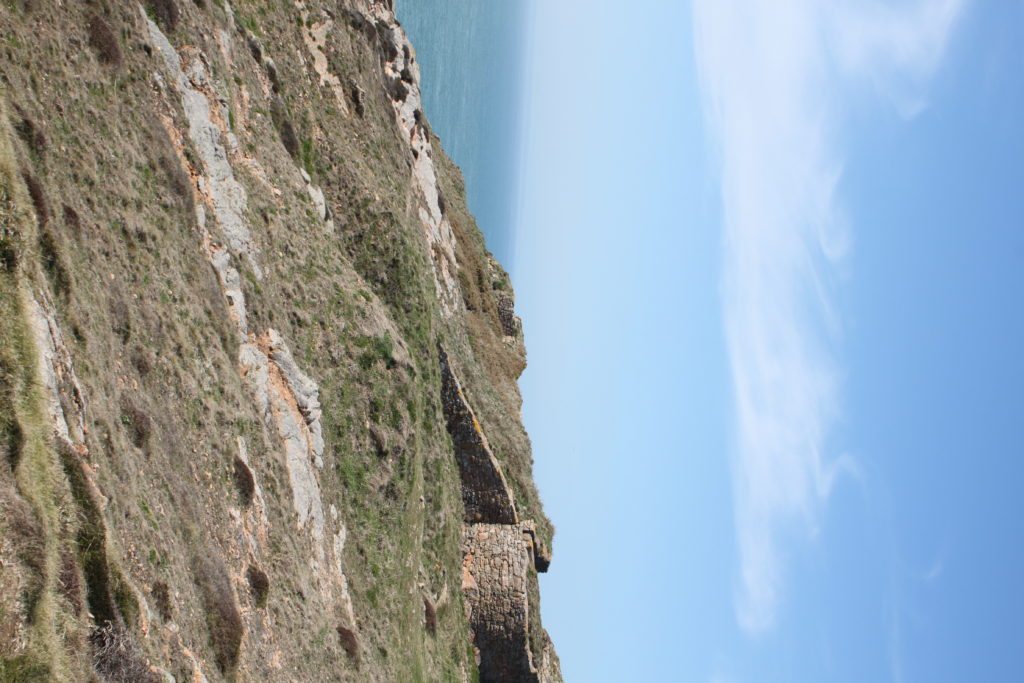
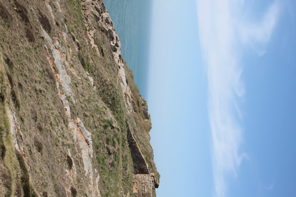
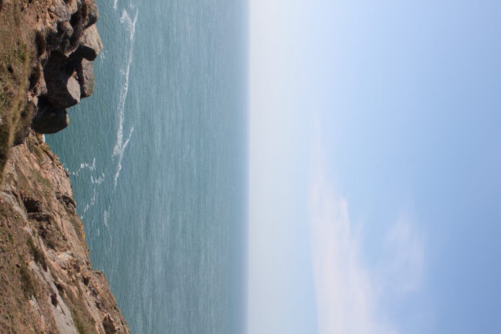
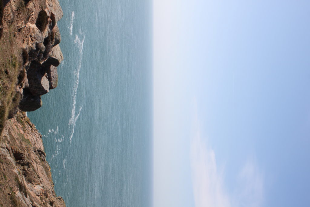
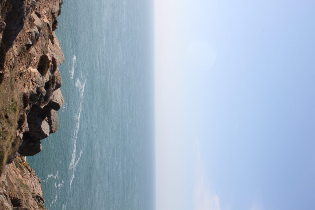
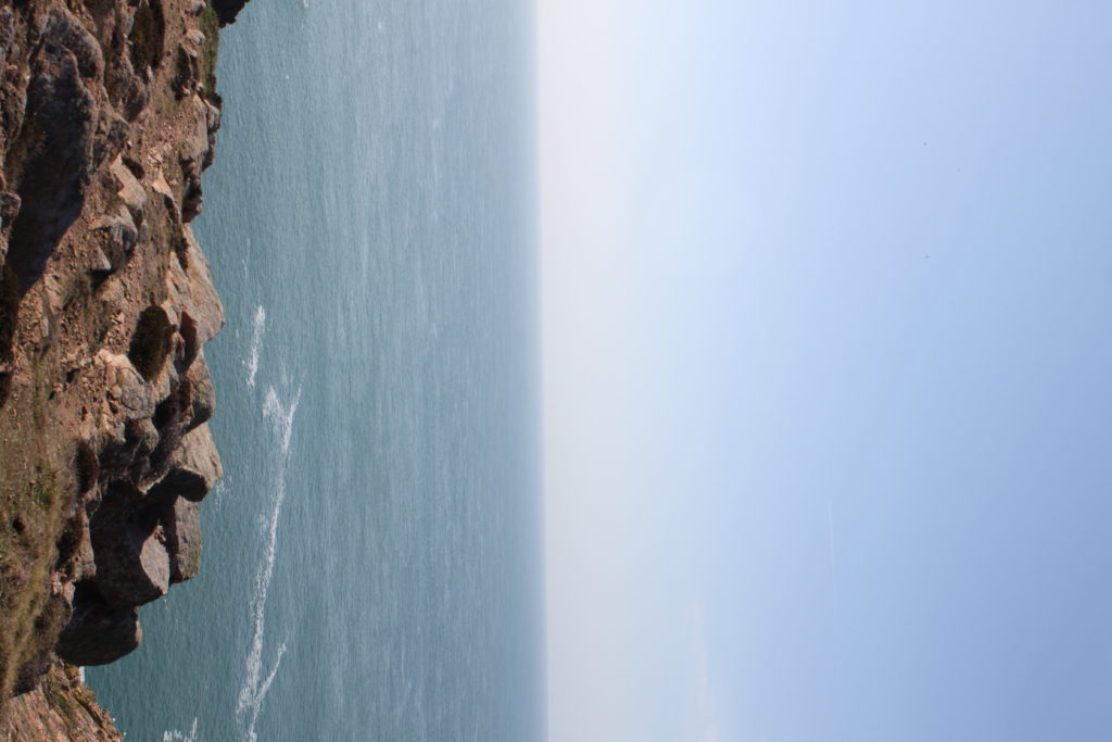
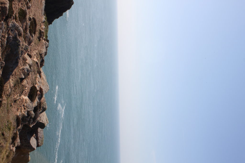
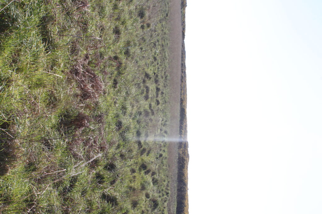
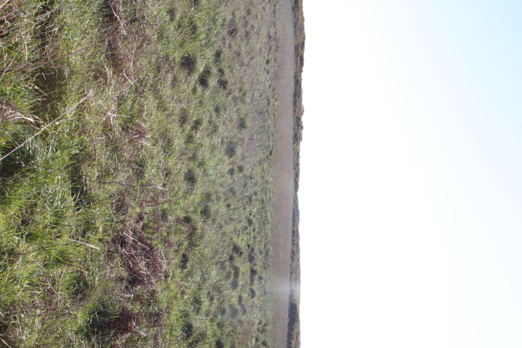
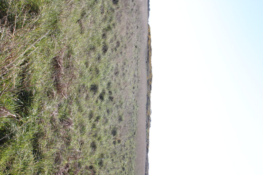
For my attempt at producing tiny planet images, I went to two locations, Les Landes and Grosnez. This is my first attempt so I am not sure how it will pan out when I put them into photoshop to create the planet.

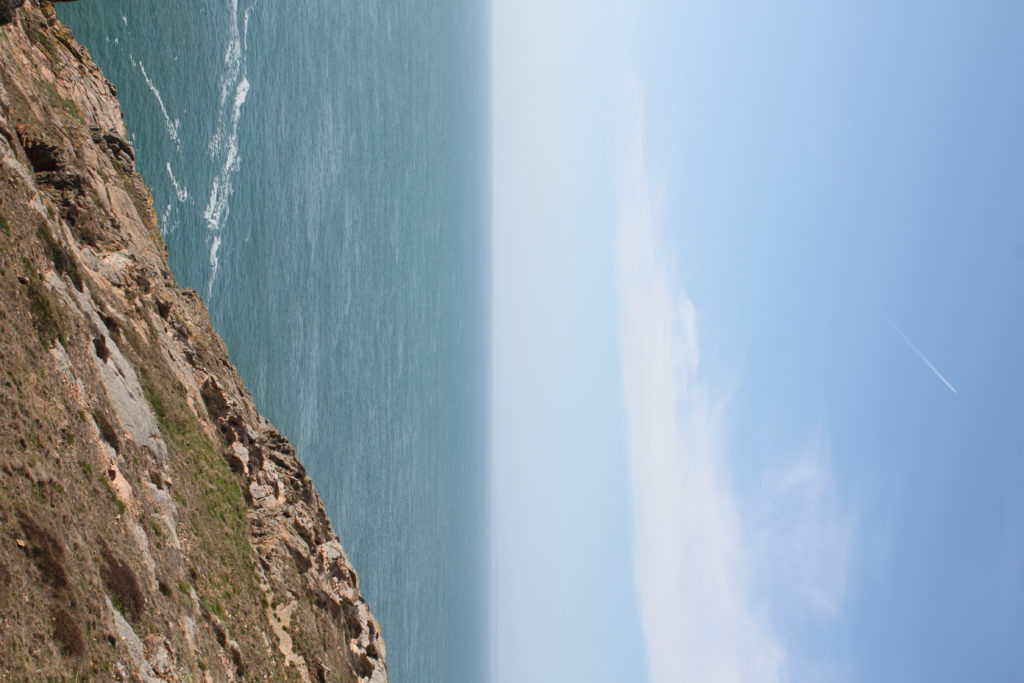
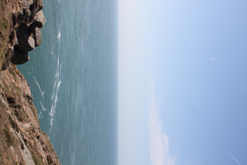
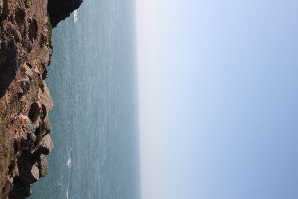
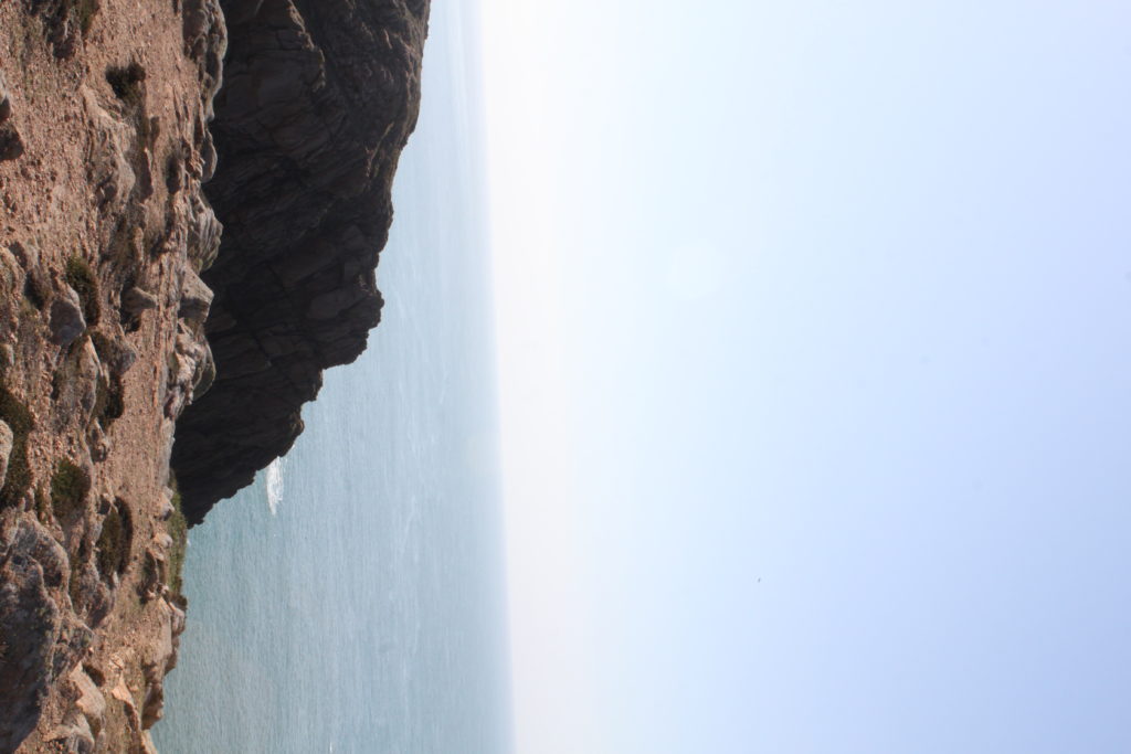
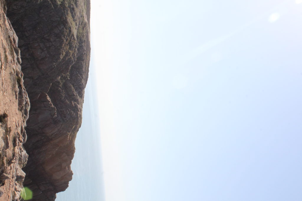
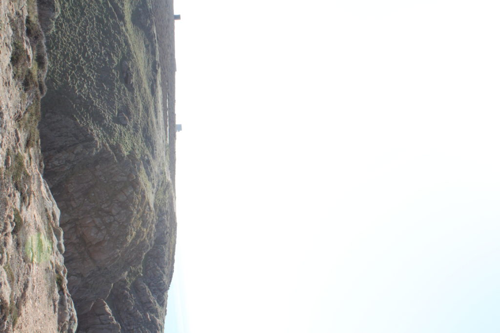
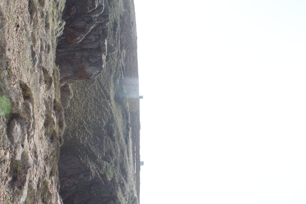
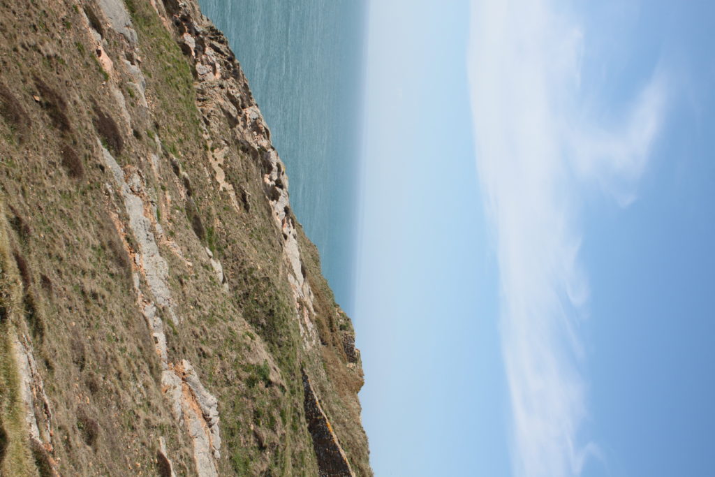
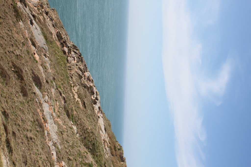
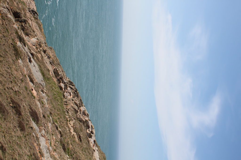
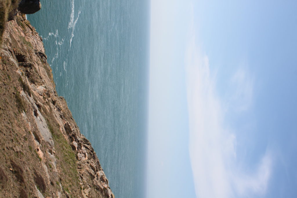
The above shoot was Grosnez, a full 360 degree panorama (not yet stitched). I had the camera on a tripod in a portrait angle so I could capture a better height. I then used full auto setting to best get the land setup best. I took the images overlapping the last by 1:3 to ensure no bits are missing and the stitching works well.

The shoot below was at Les Landes, I did the same concept, 2x 360 degree on full auto. I used ,y hand to mark the start and stop of each panorama

I now have to put the images into photoshop, create panoramas then bend the images into a circle.

Review and reflect

How well have ideas developed?

originally i was interested mass density areas and buildings. I wanted to explore the life within a city. whilst looking at Siegfried Hansen I became inspired by colour. From here my idea developed into exploring colours shapes and tones. I am happy with the current status of my project and would like to develop my images further through editing and displaying them in a colourful way.


Are ideas explored and selective appropriate to intentions?

I explored and researched each of my initial ideas until i narrowed it down to my current idea. Through careful selection i chose the theme i felt was most suitable for my project ‘variation and similarity’


How many responses/ shoots?

Overall i made 4 shoots in total, all of which i believe to be strong shoots that gave a direct response to my artist references.


How do they relate to artists references?

My images show inspiration from my three artist references as they are all linked in my project through minor and major details varying from image to image. They all relate due to composition, colour, use of shape and patterns.


How do the interpret exam theme?

They interpret the exam theme as It shows the variation of colours we have available to use and explore on this planet. I also explored shapes and size to give the images a bigger illusion and give them depth.

How to Explore and Record

There are less than two weeks until Easter it is paramount that you explore photo-shoots as per your specification and make your principal images now so you have a critical body of work to edit and produce final outcomes from.

When you are photographing and responding to ideas and inspirations from artist references you are both exploring and recording. The two go hand in hand. If yo do it well and often (on a weekly basis) you should be able to achieve 50% of your overall marks!

In the A2 Exam Planner I have highlighted the importance of a sustained investigation.

Each week you are required to make a photographic response (still-images and/or moving image) that relates to the research and work that you explored in that week. Sustained investigations means taking a lot of time and effort to produce the best you can possibly do – reviewing, modifying and refining your idea and taking more pictures to build up a strong body of work with a clear sense of purpose and direction

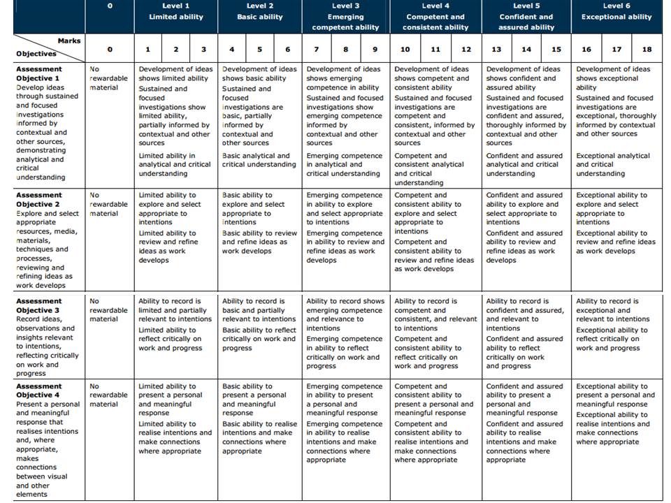
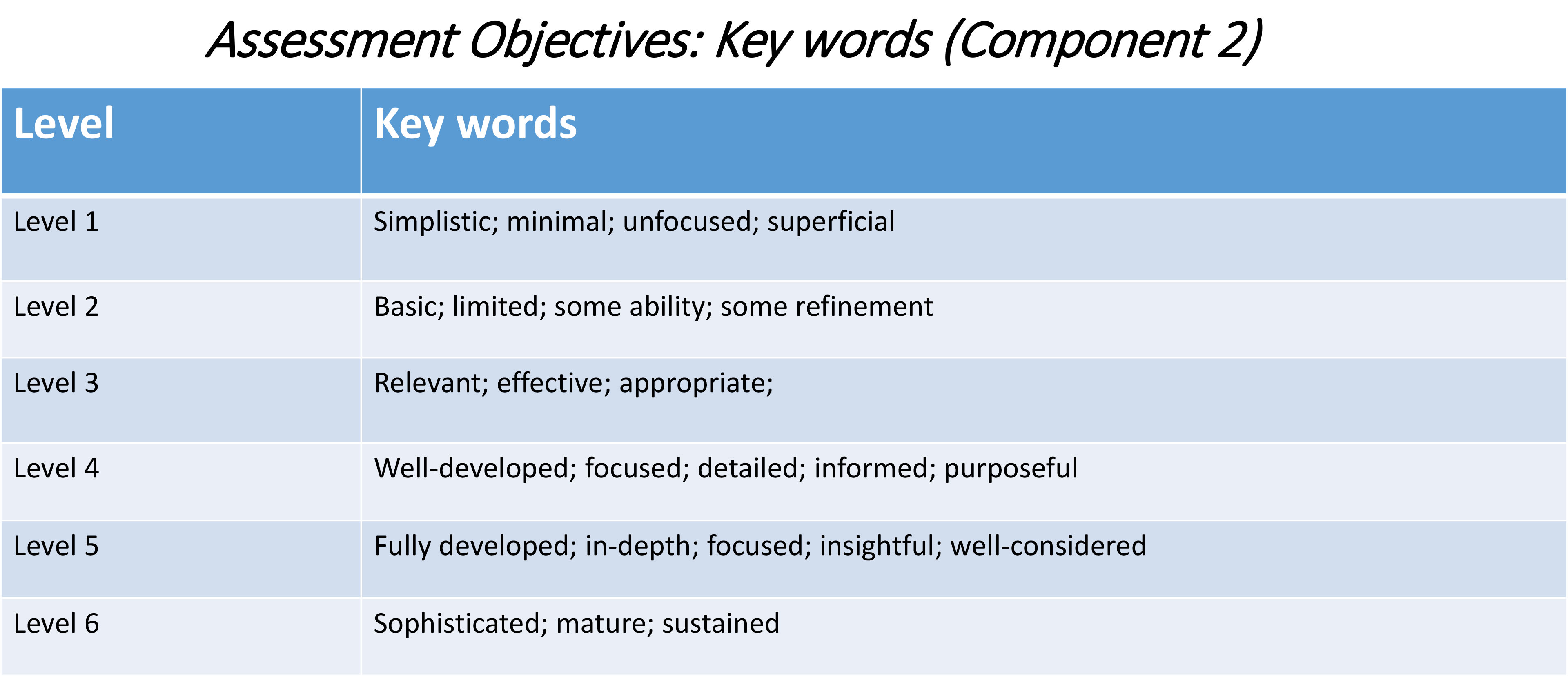
Get yourself familiar with the assessment grid here:

AO2 – Explore and select appropriate resources, media, materials, techniques and processes, reviewing and refining their ideas as work develops.

AO3 – Record ideas, observations and insights relevant to intentions, reflecting critically on work and progress.

To achieve an A or A*-grade you must demonstrate an Exceptional ability (Level 6) through sustained and focused investigations achieving 16-18 marks out of 18 in each assessment objective

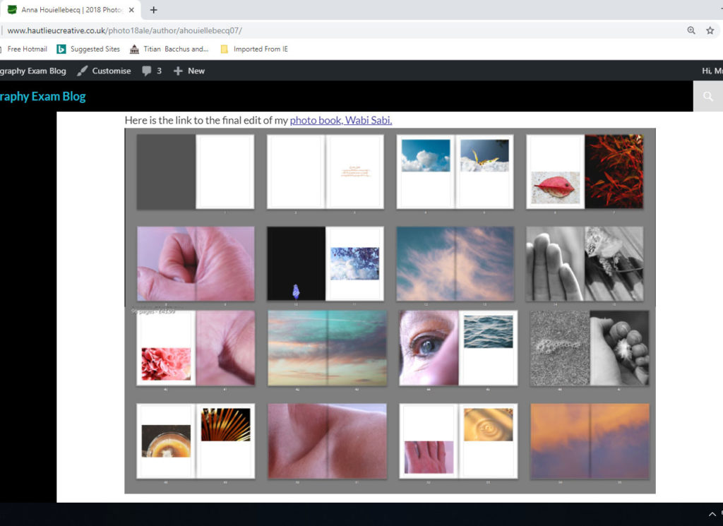
Have a look at previous student, Anna Houiellebecq and her exam work from 2018 and assess it according to the Assessment Objectives A2 Photography: (Edexcel.) Think about what level the student is working at.

Have a look at previous student, Jude Luce and his exam work from 2018 and assess it according to the Assessment Objectives A2 Photography: (Edexcel.) Think about what level the student is working at.

What you are looking for when assessing A02 (Explore) and A03 (Record):

How well have ideas developed?
Are ideas explored and selective appropriate to intentions?
Are they sustained and focused?
Are they reviewed and refined?
How many responses/ shoots?

Command of camera skills/ photographic techniques and processes
Understanding of composition/ considering quality of light
What are the overall quality of the images?
How do they respond to research?
How do they relate to artists references?
How do the interpret exam theme?

Homework: Based on the evidence of your blog, what level are you working at? Produce a blog post where you reflect on your own progress using those questions above. Provide targets that you can achieve over Easter and that can improve your work. Upload by Wed 3 April

Classwork: To develop your ideas further from research and analysis of artists references and other inspirations  on the themes of VARIATION AND SIMILARITY you now must be planning a number of photographic responses (at least 3 shoots per idea.)

Follow these steps to success!

  1. Produce a detailed plan of 3 shoots for each idea in your specification that you are intending to do;  how, who, when, where and why in the next 3 weeks?
  2. Think about lighting, are you going to shoot outside in natural light or inside using studio lights? Maybe shoot both inside and outside to make informed choices and experimentation. Remember to try out a variety of shot sizes and angles, pay attention to composition, focussing, scale, perspective, rule of 1/3rds, foreground/ background and creative control of aperture (depth of field) and shutter speed (movement). If appropriate, think about how to convey an emotion, expression or attitude and the colour palette, tone, mood and texture of your pictures. Consider mise-en-scène (everything in the frame) – e.g. in portraiture deliberate use of clothing, posture, choice of subject objects, props, accessories, settings. Make a selection of the best 15- 20 images for further experimentation. Produce 2-3 blog posts from each shoot and analyse and evaluate your photos through annotation showing understanding of basic visual language using specialist terminology.
  3. It is essential that you complete your principal shooting over Easter and return on Tue 23 April with a few hundred images ready for further post-production and editing.
  4. Upload blog post with above planning by Fri 5 April

Please be aware that there will be disruptions to normal lessons after Easter as we have to run the AS Exam. We will provide you with alternative classroom, but it is essential that you work independently.

TIME TABLE AFTER EASTER

  • Tue 23 April – NORMAL LESSON
  • Wed 24th April Groups 12A and 12B – AS EXAM
  • Thurs 25th April Groups 12C and 12E – AS EXAM
  • Fri 26 April – NORMAL LESSON
  • Mon 1 May – NORMAL LESSON
  • Tue 2 May – NORMAL LESSON
  • Wed 3 May – NORMAL LESSON
  • Thurs 2nd May Groups 12A and 12B – AS EXAM
  • Friday 3rd May 12C and 12E – AS EXAM
  • Mon 6 May – BANK HOLIDAY MONDAY
  • Tue 7 May – FIRST DAY OF EXAM – Gp 13A/ 13C
  • Wed 8 May – FIRST DAY OF EXAM – Gp 13D

SUMMARY: 13 HOURS LEFT OF NORMAL LESSON BEFORE YOUR EXAM!

Local Exhibition Study

After recently going to two exhibitions, the CCA Gallery and Public and Private, I was inspired through the works of the photographers regarding their pop art, graphics, album art, documentary photography and paintings. Looking back at the galleries I really liked how each artist’s work varied from the next, with each possessing their own unique perspective and style. The first gallery I visited was the CCA Gallery, exhibiting the works of Mike McCartney, Rupert Truman, and Carinthia West. Some examples from the gallery can be seen below:

Rupert Truman:

Storm Thorgerson founded StormStudios in the early 1990s where he worked as part of a creative team that included photographer Rupert Truman, who worked with him shooting 99% of the studio’s output.  Storm Thorgeson sadly passed away in 2013 but the Studio remains busy today creating ‘normal but’ designs and Rupert Truman has given us access to many works from the studio, including iconic props such as the heads used in the 10cc album,  Tenology, that will be included in our exhibition ‘The Eye Of The Storm‘ (Thursday 6th – Sunday 30th July 2017).
Rupert Truman is one of the leading photographers in the country and has shot images of bands from Pink Floyd to Muse. We’re delighted to announce that Rupert will be at For Arts Sake gallery Sunday 23rd July from 12-3pm talking about his art and signing copies of his book. In our interview with Rupert Truman he talks to us about his work, his time with Storm Thorgerson and the future for StormStudios.

Carinthia West:

Throughout her career as a model, actress and journalist, Carinthia West, 59, has always had her camera by her side, capturing carefree moments for her bulging scrapbooks. She remembers her great-grandmother being a keen photographer, and received her first camera – ‘a plastic thing; when you wound on the film it got caught in the sprockets’ – at the age of nine. But it was when she was given her Canon EF, a 35mm single-lens reflex camera, in the early 1970s, that she began experimenting with film and exposures while taking shots of her friends. West’s first exhibition, Hanging Out, has come about almost by chance. As a tribute to her parents, General Sir Michael and Lady West, last year she started organising a show of their extensive art collection – ranging from a Lowry, which her mother bought direct from the artist, to a Lichtenstein – at the Quay Arts Centre, a gallery that her parents had helped found and build in the Isle of Wight in 1975.

Mike McCartney:

Mike McGear is actually Paul McCartney’s brother; he changed his name in the mid-’60s shortly after the Beatles become famous, not wishing to be perceived as riding Paul’s coattails. He was a member of the Scaffold, who recorded some fairly successful comedy rock releases in the late ’60s (their “Thank U Very Much” and “Lily Pink” singles were big British hits). In 1974, he recorded a solo album with plenty of help from Paul, who wrote or co-wrote almost all the songs and sang backup; fellow Wings Linda McCartney, Denny Laine, and Jimmy McCullough also play and sing. The album, which unsurprisingly recalled Wings, attracted some critical notice, but sold poorly.

After visiting the CCA Gallery we headed over to the Public and Private gallery, they were currently holding an exhibition based around ‘Pop Icons of the 20th Century – British & American Pop Art’. Emerging in the mid 1950’s in Britain and late 1950’s in America, Pop Art reached its peak in the 1960’s and went on to become the most recognisable art form of the 20th century. It began as a revolt against the dominant approaches to art and culture and traditional views on what art should be.
Young artists felt that what they were taught at art school and what they saw in museums did not have anything to do with their lives or the things they saw around them every day. Instead they turned to sources such as Hollywood movies, advertising, product packaging, pop music and comic books for their imagery. Some of the artists who have the work exhibited are Andy Warhol, Sir Peter Blake and Patrick Caulfield. Some of their work can be seen below:

Andy Warhol:

Andy Warhol, original name Andrew Warhola, (born August 6, 1928, Pittsburgh, Pennsylvania, U.S.—died February 22, 1987, New York), American artist and filmmaker, an initiator and leading exponent of the Pop Art movement of the 1960s whose mass-produced art apotheosized the supposed banality of the commercial culture of the United States. An adroit self-publicist, he projected a concept of the artist as an impersonal, even vacuous, figure who is nevertheless a successful celebrity, businessman, and social climber. The son of Ruthenian (Rusyn) immigrants from what is now eastern Slovakia, Warhol graduated in 1949 from the Carnegie Institute of Technology, (now Carnegie Mellon University), Pittsburgh, with a degree in pictorial design. He then went to New York City, where he worked as a commercial illustrator for about a decade. Warhol began painting in the late 1950s and received sudden notoriety in 1962, when he exhibited paintings of Campbell’s soup cans, Coca-Cola bottles, and wooden replicas of Brillo soap pad boxes. By 1963 he was mass-producing these purposely banal images of consumer goods by means of photographic silkscreen prints, and he then began printing endless variations of portraits of celebrities in garish colours. The silkscreen technique was ideally suited to Warhol, for the repeated image was reduced to an insipid and dehumanized cultural icon that reflected both the supposed emptiness of American material culture and the artist’s emotional noninvolvement with the practice of his art. Warhol’s work placed him in the forefront of the emerging Pop art movement in America.

Sir Peter Blake:

Peter Blake was born in Kent and studied first at the Gravesend Technical College School of Art before continuing his studies between 1953 and 1956 at the Royal College of Art in London. At the RCA Peter Blake was at the forefront of British Pop, studying alongside Patrick Caulfield, David Hockney, Pauline Boty, Derek Boshier and Peter Phillips amongst others. He was awarded the Leverhulme Research Award in 1956, to study popular art. Between 1956 and 1957 he made an extended journey to Europe (France, Italy, Spain, Holland and Belgium), and in 1961 was awarded the first Junior Prize from the John Moores Liverpool Exhibition. In 1964 he was appointed a lecturer at the Royal College of Art in London and at the Walthamstow School of Art. In 1975 he was a founder member of the group of artists called The Brotherhood of Ruralists, and from 1994 to 1996 he was Associate Artist at the National Gallery in London. Blake became a Royal Academician in 1981, was awarded a CBE in 1983 and was knighted in 2002 for services to art. There have been multiple retrospectives of his work in Britain, with the most significant including those in 1983 at the Tate and in 2008 at Tate Liverpool. In February 2005, the Sir Peter Blake Music Art Gallery, located at the University of Leeds was opened by the artist with a permanent display of 20 examples of Blake’s album sleeve cover art, including the only public display of a signed print of the iconic Sgt. Pepper Lonely Hearts Club Band album cover.

Patrick Caulfield:


Patrick Joseph Caulfield, British artist (born Jan. 29, 1936, London, Eng.—died Sept. 29, 2005, London), was a member of the “New Generation” of 1960s British Pop and abstract artists. Caulfield’s bold paintings incorporated everyday objects in still lifes and ordinary domestic interiors and were defined by strong graphic design, black outlines, and bright, saturated colours. He later introduced elements of trompe l’oeil and photorealism into his painting. He also worked in other mediums, including graphic prints, tapestry, theatrical set design, and screen-print book illustrations. Caulfield was nominated for the Turner Prize in 1987 and shared the Jerwood Painting Prize in 1995. He was made CBE in 1996.

reviewing my current work

Using the mark scheme, I intend to annotate and explore how successful or unsuccessful my work has been through the past recent works and shoot, and which areas are the primary concern where I should draw my attention and create more work accessing the highest level on the grade boundary.

Currently throughout this project I have done, around 6 shoots with all differing themes. The first shoot was one which focused upon the combination of fine art and surrealism, forming elements of natural landscape and communicating themes in such a way to place a person within a whole new world, placing people within an art work and a fine art scenario. However, the idea sounds interesting, but the outcomes, I believe, are probably too surreal, that the whole objective of fine art itself is lost. There is no real raw representation of a photography skill or observation due to the lack of narrative and emotion, and completely photoshopped and falsely developed. This shoot will definitely not make it into the final book as I believe it no longer relates to my project, and too is not my most successful work so far.

My second Shoot was my first direct observational of the beauty around the home and area I live, However, despite this shoot having some sort of relevancy to my project itself, I do not belive it is the best representation of beauty or my life. The images although along the right track just do not show a narrative construct or are successfully to my standard and objectively I believe I Would want to present.

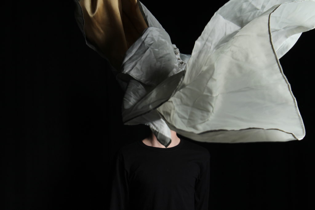
My next three shoots all used the same persons, it was done with three separate objectives. The first shoot, and in my opinion possibly the most successful, is a way of communicating a discussion of fluidity and structuralism, it allows a discussion between the model and the fabric itself, and an exposure and lack of identity. I believe too this shoot accompanied with the darker tonal background and the use of strong golds covering and wrapping around the body, has some if not many religious connotations, so could possibly be included within my new narrative story. My second Idea for the shoot was to show elements of chaos, within a different angles, many of which have been distorted in order to create a different persona or sorts. I wanted to use an array in order to get firstly a curved distortion that allowed an extension to his face, secondly I wanted to show a force of impact and a movement to his face, so having it pressed up against glass creates the illusion of the camera being pressed against his face. I believe this shoot was very experimental but if I tonally develop it in such a way, it could really be a successful performance of chaos, and really start to form an interesting concept of emotions. Finally I was inspired by the shoot previous ,to get more basic portraits, all with different forms of emotions in order to overlay and show a movement and struggle of inner emotions and chaos, forming a movement within the image itself. These developments are some of my favourite current work, I believe it is really interesting too see the forming of different emotional states all accompanied within one image. I belive all these three shoots, really started to help myself, learn what I can do to achieve a successful narrative to my book. It also opened up the idea to not just look at beauty but both elements, which is what I am currently looking at within reason of the church.

My most recent shoot was a long shoot which took around 2 hours, And I did this shoot in order to experiment within the different areas that I believed had the most relevancy and relation to the themes of haiku, so natural beauty within areas of minimalism. I believe this shoot was really a more successful expansion from my second shoot I had done previous. It allows more areas to focus on light and an emotional state and shows combinations of animals and people. I believe I could still carry out elements from this shoot, however, I do not really enjoy how I edited the image, they to my taste are too pastel and girlish, and I believe if I were to create more black and white imagery, it might create a more interesting narrative construct. I was recently looking at an artists who was trying to present light and darkness, and edited all their images to be a really light black and white all on black paper, and I believe this is a large central interests of mine, and I would like to produce black and whit images to possibly even be presented on black paper.

Overall I believe from my current shoot, they probably differ between different areas on level 4, nothing yet I belive is extremely successful, and I believe I need to tie the narrative concept up. However with the planning of my new shoots, I believe I could really both form the combination of all these shoots, and using the combination of light and darkness and the evolution of life, showing birth, light, and the run to death and darkness, will really help this project to prevail, As I would be able to use all of my images. I will after Easter once more look back at my work and see if my level to my mind has gotten better, and if my project is going in a successful direction.