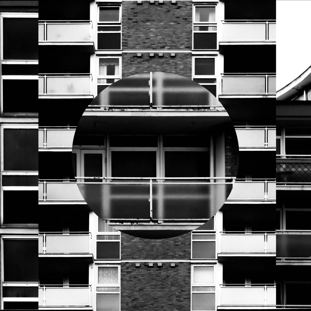
In this post I have done some further experimentation on ways to compare and merge the photographs that I have taken. The main idea behind this editing is to take away parts of a photograph layered on top of another photograph to reveal a photograph in the background – this will allow the differences and similarities between the faces of the two buildings to be shown clearly. The idea for introducing shapes into the photograph to show contrast came from John Baldessari’s work with brightly coloured dots in which he covered the face of his subjects with dots that contrasted with the background; I felt that the introduction of more shapes brought another element to the photograph. Below is my first example of experimentation with cutting shapes into a photograph then layering; I cut around a coin with a stanley knife to reveal the features of the photograph below and show to create abstract effects within the composition.

In the first set of edits below I have used both circles and oblongs to create a range of contrasts within the photograph. I believe that this method may appear too confusing and removes the aesthetically pleasing aspects from the photographs but it does show contrast between structures.
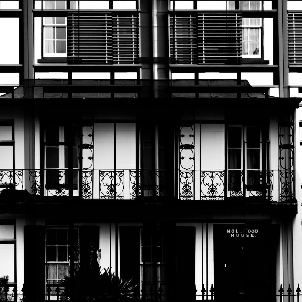
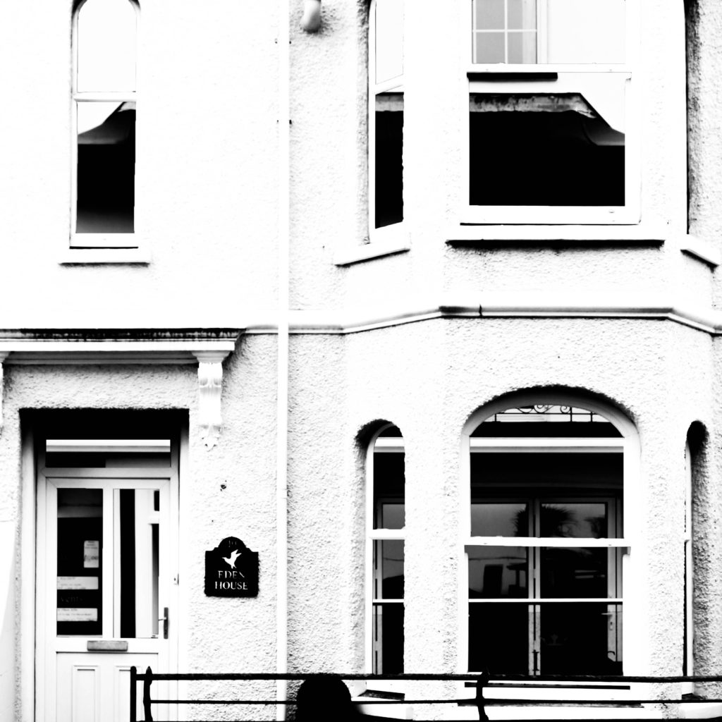
In the below set of edited photographs I have used photoshop to remove the windows from the photograph on the top layer and so opening up a viewing into the background layer. This method could be used well with a double exposure method potentially, as I have done with the photograph on the left. This method helps to show similarities as even though parts of the composition have been completely removed it does not look completely abnormal.
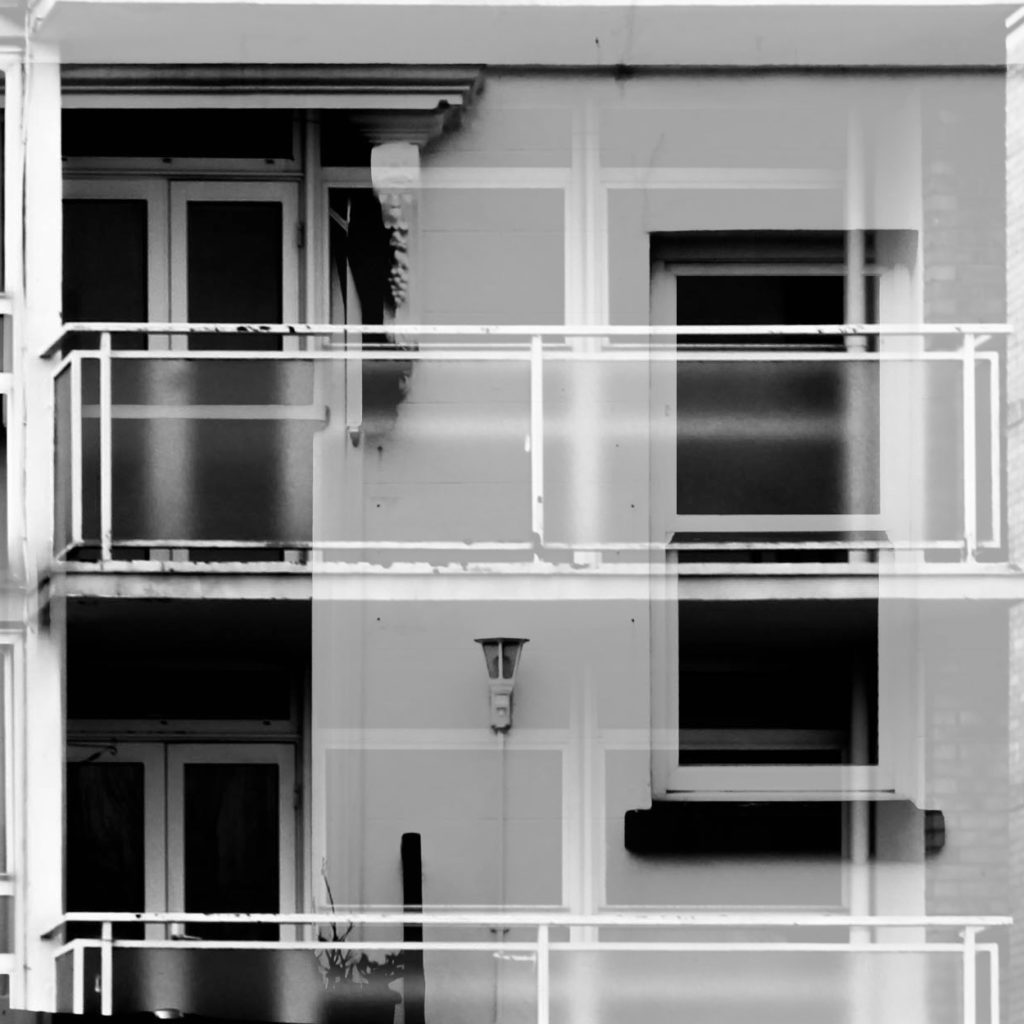
In the below left edit I had first cut out the shapes within the windows and felt that this did not create a strong enough composition so then I continued to alter the opacity of the photograph to create more of a double exposure effect in which you can see both photographs when you look at it in a different perspective. In the photograph on the right I have cropped out circles within the photograph similarly to my first experiment with cutting out shapes. I feel that the circles do not sit well against the blocky natural shapes of a building face and so creates an abstract but not an aesthetically pleasing compositon.


