For the second part of my 3D edits, I have used a different colour set, green and magenta. This has pulled through some of the more vibrant colours in my images.
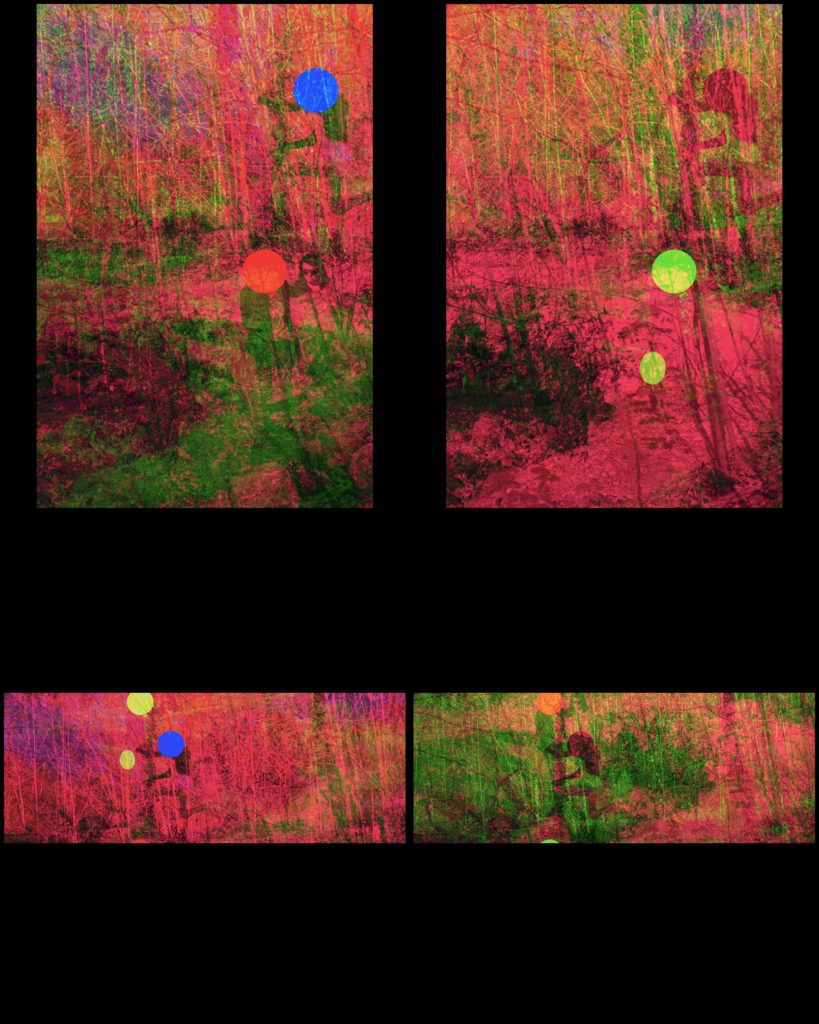
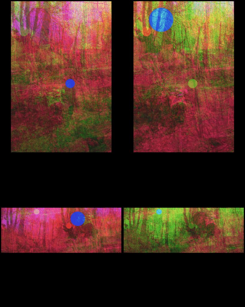
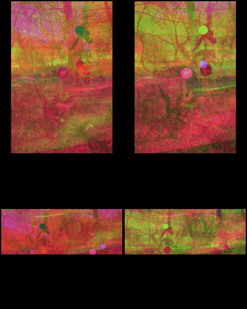
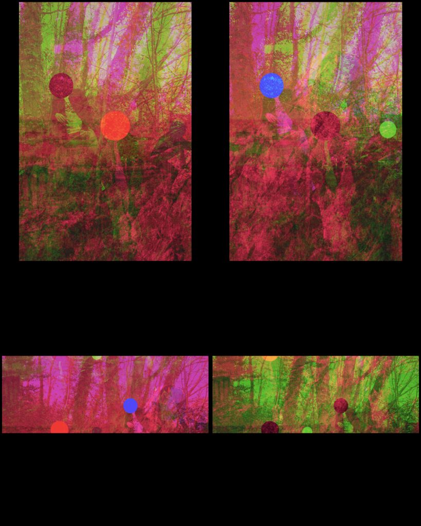
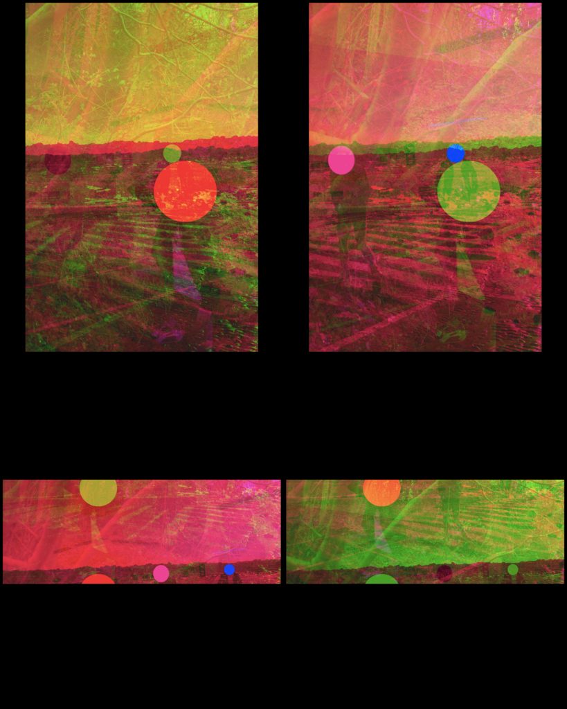
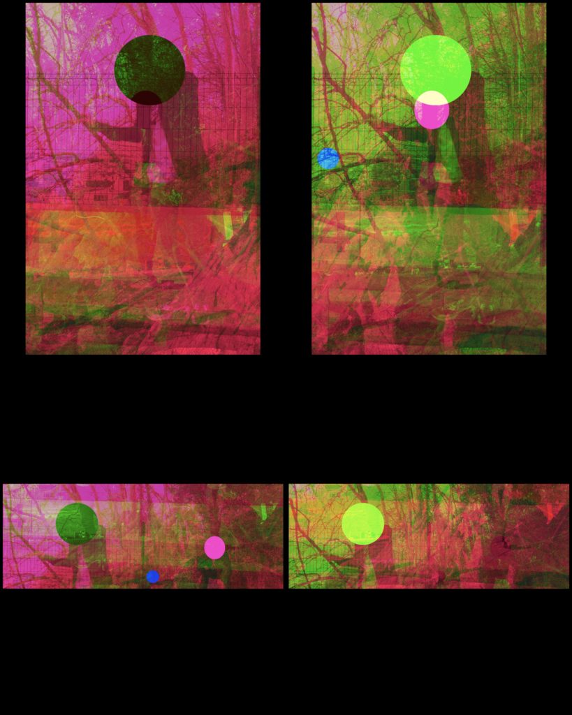
For the second part of my 3D edits, I have used a different colour set, green and magenta. This has pulled through some of the more vibrant colours in my images.


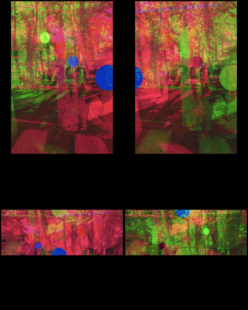
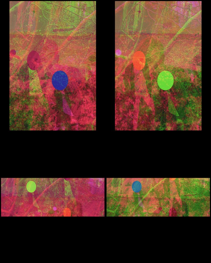
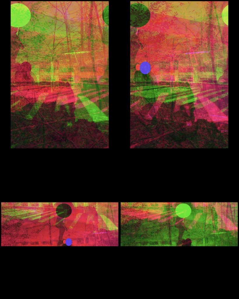
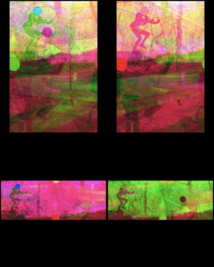
For my third set of edits I have decided to split into two parts fo two types of stereograph colours, this one is for the red and blue.
To create this effect on my images I used an application called XstereO Player. It allowed me the ability to create standard portrait sized images, and a slightly wider landscape sized images.


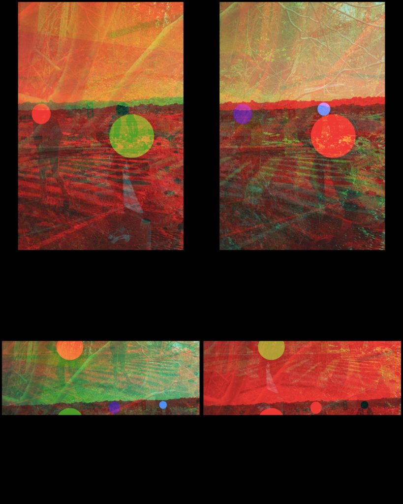


Abstract is a term often used in art to describe artworks that may appear to be without a recognisable subject. It can refer to artworks that use forms that have no source at all in external reality. Or to forms that are ‘abstracted’ from the real world – based on subject matter found in reality but reduced in shape, line and colour to their simplest forms. It uses a visual language of shape, form, color and line to create a composition which may exist with a degree of independence from visual references in the world.
As it does not try to represent the material world, abstract art has often been seen as carrying a moral dimension, embodying such virtues as order, purity, simplicity and spirituality. Pioneers of abstract painting in the early twentieth century include Kandinsky, Malevich and Mondrian, while Naum Gabo was an early pioneer of abstract sculpture. Since then abstract art has been indistinguishable from what we now know as modern art.
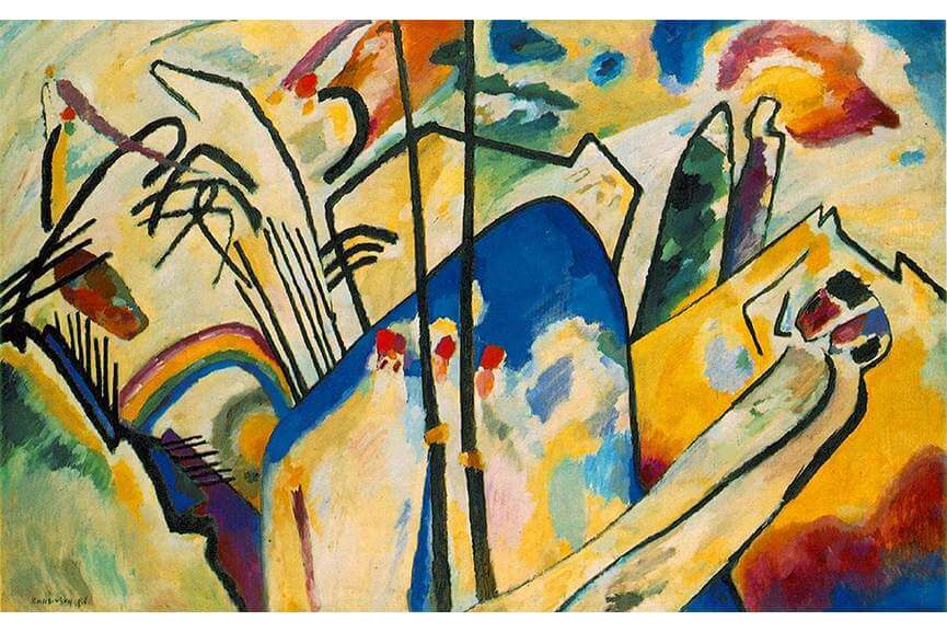
Wassily Kandinsky is one of the pioneers of abstract art. His practice spans through different abstract art techniques and styles that would later be used by generations of abstract painters. Kandinsky first began to use expressive color masses separating them from forms and lines. Soon after that, he started to merge geometry with abstraction, thus participating in creation of geometric abstract art. Although geometric forms were not something Kandinsky was particularly interested in, in his art we see the first encounters of geometry and abstraction. Finally, his work at the Bauhas cannot be ignored. Here, Kandinsky theoretically examined the use of colors, and under the influence of Gestalt psychology, he began to focus on straight lines, which led to the contrasting tones of curved and angled lines on final compositions.
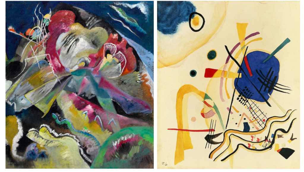
Painting was, above all, deeply spiritual for Kandinsky. He sought to convey profound spirituality and the depth of human emotion through a universal visual language of abstract forms and colors that transcended cultural and physical boundaries.
Kandinsky viewed non-objective, abstract art as the ideal visual mode to express the “inner necessity” of the artist and to convey universal human emotions and ideas. He viewed himself as a prophet whose mission was to share this ideal with the world for the betterment of society.
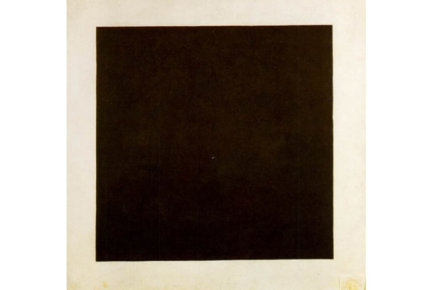
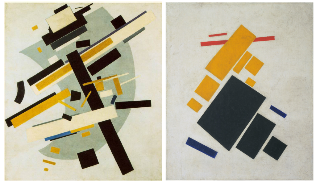
Malevich is also one of the pioneers of abstract painting, but he was also the creator of one of the most radical abstract art movements ever – Suprematism, a term which expressed the notion that colour, line, and shape should reign supreme over subject matter or narrative in art. The main interest of Malevich (and his fellow Suprematist artists) was to search for the so-called zero degree of painting, the point beyond which the medium could not go without ceasing to be art. As a consequence, they used extremely simple motifs, subjects and forms.
The whole composition is focused on basic geometric forms, such as circles, squares, lines, and rectangles, painted in a limited range of colors. Because of his contacts in the West, Malevich was able to transmit his ideas about painting to his fellow artists in Europe and the United States, thus profoundly influencing the evolution of modern art.
More radical than the Cubists or Futurists, at the same time that his Suprematist compositions proclaimed that paintings were composed of flat, abstract areas of paint, they also served up powerful and multi-layered symbols and mystical feelings of time and space

Yves Klein was the most influential, prominent, and controversial French artist to emerge in the 1950s. He is remembered above all for his use of a single color, the rich shade of ultramarine that he made his own: International Klein Blue. For many, Yves Klein has been associated with minimalism and performance art. However, his legacy within the realm of contemporary abstract art is indisputable. As Klein said himself: Blue…is beyond dimensions, whereas the other colors are not. All colors arouse specific ideas, while blue suggests at most the sea and the sky; and they, after all, are in actual, visible nature what is most abstract.
“Never using the line, one has been able to create in painting a fourth, fifth, or whatever other dimension – only color can attempt to succeed in this exploit. The monochrome is the only physical way of painting – permitting us to attain the spiritual absolute.”
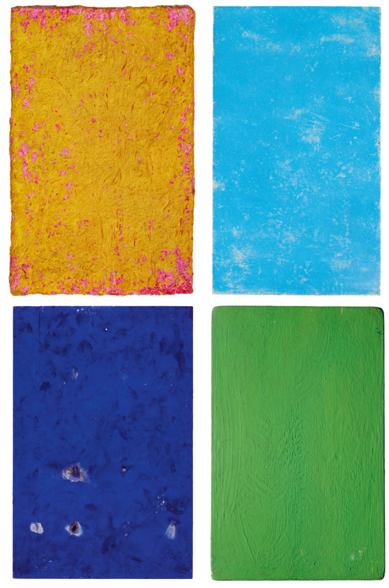
http://www.yvesklein.com/files/filter_file_91.mp4
The abstract painting that dominated French art in the 1950s was invariably premised on the notion that an artist could communicate with the viewer through the power of abstract form. But skeptics of modern, abstract art have always alleged that the viewers, like the faithful devotees of a false god, do more of the work than the artist, investing the forms with their own feelings rather than discovering the artist’s. Viewed in this light, Klein’s monochrome blue paintings might be read as a satire on abstract art, for not only do the pictures carry no motif, but Klein insisted there was nothing there at all, only “the void.”
“… I thus seek to individualize color, for I have reached the conclusion that each color expresses a living world and I express these worlds in my painting. My paintings affirm the idea of absolute unity in the context of perfect serenity, an abstract concept represented in an abstract manner (…).”
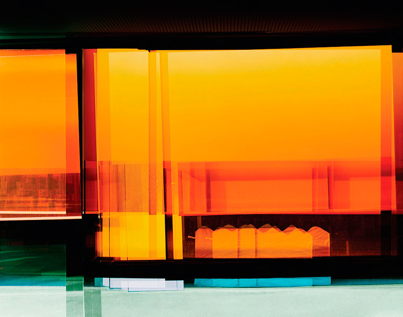
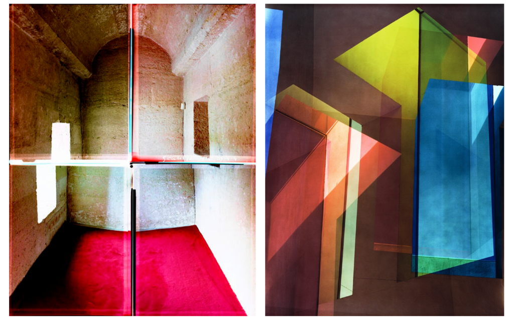
Ola Kolehmainen is a Finnish photographer whose exceptional work could easily fit into the abstract genre as we previously defined. He uses architecture as both a starting point and as his main source of inspiration. Instead of portraying architecture in a direct form, he reveals it as an examination of space, light and color, all of which reflect and question our typical, human way of looking at things.
It is intriguing to follow how Ola’s representation of buildings evolved from a direct approach into an artistic vision thanks to his closer examination of structures. Because of his unique perspective, Ola developed a more abstract and independent language that allowed him to distance himself from architecture as it is.
Recently Kolehmainen has shifted away from his traditional minimalism, and expanded into a complex approach dealing with space, light, and colour in his first exhibition centered around historical architecture. Kolehmainen photographed religious buildings in Istanbul for half a year. In addition to their historical dimension, the artist probes the buildings’ architectural volumes and light ratios: the buildings’ interiors and structural details reveal the changing light of days and seasons.

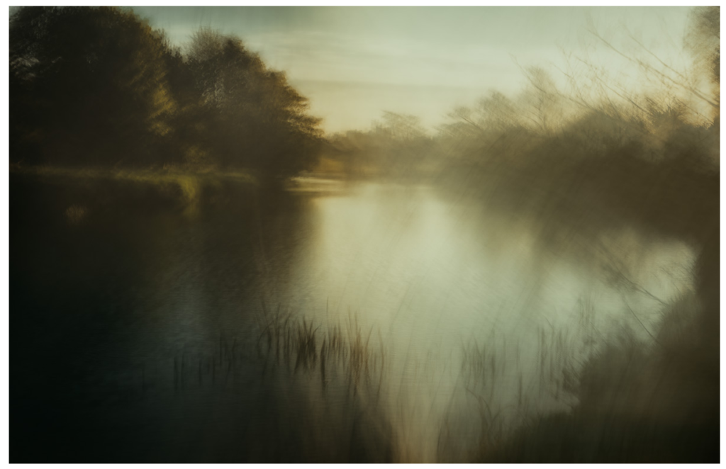
From intricate and nearly impossible points of view to elegant camera shakes, abstract can be done in a variety of ways from simple to complex, all of which produce elegant results. Inspired by the paintings of the old English masters of pictorialism, Andrew S. Gray creates beautiful abstract landscapes with a unique style using intentional camera movement as well as well-planned color palettes.
He personally prints his work, which speaks volumes about his workflow mastery. In fact, Gray is so generous that he even helps people around the globe with one-on-one sessions and video tutorials in addition to offering online help for anyone trying to create landscapes (or other imagery) with a similar style of abstraction.
” Inspired by the paintings of the old English masters with a mix of camera techniques and post processing I have developed these painterly impressionist images of both recognisable and abstract scenes into a style that goes beyond what many consider photography.
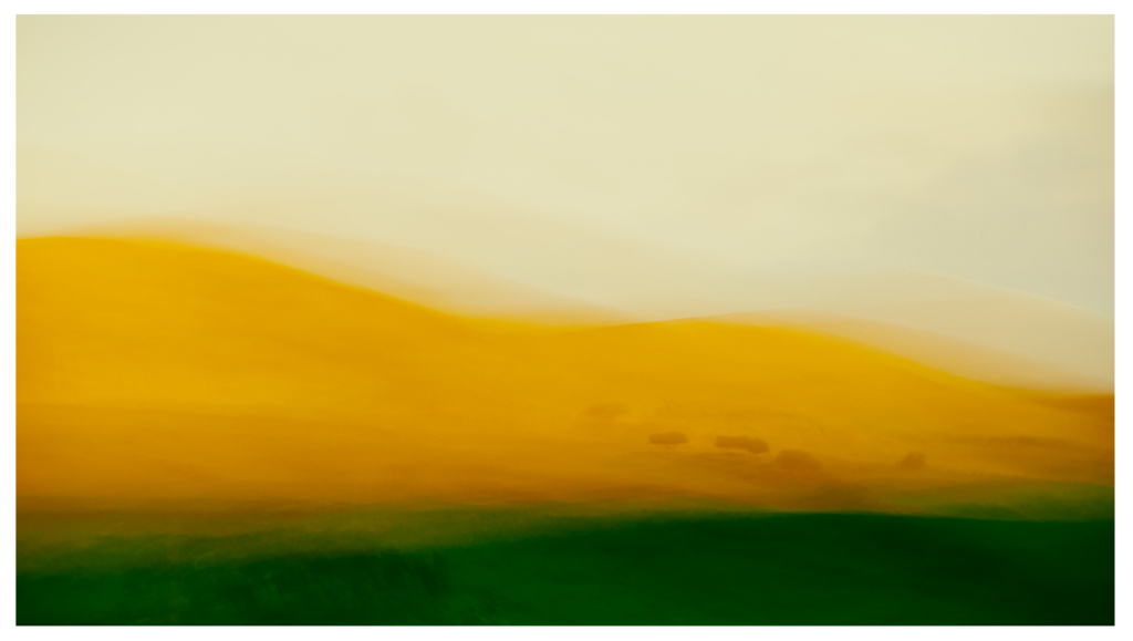
The looseness and ability to play without being tied by the light or weather affecting the scene you’d normally be shooting is the style’s appeal to me, also the chance of creating a scene that was not necessarily there. Using a tool of which its sole function is to capture exactly what is in front of it and then making it almost become a brush with which we “paint” is a joy. The results I have achieved since first experimenting with intentional camera movement (icm) have been more satisfying than any photograph I’ve made previously. “
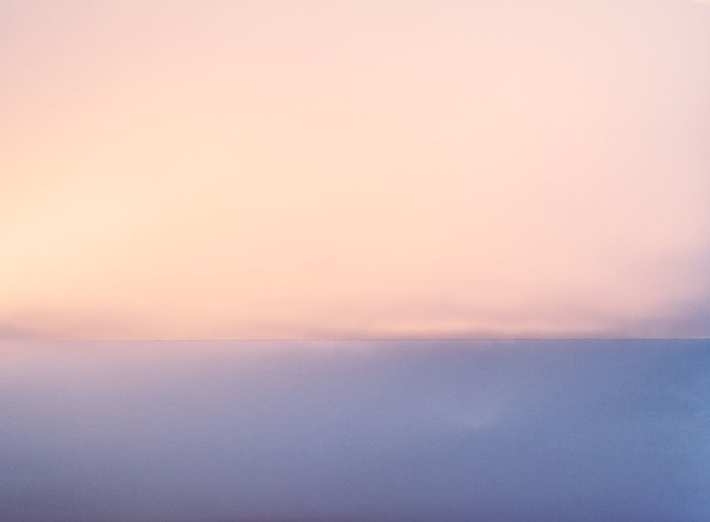
The artist, Maija Savolainen is a recognized photographer from the Helsinki School. For this specific topic, we will focus on her project called paperworks in which she created abstract and minimalist representations of landscapes using a colorful palette. Much like watching a pastel ode to Hiroshi Sugimoto, Savolainen demonstrates through her work that the simplest resources can lead to the most beautiful simplifications and abstractions.
The series, Paperworks is a study on the colors of sunlight and the photographic way of seeing. The images are made with a folded, white A4 sheet placed in direct sunlight at different times of the day and year. When looking at the picture at a distance, one might see a horizon line. When taking a closer look, it becomes clear that there is something strange about the view. The horizon appears to be a fold on a sheet of paper, the colors are reflections of sunlight on the white surface; a little bit of information makes the eye see something else than before.
In her series ‘Works on Light’ uses recurrent materials, paper, thread, sand and reflecting surfaces in her photographs to showcase the different properties of light and the illusory possibilities of photography. “They are the elements from which other things can be formed through a photographic gesture. When the light hits a round glass plate on my hand from a certain angle it might resemble the full moon in an astounding way.”
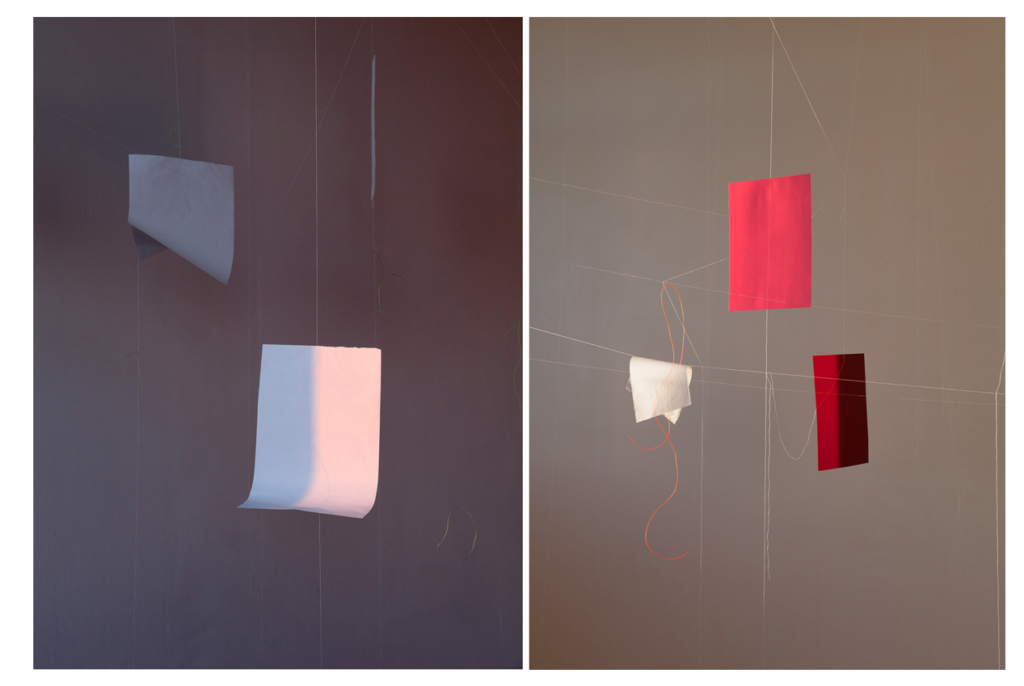
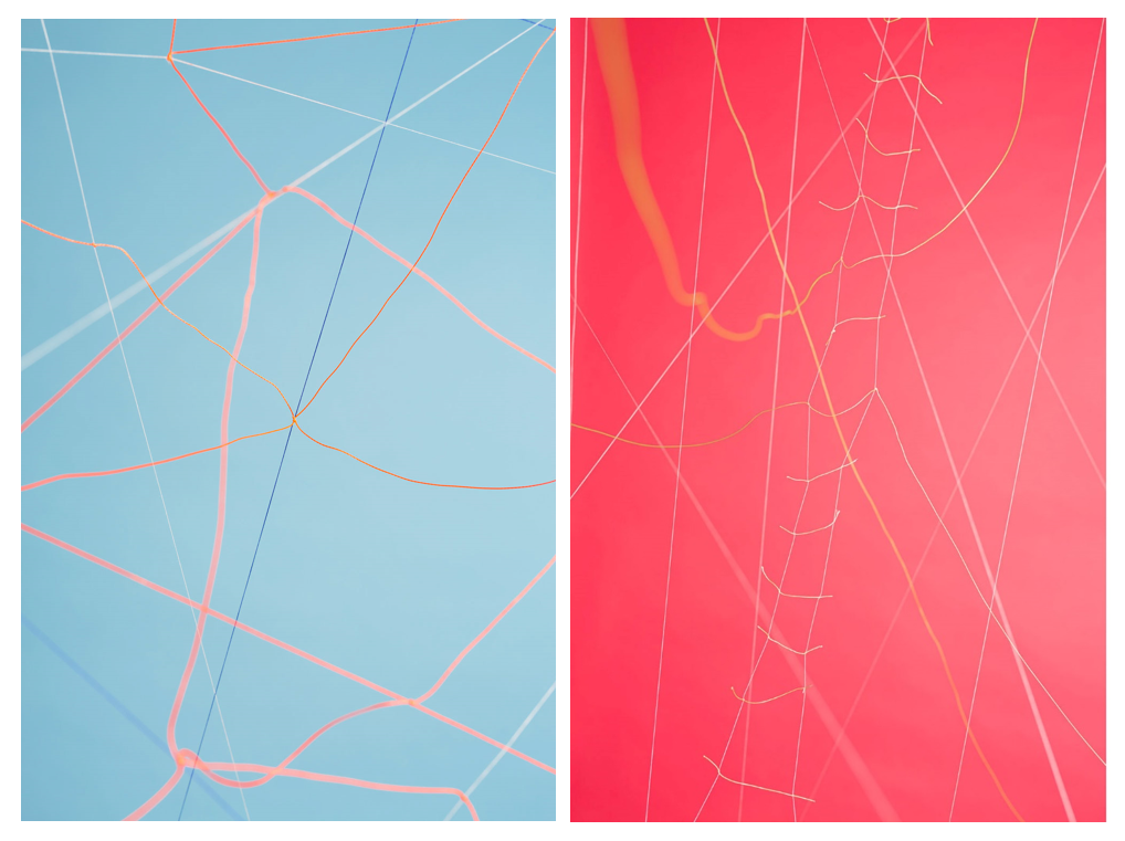
“To illustrate this feature, the Helsinki-based photographer Maija Savolainen has created still-life imagery that responds, on an abstract level, to the themes raised by Rail Baltica and the Talsinki tunnel. The sets which are built from paper and yarn, evoke notions of social and economic networks, overlapping and incompatible structures, parallel and twinned cities, and liminality.” – Crystal Bennes
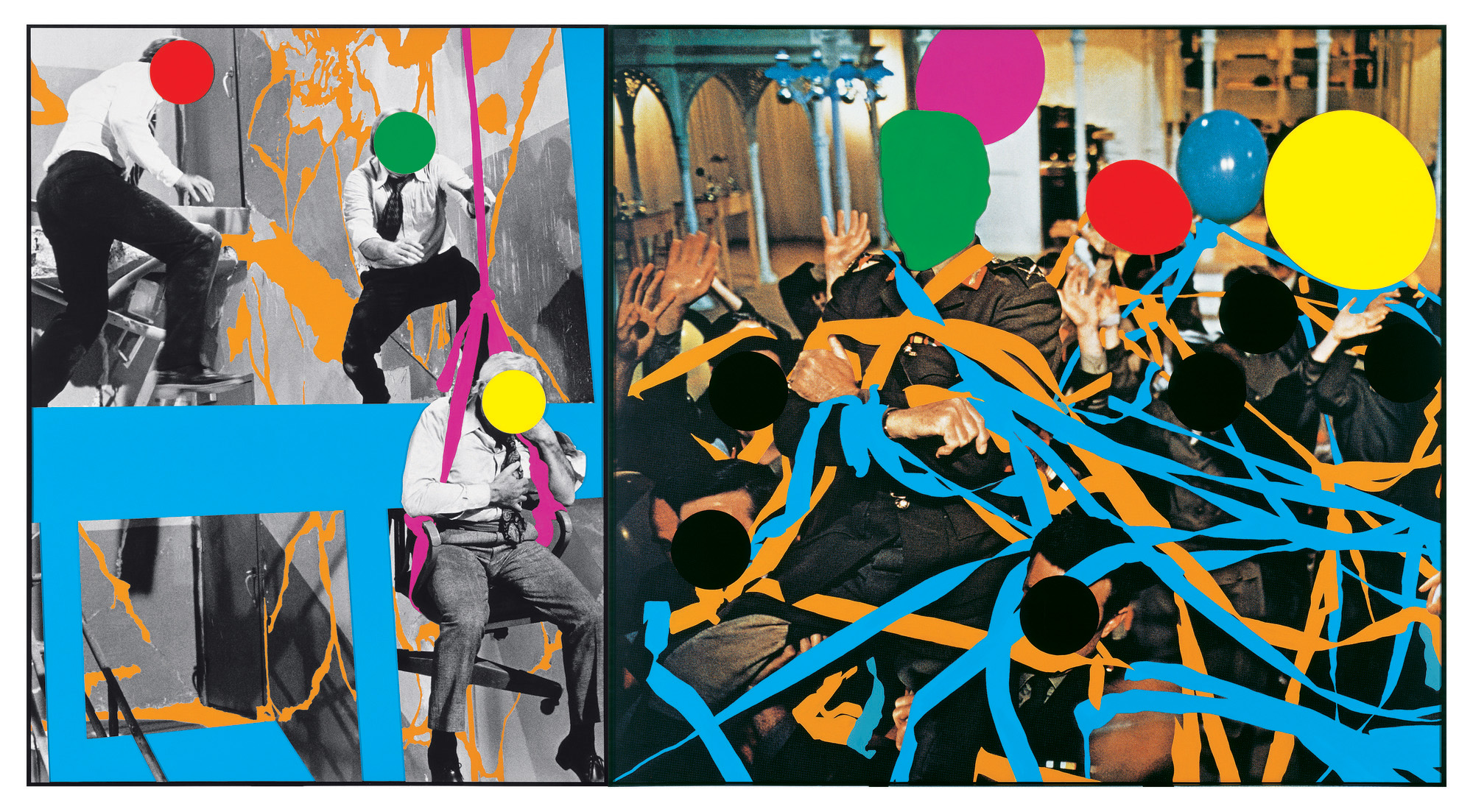
To look at the idea of play within photography we experimented with archival images and the way John Baldessari edits and manipulates them in a fun way to create expressive works of art. He used colourful price stickers to cover peoples faces in photos ultimately hiding their identity and creating a level playing field between them all . His art can be seen as radicle and chaotic with a strong playful element. Born in 1931 in America he is known for his conceptual art, incorporating found photography with text, paint also making creating using video. There is really no rhyme or reason to his work an he is known for
https://aeon.co/videos/everything-you-need-to-know-about-john-baldessari-godfather-of-conceptual
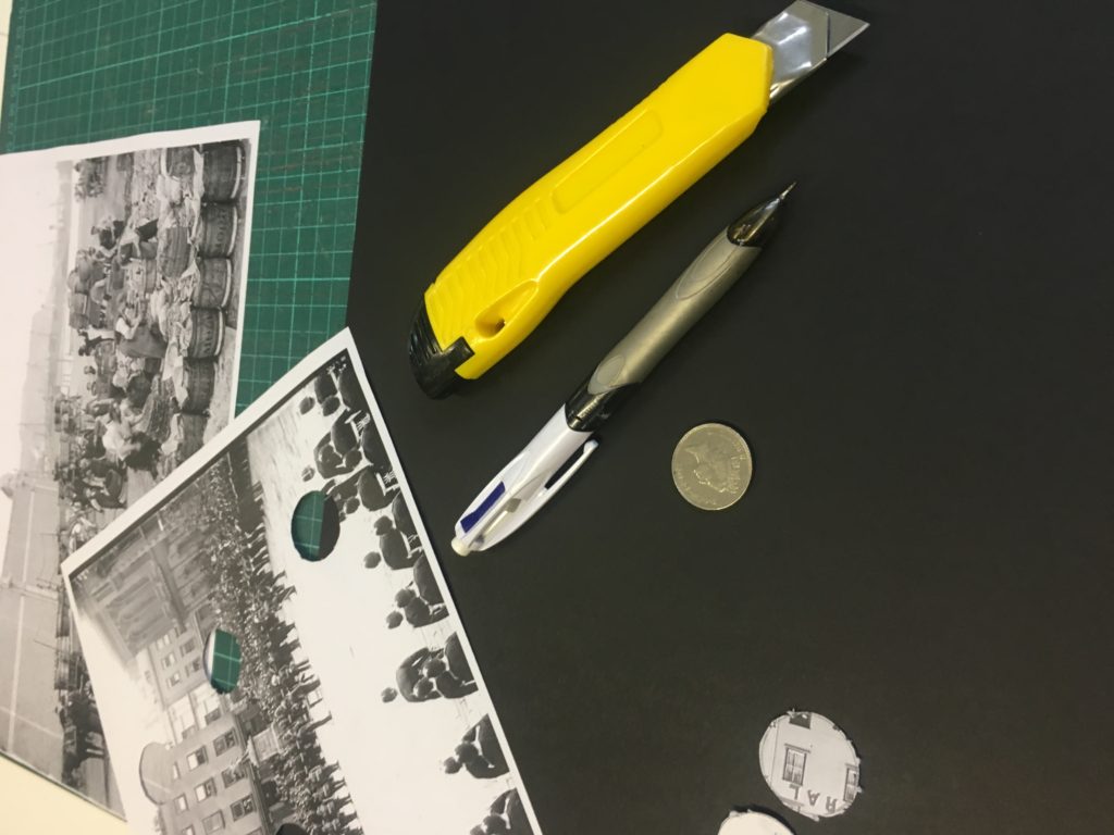
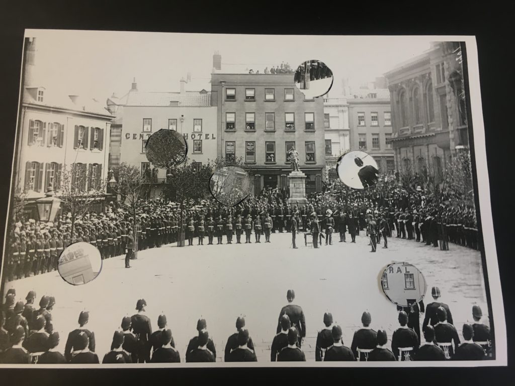
As a response to John Baldessari’s work and the idea of play and experimentation we flipped a coins above a archival image taken of Jersey. The photo I chose was take in the royal square on a special occasion, it shows soldiers standing in order. the photo is in black and white and has a high contrast making it very striking on its own. Wherever the coin landed we drew a circle around it, after doing this 6 times I used a stanley knife to cut out the circle shapes. I then chose to experiment with the cut out pieces if different ways arranging them and re capturing them in new positions.
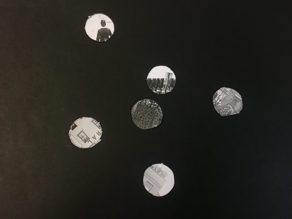
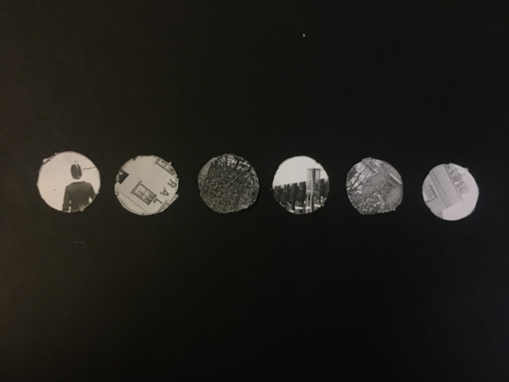
The circles are all a uniform size however the variation in the new cicular images is very different and tell a whole new story. The shapes are fun and completely re invent the scene from the original image demostraiting how the idea of play within photography can work.
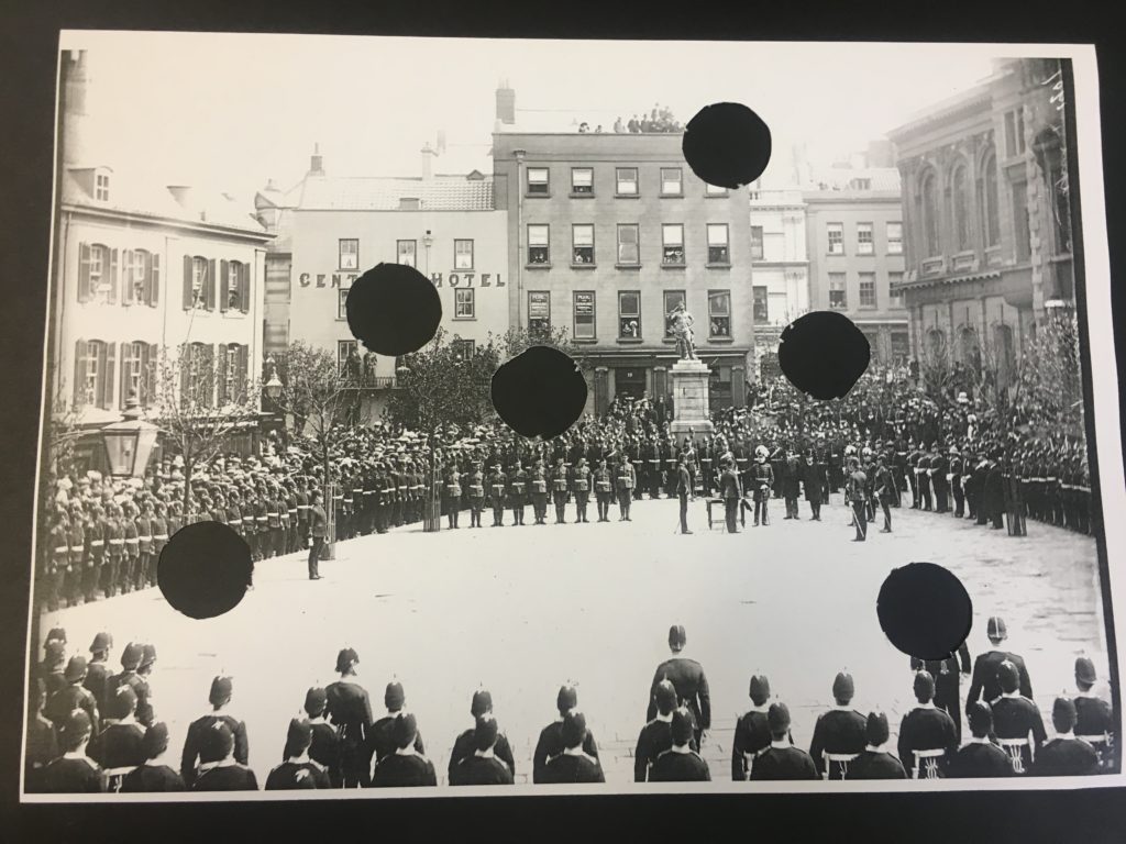
I placed the original image with the cut out holes over a piece of black card do that the circle shape stand out. I then replaced the cut out pieces on top of the image offsetting them to leave a segment shape to give the look of a shadow.

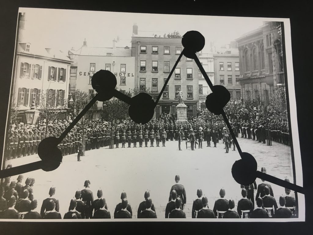
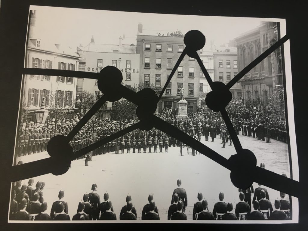
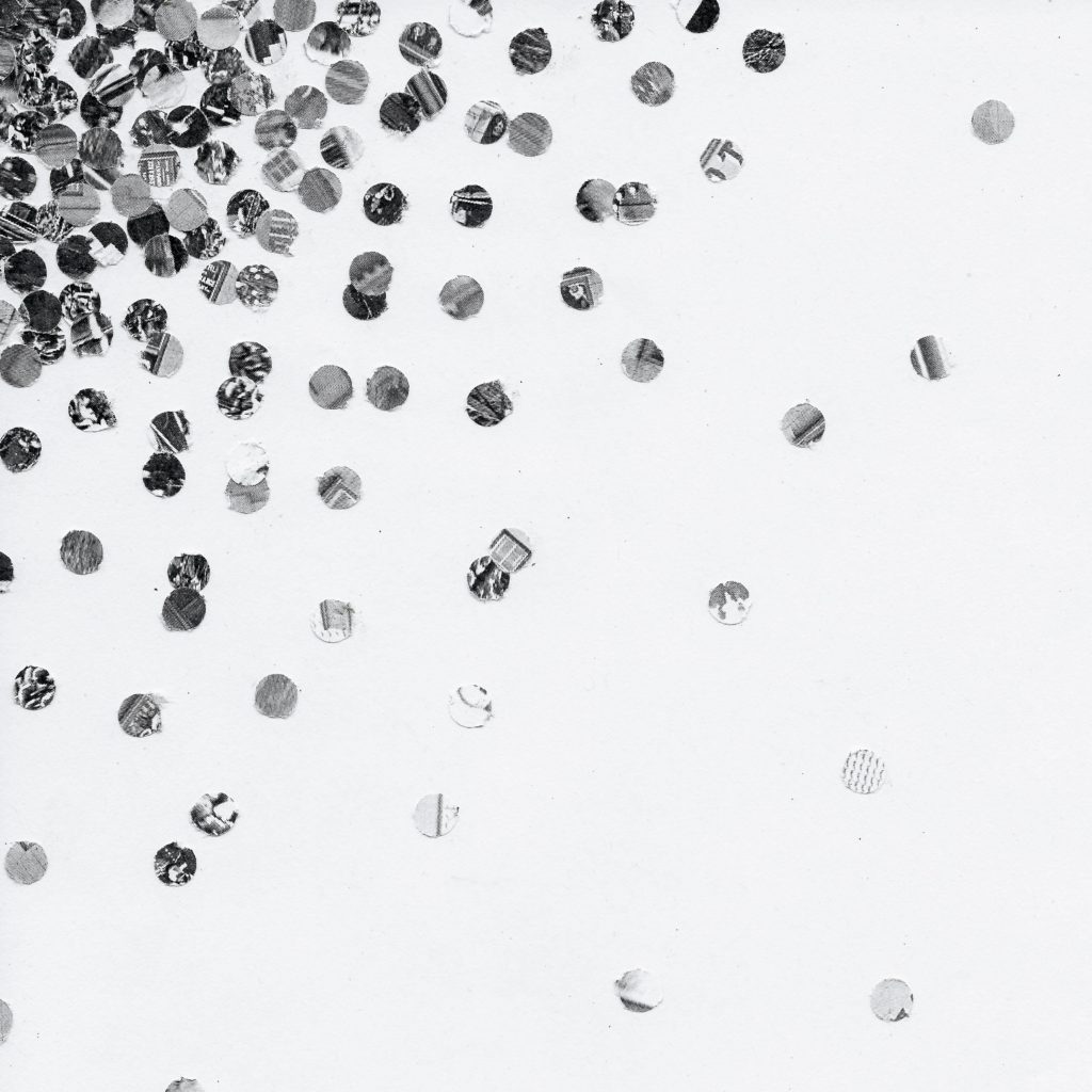
Finally I used the left over parts of the photo and cut it into smaller uniform circles using a whole punch. I then collaged them all together onto a plain white page concentrating the darker ones to the top left hand corner and having the disperse over the page.


have experimented in a variety of different ways, creating different shapes and types of lines. I have experimented on all of my photographs because I want to have a variety of options and a large range to choose from, this will make sure there is nothing I’m missing when making my final selection.
I have chosen a select amount of photographs from photoshoot 2, rocks and shells, to experiment on using different processes and methods in Photoshop.
Original Photographs:

Edit 1:

To create this effect, in Photoshop I used the ‘threshold’ tool, making the images grainy, black and white, I then used the ‘gradient map’ to add colour, the block colours creates a pop art effect.
Best outcome: I have chosen this as my best outcome because I like the composition and the contrasting colours, that create an eye-catching pop art effect. For example, I like the fact that the shell in directly in the middle of the photograph, this allows the photograph to appear more professional and planned. Also the contrasting purple and orange, the dark purple really stands out against the deep orange, creating a very pop art effect when paired with the other photographs.

Edit 2:

For this edit I simply put the images in black and white, creating a simple but effective edit. The use of the white back drop gives the photographs a professional feeling.
Best outcome: I have chosen this as my best outcome, because I like the simple white backdrop paired with the contrasting colours of the shell and also the added detail of the break in the shell, giving the audience something more to look at. The contrasting dark black and white colours of the shell add to the detail and texture creating a more interesting photograph and the white back drop allows the shell to be focal point of the photograph.

Original Photographs:

Edit 1:

To create this, in Photoshop I used ‘threshold’, the black and white creates an abstract effect, also giving an ink blot vibe, this effect makes you look further into the photograph, trying to figure out what it is of.
Best outcome: I have chosen this as my best outcome because of the texture create by the ‘threshold’ effect, also the fact that the photograph now has a abstract quality, for example due to the heavy block black, its more difficult to actually make out whats in the photograph.

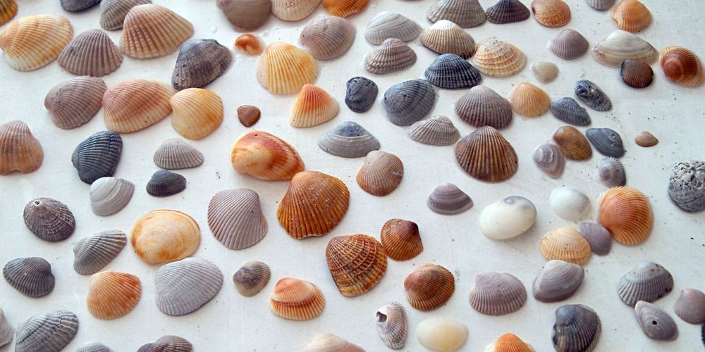
For this shoot I have chosen to photograph rocks and shells as a way to demonstrate ‘variation and similarity’ because there is the opportunity to photograph a wide range of similar objects but at the same time have them differ to each other so much, therefore being a variation of similar objects, objects found on the beach, within nature, rocks and shells. I photographed the same group of rocks and shells on a white backdrop and on a bed of smaller rocks, this also creates variation and also allows me to experiment with what creates a more successful photograph.

Most successful photographs:

I have chosen this as one of the most successful photographs because of the interesting shell, the hole cut through the middle is an eye-catching aspect that makes the photograph less boring, also the contrast of all the smaller rocks against each other and then contrasting against the white shell as well creates a striking effect. I made the large shell the focal point of the photograph by centering it and placing it on top of the other smaller rocks, this also giving it an interesting backdrop. I took this photograph outside in natural lighting.

I consider this one of my more successful photographs and have chosen this photograph because of the sequence that has been created by paring this shell a white backdrop, a sequence/ pattern of white, black, white, black is created going inwards towards the middle of the photograph, I took this photograph in natural lighting at a birds eye angle to create this effect.
For my second photo shoot I want to photograph rocks and shells as ‘objects from the beach’, I have chosen objects from the beach to photograph as part of variation and similarity because there is a wide variety of objects on the beach, meaning my selection of photographs will be larger. I also plan on using a variety of backdrops; smaller stones and a white backdrop, this allows me to create the factor of variation while taking photographs of the same object, creating the similarity. To create a more interesting effect I want to photograph the rocks and shells with the sand and dirt on them from the beach before also washing them and photographing them, I hope this adds more texture and detail to the shells and rocks when photographing them.
Types of shells I hope to find and photograph:
Places to photograph:
Equipment:
